What is Kyiv VDNH Soviet Modernism?
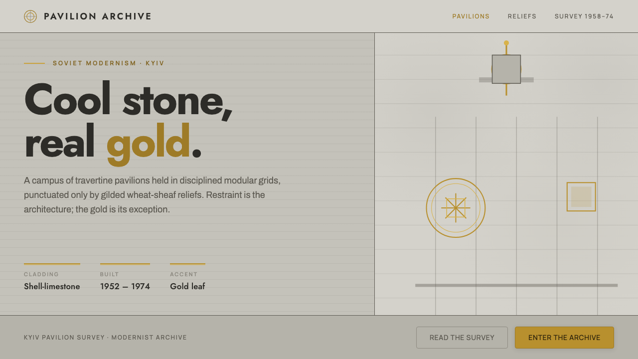
Kyiv VDNH Soviet Modernism makes restraint monumental: cool pale stone, disciplined geometry, and a rare wheat-sheaf gilt that earns attention by refusing to compete for it.
Kyiv VDNH Soviet Modernism in brief
Kyiv VDNH Soviet Modernism draws from the Expocenter of Ukraine, a Kyiv campus of exhibition pavilions begun in the 1950s and extended during the following decades. Its defining image is not decorative abundance but a measured encounter between pale architectural mass and small, emphatic moments of gold. Shell-limestone, marble, and travertine establish a cool stone-grey field; concrete envelopes, aluminium sunbreaks, and glazed steel bays give that field a rational, public-facing structure.
The style holds together two architectural languages present across the campus. The earlier exhibition pavilions carry the ceremonial force of Stalinist exhibition architecture, including rotundas, spires, and agricultural symbolism. Later Soviet-modernist additions simplify the envelope into concrete planes, glazing, sun control, and repeated geometry. A successful interpretation does not flatten this history into generic retro futurism. It keeps the earlier monumentality and the later restraint in deliberate tension.
Gold is the system's most controlled signal. Pavilion 1's rotunda spire uses real gold leaf, while gilded wheat-sheaf reliefs signify agricultural achievement. In a design translation, that means gilt should mark a title, emblem, key metric, divider, or single action rather than fill broad surfaces. The pale stone ground must remain dominant. The effect is institutional, calm, and ceremonial: an exhibition architecture of material gravity rather than spectacle.
Where does Kyiv VDNH Soviet Modernism come from?
The Kyiv VDNH, also known as the Expocenter of Ukraine, belongs to a campus tradition in which exhibition buildings presented public achievement through architecture. Its pavilions were begun between 1952 and 1958, placing the first phase within the era identified here as Stalinist exhibition architecture. The setting matters because the visual vocabulary was made for a collective, civic scale: facades had to read as durable institutions, not as temporary scenery.
The campus expanded through the 1960s and 1970s, when Soviet architectural modernism introduced a more pared-back formal language. Concrete envelopes became more prominent, while aluminium sunbreaks and glazed steel bays articulated facades with repetition, depth, and practical rhythm. This was not an abandonment of monumentality. Rather, monumentality moved away from dense surface display and into mass, spacing, structural cadence, and the contrast between solid stone-like surfaces and reflective glazing.
Pavilion 1 preserves the clearest concentrated expression of the older ceremonial register. Its rotunda spire carries kilograms of gold leaf, making gold a physical architectural material rather than a printed approximation. Gilded wheat-sheaf reliefs extend that material emphasis into symbolism, linking the campus to agricultural achievement. The significance of these motifs lies in their scarcity: they puncture a predominantly cool, pale environment instead of turning every surface into ornament.
The resulting style is therefore best understood as a bridge rather than a single frozen period. It combines the exhibition architecture's public symbolism with the later modernist envelope's discipline. For contemporary designers, Kyiv VDNH is useful precisely because it gives hierarchy a material logic: stone-like fields create calm, glazing and metal establish structure, and a deep gilt accent identifies what is ceremonially important.
What defines the Kyiv VDNH Soviet Modernism look?
Cool Stone Ground
The dominant field should feel like pale shell-limestone, marble, or travertine: cool, matte, substantial, and quietly variegated rather than sterile. It is a ground with architectural presence, not an empty neutral canvas. Broad unbroken areas let the composition breathe and give later accents a reason to exist.
Ceremonial Gilt
Deep wheat-sheaf gilt is an accent with symbolic weight, derived from the gold leaf on Pavilion 1 and its agricultural reliefs. Use it as a seal, a fine rule, a selected figure, or a singular emphasis. It should look embedded in the system, not sprayed across it. When gold becomes frequent, it loses the gravity that makes the contrast work.
Geometric Typography
Jost supplies a geometric typographic voice that feels orderly without becoming ornamental. Headlines should be firm, spacious, and direct; supporting copy should preserve a measured institutional cadence. Hierarchy comes from contrast in scale, placement, and density, not from a collection of expressive type styles. Text behaves like part of the facade.
Facade Rhythm
Repeated bays, aluminium sunbreaks, and glazed steel frames suggest a compositional rhythm of measured divisions. Use aligned columns, disciplined bands, and recurring intervals to create that rhythm. Repetition should feel structural rather than decorative, like a building system that also happens to be visually persuasive.
Monumental Restraint
Scale may be generous, but the composition should not become busy. Large stone-like planes, a single decisive heading, and limited focal points create public authority. The mood comes from confidence in mass and silence. Avoid playful clutter, ornamental flourishes, and effects that make the work feel lightweight or temporary.
Material Contrast
The system depends on contrasts that imply actual construction: pale mineral surfaces against metal, glazing against concrete, and gilt against stone. Keep those contrasts clean and legible. The aim is not to imitate every facade detail, but to make each visual layer feel as though it has a distinct material role.

Who shaped Kyiv VDNH Soviet Modernism?
Pavilion 1 is the clearest architectural reference for the style's relationship to gold. Its rotunda spire carries kilograms of gold leaf, proving that the gilt accent is not a superficial trend borrowed from decoration. In the visual system, that precedent supports using gold sparingly, with the concentrated force of a civic marker.
The source identifies the Soviet state architects responsible for the Expocenter pavilions as the key authorship behind the campus. Their work is read here through its visible architectural system: exhibition-scale massing, pale mineral cladding, symbolic relief, and the later modernist articulation of concrete, aluminium, steel, and glazing.
The wheat-sheaf reliefs are both a formal and symbolic figure. They signify agricultural achievement while showing how ornament can remain subordinate to architecture. Their lesson for design is precise: symbolic motifs gain authority when they are integrated into a larger material order and allowed to appear only where meaning is strongest.
How do you use Kyiv VDNH Soviet Modernism today?
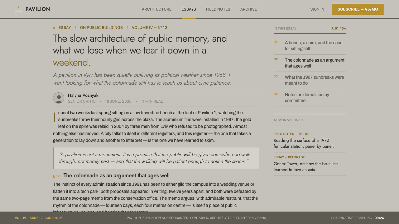
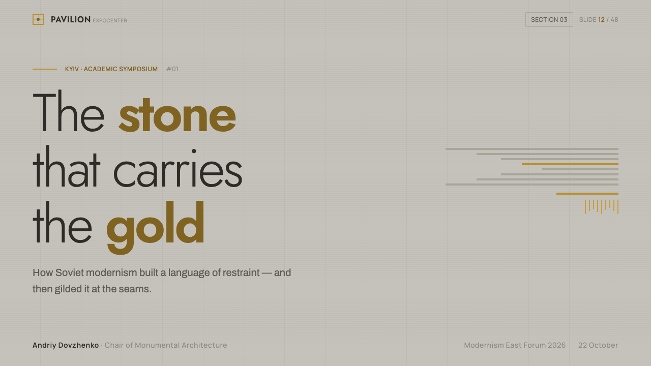
For presentation covers, use the style to establish civic confidence before any content appears. Let a pale stone-like field carry a large, decisive title in geometric Jost, with one carefully placed gilt mark or wheat-sheaf reference. A band, grid line, or glazed-panel motif can provide architectural direction. Resist the urge to fill the cover with monuments, stars, or multiple metallic effects; one ceremonial detail is more convincing than a themed collage.
Content slides should behave like pavilion facades: clear bays, sustained margins, and a hierarchy that can be understood at a glance. Keep the body text calm against the mineral ground, and use dark structural text for reliable reading. On data slides, use alignment and repeated shapes to make charts feel built rather than decorated. Reserve gilt for the selected result, a priority series, or a key annotation, while all other information remains materially quiet.
For web interfaces, the style is especially effective in dashboards, institutional portals, and pricing pages where durability and hierarchy matter. Organize navigation, panels, and data into disciplined columns that recall glazed steel bays and sunbreaks. Use pale stone-like surfaces for the broad application frame, then make active states and primary calls to action rare but unmistakable. The interface should feel composed from architectural layers, not from floating consumer-app cards.
Editorial and marketing layouts can use the style's contrast between calm field and ceremonial accent to give dense information authority. Feature stories benefit from broad margins, geometric headings, and image areas treated as architectural openings. Marketing pages can alternate substantial stone-like sections with darker structural interludes, while one gilt device carries the campaign's central promise. Agricultural symbolism should be used only when it has a real conceptual connection; otherwise the material logic is stronger than a literal motif.
The common mistake is to mistake gilt for luxury decoration or Soviet modernism for a license to make everything severe. Kyiv VDNH works because pale materials, glazing, metal, concrete, symbol, and gold are balanced by scarcity and order. Overusing metallic accents, adding ornate frames, or making every panel equally dominant destroys the architectural hierarchy. Keep the ground cool, the geometry disciplined, and the gold consequential.
Kyiv VDNH Soviet Modernism — FAQ
Is Kyiv VDNH Soviet Modernism simply a brutalist style?
No. Concrete is important in the later pavilion additions, but the style cannot be reduced to exposed mass alone. Its identity comes from the relationship among pale shell-limestone, marble, and travertine; aluminium sunbreaks; glazed steel bays; ceremonial gold leaf; and agricultural relief. The intended effect is cooler and more materially layered than a generic concrete-only interpretation.
Why should the gold accent be used so sparingly?
The source material makes gold meaningful through concentration: Pavilion 1's spire carries actual gold leaf, while wheat-sheaf reliefs use gilt to signify agricultural achievement. Gold reads as important because the surrounding architectural field is restrained. If it becomes a routine surface treatment, it stops acting as a symbol or landmark and becomes ordinary decoration.
Can the style work without a literal wheat-sheaf motif?
Yes. The wheat sheaf is a specific agricultural symbol, not a required decorative stamp. The more transferable principles are the cool mineral ground, geometric typography, facade-like rhythm, controlled material contrast, and the rare use of deep gilt. A project without an agricultural subject should retain those structural ideas rather than attach an unrelated symbol.
Where does this style work best in contemporary design?
It is strongest where a product or publication needs institutional clarity, public scale, and durable hierarchy: presentations, data-heavy dashboards, cultural or civic portals, editorial systems, and pricing pages. It is less suitable when the central promise depends on softness, casual playfulness, or abundant ornament. The question is not whether the style can be copied, but whether its values of restraint and material authority fit the message.
Related design styles
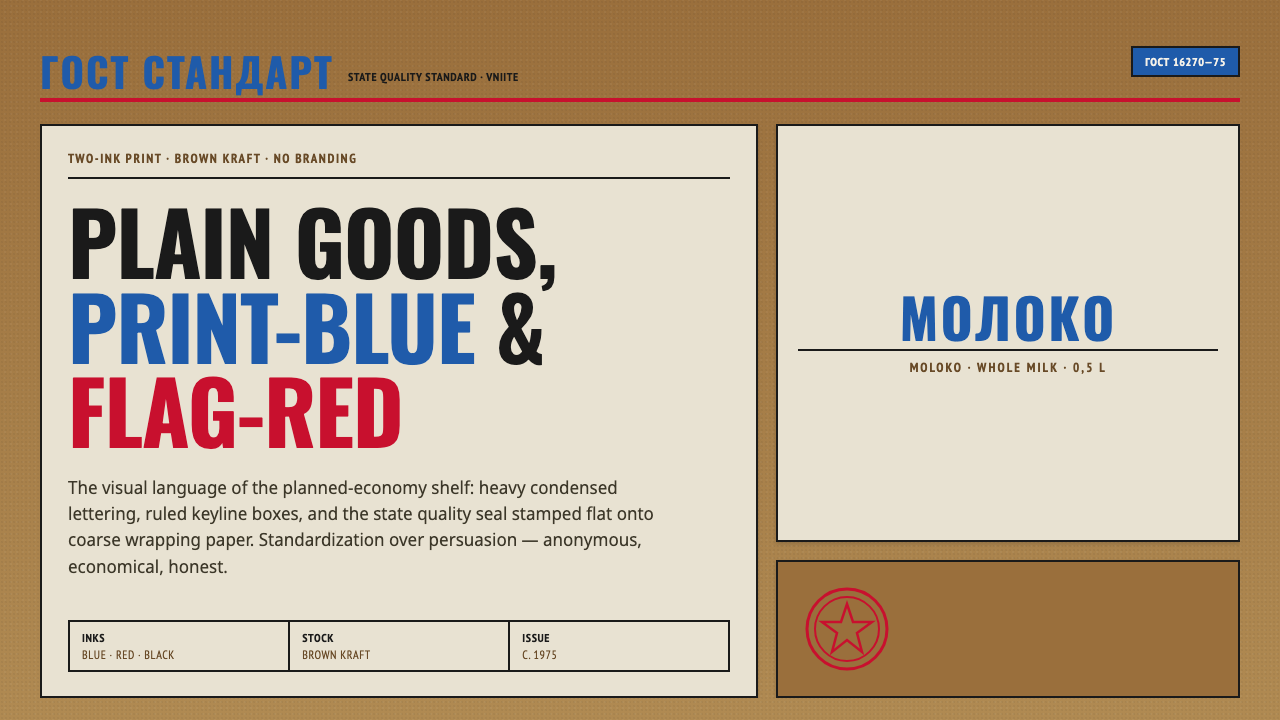 Soviet GOST PackagingAnonymous and strict. Kraft ground, red-blue ink, ruled boxes, condensed type.
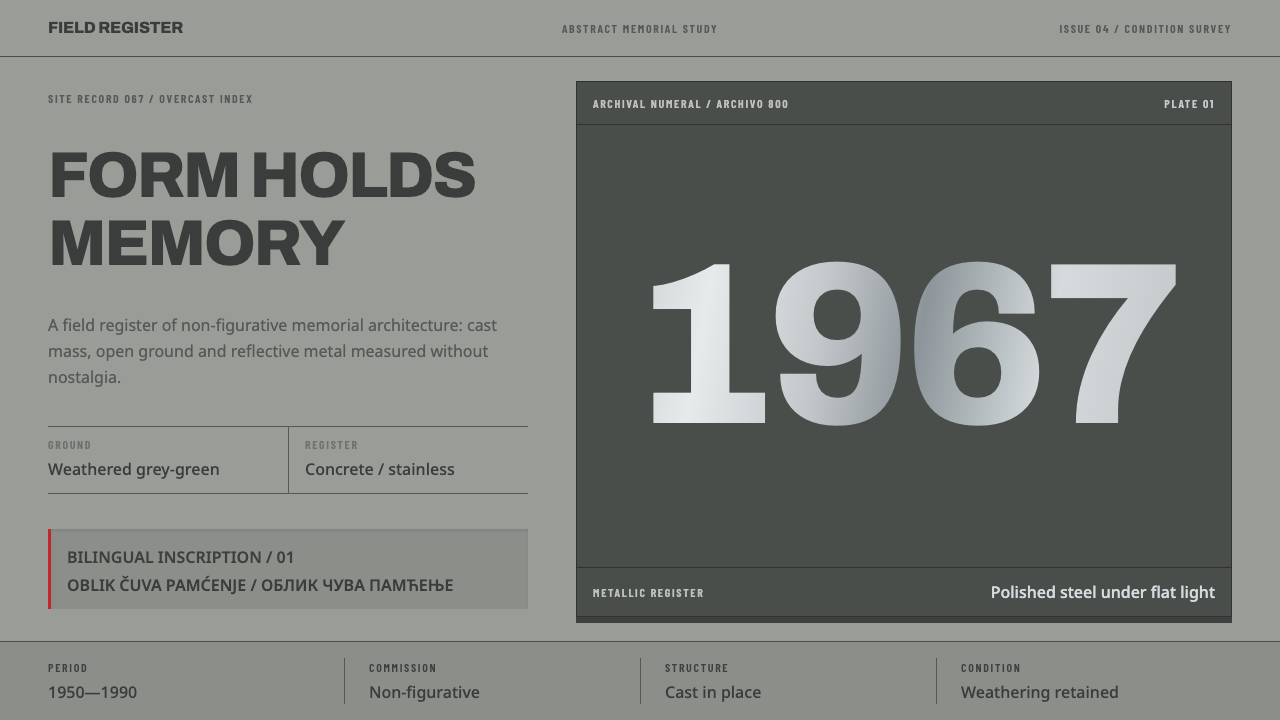 Yugoslav SpomenikMonumentality without figures. Concrete grey-green meets stainless geometry a…
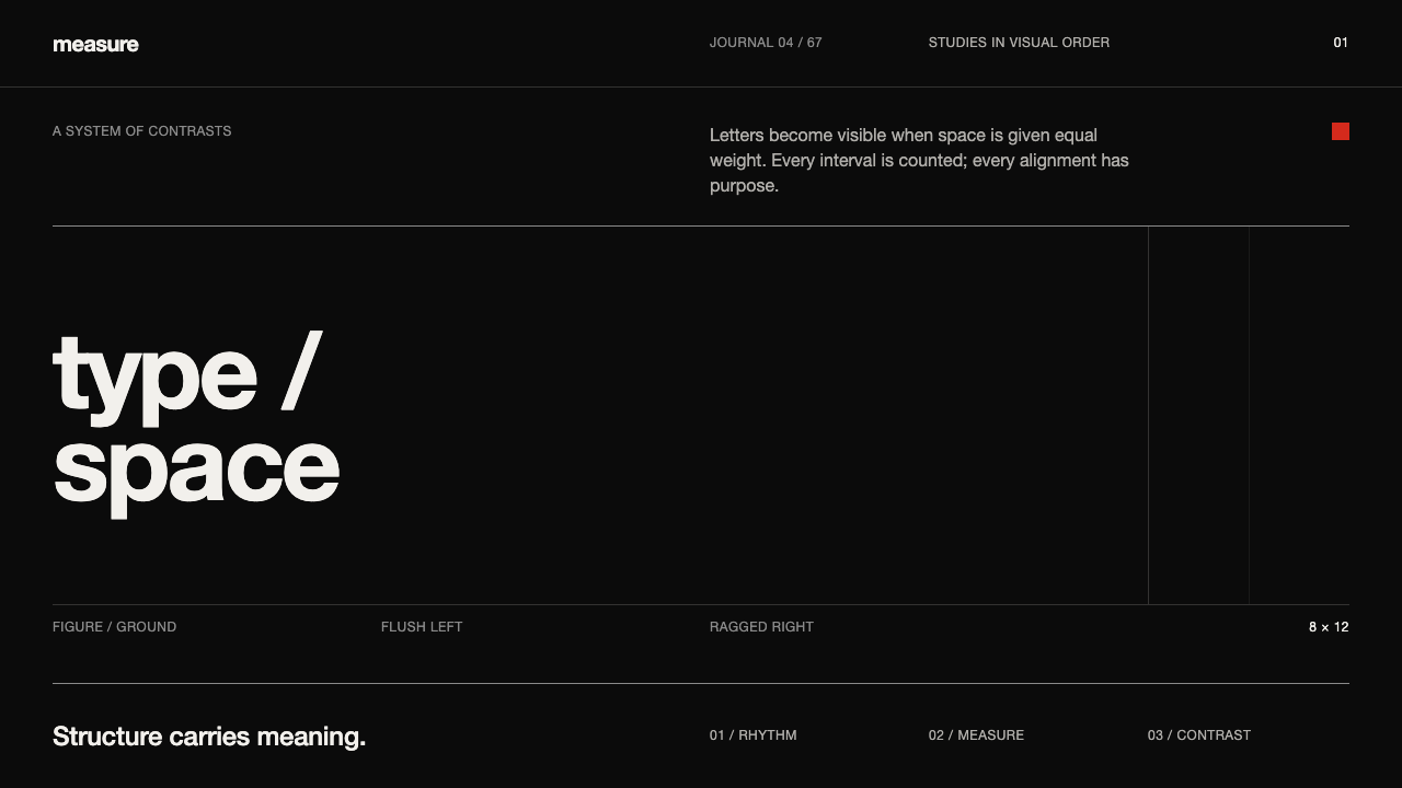 Emil Ruder TypografieDiscipline makes type visible. Near-white grotesque and measured space cut th…
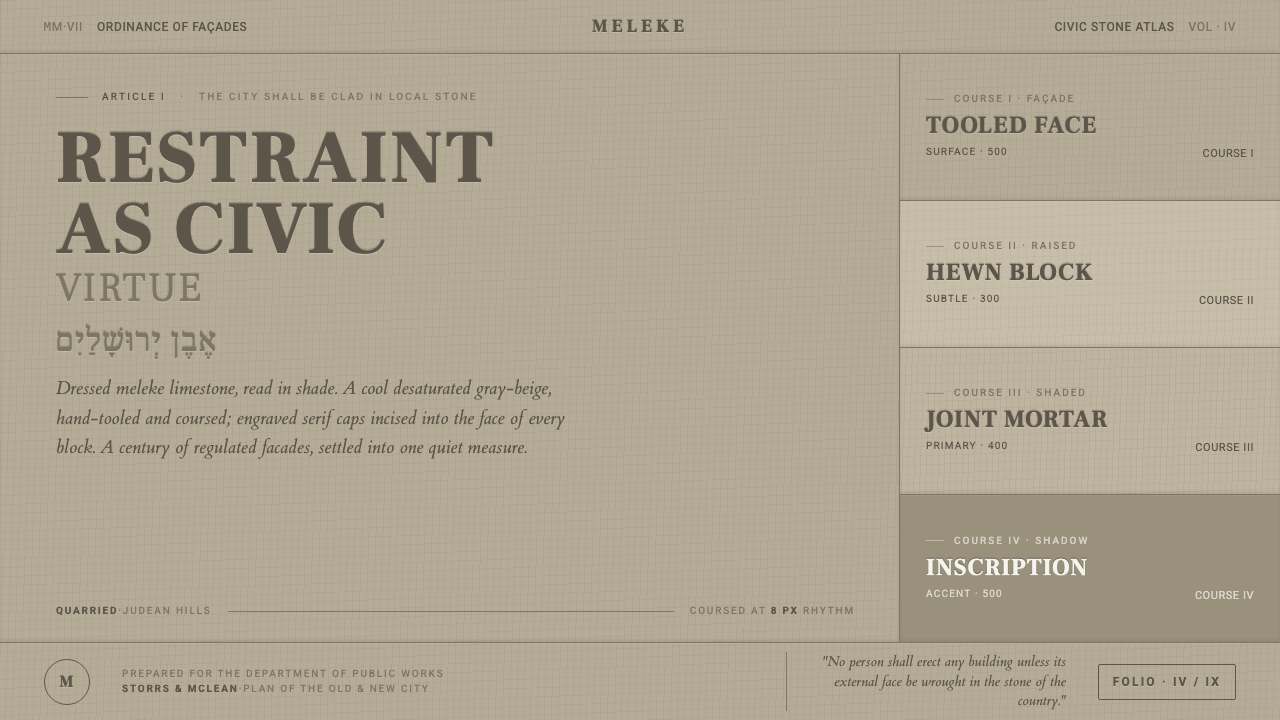 Jerusalem Stone GrayRestraint as civic virtue. Cool dressed-limestone gray-beige, ashlar coursing…
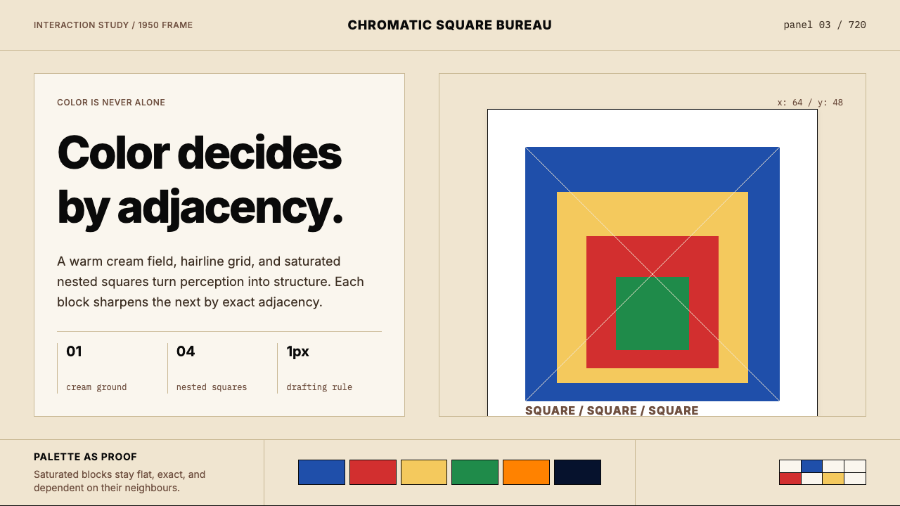 Josef Albers — Homage to the SquareColor becomes event. Warm cream, cobalt-red-yellow nested squares, exact hair…
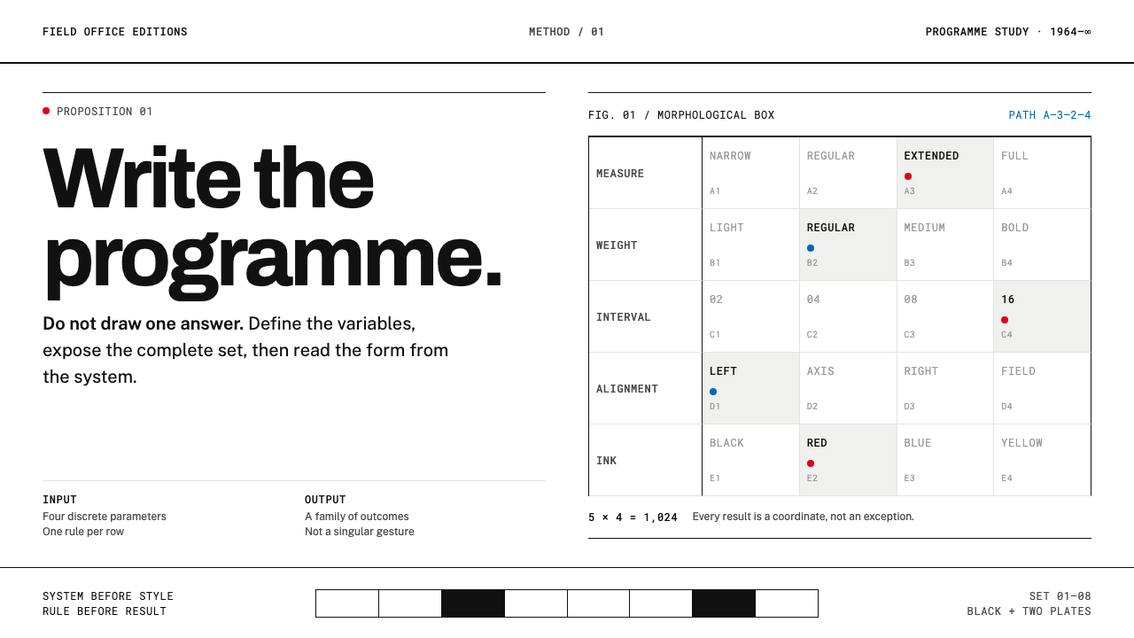 Karl Gerstner ProgrammesDesign becomes a programme. Black hairlines and a strict matrix turn paramete…