What is Jerusalem Stone Gray?
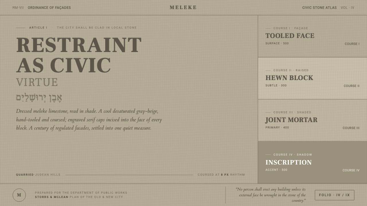
Jerusalem Stone Gray turns civic restraint into a visual language of cool limestone, ordered masonry, and engraved authority.
Jerusalem Stone Gray in brief
Jerusalem Stone Gray draws from the dressed pale meleke limestone associated with Jerusalem’s civic architecture. Its defining impression is not ordinary beige and not warm sandstone, but a cool, desaturated gray-beige shaped by hand-tooling, shallow relief, and the shadows held between courses of stone.
The style is architectural without becoming rustic. Ashlar coursing supplies its rhythm; chiseled texture gives the surface a human trace; engraved serif capitals provide institutional voice. Together, these elements create a sense of permanence and public responsibility rather than domestic comfort or decorative luxury.
Its restraint is deliberate. The visual system depends on pale mineral fields, measured alignment, quiet tonal contrast, and typography that feels carved into a building rather than placed on top of one. The result is monumental but calm: authority expressed through order, not spectacle.
Where does Jerusalem Stone Gray come from?
The material source is pale meleke limestone, dressed and hand-tooled into a surface whose character changes with light and shadow. In its shaded state, the stone reads as a cool neutral gray-beige. That distinction is essential: Jerusalem Stone Gray is deliberately desaturated, never golden and never ivory.
Its civic association reaches back to the 1918 McLean master plan. The plan established the architectural context in which dressed pale limestone became a defining public material for Jerusalem. The stone was not merely an available finish; it became part of the city’s shared visual identity.
Governor Ronald Storrs’s facade ordinance reinforced that identity by requiring the stone to clad every building in the city. The ordinance made material consistency a civic matter. Individual buildings could differ in purpose and scale, but their exterior surfaces participated in a common masonry language.
The style is placed in the period from 1950 to 1990 while continuing the Mandate-era facade ordinance. Its movement context is Jerusalem stone facade ordinance and Mandate-era civic architecture. Jerusalem Stone Gray therefore reads less as a period costume than as a continuing visual discipline: a city expressed through pale stone, coursing, and controlled public form.
What defines the Jerusalem Stone Gray look?
Color
The palette centers on a cool gray-beige derived from dressed limestone. It is pale without becoming white, neutral without becoming lifeless, and warm enough to remain material while cool enough to avoid golden nostalgia. Dark mineral gray and restrained near-black support type, rules, and engraved details. Saturated color should be rare because the style’s authority comes from tonal composure.
Stone Surface
Texture is hand-tooled rather than polished smooth. Small irregularities, cut marks, and changes in shade make the surface feel worked by a mason. In digital applications, this character should be suggested through quiet tonal variation and restrained grain, never through loud photographic texture. The surface is present, but it does not compete with information.
Ashlar Coursing
Horizontal courses are the structural rhythm of the style. Joints should feel measured and continuous, establishing a calm reading direction across a surface. Coursing can organize cards, sections, title bands, or background panels, but it should remain architectural rather than ornamental. The line of the joint is a datum: it gives neighboring elements a shared civic order.
Engraved Serif Capitals
Typography takes its authority from inscription. Serif capitals should feel cut into stone: broad, deliberate, and stable, with enough spacing to preserve the dignity of each letter. They work best for titles, civic labels, section names, and short declarations. Supporting text can be quieter, but it should remain disciplined and legible rather than expressive or playful.
Light and Relief
Depth comes from relief and shade, not from theatrical effects. The visual field should feel lit across a stone face, with darker joints and shallow recesses giving form to the masonry. Contrast is controlled and directional. Soft atmospheric glow, glossy surfaces, and decorative depth weaken the connection to carved civic material.
Civic Restraint
The governing principle is restraint as a public virtue. Nothing should feel fashionable for its own sake, and no flourish should compete with the shared structure. The style gains strength from repetition, consistency, and the sense that every mark belongs to a larger wall. Its monumentality is quiet: it asks to be trusted rather than admired.
Who shaped Jerusalem Stone Gray?
McLean is associated with the 1918 master plan that established the civic and architectural context for Jerusalem’s dressed pale limestone identity. In the Jerusalem Stone Gray system, his significance is infrastructural: the city’s material language begins with a plan that treats the facade as part of a shared urban order.
Governor Ronald Storrs is associated with the facade ordinance that required every building in Jerusalem to be clad in the city’s pale limestone. His role represents the conversion of an architectural preference into civic regulation, giving the material its unusual consistency and public force.
The dressed pale meleke limestone is the material anchor of the style. Hand-tooling, ashlar courses, and changing shade give it a character that is simultaneously mineral, crafted, and civic. Jerusalem Stone Gray translates those qualities into a broader visual system without losing the stone’s cool neutrality.
How do you use Jerusalem Stone Gray today?
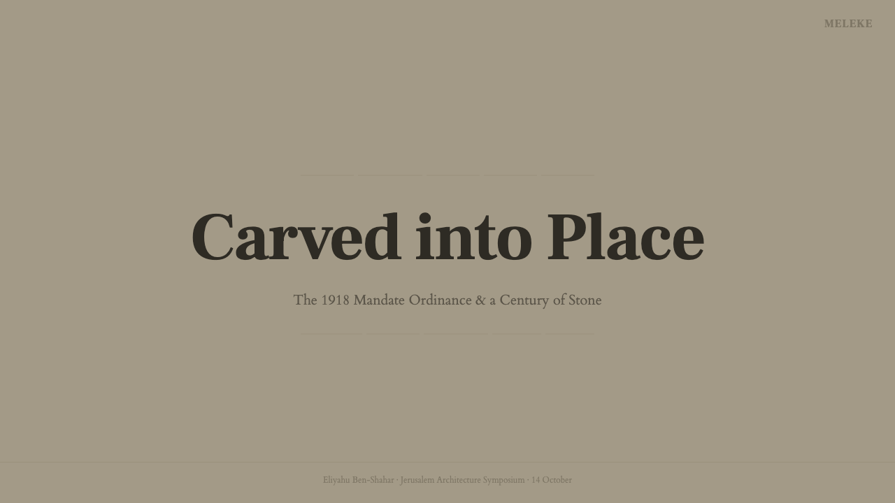
For presentation covers, use the light stone field as an architectural ground rather than a neutral backdrop. A title in engraved serif capitals can sit with generous breathing room, while a horizontal course, recessed panel, or quiet chiseled band establishes the page’s civic rhythm. Cover imagery should feel like a facade detail or a formal document, not a lifestyle photograph.
Content slides should use coursing to separate information into calm, legible bands. Section labels can take the voice of carved capitals, while supporting copy remains restrained and highly readable. Data slides benefit from the style’s material logic when charts are treated as masonry diagrams: aligned blocks, measured intervals, mineral neutrals, and contrast reserved for the most important finding.
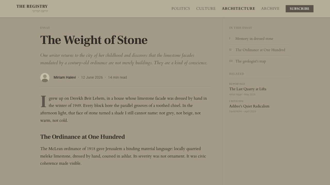
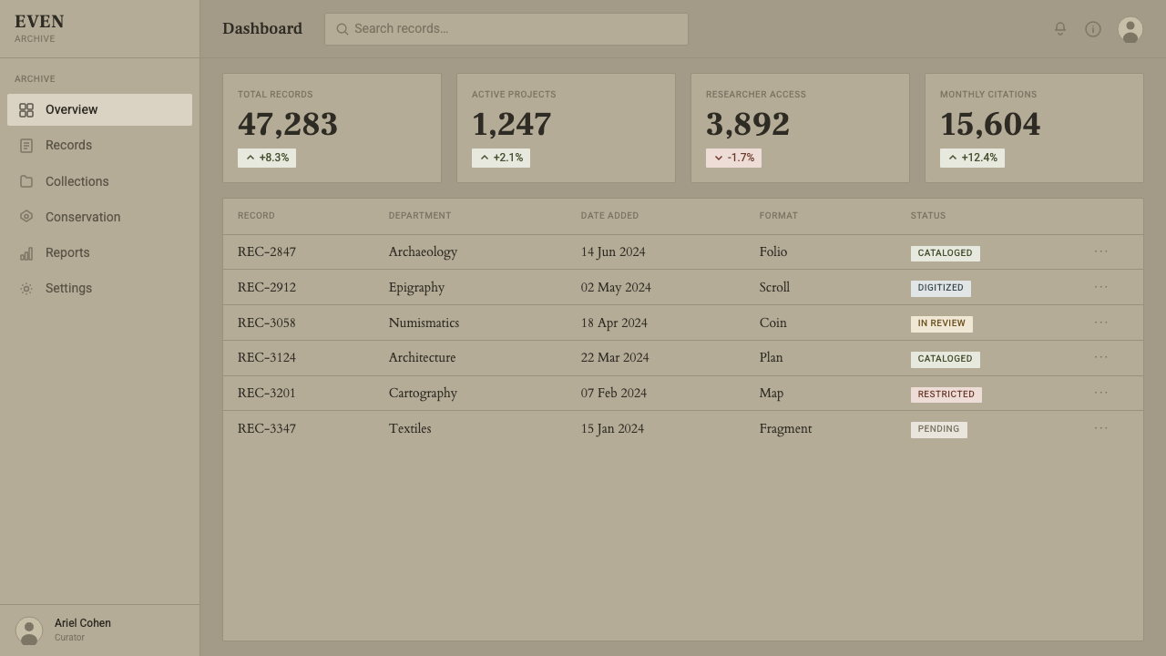
For web dashboards and pricing pages, Jerusalem Stone Gray supports products that need to feel dependable, institutional, architectural, or carefully governed. Use pale stone-gray surfaces for panels, dark text for reading, and ashlar-like divisions for grouping. Pricing tiers should be distinguished through hierarchy and tonal contrast before accent color. Buttons and active states should feel engraved or inlaid, never glossy or overly animated.
Editorial and marketing work can use the style to frame expertise as durable public knowledge. Give articles broad quiet margins, strong title bands, short engraved labels, and rules that recall masonry joints. Marketing pages should make a clear promise and repeat it with disciplined consistency. The style is especially effective when the subject involves place, architecture, policy, heritage, infrastructure, or collective responsibility.
The common mistake is turning Jerusalem Stone Gray into generic warm beige with decorative stone photography. Golden color, ivory backgrounds, faux rustic texture, ornate lettering, and excessive shadow all move the work away from its source. A successful application preserves the cool neutrality, the order of coursing, and the seriousness of engraved type; it should feel built, not themed.
Jerusalem Stone Gray — FAQ
Is Jerusalem Stone Gray a warm beige?
No. Its defining color is a cool, desaturated gray-beige derived from pale meleke limestone in its hand-tooled and shaded state. It should never drift toward golden sandstone or ivory. If an application feels sunny, creamy, or softly nostalgic, it has probably lost the style’s mineral neutrality.
Does the style require a literal stone texture?
No. Literal texture is optional. The essential cues are cool mineral color, ashlar rhythm, restrained relief, and engraved typography. A subtle surface suggestion can help, but a highly realistic stone photograph often becomes scenery rather than structure. The material should support the system, not become its subject.
Why are engraved serif capitals so important?
They connect typography to civic inscription. The capitals feel stable, formal, and physically embedded, which gives titles and labels the authority of a facade or public marker. They should be used with discipline, mainly for names, headings, and declarations. Applying them everywhere removes their institutional force.
Can Jerusalem Stone Gray be used on a dark background?
It can be inverted for a contemporary application, but the source character is fundamentally light-ground. A dark treatment should preserve the pale stone color as a material accent and keep the composition quiet. If the inversion becomes glossy, dramatic, or heavily contrastive, it no longer communicates the restrained masonry that defines the style.
What kinds of products suit the style best?
It works best where trust, permanence, civic responsibility, or architectural clarity are desirable: institutional interfaces, public information, analytical dashboards, pricing systems, editorial platforms, and work connected to place or heritage. It is less natural for playful entertainment, highly sensual luxury, or products that depend on softness and spontaneous warmth.
Related design styles
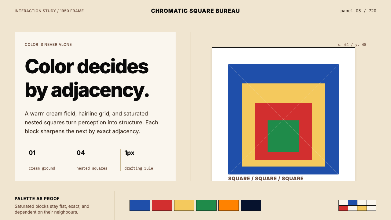 Josef Albers — Homage to the SquareColor becomes event. Warm cream, cobalt-red-yellow nested squares, exact hair…
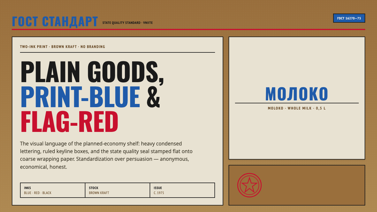 Soviet GOST PackagingAnonymous and strict. Kraft ground, red-blue ink, ruled boxes, condensed type.
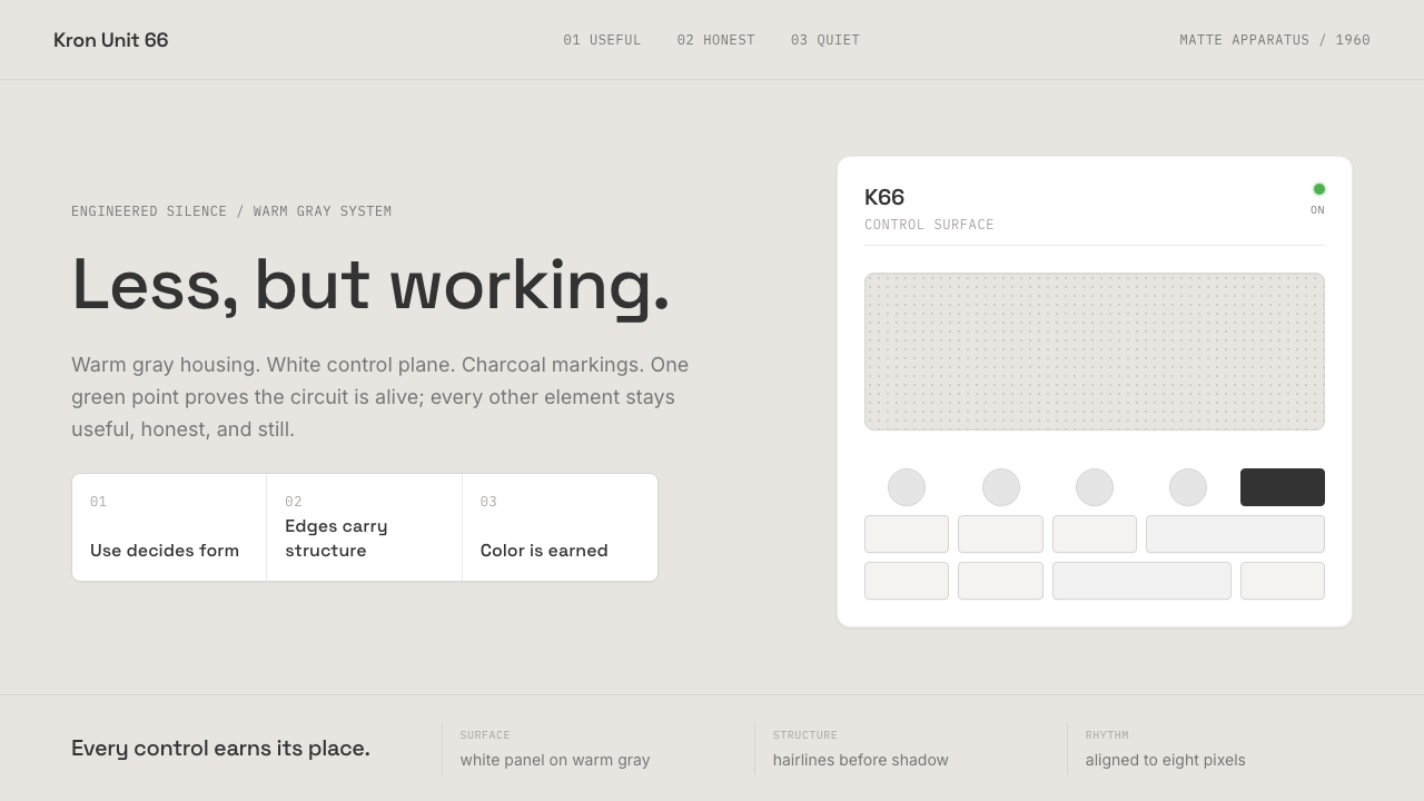 Dieter Rams / BraunQuiet by design. Warm gray, white panels, hairline grids, and one earned gree…
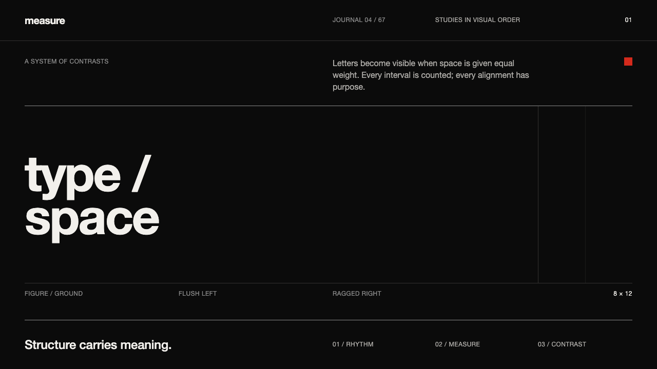 Emil Ruder TypografieDiscipline makes type visible. Near-white grotesque and measured space cut th…
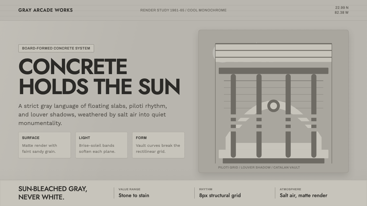 Havana Modernist GrayQuiet monumentality. Jost type, louver bands, and concrete grays hold tropica…
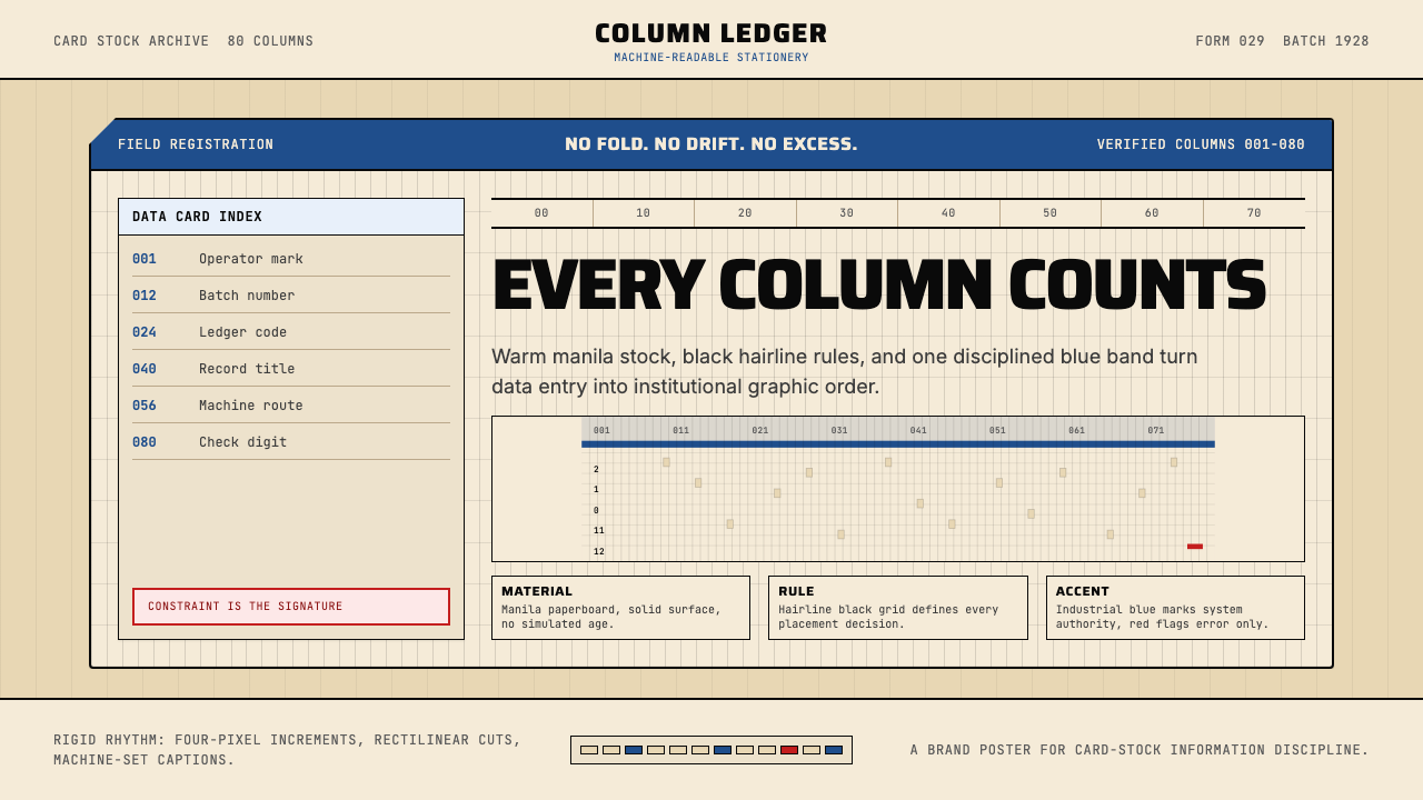 IBM Punchcard 029 (1928)Constraint becomes authority. Manila stock, hairline grid, industrial blue.