What is Typewriter Courier (1955)?什么是 Typewriter Courier (1955)?
Courier's fixed-width rhythm and ribbon-black authority turned the blank page into an institution — every character equal, every margin deliberate, every line a memo that meant business.Courier 严格等宽的节奏与色带般的黑色权威,将空白页面变成一座机构——每个字符地位平等,每条页边精心设计,每一行都是一份认真的备忘录。
Typewriter Courier (1955) in briefTypewriter Courier (1955) 速览
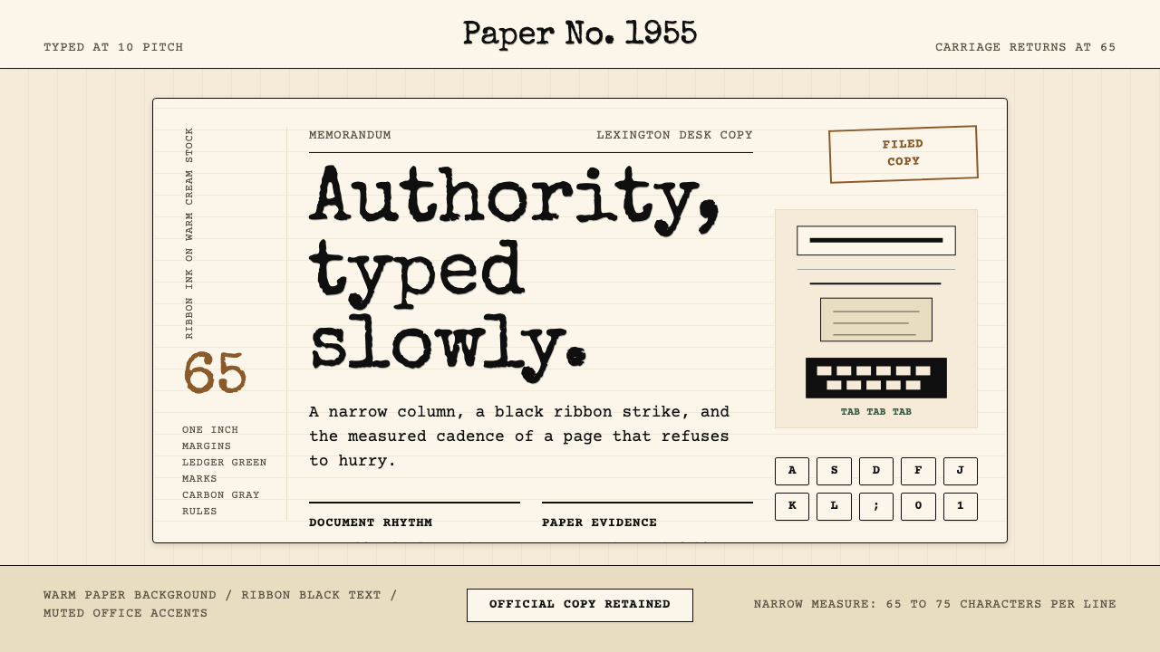
Typewriter Courier (1955) is a design system built around the visual logic of the mid-century American typewriter: monospaced letterforms, warm cream paper stock, ribbon-ink black, and the measured cadence of a sixty-five-character line. Every element in the system observes the same rule that governed the original machine — no character may claim more horizontal space than any other. The result is a grid so absolute it doubles as both structure and ornament.Typewriter Courier(1955)是一套以二十世纪中叶美国打字机视觉逻辑为核心的设计系统:等宽字形、温暖的奶油色纸张底色、色带黑,以及六十五字符行宽的从容节奏。系统中的每个元素都遵循与原始机器相同的规则——没有任何字符可以比其他字符占据更多的横向空间。如此绝对的网格,本身既是结构,也是装饰。
The system does not attempt to evoke nostalgia or period costume. Instead, it distills the typewriter's functional properties — equal-width columns, high legibility at long measures, a tonal warmth that sits between white and yellow — into a coherent visual language applicable to contemporary work. What looks like retro is in fact a rigorous set of spacing, tonal, and weight decisions rooted in the mechanical constraints of the IBM typehead.这套系统并不试图唤起怀旧情绪或模仿历史服装。它提炼的是打字机的功能性属性——等宽列、长行距下的高可读性、介于白与黄之间的色调温度——将其转化为适用于当代工作的连贯视觉语言。看似复古的背后,实则是一套严格的间距、色调与字重决策,根植于 IBM 字球的机械限制之中。
Visually, the style is defined by restraint and confidence rather than decoration. The palette is narrow: warm off-white grounds, dense near-black ink, and occasional use of a faded red or aged blue that recalls a second typewriter ribbon. Borders appear as single ruled lines rather than elaborate frames. White space is generous and structural — the one-inch margin of a typed page translated into digital breathing room.在视觉上,这种风格以克制与自信而非装饰为标志。色板极窄:暖调米白底面、浓郁的近黑色墨水,偶尔点缀一抹褪色的红或陈旧的蓝,令人联想到备用色带。边框以单条直线呈现,而非繁复的框饰。留白慷慨而具结构意义——打字页面上那条一英寸页边距,被转译为数字版面中的呼吸空间。
See the Typewriter Courier (1955) design system查看 Typewriter Courier (1955) 完整设计系统
Where does Typewriter Courier (1955) come from?Typewriter Courier (1955) 从何而来?
In 1955, IBM commissioned typeface designer Howard 'Bud' Kettler to design a new monospaced font for its line of typewriters. The engineering brief was unambiguous: every character — from the narrow letter i to the wide capital M — must occupy identical horizontal space, because the typewriter's mechanical carriage advanced a fixed increment with each keystroke. Kettler's response was Courier: a slab-serif design whose proportions were carefully balanced so that no character looked starved or crowded within its fixed cell. The name was chosen to suggest a professional messenger — reliable, neutral, carrying dispatches without editorial comment.1955年,IBM委托字体设计师霍华德·“巴德”·凯特勒(Howard 'Bud' Kettler)为其打字机系列设计一款新的等宽字体。工程需求毫不含糊:从窄细的小写 i 到宽阔的大写 M,每个字符都必须占据相同的横向空间,因为打字机的机械滑架每次击键都以固定增量前进。凯特勒的回应是 Courier:一款衬线板(slab-serif)设计,其比例经过精心平衡,使任何字符在固定格内都不显局促或空洞。字体名称意指“专业信使”——可靠、中性,传递文件却不加任何编辑评论。
Courier remained an IBM proprietary design until 1955, when the company took the unusual step of releasing it into the public domain without reserving trademark rights. IBM's stated rationale was that a standard typewriter typeface should be universally available — a stance that reflected the postwar American corporate culture of standardization and interoperability. This decision had consequences far beyond the typewriter industry. When the IBM Selectric arrived in 1961 with its revolutionary typeball mechanism — replacing individual hammers with a single interchangeable sphere — Courier became the de facto standard for American business correspondence, government documents, and legal filings.Courier 最初是 IBM 的专有设计,直至公司在1955年采取了不寻常的举措,将其发布进入公有领域,不保留任何商标权利。IBM 的官方理由是:打字机标准字体应当对所有人普遍可用——这一立场反映了战后美国企业文化中标准化与互操作性的主旋律。这个决定的影响远超打字机行业本身。1961年 IBM Selectric 推出其革命性的字球机构——以一枚可替换球体取代单个击锤——Courier 随即成为美国商业往来、政府文件与法律备案的事实标准。
The screenplay industry adopted Courier as its binding standard in the 1970s and codified it further through the decades that followed. The conventions are precise: a properly formatted film script in Courier occupies roughly one page per minute of screen time, a rule of thumb that has governed the industry's working rhythm for over fifty years. The Writers Guild of America and major studios enforced Courier as the only acceptable typeface for submitted scripts — not out of aesthetic preference, but because a standardized format made timing estimates reliable and page counts meaningful. Courier thus acquired the authority of a legal instrument: its monospace rhythm was simultaneously a design choice and a contractual specification.1970年代,影视行业将 Courier 采纳为装订标准,并在此后数十年间持续强化。规范极为精确:以 Courier 正确格式化的电影剧本,大约每页对应一分钟的银幕时间——这条经验法则支配行业工作节奏逾五十年。美国编剧工会及各大制片厂强制规定提交剧本只能使用 Courier,并非出于审美偏好,而是因为标准化格式使时长估算可靠、页数具有意义。Courier 由此获得了法律文书般的权威:其等宽节奏同时是一项设计选择,也是一份合同规格。
When personal computing arrived, Courier followed. It shipped as a default typeface with countless word processors, terminals, and operating systems, becoming the universal face of the command line, the code editor, and the plain-text document. Adrian Frutiger redesigned it as Courier New for inclusion in the core font sets distributed with early Microsoft and Apple systems, extending its reach to hundreds of millions of screens. The typeface that began as a mechanical solution to a mechanical constraint became the visual signature of the digital age's plainest, most trusted outputs: source code, legal transcripts, screenplay drafts, and government correspondence.个人电脑时代到来,Courier 随之而来。它作为默认字体随无数文字处理软件、终端机和操作系统一同发布,成为命令行、代码编辑器与纯文本文档的通用面孔。Adrian Frutiger 将其重新设计为 Courier New,纳入随早期微软与苹果系统分发的核心字体集,将其触角延伸至数亿块屏幕。这款起源于以机械方式解决机械限制的字体,成为数字时代最朴素、最可信赖的输出物的视觉标志:源代码、法律文字记录、剧本草稿,以及政府往来文件。
What defines the Typewriter Courier (1955) look?Typewriter Courier (1955) 的视觉特征是什么?
Monospaced Grid等宽网格
Every character — letter, numeral, punctuation mark, or space — occupies an identical horizontal unit. This mechanical constraint, inherited directly from the typewriter carriage, creates a grid so rigid that columns align without any deliberate tabulation. The visual effect is one of absolute orderliness: text blocks read as dense, textured rectangles rather than rivers of varying-width letters. In design application, this grid serves as the underlying structure for tables, lists, and data displays without requiring any additional alignment logic.每个字符——字母、数字、标点或空格——占据相同的横向单元。这一机械限制直接继承自打字机滑架,创造出一个严格到无需刻意制表就能对齐列的网格。视觉效果是绝对的秩序感:文本块呈现为密实、有肌理的矩形,而非宽度不一的字母流。在设计应用中,这一网格无需额外的对齐逻辑,即可作为表格、列表与数据展示的底层结构。
Warm Paper Ground温暖的纸张底色
The background is not white but a warm off-white — the color of aged bond paper or unbleached typing stock — that reads as cream or ivory under most lighting conditions. This warmth is structural: it softens the harshness of high-contrast black text, reduces eye fatigue at long reading distances, and gives the overall composition an authority that pure white grounds lack. The tone sits closer to candlelight than to the blue-white of a backlit screen, grounding the system in the physical world of the printed document.背景并非纯白,而是一种温暖的米白——陈旧胶版纸或未漂白打字纸的颜色——在多数光线条件下呈现为奶油或象牙色。这种温度具有结构意义:它软化了高对比度黑色文字的刺目感,减少长时间阅读的视觉疲劳,并赋予整体构图一种纯白底面所欠缺的权威感。这一色调更接近烛光,而非背光屏幕的蓝白,将系统锚定于印刷文件的物理世界。
Ribbon Black色带黑
The primary ink tone is a dense, slightly warm black — not a neutral or blue-tinted print black, but the color of a fresh typewriter ribbon pressed onto textured paper. This tone has a subtle inkiness, a weight that feels deposited rather than projected. In digital application, it implies the full, saturated depth of ink-on-paper without resorting to simulated texture. Against the cream ground, ribbon black delivers contrast that is authoritative without being harsh — the contrast of a government document rather than a warning sign.主要墨色是一种浓郁、略带暖调的黑——不是中性或偏蓝的印刷黑,而是新鲜色带压印在有纹理纸张上的颜色。这种色调带有细微的墨水感,一种沉积而非投射的重量。在数字应用中,它无需借助模拟纹理,就能暗示墨水着纸的饱满深度。在奶油底色的衬托下,色带黑提供的对比度既有权威感又不刺目——是政府文件的对比,而非警示标志的对比。
Ruled-Line Borders直线边框
Structural divisions in the system are marked by single, consistent ruled lines — thin horizontal or vertical strokes that recall the underlines of typed headings and the borders of printed form fields. These lines never double, ornament, or vary in weight for decorative effect. They are purely positional: they mark where one section ends and another begins. The ruled line is the system's only decorative concession, and even then it is borrowed from the typewriter's most functional gesture — the underline key.系统中的结构划分以单一、统一的直线标注——细水平或垂直线条,令人联想到打字标题的下划线和印刷表单边框。这些线从不重叠、装饰,也不以不同粗细制造装饰效果。它们纯粹用于定位:标记一个区域结束、另一个区域开始之处。直线是系统唯一的装饰性让步,即便如此,它也借鉴自打字机最功能性的手势——下划线键。
Sixty-Five Character Rhythm六十五字符节奏
The canonical typewriter line — sixty-five characters across with one-inch margins on a standard letter page — establishes a reading measure that has been tested by decades of heavy document use. This line length sits at the upper boundary of comfortable single-column reading for adult readers processing dense information. In design application, the sixty-five-character measure serves as a guide for body text columns: wide enough to convey authority, narrow enough to prevent the eye from losing its return path across the column.标准信纸页面上左右各一英寸页边距的六十五字符行——确立了经过数十年大量文件使用检验的阅读行宽。这一行长处于成年读者处理密集信息时舒适单列阅读的上限边界。在设计应用中,六十五字符行宽作为正文列的参考标准:宽到足以传达权威感,窄到足以防止眼睛在跨越列宽时迷失返回路径。
Faded Accent Colors褪色强调色
The system admits a narrow range of secondary tones: a muted brick red suggesting a second typewriter ribbon, a faded navy or slate blue that recalls carbon-copy forms and government stamp ink, and an aged manila or buff that recalls the envelopes of official correspondence. These accents are never vivid or saturated — they carry the patina of age, as if the color has been absorbed by the paper rather than applied to it. They appear sparingly, for hierarchy or emphasis only, and never compete with the dominant cream-and-black axis.系统允许一组窄幅次要色调:一种暗沉砖红,暗示第二条色带;一种褪色海军蓝或石板蓝,令人联想到复写表格与政府印章墨水;以及一种陈旧的马尼拉黄或米黄,令人联想到公文信封。这些强调色从不鲜艳或饱和——它们带有岁月的包浆,仿佛色彩是被纸张吸收而非涂抹其上的。它们被克制地使用,仅用于层级或强调,从不与主导性的奶油黑轴线竞争。
Formal Cadence正式节奏
The system's spacing and layout decisions produce a cadence that feels deliberate and unhurried — the rhythm of a document that expects to be read in full rather than scanned. Generous leading between lines of body text, consistent paragraph breaks, and the absence of call-out boxes or pull-quotes force a linear reading path. This formality is not a limitation but a feature: it signals seriousness of purpose and invites the reader to slow down and give the content the attention that official correspondence has always demanded.系统的间距与版面决策产生出一种从容而刻意的节奏——一份期待被完整阅读而非扫视的文件节奏。正文行间的充足行距、一致的段落分隔,以及引用框或拉引语的缺席,强制引导出线性阅读路径。这种正式感并非局限,而是特性:它传递出目标的严肃性,邀请读者放慢脚步,给予内容官方往来文件始终要求的那份专注。
See the Typewriter Courier (1955) design system查看 Typewriter Courier (1955) 完整设计系统
Who shaped Typewriter Courier (1955)?谁塑造了 Typewriter Courier (1955)?
Kettler designed Courier for IBM in 1955, solving the formidable challenge of creating a typeface in which every character — from the hairline-thin letter i to the broad capital W — reads as visually balanced within an identical fixed-width cell. His solution drew on the slab-serif tradition, using consistent stroke weights and bracketed serifs to give each character enough visual mass to fill its allotted space without crowding. IBM's decision to release Kettler's design into the public domain, an unusual act of corporate generosity, ensured that Courier became the common property of an entire era of typed communication.凯特勒于1955年为 IBM 设计了 Courier,解决了一项艰巨挑战:创造一款让每个字符——从纤细的小写 i 到宽阔的大写 W——在相同固定宽度格内都能呈现视觉平衡的字体。他的解决方案借鉴了板衬线传统,使用一致的笔画粗细与括弧衬线,赋予每个字符足够的视觉分量以填满分配的空间而不显拥挤。IBM 将凯特勒设计发布进入公有领域的决定——一次不寻常的企业慷慨之举——确保了 Courier 成为整个打字机通信时代的公共财产。
Frutiger, best known for the typeface that bears his name and for Univers, was commissioned to redesign Courier for the digital era. His revision — released as Courier New — adjusted the letterforms to render more cleanly at the lower resolutions of early personal computer screens and laser printers. Frutiger's intervention preserved the essential character of Kettler's original while adapting its proportions for on-screen legibility, ensuring that the typeface's authority survived the transition from mechanical impression to digital pixel.Frutiger 以与其同名的字体及 Univers 最为知名,受委托为数字时代重新设计 Courier。他的修订版——以 Courier New 之名发布——调整了字形,使其在早期个人电脑屏幕和激光打印机的较低分辨率下渲染得更为清晰。Frutiger 的介入在保留凯特勒原版本质特性的同时,为屏幕可读性调整了比例,确保这款字体的权威感在从机械压印到数字像素的转变中得以延续。
Riley is the author of one of the most widely consulted practical guides to screenplay formatting, which codified the conventions — twelve-inch page, one-inch margins, Courier as the only permissible typeface — that have governed Hollywood script submission since the 1980s. His work transformed the informal industry practice of typing scripts in Courier into a documented standard, cementing the typeface's status as not merely a design choice but a contractual and professional requirement. The screenplay industry's insistence on Courier is one of the most durable examples of a design decision preserved unchanged for reasons of institutional inertia and functional reliability.Riley 是剧本格式化实践指南中被引用最广泛的作者之一,他将各种规范——十二英寸页面、一英寸页边距、Courier 作为唯一允许字体——编纂成文,这些规范自1980年代以来一直支配好莱坞剧本提交。他的工作将行业内以 Courier 打印剧本的非正式惯例转化为有据可查的标准,巩固了这款字体不仅是设计选择更是合同与职业要求的地位。影视行业对 Courier 的坚守,是一项设计决策因机构惯性与功能可靠性而保持不变的最持久范例之一。
The IBM Selectric typewriter was not a person but an artifact whose influence on design history rivals any individual designer's contribution. Its interchangeable typeball mechanism — a golfball-sized sphere bearing the complete character set — replaced the jamming-prone individual hammer system and allowed a single machine to switch typefaces by swapping the ball. The Selectric made Courier the default face of American office culture by shipping with a Courier typeball as standard, and its global commercial success — over thirteen million units sold — ensured that the visual conventions of Courier-typed documents became the universal template for authoritative written communication.IBM Selectric 打字机不是一个人,而是一件影响设计史的物件,其贡献足以与任何个人设计师媲美。其可替换字球机构——一个高尔夫球大小的球体,承载完整字符集——取代了容易卡纸的单个击锤系统,允许同一台机器通过更换字球切换字体。Selectric 以 Courier 字球作为标准配置发货,使 Courier 成为美国办公室文化的默认面孔;其全球商业成功——逾一千三百万台销量——确保了 Courier 打印文件的视觉规范成为权威书面传播的通用模板。
How do you use Typewriter Courier (1955) today?今天怎么用 Typewriter Courier (1955)?
Typewriter Courier's greatest strength in contemporary design is the authority it confers without requiring elaborate visual language. The system works because it has been pre-loaded with institutional credibility by a century of legal contracts, government reports, and screenplay drafts. Applying it correctly means understanding which design contexts benefit from that borrowed authority — and which contexts will be undermined by its formality.Typewriter Courier 在当代设计中最大的优势,是无需复杂视觉语言就能赋予作品权威感。这套系统之所以有效,是因为一个世纪的法律合同、政府报告与剧本草稿已为其预先注入了机构公信力。正确应用它,意味着理解哪些设计场景能从这种借来的权威中获益——以及哪些场景会因其正式感而受损。
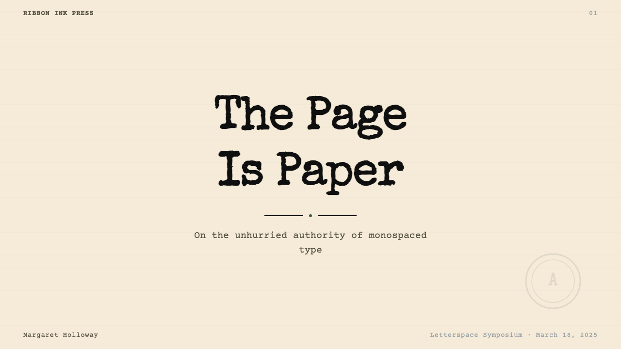
For presentation slides, the system divides naturally between cover and content pages. A cover benefits from the contrast of a centered, weighted title in the monospaced face against an expanse of warm cream — with a single thin ruled line separating the title from a subtitle or date, and no additional graphic elements. Content slides should treat text as document pages rather than designed graphics: one level of body text, a clearly subordinated caption layer, and section labels set as typed headings rather than styled callouts. Data slides work well in this system precisely because the monospaced grid aligns numerical columns without design intervention — a table of figures in Courier is already formatted by its own typeface logic. Resist the temptation to color-code rows; instead, use the ruled-line border to group data and let the cream-and-black contrast carry the hierarchy.对于演示文稿,这套系统在封面页与内容页之间形成自然分工。封面适合在温暖奶油色的大面积底面上,以居中的等宽字体呈现加重标题——标题与副标题或日期之间用一条细直线分隔,不加任何额外图形元素。内容页应将文字视为文件页面而非设计图形:一级正文文字、清晰从属的题注层、以打字标题而非样式化引用框呈现的章节标签。数据页在这套系统中表现尤为出色,正是因为等宽网格无需设计干预即可对齐数字列——Courier 中的数字表格已被字体自身的逻辑格式化。克制以颜色编码行的冲动;改用直线边框对数据分组,让奶油黑对比承载层级关系。
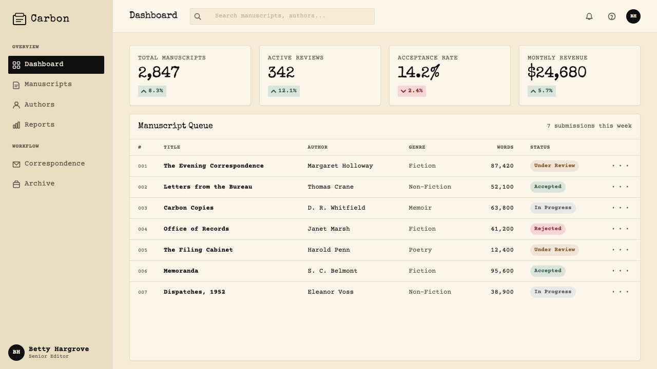
For web interfaces, the system is best deployed in contexts where deliberate, sustained reading is expected — documentation pages, legal disclosures, pricing tables, and editorial platforms. Dashboard interfaces benefit from the monospaced grid for numerical data: figures displayed in a fixed-width face align on the decimal without explicit layout rules, giving a table of metrics the precision of a spreadsheet without the coldness of a spreadsheet aesthetic. Navigation and interface labels should respect the system's document logic — sentence case, minimal iconography, no gradient fills on interactive elements. Accent colors in the faded brick-red or aged-blue range can mark interactive states or tier differentiation without breaking the paper-and-ink axis.对于网页界面,这套系统最适合部署在期望读者刻意持续阅读的场景——文档页面、法律披露、定价表和编辑平台。仪表板界面受益于等宽网格对数字数据的处理:以固定宽度字体显示的数字在小数点处自动对齐,无需明确的版面规则,赋予指标表格电子表格的精准感,却没有电子表格美学的冷漠感。导航与界面标签应尊重系统的文件逻辑——句首大写、极少图标、交互元素上不使用渐变填充。褪色砖红或陈旧蓝色范围内的强调色可以标记交互状态或等级区分,而不破坏纸张与墨水的主轴。
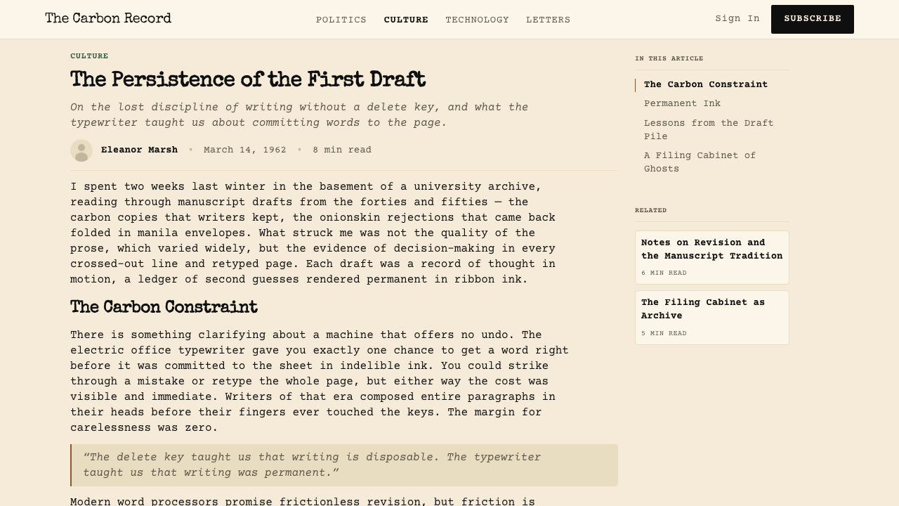
In editorial and marketing contexts, the style's authority translates into a distinctive voice for long-form content and institutional communication. A landing page built on this system should lead with a full-width hero treated as a typed memo — center-weighted or left-aligned title, a thin horizontal rule, and a brief identifying line in a smaller weight. Body sections work as document columns: narrow measure, generous leading, pull-quotes set as indented typed paragraphs rather than enlarged display type. Marketing applications that lean into the system's contractual associations — legal tech, financial services, policy platforms — benefit especially from its matter-of-fact tone. The absence of illustration and decorative imagery is intentional: the system's credibility depends on looking like it has no interest in selling you something.在编辑与营销场景中,这种风格的权威感为长篇内容和机构传播提供了独特声音。基于此系统构建的着陆页,应以全宽英雄区域呈现为一份打字备忘录——居中或左对齐的标题,一条细水平线,一行较小字重的简短识别信息。正文区块作为文件列运作:窄行宽、充足行距、引用语以缩进打字段落而非放大展示文字呈现。倾向于利用系统合同联想的营销应用——法律科技、金融服务、政策平台——尤其能从其就事论事的基调中获益。插图与装饰性图像的缺席是刻意为之:系统的可信度有赖于看起来对说服你购买任何东西毫无兴趣。
The most common mistake when applying this system is treating the monospaced typeface as a stylistic texture while ignoring the spacing and tonal logic that gives it meaning. Using a monospaced face inside a brightly colored, rounded-corner card component produces pastiche rather than system coherence — the face signals one set of values while the surrounding design signals another. The second common error is introducing too much variety into the accent palette: a faded red, an aged blue, and a manila yellow used simultaneously lose the system's austere authority and begin to look merely vintage. Choose one accent tone per application and use it sparingly, consistently, and only for structural — never decorative — purposes.应用这套系统时最常见的错误,是将等宽字体视为风格纹理,同时忽视赋予其意义的间距与色调逻辑。在色彩鲜艳、圆角卡片组件内使用等宽字体,产生的是拼贴感而非系统连贯性——字体传达一套价值观,而周围的设计传达另一套。第二个常见错误是在强调色板中引入过多变化:同时使用褪色红、陈旧蓝与马尼拉黄,会消解系统的严肃权威,开始看起来只是“复古风格”。每个应用场景选择一种强调色调,克制、一致地使用,且仅用于结构性——而非装饰性——目的。
See the Typewriter Courier (1955) design system查看 Typewriter Courier (1955) 完整设计系统
Typewriter Courier (1955) — FAQTypewriter Courier (1955) · 常见问题
Is this style appropriate only for text-heavy content, or can it support visual and data-driven work?这种风格只适合文字密集的内容,还是也能支持视觉与数据驱动的作品?
The monospaced grid makes this system surprisingly well-suited to data-heavy work. Numerical tables, code listings, and structured data displays align naturally in a fixed-width environment — the typeface's mechanical origin as a precision instrument means that data formatted in it inherits an air of exactitude. Charts and graphs work in the system when treated as typed diagrams rather than designed infographics: axis labels in the monospaced face, bars or lines in the primary ink tone, minimal gridlines. The system struggles with layouts that depend on photography, rich color, or freeform illustration — it is fundamentally a text-and-structure system, and any imagery introduced should be treated as a formal document element rather than an emotional visual.等宽网格使这套系统出人意料地适合数据密集型工作。数字表格、代码列表与结构化数据展示在等宽环境中自然对齐——字体作为精密工具的机械起源,意味着以其格式化的数据自然带有一种精确感。图表在系统中以打字示意图而非设计信息图的方式处理时表现良好:轴标签使用等宽字体,柱条或折线使用主要墨色,网格线极简。这套系统在依赖摄影、丰富色彩或自由插图的版面中力不从心——它从根本上是一套文字与结构的系统,引入的任何图像都应被视为正式文件元素,而非情感性视觉。
Can the Typewriter Courier system work in a dark or night-mode layout?Typewriter Courier 系统能用于深色或夜间模式版面吗?
A dark inversion is possible but requires care. The system's warmth depends on the relationship between cream ground and ribbon black — invert this to dark charcoal or near-black ground with a cream or aged-white foreground type, and the warmth largely survives. What does not survive well is the literal black-ink color: in a dark layout, the primary text tone should shift to the warm cream used as background in the light version. The faded accent colors — brick red and aged blue — function adequately on dark grounds. What breaks the system entirely is a cold, saturated dark background such as pure navy or deep green, which imports the wrong tonal associations.深色反转是可行的,但需要谨慎处理。这套系统的温度取决于奶油底与色带黑之间的关系——将其反转为深炭色或近黑底面,以奶油或陈旧白色的前景文字,温度基本得以保留。不能良好存续的是字面意义上的黑色墨水:在深色版面中,主要文字色调应转变为浅色版中用作背景的温暖奶油色。褪色强调色——砖红与陈旧蓝——在深色底面上功能尚可。完全破坏系统的,是冷调高饱和深色背景,如纯深蓝或深绿,它们引入了错误的色调联想。
How should illustration and imagery be used within this system?在这套系统中应如何使用插图与图像?
The system has no native place for photography or representational illustration, and forcing either in tends to undermine the document authority the style depends on. When imagery is unavoidable — a product screenshot, a portrait, a diagram — it should be treated as a formal document inclusion rather than a designed graphic: housed within a ruled-line border, captioned in a subordinate monospaced size, and left without drop shadows or rounded corners. High-contrast, desaturated, or duotone image treatments in the cream-and-ink palette preserve tonal coherence. Diagrams and charts drawn as monospaced-grid constructions — using horizontal and vertical lines only, no decorative fills — integrate most naturally.这套系统没有为摄影或具象插图设置原生位置,强行引入任何一者往往会削弱这种风格赖以存在的文件权威感。当图像不可避免时——产品截图、人像、示意图——应将其视为正式文件引用而非设计图形:置于直线边框内,以从属的等宽字号添加题注,不加投影或圆角。以奶油墨水色板处理的高对比度、去饱和或双色调图像处理能保持色调连贯性。以等宽网格构造绘制的示意图和图表——仅使用水平和垂直线,不加装饰性填充——融合得最为自然。
What distinguishes this system from generic retro or nostalgia design?这套系统与一般复古或怀旧设计有何区别?
The distinction is between mining a historical aesthetic for atmosphere and applying the functional logic that created that aesthetic. Retro typewriter design typically imports visual signals — worn textures, smudged ink effects, distressed letterforms — to generate a nostalgic emotional response. The Typewriter Courier system does the opposite: it abstracts the functional principles of the typewriter — equal-width spacing, warm stock, ribbon ink, sixty-five-character measure — into a design language that is contemporary in execution while carrying the institutional authority those functional origins produced. There are no worn textures, no distress effects, no simulation of age. The warmth is tonal, not simulated. The authority is structural, not atmospheric.区别在于:是从历史美学中挖掘氛围,还是应用创造那种美学的功能逻辑。复古打字机设计通常引入视觉信号——磨损纹理、油墨晕染效果、残损字形——来激发怀旧情感反应。Typewriter Courier 系统则恰恰相反:它将打字机的功能原则——等宽间距、暖色纸张、色带墨水、六十五字符行宽——抽象为一套执行上属于当代的设计语言,同时携带这些功能起源所产生的机构权威感。没有磨损纹理,没有残损效果,没有对岁月感的模拟。温度是色调性的,而非模拟性的。权威是结构性的,而非氛围性的。
Which design contexts are genuinely unsuitable for this system?哪些设计场景真正不适合这套系统?
The system is poorly matched to any context where warmth, playfulness, sensory richness, or cultural proximity is a primary value. Consumer food brands, children's educational products, wellness and self-care applications, entertainment platforms, and fashion or lifestyle editorial all depend on visual warmth and variety that the typewriter system structurally refuses. The system is also a poor fit for products targeting audiences who associate the typewriter aesthetic with obsolescence or bureaucratic friction — younger users with no direct experience of typed documents may read the style as dated rather than authoritative. Finally, any design requiring strong photographic imagery or colorful illustration will fight against the system's formal constraints rather than working within them.这套系统与任何以温暖感、趣味性、感官丰富性或文化亲近性为主要价值的场景均不匹配。消费者食品品牌、儿童教育产品、健康与自我护理应用、娱乐平台,以及时尚或生活方式编辑——都依赖打字机系统从结构上所拒绝的视觉温度与多样性。这套系统也不适合那些将打字机美学与过时感或官僚摩擦相关联的受众群体——没有打字文件直接体验的年轻用户可能将这种风格解读为陈旧而非权威。最后,任何需要强烈摄影图像或色彩丰富插图的设计,都将与系统的正式约束形成对抗,而非在其中运作。
Related design styles相关设计风格
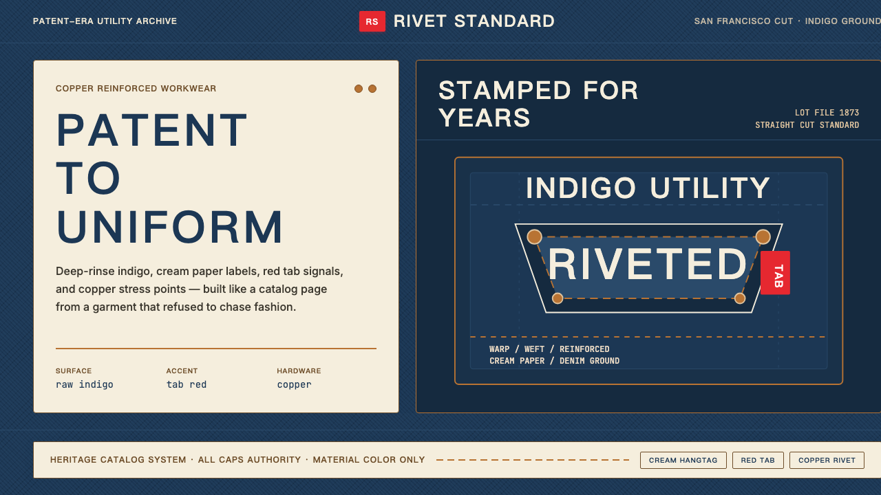 Levi's 501Utility becomes permanent. Indigo ground, cream hangtag panels, red tab and c…实用成为恒久。靛蓝底、奶油吊牌、红标与铜铆钉。
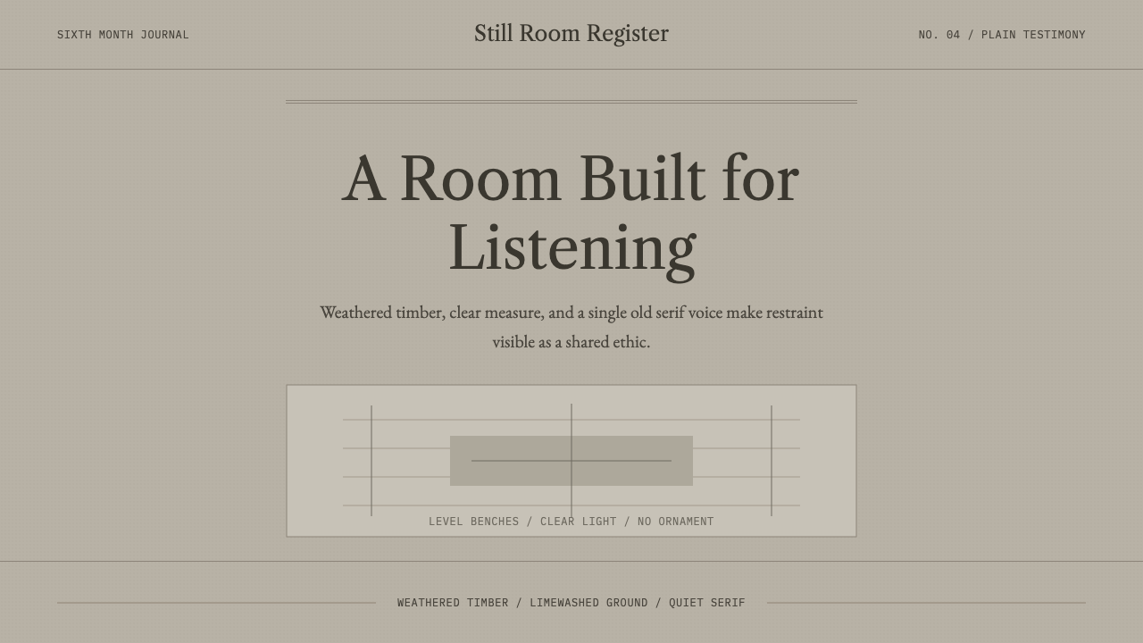 Quaker Plain StyleSilence made visible. Timber gray, Caslon serif, and bench-rule spacing leave…让静默可见:木灰色、卡斯隆衬线与长凳横线,只留下用途。
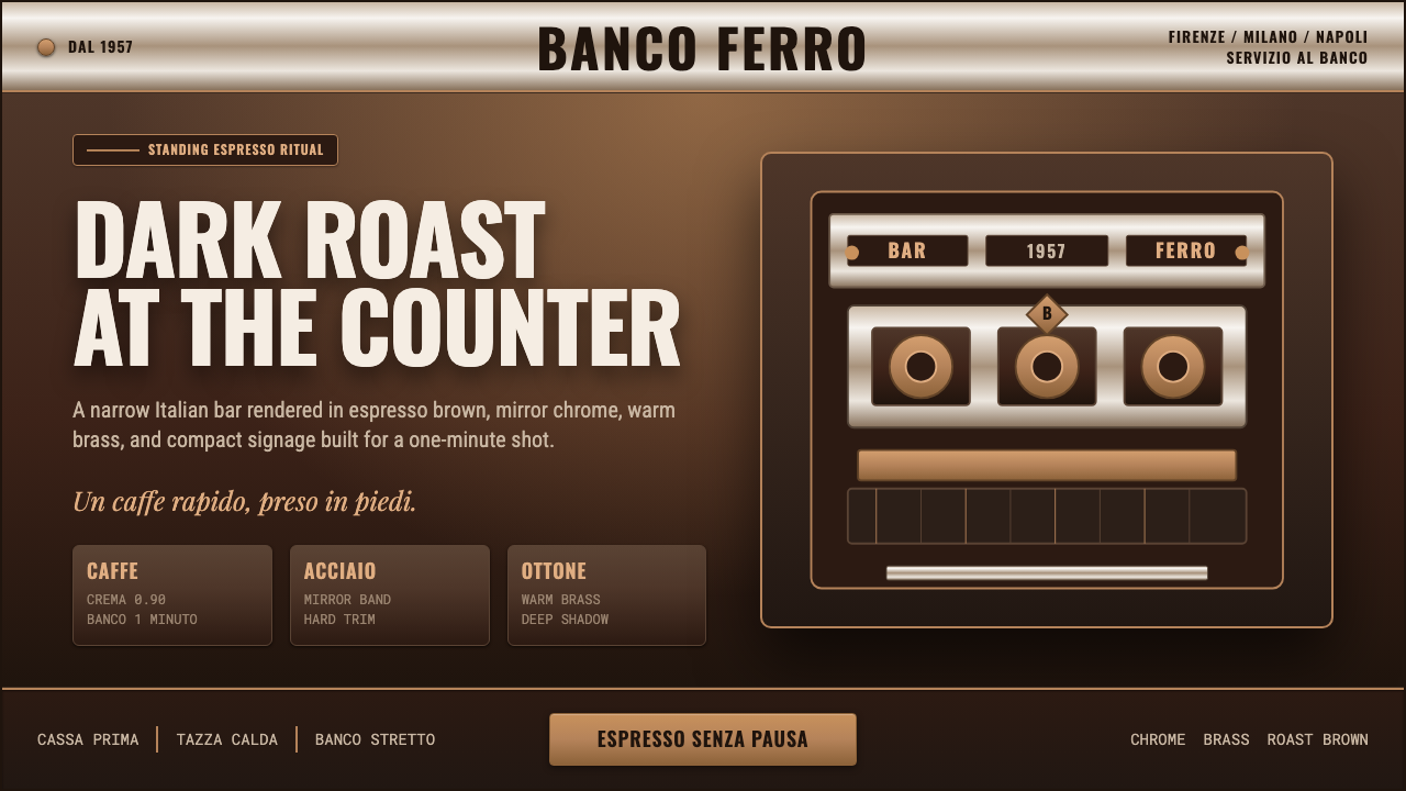 Italian Espresso BarDark roast, hard metal. Brass lines and Oswald signage slice a deep espresso…深烘硬朗。黄铜线与Oswald招牌字切开浓缩棕底。
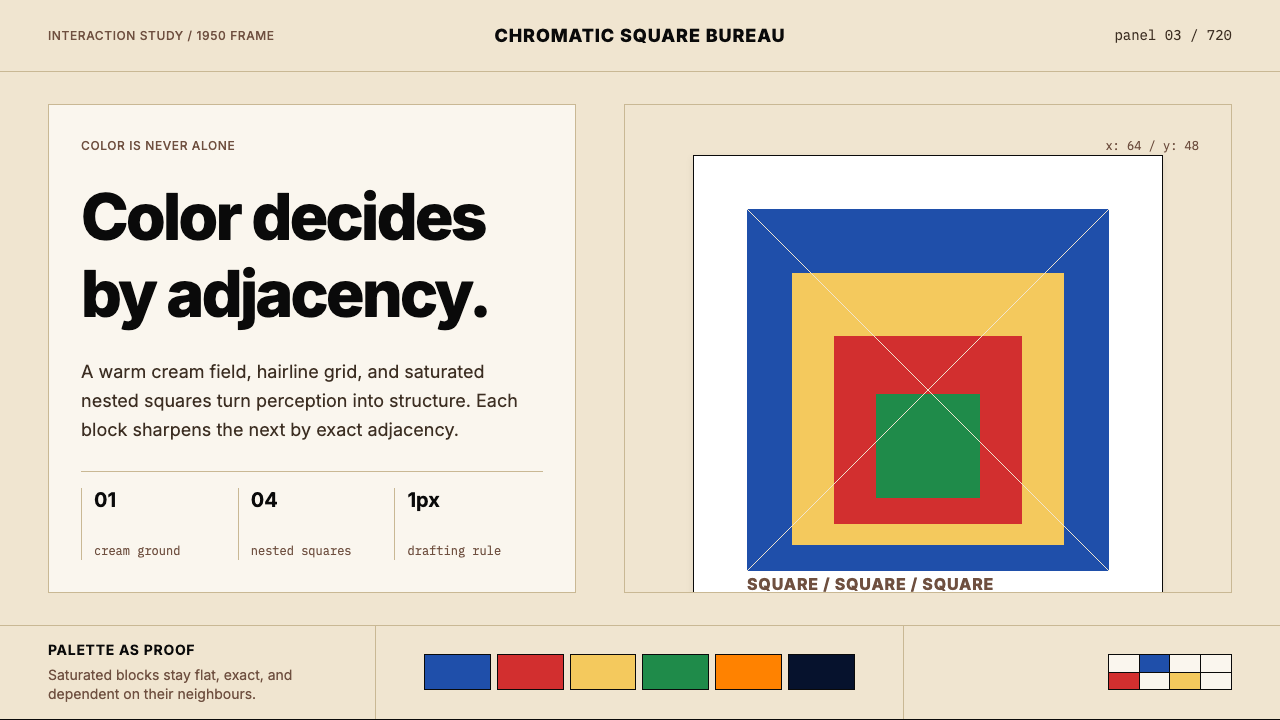 Josef Albers — Homage to the SquareColor becomes event. Warm cream, cobalt-red-yellow nested squares, exact hair…色彩成为事件。暖米底、钴蓝红黄嵌套方块与精确发丝线。
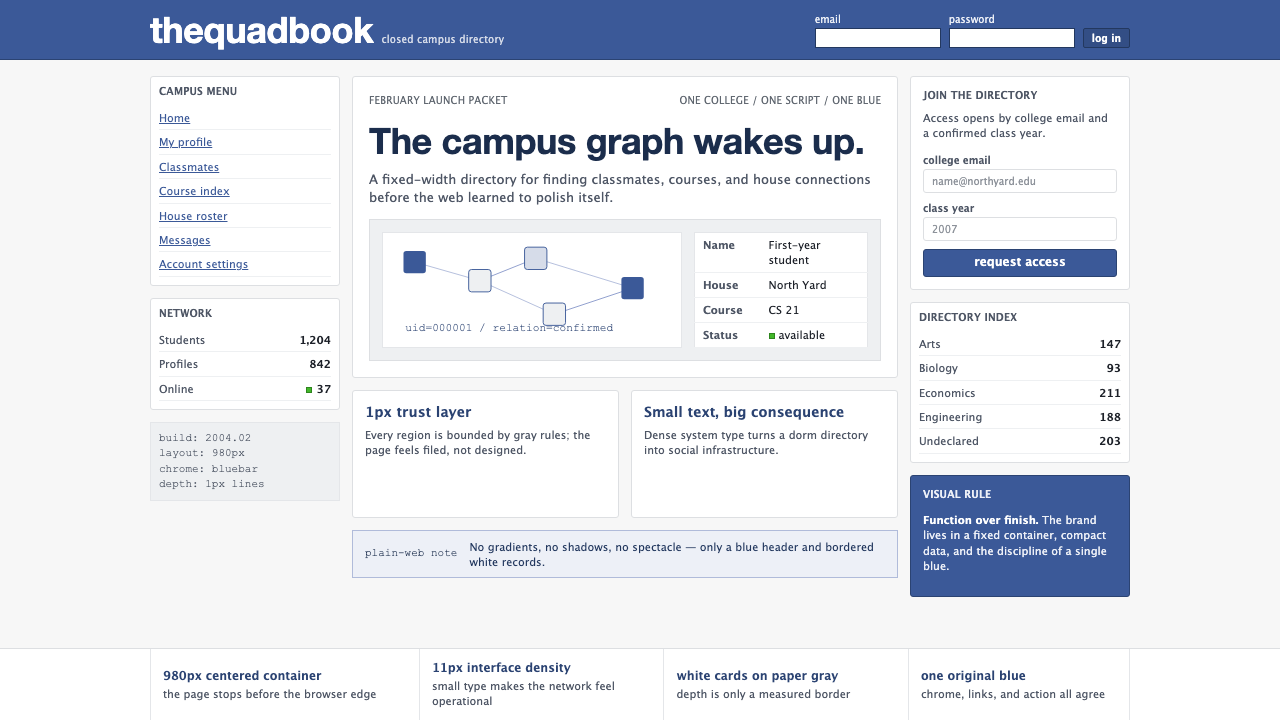 Facebook 2004Dorm-web austerity. Original blue, 980px grid, 1px borders, tiny Lucida Grand…宿舍网页的克制:原初蓝、980px网格、1px边框与小号系统字。
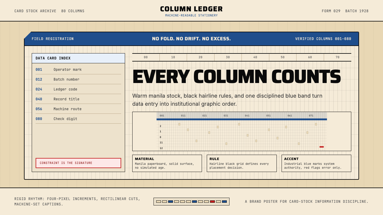 IBM Punchcard 029 (1928)Constraint becomes authority. Manila stock, hairline grid, industrial blue.约束即权威。米黄色卡纸、发丝网格与工业蓝。