What is Facebook 2004?什么是 Facebook 2004?
Before social media had a look, thefacebook.com defined one: a blue bar, a gray page, white bordered cards, and system type so small it felt like it was whispering.在社交媒体尚无定型面孔之前,thefacebook.com已先一步划定了它的轮廓:蓝色顶栏、灰色页面、白边卡片,以及小到像在低语的系统字体。
Facebook 2004 in briefFacebook 2004 速览
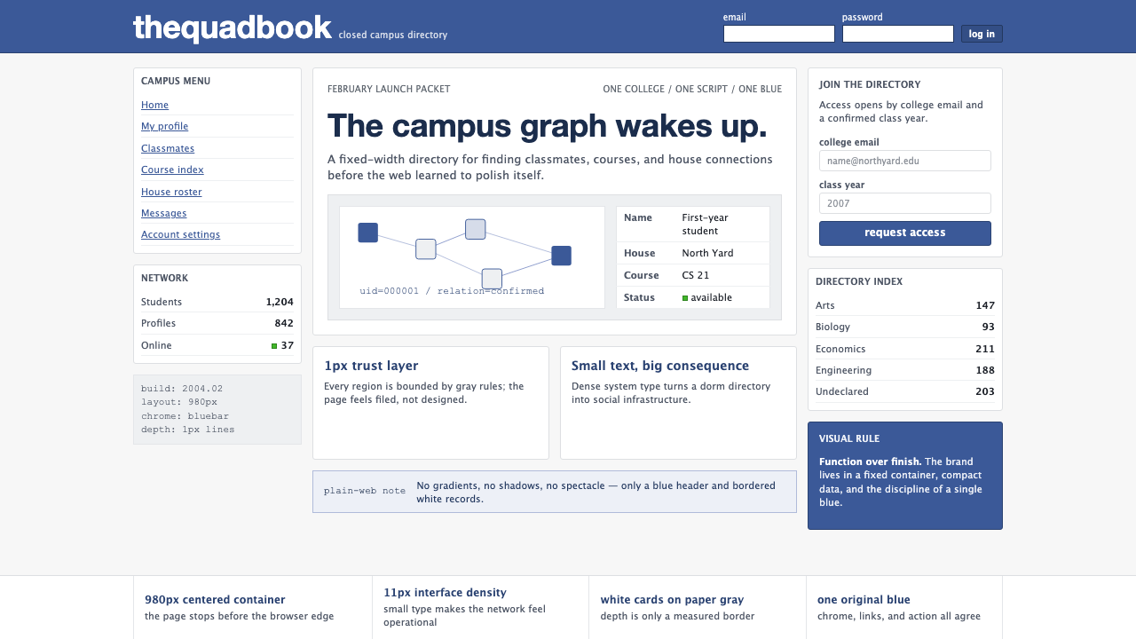
Facebook 2004 is the visual language of the original thefacebook.com — launched from a Harvard dormitory in February 2004 — before the site acquired polish, rounded corners, or any of the softening conventions that would define consumer social media in the decade to follow. It is a fixed-width page built on a disciplined columnar grid, a stark blue header bar, a light gray background, and white content cards outlined with hairline borders. There are no gradients, no drop shadows, no decorative illustration. The aesthetic is almost bureaucratic: a university directory that happened to become the most visited site on earth.Facebook 2004是最初的thefacebook.com的视觉语言——2004年2月从哈佛大学宿舍发布——彼时这个网站还未经过打磨,没有圆角,没有任何此后十年消费级社交媒体用以柔化界面的惯例。它是一个建立在严谨列式网格上的定宽页面:醒目的蓝色顶栏,浅灰色背景,白色内容卡片以细线边框勾勒轮廓。没有渐变,没有投影,没有装饰性插图。这种美学近乎官僚文书风格:一本碰巧成为全球访问量最高网站的大学通讯录。
The style belongs to a precise and unrepeatable moment in web history — what designers sometimes call pre-Web 2.0 sobriety. Before Ajax made pages feel alive, before CSS3 made rounded corners effortless, before broadband made imagery cheap, sites were built around system fonts, table-based grids, and a color palette limited to whatever browsers rendered reliably. Facebook 2004 did not transcend these constraints; it made them into an identity. The blue that anchored every page became one of the most recognized colors in the history of digital media.这种风格属于网络历史上一个精确而不可复制的时刻——设计师有时称之为Web 2.0前的清醒时代。在Ajax让页面产生生命感之前,在CSS3让圆角变得轻而易举之前,在宽带让图片变得廉价之前,网站建立在系统字体、表格网格和浏览器能稳定渲染的有限色板之上。Facebook 2004没有超越这些约束,而是将它们化为了一种身份认同。那个锚定每一页面的蓝色,成为数字媒体史上辨识度最高的颜色之一。
As a design reference, Facebook 2004 is valuable precisely because of its constraint. It demonstrates what a coherent visual system can achieve with almost no decorative resources: consistent grid, deliberate typographic hierarchy, and a single strong hue used structurally rather than expressively. Applied today — to slides, dashboards, editorial layouts, or brand identities positioning themselves as direct and functional — it reads not as nostalgia but as principled restraint.作为设计参考,Facebook 2004的价值恰恰在于其约束性。它展示了一套连贯的视觉系统在几乎没有任何装饰资源的情况下能够达成什么:一致的网格、经过深思的字体层级,以及一种强烈的色相以结构性而非表达性的方式使用。将其应用于当代——无论是幻灯片、数据仪表板、编辑版面,还是以直接和功能性为定位的品牌标识——读来不是怀旧,而是有原则的克制。
Where does Facebook 2004 come from?Facebook 2004 从何而来?
In the early hours of February 4, 2004, Mark Zuckerberg launched thefacebook.com from his room in Kirkland House at Harvard University. The site was built in roughly two weeks, in PHP, on a shared hosting plan. Its original purpose was narrow: a directory of Harvard students with profile photos, basic biographical information, and — crucially — the ability to declare social relationships. Within twenty-four hours, twelve hundred students had registered. Within a month, it had spread to Yale, Columbia, and Stanford.2004年2月4日凌晨,马克·扎克伯格在哈佛大学柯克兰宿舍的房间里发布了thefacebook.com。这个网站大约在两周内用PHP搭建完成,托管在一个共享主机方案上。它最初的目的非常有限:一个哈佛学生的通讯录,包含个人照片、基本个人信息,以及最关键的——声明社交关系的功能。二十四小时之内,一千两百名学生完成注册。一个月之内,它已扩散至耶鲁、哥伦比亚和斯坦福。
The visual language was not designed so much as assembled. Zuckerberg and Andrew McCollum, who handled early graphic work, made choices that were partly aesthetic and partly practical. The fixed-width grid was a standard technique for controlling layout across the inconsistent browsers of the era. The blue header reflected a known personal preference of Zuckerberg's — he has been reported to have a degree of red-green color blindness that made blue the color he could perceive most vividly and reliably. The Klavika typeface, used for the wordmark, was a contemporary geometric sans designed by Eric Olson and released by Process Type Foundry in 2004, chosen for its clean, neutral authority. The system-font body text — primarily Lucida Grande on Mac and its Windows equivalents — was simply the most readable option available without requiring custom font loading.这套视觉语言与其说是设计出来的,不如说是拼装出来的。扎克伯格与负责早期图形工作的安德鲁·麦科勒姆所做的选择,一半是美学判断,一半是实际考量。定宽网格是在那个时代各浏览器渲染不一致的环境下控制布局的标准技术。蓝色顶栏折射出扎克伯格已知的个人偏好——有报道称他存在一定程度的红绿色觉障碍,蓝色是他感知最清晰、最稳定的颜色。用于文字标识的Klavika字体,是埃里克·奥尔森设计、Process Type Foundry于2004年发布的当代几何无衬线字体,因其干净中性的权威感而被选用。正文所采用的系统字体——Mac上主要是Lucida Grande及其Windows对应字体——只是在不需要加载自定义字体的前提下可读性最佳的选项。
The site's aesthetic was shaped by the conventions of the mid-2000s campus web. University intranets, student government pages, and academic department sites all shared a similar visual grammar: light gray backgrounds, bordered white content regions, small body text, and navigation bars in institutional colors. Facebook did not subvert this grammar — it executed it more crisply than anyone else. The resulting look was simultaneously familiar and authoritative, which contributed to the trust and adoption speed among the college demographic it targeted.这个网站的美学受2000年代中期校园网页惯例的塑造。大学内网、学生会页面和学术院系网站都共享着相似的视觉语法:浅灰色背景、带边框的白色内容区域、小号正文,以及机构色导航栏。Facebook没有颠覆这套语法——而是比任何人都执行得更清晰。由此形成的外观既熟悉又具有权威感,这一点促成了它在目标大学群体中的信任感与快速传播。
The visual identity crystallized over the period from the February 2004 launch through roughly 2006, when the platform began expanding beyond colleges and started accumulating the additional UI surface area that would gradually alter its appearance. The 2004 to 2006 window represents the frozen form of the style: the proportions, the column structure, the typographic scale, and the blue-and-gray palette had all settled into a consistent system before the scale of the platform demanded the more elaborate interface conventions that followed.这套视觉身份在2004年2月发布至大约2006年间逐渐固化——其时平台开始向大学以外扩张,并陆续积累了更多UI层面的表面积,外观随之逐渐改变。2004至2006年这段时间窗口,代表了这种风格的冻结形态:比例关系、列式结构、字体尺度以及蓝灰色板,在平台规模需要更复杂的界面惯例之前,已全部沉淀为一套连贯的体系。
What defines the Facebook 2004 look?Facebook 2004 的视觉特征是什么?
The Structural Blue结构性蓝色
A single cool, medium-value blue serves as the entire brand and structural signal. It appears on the header bar, on primary navigation links, on interactive text elements, and on the wordmark — and nowhere else. The blue is not expressive or atmospheric; it is organizational, functioning like a heading rule in a printed document. Against the light gray and white of the page body, it creates an immediate sense of orientation: wherever the blue is, the frame of the interface is.一种冷调、中明度的蓝色承担了整个品牌与结构信号的职能。它出现在顶栏、主导航链接、可交互文字元素和文字标识上——且仅出现在这些地方。这种蓝色不具表达性或氛围感,而是组织性的,功能类似于印刷文件中的标题线。在页面主体的浅灰与白色衬托下,它立刻创造出方向感:蓝色所在之处,就是界面的框架所在。
Gray-Ground Neutrality灰底中性调
The page background is a flat, cool light gray — not white, not off-white, but a distinctly institutional gray that the browser could render without inconsistency. This ground color performs an important function: it makes the white content cards read as raised and distinct without the use of shadows. The contrast between background gray and card white is subtle enough to remain quiet, but clear enough to define content boundaries. The entire depth vocabulary of the site is accomplished through this single tonal step.页面背景是一种平整、冷调的浅灰——不是白色,不是米白,而是一种浏览器能够稳定渲染的机构性灰色。这种底色发挥着重要作用:它使白色内容卡片在不借助阴影的情况下呈现出被托起、独立的感觉。背景灰与卡片白之间的对比足够微妙,不会产生喧嚣感,但足够清晰,能够界定内容边界。网站所有的深度语汇,都由这一个色调层级差异完成。
Hairline Borders细线边框
Content cards, table rows, form fields, and navigational divisions are all defined by single-pixel borders in a medium gray. The borders are not decorative — they are structural, functioning as the primary means of separating information regions. Because they are so fine, they recede visually and allow the content itself to dominate. The convention requires that content regions be substantial enough to hold their own weight; hairline borders around empty or sparse content feel anxious rather than clean.内容卡片、表格行、表单字段和导航分隔,全部由中灰色的单像素细线边框界定。这些边框不是装饰性的——它们是结构性的,作为分隔信息区域的主要手段。因为极其纤细,它们在视觉上退后,让内容本身占据主导。这一惯例要求内容区域本身足够充实,能够撑起自身的重量;细线边框围绕空洞或稀疏的内容,只会让人感到局促,而非干净。
System-Font Sobriety系统字体的克制
Body text is set in the system sans-serif of the user's operating system — a convention that, in 2004, was both a technical necessity and an invisible aesthetic choice. The result is text that feels native to the device rather than branded or styled. Point size is small by contemporary standards, set tight, with limited line spacing — a density that signals seriousness and information priority over comfort. The typographic hierarchy is achieved entirely through size and color shift rather than through distinctive typefaces at each level.正文采用用户操作系统的系统无衬线字体——这一惯例在2004年既是技术必然,也是一种隐形的美学选择。结果是文字感觉像是原生于设备,而非品牌化或风格化的。以当代标准衡量,字号偏小,行间距紧凑——这种密度传递出严肃感和信息优先于舒适度的取向。字体层级完全通过字号变化与色彩偏移来实现,而非在每个层级使用不同的字体。
Fixed-Width Column Grid定宽列式网格
The page is constructed on a fixed total width, divided into a narrow left navigation rail and a dominant main content column, with a thinner right sidebar. This columnar structure was the standard layout grammar of mid-2000s web design, but Facebook applied it with unusual consistency. Every page in the site maps to this same underlying grid regardless of content type, which creates a visual uniformity that reinforces the sense of a coherent system rather than a collection of ad-hoc pages.页面以固定总宽度构建,划分为左侧窄导航栏、主导内容列以及右侧更细的边栏。这种列式结构是2000年代中期网页设计的标准布局语法,但Facebook以异乎寻常的一致性加以应用。网站中的每个页面,无论内容类型如何,都映射到同一套底层网格,由此形成的视觉统一性强化了一种感受——这是一套连贯的系统,而非一组临时拼凑的页面。
Geometric Wordmark Clarity几何文字标识的清晰感
The facebook wordmark, set in a geometric sans-serif, sits in the upper left corner of the blue header bar in white — the most structurally inevitable position on the page. The letterforms are clean and reductive, with no custom ligatures, no illustrative marks, and no supporting icon. The identity is purely typographic. This convention, which later became an expectation in startup branding, was in 2004 notable for its self-confidence: the name alone, in a reliable sans-serif, against the blue.以几何无衬线体排列的facebook文字标识,白色置于蓝色顶栏左上角——页面上结构上最不可避免的位置。字形干净、精简,没有自定义连字,没有插图性图形,没有辅助图标。品牌身份纯粹是字体性的。这一惯例后来成为初创品牌的普遍期待,但在2004年,它以自信著称:只有名称,一种可靠的无衬线字体,衬着蓝色。
No Decoration, No Imagery无装饰,无图像
Outside of user-uploaded profile photographs — which are constrained to small, fixed-proportion containers — the interface contains no imagery. No background textures, no icon illustrations, no marketing photography, no gradient fills. The visual field is composed entirely of text, borders, and the structural blue. This absence is not poverty but discipline: every pixel that is not content is overhead, and in 2004, bandwidth was still a constraint that design had to respect.除了被限制在小型固定比例容器内的用户上传头像之外,界面不包含任何图像。没有背景纹理,没有图标插图,没有营销摄影图片,没有渐变填充。视觉场域完全由文字、边框和结构性蓝色构成。这种缺席不是匮乏,而是纪律:每一个不是内容的像素都是开销,而在2004年,带宽仍是设计必须尊重的约束。
Who shaped Facebook 2004?谁塑造了 Facebook 2004?
Zuckerberg coded and effectively art-directed the original thefacebook.com while a nineteen-year-old sophomore at Harvard. His reported color perception characteristics influenced the blue that would become the site's primary brand signal. His preference for clear, direct information presentation — rooted in his background in competitive programming and his stated admiration for well-structured data displays — shaped the spare, function-first visual character of the original interface. The decision to keep the design unadorned while competitors were adding skeuomorphic flourishes was, in retrospect, a significant aesthetic judgment.扎克伯格在哈佛大学读大二、年仅十九岁时,编写了最初的thefacebook.com并实际上主导了其美术方向。他据报道的色觉特征影响了蓝色的选择——这种颜色后来成为网站最主要的品牌信号。他对清晰直接信息呈现的偏好——根植于他的竞争性编程背景,以及他对结构良好的数据展示的公开欣赏——塑造了最初界面简洁、功能优先的视觉特质。在竞争对手纷纷添加拟物化装饰时,他坚持保持设计的朴素,回头来看,这是一个重大的美学判断。
McCollum, one of the original co-founders and Zuckerberg's roommate at Harvard, handled much of the early graphic design work on thefacebook.com, including the original profile interface and the visual layout of the first feature pages. His contributions established the structural conventions — the column grid, the card-based content layout, the use of bordered containers — that would persist as recognizable Facebook DNA through multiple subsequent redesigns. McCollum later moved into product leadership roles at the company.麦科勒姆是最初的联合创始人之一,也是扎克伯格在哈佛的室友,他负责了thefacebook.com早期大量的图形设计工作,包括最初的个人主页界面和首批功能页面的视觉布局。他的贡献确立了那些结构性惯例——列式网格、基于卡片的内容布局、带边框容器的使用——这些惯例在此后多次重新设计中,始终作为可辨识的Facebook基因延续下来。麦科勒姆后来在公司担任了产品领导职务。
Saverin co-founded and initially financed thefacebook.com, providing the capital that covered early server costs and allowed the site to expand beyond Harvard. His business role was distinct from the design and engineering work, but his financial contribution made the 2004 visual identity possible to sustain and scale — without his funding, the platform would have been unable to support the server load that came with rapid early growth. His later legal dispute with Zuckerberg over equity became the subject of significant public attention.萨瓦林共同创立了thefacebook.com并提供了最初的融资,他的资金覆盖了早期服务器成本,使网站得以向哈佛以外扩张。他的商业角色与设计和工程工作截然不同,但他的财务贡献使2004年的视觉身份得以维系和扩大规模——没有他的资金,平台将无力支撑早期快速增长带来的服务器负载。他后来与扎克伯格的股权法律纠纷成为广泛关注的公众事件。
Moskovitz, Zuckerberg's roommate and another of the original co-founders, joined as an engineer in the first weeks of the site and was instrumental in the technical expansion that allowed the Facebook visual system to scale from a single-school site to a multi-campus network in the spring and summer of 2004. The consistency of the visual identity across this rapid geographic expansion — the same grid, the same blue, the same card conventions appearing at Yale and Stanford — was a product of the tight engineering constraints Moskovitz and Zuckerberg maintained as the codebase grew.莫斯科维茨是扎克伯格的室友,也是最初的联合创始人之一,在网站创立最初几周作为工程师加入,对技术扩张起到了关键作用——正是这一扩张使Facebook的视觉系统在2004年春夏之间从单一院校网站扩展至多校园网络。在这次快速地理扩张过程中,视觉身份保持了高度一致——同样的网格、同样的蓝色、同样的卡片惯例在耶鲁和斯坦福如期呈现——这是莫斯科维茨和扎克伯格在代码库扩张过程中维持严格工程约束的结果。
How do you use Facebook 2004 today?今天怎么用 Facebook 2004?
Facebook 2004 is a surprisingly versatile reference for contemporary work because its constraints are universal rather than period-specific. The underlying principles — a single structural color, a neutral ground, hairline borders as the primary division mechanism, system-native typography, and a columnar grid — are transferable to any medium where clarity and directness are the priority values. Applying it correctly requires accepting the austerity: the moment you add a gradient fill, a soft drop shadow, or a decorative icon set, you have left the style.Facebook 2004作为当代设计参考,其适用性出人意料地广泛,因为它的约束是普遍性的而非特定时代的。其底层原则——单一结构性色彩、中性底色、细线边框作为主要分隔机制、原生系统字体排版、以及列式网格——可迁移至任何以清晰和直接为优先价值的媒介。正确应用它需要接受其简朴性:一旦添加渐变填充、柔和投影或装饰性图标集,你就已经离开了这种风格。
For presentation slides, the style works on both cover and content pages with distinctly different treatments. A cover benefits from the full structural impact: the wordmark or title set in a clean geometric sans, the blue occupying the full top band or a large anchoring block, the rest of the field in light gray or white with no imagery. Content slides should be treated as information grids — left-aligned type hierarchy using only size and weight to distinguish heading from body, data presented in bordered tables or simple column charts with the blue reserved for the single most important value or column. Avoid decorative separators; a hairline rule in medium gray is the only necessary division element.在演示文稿中,这种风格在封面和内容页上都适用,但处理方式截然不同。封面适合发挥完整的结构冲击力:文字标识或标题以干净的几何无衬线体排列,蓝色占满顶部通栏或形成一个大型锚定色块,其余区域为浅灰或白色,不含任何图像。内容页应被当作信息网格处理——左对齐的字体层级,仅以尺寸和字重区分标题与正文,数据呈现在带边框的表格或简洁的柱状图中,蓝色仅保留给最重要的单个数值或列。避免装饰性分隔符;中灰色细线是唯一必要的分隔元素。
For web interfaces and dashboards, Facebook 2004 is particularly well-suited to data-dense screens where the user needs to scan and orient quickly. The approach: establish a fixed-width or constrained-width main column, set the page background to a flat cool light gray, use white for content card surfaces with a thin border rather than a shadow, and reserve the structural blue exclusively for the primary navigation bar, active states, and links. Pricing pages benefit from the style's directness — tier columns in bordered cards, feature rows in alternating light-gray and white, with the blue appearing only on the recommended tier or the call-to-action button.对于网页界面和数据仪表板,Facebook 2004尤其适合用户需要快速扫描和定位的信息密集型页面。方法如下:建立固定宽度或约束宽度的主要列,将页面背景设置为平整的冷调浅灰,内容卡片表面使用白色配细线边框而非阴影,结构性蓝色专属于主导航栏、激活状态和链接。定价页面受益于这种风格的直接性——等级列呈现在带边框的卡片中,功能行在浅灰与白色之间交替,蓝色仅出现在推荐等级或行动按钮上。
For editorial and marketing contexts, the style's effectiveness comes from its information hierarchy rather than its visual warmth. An editorial layout in this mode uses a narrow body column, a distinct blue or bold-type headline, and a conservative gray system for subheadings and metadata. Marketing pages work best when they commit to the poster-like directness of the blue header convention: full-width top section in the structural blue with white type, followed by white-background content sections with bordered feature callouts. The style does not support hero photography, illustrated icons, or testimonial carousels — these should be replaced with structured text, data tables, or simple bordered feature grids.对于编辑和营销场景,这种风格的效力来自其信息层级而非视觉温度。采用这一模式的编辑版面使用窄正文列、醒目的蓝色或粗体标题,以及保守的灰色体系用于副标题和元数据。营销页面在充分接受蓝色顶栏惯例的海报式直接性时效果最佳:顶部全宽区域使用结构性蓝色配白色文字,随后是白色背景的内容区,配以带边框的功能引用块。这种风格不支持大图摄影、插图图标或证言轮播组件——这些应当被结构化文字、数据表格或简单带边框的功能网格所取代。
A common mistake when applying Facebook 2004 is misidentifying what made the style functional and treating it as an exercise in deliberate ugliness. The original interface was not ugly — it was efficient. The small type, the tight spacing, the gray ground: these were decisions that made the most of 2004 technical constraints, and they read as intentional discipline rather than aesthetic poverty when applied with consistency. The error to avoid is applying these elements inconsistently — mixing tight small type on one page with loosely set large type on the next, or using bordered cards in some contexts and shadow cards in others. The style's authority comes from its uniformity.应用Facebook 2004时最常见的错误,是误判了这种风格功能性的来源,将其当作刻意丑陋的练习。最初的界面并不丑——它是高效的。小号字体、紧凑间距、灰色底色:这些是充分利用2004年技术约束的决策,以一致的方式应用时,读来是有意为之的纪律,而非美学贫乏。需要避免的错误是不一致地应用这些元素——在一个页面上使用紧凑的小字,在下一个页面又采用松散的大字,或在某些场景用带边框卡片,在其他场景用阴影卡片。这种风格的权威性来自其统一性。
Facebook 2004 — FAQFacebook 2004 · 常见问题
Is Facebook 2004 just bad design that became famous?Facebook 2004只是因为出名而被记住的糟糕设计吗?
No — it is constrained design that was highly effective for its context. The small type, the hairline borders, the information density: these were responses to real conditions in 2004, including bandwidth costs, browser inconsistency, and the need to display substantial amounts of profile and network data in a compact space. The design did not age badly because it was bad; some elements — particularly the information density and the gray-ground card convention — aged badly only relative to the higher visual expectations that broadband, retina screens, and CSS3 made possible. As a reference extracted from its era and applied deliberately, it reads as principled economy rather than naivety.不——它是在特定场景下高度有效的约束性设计。小号字体、细线边框、高信息密度:这些都是对2004年真实条件的回应,包括带宽成本、浏览器渲染不一致,以及在紧凑空间内显示大量个人资料和社交网络数据的需求。这种设计的老化,不是因为它本身糟糕;某些元素——尤其是信息密度和灰底卡片惯例——的老化,只是相对于宽带、视网膜屏幕和CSS3所带来的更高视觉期待而言。将其从时代中提取出来、有意识地应用时,它读来是有原则的经济性,而非天真。
How is Facebook 2004 different from generic Web 2.0 design?Facebook 2004与泛泛的Web 2.0设计有什么区别?
Web 2.0 design, as it emerged from roughly 2005 onward, is characterized by reflections, rounded corners, gradient fills, shiny button treatments, and illustrated icons — a visual language of softness and approachability that was heavily influenced by Apple's Aqua interface and the design language of early social platforms like MySpace. Facebook 2004 predates this wave and pointedly lacks all of it. There are no gradients, no rounded corners, no reflections, no illustrated elements. The style is closer to a well-maintained institutional website than to the glossy consumer-web aesthetic that Web 2.0 canonized. This distinction is part of what makes it a useful reference: it is a pre-candy-coating moment.Web 2.0设计,从大约2005年开始涌现,以倒影效果、圆角、渐变填充、光泽按钮处理和插图图标为特征——一种受苹果Aqua界面和MySpace等早期社交平台设计语言深刻影响的柔和与亲和力视觉语言。Facebook 2004早于这股浪潮,且鲜明地缺乏上述一切。没有渐变,没有圆角,没有倒影,没有插图元素。这种风格更接近一个维护良好的机构网站,而非Web 2.0所经典化的光泽消费者网络美学。这一区别正是它作为有用参考的原因所在:它是糖衣化之前的一个时刻。
Can this style work in dark mode?这种风格可以用于深色模式吗?
The original Facebook 2004 visual system was entirely light-ground — dark mode did not exist as a user expectation in 2004. A dark inversion is possible, but requires reinterpreting several conventions. The gray background becomes a dark charcoal or near-black; the white card surfaces become a slightly lighter dark tone; the hairline borders shift to a low-contrast light-on-dark gray. The structural blue must be recalibrated, as the original value reads poorly on dark grounds — a lighter, brighter variant of the same hue maintains the structural role. The most important discipline: keep the same information density and typographic restraint. A dark variant that loosens the type or softens the borders has abandoned the reference.最初的Facebook 2004视觉系统完全是浅色底面——2004年深色模式尚不是用户期待。深色反转是可能的,但需要重新诠释若干惯例。灰色背景变为深炭灰或近黑色;白色卡片表面变为略浅的深色调;细线边框转换为低对比度的深色底浅色灰。结构性蓝色必须重新校准,因为原始值在深色底面上可读性欠佳——同一色相的更浅、更明亮变体能够维持结构性职能。最重要的纪律:保持相同的信息密度和字体克制。一旦放松了字体或软化了边框,深色变体就已经抛弃了这个参考。
What is the right way to use blue in this system?在这套系统中,蓝色的正确使用方式是什么?
Blue in the Facebook 2004 system is structural, not expressive. It appears in exactly three contexts: the primary navigation header, interactive text links, and the wordmark. It does not appear as a background fill for feature sections, as a hover state color on non-interactive elements, or as an accent on data visualizations. When applying the style, treat the blue as a system color that signals 'navigation or action' and nothing else. Using it on decorative elements — a border accent, a pull-quote background, an illustration fill — breaks the structural logic and makes the overall composition feel unanchored.Facebook 2004系统中的蓝色是结构性的,而非表达性的。它恰好出现在三个场景中:主导航顶栏、可交互文字链接,以及文字标识。它不出现为功能区块的背景填充色,不作为非可交互元素的悬停状态色,也不作为数据可视化的强调色。应用这种风格时,将蓝色视为一种仅表示「导航或操作」的系统色,仅此而已。将其用于装饰性元素——边框强调、引用块背景、插图填充——会破坏结构性逻辑,使整体构图感觉失去锚定。
Is this style appropriate for consumer products, or is it too institutional?这种风格适合消费类产品吗,还是太过机构化?
Facebook 2004 succeeded with a consumer audience precisely because the college demographic it targeted was comfortable with institutional visual grammar — university systems, library catalogs, academic portals. For a contemporary consumer product targeting a general audience, the style's austerity can read as cold, bureaucratic, or dated without careful application. It works best for productivity tools, developer platforms, financial applications, or any product where the user's primary relationship to the interface is functional rather than emotional. For products where warmth, play, or sensory appeal are core values — food, wellness, entertainment, fashion — the style is a poor fit and will require significant modification that risks abandoning the reference entirely.Facebook 2004在消费者受众中获得成功,正是因为它所针对的大学群体对机构性视觉语法感到熟悉——大学系统、图书馆目录、学术门户。对于面向广泛受众的当代消费类产品,这种风格的简朴性如果不加谨慎应用,可能被解读为冷漠、官僚或过时。它最适合生产力工具、开发者平台、金融应用,或任何用户与界面的主要关系是功能性而非情感性的产品。对于温暖感、游戏性或感官吸引力是核心价值的产品——食品、健康、娱乐、时尚——这种风格不合适,需要大幅修改,而这些修改有可能完全抛弃原有参考。
Related design styles相关设计风格
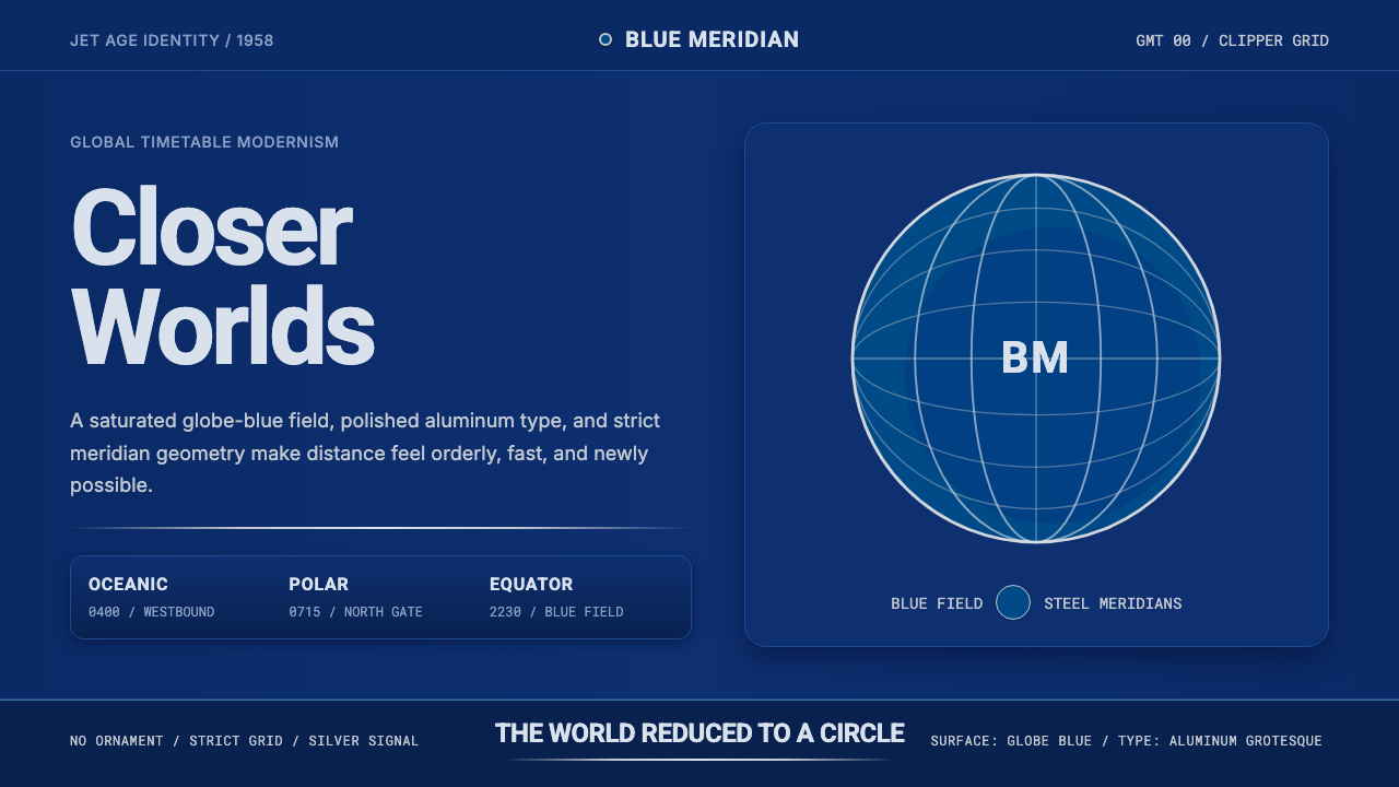 Pan Am Jet AgeJet-age confidence. Globe-blue field, steel type, meridian circle on a strict…喷气时代的信心:蓝色地球场、钢灰字体、经纬圆与严格网格。
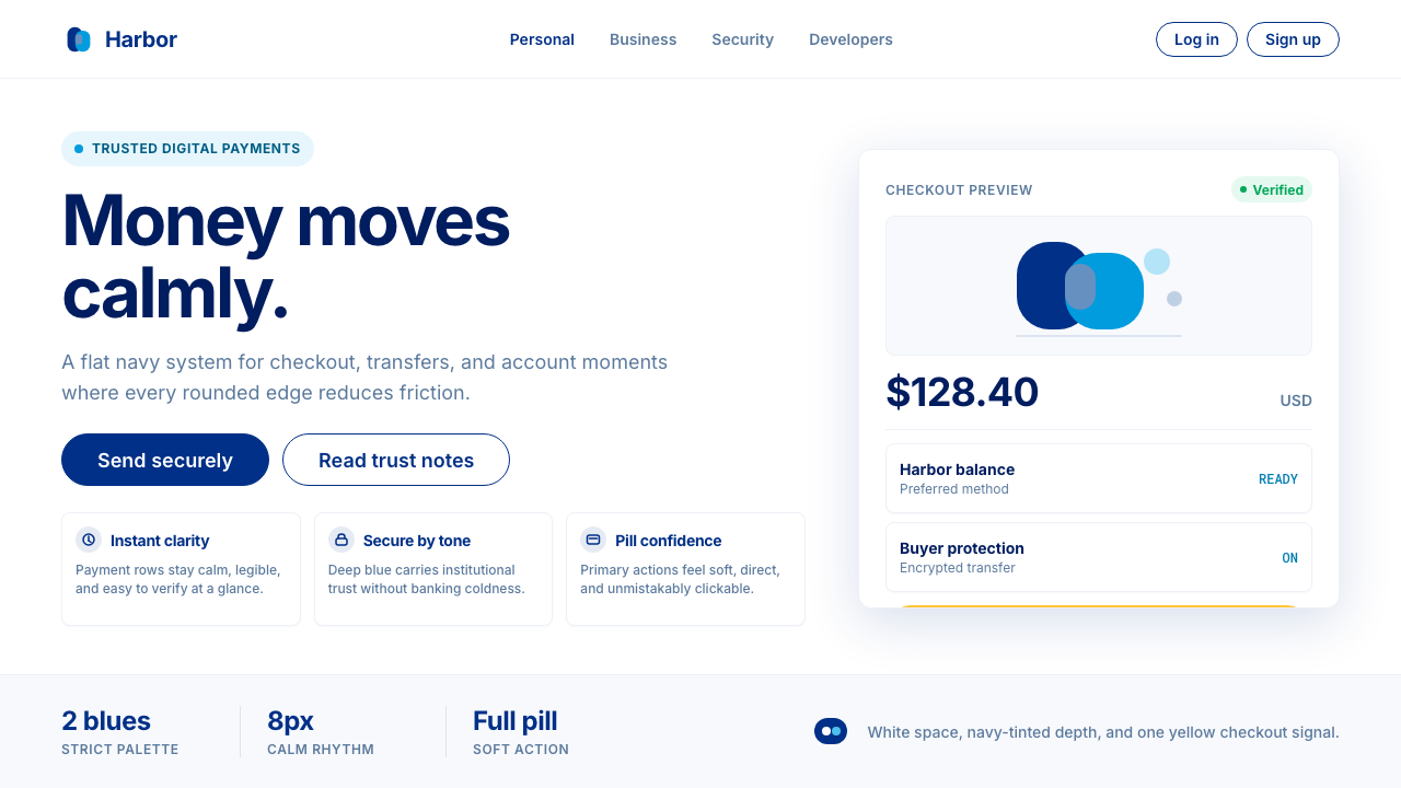 PayPalTrust without coldness. Deep navy, sky cyan, white cards, and pill checkout c…信任却不冰冷:深海军蓝与天青、白卡片和药丸结账提示。
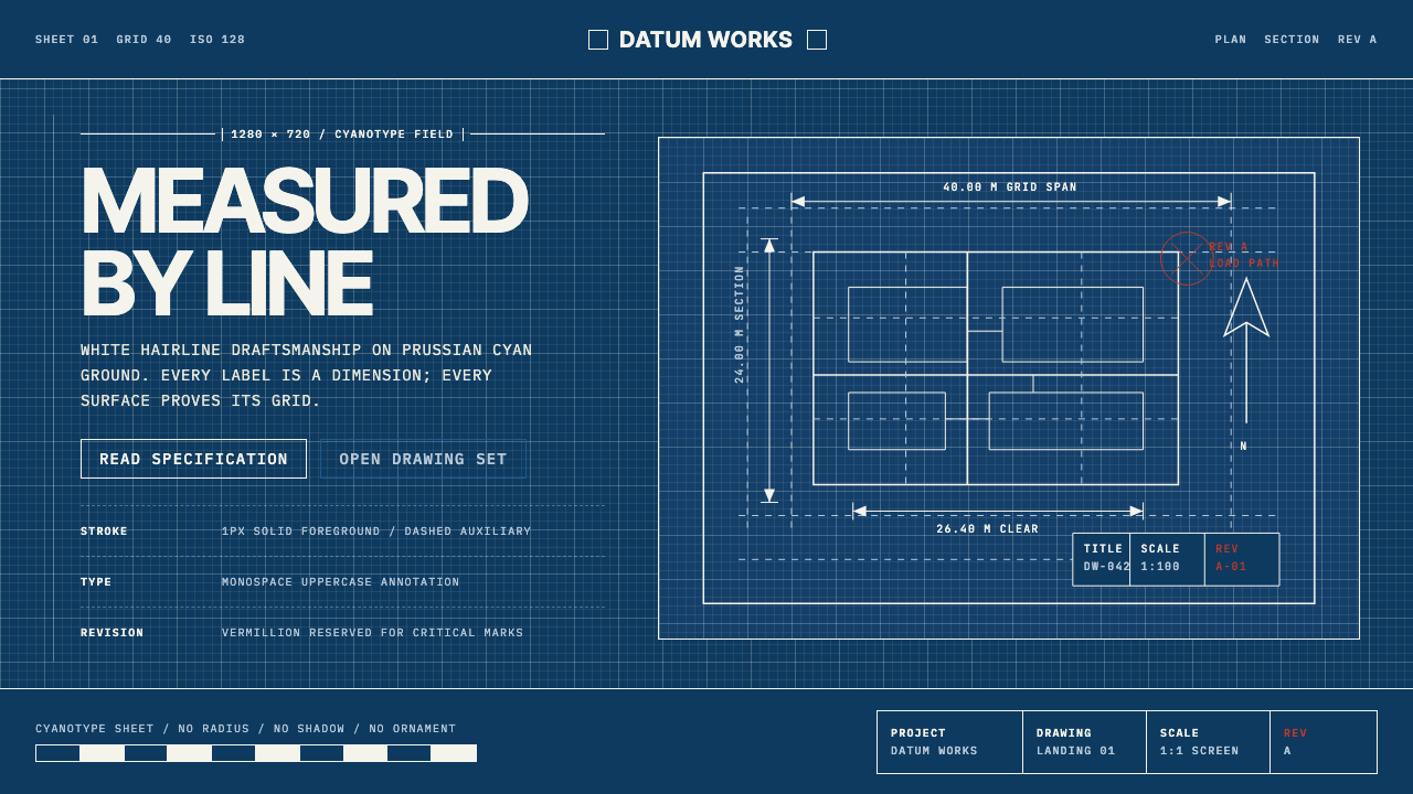 Architectural BlueprintMeasurement, not mood. Prussian cyan grid with white hairlines and vermillion…测量,不造情绪。普鲁士青网格、白色发丝线与朱砂修订标记。
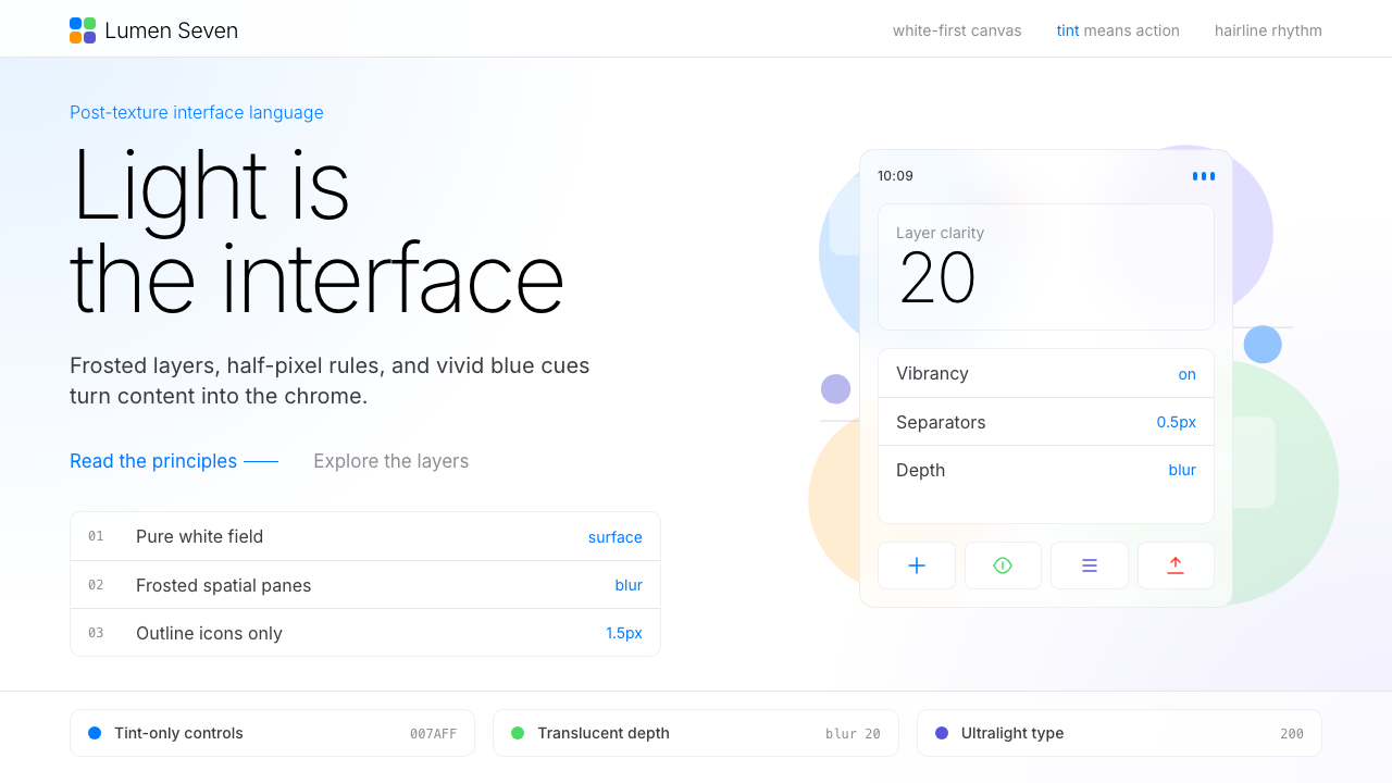 Flat Design iOS 7The day skeuomorphism died. Bright tints on white, hairline separators, frost…苹果一夜终结拟物化的革命:纯白留白、毛玻璃模糊面板、纤细到失重的字体——定义十…
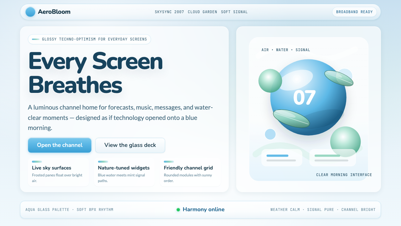 Frutiger Aero 2007Glossy techno-optimism. Translucent glass, photoreal skies, blue-greens — tec…千禧年代的光泽科技乐观主义:半透明玻璃、逼真蓝天、蓝绿色调——相信科技与自然可…
 GitHub README Markdown (2014)Calm code authority. Blue links, gray code panels, and Inter/Mono stack on wh…沉稳的代码权威:白底蓝链、灰代码块与等宽节奏。