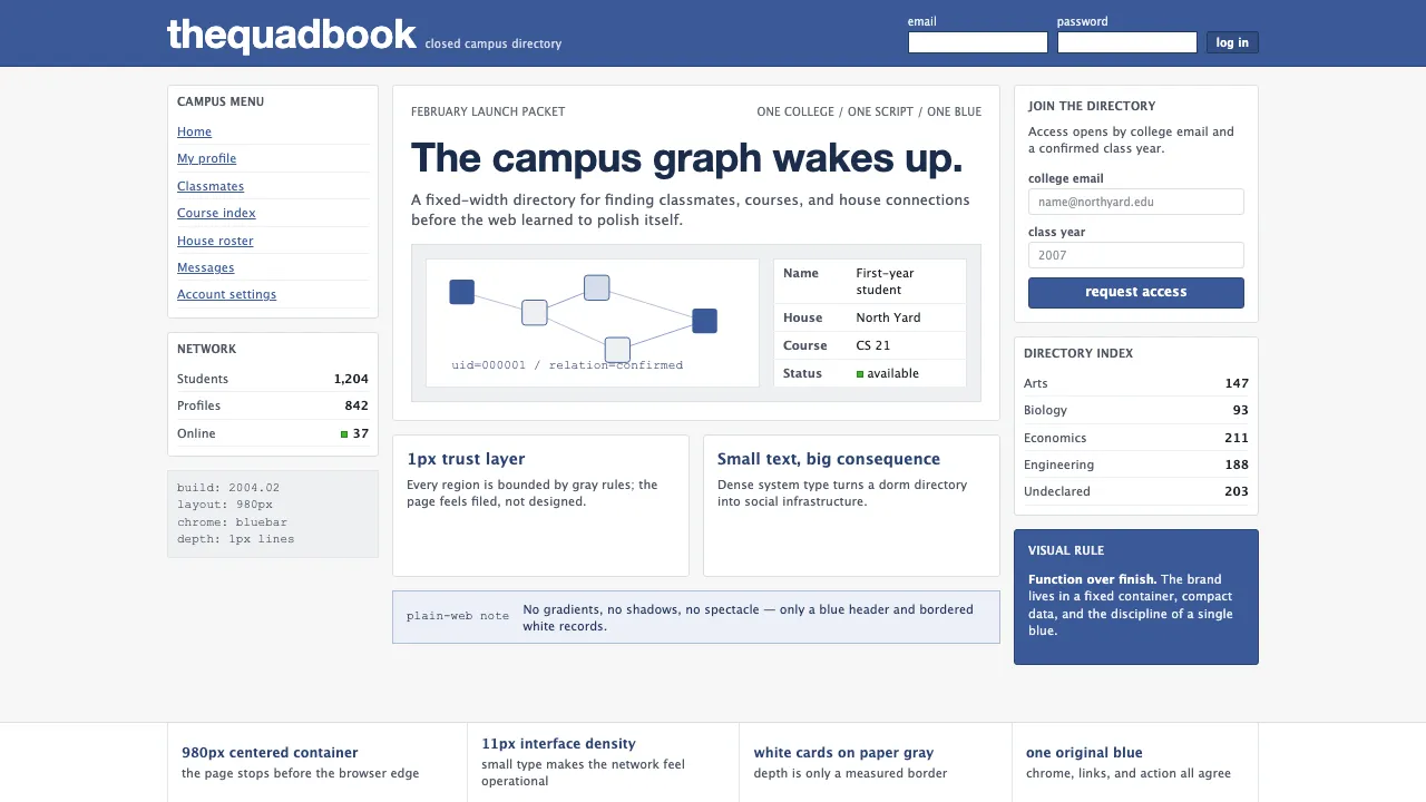
About Facebook 2004
The original thefacebook.com was a study in radical simplicity — a 980px fixed-width page with a blue header bar, gray background, and white bordered cards. Launched from a Harvard dorm room in February 2004, its visual language was defined by Klavika wordmark type, Lucida Grande system UI, and the now-iconic #3B5998 blue that would become one of the most recognized colors on the internet.
This system captures that pre-polish Web 2.0 moment: pixel-precise 1px borders, no shadows, no gradients, 11px body text, and a UI that prioritized function over form. It's the aesthetic of PHP rendered in a browser tab — mildly ugly, deeply functional, world-changing.
- Origin
- Cambridge, Massachusetts / Palo Alto, California
- Era
- February 2004 launch (thefacebook.com Harvard-only); visual identity frozen ~2004–2006
- Key figures
- Mark Zuckerberg · Andrew McCollum · Eduardo Saverin · Dustin Moskovitz
- Movements
- Web 2.0 social-graph era · college-network bootstrap · Bay Area startup canon
Facebook 2004 design spec
Colors
Typography
The other 11 sections — buttons, cards, spacing, motion, techniques and more — open once you unlock. Download the DESIGN.md or send it to your AI in one click. Unlock once, yours forever.
Sign up nowStyles similar to Facebook 2004
Also inspired by brands & products, with a close feel.
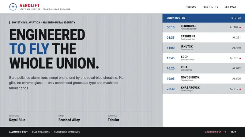 Aeroflot Soviet AirlineEngineered restraint rules. Silver ground, royal-blue cheatlines, and flat grotesque type set order.
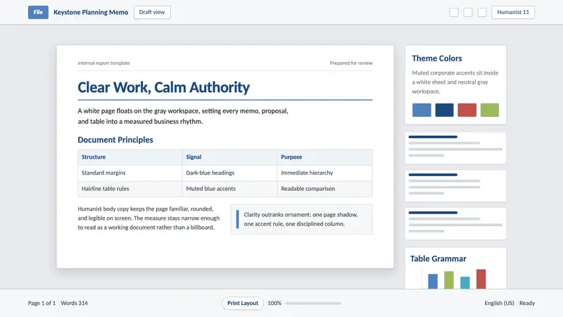 Office Document (Calibri 2007)Quiet authority. White page sheet, muted blue rules, and humanist-sans rhythm.
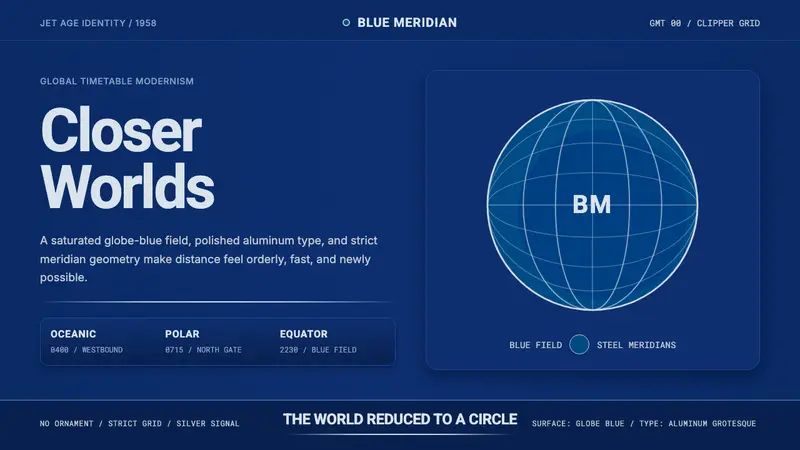 Pan Am Jet AgeJet-age confidence. Globe-blue field, steel type, meridian circle on a strict grid.
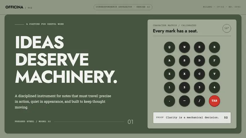 Olivetti LetteraEngineered, never styled. Grey-green enamel, precise type blocks and one red control.