What is Frutiger Aero 2007?什么是 Frutiger Aero 2007?
Frutiger Aero was the glossy, sky-drenched design language of the mid-2000s — a belief, rendered in translucent glass and blue-green light, that technology and nature could exist in luminous harmony.Frutiger Aero 是二十一世纪中期光泽夺目、蓝天浸润的设计语言——一种以半透明玻璃和蓝绿光芒呈现的信念:科技与自然可以在光辉中和谐共存。
Frutiger Aero 2007 in briefFrutiger Aero 2007 速览
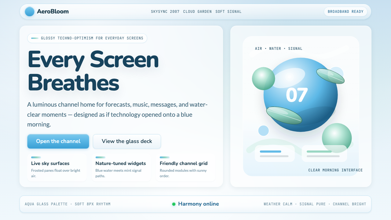
Frutiger Aero is the name retroactively given to the dominant visual style of consumer technology between roughly 2004 and 2013. The aesthetic is built on a small number of immediately recognizable elements: translucent and glossy surfaces that simulate glass and liquid, photorealistic skies and water rendered as interface backgrounds, a palette anchored in luminous blue-greens and aquas, and soft specular highlights that give every button, icon, and panel the appearance of something freshly molded from light itself.Frutiger Aero 是后来人们追溯命名的、2004 至 2013 年间主导消费科技领域的视觉风格。这种美学建立在少数几个一眼可辨的元素之上:模拟玻璃与液体的半透明光泽表面、作为界面背景的逼真蓝天与水景、以明亮蓝绿色和水蓝色为基础的色调,以及让每一个按钮、图标和面板都像是用光线刚刚塑形而成的柔和高光。
The name fuses two reference points. Adrian Frutiger was the Swiss typographer whose humanist typefaces — clean, legible, and rooted in a faith that letterforms should feel natural to the human eye — gave the style its first half. 'Aero' comes directly from Microsoft's Windows Vista interface theme of the same name, launched in 2007, which became the era's most widely distributed and recognized expression of the aesthetic. Together they name something that was never a formal movement: a shared mood, transmitted across corporate design teams, broadcast studios, consumer packaged goods, and game console interfaces, bound by a common optimism about what the near future looked like.这个名字融合了两个参照点。阿德里安·弗鲁提格是瑞士字体设计师,他的人文主义字体——简洁、易读,根植于字形应令人眼感到自然的信念——为这个风格名称贡献了前半部分。「Aero」则直接来自微软 Windows Vista 于 2007 年发布的同名界面主题,那是这一美学在那个时代传播最广、最广为人知的表达。合在一起,它们命名了一种从未被正式认定为运动的东西:一种共同的情绪,在企业设计团队、广播工作室、消费品包装和游戏主机界面之间传递,被对不久之后的未来长什么样的共同乐观所维系。
The style stood in explicit contrast to what came before and what came after. Before Frutiger Aero, digital interfaces were largely flat, boxy, and utilitarian — the visual vocabulary of the early-to-mid 1990s. After it, iOS 7's 2013 flat redesign triggered an industry-wide purge of glossiness, gradients, and skeuomorphic suggestion. The years in between belong to this aesthetic: a window in design history when screens were gaining resolution fast enough to render convincing material surfaces, and when the prevailing cultural mood — pre-financial crisis, early broadband, first smartphone — encouraged designers to imagine digital life as something genuinely beautiful.这种风格与它之前和之后的东西形成了明确的对比。Frutiger Aero 之前,数字界面大体是平面的、方盒子式的、功能性的——二十世纪九十年代初中期的视觉词汇。它之后,iOS 7 在 2013 年的扁平化重设计引发了全行业对光泽感、渐变与拟物暗示的大清洗。中间那些年属于这种美学:设计史上的一扇窗户,那时屏幕分辨率提升之快已足以渲染出令人信服的材质表面,而那个时代的文化心态——金融危机前、宽带互联网早期、第一代智能手机时代——鼓励设计师把数字生活想象成真正美丽的东西。
See the Frutiger Aero 2007 design system查看 Frutiger Aero 2007 完整设计系统
Where does Frutiger Aero 2007 come from?Frutiger Aero 2007 从何而来?
The roots of Frutiger Aero reach back to Apple's Aqua interface, introduced with Mac OS X in 2001. Aqua was the first widely distributed consumer operating system to stake its identity on simulated material richness: its buttons looked like water droplets, its scroll bars gleamed, its dock reflected icons as if sitting on a polished surface. Apple's design team, then operating under an aesthetic philosophy of 'lickable' interfaces, demonstrated that mass-market hardware could carry an image of sensory luxury. Aqua established the baseline assumptions that the rest of the industry would then amplify.Frutiger Aero 的根源可以追溯到苹果公司于 2001 年随 Mac OS X 引入的 Aqua 界面。Aqua 是第一个以模拟材质丰富感为核心身份的广泛发行消费者操作系统:它的按钮像水珠,滚动条闪闪发光,程序坞将图标倒映其中,仿佛置于抛光表面之上。苹果的设计团队——当时奉行「令人想舔」的界面设计哲学——证明了面向大众市场的硬件可以承载一种感官奢华的形象。Aqua 确立了基本假设,行业其余部分随后将其进一步放大。
Microsoft's Aero theme for Windows Vista, launched to consumers in January 2007, became the aesthetic's definitive mass-market expression. The Vista Aero interface introduced translucent window borders — the 'glass' effect that gave users the impression of looking through frosted panes at the desktop beneath — alongside glowing taskbar buttons, smoothly animated transitions, and a general atmosphere of softness and light. Vista itself had a troubled reception, but its visual language was absorbed immediately and broadly: PC manufacturers shipped it on hundreds of millions of machines, and its palette of cool blues, slate grays, and glowing accents entered the visual vocabulary of an entire generation of desktop software, websites, and broadcast graphics.微软为 Windows Vista 开发的 Aero 主题于 2007 年 1 月面向消费者发布,成为这一美学最具代表性的大众市场表达。Vista 的 Aero 界面引入了半透明的窗口边框——那种「磨砂玻璃」效果让用户产生透过磨砂窗格看见下方桌面的错觉——以及发光的任务栏按钮、流畅的过渡动画,以及一种整体上柔和而明亮的氛围。Vista 本身的市场表现颇受非议,但它的视觉语言被立即广泛吸收:PC 制造商将其预装在数亿台机器上,它那冷蓝色、石板灰和发光强调色的色调进入了整整一代桌面软件、网站和广播图形的视觉词汇。
The Nintendo Wii, launched in late 2006, brought the aesthetic into the living room in a different register. The Wii's channel interface and system menus used soft gradients, gentle glows, and a friendly rounded vocabulary that felt like a console designed for the whole family — approachable, clean, slightly luminous. At roughly the same time, British broadcasters including Sky Sports and BBC News were adopting similar visual grammars for their on-screen graphics packages: swooping translucent panels, glowing text treatments, and photorealistic environmental imagery used as motion backgrounds. The aesthetic was not confined to software; it was the house style of a technological moment.任天堂 Wii 于 2006 年底发布,以不同的腔调将这种美学带入了客厅。Wii 的频道界面和系统菜单使用了柔和的渐变、轻柔的光晕,以及一种友好的圆角词汇,感觉像是为全家人设计的主机——平易近人、整洁,略带光泽。大约在同一时期,天空体育和 BBC 新闻等英国广播机构也将类似的视觉语法引入了它们的荧幕图形包:弧形扫过的半透明面板、发光的文字处理效果,以及作为动态背景的逼真环境图像。这种美学并不局限于软件;它是一个技术时代的视觉基调。
Consumer packaged goods absorbed it too. Vitaminwater's packaging — photographed water in vivid fruit colors, clean sans-serif labeling, a sense of freshness engineered from color and light — is a physical-world analogue to the style's priorities. Mobile carrier advertising, energy drink branding, and early social media interfaces all pulled from the same visual well. What united them was a shared cultural proposition: technology was becoming beautiful, nature was becoming accessible through technology, and the future was bright, translucent, and blue-green. This optimism had a specific historical context — the mid-2000s, before the 2008 financial crisis and before social media's social costs became apparent — and when the context changed, the aesthetic changed with it.消费品包装也吸收了它。维他命水的包装——以鲜艳水果色拍摄的水体图像、简洁的无衬线标签、用色彩和光线精心营造的新鲜感——是这种风格在实体世界中的对应物。移动运营商广告、能量饮料品牌和早期社交媒体界面都从同一口视觉井中汲取。将它们统一在一起的,是一个共同的文化主张:科技正在变得美丽,自然正通过科技变得触手可及,未来是明亮的、半透明的、蓝绿色的。这种乐观主义有其特定的历史背景——二十一世纪中期,2008 年金融危机之前,社交媒体的社会代价尚未显现——当背景改变,美学也随之改变。
What defines the Frutiger Aero 2007 look?Frutiger Aero 2007 的视觉特征是什么?
Translucent Glass Surfaces半透明玻璃质感
The defining material metaphor of Frutiger Aero is glass: panels, windows, and interface elements are treated as if made from frosted or tinted transparent material, allowing the suggestion of depth and layering without fully revealing what lies beneath. This translucency is achieved through layered light effects rather than literal see-through compositing — what matters is the impression of a glassy, refractive surface. Highlights appear at the top edge of elements, shadows pool at the bottom, and the overall effect is of an interface floating just above its background rather than sitting flat against it.Frutiger Aero 最具代表性的材质隐喻是玻璃:面板、窗口和界面元素被处理成仿佛由磨砂或有色透明材料制成,在不完全展示其下内容的前提下暗示出深度与层叠关系。这种半透明感通过层叠的光效而非字面意义上的透明合成来实现——重要的是玻璃质感、折射感表面的印象。高光出现在元素的顶部边缘,阴影聚积在底部,整体效果是界面漂浮在背景之上,而非平贴其上。
Photorealistic Sky and Water逼真的天空与水景
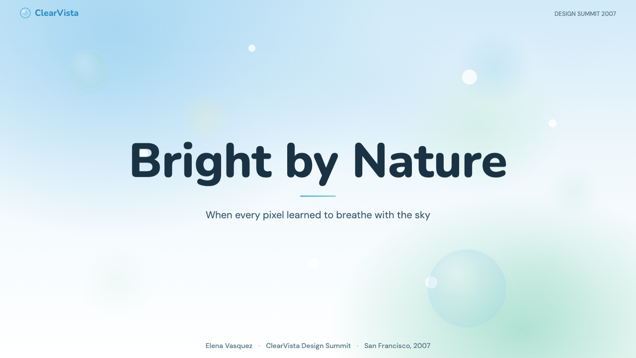
Natural imagery — specifically expansive blue skies, cumulus clouds, sunlit water, and green hillsides — appears throughout the aesthetic as background material, wallpaper, and decorative framing. These are not stylized or illustrated; they are photographic or rendered to photorealistic standards, lending an almost aspirational quality to digital environments. The repeated use of sky imagery in particular suggests boundlessness and possibility. Nature is not depicted as wild or untamed but as serene, clean, and perfectly lit — a vision of the natural world that technology has curated and made safely accessible.自然图像——特别是广阔的蓝天、积云、阳光照耀的水面和绿色山坡——在这种美学中作为背景素材、壁纸和装饰性框架大量出现。它们并非程式化或插画风格的,而是摄影照片或达到摄影写实标准的渲染图,为数字环境带来一种近乎憧憬的品质。反复出现的天空图像尤其暗示无边无际和无限可能。自然被描绘为宁静、洁净、光线完美的——一种科技已经策划并使之安全可及的自然世界愿景。
Blue-Green Palette with Warm Accents蓝绿主色与暖色点缀
The dominant hue range runs from aquamarine through teal to sky blue — a family of colors that simultaneously evokes clear water, open sky, and clean technology. This chromatic territory feels both natural and synthetic, which is precisely the aesthetic's ambition. Warm accents — glowing oranges, lime greens, soft whites — punctuate the cool foundation without displacing it. Saturated color is applied at varying luminosities to create depth: lighter values for highlights and airy backgrounds, deeper values for shadow and grounding. The palette reads as optimistic and forward-facing rather than neutral or authoritative.主色调范围从海蓝绿色经过青蓝色延伸至天空蓝——这一色彩家族同时唤起清澈的水、开阔的天空和洁净的科技。这个色域既感觉自然又感觉合成,而这恰恰是这种美学的雄心所在。温暖的点缀色——发光的橙色、莱姆绿、柔白——在不取代冷色基础的前提下为其注入活力。高饱和色以不同明度层叠,创造出深度感:较浅的明度用于高光和通透背景,较深的明度用于阴影与接地。这套色调读来乐观而朝向未来,而非中性或权威。
Specular Highlights and Gloss镜面高光与光泽感
Every surface in Frutiger Aero catches light. Buttons carry a bright highlight stripe across their upper third, suggesting a curved surface reflecting an overhead light source. Icons have a glossy cap — a teardrop or circular zone of concentrated brightness at the top. Badges and notification elements appear to be lacquered. This persistent application of specular highlights was the era's primary technique for communicating quality and interactivity: something that catches light seems alive, responsive, and worth touching. The highlight is not subtle; it is the foreground event of the design.Frutiger Aero 中的每一个表面都捕捉光线。按钮在上三分之一处有一道明亮的高光条,暗示一个弯曲表面正在反射头顶的光源。图标有一个光泽感的顶盖——一个集中亮度的泪滴形或圆形区域位于顶部。徽章和通知元素看起来像是涂了漆。这种对镜面高光的持续运用是那个时代传达品质与可交互性的主要技法:捕捉光线的东西看起来有生命、有响应性、值得触碰。高光并不含蓄——它是设计的前景事件。
Soft Gradients and Luminous Depth柔和渐变与发光深度
Whereas earlier interface design used hard edges and flat fills, Frutiger Aero suffuses almost every surface with gentle tonal gradation — lighter at top, darker at bottom, as if lit from above by a diffuse overhead source. These gradients are rarely dramatic; they exist to suggest volume and material substance rather than to create visual contrast. Backgrounds often feature radial glows emanating from a central light source, giving the compositional center a sense of warmth and luminosity. The cumulative effect is of a world that has been softly illuminated from within: everything glows slightly, nothing is harsh.与早期界面设计使用硬边和平面填充不同,Frutiger Aero 几乎让每一个表面都弥漫着柔和的色调渐变——上浅下深,仿佛被来自上方的漫射光源照亮。这些渐变很少是戏剧性的;它们的存在是为了暗示体积和材质实体感,而非创造视觉对比。背景通常有从中央光源向外辐射的径向光晕,为构图中心带来温暖和发光感。累积效果是一个从内部被柔和照亮的世界:一切都略微发光,没有什么是刺眼的。
Humanist Legibility and Rounded Forms人文主义易读性与圆润形态
Typography in the Frutiger Aero era leans toward clean, humanist letterforms with slightly rounded terminals — letterforms that feel approachable and warm rather than mechanically precise. Icons and interface controls follow the same logic: corners are rounded rather than sharp, shapes are organic enough to feel handcrafted but regular enough to feel engineered. This rounding is not aggressive in the way of later 'squircle' trends; it is a subtle softness applied to every edge that reinforces the broader aesthetic of comfort and luxury. The overall effect is of a designed world that wants you to touch it.Frutiger Aero 时代的字体排印倾向于简洁的、人文主义的字形,带有轻微圆润的笔端——感觉平易近人、温暖,而非机械精确的字形。图标和界面控件遵循同样的逻辑:角落是圆润而非锋利的,形状有机到足以感觉手工制作,但又规整到足以感觉工程设计。这种圆润并不像后来的「圆角方形」趋势那样激进;它是一种施加在每条边缘上的微妙柔和,强化了更宏观的舒适与奢华美学。整体效果是一个想让你触碰的被设计的世界。
Nature-Technology Synthesis自然与科技的融合
Perhaps the deepest characteristic of Frutiger Aero is its central proposition: that technology and nature are not opposed but complementary, and that the designed artifact can express both simultaneously. Organic imagery — leaves, water, light, sky — appears inside or alongside synthetic material surfaces. Green energy iconography, water droplets on glass, aurora-like gradients: these combinations argue that the digital world is an extension of the natural one, not its replacement. This was a culturally specific optimism, characteristic of a moment when environmental awareness and technological enthusiasm had not yet come into sharp conflict.Frutiger Aero 最深层的特征或许是它的核心主张:科技与自然并非对立而是互补的,被设计的物件可以同时表达两者。有机图像——叶片、水、光、天空——出现在合成材质表面的内部或旁边。绿色能源图标、玻璃上的水珠、极光般的渐变:这些组合论证了数字世界是自然世界的延伸,而非其替代品。这是一种有特定文化背景的乐观主义,是环保意识与科技热情尚未产生尖锐矛盾的那个时代的特征。
See the Frutiger Aero 2007 design system查看 Frutiger Aero 2007 完整设计系统
Who shaped Frutiger Aero 2007?谁塑造了 Frutiger Aero 2007?
The Swiss typographer whose name anchors half of the aesthetic's retroactive label never worked in digital interface design. Frutiger's significance is indirect but genuine: his humanist typefaces — designed with the conviction that letterforms should feel natural to the human eye and should prioritize legibility over expression — shaped the typographic sensibility of the entire era. The Frutiger typeface family, originally designed for Charles de Gaulle Airport's signage system in 1968 and widely licensed from the 1990s onward, became a default choice for corporations and institutions seeking a voice that was clean, modern, and approachable. When designers of the mid-2000s reached for type that felt simultaneously technical and warm, they reached for Frutiger or its direct descendants.这位瑞士字体设计师的名字构成了这一美学追溯命名的前半部分,而他本人从未从事过数字界面设计。弗鲁提格的意义是间接的,却是真实的:他的人文主义字体——设计时抱持字形应令人眼感到自然、应将易读性置于表现力之上的信念——塑造了整个时代的字体排印感受。弗鲁提格字体家族最初于 1968 年为戴高乐机场的标识系统而设计,自 1990 年代起被广泛授权使用,成为寻求简洁、现代、平易近人声调的企业和机构的默认选择。当二十一世纪中期的设计师寻找感觉同时具有技术性和温暖感的字体时,他们选择了弗鲁提格或其直系后代。
The team responsible for Windows Vista's Aero interface — working in Redmond across the mid-2000s under the broader Windows Vista development program — produced the most widely distributed single artifact of the Frutiger Aero aesthetic. The glass window chrome, the glowing taskbar, the soft drop shadows, the translucent start menu panel: these were design decisions made for a mainstream PC operating system that shipped on hundreds of millions of machines. Whatever its reception as a product, Vista Aero set the visual baseline for an era. The team's work demonstrates that aesthetic movements in the consumer technology space are often defined not by the most artistically ambitious efforts but by the ones that reach the largest audiences.负责 Windows Vista Aero 界面的团队——在二十一世纪中期于华盛顿州雷德蒙德在更大的 Vista 开发项目框架下工作——制作了 Frutiger Aero 美学传播最广泛的单一产物。玻璃感的窗口边框、发光的任务栏、柔和的投影、半透明的开始菜单面板:这些都是为一个主流 PC 操作系统所做的设计决策,该系统预装在数亿台机器上。无论作为产品接受度如何,Vista Aero 为一个时代设定了视觉基准线。这个团队的工作表明,消费科技领域的美学运动往往不是由艺术上最有抱负的努力所定义,而是由触达最广泛受众的那些所定义。
The Wii's channel-based interface, developed in Kyoto and launched in late 2006, represented a distinct and influential interpretation of the Frutiger Aero visual language. Where Microsoft's Vista Aero leaned into glass and shadow, the Wii interface opted for a warmer, softer expression: rounded white panels floating on a pale blue gradient, gentle glows rather than hard reflections, an atmosphere of invitation rather than sophistication. The Wii reached audiences — families, casual players, older users — who had no prior relationship with the aesthetic from personal computing, and its success demonstrated that the style's core associations (clean, modern, approachable, luminous) were legible across age groups and experience levels.Wii 的频道界面——在京都开发,于 2006 年底发布——代表了对 Frutiger Aero 视觉语言的一种截然不同却颇具影响力的诠释。微软的 Vista Aero 偏重玻璃和阴影,而 Wii 界面则选择了更温暖、更柔和的表达:漂浮在浅蓝色渐变上的圆角白色面板,轻柔的光晕而非硬反射,邀请感而非精致感的氛围。Wii 触及了与个人电脑无既有关系的受众——家庭、休闲玩家、年长用户——其成功证明了这种风格的核心联想(简洁、现代、平易近人、发光)在不同年龄层和经验水平上都是可解读的。
Apple's Aqua interface, introduced with Mac OS X in 2001 and refined through subsequent releases, established the foundational assumptions that the broader Frutiger Aero era would amplify. The Aqua team — working under a design philosophy that prized sensory richness and the 'lickable' quality of digital surfaces — demonstrated that operating system interfaces could be beautiful in an explicitly material, tactile sense: that buttons could look like candy, that scroll bars could gleam, that the desktop could feel like a lit stage rather than a gray utility space. This precedent was enormously influential, both directly (Apple devices carried Aqua throughout the period) and indirectly (it legitimized the premise that consumer-facing software should be visually pleasurable).苹果的 Aqua 界面随 Mac OS X 于 2001 年引入,并在后续版本中持续打磨,确立了更广泛的 Frutiger Aero 时代将要放大的基础假设。Aqua 团队——在重视感官丰富性和数字表面「令人想舔」品质的设计哲学下工作——证明了操作系统界面可以在明确的材质、触觉意义上变得美丽:按钮可以看起来像糖果,滚动条可以闪闪发光,桌面可以感觉像一个打了灯光的舞台而非灰色功能空间。这一先例极具影响力,既有直接影响(苹果设备在整个时期都搭载着 Aqua),也有间接影响(它为面向消费者的软件应该在视觉上令人愉悦这一前提赋予了合法性)。
British broadcast design played a distinctive role in diffusing the Frutiger Aero aesthetic beyond the software world. The on-screen graphics packages developed by Sky Sports, BBC News, and other British broadcasters during the mid-2000s brought the style's key elements — translucent swooping panels, glowing text, photorealistic environmental imagery as animated backgrounds, blue-green and silver palettes — into tens of millions of living rooms every day. Broadcast graphics have their own production constraints and technical standards, and the fact that the aesthetic translated successfully from GUI design to motion graphics and television overlay work demonstrated its versatility. The broadcasters were not followers of a software trend; they were parallel contributors to a shared visual moment.英国广播设计在将 Frutiger Aero 美学扩散至软件世界之外方面发挥了独特作用。天空体育、BBC 新闻及其他英国广播机构在二十一世纪中期开发的荧幕图形包,将这种风格的关键元素——半透明弧形扫动的面板、发光的文字、作为动态背景的逼真环境图像、蓝绿色和银色调——每天带入数千万个客厅。广播图形有其自身的制作约束和技术标准,这种美学从 GUI 设计成功迁移至动态图形和电视叠加效果这一事实,证明了它的多样适应性。广播机构不是软件趋势的追随者;他们是一个共同视觉时刻的平行贡献者。
How do you use Frutiger Aero 2007 today?今天怎么用 Frutiger Aero 2007?
Frutiger Aero is a style rooted in a specific historical optimism, and applying it today requires understanding what that optimism communicated — and choosing deliberately whether to invoke it straight, ironically, or as nostalgic homage. In contemporary presentation design, the aesthetic works best when the content itself calls for a sense of technological aspiration or forward momentum: technology company keynote decks, climate-tech funding presentations, product launches framing innovation as inherently positive. Cover slides benefit most directly: a full-bleed photorealistic sky or water background, a large translucent panel carrying the title in clean humanist type, and a single glowing accent element create an immediate sense of luminous arrival. Content slides should carry the translucency forward with panel-style containers rather than flat white rectangles, with type set against soft gradient fields rather than flat grounds.Frutiger Aero 是一种根植于特定历史乐观主义的风格,今天应用它需要理解那种乐观主义传达了什么——并有意识地选择是直接引用、带有反讽距离,还是作为怀旧致敬。在当代演示设计中,这种美学在内容本身呼唤一种科技抱负感或向前动力时效果最佳:科技公司的主题演讲幻灯片、气候科技融资路演、将创新定格为本质上积极的事物的产品发布。封面幻灯片从中受益最直接:一张满版的逼真天空或水景背景图,一块承载着以简洁人文字体排版的标题的大型半透明面板,以及一个单一的发光强调元素,立即创造出一种光辉到来的感受。内容幻灯片应以面板式容器而非平面白色矩形延续半透明感,文字应设置在柔和渐变底面而非平面底面之上。
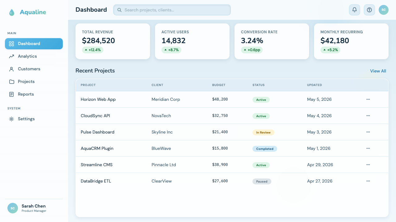
For web UI work — particularly dashboards, SaaS product marketing pages, and pricing tiers — Frutiger Aero offers a distinct alternative to the flat and ultra-minimal aesthetics that have dominated since 2013. The approach is to treat UI components as physical objects: cards with soft gloss and a gentle top highlight, navigation bars with a frosted-glass treatment that lets the background bleed through slightly, buttons with a subtle gradient from a brighter top to a slightly deeper bottom. Interactive states — hover, active, focus — should feel materially responsive, as if the surface is reacting to touch. The palette anchors in cool blues and aquas, with white used generously for breathing room and warm accents used sparingly for calls to action.对于网页 UI 工作——特别是仪表板、SaaS 产品营销页面和定价层级——Frutiger Aero 提供了一种与 2013 年以来主导设计的扁平和超极简美学截然不同的选择。方法是将 UI 组件视为物理对象:带有柔和光泽和顶部轻微高光的卡片,带有磨砂玻璃处理使背景略微透出的导航栏,带有从较亮顶部到略深底部微妙渐变的按钮。交互状态——悬停、激活、聚焦——应感觉有材质响应性,仿佛表面正在对触碰作出反应。色调以冷蓝色和水蓝色为锚,白色大量用于呼吸空间,暖色点缀色节制地用于行动号召。
In editorial and marketing contexts, the style supports a register of premium technological promise. Feature articles about innovation, sustainability reports from technology companies, and brand campaigns positioning products within a nature-and-technology narrative all benefit from the aesthetic's core visual vocabulary. A spreads layout might use a full-bleed sky photograph as the background field, with article text set in a wide translucent overlay panel. Marketing pages work well with alternating section backgrounds: a pale sky-blue gradient followed by a near-white section followed by a deeper teal — each transition feeling like moving through atmospheric layers. Headline typography should be large and confident, set in a clean humanist face, with no serif and no display-style decoration.在编辑和营销语境中,这种风格支持一种高端科技承诺的语气。关于创新的专题文章、科技公司的可持续发展报告,以及将产品定位于自然与科技叙事框架内的品牌营销活动,都能从这种美学的核心视觉词汇中获益。跨页版面可以使用满版天空照片作为背景底面,文章文字设置在宽阔的半透明叠加面板中。营销页面适合采用交替的版块背景:浅天蓝色渐变接着接近白色的版块接着较深的青蓝色——每次过渡感觉像是穿越大气层。标题字体应大而自信,以简洁的人文字型排列,无衬线,无展示性装饰。
Data visualization within the Frutiger Aero framework takes on a luminous, immersive quality. Charts and graphs are treated as illuminated objects: line graphs glow slightly against dark gradient backgrounds, bar charts use the blue-green palette with graduated fills from lighter to deeper tones, area charts carry a gentle transparency that allows underlying grid lines to show through as if seen through water. This approach is particularly effective in executive-facing dashboards and annual report data pages, where the goal is to make data feel significant and considered rather than utilitarian.在 Frutiger Aero 框架内的数据可视化呈现出一种发光的、沉浸式的品质。图表被视为被照亮的对象:折线图在深色渐变背景上略微发光,条形图使用蓝绿色色板配以从浅到深的渐变填充,面积图带有轻微透明度,使底层网格线透过显现,仿佛透过水面观看。这种方法在面向高管的仪表板和年度报告数据页面中特别有效,目标是让数据感觉重要而经过深思熟虑,而非功能性的。
A common mistake when applying Frutiger Aero is mistaking surface ornament for the aesthetic itself — adding gloss highlights and gradient fills without the underlying compositional logic that makes them coherent. The style's gloss elements work because they suggest material consistency: every surface catches light from the same implied direction, every gradient moves light-to-dark from top to bottom. Inconsistent highlight directions, gradients that run in different orientations, or photorealistic nature imagery placed next to flat-design UI components create a visual incoherence that reads as dated rather than nostalgic. Similarly, applying the full palette — cool blues, warm greens, glowing oranges, and lime accents — simultaneously without a clear hierarchy produces visual noise rather than techno-optimism. Anchor the composition in one or two hues from the blue-green range, and treat all others as punctuation.应用 Frutiger Aero 时最常见的错误是将表面装饰与美学本身混淆——在没有让这些装饰连贯起来的底层构图逻辑的情况下添加光泽高光和渐变填充。这种风格的光泽元素之所以有效,是因为它们暗示了材质一致性:每个表面从同一个隐含方向捕捉光线,每个渐变从上到下由浅至深流动。不一致的高光方向、朝不同方向运行的渐变,或者逼真的自然图像被摆放在扁平设计 UI 组件旁边,会产生一种视觉不一致感,读来让人感觉是过时的而非怀旧的。同样,在没有清晰层级的情况下同时应用完整色板——冷蓝、暖绿、发光橙和莱姆绿点缀——会产生视觉噪音而非科技乐观主义。将构图锚定在蓝绿色范围内的一到两种色调,所有其他色调均作为标点使用。
See the Frutiger Aero 2007 design system查看 Frutiger Aero 2007 完整设计系统
Frutiger Aero 2007 — FAQFrutiger Aero 2007 · 常见问题
Is Frutiger Aero the same as skeuomorphism?Frutiger Aero 和拟物化设计是同一回事吗?
They overlap but are not identical. Skeuomorphism is the broader design principle of making digital interfaces look and behave like physical objects — leather-textured calendars, felt-lined game center tables, realistic toggle switches. Frutiger Aero shares skeuomorphism's interest in material richness and tactile suggestion but is more specifically an atmospheric and chromatic sensibility: it is concerned with light, translucency, and the color of sky and water rather than with imitating specific physical objects. A skeuomorphic design might imitate a legal pad; a Frutiger Aero design immerses the user in the feeling of a clear day. Many products of the era combined both tendencies, which is why they are often conflated, but the retronym 'Frutiger Aero' points to the atmospheric and luminous qualities specifically.两者有重叠,但并不等同。拟物化是更宏观的设计原则,指让数字界面看起来并表现得像实体对象——皮革纹理的日历、毡布衬底的游戏中心桌面、逼真的拨动开关。Frutiger Aero 与拟物化共享对材质丰富性和触觉暗示的兴趣,但更具体地是一种大气和色彩感性:它关注的是光线、半透明感,以及天空和水的颜色,而非模仿特定的实体对象。一个拟物化设计可能模仿一本法律纸本;一个 Frutiger Aero 设计则让用户沉浸在晴朗天气的感觉之中。那个时代的许多产品兼具两种倾向,这就是它们经常被混为一谈的原因,但「Frutiger Aero」这个追溯命名具体指向的是大气和发光的品质。
Why did the style disappear so quickly after 2013?为什么这种风格在 2013 年后消失得如此之快?
iOS 7, released in September 2013, was the triggering event, but the conditions for the style's decline had been accumulating for years. Mobile screens had become the dominant computing surface, and the glossy, gradient-heavy aesthetic designed for large-format desktop displays did not translate well to small screens where every pixel needed to work harder. The style also carried cultural baggage by 2013: it was associated with a mid-2000s optimism that the 2008 financial crisis had complicated, and its visual references — aquamarine skies, clean technology, luminous promise — could read as naive given the intervening years. Apple's flat redesign gave the industry a coordinating mechanism: once the most influential platform shifted, other platforms, software developers, and brand designers followed quickly. The transition was unusually rapid because the aesthetic had always been defined by the platforms rather than by a principled design movement.iOS 7 于 2013 年 9 月发布是触发事件,但这种风格衰落的条件早已积累多年。移动屏幕已成为主导性的计算表面,为大尺寸桌面显示器设计的光泽、渐变浓重的美学在每个像素都需要更努力工作的小屏幕上表现欠佳。到 2013 年,这种风格也承载了文化包袱:它与二十一世纪中期的乐观主义相关联,而 2008 年金融危机已使这种乐观主义变得复杂;它的视觉参照——海蓝绿的天空、洁净的科技、发光的承诺——在经历了那些年之后可能读来显得天真。苹果的扁平化重设计为整个行业提供了一个协调机制:一旦最具影响力的平台转向,其他平台、软件开发者和品牌设计师迅速跟进。这次转变异常迅速,因为这种美学向来是由平台而非有原则的设计运动所定义的。
How is the current Gen Z nostalgia for Frutiger Aero different from simply reviving it?当代 Z 世代对 Frutiger Aero 的怀旧与简单复兴有何不同?
The nostalgia operates with an awareness of the gap between the aesthetic and the present that the original did not have. When designers in 2006 produced Frutiger Aero visuals, they were expressing a sincere belief in a techno-optimist future; when a designer in 2024 recreates those visuals for a TikTok aesthetic or a brand identity, the mood is more complex — a longing for a moment when optimism felt possible, combined with an ironic distance from its naivety. The resulting work often exaggerates the style's most recognizable elements (brighter glows, more saturated aquas, more obviously photorealistic skies) rather than reproducing them with period accuracy, because the goal is to evoke a feeling rather than to document a historical moment. This is nostalgia as emotional argument, not historical reconstruction.这种怀旧带着一种对美学与当下之间落差的意识,而原版并不具备这种意识。当 2006 年的设计师制作 Frutiger Aero 视觉作品时,他们表达的是对科技乐观主义未来的真诚信念;当 2024 年的设计师为 TikTok 美学或品牌识别重现那些视觉时,情绪更为复杂——对乐观主义还曾感觉可能的那个时刻的渴望,与对其天真的反讽距离并存。由此产生的作品往往夸大了这种风格最易辨认的元素(更亮的光晕、更饱和的水蓝色、更明显的写实天空),而非以时代精准度复制它们,因为目标是唤起一种感觉,而非记录一个历史时刻。这是作为情感论证的怀旧,而非历史重构。
Can Frutiger Aero work for brands that need to feel trustworthy and serious, not just aspirational?Frutiger Aero 能适用于需要感觉可信和严肃而非仅仅充满憧憬的品牌吗?
Yes, with calibration. The aesthetic has two registers: the exuberant, glossy consumer-facing version seen in Vitaminwater and early social media, and the more composed, luminous-but-restrained version seen in enterprise software, hospital signage systems, and institutional communications of the same era. The latter register is entirely usable for serious applications. The key adjustments are: reducing the saturation of the blue-green palette toward a more muted, professional range; limiting gloss highlights to structural accents rather than applying them to every element; choosing photography that feels documentary rather than aspirational; and ensuring that the translucency effects serve clarity rather than decoration. In this register, the style communicates technology, precision, and environmental responsibility — values that are quite compatible with institutional trust.可以,但需要调校。这种美学有两种语气:在维他命水和早期社交媒体中看到的那种热情、光泽感的面向消费者版本,以及在同一时代的企业软件、医院标识系统和机构传播中看到的更沉稳、发光但克制的版本。后一种语气完全可用于严肃场合。关键调整是:将蓝绿色色板的饱和度降至更沉稳、专业的范围;将光泽高光限制在结构性强调,而非施加于每个元素;选择感觉纪实性而非憧憬性的摄影图像;并确保半透明效果服务于清晰度而非装饰。在这种语气下,这种风格传达的是科技、精确和环境责任——与机构信任完全相容的价值观。
What is the single most common failure mode when applying this aesthetic?应用这种美学时最常见的失败模式是什么?
Applying the visual surface features without the underlying light logic. Frutiger Aero works as a coherent aesthetic because it implies a consistent light environment: overhead, diffuse, slightly warm, and omnipresent. Every highlight, every gradient, every translucent surface is a consequence of that implied light source. When designers add gloss highlights pointing in different directions, combine gradients that run in conflicting orientations, or mix photorealistic nature imagery with unlit flat elements, they break the implied physics that make the aesthetic feel intentional. The result looks like a collection of glossy parts rather than a designed world. Before adding any gloss or gradient, establish where the light is coming from, and apply every surface effect as if the same sun is shining on everything in the composition.应用视觉表面特征而缺乏底层光线逻辑。Frutiger Aero 之所以作为一种连贯的美学有效,是因为它暗示了一个一致的光线环境:来自头顶、漫射、略带温暖、无处不在。每一个高光、每一个渐变、每一个半透明表面都是这个隐含光源的结果。当设计师添加指向不同方向的光泽高光、组合朝相互冲突方向运行的渐变,或者将逼真的自然图像与未被照亮的平面元素混合时,他们打破了让这种美学感觉有意图的隐含物理逻辑。结果看起来像是一堆光泽零部件的堆砌,而非一个被设计的世界。在添加任何光泽或渐变之前,先确定光线从哪里来,然后将每一个表面效果施加得仿佛同一个太阳照耀着构图中的一切。
Related design styles相关设计风格
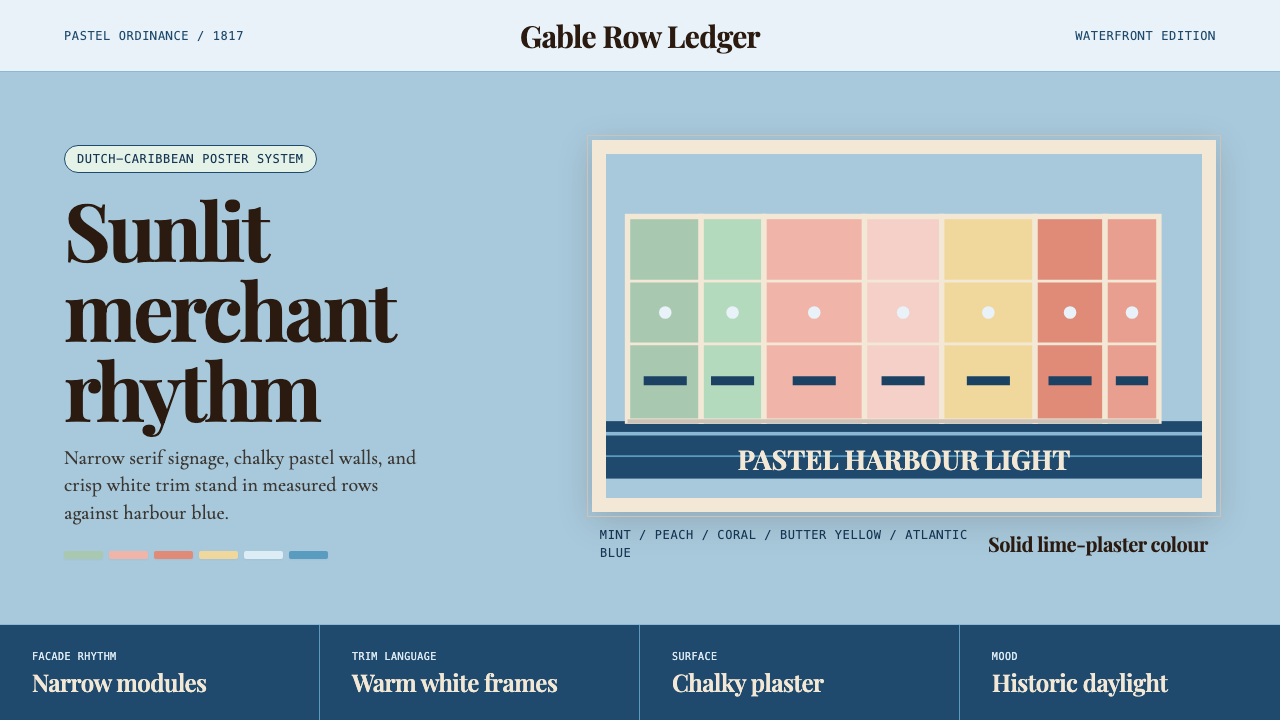 Curaçao Handelskade PastelPastel order feels sunlit. Coral, mint, and serif gables march across sky blu…粉彩秩序明亮如日照:珊瑚与薄荷山墙排在天蓝底上。
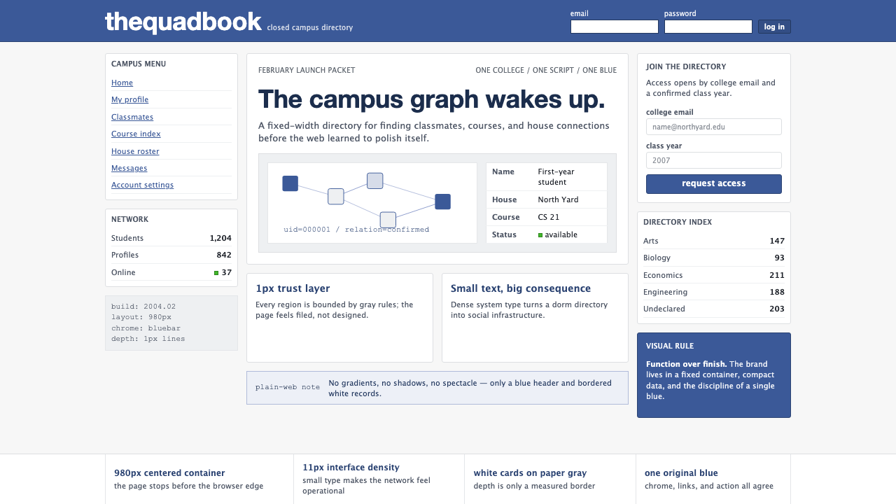 Facebook 2004Dorm-web austerity. Original blue, 980px grid, 1px borders, tiny Lucida Grand…宿舍网页的克制:原初蓝、980px网格、1px边框与小号系统字。
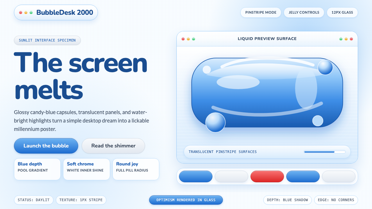 Y2K Aqua 2000Optimism looks lickable. Candy-blue pills, pinstripes, and glass panels gleam…乐观变得可舔:糖果蓝药丸、细条纹与玻璃面板营造Y2K深度。
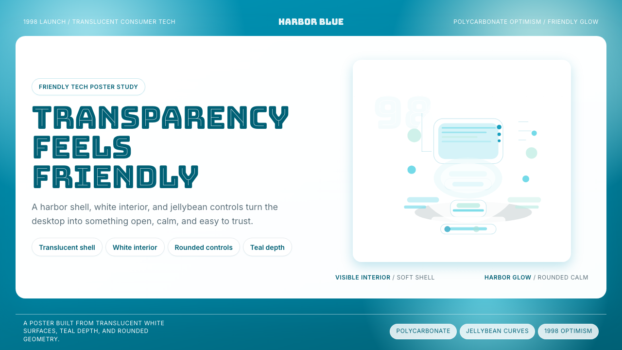 iMac G3 Bondi Blue (1998)Transparency feels friendly. Bondi blue, white glass, and pill curves set the…透明也很亲切。邦迪蓝、白色玻璃和圆润胶囊感定调。
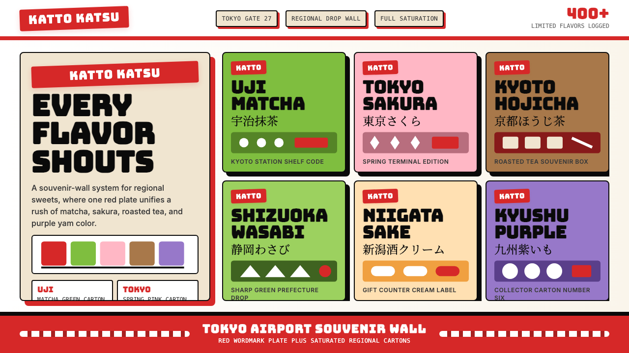 Kit Kat Japan CollectorSouvenir wall joy. Red plates and saturated flavor tiles turn regional sweets…伴手礼墙的快乐。红牌与饱和风味色块把地方甜点变成收藏品。
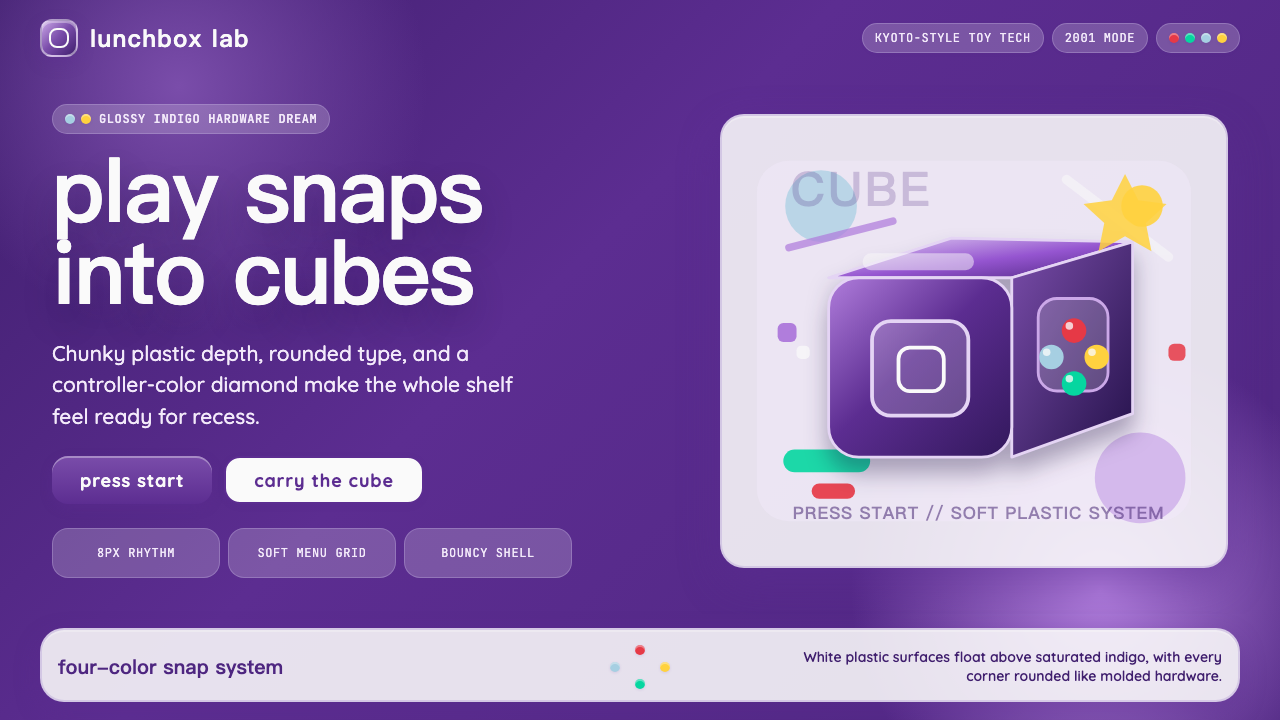 Nintendo GameCube (2001)Toy-tech refuses restraint. Indigo plastic, glossy cubes, and four-color butt…玩具科技拒绝克制:靛紫塑料、光泽立方与四色按钮传递快乐。