Design style guide设计风格指南
What is Curaçao Handelskade Pastel?什么是 Curaçao Handelskade Pastel?
Willemstad's Handelskade proves that a municipal painting ordinance from 1817 can become one of the Caribbean's most distinctive design languages — chalky pastels, stepped gables, and harbour-salt geometry arranged with the precision of a Dutch merchant ledger.威廉斯塔德汉德尔斯卡德告诉我们:一道颁布于1817年的市政涂色令,竟能演变成加勒比海最独特的设计语言之一——粉笔质感的粉彩、阶梯山墙与海盐侵蚀的几何,以荷兰商人账簿般的精准秩序排列。
Curaçao Handelskade Pastel in briefCuraçao Handelskade Pastel 速览
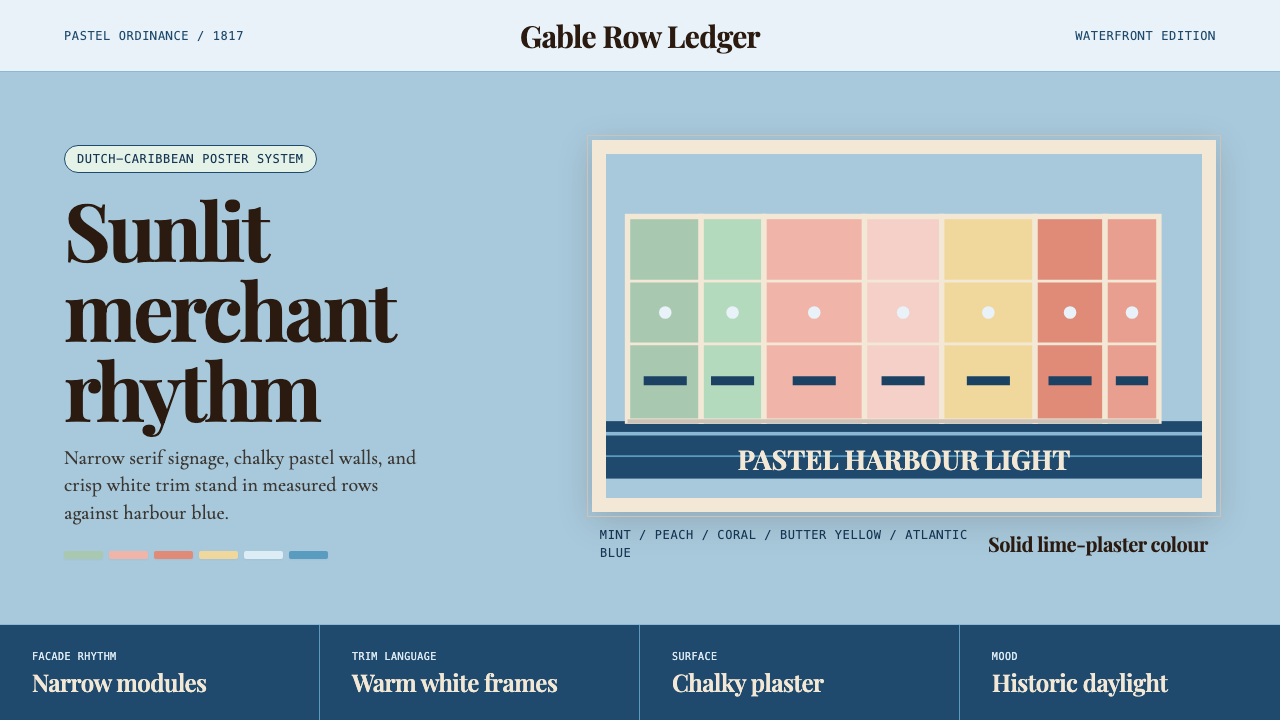
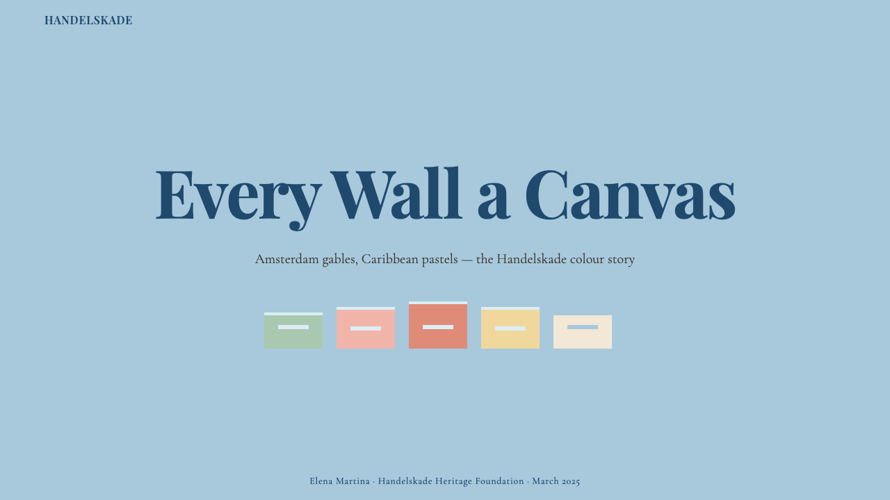
Curaçao Handelskade Pastel is a design system rooted in the waterfront merchant houses of Willemstad, the capital of Curaçao in the Dutch Caribbean. The style draws on the UNESCO World Heritage streetscape of the Handelskade — a continuous row of narrow, stepped-gable façades painted in mandated chalky pastels: mint, peach, coral, butter yellow, and sky blue. The effect is simultaneously regimented and joyful, the product of colonial Dutch mercantile order meeting Caribbean light and colour.库拉索汉德尔斯卡德粉彩风格是一套植根于威廉斯塔德滨水商人宅邸的设计体系。威廉斯塔德是荷属加勒比岛屿库拉索的首府。这种风格汲取自汉德尔斯卡德联合国教科文组织世界遗产街景——一排连续的窄幅阶梯山墙立面,被强制涂以粉笔质感的柔和粉彩:薄荷绿、蜜桃色、珊瑚粉、奶油黄与天蓝色。整体效果既整齐划一又充满喜悦,是荷兰殖民商业秩序与加勒比光线和色彩相遇的产物。
The visual character is shaped by a tension between strict regularity and warm softness. The gabled façades repeat at the same narrow width, creating a rhythm of vertical punctuation across the harbourfront. Yet within that rigid frame, each building wears its own pastel hue, making the row feel like a curated collection rather than a uniform block. This interplay of order and chromatic individuality is the style's defining paradox — and its chief source of visual energy.这种视觉气质源于严格规整与温暖柔软之间的张力。阶梯山墙立面以相同的窄幅等距重复,在港口沿线营造出竖向节奏的律动感。然而在这一刚性框架内,每栋建筑披着各自的粉彩色调,使整排街区呈现出精心策划的收藏感,而非千篇一律的单调。这种秩序与色彩个性的相互作用,正是这种风格最核心的视觉悖论,也是其主要的视觉张力来源。
As a design system, the style translates the Handelskade's physical grammar into digital and print contexts: chalky, slightly muted pastel palettes deployed against deep harbour blues; stepped and gabled silhouettes as structural ornament; period-influenced serif letterforms that echo the colonial-era signage of the waterfront; and a gentle surface texture suggesting lime plaster weathered by salt air and tropical sun. The overall atmosphere is warm, precise, and faintly theatrical — like a Wes Anderson scene staged on an island.作为一套设计体系,它将汉德尔斯卡德的实体语法转译至数字与印刷语境:粉笔质感、略带哑光的粉彩调色板铺展于深港蓝底色之上;阶梯山墙轮廓作为结构性装饰元素;受历史影响的衬线字体呼应着滨水区殖民时代招牌的气息;以及一种微妙的表面纹理,令人联想到被海盐与热带阳光侵蚀的石灰粉墙。整体氛围温暖、精致、略带戏剧性——如同一幕在岛屿上搭建的韦斯·安德森场景。
See the Curaçao Handelskade Pastel design system →查看 Curaçao Handelskade Pastel 完整设计系统 →
Where does Curaçao Handelskade Pastel come from?Curaçao Handelskade Pastel 从何而来?
Willemstad's Handelskade — literally 'merchants' quay' — developed in the seventeenth and eighteenth centuries as the commercial heart of the Dutch West India Company's Caribbean operations. Curaçao's natural deep-water harbour made it the pivot of trade across the region: enslaved Africans, sugar, salt, tropical hardwoods, and European manufactured goods all passed through Willemstad's wharves. The merchant houses lining the harbour were built in a distinctly Dutch style — narrow-fronted, with the characteristic stepped gables that allowed buildings to be identified by silhouette from vessels approaching port.威廉斯塔德的汉德尔斯卡德——字面意思是“商人码头”——在十七、十八世纪发展成为荷兰西印度公司加勒比运营的商业核心。库拉索天然的深水港使其成为整个地区贸易的枢纽:被奴役的非洲人、蔗糖、盐、热带硬木与欧洲制造品,均经由威廉斯塔德的码头流转。沿港排列的商人宅邸以鲜明的荷兰风格建造——窄窗面、带有标志性阶梯山墙,使船只从海面靠近时便能通过轮廓辨认出各栋建筑。
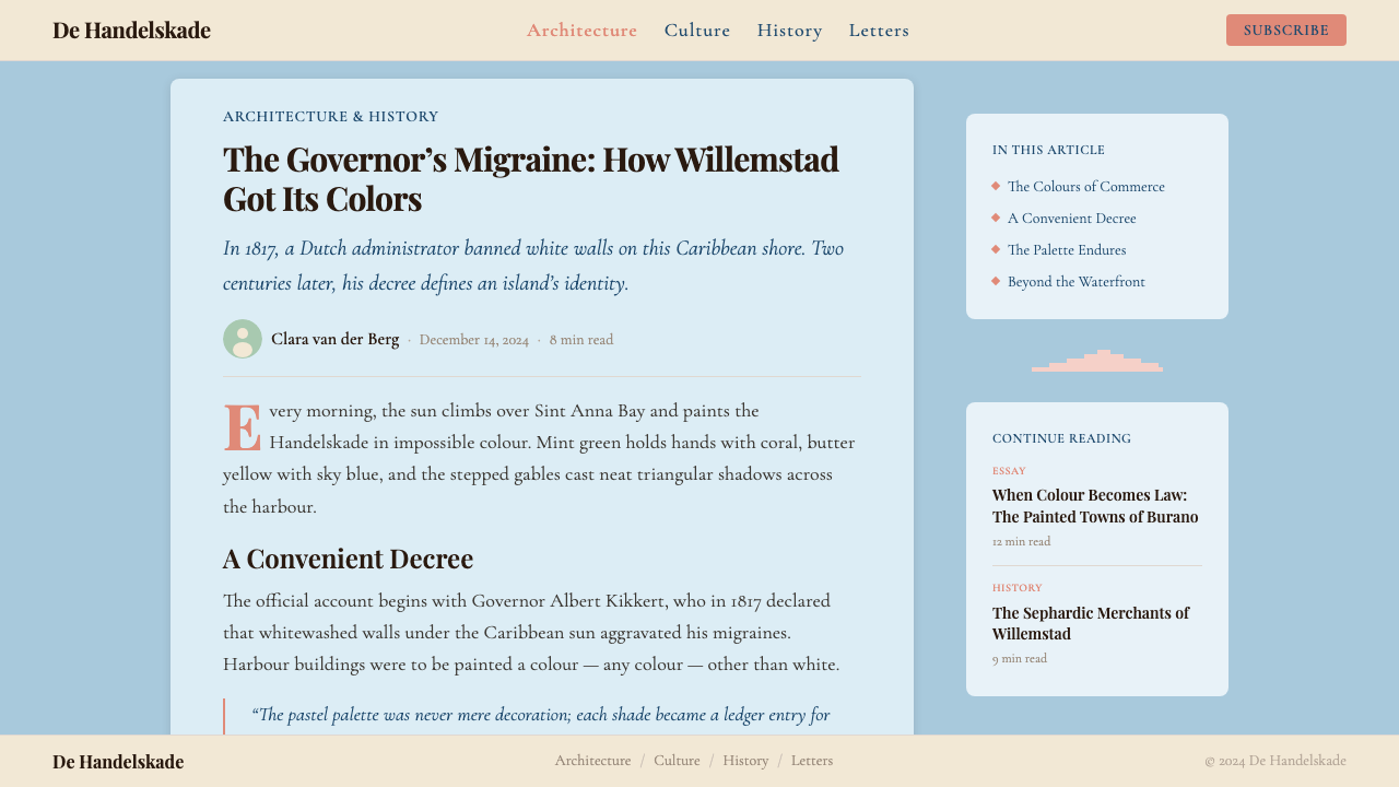
The mandatory pastel palette has an origin story that has become part of the island's mythology. Governor Albert Kikkert, who administered the island in the early nineteenth century, is said to have suffered from debilitating headaches that he attributed to the glare of the whitewashed buildings in the tropical sun. In 1817 he issued a directive requiring that buildings be painted in colours rather than white. Whether the headache story is apocryphal or not, the effect was lasting: the ordinance established a colour culture that persisted through changing political administrations, architectural fashions, and economic cycles. By the twentieth century the pastel palette of the Handelskade had become the island's defining visual identity.粉彩强制令有一段已成为岛屿神话的起源故事。据说在十九世纪初管辖该岛的总督阿尔伯特·基克特深受剧烈头痛困扰,他将病因归咎于热带阳光照射下白墙建筑的强烈反光。1817年,他颁布了一道要求建筑物涂以彩色而非白色的指令。头痛故事是否属实已难考证,但其效果却是持久的:这道法令确立了一种延续至今的色彩文化,历经政治更迭、建筑风尚演变与经济周期起伏而长存。到二十世纪,汉德尔斯卡德的粉彩调色板已成为该岛最具辨识度的视觉身份。
The architectural style itself reflects layers of cultural influence. Dutch colonial building traditions dominated the structural forms — stepped gables, symmetrical façades, and the narrow footprints dictated by the width of original land grants. But the surface treatment absorbed Sephardic Jewish merchant influence: many of the most prominent Handelskade trading houses were built and owned by Sephardic families who had settled in Curaçao after expulsion from Iberia, bringing with them a Mediterranean sensibility for warm colour and ornamental plasterwork. The resulting architecture is genuinely syncretic, neither purely Dutch nor purely Caribbean nor purely Mediterranean, but a fusion unique to this island.建筑风格本身折射出多层文化影响。荷兰殖民建筑传统主导了结构形式——阶梯山墙、对称立面,以及由原始土地分配宽度所决定的窄进深。而表面处理则吸收了塞法迪犹太商人群体的影响:许多最著名的汉德尔斯卡德商行由塞法迪家族建造并拥有——这些家族在伊比利亚半岛被驱逐后定居库拉索,带来了对温暖色彩与装饰灰泥工艺的地中海审美感性。由此产生的建筑是真正意义上的多元融合:既非纯粹荷兰式,也非纯粹加勒比式或地中海式,而是这座岛屿所独有的混血产物。
UNESCO inscribed the historic area of Willemstad, including the Handelskade, as a World Heritage Site in 1997, citing its outstanding example of Dutch colonial Caribbean architecture and its role as a cultural crossroads. The inscription triggered a wave of restoration work led by architects in the Pietermaai district and along the waterfront, which in turn introduced the Handelskade streetscape to a global audience of designers, photographers, and filmmakers. The colour-coordinated row of gabled buildings — vivid against the deep Caribbean blue of the Sint Annabaai waterway — became one of the most photographed urban streetscapes in the world and a touchstone for designers working with pastel palettes in contemporary contexts.1997年,联合国教科文组织将威廉斯塔德历史区(含汉德尔斯卡德)列入世界遗产名录,理由是其作为荷兰殖民加勒比建筑杰出范例以及文化交汇点的重要价值。列入名录触发了一波由皮特马艾区及滨水沿线建筑师主导的修缮工程,进而将汉德尔斯卡德街景推介给全球的设计师、摄影师与电影人。这排山墙建筑在圣安娜湾深蓝海水映衬下色彩鲜艳的景象,成为全球被拍摄最多的城市街景之一,也成为当代设计师在粉彩色调语境中工作时不断回溯的参照基点。
What defines the Curaçao Handelskade Pastel look?Curaçao Handelskade Pastel 的视觉特征是什么?
Pastel Palette粉彩调色板
The defining feature of the style is its chalky, slightly muted pastel range — mint, peach, coral, butter yellow, and sky blue — drawn directly from the mandatory painting ordinance of the Handelskade. These are not candy-bright pastels but sun-bleached, lime-plaster tints: colours that carry the memory of tropical heat and salt air. They are deployed in sequences rather than isolation, always in relationship with a deeper anchor hue — typically a saturated Caribbean or harbour blue — that gives the palette its depth and prevents it from floating into sweetness.这种风格最核心的特征是其粉笔质感、略带哑光的粉彩色域——薄荷绿、蜜桃色、珊瑚粉、奶油黄与天蓝色——直接取材于汉德尔斯卡德的强制涂色令。这些不是糖果般鲜艳的粉彩,而是经热带阳光褪淡、带有石灰粉墙气息的色调:携带着热带炎热与海盐气息记忆的颜色。它们以序列而非孤立的方式出现,始终与一个更深沉的锚定色调(通常是饱和的加勒比蓝或港口蓝)形成关联,赋予色板以深度,防止整体漂向过于甜腻的轻盈。
Stepped Gable Geometry阶梯山墙几何
The stepped gable — the characteristic Dutch roofline silhouette — is the style's primary structural ornament. In two-dimensional contexts, the gable form appears as a repeating motif that organizes space: card headers shaped like gabled façades, dividers that trace roofline silhouettes, navigational elements that echo the rhythmic repetition of the harbourfront row. The geometry is simultaneously historical and abstract — recognizable as a building profile but usable as a pure shape language without literal illustration.阶梯山墙——荷兰建筑标志性的屋顶轮廓——是这种风格主要的结构性装饰元素。在二维语境中,山墙形态作为组织空间的重复母题出现:形如山墙立面的卡片头部、描摹屋顶轮廓的分隔线、呼应滨水排屋节奏重复的导航元素。这种几何形态既是历史性的又是抽象的——可辨识为建筑轮廓,却也能作为纯粹的形态语言使用,无需字面意义上的具象插图。
Lime-Plaster Surface Texture石灰粉墙表面质感
The original Handelskade buildings were finished in lime plaster — a material that ages beautifully in tropical climates, developing a gently pitted, slightly granular surface as salt air and sun work on it over decades. The style captures this quality as a subtle textural layer: a faint grain or chalky dust that sits beneath the colour, giving flat fields a tactile quality without competing with the information hierarchy. Applied with restraint, it distinguishes the Handelskade aesthetic from flat digital pastels and grounds it in its physical architectural source.汉德尔斯卡德原建筑以石灰粉刷收面——这种材料在热带气候中老化得极为优雅,经过数十年海盐侵蚀与阳光炙烤,形成微微凹凸、略带颗粒感的表面。这种风格将这一品质捕捉为微妙的纹理层:一种淡淡的颗粒感或粉笔灰尘感,沉于色彩之下,赋予平面色块以触感品质,又不与信息层级争夺注意力。适度运用时,它使汉德尔斯卡德美学区别于扁平数字粉彩,将其锚定于实体建筑的物质来源之中。
Colonial Serif Typography殖民时期衬线字体排印
Where Bauhaus reaches for the geometric sans-serif as its typographic instrument, the Handelskade style turns instead to period-influenced serifs — letterforms that recall the painted signage and carved stone inscriptions of the colonial-era waterfront. These are serifs with moderate bracketing and classical proportions, neither aggressively condensed nor excessively decorative: legible, composed, and carrying a quiet sense of historical authority. They pair naturally with the architectural setting, reinforcing the visual logic that this is a system with roots in a specific time and place.包豪斯以几何无衬线体为其排印工具,而汉德尔斯卡德风格则转向受历史影响的衬线字体——这些字形令人联想到殖民时代滨水区的手绘招牌与石刻碑文。这些衬线字体具有适度的括弧曲线与古典比例,既不过分压缩也不过度装饰:清晰易读、沉稳庄重,携带着一种低调的历史权威感。它们与建筑环境自然搭配,强化了这套体系植根于特定时空的视觉逻辑。
Narrow-Façade Rhythm窄立面节奏
The Handelskade's distinctive spatial rhythm comes from the repetition of narrow building widths — each plot was historically allocated a defined frontage, producing a row where no single building dominates but the collective sequence creates a visual density. In layouts and interfaces, this principle translates to tight modular grids and column structures where elements repeat at consistent narrow intervals, creating a harbourfront-like procession of contained units. The rhythm is not rigid uniformity but controlled variation: each unit holds its place, and together they form a coherent whole.汉德尔斯卡德独特的空间节奏来自窄幅建筑宽度的重复——历史上每块地皮被分配固定的正面宽度,产生出没有单一建筑主导全局、却由整体序列共同营造出视觉密度的排列方式。在版面与界面设计中,这一原则转化为紧凑的模块网格和列结构,元素在一致的窄间距中等距重复,营造出如同沿港排屋般的连续单元行进感。这种节奏并非刚性的整齐划一,而是受控的变化:每个单元各守其位,共同构成连贯的整体。
Deep Anchor Blue深沉锚定蓝
Against the chalky lightness of the pastel range, the style anchors its compositions with a deep, saturated blue that references both the Caribbean sea and the harbour waters of Sint Annabaai. This is not a standard navy nor a digital primary blue but something closer to the colour of deep tropical water: rich, slightly warm, and carrying the visual weight that the pastels cannot provide on their own. It serves as the backdrop against which the pale tones read most vividly, and as the primary vehicle for type and structural elements when contrast and authority are required.在粉彩色域的粉笔质轻盈感之上,这种风格以深沉、饱和的蓝色锚定构图——这种蓝既指涉加勒比海,也指涉圣安娜湾的港口水域。它既非标准深蓝也非数字三原蓝,而更接近深热带水体的颜色:浓郁、略带暖意,承载着淡色调无法独立提供的视觉重量。它是淡色系在对比中最鲜活呈现的背景板,也是在需要对比度与权威感时文字和结构元素的主要承载色。
Symmetry with Chromatic Variation对称秩序与色彩变奏
The Handelskade's paradox — strict structural symmetry paired with individual chromatic freedom — is the style's most transferable compositional principle. Layouts are organized through symmetric or near-symmetric structural grids, establishing a sense of mercantile order and reliability. Within that ordered structure, colour assignments vary from unit to unit: one card reads in coral, its neighbour in mint, the next in peach. The system does not require colour uniformity; it requires structural consistency. This gives the style unusual flexibility — it can accommodate a wide range of content while maintaining visual coherence.汉德尔斯卡德的悖论——严格的结构对称与个体色彩自由的并存——是这种风格最具可移植性的构图原则。版面通过对称或近对称的结构网格组织,建立起一种商业秩序感与可靠感。在这一有序结构之内,色彩分配逐单元变化:一张卡片呈现珊瑚粉,相邻的是薄荷绿,再下一张是蜜桃色。这套体系不要求色彩统一,而要求结构一致。这赋予了这种风格非同寻常的弹性——它能容纳各类内容,同时维持视觉连贯性。

See the Curaçao Handelskade Pastel design system →查看 Curaçao Handelskade Pastel 完整设计系统 →
Who shaped Curaçao Handelskade Pastel?谁塑造了 Curaçao Handelskade Pastel?
Kikkert administered Curaçao in the early nineteenth century and is credited — whether historically verified or mythologized — with the 1817 ordinance that required Handelskade buildings to be painted in colours rather than the traditional white. Whatever the precise circumstances, the ordinance he is associated with had consequences that outlasted his administration by two centuries: it set the colour culture of Willemstad on a trajectory that would eventually define the island's visual identity for the world.基克特在十九世纪初管辖库拉索,被认为——无论历史是否确实如此抑或已成传说——颁布了1817年那道要求汉德尔斯卡德建筑涂以彩色而非传统白色的法令。无论具体情境如何,与他相关联的这道法令产生的影响超越了他的任期足足两个世纪:它将威廉斯塔德的色彩文化导向了一条最终为全世界定义这座岛屿视觉身份的轨迹。
Curaçao's Sephardic community — descendants of Jews expelled from the Iberian Peninsula in the late fifteenth century — played a central role in establishing the Handelskade as a commercial and architectural landmark. Families such as the de Leóns, the Henriquezes, and the Maderios built and occupied many of the waterfront trading houses, bringing with them a Mediterranean aesthetic sensibility for warm colour, ornamental plasterwork, and the architectural grandeur appropriate to prosperous mercantile families. Their cultural contribution is embedded in the Handelskade's appearance at a level that the colonial Dutch structural tradition alone does not explain.库拉索的塞法迪社区——十五世纪末被驱逐出伊比利亚半岛的犹太人的后裔——在将汉德尔斯卡德确立为商业与建筑地标方面发挥了核心作用。德·莱昂、恩里克斯、马德里奥斯等家族建造并居住于许多滨水商行,带来了对温暖色彩、装饰灰泥工艺以及与富裕商人家族身份相称的建筑气度的地中海审美感性。他们的文化贡献深嵌于汉德尔斯卡德的外观之中,是单凭荷兰殖民结构传统所无法解释的。
Following UNESCO World Heritage designation in 1997, a generation of architects and preservation specialists working in Willemstad's Pietermaai district led the effort to restore and stabilize the Handelskade and surrounding historic buildings. Their work involved not only structural consolidation but the careful research and reapplication of historically appropriate pastel finishes — re-establishing the colour culture of the waterfront after decades of neglect and inappropriate repainting. This restoration effort is largely responsible for the Handelskade's current photogenic clarity and for the contemporary design world's access to the style as a coherent, legible visual system.1997年联合国教科文组织世界遗产认定之后,一代在威廉斯塔德皮特马艾区工作的建筑师与保护专家主导了对汉德尔斯卡德及周边历史建筑的修缮与稳固工程。他们的工作不仅涉及结构加固,还包括对历史上适用的粉彩饰面的仔细研究与重新应用——在数十年的疏于维护与不当重新涂装之后,重建了滨水区的色彩文化。正是这项修缮工作,很大程度上造就了汉德尔斯卡德今日的上镜清晰度,以及当代设计界将这种风格作为连贯、清晰视觉体系加以接触的可能。
The VOC's Atlantic counterpart, the Dutch West India Company (WIC), established Curaçao as its Caribbean headquarters in the seventeenth century. The company's mercantile logic shaped everything about the Handelskade: the narrow building plots (each proportioned to maximize frontage on the valuable waterfront), the stepped gables (imported from Amsterdam and Rotterdam), and the commercial density that made Willemstad one of the most important trading posts in the Caribbean. The WIC's colonial infrastructure is the structural reason the Handelskade exists at all — and the reason its architecture speaks in the specific dialect of Dutch mercantile prosperity.VOC的大西洋对应物——荷兰西印度公司(WIC)——在十七世纪将库拉索确立为其加勒比总部。公司的商业逻辑塑造了汉德尔斯卡德的一切:窄幅地块(每块按最大化宝贵滨水面积的原则分配)、阶梯山墙(从阿姆斯特丹和鹿特丹移植而来),以及使威廉斯塔德成为加勒比最重要贸易站之一的商业密度。WIC的殖民基础设施是汉德尔斯卡德得以存在的结构性原因——也是其建筑以荷兰商业繁荣这一特定方言言说的原因。
While not a figure in the style's historical development, the American filmmaker Wes Anderson has become an unexpected touchstone for understanding the Handelskade aesthetic in contemporary design discourse. Anderson's characteristic use of symmetric composition, precisely coordinated pastel palettes, period architectural settings, and a tone that balances melancholy with whimsy maps almost exactly onto the visual qualities of the Handelskade waterfront. Designers and commentators frequently invoke Anderson's work when describing the style's appeal — the sense of a colour-coded world organized with slightly absurd precision — making him a useful bridge between the historical streetscape and contemporary audiences.尽管并非这种风格历史发展的参与者,美国电影导演韦斯·安德森在当代设计话语中意外地成为理解汉德尔斯卡德美学的重要参照。安德森标志性的对称构图、精确协调的粉彩调色板、历史建筑背景以及在忧郁与奇想之间取得平衡的基调,几乎完美契合汉德尔斯卡德滨水区的视觉品质。设计师和评论者在描述这种风格的魅力时常援引安德森的作品——那种以略带荒诞的精准性组织一个色彩编码世界的感觉——使他成为连接历史街景与当代受众的有效桥梁。
How do you use Curaçao Handelskade Pastel today?今天怎么用 Curaçao Handelskade Pastel?
Curaçao Handelskade Pastel is a warm, historically grounded style with strong visual identity, and its success in application depends on understanding the logic beneath the palette. The style is not simply about using pastels — it is about the specific relationship between chalky, muted tones and a deep anchor blue, organized through a rhythm of repeating narrow units and given tactile weight by lime-plaster texture. Applied without that structural understanding, the result reads as generic pastel design rather than the genuine Caribbean-Dutch synthesis the source material represents.库拉索汉德尔斯卡德粉彩是一种温暖、植根历史且具有强烈视觉个性的风格。其应用成效取决于对调色板底层逻辑的理解。这种风格并不只是关于使用粉彩色——它关乎粉笔质感的哑光色调与深沉锚定蓝之间的特定关系、通过重复窄幅单元的节奏加以组织、并由石灰粉墙纹理赋予触感重量。若缺乏这种结构性理解,结果将呈现为泛泛的粉彩设计,而非原材料所代表的加勒比-荷兰真实融合。
For presentation slides, the style works particularly well on cover pages that need warmth and distinctiveness without sacrificing clarity. A cover organized like a Handelskade façade — a row of colour-differentiated gabled panels, each containing a key point or category — immediately communicates a system with multiple distinct parts. Content slides benefit from the style's inherent modularity: a consistent narrow-column grid with chalky pastel panel backgrounds for supporting information, and a deep blue field for primary text or data. Data visualizations take on a genuine character in this system — bar charts and comparative tables can be colour-coded using the pastel range, with the anchor blue used to highlight the primary subject of attention.对于演示文稿幻灯片,这种风格在需要温暖感与辨识度、同时又不牺牲清晰度的封面页上表现尤为出色。一张按汉德尔斯卡德立面方式组织的封面——一排色彩各异的山墙面板,每块容纳一个关键要点或类别——立即传达出一个包含多个独立组成部分的系统感。内容页受益于这种风格固有的模块性:一致的窄列网格,以粉彩哑光底色面板承载辅助信息,以深蓝底色承载主要文字或数据。在这套体系中,数据可视化呈现出真实的个性——柱状图与对比表可用粉彩色域进行色彩编码,以锚定蓝突出主要关注对象。
For web interfaces and digital products, the style is best suited to platforms with a strong brand personality that want to differentiate from generic minimal or generic material design. Travel and hospitality platforms, cultural heritage applications, boutique e-commerce, and editorial destinations all offer natural fits. The implementation logic: a near-white or very pale pastel background carries most of the content; structured card components with chalky pastel fills and gable-profile headers organize collections; the deep anchor blue appears in navigation, primary calls to action, and wherever the interface needs to assert authority. Surface texture, applied very lightly to background fields, prevents the pastel palette from feeling sterile or digital.对于网页界面与数字产品,这种风格最适合具有强烈品牌个性、希望区别于泛泛极简或泛泛材料设计的平台。旅游与酒店平台、文化遗产应用、精品电商与编辑性内容平台均能自然契合。实现逻辑如下:接近白色或极淡粉彩的背景承载大部分内容;带有粉彩哑光填充与山墙轮廓头部的结构性卡片组件组织集合;深沉锚定蓝出现在导航、主要行动号召以及界面需要彰显权威的任何位置。极轻地应用于背景区域的表面纹理,可防止粉彩调色板显得过于无菌或数字化。
For editorial and marketing contexts — printed materials, social content, brand identity work — the style offers a strong and underused visual territory. Most contemporary pastel design skews either toward millennial pink softness or Scandinavian minimalism; the Handelskade palette, with its colonial Dutch structure and Caribbean warmth, occupies a different position entirely. A brand identity built on this system reads as historically informed, globally curious, and visually self-confident: appropriate for cultural organizations, design-forward hospitality businesses, heritage tourism, premium food and beverage, and publishers with a strong editorial point of view.对于编辑与营销语境——印刷品、社交内容、品牌识别设计——这种风格提供了一片强劲而尚未被充分开发的视觉领域。大多数当代粉彩设计倾向于千禧粉的柔软感或斯堪的纳维亚极简主义;汉德尔斯卡德调色板凭借其荷兰殖民结构与加勒比温度,占据了一个完全不同的位置。以这套体系构建的品牌识别读起来具有历史视野、全球好奇心与视觉自信:适合文化机构、注重设计的酒店餐饮企业、遗产旅游、高端食品饮料品牌,以及具有强烈编辑立场的出版机构。
A common mistake when working with this style is treating the pastel palette as the complete system and neglecting the deep anchor blue. Without the harbour blue, the chalky pastels lack visual weight and the compositions tend toward weakness rather than warmth. A related error is over-texturing: the lime-plaster effect should read as a whisper beneath the colour, not as a dominant surface treatment. Finally, the gable motif should be used selectively as a structural accent rather than repeated literally as decoration — when every element wears the gable silhouette, the architectural reference becomes kitsch rather than resonant.使用这种风格时最常见的错误是将粉彩调色板视为完整的体系而忽视深沉的锚定蓝。缺少港口蓝,粉笔质粉彩就失去了视觉重量,构图往往趋于虚弱而非温暖。另一个相关错误是过度纹理化:石灰粉墙效果应作为色彩之下的低语而非主导性表面处理来呈现。最后,山墙母题应有选择地作为结构性点缀使用,而非字面地作为装饰反复出现——当每个元素都披着山墙轮廓时,建筑参照就会从共鸣滑向俗气。
See the Curaçao Handelskade Pastel design system →查看 Curaçao Handelskade Pastel 完整设计系统 →
Curaçao Handelskade Pastel — FAQCuraçao Handelskade Pastel · 常见问题
Is this style appropriate for dark-mode interfaces?这种风格适合深色模式界面吗?
The Handelskade palette is fundamentally a light-ground system — the chalky pastels read best against white, cream, or very pale backgrounds, just as the original buildings read best against the bright Caribbean sky. A strict dark inversion is possible but requires significant adaptation: the pastels must be deepened and desaturated to avoid reading as garish against a dark ground, the lime-plaster texture becomes less effective and may need to be dropped entirely, and the deep harbour blue loses its anchoring function since it can no longer contrast with lighter tones. A more successful approach for dark contexts is to select one or two pastels from the range, deepen them toward jewel tones, and use the harbour blue as the near-black base rather than as an accent.汉德尔斯卡德调色板从根本上是一套浅色底面体系——粉笔质粉彩在白色、奶油色或极淡底色上呈现最佳,正如原建筑在明亮加勒比天空映衬下最为好看。严格的深色反转是可行的,但需要大幅调整:粉彩必须加深并降低饱和度,以避免在深色底面上显得俗艳;石灰粉墙纹理效果会降低,可能需要完全舍弃;深沉港口蓝也会失去其锚定功能,因为它不再能与更浅的色调形成对比。在深色语境下更有效的做法是:从色域中选取一两种粉彩色,将其加深至宝石调,并将港口蓝作为近黑底色而非强调色来使用。
How does this style differ from other Caribbean or tropical design aesthetics?这种风格与其他加勒比或热带设计美学有何区别?
Most tropical design aesthetics rely on high-saturation brights — vivid teals, intense yellows, strong magentas — alongside organic motifs like foliage, florals, and hand-drawn illustration. The Handelskade style is distinctly different: its pastels are muted rather than bright, its geometry is architectural and rectilinear rather than organic, and its cultural reference is Dutch colonial mercantile rather than indigenous or Creole. The result is tropical in climate but European in structure — warm in palette but ordered in composition. This makes it particularly useful for contexts that want warmth and exoticism without the visual noise of conventional tropical design.大多数热带设计美学依赖高饱和的鲜亮色彩——鲜艳的蓝绿色、强烈的黄色、浓郁的品红——以及植被、花卉与手绘插图等有机母题。汉德尔斯卡德风格截然不同:其粉彩是哑光而非鲜亮的,其几何形态是建筑式、直角化的而非有机的,其文化参照是荷兰殖民商业传统而非本土或克里奥尔文化。结果是:气候上是热带的,结构上却是欧洲式的——色板温暖,构图有序。这使它在需要温度与异域感、同时又不希望陷入常规热带设计视觉噪音的语境中格外有用。
Can the gable motif be used without literal architectural illustration?山墙母题可以在没有字面建筑插图的情况下使用吗?
Yes, and this is often the more sophisticated approach. The stepped gable silhouette is a purely geometric form — a series of horizontal steps ascending to a peak — that can be abstracted into dividers, card headers, icon backgrounds, and decorative rules without reading as literal building illustration. Used this way, it functions like the Bauhaus triangle or the Art Deco chevron: a culturally resonant geometric form that carries the style's identity without demanding pictorial interpretation. The key is consistency of angle and step proportion so that the abstracted form retains its architectural DNA across different applications and scales.可以,而且这通常是更为老练的处理方式。阶梯山墙轮廓是一种纯粹的几何形——一系列向峰顶攀升的水平台阶——可以抽象为分隔线、卡片头部、图标背景和装饰性规则线,而不必被解读为字面上的建筑插图。如此使用,它的功能类似于包豪斯三角形或装饰艺术雪佛纹:一种携带着文化共鸣的几何形态,无需图像性诠释便能传达风格身份。关键在于角度与台阶比例的一致性,使抽象化的形态在不同应用与尺度中保留其建筑基因。
How many colours from the pastel range should be used simultaneously?粉彩色域中应同时使用多少种颜色?
The Handelskade source uses the full pastel range simultaneously — this is essential to the style's character, since a single pastel without its neighbours reads simply as a quiet colour rather than as part of a coordinated ensemble. The visual logic works because each hue is similarly muted and chalky, giving the range internal coherence even when five or six tones appear together. In practice, two to four pastels alongside the anchor blue constitutes a workable palette for most applications; the full range of five or six is appropriate for gallery-like or collection contexts where the variety itself is the point. The critical rule is that the pastels must be consistent in character — all chalky and muted, none candy-bright — or the ensemble falls apart.汉德尔斯卡德原型同时使用了完整的粉彩色域——这对于风格气质至关重要,因为单一粉彩缺少邻色的衬托,只会被读为一种安静的颜色,而非协调整体的组成部分。视觉逻辑得以成立,是因为每种色调在哑光与粉笔质感上保持一致,即便五六种色调同时出现,色域仍具内部连贯性。实际操作中,两到四种粉彩搭配锚定蓝构成大多数应用场景的可行调色板;完整的五六种色调则适合用于展廊式或集合式语境——在那些场景中,多样性本身即是重点。关键规则是:所有粉彩在气质上必须保持一致——全部哑光、全部粉笔感,绝无糖果般的鲜艳——否则整体效果将会瓦解。
Is the style suited to serious or functional contexts, or is it primarily decorative?这种风格适合严肃或功能性的语境,还是主要用于装饰性场合?
The style is more functional than it appears. The Handelskade's colour-coordination originated as a regulatory system — each building is individually coloured but the range is controlled, producing order from variety. This makes it a genuinely useful model for information design contexts where multiple categories or entities need to be visually distinguished while maintaining overall coherence: product catalogues, multi-stream data presentations, portfolio or collection platforms, and multi-brand environments. The architectural order beneath the cheerful palette — the strict narrow-façade rhythm, the consistent gable geometry, the regulated colour range — is what separates the style from casual pastels and gives it the structural backbone to carry serious content.这种风格比外表看起来更具功能性。汉德尔斯卡德的色彩协调本质上起源于一套监管制度——每栋建筑单独涂色,但色域受到管控,从多样性中产生秩序。这使它成为信息设计语境的真正有效参照:当多个类别或实体需要在视觉上彼此区分、同时维持整体连贯性时——产品目录、多流数据呈现、作品集或藏品平台、多品牌环境——均可从这套逻辑中受益。欢快调色板之下的建筑秩序——严格的窄立面节奏、一致的山墙几何、受管控的色域——正是将这种风格从随意粉彩中区分出来的要素,也是赋予它承载严肃内容所需结构骨架的根本所在。
Related design styles相关设计风格
 Renoir ImpressionismWarmth refuses haste. Rose shadows and Cormorant curves drift across cream.温暖拒绝匆忙:玫瑰阴影与衬线曲线漂浮在奶油底上。
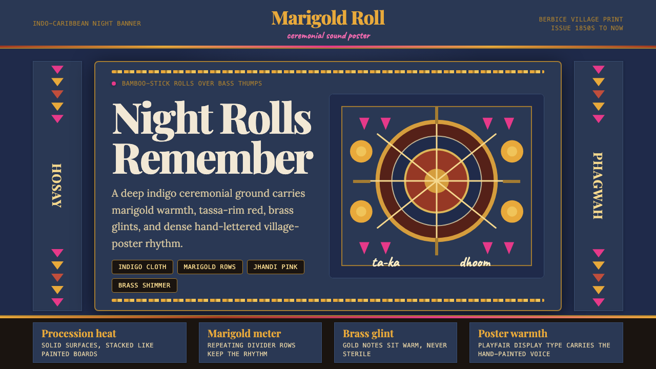 Guyanese Tassa DrumCeremony carries the beat. Indigo banners, Playfair type, and marigold rows g…仪式感击出鼓点:靛蓝旗面、Playfair 标题与万寿菊分隔线发光。
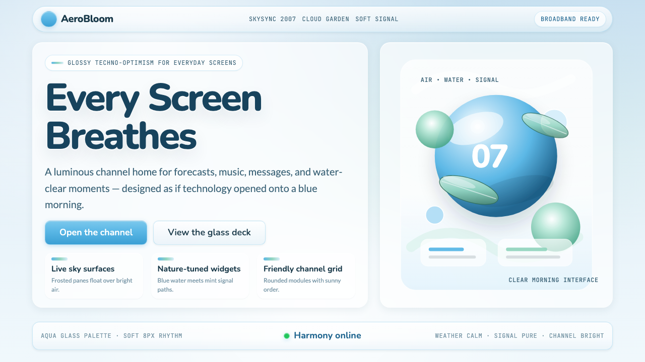 Frutiger Aero 2007Glossy techno-optimism. Translucent glass, photoreal skies, blue-greens — tec…千禧年代的光泽科技乐观主义:半透明玻璃、逼真蓝天、蓝绿色调——相信科技与自然可…
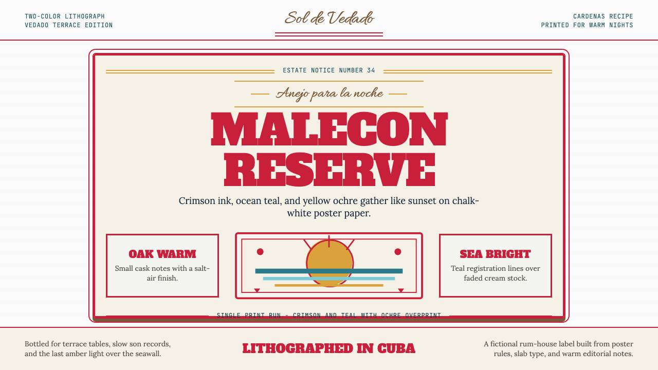 Havana Club Cuban RumSunset in print. Crimson slab type and ocean teal rules age on chalk-white pa…印刷里的日落。深红粗衬线与海洋青绿线框落在白垩纸上。
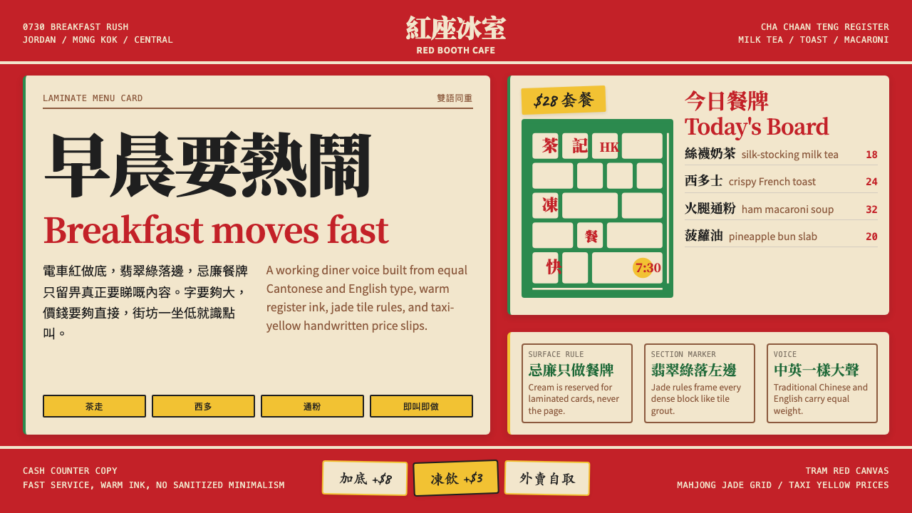 Hong Kong Cha Chaan TengDemocratic diner warmth. Tram red, jade rules, cream menu cards, equal Canton…街坊飯堂的熱度:電車紅、翡翠綠線、忌廉餐牌,中英並重。
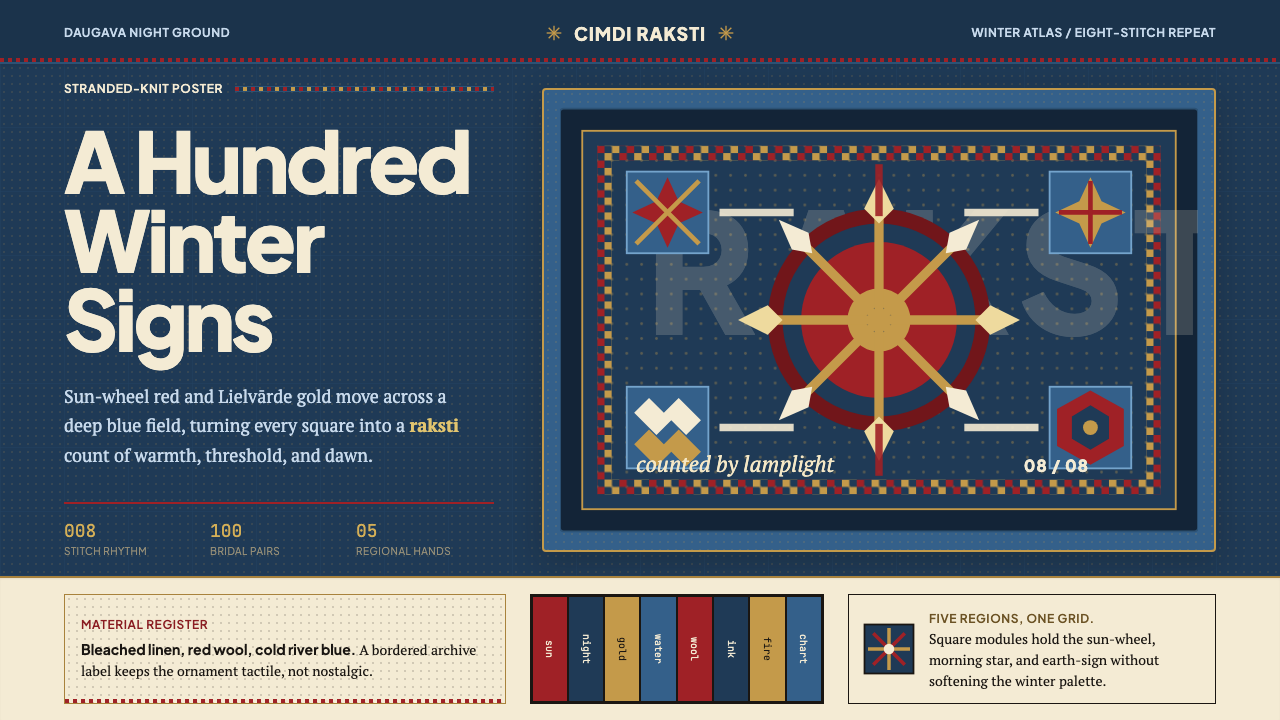 Latvian Knitted MittensWinter craft glows. Sun-wheel red and Lielvarde gold lock into an 8-stitch bl…冬夜手作发光。太阳红与利耶尔瓦尔德金锁进八针蓝格。