What is Renoir Impressionism?什么是 Renoir Impressionism?
Renoir turned the Parisian Sunday afternoon into a visual language — rose shadows, cream highlights, and brushwork soft as petals wherever the light landed on skin.雷诺阿把巴黎的周日午后变成了一套视觉语言——玫瑰阴影、奶油高光,凡阳光落在皮肤上的地方,笔触便柔软如花瓣。
Renoir Impressionism in briefRenoir Impressionism 速览
Renoir Impressionism names the warm, sociable branch of French Impressionism associated above all with Pierre-Auguste Renoir during the 1870s and 1880s. Where Monet's eye followed water and atmosphere and Degas mapped the indoor world of dancers and café-goers, Renoir anchored his gaze on the outdoor figure in light — the cheek catching afternoon sun, the hand holding a glass, the crowd at a garden dance losing itself in dappled shade. His two most studied works, Bal du moulin de la Galette (1876) and Luncheon of the Boating Party (1880–81), are less paintings of events than paintings of a feeling: the relaxed, slightly unfocused warmth of being among people on a good afternoon.雷诺阿印象主义,指的是法国印象派中以皮埃尔-奥古斯特·雷诺阿为核心、在1870至1880年代形成的温暖而好交际的分支。莫奈的目光追逐水与光的氛围,德加精确描绘舞者与咖啡馆的室内世界,而雷诺阿则将视线锚定在阳光下的户外人物——接住午后阳光的脸颊、握着酒杯的手、在花园舞会上沉浸于斑驳阴影里的人群。他被研究最多的两件作品——《煎饼磨坊的舞会》(1876)和《船上的午宴》(1880—81)——与其说是关于事件的画,不如说是关于一种感受的画:在某个美好午后置身人群之中那种松弛、略带散漫的温暖。
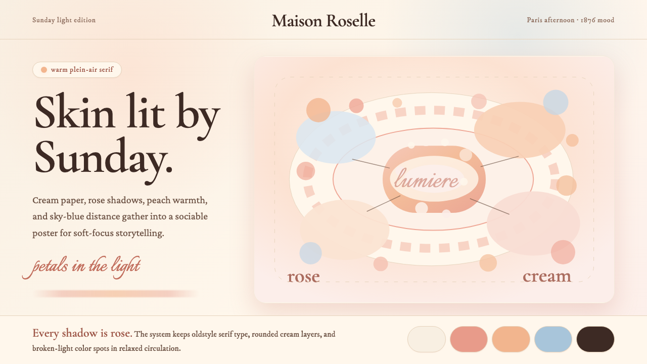
As a design system, Renoir Impressionism borrows this chromatic and textural sensibility. The palette is built from warm creams and off-whites as grounds, layered with blush pinks, peachy corals, and dusty roses — the full register of the warm skin and petal tones Renoir mixed directly from the tube. Shadows are never cool or grey; they tip into rose or lavender. Highlights are not pure white but warm cream. Typography in this register favors the curved, humanist serif letterforms that were standard in French printing of the 1880s — forms with optical warmth, bracketed serifs, and slightly irregular stroke contrast that recall handcraft rather than machine precision. The overall effect is unhurried, inviting, and luminous without being garish.作为设计系统,雷诺阿印象主义借鉴的正是这套色彩与肌理的感受力。色板以温暖的奶油色和米白色为底,叠加腮红粉、桃色珊瑚和尘玫瑰——雷诺阿直接从管中混出的全套暖肤色与花瓣色调。阴影从不走向清冷或灰色,而是偏向玫瑰或薰衣草。高光不是纯白,而是温暖的奶油色。这一风格中的字体偏爱1880年代法国印刷业通行的曲线感人文衬线字形——那种带有视觉温度、具括弧衬线、笔画粗细对比略显不规则、令人联想到手工而非机器精度的字形。整体效果从容、宜人,明亮而不刺眼。
The style is distinct from both the tighter linearity of Ingres-influenced academic painting and the colder atmospheric dissolve of Monet's series works. It occupies a middle position: recognizably representational, emotionally warm, technically dazzling in its handling of broken color, yet always organized around a social center of gravity. In design application, this translates to compositions that feel inhabited — never stark, never clinical — with a persistent undercurrent of pleasure.这种风格有别于安格尔影响下学院派绘画更紧绷的线性,也有别于莫奈系列作品更冷峻的大气溶解感。它占据一个中间位置:辨识度清晰的再现性、情感上的温暖、破色技法的技术光芒,却始终围绕一个社交重心加以组织。在设计应用中,这转化为一种感觉被「住」过的构图——从不生硬,从不临床——带着一股持续的愉悦底色。
See the Renoir Impressionism design system查看 Renoir Impressionism 完整设计系统
Where does Renoir Impressionism come from?Renoir Impressionism 从何而来?
Pierre-Auguste Renoir was born in Limoges in 1841 and trained as a porcelain painter before entering the École des Beaux-Arts in Paris in 1862. His early formation was technical in the old sense: he learned to mix colors for ceramic glazes, to handle fine brushes with precision, and to work with materials whose optical warmth was built into their chemistry. These habits of hand never left him. When he turned to canvas, he brought the porcelain painter's instinct for luminous surface — a preference for warm grounds, translucent layering, and colors that seem to glow from within rather than sit opaquely on top.皮埃尔-奥古斯特·雷诺阿1841年生于利摩日,在进入巴黎国立美术学院(1862年)之前曾接受瓷器彩绘师训练。他早年的技术养成是旧式的:学习为瓷器釉料调色、用细笔精准运笔,以及处理那些光学温度内置于化学成分之中的材料。这些手的习惯从未离开他。当他转向画布时,他带来了瓷器画家对发光表面的本能——偏爱暖底色、半透明叠色,以及那些看起来从内部发光而非不透明地覆盖其上的色彩。
The Impressionist movement in Paris coalesced around a shared rejection of the French Salon's academic conventions. Renoir, Monet, Degas, Alfred Sisley, and Berthe Morisot formed the nucleus of a group that, beginning with their first independent exhibition in 1874, presented work painted in front of actual subjects rather than composed in the studio from preparatory drawings. The name 'Impressionist' was initially a critic's insult — derived from Monet's Impression, Sunrise (1872) — that the group eventually adopted with ironic pride. The critical reception was hostile for years: the 1874 exhibition was widely mocked, and sales were negligible. It was the dealer Paul Durand-Ruel, who had begun buying Impressionist canvases as early as 1871, who sustained the movement financially through its most uncertain years.巴黎的印象派运动凝聚于对法国沙龙学院派惯例的共同拒绝。雷诺阿、莫奈、德加、阿尔弗雷德·西斯莱和贝尔特·莫里索构成了这个群体的核心,他们从1874年第一次独立展览开始,展示的是面对真实对象写生而非在画室内依据草稿构图的作品。「印象主义」这个名称最初是批评家的嘲讽——源自莫奈的《印象·日出》(1872)——这个群体最终以带着反讽意味的自豪接受了它。批评界的接受充满敌意,长达数年:1874年的展览遭到广泛嘲弄,销售可以忽略不计。是商人保罗·杜朗-吕埃尔——他早在1871年就开始购买印象派画作——在运动最不确定的岁月里为它提供了财务支撑。
Renoir's distinctive warmth within the Impressionist group crystallized during the mid-1870s in Montmartre, the hilly neighborhood on Paris's northern edge that mixed working-class Parisians, artists, and the bourgeoisie seeking weekend pleasure. The Moulin de la Galette — an outdoor dance garden that occupied the grounds of a former windmill — was one of the neighborhood's social centers. Renoir set up to paint there on Sundays, working from life in the shifting outdoor light, completing Bal du moulin de la Galette in 1876. The painting is technically extraordinary: dappled blue-grey shadows fall across white shirts and pink cheeks with a flickering, unstable quality that academic techniques could not produce. It was acquired by the collector Gustave Caillebotte and is now in the Musée d'Orsay, Paris.雷诺阿在印象派群体中独特的暖意,在1870年代中期的蒙马特区逐渐凝结成形。蒙马特是巴黎北边的丘陵街区,工人阶级巴黎人、艺术家和寻求周末消遣的资产阶级在此交混。煎饼磨坊——建在旧风车基地上的一座户外舞蹈花园——是街区的社交中心之一。雷诺阿在那里的每个周日支起画架,在变幻的户外光线中对景写生,于1876年完成了《煎饼磨坊的舞会》。这幅画在技术上极为出色:闪烁不定的蓝灰色斑驳阴影落在白衬衫和粉脸颊上,那种颤动而不稳定的品质是学院派技法无法产生的。画作由收藏家居斯塔夫·卡耶博特购得,现藏于巴黎奥赛博物馆。
By the 1880s, Renoir had begun to question the looser edges of high Impressionism, undertaking a 'dry' or 'Ingresque' period in which he tightened contours and experimented with more classical figure construction. Luncheon of the Boating Party (1880–81), painted at a restaurant terrace at Bougival on the Seine, represents a moment of balance between the dissolving light of his 1870s work and this more structured attention. The figures — friends, models, and the woman who would become his wife, Aline Charigot — retain the warm flesh tones and sociable ease of his mature Impressionist style while being more fully resolved as individual presences. Renoir moved eventually to Cagnes-sur-Mer in the south of France, where he painted until his death in 1919, his hand increasingly affected by rheumatoid arthritis — in later years he painted with the brush attached to his wrist.1880年代,雷诺阿开始质疑高峰印象主义较为松散的边缘,进入一段「干式」或「安格尔式」时期——他收紧了轮廓,尝试更古典的人物构造。《船上的午宴》(1880—81)在塞纳河畔布吉瓦尔的餐厅露台写生完成,代表了他1870年代消溶光线与这种更结构化的关注之间的平衡时刻。画中人物——朋友、模特,以及后来成为他妻子的阿莉娜·夏里戈——保留了他成熟印象主义风格的暖色肤调与好交际的从容,同时作为个体存在更为完整地呈现。雷诺阿最终移居法国南部的卡涅-絮尔-梅尔,在那里一直作画直至1919年辞世。晚年,风湿性关节炎愈发影响他的双手——在最后的岁月里,他将画笔绑在手腕上作画。
What defines the Renoir Impressionism look?Renoir Impressionism 的视觉特征是什么?
Warm Ground and Palette暖底与色板
The entire system rests on a warm off-white or cream ground — not the cool stark white of clinical modernism, but the slightly yellowed surface of aged paper or ivory. Against this ground, the active palette layers blush pinks, peachy corals, dusty roses, and soft terracottas. These are the tones Renoir identified in skin, petals, and afternoon light, and they share a family warmth regardless of value or saturation. There are no cool neutrals; even passages that read as grey or beige are actually warm-shifted.整套系统建立在温暖的米白色或奶油色底面上——不是临床现代主义的冷峻纯白,而是旧纸或象牙那种略带黄意的表面。在这底色之上,主动色板叠加了腮红粉、桃色珊瑚、尘玫瑰和柔赭色。这些是雷诺阿在皮肤、花瓣与午后光线中辨认出来的色调,无论明度还是饱和度如何,它们共享着同一种家族暖意。没有冷性中性色;即便是那些读起来像灰色或米色的部分,实际上也是向暖色偏移的。
Rose and Lavender Shadows玫瑰与薰衣草阴影
The defining color innovation of Renoir's outdoor painting is his treatment of shadows. Academic painters used brown or black to darken; the Impressionists understood that shadows in nature are not the absence of light but the presence of reflected sky and ambient color. Renoir's shadows are rose, lavender, or warm violet — chromatically rich rather than tonally inert. In design application, this means shadow states, hover conditions, and secondary surfaces should be tinted with a warm rose or soft violet rather than grey or black, preserving the luminous quality that makes the palette feel inhabited.雷诺阿户外绘画最具定义性的色彩创新,是他对阴影的处理。学院派画家用棕色或黑色来压暗;印象派人士则理解,自然界中的阴影不是光的缺席,而是天空反光与环境色的存在。雷诺阿的阴影是玫瑰色、薰衣草色或暖紫色——色彩上丰富,而非色调上惰性。在设计应用中,这意味着阴影状态、悬停条件和次级表面应当用暖玫瑰或柔紫色调着色,而非灰色或黑色,以保留让色板感觉被「住」过的发光品质。
Soft and Feathered Brushwork柔软而羽化的笔触
Renoir's characteristic mark in paint is a short, feathered stroke that blurs into its neighbor at the edges — not the disciplined comma-stroke of some Impressionists but something closer to a gentle press and lift. Translated into design, this quality appears as soft-edged elements: blurred glows rather than hard shadows, gradients that dissolve at their periphery rather than cutting to a clean edge, photography treated with a slight luminous haze. The effect suggests atmosphere rather than precision. Edges are present but never harsh.雷诺阿在画面中标志性的笔迹,是一种短促的羽化笔触,在边缘处模糊融入邻近色——不是某些印象派画家那种规整的逗号形笔触,而是更接近一种轻柔的按压与提起。转化为设计语言,这种品质体现为边缘柔和的元素:模糊的光晕而非硬边阴影,在边缘渐隐溶解而非切至干净边界的渐变,以及带有轻微发光雾气感的摄影处理。效果传递的是氛围而非精确。边缘存在,但从不生硬。
Humanist Serif Typography人文主义衬线字体
The typographic correlate of Renoir Impressionism is the humanist serif — letterforms whose proportions and stroke contrast derive from calligraphic handwriting rather than geometric construction. These forms, dominant in French book printing during the 1870s and 1880s, have slightly bracketed serifs, moderate stroke variation, and a visual warmth that optical geometrical typefaces lack. They sit naturally in cream-ground compositions and read as cultured rather than authoritative. Headline type can carry more weight and scale, but it should remain within the serif humanist family — weight and size are the hierarchy tools, not categorical shifts in style.雷诺阿印象主义的字体对应物是人文主义衬线字体——比例与笔画对比源于书法手写而非几何构造的字形。这些字形在1870至1880年代的法国书籍印刷中占主导,具有略微带括弧的衬线、适度的粗细变化,以及几何光学字体所缺乏的视觉温度。它们自然地融入奶油底色的构图,读起来是有教养的,而非权威性的。标题字体可以承担更多字重与字号,但应保持在衬线人文主义字体家族内——字重与尺寸是层级工具,而非风格上的类别转换。
Dappled Light and Texture斑驳光影与肌理
Renoir was preoccupied with dappled light — sunlight filtered through leaves, broken by movement, arriving on surfaces in shifting patches rather than uniform washes. This quality of interrupted, variegated illumination gives his canvases their sense of aliveness. In design, its equivalent is subtle surface texture and layered tonal variation: backgrounds that are not flat fills but carry a slight linen or paper grain, image treatments that introduce warm luminous patches, layout zones that differentiate through overlapping tints rather than hard boundary lines.雷诺阿痴迷于斑驳的光——穿过叶隙过滤下来、被运动打碎、以游移的光斑而非均匀平涂落在表面上的阳光。这种被打断、斑驳的光照品质,赋予他的画布以生动感。在设计中,其对应物是细腻的表面肌理与分层的色调变化:背景不是平坦填充而带有轻微的亚麻或纸张纹理,图像处理引入温暖发光的光斑,版面区域通过叠加色调而非硬性边界线来区分。
Sociable Composition好交际的构图
Unlike the rigorous geometric or grid logic of movements such as Bauhaus, Renoir's compositional structure is organized around social gravity — clusters of figures and objects that suggest conversation, proximity, and ease. There is always a sense that the elements in a painting are comfortable near one another. In design application, this translates to layouts that avoid severe isolation of components. Elements relate to each other through spatial proximity and tonal family rather than through hard alignment to a strict grid. Whitespace is generous but soft-edged, not the emphatic negative space of austere modernism.与包豪斯等运动严格的几何或网格逻辑不同,雷诺阿的构图结构围绕社交重力来组织——人物与物件的簇群暗示着对话、亲近与从容。画面中的元素总有一种彼此相处舒适的感觉。在设计应用中,这转化为避免组件严酷孤立的版面。各元素通过空间亲近性与色调家族彼此关联,而非通过对严格网格的硬性对齐。留白慷慨但边缘柔和,不是朴素现代主义那种强调性的负空间。
Luminosity Over Contrast发光感优先于对比度
Where many design systems use high contrast — sharp value differences between foreground and background — to create hierarchy and readability, Renoir Impressionism achieves these goals through luminosity. The light in Renoir's paintings is diffuse and even; nothing is so bright it dominates harshly, nothing is so dark it becomes an anchor. In design terms, this means avoiding deeply saturated darks as primary backgrounds and instead building hierarchy through tonal temperature shifts, scale differences, and the strategic placement of the palette's warmest and most saturated tones as focal signals.许多设计系统通过高对比度——前景与背景之间清晰的明度差——来建立层级与可读性,而雷诺阿印象主义则通过发光感来实现这些目标。雷诺阿画作中的光是漫射而均匀的;没有什么亮得咄咄逼人,也没有什么暗得如锚沉底。在设计语言中,这意味着避免将深度饱和的暗色作为主要背景,而是通过色调温度的移变、尺度差异,以及将色板中最温暖、最饱和的色调战略性地放置为焦点信号来构建层级。
See the Renoir Impressionism design system查看 Renoir Impressionism 完整设计系统
Who shaped Renoir Impressionism?谁塑造了 Renoir Impressionism?
Renoir (1841–1919) remains the defining figure of warm-toned Impressionism. His career spans the movement's formation in the 1870s, its commercial breakthrough in the 1880s via Durand-Ruel's New York and London exhibitions, and a late phase at Cagnes-sur-Mer where he continued to paint large figurative compositions despite severe arthritis. His contribution to design thinking is less stylistic than sensory: he demonstrated that light falling on the human figure could be the entire subject of an image, and that warmth and pleasure were as legitimate aesthetic values as rigor and precision.雷诺阿(1841—1919)至今仍是暖色调印象主义的标志性人物。他的职业生涯横跨运动在1870年代的形成期、1880年代经由杜朗-吕埃尔纽约与伦敦展览实现的商业突破,以及晚年在卡涅-絮尔-梅尔的阶段——在那里,他尽管罹患严重关节炎,仍持续创作大幅人物构图。他对设计思维的贡献与其说是风格性的,不如说是感官性的:他证明了落在人体上的光可以成为一幅图像的全部主题,而温暖与愉悦作为美学价值,与严谨和精确一样正当。
Monet (1840–1926) was Renoir's closest friend and artistic ally during the formative years of Impressionism. The two painters worked alongside each other at La Grenouillère on the Seine in 1869, producing nearly simultaneous paintings of the same subject from adjacent positions — a unique document of how two very different sensibilities operated within the same visual problem. Monet's cooler, more atmospheric approach to broken color provides the essential contrast that defines Renoir's warmth by opposition. Understanding Monet is necessary for understanding what Renoir chose not to do.莫奈(1840—1926)是雷诺阿在印象主义形成期最亲密的朋友与艺术盟友。两位画家于1869年在塞纳河畔的格勒努耶尔并肩创作,以相邻的位置对同一主题几乎同时作画——这是两种截然不同的感受力处理同一视觉问题的独特文献。莫奈更冷静、更具大气感的破色方式,提供了通过对照来定义雷诺阿温暖感的本质对比。理解莫奈,是理解雷诺阿选择不做什么的必要前提。
Durand-Ruel (1831–1922) was the dealer who transformed Impressionism from a scandal into a market. He began purchasing Renoir, Monet, Degas, and Sisley in the early 1870s, sustaining the group through years of critical rejection by advancing money against future sales. His 1886 exhibition in New York — mounted over the opposition of the American art establishment — was the decisive commercial breakthrough: American collectors responded enthusiastically where French bourgeois taste had been slow to follow. Durand-Ruel's role demonstrates that aesthetic movements require institutional infrastructure to survive.杜朗-吕埃尔(1831—1922)是将印象主义从丑闻转化为市场的商人。他从1870年代初开始购买雷诺阿、莫奈、德加和西斯莱的作品,在批评界拒绝他们的那些岁月里,以预支款项对抗未来销售的方式支撑着整个群体。他1886年在纽约举办的展览——顶着美国艺术建制的反对——是决定性的商业突破:美国收藏家热情响应,而法国资产阶级口味此前行动迟缓。杜朗-吕埃尔的角色证明,美学运动需要机构基础设施才能存活。
Degas (1834–1917) exhibited with the Impressionists but never fully embraced plein-air painting. His indoor figures — ballet dancers, café women, bathers — were observed with a precision and psychological detachment that contrasts sharply with Renoir's warmth. Yet the two painters were part of the same social milieu and attended the same Thursday dinners at the Café Riche. Comparing their treatments of the same subjects — women, crowds, leisure — illuminates how Renoir's chromatic warmth was a deliberate affective choice, not merely a technical habit.德加(1834—1917)与印象派人士同台展览,却从未完全拥抱户外写生绘画。他的室内人物——芭蕾舞者、咖啡馆女性、沐浴者——以一种精确而心理上超然的观察方式呈现,与雷诺阿的温暖形成鲜明对照。然而两位画家同处一个社交圈,同赴咖啡馆的周四晚宴。比较他们对同一主题——女性、人群、休闲——的处理,揭示了雷诺阿的色彩温度是一种刻意的情感选择,而非单纯的技术习惯。
Aline Charigot (1859–1915), who became Renoir's wife in 1890, appears in numerous canvases from the early 1880s including Luncheon of the Boating Party, where she holds a small dog at the table's edge. Her recurring presence in his work makes her an unlikely collaborator in the Renoir visual system: she embodied the type of natural ease and unaffected warmth that Renoir sought in all his models. Her background — she came from a modest Burgundian family and was working as a seamstress when they met — was consistent with Renoir's democratic view of beauty as something found in ordinary life rather than constructed from idealized types.阿莉娜·夏里戈(1859—1915)于1890年成为雷诺阿的妻子,她出现在1880年代初的大量画作中,包括《船上的午宴》——她在画面边角抱着一条小狗。她在他作品中的反复出现,使她成为雷诺阿视觉系统中一个意想不到的共同创造者:她体现了雷诺阿在所有模特身上寻找的那种自然的从容与不矫饰的温暖。她的出身——来自勃艮第一个质朴家庭,相识时正以缝纫为业——与雷诺阿关于美的民主观一致:美是在日常生活中发现的,而非从理想化类型中构建的。
How do you use Renoir Impressionism today?今天怎么用 Renoir Impressionism?
Renoir Impressionism translates into contemporary design most naturally in contexts where warmth, approachability, and sensory pleasure are primary values. The system does not impose geometric rigor or structural severity; it succeeds through tonal harmony, soft light, and the persistent suggestion of human presence. Applying it requires leaning into these qualities rather than trying to systematize them the way a grid-based or typographic style would be systematized.雷诺阿印象主义在当代设计中,最自然地转化为温暖感、亲近感和感官愉悦是首要价值观的场景。这套系统不施加几何严格性或结构上的严酷;它通过色调和谐、柔和光线与持续的人类存在感取得成功。应用它,需要向这些品质倾靠,而非试图像网格化或字体化风格那样将其系统化。
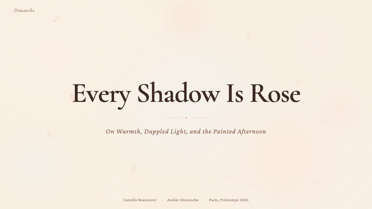
For presentation slides, the style works best on covers and transitional pages where a single strong impression is needed. A cover built in this register might place a full-bleed warm cream field behind a large humanist serif title, with a blush or coral accent element — a rule, a framing shape, an image vignette — positioned asymmetrically to create gentle visual tension. Avoid exact geometric alignment; elements should feel placed by eye rather than snapped to a grid. Content slides benefit from generous whitespace, a consistent warm neutral ground, and the use of the palette's rose and terracotta tones to highlight key data points or call-out quotes. Data visualizations — charts, timelines, comparison tables — should replace hard-edge outlines with soft fills and warm tints, so that even analytical content retains the palette's luminous character.在演示文稿中,这种风格最适合用于封面和过渡页——需要传递单一强烈印象的地方。以这种风格构建的封面,可以在全幅温暖奶油色底场后,放置一个大型人文主义衬线字体标题,配以腮红或珊瑚色的强调元素——分割线、框架形状、图像渐晕——以不对称的方式放置,制造温柔的视觉张力。避免精确的几何对齐;元素应感觉是用眼睛放置的,而非吸附到网格上的。内容页受益于慷慨的留白、一致的暖中性底色,以及用色板中的玫瑰色和赭色来突出关键数据点或引用语。数据可视化——图表、时间轴、对比表——应以柔和填充和暖色调替换硬边轮廓,使即便是分析性内容也保留色板的发光特质。
For web interfaces, the style suits editorial platforms, lifestyle brands, cultural institutions, and premium consumer products where the emotional register is more important than efficiency signaling. A homepage built in this register uses a warm off-white body, humanist serif headlines, and photography treated to emphasize warm skin tones and natural light. Interactive states — hover, active, focus — shift through tonal temperature rather than contrast flips: a button that shifts from cream to blush on hover, a card that develops a warm rose shadow on focus. Navigation should be typographic and light-handed; heavy dark headers break the palette's luminous quality. For pricing or feature comparison pages, the warm palette works well when tiers are differentiated by tonal warmth — the premium tier glowing slightly warmer — rather than by hard color coding.对于网页界面,这种风格适合编辑平台、生活方式品牌、文化机构和高端消费产品——情感基调比效率信号更重要的场景。以这种风格构建的主页,使用温暖米白色正文区域、人文主义衬线标题,以及处理得强调暖肤调和自然光的摄影。交互状态——悬停、激活、聚焦——通过色调温度移变而非对比度翻转来切换:一个按钮悬停时从奶油色移向腮红色,一张卡片聚焦时生出温暖的玫瑰色阴影。导航应当是字体性的、轻盈的;沉重的深色头部破坏色板的发光品质。对于定价或功能对比页面,暖色板在等级通过色调温度差异而非硬性色彩编码来区分时效果最佳——高级方案略微温暖地发光。
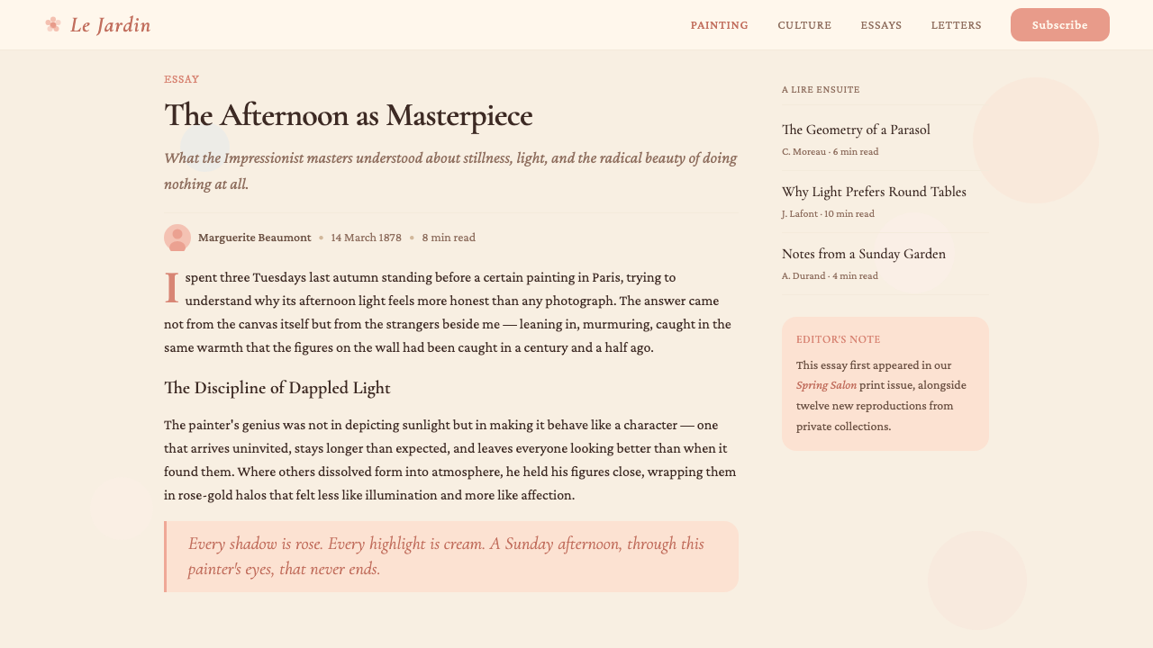
For editorial and marketing work, Renoir Impressionism supports magazine layouts, exhibition catalogues, seasonal brand campaigns, and any communication where the audience is being invited into an experience rather than confronted with information. Article layouts use a warm body, generous margins for pull quotes, and soft image placements that bleed into the ground rather than sitting within hard frames. Photography should be selected and treated to emphasize the palette: images shot in warm afternoon light, close-up textures of fabric or botanicals, portraits that favor natural expression over studio formality. Marketing materials for food, hospitality, wellness, fashion, and cultural events translate particularly well, since the style's emotional temperature aligns with these sectors' core values.对于编辑与营销内容,雷诺阿印象主义支持杂志版面、展览图录、季节品牌推广,以及任何邀请受众进入一种体验而非以信息正面迎击他们的传播。文章版面使用温暖正文底色、为引用语留出慷慨的页边,图片放置柔和渗入底色而非坐在硬边框内。摄影应当选用并处理得强调色板:在温暖午后光线中拍摄的图像、面料或植物的特写肌理、偏爱自然表情而非摄影棚正式感的肖像。食品、餐旅、健康、时尚和文化活动的营销材料转化尤其顺畅,因为这种风格的情感温度与这些行业的核心价值观天然对齐。
A persistent mistake when applying Renoir Impressionism is importing the visual vocabulary without the underlying warmth logic — using pink and cream colors over a fundamentally cold or high-contrast compositional structure. The result reads as superficially decorative rather than genuinely Impressionist. A related error is pushing the palette into high saturation: Renoir's tones are characteristically soft and slightly dusty, not candy-bright. Saturated pinks and vivid corals shift the register toward something more contemporary and commercial, losing the period's characteristic sense of diffuse afternoon light. When in doubt, lower the saturation and raise the warmth — the palette should always feel as if it is lit from within rather than illuminated from outside.应用雷诺阿印象主义时一个持续存在的错误,是引入视觉词汇却没有引入底层的暖意逻辑——在本质上冷峻或高对比度的构图结构上使用粉色和奶油色。结果读起来是表面装饰性的,而非真正的印象主义。一个相关的错误是将色板推向高饱和度:雷诺阿的色调其特征是柔和而略带尘感,而非糖果般明艳。饱和的粉色和鲜亮的珊瑚色将风格基调推向更当代、更商业的方向,丧失了那个时代漫射午后光线的标志性感受。有疑问时,降低饱和度,提升暖度——色板应始终感觉是从内部发光,而非从外部被照亮。
See the Renoir Impressionism design system查看 Renoir Impressionism 完整设计系统
Renoir Impressionism — FAQRenoir Impressionism · 常见问题
How does Renoir Impressionism differ from other Impressionist styles like Monet or Degas?雷诺阿印象主义与莫奈或德加等其他印象主义风格有何不同?
The three painters represent three distinct emphases within the same movement. Monet is primarily concerned with atmospheric light and its effect on large-scale subjects — haystacks, cathedrals, water surfaces — where the figure is secondary or absent. His palette is cooler, his edges more dissolved, his compositions more expansive. Degas is an indoor painter of precise observation: his figures are caught in moments of unconscious posture, and his draughtsmanship is closer to academic tradition than either Renoir or Monet. Renoir is the warmest and most sociable of the three: his subjects are people in pleasure, his shadows are rose rather than grey, and his brushwork dissolves edges not into atmosphere but into warmth. For design, the choice between these registers depends on the emotional temperature required — Monet for expansive and contemplative, Degas for analytical and precise, Renoir for welcoming and sensory.三位画家代表同一运动内三种截然不同的侧重。莫奈主要关注大气光线及其对大尺度主题的影响——干草堆、大教堂、水面——人物是次要的或缺席的。他的色板更冷,边缘更溶解,构图更宏阔。德加是精确观察的室内画家:他的人物被捕捉在无意识姿态的瞬间,他的素描功力比雷诺阿或莫奈都更接近学院传统。雷诺阿是三人中最温暖、最好交际的:主题是享乐中的人们,阴影是玫瑰色而非灰色,笔触将边缘溶解进的不是大气而是温度。在设计中,这三种基调的选择取决于所需的情感温度——莫奈适合宏阔与沉思,德加适合分析与精确,雷诺阿适合迎接与感官。
Can Renoir Impressionism work in a dark or night-mode interface?雷诺阿印象主义能在深色或夜间模式界面中使用吗?
The style's core logic is built on warm light — the system assumes illumination from a warm source and reads shadow as chromatically warm, not dark. A strict dark inversion is therefore at odds with the palette's fundamental premise. However, a dusk or evening variant is possible: a deep warm brown or desaturated burgundy as ground, with cream and rose as foreground elements, allows the palette's warmth to persist without relying on a light ground. This variant works best for interfaces where mood is paramount — a restaurant booking app in evening mode, a cultural event program, a reading application. The key constraint is that even on a dark ground, shadows should never tip toward cool grey or blue; they must remain in the warm violet and rose family.这种风格的核心逻辑建立在暖光之上——系统假设来自温暖光源的照明,并将阴影读作色彩上暖的而非暗的。因此,严格的深色反转与色板的基本前提相抵触。然而,一种黄昏或夜晚变体是可能的:以深暖棕或降饱和度的酒红作为底色,以奶油色和玫瑰色作为前景元素,可以让色板的暖意在不依赖浅色底面的情况下延续。这种变体最适合氛围至上的界面——夜间模式下的餐厅预订应用、文化活动节目单、阅读应用。关键约束是:即便在深色底面上,阴影也绝不应偏向冷灰或冷蓝;它们必须保持在暖紫和玫瑰色系内。
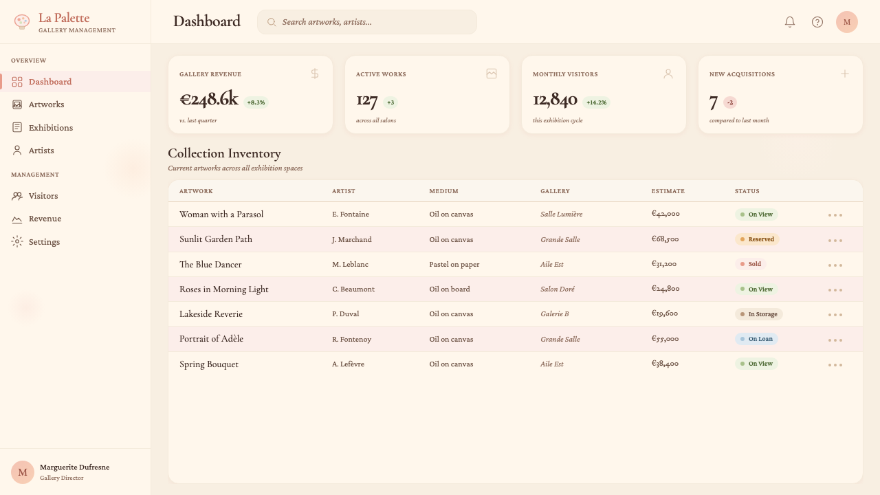
Is Renoir Impressionism appropriate for data-heavy or analytical products?雷诺阿印象主义适合数据密集型或分析性产品吗?
It is appropriate in limited applications but requires deliberate adaptation. The style's warmth and soft-edge quality can make dense data feel less clinical and more approachable — a genuine advantage in contexts like health dashboards, personal finance summaries, or educational analytics where user anxiety is a real design problem. However, the style's resistance to hard contrast and sharp edges can reduce the legibility of complex tables or small-scale data labels. The practical approach is to reserve the full Impressionist palette for the compositional frame — headers, background zones, decorative elements — while using a neutral or near-neutral treatment for the data layer itself, with the warm accent tones applied selectively to the most important figures. This creates warmth in context without sacrificing the precision that data display requires.在有限的应用中是合适的,但需要刻意的调适。这种风格的温度与柔边品质,可以让密集数据感觉更少临床感、更亲近——在健康仪表板、个人财务摘要或教育分析等用户焦虑是真实设计问题的场景中,这是实实在在的优势。然而,这种风格对硬对比和清晰边缘的抗拒,可能降低复杂表格或小尺度数据标签的可读性。实际做法是:将完整的印象主义色板保留给构图框架——页眉、背景区域、装饰性元素——同时对数据层本身使用中性或近中性的处理方式,将暖色强调调调选择性地应用于最重要的数字。这在不牺牲数据展示所需精确度的前提下,在语境中创造了温度。
What photography style pairs naturally with this design system?什么摄影风格与这套设计系统天然相配?
Photography that pairs naturally with Renoir Impressionism shares three qualities with his painted surfaces: warm light, soft focus at the periphery, and subjects that suggest ease rather than performance. Images shot in late afternoon or golden-hour light — where shadows are long and warm rather than harsh and cool — align most closely with the palette. Close crops of natural textures (fabric, botanicals, food, skin) work better than wide architectural shots. Portraiture should favor candid or softly directed expressions over formal studio poses. In post-processing, images benefit from a warm grade that lifts shadows toward amber or rose and slightly desaturates the coolest tones; high-contrast black-and-white or teal-orange color grading breaks the system entirely. The goal is photography that feels as if it was lit by a window in an 1880s Paris apartment rather than a contemporary studio.与雷诺阿印象主义天然相配的摄影,与他的绘画表面共享三种品质:暖光、边缘柔焦,以及暗示从容而非表演的主题。在傍晚或黄金时刻光线中拍摄的图像——阴影绵长而温暖,而非生硬而冷峻——与色板最为契合。自然肌理的近景裁切(面料、植物、食物、皮肤)比宽幅建筑照效果更好。人像摄影应偏爱自然或轻柔引导的表情,而非正式的摄影棚姿势。在后期处理中,图像受益于将阴影提升向琥珀或玫瑰的暖色调,并略微降低最冷色调的饱和度;高对比度黑白或青橙调色会彻底破坏这套系统。目标是让摄影感觉像是被1880年代巴黎公寓的一扇窗户照亮,而非当代摄影棚。
How do I avoid making a Renoir-inspired design feel merely nostalgic or period-costume?如何避免雷诺阿启发的设计显得仅仅是怀旧或换了套古装?
The risk of period pastiche arises when design borrows the surface signals — blush pink, serif type, soft texture — without internalizing the underlying logic. Renoir's warmth was not decorative; it was a claim about what painting should care about and what visual experience should feel like. To avoid pastiche in contemporary application, treat the palette and texture as a light-and-color system rather than a historical costume: ask what this warmth is doing communicatively, not what it looks like historically. Use contemporary layout conventions — responsive grids, accessible type scales, modern interaction patterns — and apply the Impressionist palette as a chromatic and tonal layer on top, rather than reconstructing a nineteenth-century magazine page. The distinction between an Impressionist-informed design and a period reproduction is that the former is structurally modern and chromatically warm; the latter is structurally antique and only accidentally warm.时代仿制的风险,在于设计只借用了表面信号——腮红粉、衬线字体、柔和肌理——而没有内化底层逻辑时产生。雷诺阿的温暖不是装饰性的;它是关于绘画应当关心什么、视觉体验应当感觉如何的一种主张。为了在当代应用中避免仿制,将色板和肌理作为一套光与色的系统而非历史戏服来对待:问这种温度在传播上做什么,而不是历史上看起来是什么。使用当代版面惯例——响应式网格、可访问的字体比例、现代交互模式——并将印象主义色板作为色彩与色调的图层叠加其上,而非重建一页十九世纪的杂志页面。印象主义启发的设计与时代复制品之间的区别,在于前者结构上现代、色彩上温暖;后者结构上古旧、温暖只是偶然。
Related design styles相关设计风格
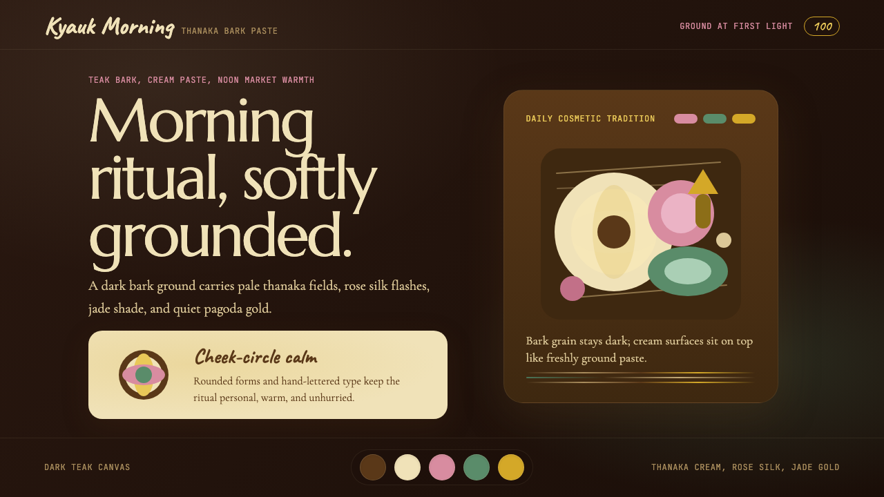 Burmese Shan Thanaka (Bark Paste)Handmade warmth on dark bark. Thanaka cream roundels soften rose, jade, and g…深色树皮上的手作暖意。特纳卡奶油圆斑柔化玫瑰、翡翠与金色。
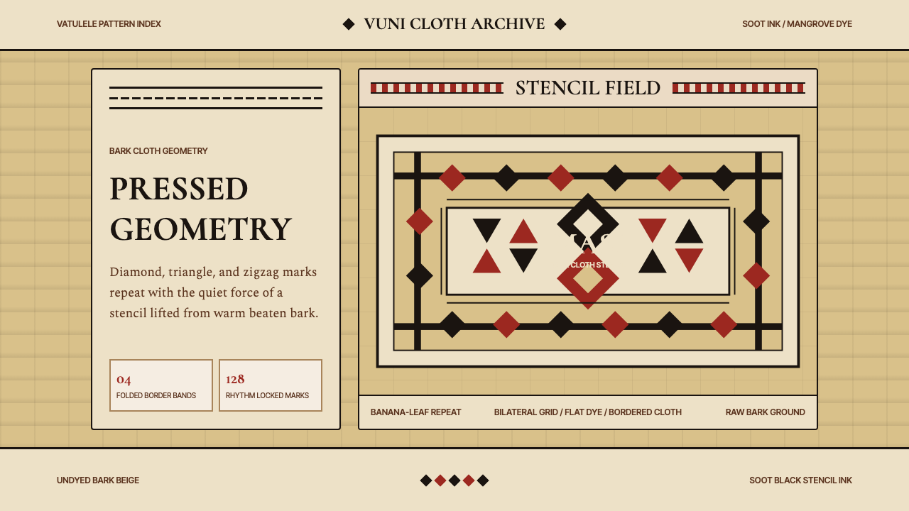 Fijian Masi Tapa StencilGeometry keeps ceremony. Soot-black diamonds repeat on bark beige with rust-r…几何守住仪式感:树皮米黄上,烟黑菱形与锈红边带反复压印。
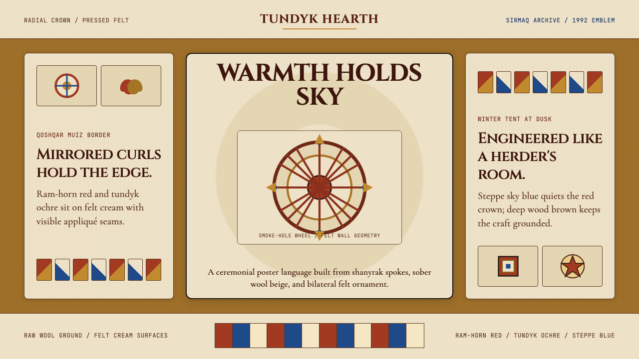 Kazakh Shanyrak Yurt FeltDomestic warmth, engineered. Ram-horn red felt curls around a radial shanyrak…居家暖意如工程般精密。羊角红毡纹环绕沙尼拉克轮。
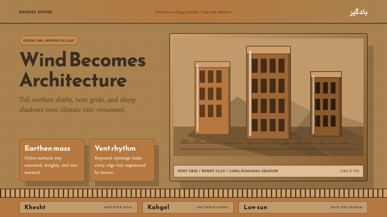 Persian WindcatcherClimate becomes geometry. Adobe ochre, Reem Kufi, vent grids, and hard shadow…气候成为几何:土坯赭色、Reem Kufi、通风格栅与硬投影。
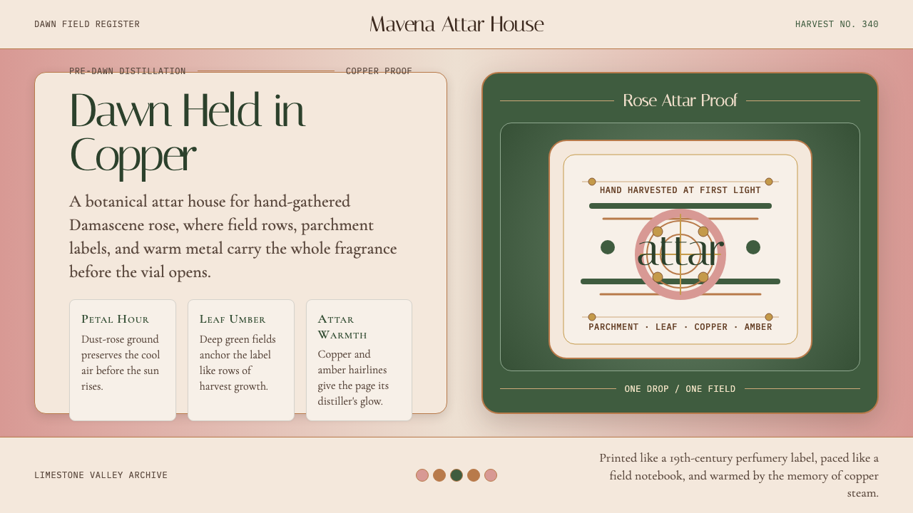 Bulgarian Kazanlak Rose ValleyDawn feels distilled. Dust-rose ground, leaf green, and copper label geometry…黎明被蒸馏:暮粉底、叶绿面与铜色标签几何留住香气。
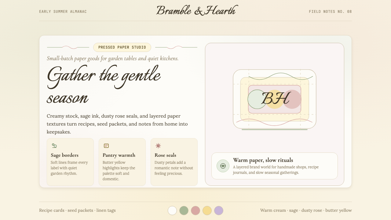 CottagecoreRural romance, hand-drawn. Sage and dusty rose, gingham textures, serif paire…工业化前的乡村浪漫:鼠尾草绿与灰粉、亚麻方格纹质感、衬线搭配手写体——慢生活的…