What is Cottagecore?什么是 Cottagecore?
Cottagecore turns the pre-industrial countryside into a design language — warm cream grounds, pressed-flower borders, hand-script type, and the unhurried beauty of things made by hand.田园核心将工业化之前的乡村生活转化为设计语言——暖奶油色底、压花边框、手写体字形,以及手工制物那种从容而至的美。
Cottagecore in briefCottagecore 速览
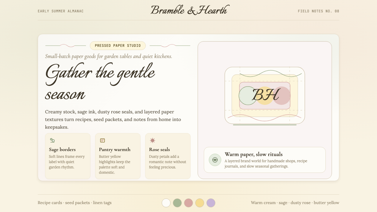
Cottagecore is an internet-native aesthetic that romanticizes rural, pre-industrial life — herb gardens, wildflower meadows, linen aprons, candlelit kitchens, and the slow, deliberate pace of homesteading. As a design system it translates that pastoral warmth into a coherent visual vocabulary: warm cream and off-white backgrounds, a palette drawn from sage greens, dusty roses, muted lavenders and soft ochres, generous rounded corners, serif body type set in a relaxed measure, and hand-script accents that feel personally inscribed rather than typeset.田园核心是一种诞生于互联网的美学,它将乡村、工业化前的生活浪漫化——香草花园、野花草甸、麻布围裙、烛光厨房,以及田园生活那种从容而刻意的慢节奏。作为设计体系,它将这份田园温度转化为连贯的视觉词汇:暖奶油色与米白色背景,鼠尾草绿、灰粉、淡薰衣草紫与柔和赭色构成的色板,圆润慷慨的圆角,以宽松行距排列的衬线正文,以及令人感到亲手书写而非机器排印的手写体点缀。
What distinguishes Cottagecore from broader vintage or botanical aesthetics is its emotional posture. The style is not nostalgic in a sentimental, backward-looking way — it is aspirational. It imagines a version of rural simplicity that is warm, abundant, and unhurried, borrowing selectively from Romanticism, the Arts and Crafts movement, and the illustrated worlds of Beatrix Potter and early-twentieth-century nature writing. Texture is central: linen weaves, watercolor washes, pressed-flower overlays, and paper-grain backgrounds all work to suggest the handmade over the machine-manufactured.田园核心之所以有别于更宽泛的复古或植物学美学,在于它的情感姿态。这种风格并非充满眷恋的、向后看的怀旧——它是向前看的、充满憧憬的。它想象一种温暖、丰盛而从容的乡村简朴生活,有选择地借鉴了浪漫主义、工艺美术运动,以及碧雅翠丝·波特与二十世纪初自然写作的插画世界。质感是核心:亚麻纹理、水彩晕染、压花标本叠层、纸张颗粒感背景——这一切都在暗示手工而非机制。
In practical terms, Cottagecore design is defined by softness at every level. Corners round rather than square off. Type sits in generous leading. Illustrative botanical motifs — sprigs of chamomile, fern fronds, wildflower clusters — serve as structural dividers and decorative borders. Color never shouts; it blooms slowly across a warm, slightly muted ground. The overall effect is one of intimate legibility rather than arresting contrast, of being welcomed into a space rather than confronted by it.在实践层面,田园核心设计在每一个维度上都以柔和为原则。角是圆的而非尖的;文字以宽行距呼吸;植物插图母题——洋甘菊小枝、蕨叶、野花簇——充当结构分割线与装饰边框;色彩从不喧哗,而是在温暖、略带静默的底色上缓缓盛开。整体效果是亲密的可读性而非强烈的对比,是被迎入一个空间而非被一个空间直面。
Where does Cottagecore come from?Cottagecore 从何而来?
Cottagecore as a named aesthetic crystallized on Tumblr around 2018, when communities of users began tagging posts of rural imagery, cottage interiors, foraging photography, and hand-crafted objects under a shared sensibility. The word itself fuses the English domestic ideal of the cottage — small, garden-surrounded, impractical by modern standards but emotionally resonant — with the internet suffix '-core' that signals a fully committed subculture. Unlike many internet micro-aesthetics that vanish within months, Cottagecore had roots deep enough in existing cultural formations to outlast its initial Tumblr moment.田园核心作为一种命名的美学,约在2018年于 Tumblr 社区中成形——用户们开始将乡村意象、农舍内景、采集摄影与手工艺品的帖子用一种共同的感性打上标签。这个词本身融合了英语中「农舍」(cottage)的家庭理想——小而花园环绕,以现代标准衡量颇为不实用,却极具情感共鸣——与互联网后缀「-core」,后者意味着一种全身心投入的亚文化身份。与许多在数月内消失的互联网微美学不同,田园核心在已有的文化构型中扎根足够深,得以在其最初的 Tumblr 时刻之后继续生长。
Those roots run through Romanticism, which in the late eighteenth and early nineteenth centuries elevated rural life as a moral and spiritual corrective to industrialization. The British Romantics — Wordsworth walking the Lake District, Keats writing in the garden — established the template of the countryside as a site of authentic feeling. The Arts and Crafts movement of the 1880s and 1890s, led by William Morris and his contemporaries, translated that Romantic longing into material practice: handwoven textiles, hand-printed wallpapers with botanical motifs, furniture made by craftsmen who knew the name of the wood. These movements established the visual and ethical vocabulary that Cottagecore would later digitize.这些根脉穿越了浪漫主义——十八世纪末至十九世纪初,浪漫主义将乡村生活抬升为对工业化的道德与精神修正。英国浪漫主义者——华兹华斯漫步湖区,济慈在花园中写作——确立了乡村作为真实感受之所的模板。十九世纪八九十年代的工艺美术运动,由威廉·莫里斯及其同代人引领,将这种浪漫渴望转化为物质实践:手织纺织品、印有植物母题的手工印花壁纸、由了解木材来历的工匠制作的家具。这些运动建立了田园核心后来加以数字化的视觉与伦理词汇。
The aesthetic also draws directly from a tradition of illustrated nature writing and children's literature. Beatrix Potter's watercolors — rendered with meticulous botanical accuracy and suffused with the warmth of a English Lake District cottage — established a visual grammar of small animals in domestic settings, herbs and wildflowers as supporting cast, and handmade domestic objects treated with affectionate attention. L.M. Montgomery's Anne of Green Gables built a comparable literary world, one in which the observation of natural beauty — morning light on an orchard, a field of violets — is itself a form of moral and aesthetic education. These works provided Cottagecore with ready-made reference points that felt both personal and culturally legible.这一美学也直接汲取自插画自然写作与儿童文学的传统。碧雅翠丝·波特的水彩画——以精准的植物学准确度描绘,浸透了英国湖区农舍的温度——确立了一套视觉语法:小动物置于家庭场景之中,香草与野花作为配角,家用手工物件获得深情的关注。露西·莫德·蒙哥马利的《绿山墙的安妮》构建了可与之媲美的文学世界,在那里,对自然之美的观察——果园上的晨光,一片紫罗兰田野——本身就是一种道德与审美的教育。这些作品为田园核心提供了现成的参照点,既感性私密又文化可读。
In 2020, the COVID-19 pandemic lockdowns gave the aesthetic its mass-cultural moment. Confined to cities and suburban interiors, millions of people found in Cottagecore an idealized counter-image: a life of homemade bread, kitchen gardens, and unhurried afternoons. Taylor Swift's surprise album Folklore, released in July 2020, reinforced the moment — its cabin-in-the-woods imagery, hand-lettered aesthetic, and wistful pastoral themes aligned so naturally with the Cottagecore sensibility that the two became culturally entangled. By the time lockdowns lifted, Cottagecore had established itself not just as an internet aesthetic but as a commercially viable visual language, appearing in brand identity work, packaging design, editorial illustration, and web UI across a range of industries.2020年,新冠疫情封锁赋予了这一美学其大众文化时刻。被困于城市与郊区室内的数百万人在田园核心中找到了一幅理想化的反面镜像:自制面包的生活、厨房花园、悠然的午后。泰勒·斯威夫特在2020年7月突发布的专辑《Folklore》强化了这一时刻——其林间小屋意象、手写体美学与充满惆怅的田园主题与田园核心的感性如此自然地契合,以至于二者在文化上紧密缠绕。封锁解除之际,田园核心已不仅是一种互联网美学,更成为一种商业上可行的视觉语言,出现在品牌形象、包装设计、编辑插画以及各行业的网页界面之中。
What defines the Cottagecore look?Cottagecore 的视觉特征是什么?
Color Palette色彩体系
The Cottagecore palette is built on warmth and restraint rather than saturation and contrast. Backgrounds are warm cream, parchment, or soft off-white — never stark white. The accent colors are drawn from a muted garden: sage green, dusty rose, soft lavender, faded ochre, and warm terracotta. These are colors that appear to have aged gently in sunlight — never fully vivid, always slightly desaturated, as though seen through gauze or watercolor wash. Deep, dark tones like forest green or warm chocolate brown anchor the composition when needed, but never dominate. The palette is generous but never loud.田园核心的色板建立在温暖与克制之上,而非饱和度与对比度。背景是暖奶油色、羊皮纸色或柔和的米白——绝非刺眼的纯白。强调色从静默的花园中取材:鼠尾草绿、灰粉、淡薰衣草紫、褪色赭黄与暖陶土红。这些是在阳光中轻柔老去的颜色——从不完全鲜艳,始终略带失饱和,仿佛透过薄纱或水彩晕染所见。深沉的暗调,如森林绿或暖巧克力棕,在需要时锚定构图,但从不主导。色板慷慨而从不喧哗。
Typography字体排印
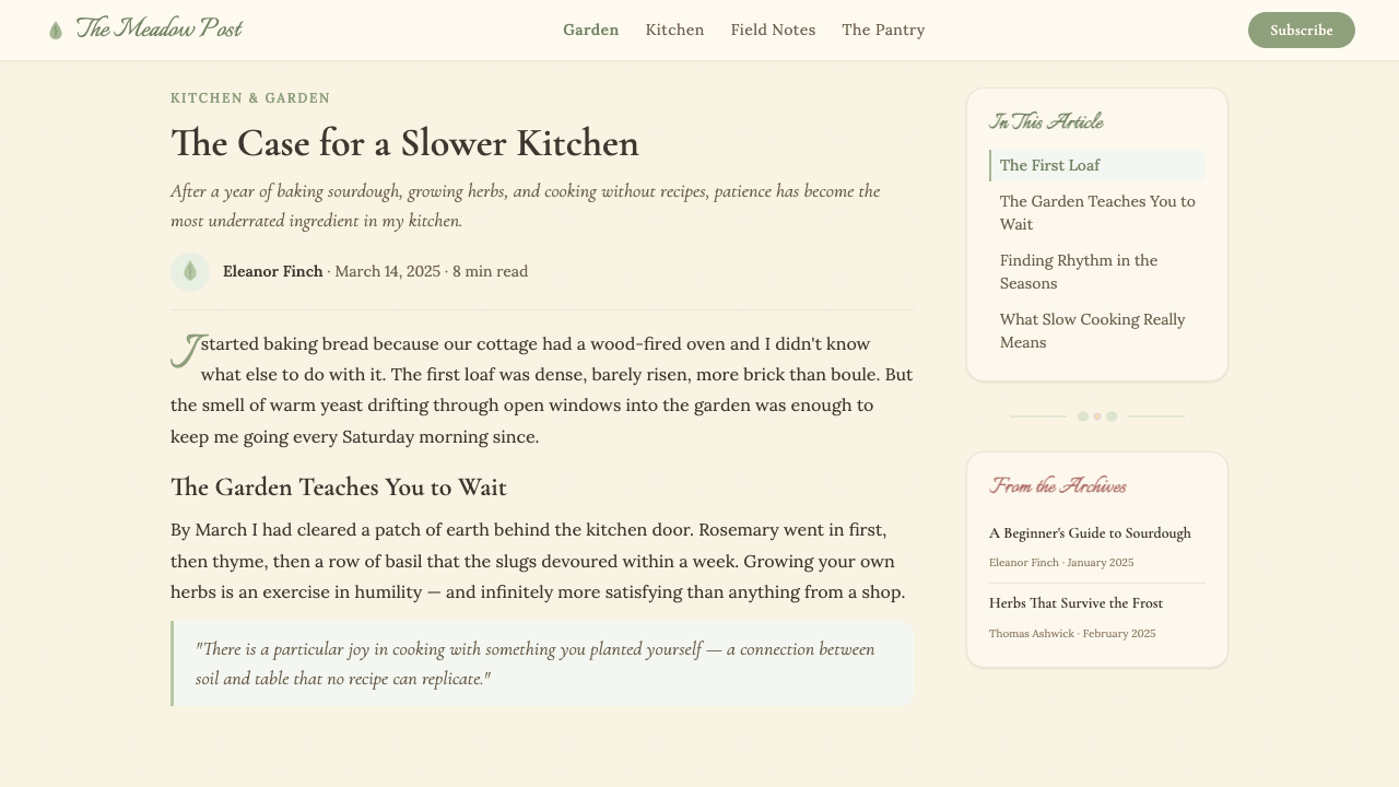
Cottagecore typography pairs a warm, humanist serif for body text with a flowing hand-script for accents, headings, and decorative labels. The serif should feel like it belongs in a nineteenth-century botanical journal — slightly condensed, with bracketed serifs and moderate stroke contrast that recalls letterpress printing. The hand-script element is crucial: it signals personal inscription, the note passed through a garden gate, the recipe written in a grandmother's hand. Type is set with generous leading and comfortable measure, never compressed. All-caps settings are used sparingly and with wide letter-spacing, suggesting an embossed label or a dried-herb sachet tag rather than a shout.田园核心的排版以温暖的人文衬线体承担正文,以流动的手写体点缀标题与装饰标签。衬线体应令人感到它属于十九世纪的植物学期刊——略带凝缩,括弧式衬脚,适中的笔画对比,令人联想到活字印刷。手写体元素至关重要:它传递亲手书写的信号,像一张穿越花园篱笆传递的便条,像祖母手写的食谱。排版以宽行距和舒适行宽设定,从不压缩。全大写排列应谨慎使用并配以宽字间距,令人联想到压印标签或干香草小袋的字样,而非呼喊。
Botanical Illustration植物插图
Botanical motifs are the signature visual element of Cottagecore design — not as mere decoration but as a structural vocabulary. Sprigs of chamomile, lavender stems, fern fronds, pressed flower silhouettes, clusters of wild berries, and trailing ivy serve as dividers, borders, corner ornaments, and background texture. The illustrative style references nineteenth-century scientific botanical engraving: accurate in its observation, delicate in its line work, but rendered with the warmth of hand-drawing rather than the precision of mechanical reproduction. Watercolor washes behind or around these illustrations add depth and the suggestion of natural variation.植物母题是田园核心设计的标志性视觉元素——不仅是装饰,更是结构性词汇。洋甘菊小枝、薰衣草茎秆、蕨叶、压花轮廓、野浆果簇与蔓延的常春藤充当分割线、边框、角落装饰与背景纹理。插图风格参照十九世纪科学植物版画:观察精准,线条纤细,但以手绘的温度而非机械复制的精密呈现。插图之后或之间的水彩晕染增添了深度,以及自然变化的暗示。
Texture and Surface质感与肌理
Cottagecore design consistently implies physical texture even in purely digital contexts. Linen-weave grain overlays soften backgrounds that would otherwise read as flat. Paper textures give backgrounds the depth of aged stock. Watercolor bleed effects at the edges of color blocks suggest hand-applied pigment. These textural layers are never so prominent that they obscure legibility — they operate subtly, as atmosphere rather than substance. The cumulative effect is that the design feels tactile and materially warm, as though it could be touched and would yield slightly to the touch.田园核心设计即便在纯数字语境中也始终暗示着物理质感。亚麻织纹叠层柔化了原本显得平整的背景;纸张纹理赋予背景以陈年纸张的深度;色块边缘的水彩晕染效果暗示手涂颜料。这些质感层从不喧宾夺主到遮蔽可读性——它们以微妙的方式运作,作为氛围而非实质。累积的效果是:设计感觉可触碰、材质温暖,仿佛是实物,触碰后会略有回弹。
Softness and Roundness柔和与圆润
Hard edges are largely absent from Cottagecore design. Corners are generously rounded on containers, cards, and buttons. Borders, when present, are thin and often dashed or dotted in a way that suggests a stitched seam rather than a printed rule. Shapes — badges, tags, frames — tend toward the oval and the wreath rather than the rectangle. Even photographic imagery, when used, benefits from soft vignetting at the edges that blurs the frame's boundary. This pervasive softness communicates approachability, gentleness, and the organic irregularity of natural forms over the imposed regularity of manufactured ones.硬朗的边缘在田园核心设计中几乎缺席。容器、卡片与按钮的角落被大幅圆润处理。边框(若出现)纤细,且常以虚线或点线呈现,令人联想到缝线而非印刷直线。形状——徽章、标签、相框——倾向于椭圆与花环而非矩形。即便是摄影图像,使用时也受益于边缘柔化的晕影处理,模糊了画面的边界。这种无处不在的柔和传递亲切、温柔,以及自然形态的有机不规则性,而非制造物的强加规整性。
Handmade Warmth手工温度
Cottagecore actively resists the appearance of perfection. Slight variations in line weight, irregular botanical silhouettes, type that sits with a gentle imprecision rather than machine-tight registration, watercolor fills that bleed slightly beyond their outlines — these imperfections are not failures of craft but evidence of hand. A perfectly mechanically rendered Cottagecore composition misses the point entirely; the warmth of the aesthetic depends on signals that a human being, not a machine, made these marks. This is the design equivalent of a hand-stitched hem or a handwritten address on an envelope: the imprecision is the intimacy.田园核心主动抵制完美的外观。笔画粗细的细微变化、形状不完全规整的植物剪影、带着轻柔的不精确感排列而非机械精准对齐的字体、稍稍溢出轮廓的水彩填充——这些不完美不是工艺的失败,而是手工的证明。一幅机械完美呈现的田园核心构图完全错失了要点;这一美学的温度依赖于人而非机器留下这些痕迹的信号。这是设计意义上的手缝边或手写信封地址:不精确本身即是亲密。
Narrative and Quietude叙事性与宁静感
More than most design aesthetics, Cottagecore tells a small story in every composition. A label suggests the jar it belongs on; a card header suggests the letter it introduces; a recipe illustration suggests the kitchen it was drawn in. This narrative quality is achieved through the accumulation of detail — the botanical sprig in the corner, the hand-script subtitle, the warm cream ground that implies afternoon light rather than studio lighting — rather than through explicit illustration. The effect is one of quietude: the design is not trying to arrest attention but to sustain it, to reward the reader who lingers.与大多数设计美学相比,田园核心在每一幅构图中都讲述一个小故事。一个标签暗示它所属的罐子;一张卡片的标题暗示它所引言的信件;一幅食谱插图暗示绘制它的厨房。这种叙事性质是通过细节的积累实现的——角落里的植物小枝、手写体副标题、暗示午后阳光而非摄影棚灯光的暖奶油底——而非通过明确的插图叙事。效果是宁静的:设计并不试图抓住注意力,而是维持它,奖励那个驻足细看的读者。
Who shaped Cottagecore?谁塑造了 Cottagecore?
Potter is the single most important visual reference for Cottagecore design. Her watercolor illustrations — created between the 1890s and 1940s, initially for her own entertainment and later published as picture books for children — combined meticulous scientific accuracy in the rendering of plants, fungi, and animals with a warmth of domestic setting that placed those natural subjects in recognizably human contexts. Her palette of sage greens, dusty blues, and warm ochres; her use of botanical specimens as background and framing devices; and her integration of hand-lettered text into illustrated pages all established templates that Cottagecore designers continue to reference.波特是田园核心设计最重要的单一视觉参照。她的水彩插画——从1890年代至1940年代创作,最初为自娱,后来出版为儿童绘本——将对植物、菌类与动物的精细科学准确描绘,与将这些自然主题置于可辨识的人类家庭场景中的温度相结合。她鼠尾草绿、灰蓝与暖赭色的色板;她将植物标本用作背景与画面框架的方式;以及她将手写文字融入插画页面的做法——这一切都确立了田园核心设计师至今仍在援引的模板。
Swift's 2020 album Folklore and its companion record Evermore catalyzed Cottagecore's transition from an internet subculture to a mainstream aesthetic moment. Released during COVID-19 lockdowns, the albums' visual identity — hand-lettered typography on rough natural paper, cabin-in-the-woods photography by Beth Garrabrant, a palette of warm grays and forest greens, and wistful, pastoral lyrical themes — aligned precisely with the Cottagecore sensibility at the moment when millions of people were seeking that exact imaginative escape. The albums demonstrated that the aesthetic could operate at full commercial scale without losing its sense of intimacy.斯威夫特2020年专辑《Folklore》及其姊妹专辑《Evermore》催化了田园核心从互联网亚文化到主流美学时刻的转型。在新冠疫情封锁期间发布,专辑的视觉识别——粗糙天然纸张上的手写体排版、贝丝·加拉布兰特拍摄的林间小屋摄影、暖灰与森林绿的色板,以及充满惆怅的田园歌词主题——在数百万人寻求那种恰好的想象逃逸的时刻,与田园核心的感性精准契合。这两张专辑证明,这一美学能在完全商业规模下运作,同时不失其亲密感。
Miyazaki's films — particularly My Neighbor Totoro (1988), Kiki's Delivery Service (1989), and Nausicaä of the Valley of the Wind (1984) — created a visual and emotional grammar of pastoral warmth that has deeply shaped Cottagecore's sensibility. The detailed rendering of domestic interiors filled with handmade objects, the treatment of natural landscapes as alive and morally significant, the palette of warm greens and earth tones, and the recurring figure of the self-sufficient young woman in a rural setting are all Miyazaki signatures that Cottagecore imagery consistently echoes.宫崎骏的电影——尤其是《龙猫》(1988)、《魔女宅急便》(1989)与《风之谷》(1984)——创造了一套充满田园温度的视觉与情感语法,深刻塑造了田园核心的感性。充满手工物件的家庭室内的细腻描绘、将自然景观视为有生命且具道德意义的处理方式、暖绿与大地色调的色板,以及乡村场景中自立的年轻女性这一反复出现的人物形象——这些都是宫崎骏的签名,田园核心的意象持续与之呼应。
Montgomery's Anne of Green Gables (1908) and its sequels established a literary template for Cottagecore's emotional register: the intense, almost devotional observation of natural beauty as a form of daily spiritual practice; the transformative power of a domestic space made beautiful and personally meaningful; and the social value of handcraft, homemaking, and the sharing of food. Montgomery's prose — rich with the sensory details of Prince Edward Island's landscape, seasons, and domestic life — gave Cottagecore much of its characteristic vocabulary of longing, belonging, and the small sacredness of ordinary beautiful things.蒙哥马利的《绿山墙的安妮》(1908年)及续集确立了田园核心情感基调的文学模板:对自然之美近乎虔诚的强烈观察,作为一种日常精神实践;将居家空间改造得美丽而具有个人意义的转化力量;以及手工艺、家政与分享食物的社会价值。蒙哥马利的散文——充满爱德华王子岛景观、季节与家庭生活的感官细节——赋予了田园核心大量其标志性的渴望、归属感词汇,以及普通美好事物所具有的微小神圣性。
Morris, the central figure of the British Arts and Crafts movement (1880s–1900s), established the moral and aesthetic framework that Cottagecore unconsciously inherits. His argument — that industrialization had degraded both the objects people lived with and the workers who made them, and that the remedy lay in handcraft, natural materials, and designs drawn from the organic forms of plants and animals — reads like a nineteenth-century manifesto for many Cottagecore values. Morris's textile and wallpaper patterns, with their dense interlocking botanical motifs in warm, slightly muted colorways, remain among the most direct visual ancestors of the Cottagecore design language.莫里斯——英国工艺美术运动(1880至1900年代)的核心人物——确立了田园核心无意识继承的道德与美学框架。他的论断——工业化降低了人们日常生活中物品的品质,也降低了制造这些物品的工人的尊严,而解药在于手工艺、天然材料,以及从植物和动物的有机形态中提取的设计——读来如同田园核心许多价值观的十九世纪宣言。莫里斯的织物与壁纸图案,以其在暖而略带静默色调中密集交错的植物母题,至今仍是田园核心设计语言最直接的视觉祖先之一。
How do you use Cottagecore today?今天怎么用 Cottagecore?
Cottagecore is one of the most context-specific aesthetics in contemporary design — its warmth and intimacy are powerful assets in the right setting and liabilities in the wrong one. Before applying it, the key question is whether the product or communication benefits from feeling personal, handcrafted, and gentle rather than authoritative, precise, or corporate. Food and beverage brands, wellness and self-care products, stationery and journaling tools, independent retail, herbal and botanical categories, and any platform oriented toward slow living, crafting, or domestic creativity are natural homes for the style. Enterprise software, financial services, and platforms where technical authority matters are not.田园核心是当代设计中情境针对性最强的美学之一——其温暖与亲密感在合适的场景中是强大的资产,在错误的场景中则是负担。应用之前,关键问题是:这个产品或传播内容,是否更适合感觉个人化、手工化与温柔,而非权威、精准或企业化?食品饮料品牌、健康与自我护理产品、文具与日记工具、独立零售、草本与植物类别,以及任何指向慢生活、手工艺或居家创意的平台,都是这一风格的天然归宿。企业软件、金融服务以及技术权威感至关重要的平台,则不在其列。
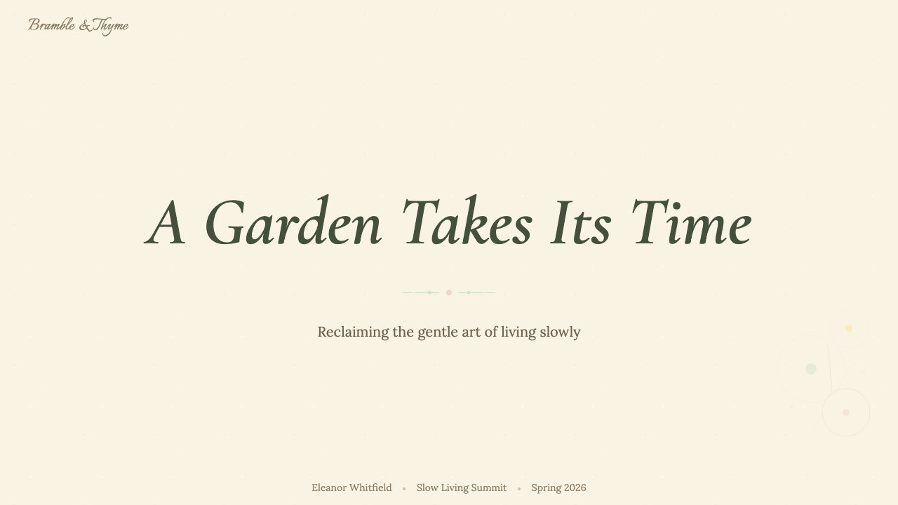
For presentation slides, Cottagecore works best when the subject itself has warmth — a brand story, a creative pitch, an editorial proposal, or an educational overview of something people genuinely care about. A cover slide benefits from a single strong botanical illustration centered or set asymmetrically, a hand-script title, and a warm cream ground. Content slides should be clean enough to be legible at a distance: two or three text levels differentiated by size and weight rather than color, botanical motifs used as section headers or margin ornaments rather than scattered throughout. Data slides can incorporate the palette without sacrificing clarity — soft sage bars on a cream ground, with a single warm accent for the featured data point — but avoid overlaying texture on charts, where legibility must come first.对于演示文稿,田园核心在主题本身具有温度时表现最佳——品牌故事、创意提案、编辑提案,或关于人们真正在意的事物的教育性概述。封面幻灯片适合以一幅强烈的植物插图居中或非对称布置,配以手写体标题与暖奶油底色。内容幻灯片应保持足够清晰以在距离内可读:用大小与字重而非颜色区分两到三个文字层级,植物母题用作段落标题或边距装饰而非散落各处。数据幻灯片可以融入色板而不牺牲清晰度——奶油底上的柔和鼠尾草绿柱形图,以一个暖色强调色突出关键数据点——但避免在图表上叠加纹理,那里可读性必须优先。
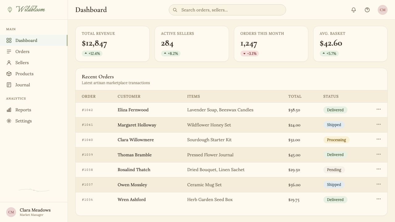
For web and digital interfaces, the style suits e-commerce storefronts, editorial blogs, portfolio sites, booking platforms for small artisan businesses, and wellness or subscription platforms where brand warmth is a differentiator. The practical approach: use a warm off-white as the base background, restrict primary interactions to one botanical-palette accent color used consistently, set body text in a humanist serif with generous leading, and reserve hand-script for display headings and decorative labels only. UI components should have noticeably rounded corners, light borders rather than heavy shadows, and subtle paper or linen texture overlays on cards and panels. Navigation should be understated — small, well-spaced, in the same humanist serif as body text — allowing the illustrative content to carry visual weight.对于网页与数字界面,这一风格适合电商店面、编辑博客、作品集网站、小型手工艺业务的预订平台,以及品牌温度是差异化因素的健康或订阅平台。实践方法:以暖米白色作为基础背景,将主要交互限制在一种植物色板强调色上并保持一致,正文以人文衬线体宽行距排列,手写体仅用于展示性标题与装饰标签。界面组件应有明显圆润的圆角、轻边框而非厚重阴影,以及卡片与面板上的细腻纸张或亚麻纹理叠层。导航应低调——字体小而间距充足,与正文使用同一人文衬线体——让插图内容承担视觉重量。
For editorial and marketing work, Cottagecore supports long-form content particularly well. An article layout that uses a slightly narrowed measure for body text, botanical drop-caps or section ornaments, a pull-quote set in hand-script, and a warm-toned hero photograph with a soft vignette at the edges will feel cohesive and distinctively atmospheric. Marketing campaigns benefit from the style's poster quality: a single strong botanical illustration paired with a confident hand-script headline on a warm ground reads clearly at any scale, from a social card to a printed broadside. Packaging design is perhaps the style's strongest application — labels for preserves, teas, candles, skincare, and dried herbs are natural fits, as are gift wrap patterns and stationery suites.对于编辑与营销内容,田园核心对长篇内容尤为有利。一个为正文使用略收窄行宽、植物首字下沉或段落装饰、手写体引言,以及边缘柔化晕影处理的暖色调大图的文章版面,会感觉连贯而有独特氛围。营销活动受益于这一风格的海报质量:一幅强烈的植物插图配以自信的手写体标题,置于暖色底上,在任何尺度下都清晰可读,从社交卡片到印刷招贴。包装设计或许是这一风格最强大的应用场景——果酱、茶叶、蜡烛、护肤品与干香草的标签是天然契合,礼品包装图案与文具套装亦然。
The most common mistake when applying Cottagecore is mistaking abundance for clutter. The style's warmth comes from the accumulation of carefully chosen details — the right sprig in the right corner — not from covering every surface with botanical elements. A Cottagecore composition should have breathing room: generous margins, deliberate white space (or, more accurately, warm-cream space) around type, and botanical motifs used as punctuation rather than wallpaper. A related mistake is choosing typefaces that are excessively ornate or difficult to read — the hand-script element should feel warm and personal, not illegible. Test all type at small sizes and against the textured backgrounds you intend to use before committing.应用田园核心时最常见的错误是将丰盛误解为堆砌。这一风格的温度来自精心挑选的细节的积累——恰当的小枝置于恰当的角落——而非用植物元素覆盖每一个表面。田园核心的构图应有呼吸空间:宽阔的页边距,文字周围刻意留出的白色(更准确地说是暖奶油色)空间,植物母题用作标点而非壁纸。相关的错误是选择过度华丽或难以阅读的字体——手写体元素应感觉温暖而私密,而非难以辨读。在使用之前,务必在小字号和你打算使用的纹理背景上测试所有字体。
Cottagecore — FAQCottagecore · 常见问题
Is Cottagecore the same as a vintage or rustic aesthetic?田园核心与复古风或乡村风是同一回事吗?
They overlap but are distinct. Vintage aesthetics draw broadly from any past era and often lean into the specific visual codes of that era — mid-century typography, Art Nouveau ornament, Victorian print conventions. Rustic aesthetics tend toward raw, unfinished surfaces, bold natural materials, and a roughness that reads as authentically rural. Cottagecore is more selective and more aspirational: it curates a soft, idealized version of pre-industrial rural life, with an emphasis on botanical nature, handcraft, gentleness, and domestic abundance. Where rustic is rough, Cottagecore is delicate. Where vintage references a specific historical period, Cottagecore blurs history into a timeless pastoral fantasy.它们有交叠但截然不同。复古美学广泛取材于任何过去的时代,往往深入那个时代的特定视觉密码——中世纪排版、新艺术装饰、维多利亚印刷惯例。乡村风倾向于原始、未经处理的表面,粗犷的天然材料,以及一种被解读为真实乡村的粗糙感。田园核心则更具选择性也更具憧憬性:它精心策划一个工业化前乡村生活的柔和、理想化版本,着重于植物自然、手工艺、温柔与居家丰盛。乡村风是粗粝的,田园核心是精致的。复古风参照特定的历史时期,田园核心则将历史模糊成一个无时间感的田园幻想。
Can Cottagecore work in a digital product beyond marketing surfaces?田园核心能否在营销页面之外的数字产品中奏效?
Yes, but it requires care in distinguishing decorative from functional elements. The botanical illustrations, textured backgrounds, and hand-script typography that define the style can apply richly to marketing pages, onboarding flows, and editorial surfaces within an app. For core functional UI — forms, data tables, navigation, input states — the style must simplify: warm palette, rounded corners, and humanist serif type can carry the aesthetic without texture overlays or illustrative decoration that would impede task completion. Think of it as a gradient of application: full Cottagecore on hero and marketing surfaces, distilled Cottagecore warmth on functional screens. The transition should feel seamless rather than jarring.可以,但需要注意区分装饰性元素与功能性元素。定义这一风格的植物插图、纹理背景与手写体排版,可以丰富地应用于营销页面、引导流程与应用内编辑性界面。对于核心功能性界面——表单、数据表格、导航、输入状态——风格必须简化:暖色板、圆润圆角与人文衬线体字形可以承载美学,而无需纹理叠层或阻碍任务完成的插图装饰。可以将其想象为一个应用梯度:英雄区与营销表面使用完整的田园核心,功能性屏幕使用提炼后的田园核心温度。过渡应感觉无缝而非突兀。
How do I stop Cottagecore from looking overdone or clichéd?如何避免田园核心看起来过度或落入俗套?
The style's worst versions pile every signifier simultaneously — hand-script on every heading, botanical borders on every element, paper texture on every surface, muted palettes pushed into muddy territory. The antidote is restraint and hierarchy. Commit to one or two signature elements that will define this particular application of the style — perhaps a botanical border system and a hand-script display typeface, with everything else simplified — and let those elements carry the aesthetic weight. Resist the impulse to add more; Cottagecore's warmth comes from selective accumulation, not comprehensive decoration. Using the palette with confidence also helps: a small number of genuinely warm, well-matched colors beats a wide range of imprecisely muted ones.这一风格最差的版本同时堆叠了所有标志符号——每个标题都用手写体,每个元素都有植物边框,每个表面都有纸张纹理,静默色板被推向浑浊地带。解药是克制与层级。专注于一两个将定义这一特定风格应用的标志性元素——也许是一套植物边框系统加上一种手写体展示字体,其余一切简化——让这些元素承担美学重量。抵制继续添加的冲动;田园核心的温度来自有选择的积累,而非全面的装饰。自信地使用色板也有帮助:少量真正温暖、搭配良好的颜色,胜过一大组不够精准的哑光色。
Does Cottagecore work for dark-mode or dark-background designs?田园核心适合深色模式或深色背景设计吗?
It is possible but unusual, and it requires rethinking the palette entirely. The canonical Cottagecore palette is built around warm light grounds — the warmth and softness of the aesthetic depends heavily on the luminosity of that cream or parchment background. A dark inversion tends to shift the mood from warm and inviting to something more gothic or moody — which can work for specific applications like a dark-season editorial or a night-market brand, but is no longer purely Cottagecore. If a dark variant is needed, anchor it with deep forest green or warm deep brown rather than cold black, keep the botanical and hand-script elements, and use a much lighter and more selective hand with texture overlays.这是可能的,但并不常见,且需要完全重新思考色板。正统的田园核心色板建立在温暖的浅色底面上——这一美学的温暖与柔和在很大程度上依赖于奶油色或羊皮纸背景的亮度。深色反转往往会将气氛从温暖迎人转向更哥特式或忧郁的方向——这对于特定应用或许奏效,例如深秋季节编辑内容或夜市品牌,但这已不再是纯粹的田园核心。若需要深色变体,以深邃的森林绿或暖深棕而非冷黑色作为基础,保留植物与手写体元素,并以更轻、更克制的手法使用纹理叠层。
What distinguishes authentic Cottagecore from a surface-level imitation?真正的田园核心与表面模仿之间的区别是什么?
The distinction is usually legible in the botanical illustration quality and in the typographic choices. Authentic Cottagecore treats botanical motifs as a craft tradition — the illustration style references scientific botanical engraving, each plant is rendered with some specificity and care, the placement is considered rather than scattered. Surface imitations tend to use generic floral clip-art applied at random, with no internal logic to the botanical vocabulary. On the typographic side, the pairing of a genuinely warm humanist serif with a hand-script that has real calligraphic DNA is what elevates the style; substituting generic rounded fonts for both degrades it to a craft-store greeting card. The quality of the warmth — specific, considered, rooted in actual reference — is what separates the thing from the simulacrum.区别通常在植物插图质量与字体选择上一目了然。真正的田园核心将植物母题视为一种工艺传统——插图风格参照科学植物版画,每种植物都以一定的特异性与用心描绘,摆放是经过考量的而非随意散落的。表面模仿往往使用随机应用的通用花卉剪贴画,植物词汇之间毫无内在逻辑。在排版方面,将真正温暖的人文衬线体与具有真实书法基因的手写体配对,是提升这一风格的关键;将两者都替换为通用的圆体字,会将它降格为工艺品店贺卡的水准。温度的质量——具体的、经过考量的、植根于真实参照的——是真品与仿制品的分野所在。
Related design styles相关设计风格
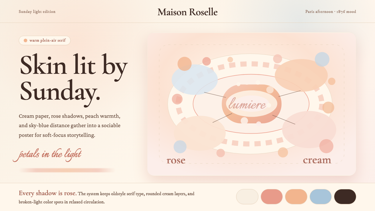 Renoir ImpressionismWarmth refuses haste. Rose shadows and Cormorant curves drift across cream.温暖拒绝匆忙:玫瑰阴影与衬线曲线漂浮在奶油底上。
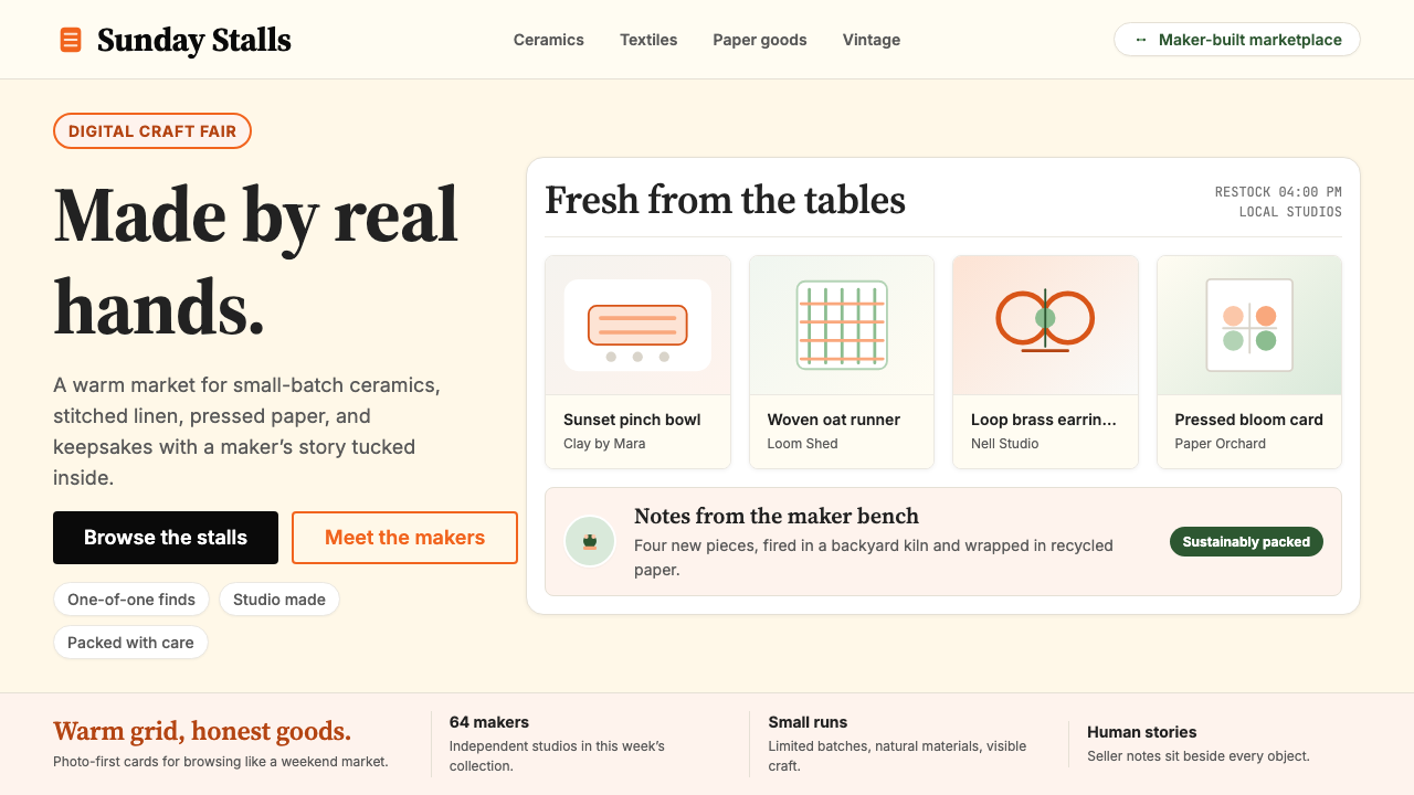 Etsy HandmadeA digital craft fair, in orange. Hand-drawn accents, cream backgrounds, delib…数字时代的手工艺集市:标志性 Etsy 橙、奶油底色、手绘插画点缀——每件物品…
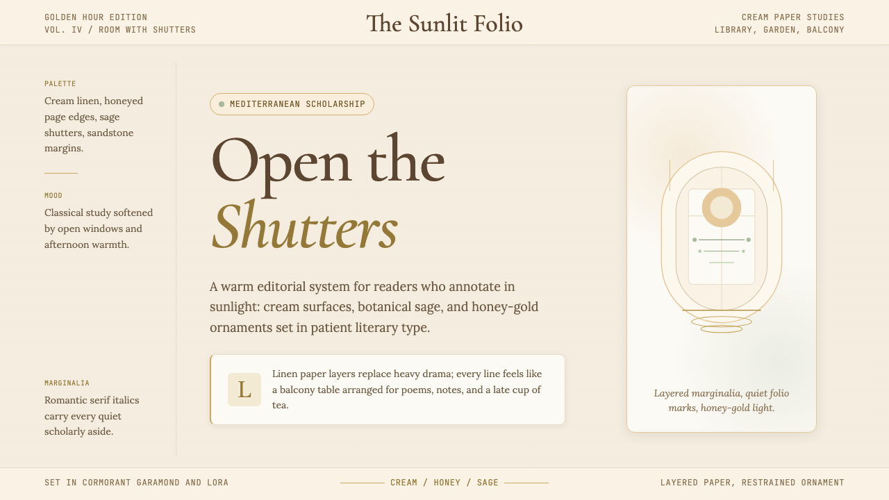 Light AcademiaScholarship turns sunlit. Cream linen, honey gold, sage botanicals, and roman…学术被阳光照亮:奶油亚麻、蜂蜜金、鼠尾草植物与浪漫斜体。
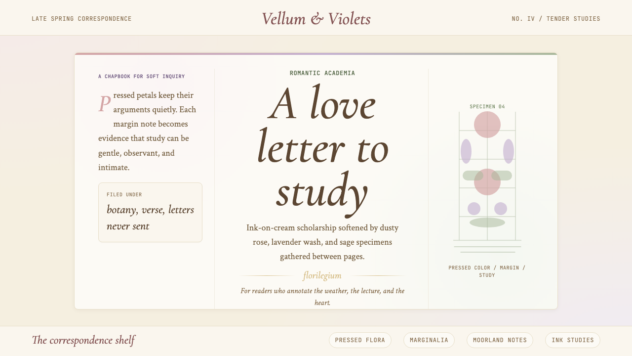 Romantic AcademiaScholarship turns tender. Dusty rose and lavender frame ink-on-cream poetry w…学问变得温柔:灰玫瑰与薰衣草框住米白纸上的墨字与压花。
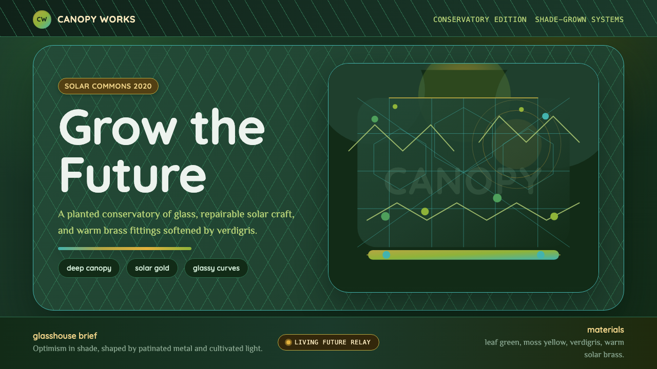 Solarpunk GreenhouseA grown future, not a sterile one. Deep canopy green, solar gold, and glassy…未来是可种植的:深冠绿、太阳金与玻璃曲线。
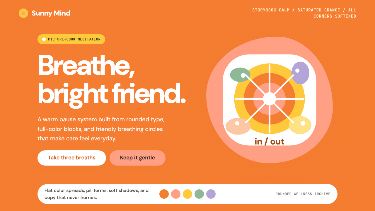 Headspace Orange MeditationMeditation becomes friendly. Orange blocks, DM Sans, and pill shapes soften e…冥想变得亲切:橙色块、DM Sans 与药丸圆角软化一切。