What is Headspace Orange Meditation?
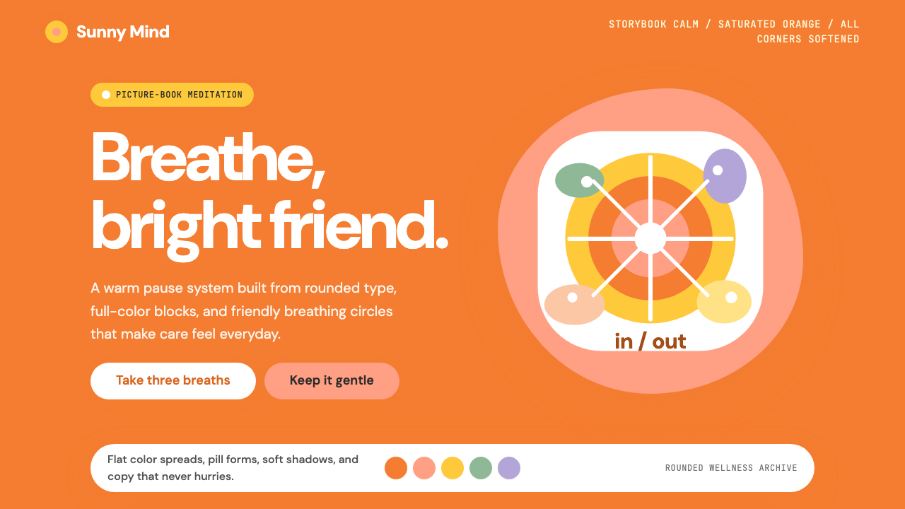
Headspace proved that a thousand-year-old practice could feel as approachable as a Saturday morning cartoon — by dressing it in warm orange, pill-shaped buttons, and round-eyed illustrated characters.
Headspace Orange Meditation in brief
Headspace Orange Meditation is a visual style born from the mission of making mindfulness feel safe, friendly, and genuinely joyful rather than austere or intimidating. Where earlier wellness brands leaned on clinical whites and cool blues, Headspace chose a vivid, warm orange as its anchor — a hue that sits closer to the energy of a cheerful greeting than the neutrality of a hospital corridor. The style wraps every element of the experience in softness: corners are rounded to their fullest extent, shapes dissolve into blobs and pill forms, and the illustrative characters that populate the world are deliberately simplified into rounded bodies with small dot eyes.
The system is rooted in the belief that visual friction amplifies psychological friction. If an app about calming the mind presents sharp edges, aggressive contrast, or complex layouts, it undermines the very promise it is making. So every design decision in this style trends toward reassurance: generous padding, abundant white space, warm pastels as secondary tones alongside the dominant orange, and typography that is friendly and open rather than formal or compressed. Nothing here announces urgency. The visual tempo is slow by design.
What makes Headspace Orange Meditation distinctive is that it achieves warmth without sacrificing legibility or structure. The style is not chaotic or naively decorative — it has a clear hierarchy, consistent spatial logic, and purposeful use of illustration. The orange itself does real organizational work: it marks primary actions, highlights key content, and provides the brand's identity anchor across every surface. Softness and structure coexist here because they serve the same goal: helping someone feel calm enough to actually begin.
Where does Headspace Orange Meditation come from?
Headspace was founded in London in 2010 by Andy Puddicombe, a former Buddhist monk, and Richard Pierson, a marketing executive. Puddicombe had spent years training in Buddhist monasteries across Asia and Europe before returning to London and beginning to teach meditation in a way that stripped away the religious scaffolding without discarding the practice's depth. The original Headspace was an events company — Puddicombe would lead in-person mindfulness sessions — before the app format allowed the concept to scale globally.
The early visual identity of Headspace was serviceable but not distinctive. The brand's transformative aesthetic moment came around 2018, when Headspace commissioned the London-based animation studio Animade and illustrator Erica Williams to develop a character-led illustration system. Williams' characters — round, soft-bodied, rendered in warm hues with minimal facial features — became the visual heart of the brand. They were designed to be immediately readable across cultures: no sharp features, no ethnically specific markers, no expressions that required cultural decoding. A small orange circle with two dots for eyes could represent anxiety, calm, or focus equally well across markets in Tokyo, São Paulo, and Copenhagen.
The orange that defines the system was not chosen arbitrarily. In color psychology and cross-cultural perception research, orange occupies a distinctive position: it is energizing without the aggression of red, warm without the passivity of yellow, and carries strong associations with creativity and playfulness in many global markets. For a brand asking skeptical new users to try something as unfamiliar as meditation, orange offered a gentle on-ramp — it said approachable and curious rather than medicinal or austere.
The mindfulness app boom of the 2010s created a crowded category, and Headspace's visual distinctiveness became a genuine competitive asset. Where competitors leaned into nature photography, cool gradients, and serif typography that evoked traditional spa branding, Headspace's illustration-led, orange-saturated system looked different on every platform it appeared. This contrast was intentional: Puddicombe and Pierson had always positioned Headspace as the anti-guru, the meditation practice for people who thought meditation was not for them. The visual system had to embody that same spirit of demystification.
What defines the Headspace Orange Meditation look?
Saturated Warm Orange
The style's defining color is a vivid, fully saturated warm orange — neither a dusty terracotta nor a neon accent, but a confident mid-register warmth that reads as both energetic and safe. This orange does the bulk of the brand's organizational work: it marks primary interactive elements, anchors identity across surfaces, and creates an immediate emotional signal of approachability. Secondary tones are drawn from a soft pastel range — peachy pinks, warm creams, and muted lavenders — that complement the orange without competing with it.
Extreme Rounding
Nothing in this visual system has a sharp corner. Buttons are pill-shaped — so rounded that they become capsules. Cards and containers carry radii that approach circular. Illustrative shapes dissolve into organic blobs that suggest softness rather than geometry. This extreme rounding is not incidental; it is the primary carrier of the style's emotional register. Rounded forms read as non-threatening across developmental psychology research, and the style deploys this effect consistently at every scale — from the smallest icon to full-screen layout containers.
Character-Led Illustration
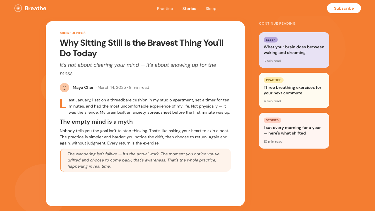
The illustrated characters that populate the Headspace world are its most culturally significant design element. They are rendered with the minimum number of features necessary to convey emotion: a round body, two small dots for eyes, and subtle posture changes. This extreme reduction makes the characters simultaneously universal and expressive — a slightly slouched figure communicates anxiety as clearly in Seoul as in Stockholm. The characters appear in motion through the app: meditating, walking, breathing, sleeping. Their presence transforms a software interface into a world.
Generous White Space
The style relies heavily on open, breathing space between every element. Padding inside containers is wide; margins between sections are expansive; text does not crowd itself. This generosity of space is not simply aesthetic preference — it is functional. A cluttered screen raises cognitive load; a calm, open screen lowers it. For an app whose core proposition is helping the mind slow down, a layout that feels rushed or compressed would actively undermine the product experience. White space here is not empty — it is active negative space that creates calm.
Soft, Legible Typography
The typographic choices in this style favor openness and warmth over precision or authority. Type is set with ample line spacing, modest contrast between headline and body weights, and no condensed or aggressive letterforms. The hierarchy is gentle rather than commanding: headings guide rather than instruct, body copy feels like a spoken voice rather than a printed directive. The overall typographic tone suggests a friendly teacher rather than a clinical manual — someone who is glad you are here and confident you can do this.
Warm Pastel Secondary Palette
Supporting the dominant orange is a secondary palette of warm, desaturated pastels — soft peaches, quiet creams, and gently muted lavenders. These tones appear in background sections, illustration environments, and content groupings. They prevent visual monotony without introducing the visual tension that high-saturation secondary colors would bring. The pastel palette is always warm-toned rather than cool, maintaining the overall sense of thermal comfort that the style is built around.
Motion as Reassurance
Transitions and micro-animations in this style are slow, smooth, and always decelerating rather than snapping. Loading states use gentle pulsing rather than spinning indicators. Element entrances ease in softly rather than cutting or bouncing. This approach to motion is philosophically consistent with the rest of the style: nothing should startle, nothing should demand attention through abruptness, everything should model the very quality of ease that the product is trying to teach. The style treats motion as another opportunity to reinforce emotional tone.
Who shaped Headspace Orange Meditation?
Puddicombe is the co-founder and the voice behind Headspace's guided meditations. A former Buddhist monk who trained in monasteries across Asia and Europe, he returned to London and began teaching meditation in a way that made the practice accessible to secular audiences. His approach — grounding ancient techniques in contemporary neuroscience and stripping away religious language without discarding the practice's depth — defined Headspace's tone long before its visual identity was formalized. The illustrated characters in the Headspace system are, in part, visualizations of the personality he projects in audio.
Pierson co-founded Headspace with Puddicombe and was responsible for building the business model and brand strategy that turned a meditation events company into a globally recognized digital health platform. His marketing background shaped the brand's positioning — explicitly secular, accessible, and optimistic rather than esoteric or prescriptive. The deliberate choice to use illustration rather than photography, and orange rather than clinical white, reflects strategic decisions about which audiences Headspace was trying to reach and which assumptions it was trying to challenge.
Williams is the illustrator responsible for creating the character system that became the visual signature of Headspace. Her characters — deceptively simple, deeply expressive — solved one of the hardest problems in global product design: how to depict human emotion and diversity without specific cultural or racial markers. The decision to reduce the human figure to near-abstract rounded forms was a deliberate creative choice, not a production shortcut. Williams' work demonstrates that illustration can carry the entire emotional weight of a brand identity without relying on photography or representational realism.
Animade is the London-based animation studio that collaborated with Headspace to develop and systematize the character animation language around Williams' illustration work. Their contribution was building the motion grammar — how the characters move, breathe, gesture, and transition — that gives the Headspace world its sense of life. Animade's approach to the project became a case study in how animation studios can function as brand identity partners rather than simply production vendors, codifying motion principles that the Headspace team could apply consistently across all platforms.
How do you use Headspace Orange Meditation today?
Headspace Orange Meditation is one of the most instructive styles to study for anyone designing in the wellness, education, consumer mental health, or children's product categories — not because it should be copied, but because it demonstrates how far a single emotional commitment, rendered consistently across every design decision, can carry a brand identity. The practical lesson is not about orange specifically; it is about choosing a thermal register — warm versus cool — and then enforcing it without exception across color, form, motion, illustration, and typography.
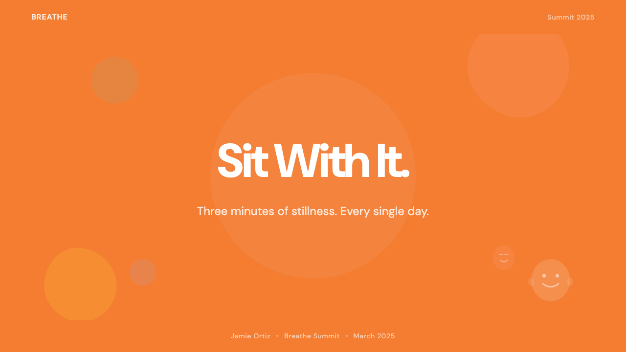
For presentation slides, this style works well in contexts where the goal is to lower the audience's defenses rather than impress them with authority. A cover slide in this register uses a warm background tone, a single large character or soft organic shape, and headline text that is conversational in tone and generous in spacing. Content slides should carry the same spatial logic: wide margins, no tight bullet-point stacks, data presented through simple rounded charts rather than complex infographics. The visual message should be: this is going to be a calm, clear experience. Avoid presenting dense data grids or aggressive comparison tables in this style — they read as contradictions.
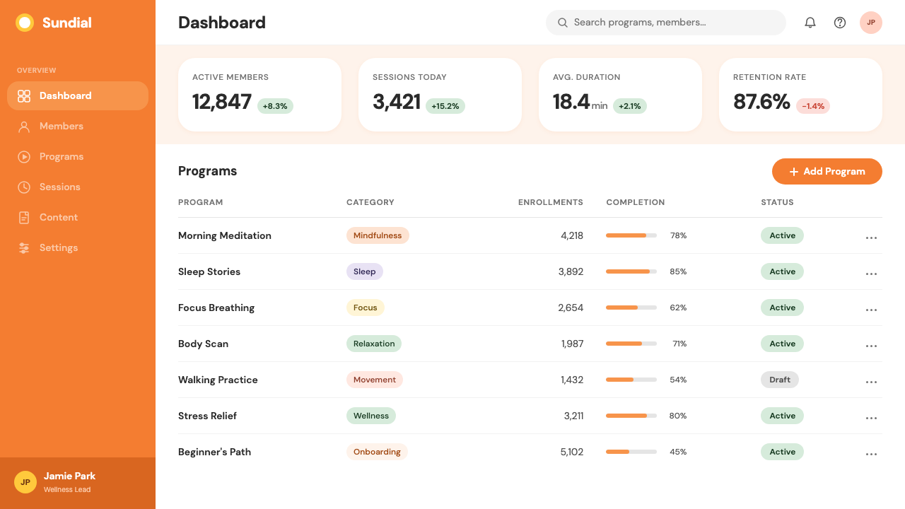
For web interfaces and dashboards, this style suits onboarding flows, progress trackers, habit-forming features, and any interface section where you are asking a user to take an action that requires emotional trust — subscribing, sharing personal data, beginning an unfamiliar practice. The rounded button shapes and warm accent color create low-friction call-to-action elements. Pricing pages in this style should avoid cold tiered comparison tables; instead, lead with warm copy, use the orange sparingly on the primary tier choice, and keep the layout breathable. The style becomes inconsistent when used for information-dense analytical dashboards where precision and density are required.
For editorial and marketing work, the style is strongest in awareness campaigns directed at audiences who may feel that the product is not for them. The visual language says: this is not complicated, this is not exclusive, this is not going to judge you. In social media and advertising formats, the illustrated characters are particularly effective — they attract the eye without the uncanny valley risk of photography, and they are infinitely adaptable to different scenario and emotion combinations. Avoid using this style for premium or luxury positioning, where the warmth reads as approachable rather than aspirational.
The most common mistake when applying this style is treating the orange as a permission to use it at high volume everywhere. In the original Headspace system, orange is deployed purposefully — it marks action points, not decoration. When orange covers large background areas, competes with illustration, and saturates navigation elements simultaneously, the warm reassurance tips into visual noise. Use the orange as a signal, not a wash. A second frequent error is introducing sharp geometry — pointed icons, angular dividers, right-angle containers — that immediately disrupts the all-rounded visual grammar the style depends on for its emotional effect.
Headspace Orange Meditation — FAQ
Is this style only suitable for meditation or wellness apps?
No, but it requires careful context matching. The Headspace style is built around a specific emotional promise — accessibility, warmth, and the reduction of friction in starting an unfamiliar practice. That same emotional architecture is useful in any product where the barrier to entry is psychological rather than technical: onboarding flows for complex tools, educational platforms targeting non-expert users, community features that depend on vulnerability and trust. Where the style struggles is in contexts that require authority, precision, or luxury positioning — financial dashboards, legal products, or high-end lifestyle brands where warmth reads as casualness.
How does this style handle dark mode?
A dark mode version of this style requires significant recalibration rather than simple color inversion. The warm orange works reasonably well against dark backgrounds — it maintains its energy without becoming aggressive. However, the pastel secondary tones that give the light version its gentleness tend to disappear or read as muddy against dark grounds. A successful dark adaptation typically replaces the pastel range with slightly deeper, more saturated warm tones, darkens background containers to near-black while keeping some warmth in the undertone, and preserves the generous spacing that provides the style's characteristic breathing room. The illustrated characters adapt well — their rounded forms read clearly at any background level.
Can this style work without the illustration component?
It can, but it loses much of its personality. The illustration system is not decorative surface on top of a functional layout — it carries the majority of the emotional work in the Headspace visual language. Without it, the remaining elements (orange, rounded shapes, soft pastels, generous space) produce a pleasant but generic friendly-app aesthetic that reads more like a health food brand than a distinct design identity. A stripped version of the style works adequately for simple interfaces — a meditation timer, a progress widget, a settings screen — where the illustration would feel forced anyway. But for any surface where brand character matters, some form of character or organic illustrative element should be preserved.
How does this style differ from other friendly wellness brands?
The key differentiator is that Headspace's warmth is grounded in a specific emotional argument — meditation for skeptics — rather than in generic lifestyle aspiration. This specificity gives the style a coherence that purely trend-following wellness aesthetics often lack. Other friendly wellness brands might use rounded forms and warm colors, but they often combine these with nature photography, script typography, or botanical illustration that signals a different kind of aspirational identity. Headspace's system is more urban, more secular, and more focused on the interior experience of the user rather than an external lifestyle ideal. The illustrated characters represent the user's internal states, not an idealized version of who the user should become.
What is the most important thing to preserve when adapting this style for a new context?
The thermal register: warmth, in all its senses. The specific orange can be shifted — toward a peach, a yellow-orange, a deeper amber — and the style still functions if the overall color temperature of the palette remains warm. What cannot change without breaking the system is the emotional promise: that nothing here will be abrupt, demanding, or alienating. If a design decision creates visual tension — a sharp edge, a cold blue, a dense text block, an aggressive transition — it is incompatible with the style's core commitment, regardless of what other elements surround it. The style is less a specific collection of elements than a discipline of sustained gentleness.
Related design styles
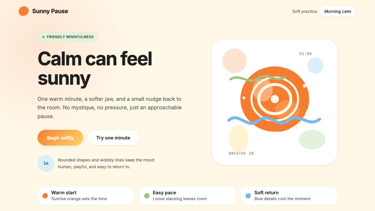 HeadspaceOptimism makes calm approachable. Sunrise orange and wobbly rounded forms bre…
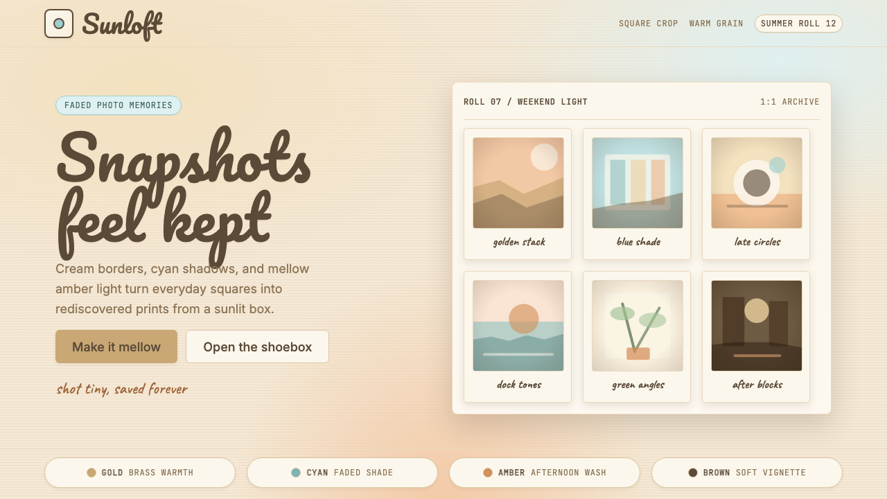 Instagram 2010s FilterWhen photos felt like memories. Faded warmth, dark vignettes, cream-tinted Po…
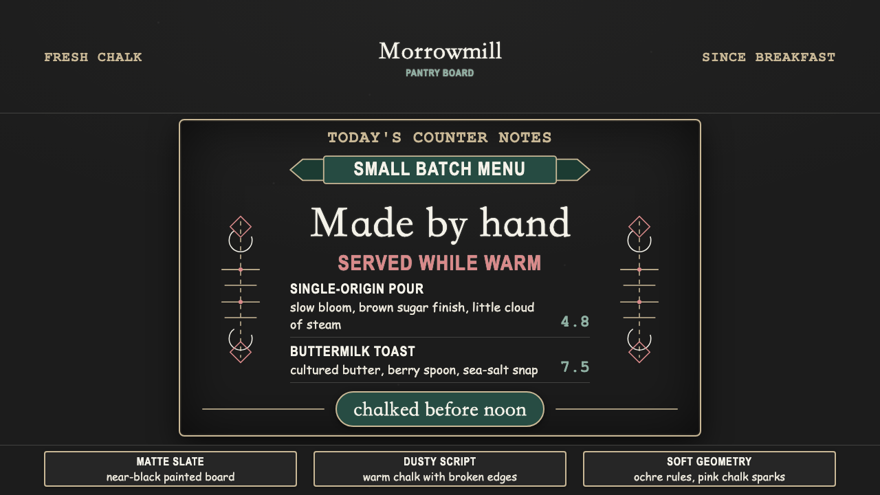 Chalk Café BoardWarmth written by hand. Dusty chalk script on graphite slate, framed by soft…
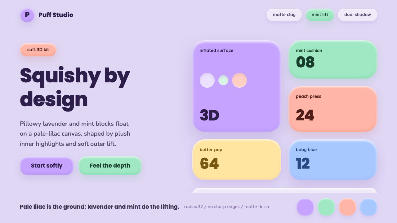 ClaymorphismSquishy, not flat. Lilac clay surfaces puff up with mint and lavender dual sh…
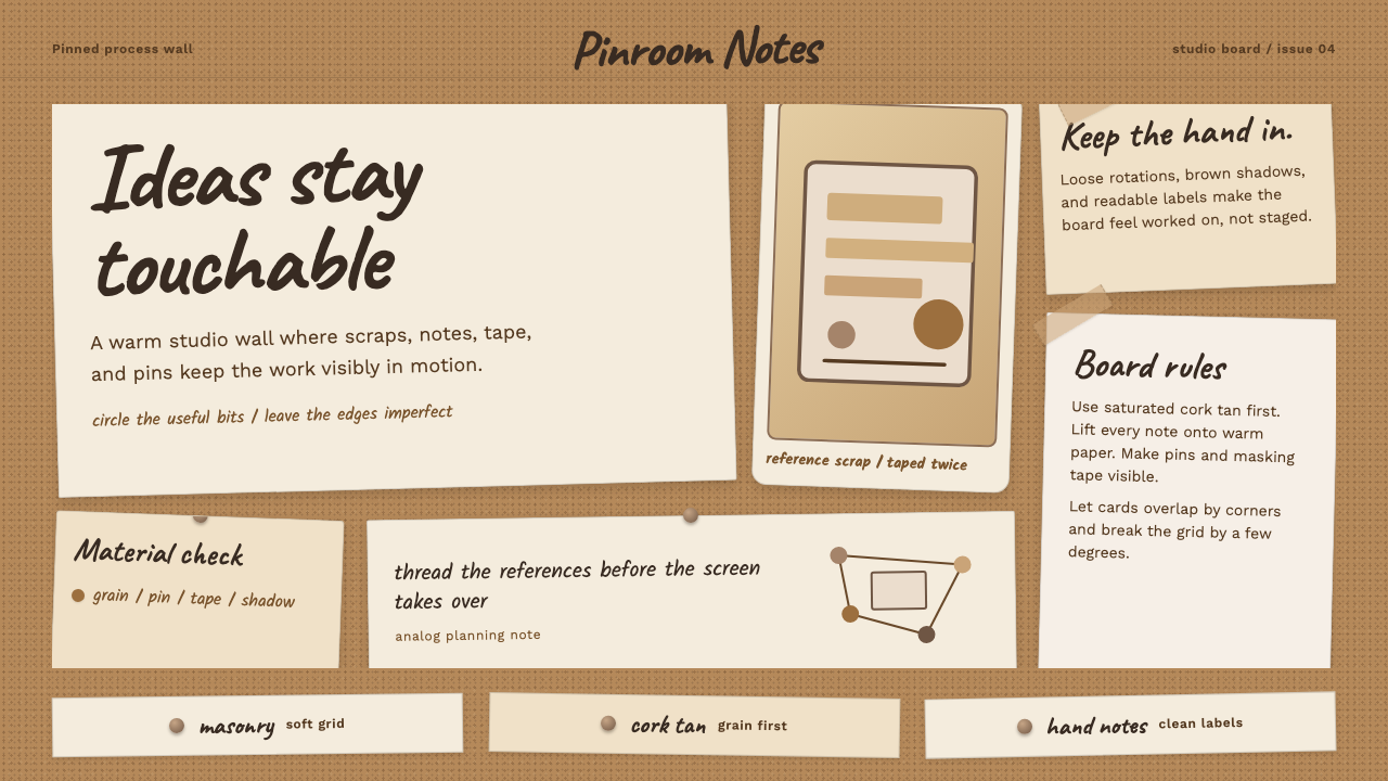 Cork Board StudioWarm ideas stay tactile. Cork tan, Caveat handwriting, pinned paper, and tape…
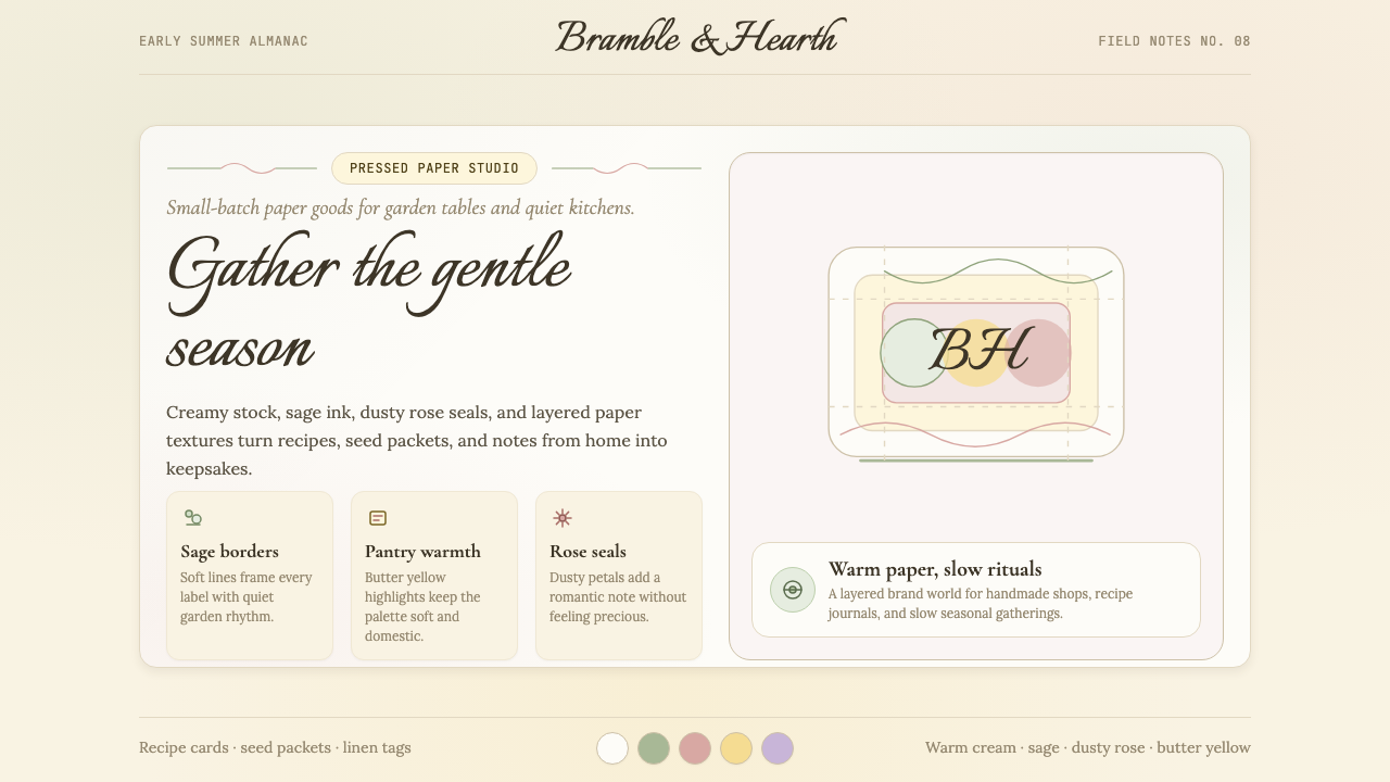 CottagecoreRural romance, hand-drawn. Sage and dusty rose, gingham textures, serif paire…