What is Instagram Filters 2012?什么是 Instagram Filters 2012?
Before flat design erased everything, Instagram's early filters turned every phone snapshot into a warm, grain-dusted memory — and in doing so, accidentally invented a design language the internet still hasn't forgotten.在扁平化设计抹去一切之前,Instagram 的早期滤镜让每一张手机快照都变成了温暖、布满颗粒的记忆——并在无意间创造了一套互联网至今未曾忘却的视觉语言。
Instagram Filters 2012 in briefInstagram Filters 2012 速览
Instagram Filters 2012 is a design style rooted in the visual vocabulary of the Instagram app's filter era, roughly 2010 to 2014. During those years, a set of named photo filters — Hudson, Earlybird, X-Pro II, Valencia, Lo-Fi, Amaro, and others — became the shared aesthetic of a generation of smartphone photographers. Each filter applied a distinct combination of faded warmth, boosted contrast, shifted color temperature, film grain, and dark vignettes to ordinary photographs, making them feel like rediscovered prints from an earlier decade.Instagram 2012 滤镜风格植根于 Instagram 应用滤镜时代(大约 2010 至 2014 年)的视觉语汇。在那些年里,一批有名字的照片滤镜——Hudson、Earlybird、X-Pro II、Valencia、Lo-Fi、Amaro 等——成为一代智能手机摄影者共同的美学。每种滤镜都将特定的褪色暖调、增强对比度、偏移色温、胶片颗粒与暗角晕影的组合叠加到普通照片上,让它们仿佛是从更早的年代重新发掘出来的印相。
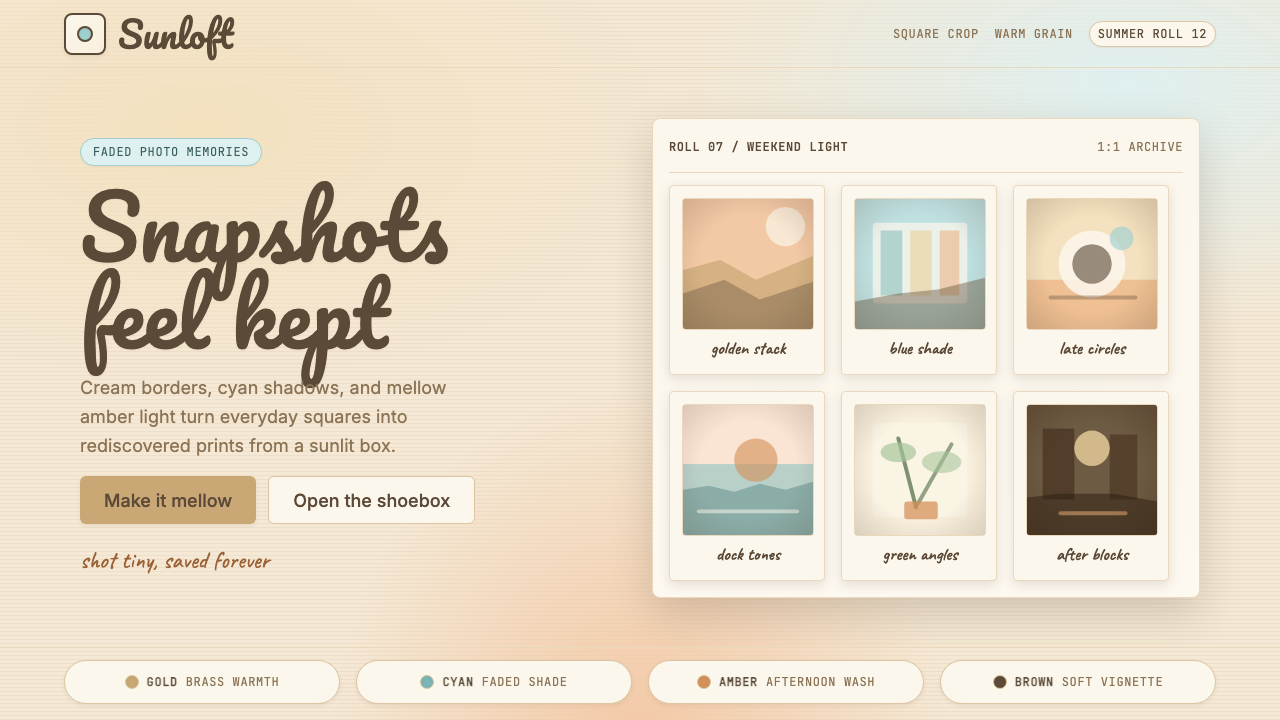
As a design system, the style distills those photographic qualities into interface elements: cream and warm-ivory backgrounds in place of sterile white, visible grain textures, Polaroid-frame card layouts, handwritten-script headline typography, and a color palette that leans into amber, dusty rose, and muted teal rather than saturated primaries. The overall effect is skeuomorphic warmth — it is a style that references physical photography and analog memory rather than the clean grid of the digital screen.作为一套设计体系,这种风格将那些摄影品质提炼为界面元素:以奶油色和暖象牙色底面取代冰冷的纯白,加入可见的颗粒质感、宝丽来相框式卡片布局、手写脚本标题字体,以及偏向琥珀色、尘埃玫瑰与哑光蓝绿而非饱和原色的色板。整体效果是拟物化的温暖——这是一种参照实体摄影和模拟记忆而非数字屏幕清洁网格的风格。
What distinguishes Instagram filter aesthetics from generic vintage styling is its specificity to early mobile photography culture. It is not a broad nostalgia for the twentieth century; it is nostalgia for a particular moment — 2010 to 2014 — when social sharing was new, filters were a revelation, and the act of photographing everyday life felt genuinely expressive rather than performative. The design style carries that emotional register into interface work: it signals intimacy, warmth, and the feeling that content is personal rather than produced.将 Instagram 滤镜美学与泛泛的复古造型区分开来的,是它对早期移动摄影文化的特异性。它不是对二十世纪的宽泛怀旧;它怀念的是一个特定的时刻——2010 至 2014 年,社交分享还是新鲜事物,滤镜令人豁然开朗,日常生活的摄影行为感觉是真实的表达而非表演。这种设计风格将那种情感基调带入界面工作:它传递亲密感、温暖感,以及内容是个人化而非生产出来的感觉。
See the Instagram Filters 2012 design system查看 Instagram Filters 2012 完整设计系统
Where does Instagram Filters 2012 come from?Instagram Filters 2012 从何而来?
Instagram launched on October 6, 2010, created by Kevin Systrom and Mike Krieger in San Francisco. The app was built around a simple proposition: square photos, instant sharing, and a set of one-tap filters that could make any mediocre snapshot look intentional. In the first twenty-four hours, the app gained twenty-five thousand users. Within a year, that number had reached ten million. The filters were not an afterthought — they were the product. Systrom had studied at Stanford and worked at Odeo and Twitter before co-founding Instagram; Krieger brought the engineering depth. Together they identified that amateur photographers did not need better cameras; they needed a way to make their photos look as good as they felt when they took them.Instagram 于 2010 年 10 月 6 日上线,由凯文·斯特罗姆和迈克·克里格在旧金山创立。这款应用围绕一个简单的主张构建:方形照片、即时分享,以及一套一键滤镜,可以让任何平庸的快照看起来是有意为之的。在上线后的二十四小时内,应用获得了两万五千名用户;一年之内,这一数字增长至一千万。滤镜并非事后添加的功能——它们就是产品本身。斯特罗姆曾就读于斯坦福,在联合创办 Instagram 之前供职于 Odeo 和 Twitter;克里格带来了工程深度。两人共同认识到:业余摄影者并不需要更好的相机,他们需要的是一种让照片看起来像他们拍摄时感受到的那样好的方式。
The visual character of the early filters was shaped significantly by Cole Rise, a photographer and designer who created or inspired several of the most iconic filter looks — including Rise, which bore his name. Rise drew on the aesthetics of Hipstamatic, a camera app released in 2009 that simulated the look of toy cameras, plastic lenses, and expired film. Hipstamatic had demonstrated that a large community of mobile photographers actively wanted images that looked lo-fi, imperfect, and analog rather than sharp and digital. Instagram systematized and socialized that impulse: instead of a camera app, it was a sharing platform, and the filters were a social common language that anyone could apply.早期滤镜的视觉特征在很大程度上由科尔·莱斯塑造——这位摄影师兼设计师创造或启发了若干最具标志性的滤镜形态,包括以他名字命名的 Rise。莱斯的灵感来源于 Hipstamatic——这款 2009 年发布的相机应用模拟了玩具相机、塑料镜头和过期胶卷的观感。Hipstamatic 已经证明,移动摄影者中存在一个庞大的社群,他们积极渴望图像呈现出粗糙、不完美、模拟质感,而非清晰的数字感。Instagram 将这种冲动系统化并社交化:它不是相机应用,而是分享平台;滤镜是任何人都可以使用的社交公共语言。
The broader cultural moment mattered as much as the product decisions. The early 2010s were a period of what cultural critics called the Polaroid revival — a widespread enthusiasm for instant cameras, film photography, and analog media among a generation that had grown up entirely digital. Fujifilm Instax sales were climbing; Urban Outfitters was stocking darkroom supplies; Lomography had built a global community around deliberately imperfect plastic-lens cameras. Instagram filters arrived at the intersection of this analog nostalgia and the explosive growth of the iPhone, giving millions of people a frictionless way to produce images that looked handmade and time-worn.更广泛的文化时机与产品决策同样重要。2010 年代初期是文化评论家所称的「宝丽来复兴」时代——一代完全在数字环境中成长的年轻人,对即时相机、胶片摄影和模拟媒介表现出广泛的热情。富士 Instax 的销量攀升,Urban Outfitters 上架暗室耗材,Lomography 围绕刻意不完美的塑料镜头相机建立了全球社群。Instagram 滤镜恰好出现在这种模拟怀旧与 iPhone 爆炸式增长的交汇点,为数以百万计的用户提供了一种毫无摩擦的方式,让他们生产出看起来手工制作、饱经岁月的图像。
The aesthetic dominance of the filter era did not last. As Instagram's user base grew into the hundreds of millions, the filters paradoxically undermined themselves: everyone using the same visual language made the language invisible. By 2014 and 2015, a counter-movement toward unfiltered, naturalistic photography was gathering — VSCO Cam had launched in 2012 offering subtler editing, and the term 'no filter' became a meaningful badge of authenticity. Apple's 2013 iOS 7 introduced flat design as a system-wide language, accelerating the departure from skeuomorphism across the entire mobile ecosystem. By 2016 the heavy-filter look was largely read as dated. But its influence had been substantial: it had established that warmth, imperfection, and analog reference were legible and emotionally resonant signals in digital interfaces, a lesson that would echo through subsequent movements in design and photography.滤镜时代的美学统治并未持久。随着 Instagram 用户规模增长至数亿,滤镜在悖论性地消解自身:所有人都使用相同的视觉语言,使这种语言变得隐形。到 2014 至 2015 年,一股反向的自然主义摄影潮流开始聚集——VSCO Cam 于 2012 年上线,提供更为细腻的编辑工具;「无滤镜」一词成为真实性的有意义标志。苹果 2013 年推出的 iOS 7 将扁平化设计确立为全系统语言,加速了整个移动生态系统对拟物风格的告别。到 2016 年,浓重滤镜的外观已基本被解读为过时。但它的影响是深远的:它确立了温暖感、不完美性和模拟参照是数字界面中可辨认且情感共鸣的信号,这一启示在此后的多个设计与摄影潮流中留下了回响。
What defines the Instagram Filters 2012 look?Instagram Filters 2012 的视觉特征是什么?
Color Temperature and Warmth色温与暖调
The palette is built around warm amber, honey, and muted golden tones rather than neutral or cool whites. Backgrounds shift away from pure white toward cream, warm ivory, and aged-paper tones. Shadows are not blue-grey but lean amber-brown. Color temperature throughout is pulled toward the warm end of the spectrum — the visual equivalent of afternoon light filtered through a window with aged glass. Teal and dusty rose appear as accent hues, echoing the split-tone effects that filters like X-Pro II and Earlybird applied to shadows and highlights respectively.色板围绕暖琥珀色、蜂蜜色和哑光金调构建,而非中性或冷白色调。背景从纯白偏向奶油色、暖象牙色和旧纸张色调。阴影不是蓝灰色,而是偏向琥珀棕。整体色温被拉向暖端——视觉上相当于透过老化玻璃窗过滤的午后光线。蓝绿色和尘埃玫瑰色作为强调色出现,呼应 X-Pro II、Earlybird 等滤镜分别对阴影和高光施加的分调效果。
Film Grain and Texture胶片颗粒与质感
Visible grain overlaid on backgrounds, cards, and image containers is central to the aesthetic. The grain is not harsh or distracting — it is present at a level that gives surfaces a tactile, analog quality rather than the frictionless smoothness of a digital screen. Applied to solid-color areas, grain prevents flatness; applied to photographs, it harmonizes digital images with the surrounding interface, softening the boundary between UI and content. The texture evokes expired Kodachrome or Fujifilm stocks, not contemporary inkjet print.覆盖在背景、卡片和图片容器上的可见颗粒是这种美学的核心。颗粒并不粗糙或令人分心——它存在的程度是为表面赋予一种触感的、模拟的品质,而非数字屏幕的无摩擦光滑感。施加在纯色区域,颗粒防止了平面感;施加在照片上,它使数字图像与周围界面协调,软化了 UI 与内容之间的边界。这种质感唤起的是过期的柯达胶片或富士胶卷,而非当代喷墨打印。
Vignette and Edge Darkening暗角与边缘加深
Dark vignettes — the gradual darkening of image edges toward the corners — are a signature element borrowed directly from the filter era. In interface contexts, vignetting appears not just on photographs but on card components and container backgrounds, drawing the eye inward and lending panels a sense of depth and age. The vignette is a non-linear shadow: it does not simulate a light source as much as it simulates the optical falloff of a lens, making content feel like it was captured rather than generated.暗角——图像边缘朝向角落逐渐加深——是直接从滤镜时代借用的标志性元素。在界面语境中,暗角不仅出现在照片上,也出现在卡片组件和容器背景上,将视线引向内部,赋予面板一种深度感和年代感。暗角是一种非线性阴影:它模拟的与其说是光源,不如说是镜头的光学衰减,让内容感觉像是被捕捉而非被生成。
Faded Contrast and Lifted Shadows褪色对比度与提亮阴影
Deep blacks are avoided. Shadows and dark values are lifted — pulled up from true black toward a warm dark-grey or dark-brown — creating the characteristic faded quality that made filter-era photos look like they had spent years in a shoebox. This lifted-black treatment prevents any element from anchoring to the page with full weight, giving the whole layout a slightly dreamy, impermanent quality. Even body text, when dark, rests against warm backgrounds rather than white, so there is no hard chromatic edge.深黑色被回避。阴影和暗调值被提亮——从真正的黑色拉向暖深灰或深棕——产生了让滤镜时代照片看起来像在鞋盒里存放多年的特征性褪色品质。这种提亮黑色的处理方式防止任何元素以全重量锚定在页面上,赋予整个版面略带梦幻、短暂的品质。即便是正文文字,颜色较深时也依靠在暖色背景上而非白色上,因此没有硬性的色彩边缘。
Polaroid and Frame References宝丽来与相框参照
Card and image components frequently reference the Polaroid print format: a square or near-square image area with a thick cream or white border, sometimes with uneven width at the bottom edge — the classic Polaroid undercard. This framing device treats digital content as if it were a physical photograph, reinforcing the analog memory register of the overall style. Stacked or slightly rotated card arrangements echo the experience of handling a pile of prints, adding a tactile spatial quality to what are otherwise flat interface components.卡片和图像组件频繁参照宝丽来印相的格式:正方形或接近正方形的图像区域,配以厚实的奶油色或白色边框,有时底部边缘宽度不均——即经典的宝丽来底部白条。这种框架处理将数字内容当作实体照片,强化了整体风格的模拟记忆基调。堆叠或略微旋转的卡片排列呼应了翻阅一叠印相的体验,为原本平面的界面组件增添了触感的空间品质。
Handwritten and Script Typography手写与脚本字体排印
Headline typography leans toward flowing script and handwritten letterforms rather than the precision of geometric sans-serifs. The script energy references the hand-lettering of vintage diners, travel postcards, and craft packaging — an association with the handmade and the personal. Body text is typically set in a simple, warm-feeling serif or humanist sans-serif rather than a technical or geometric one, maintaining legibility while reinforcing the human-made quality of the overall aesthetic. Type sizing is restrained; the style does not rely on typographic scale for drama.标题字体倾向于流动的脚本体和手写字形,而非几何无衬线体的精确感。这种脚本气息参照了复古小餐馆、旅行明信片和手工包装的手绘字体——与手工制作和个人化的关联。正文通常设置在简单、带有温暖感的衬线体或人文主义无衬线体中,而非技术性或几何性的,在保持可读性的同时强化整体美学的手工制造品质。字体尺寸克制;这种风格不依赖排版尺度来制造戏剧感。
Warmth Through Restraint克制中的温暖
Unlike many nostalgic or retro styles, the Instagram filter aesthetic achieves its emotional register not through overloaded decoration but through tonal unity. Every element — background, border, image treatment, type color — is pulled into the same warm, slightly faded register. There are no sharp chromatic surprises, no high-saturation accent colors that break the mood. The restraint is the warmth: because nothing fights for attention at full intensity, the overall effect reads as intimate and unhurried rather than designed and deliberate.与许多怀旧或复古风格不同,Instagram 滤镜美学的情感基调不是通过过载的装饰实现的,而是通过色调统一性。每个元素——背景、边框、图像处理、字色——都被拉入相同的温暖、略带褪色的基调。没有突兀的色彩惊喜,没有打破氛围的高饱和强调色。克制本身就是温暖:因为没有任何东西以全强度争夺注意力,整体效果读来亲密而不紧迫,而非刻意设计的结果。
See the Instagram Filters 2012 design system查看 Instagram Filters 2012 完整设计系统
Who shaped Instagram Filters 2012?谁塑造了 Instagram Filters 2012?
Systrom co-founded Instagram in 2010 and served as its CEO until 2018. A trained engineer with a background in product management at Google, Systrom was the driving force behind the filter feature from the earliest stages of the product. He understood that filters were not a technical gimmick but a leveling mechanism: they gave non-photographers a way to produce images that felt intentional and emotionally resonant. His conviction that software should amplify human creativity rather than showcase technical capability shaped Instagram's early design philosophy and, by extension, the visual language of the entire filter era.斯特罗姆于 2010 年联合创办 Instagram,担任 CEO 直至 2018 年。曾在谷歌从事产品管理的工程背景,让他从产品最早期阶段就成为滤镜功能的主要推动者。他理解滤镜不是技术噱头,而是一种平等化机制:它让非摄影师也能生产出感觉有意为之且情感共鸣的图像。他关于软件应当放大人类创造力而非展示技术能力的信念,塑造了 Instagram 的早期设计哲学,进而塑造了整个滤镜时代的视觉语言。
Krieger co-founded Instagram alongside Systrom and served as its CTO, responsible for the engineering infrastructure that allowed the filter experience to work smoothly on the constrained hardware of early iPhones. Where Systrom brought product intuition, Krieger brought systems thinking: he ensured that a filter could be applied, previewed, and shared in seconds, which was essential to the social dynamic that made the platform addictive. His focus on speed and reliability meant the aesthetic experience was never compromised by latency — a critical factor in making filters feel like a natural extension of the photographic act.克里格与斯特罗姆联合创办 Instagram,担任 CTO,负责使滤镜体验在早期 iPhone 受限硬件上顺畅运行的工程基础设施。斯特罗姆带来产品直觉,克里格带来系统性思维:他确保滤镜可以在数秒内被应用、预览和分享,这对使平台令人上瘾的社交动态至关重要。他对速度和可靠性的专注意味着美学体验从未因延迟而受损——这是使滤镜感觉像摄影行为自然延伸的关键因素。
Rise was a photographer and designer whose work directly shaped some of Instagram's most iconic early filters — including the filter that bears his name. Drawing on a background in fine art photography and deep familiarity with analog film stocks, Rise brought an understanding of how light, grain, and color interact in physical photographic processes and translated that understanding into digital filter design. His filters leaned toward the warm, golden tones of well-exposed Kodachrome rather than the cool cross-processed look of other filters, establishing the warm-amber register that became most closely associated with the platform's early identity.莱斯是一位摄影师兼设计师,他的工作直接塑造了 Instagram 一些最具标志性的早期滤镜——包括以他名字命名的那个。凭借纯艺术摄影背景和对模拟胶卷类型的深入了解,莱斯带来了对光线、颗粒与色彩在实体摄影过程中如何相互作用的理解,并将这种理解转化为数字滤镜设计。他的滤镜偏向曝光良好的柯达胶片的温暖金调,而非其他滤镜的冷调交叉冲洗感,确立了与该平台早期身份最为紧密关联的暖琥珀基调。
Hipstamatic preceded Instagram by a year and established the cultural permission structure that made Instagram's filter proposition legible. Founded by Joel T. Johnson and Lucas Allen Buick in 2009, Hipstamatic simulated the output of toy cameras, expired film stocks, and plastic lenses through a detailed skeuomorphic interface that required users to 'load' virtual film and 'attach' virtual lenses before shooting. The app demonstrated that a significant community of smartphone users wanted images that looked imperfect and analog rather than sharp and digital. Without Hipstamatic establishing that market, the Instagram filter as a casual one-tap tool might not have found its audience so quickly.Hipstamatic 比 Instagram 早一年问世,奠定了让 Instagram 滤镜主张变得可理解的文化许可结构。由乔尔·T·约翰逊和卢卡斯·艾伦·比克于 2009 年创立,Hipstamatic 通过详细的拟物化界面模拟玩具相机、过期胶卷和塑料镜头的输出——用户在拍摄前需要「装载」虚拟胶卷、「安装」虚拟镜头。该应用证明了智能手机用户中存在一个相当规模的社群,他们渴望不完美、模拟感的图像而非清晰的数字感。如果没有 Hipstamatic 确立这一市场,Instagram 滤镜作为随意的一键工具可能不会如此迅速地找到它的受众。
VSCO — the Visual Supply Company, founded by Joel Flory and Greg Lutze in 2011 — represented both an evolution and a critique of the Instagram filter model. Where Instagram filters were dramatic and immediate, VSCO's editing tools were subtle and precise, oriented toward photographers who wanted more control and a less processed look. VSCO presets became the successor aesthetic to Instagram filters as the platform's visual culture matured: warmer but less saturated, lighter on vignetting, more naturalistic. By documenting the transition from heavy filter culture to more restrained editing, VSCO marks the inflection point at which the Instagram 2012 style became recognizable as a distinct period style rather than simply 'how photos look now'.VSCO——由乔尔·弗洛里和格雷格·卢茨于 2011 年创立的视觉供应公司——既是 Instagram 滤镜模式的演进,也是对它的批评。Instagram 滤镜戏剧性而即时,VSCO 的编辑工具则细腻而精准,面向希望更多控制权和更少加工感的摄影师。随着平台视觉文化的成熟,VSCO 预设成为 Instagram 滤镜的继任美学:更暖但饱和度更低,暗角更轻,更具自然主义感。通过记录从浓重滤镜文化到更克制编辑的过渡,VSCO 标志着 Instagram 2012 风格成为一种可辨认的特定时期风格——而非仅仅是「照片现在的样子」——的转折点。
How do you use Instagram Filters 2012 today?今天怎么用 Instagram Filters 2012?
Applying Instagram filter aesthetics to designed work requires understanding the emotional logic of the style before reaching for its visual elements. The style works because every element points in the same direction — warmth, imperfection, intimacy, memory — and the moment one element breaks that register (a saturated red call-to-action button, a sharp-white modal background, a geometric sans-serif headline), the coherence collapses. Before specifying anything, identify whether the product's emotional positioning genuinely aligns with analog warmth and personal memory. Consumer lifestyle products, travel experiences, food and beverage brands, personal creative platforms, and photography-adjacent tools are natural fits. Enterprise software, financial dashboards, and clinical health applications are not.将 Instagram 滤镜美学应用于设计工作,需要在接触视觉元素之前先理解这种风格的情感逻辑。这种风格奏效,是因为每个元素都指向同一个方向——温暖、不完美、亲密感、记忆——一旦某个元素打破了这种基调(高饱和度的红色行动号召按钮、纯白色的弹窗背景、几何无衬线的标题字体),连贯性就会瞬间崩溃。在做任何具体设定之前,先判断产品的情感定位是否真正与模拟温暖和个人记忆对齐。消费者生活方式产品、旅行体验、餐饮品牌、个人创意平台和摄影相关工具是天然的适配场景。企业软件、金融仪表板和临床健康应用则不然。
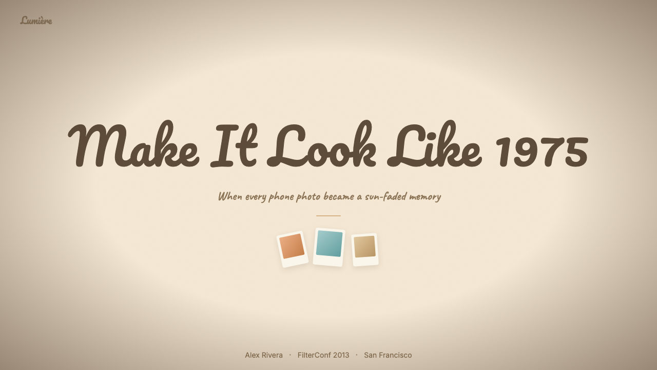
For presentation slides, the style works best on covers designed to establish mood and on section dividers that mark transitions between themes. A cover using this aesthetic might feature a warm cream or aged-ivory background with a Polaroid-frame image container offset to one side, a handwritten-script headline in a warm dark tone, and subtle grain across the full bleed. Content slides should be simpler: warm background, one clear typographic hierarchy using a humanist serif for headings and a readable body weight for text, no decorative borders beyond a thin warm rule. Data slides are the most challenging — the faded, warm palette conflicts with the precision that charts require. The solution is to use a lightly tinted card behind each chart, pull chart colors into the warm register (amber for primary data, dusty rose for secondary), and lift the darks so no value appears as a hard black.在演示文稿中,这种风格最适合用于建立氛围的封面,以及标记主题转换的章节分隔页。使用这种美学的封面可能包含:温暖奶油色或旧象牙色背景,偏向一侧的宝丽来相框图片容器,暖深色调的手写脚本标题,以及覆盖满幅的细腻颗粒。内容页应当更简单:暖色背景,一层清晰的字体层级(标题用人文主义衬线体,正文用可读字重),除细温色线条外无装饰性边框。数据页是最具挑战性的——褪色暖色板与图表所需的精确度存在冲突。解决方案是在每张图表后放置轻度着色的卡片,将图表颜色拉入暖色调(主数据用琥珀色,次数据用尘埃玫瑰色),并提亮暗调使没有值显示为硬黑色。
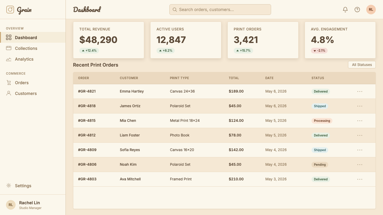
For web interfaces, the style is well-suited to portfolio sites, personal blogs, food and recipe platforms, lifestyle brand marketing pages, and any product where the user relationship is meant to feel personal rather than transactional. The approach for dashboards or utility pages in this style is more constrained: use warm backgrounds and cream surface tones to set the register, apply grain texture only to hero or background areas rather than to interactive components, and rely on warm-toned bordered cards rather than soft-shadow floating panels. Navigation and interactive elements (buttons, inputs, tabs) should stay legible and clean — the warmth lives in the surfaces, not in the controls. Pricing pages can use this style effectively if the brand positioning supports it: warm card containers, script or humanist type for plan names, amber or honey-toned highlights for recommended tiers.对于网页界面,这种风格非常适合作品集网站、个人博客、美食与食谱平台、生活方式品牌营销页面,以及任何用户关系应该感觉个人化而非交易性的产品。将这种风格用于仪表板或实用性页面需要更多约束:使用暖色背景和奶油色表面基调来建立整体基调,仅将颗粒质感应用于英雄区域或背景区域而非交互组件,依靠暖色调有边框卡片而非软阴影浮动面板。导航和交互元素(按钮、输入框、标签页)应保持清晰可读——温暖感存在于表面,而非控件。定价页面如果品牌定位支持,可以有效使用这种风格:暖色卡片容器,计划名称使用脚本体或人文主义字体,推荐等级使用琥珀色或蜂蜜色高亮。
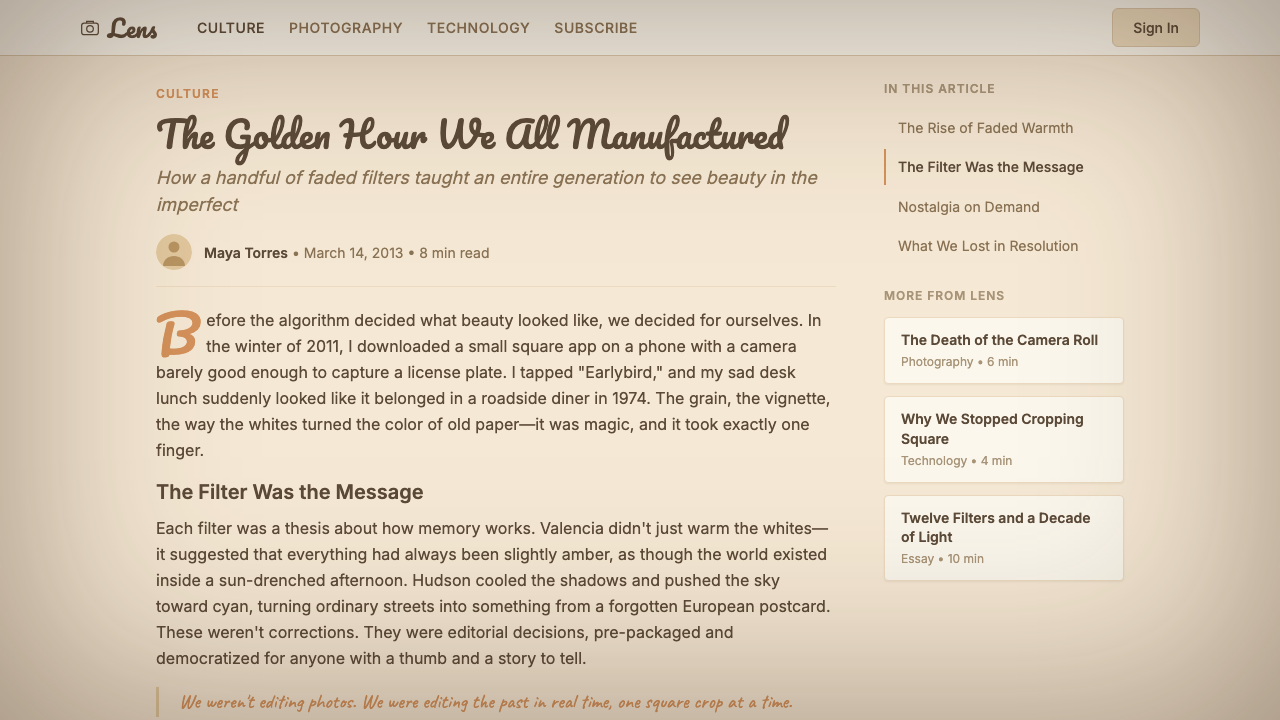
For editorial and marketing work, the filter aesthetic excels at hero imagery treatments, campaign landing pages, and print-adjacent digital collateral. A marketing page in this style typically features full-bleed imagery with a warm overlay and vignette, cream-background text sections with generous leading and a moderate measure, and section breaks marked by thin warm rules or Polaroid-frame photo inserts rather than geometric dividers. Headlines in a flowing script or warm serif create an editorial tone that feels crafted rather than templated. For social media graphics, the style translates directly: warm-toned background, centered or left-aligned script headline, subtle grain, and a Polaroid-border treatment on any image used.对于编辑和营销内容,滤镜美学在英雄图像处理、活动落地页和接近印刷的数字宣传材料上表现出色。这种风格的营销页面通常包含带暖色叠加和暗角的满幅图像、行距宽松、行宽适中的奶油色背景文字区段,以及用细暖色线条或宝丽来相框照片插件而非几何分隔线标记的章节分隔。流动脚本体或暖色衬线体的标题创造出一种精心制作而非模板化的编辑语调。对于社交媒体图形,这种风格可直接转化:暖色调背景、居中或左对齐的脚本体标题、细腻颗粒,以及对任何所用图像施加宝丽来边框处理。
A common and damaging mistake is using the visual elements of the filter era without the tonal discipline. Designers reach for grain texture and cream backgrounds but then introduce a fully saturated brand color, a hard-white popup, or a geometric icon set — all of which signal a completely different design vocabulary and break the warmth register instantly. Another frequent error is overdoing the grain: at high intensity, grain reads as a technical problem rather than an intentional aesthetic, particularly on screens that render at high pixel density. The grain should be present but subliminal. Finally, mixing handwritten-script headlines with body text in a heavy geometric sans-serif creates a tonal mismatch that reads as confused rather than layered. Choose one humanist family and vary it by weight and size rather than combining expressive script with cold geometric forms.一种常见且有害的错误是在没有色调纪律的情况下使用滤镜时代的视觉元素。设计师使用颗粒质感和奶油色背景,却引入了完全饱和的品牌色、纯白色的弹窗或几何图标集——这些都传递出完全不同的设计词汇,瞬间打破暖色基调。另一个频繁出现的错误是过度使用颗粒:强度过高时,颗粒读起来像是技术问题而非有意为之的美学,尤其在高像素密度的屏幕上。颗粒应当存在但近乎潜意识。最后,将手写脚本标题与粗重几何无衬线体的正文混用,会造成色调不匹配,读起来是混乱而非层次丰富。选择一个人文主义字体家族,通过字重和尺寸的变化来区分层级,而非将表达性脚本体与冷感几何形式组合在一起。
See the Instagram Filters 2012 design system查看 Instagram Filters 2012 完整设计系统
Instagram Filters 2012 — FAQInstagram Filters 2012 · 常见问题
Is this style the same as general vintage or retro design?这种风格和泛泛的复古设计是一回事吗?
No, and the distinction matters for application. General vintage and retro design is a broad category that can reference any era — Art Deco geometry, fifties diners, seventies psychedelia, eighties neon. Instagram filter aesthetics is specifically anchored to early smartphone culture and the photographic conventions of film stocks from the 1970s and early 1980s as mediated through digital filters. It is warm and faded rather than colorful and ornate. It has no decorative borders, no typography that references a specific historical period's poster conventions, and no color relationships derived from a specific decade's fashion or print palette. If you are designing something that should evoke the early 2010s social internet rather than a general sense of 'the past,' the Instagram filter register is the right reference. For a broader or differently anchored nostalgia, a different vintage style is more appropriate.不是,这一区别对应用至关重要。泛泛的复古设计是一个宽泛的类别,可以参照任何时代——装饰艺术几何、五十年代小餐馆、七十年代迷幻、八十年代霓虹。Instagram 滤镜美学则特定地锚定于早期智能手机文化,以及经由数字滤镜中介的七十年代和八十年代初胶卷的摄影惯例。它是温暖褪色的,而非色彩丰富且装饰繁复的。它没有装饰性边框,没有参照特定历史时期海报惯例的字体,没有源自特定十年时尚或印刷色板的色彩关系。如果你设计的东西应该唤起 2010 年代初期的社交互联网而非泛泛的「过去感」,Instagram 滤镜基调是正确的参照。对于更宽泛或以不同方式锚定的怀旧感,另一种复古风格更为合适。
Can this style work for professional or business-facing products?这种风格适合面向专业或商业用途的产品吗?
It can, but only for specific categories of professional products where warmth and personal connection are brand values. A professional photography platform, a creative freelancer portfolio tool, a specialty food or beverage business, or a boutique travel service could use this style effectively. It is inappropriate for products where authority, precision, and neutrality are expected — financial services, legal software, medical platforms, enterprise analytics. The risk in applying this style to a professional context is that the warmth reads as informality, and the faded quality reads as lack of precision. If a user needs to trust the accuracy of what they are seeing, the Instagram filter register — which makes everything look slightly dreamy and impermanent — works against that trust.可以,但仅适用于温暖感和个人连接是品牌价值的特定专业产品类别。专业摄影平台、创意自由职业者的作品集工具、特色食品或饮料企业、精品旅游服务可以有效使用这种风格。它不适合权威性、精确性和中立性是期望值的产品——金融服务、法律软件、医疗平台、企业分析工具。将这种风格应用于专业语境的风险在于:温暖感被读作随意性,褪色品质被读作缺乏精确度。如果用户需要信任他们所看到内容的准确性,Instagram 滤镜基调——让一切看起来略带梦幻且短暂——会对抗这种信任。
How do you prevent the style from looking dated or ironic?如何防止这种风格看起来过时或带有反讽意味?
The key is to apply the aesthetic qualities — warmth, grain, faded tones, analog references — without literal nostalgia signaling. A design that uses cream backgrounds, lifted shadows, and warm grain can read as a contemporary considered choice rather than a period imitation, provided it avoids the specific UI conventions of the 2010s: chunky skeuomorphic buttons, linen texture backgrounds, drop shadows on everything, and literal filter-name typography. The grain should be fine and integrated, not coarse and theatrical. The warmth should be in the tonal register, not signaled by obvious Instagram-era icons or interface metaphors. Used with restraint and paired with contemporary layout sensibility, the warmth and grain of the filter era can feel fresh because the underlying emotional register — intimacy, impermanence, analog warmth — is genuinely resonant rather than historically specific.关键在于应用美学品质——温暖感、颗粒、褪色调、模拟参照——而不进行字面意义上的怀旧信号传递。使用奶油色背景、提亮阴影和暖色颗粒的设计,可以被读作当代深思熟虑的选择,而非特定时期的仿制,前提是避免 2010 年代的特定 UI 惯例:厚重的拟物化按钮、亚麻质感背景、无处不在的投影阴影,以及字面意义的滤镜名称字体。颗粒应当细腻且融合,而非粗糙且戏剧性。温暖感应当存在于色调基调中,而非通过明显的 Instagram 时代图标或界面隐喻来传递。在克制的使用下,配合当代版式感,滤镜时代的温暖和颗粒可以感觉清新——因为底层的情感基调——亲密感、短暂性、模拟温暖——是真正共鸣的,而非历史性特定的。
What is the difference between this style and VSCO aesthetic?这种风格和 VSCO 美学有什么区别?
Instagram filter aesthetics (2010–2014) is heavier, more dramatic, and more obviously processed than VSCO aesthetic. Instagram filter-era images have strong vignettes, visible grain, dramatic color shifts, and the distinctive faded quality of lifted blacks. VSCO presets — which dominated from around 2013 onward — are subtler: lighter on vignetting, more controlled in grain, warmer or cooler in temperature shifts rather than multi-dimensional, and oriented toward a look that appears edited but not overtly filtered. If Instagram filters say 'this photo has been transformed,' VSCO says 'this photo has been refined.' In design application, Instagram filter aesthetics is more texturally rich and emotionally warm; VSCO-influenced work is cleaner and more photographic, closer to the contemporary editorial aesthetic that followed the filter era.Instagram 滤镜美学(2010—2014 年)比 VSCO 美学更厚重、更戏剧性、更明显地被加工。Instagram 滤镜时代的图像有强烈的暗角、可见的颗粒、戏剧性的色彩偏移,以及提亮黑色产生的独特褪色品质。VSCO 预设——大约从 2013 年起占主导地位——则更细腻:暗角更轻,颗粒更受控,色温偏移是单维度的暖或冷而非多维度的,面向一种看起来经过编辑但未被明显滤镜化的外观。如果 Instagram 滤镜在说「这张照片被转化了」,VSCO 则在说「这张照片被精炼了」。在设计应用中,Instagram 滤镜美学在质感上更丰富,情感上更温暖;受 VSCO 影响的作品更清洁、更具摄影感,更接近滤镜时代之后出现的当代编辑美学。
Can dark mode work with Instagram filter aesthetics?深色模式能与 Instagram 滤镜美学配合吗?
A dark variant is possible but requires a careful rethinking of every element. The light version of the style derives its warmth from cream and ivory grounds on which faded tones float; on a dark background, the same faded tones can read as murky or unresolved rather than warm. A successful dark adaptation would anchor to a very dark warm-brown or amber-tinged near-black rather than a neutral dark grey or true black, keeping cream and warm ivory as foreground text and card surface colors, and reducing grain intensity since grain reads differently at higher contrast. The vignette logic inverts: instead of edges darkening into corners, the center of a component might be slightly lighter, simulating a gentle spotlight rather than optical falloff. Polaroid frame treatments become amber-bordered rather than cream-bordered. The style is achievable in a dark context, but it is more constrained and requires more deliberate calibration than the light version.深色变体是可能的,但需要对每个元素进行仔细的重新思考。这种风格的浅色版本从奶油色和象牙色底面衍生出温暖感,褪色调在其上浮动;在深色背景上,相同的褪色调可能读来昏暗或未解决,而非温暖。成功的深色适配会以非常深的暖棕色或带琥珀色调的近黑色作为锚点,而非中性深灰或真正的黑色,将奶油色和暖象牙色保留为前景文字和卡片表面颜色,并降低颗粒强度——因为颗粒在更高对比度下的读法不同。暗角逻辑反转:边缘不是暗向角落,而是组件中心可能略微更亮,模拟柔和的聚光灯效果而非光学衰减。宝丽来相框处理从奶油色边框变为琥珀色边框。这种风格在深色语境中是可实现的,但比浅色版本更受约束,需要更为刻意的校准。
Related design styles相关设计风格
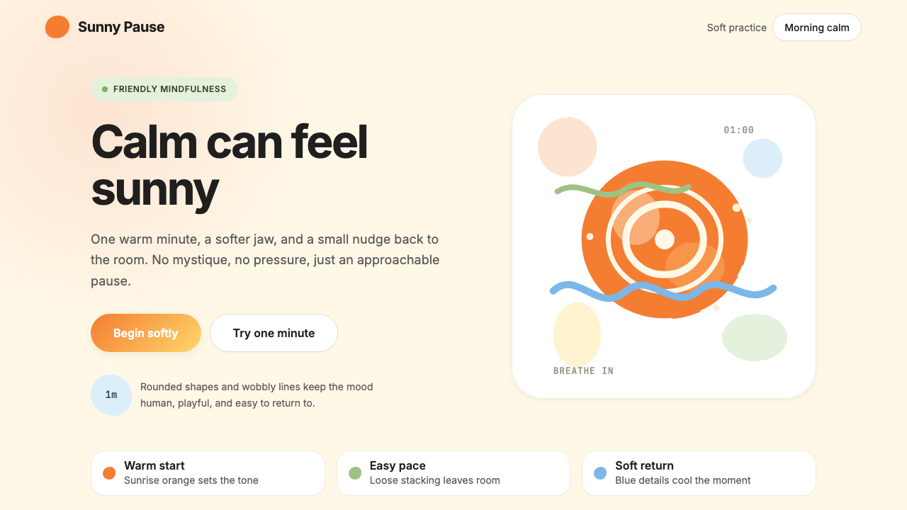 HeadspaceOptimism makes calm approachable. Sunrise orange and wobbly rounded forms bre…乐观让平静亲近:日出橙与摇摆圆形在奶油底上呼吸。
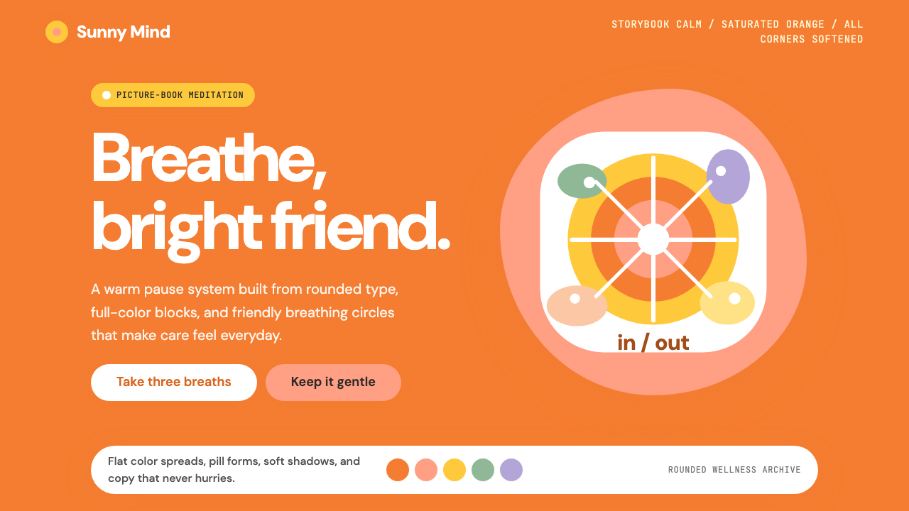 Headspace Orange MeditationMeditation becomes friendly. Orange blocks, DM Sans, and pill shapes soften e…冥想变得亲切:橙色块、DM Sans 与药丸圆角软化一切。
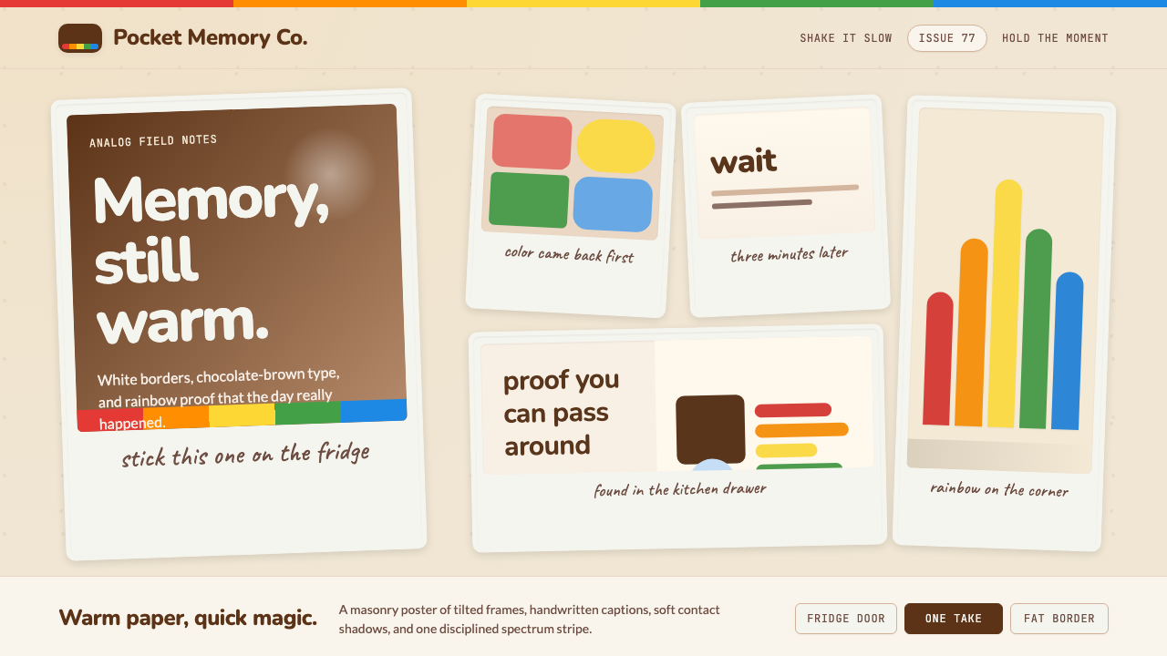 Polaroid InstantMemory made tangible. Photo-white frames tilt on aged paper with a warm rainb…记忆变得可触:相纸白边倾斜在旧纸底上,彩虹条点亮温度。
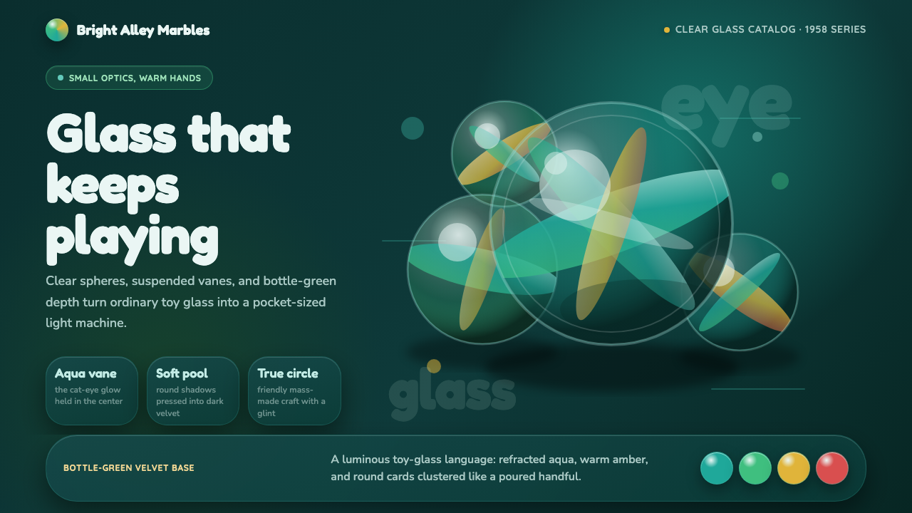 Cat's Eye MarblesMass-made glass feels magical. Aqua vanes glow inside round forms on bottle-g…量产玻璃也有魔法:水绿叶片在圆形玻璃与墨绿绒面里发光。
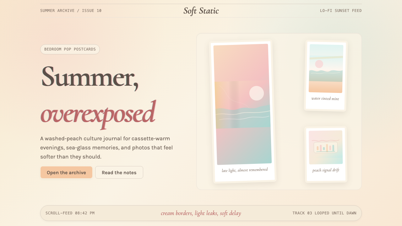 Chillwave TumblrA summer that never happened. Cream Polaroids, washed peach, and turquoise li…从未发生的夏天:奶油宝丽来、褪色蜜桃与松石漏光。
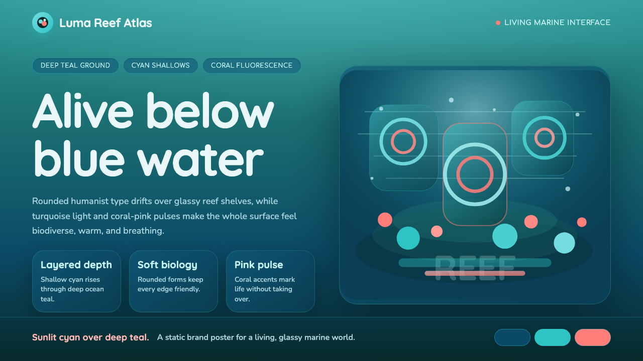 Great Barrier ReefAlive under deep teal. Quicksand curves, cyan glow, and coral-pink pulses bui…深海蓝绿中有生命:圆润字形、青蓝光晕与珊瑚粉脉冲层叠成礁。