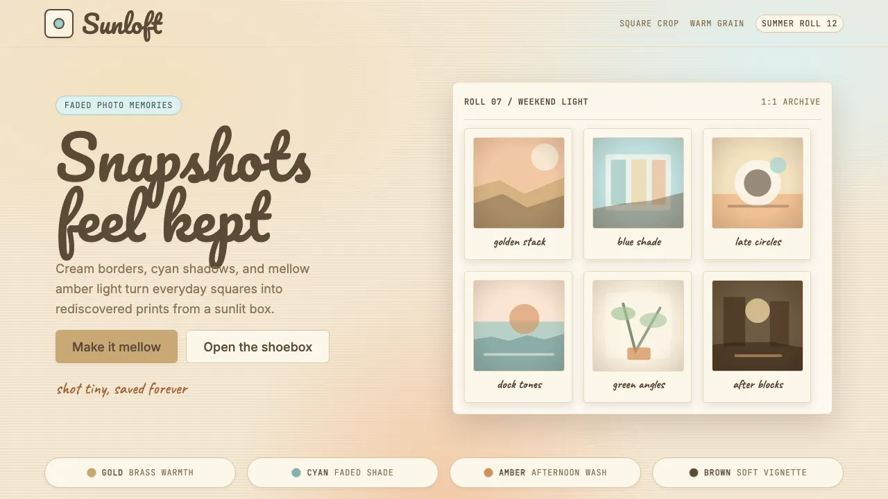
About Instagram Filters 2012
Instagram's filter era (2010–2014) made every phone snapshot feel like a rediscovered 1975 Kodachrome print. Hudson, Earlybird, X-Pro II, and Valencia became a shared visual vocabulary — faded warmth, dark vignettes, and cream-tinted borders turned mundane photos into objects of instant nostalgia.
This design system distills that pre-flat, skeuomorphic warmth into interface tokens: cream backgrounds instead of sterile whites, film-grain textures, Polaroid-frame cards, and the handwritten script energy of Pacifico headlines. It is a system that says "remember when photos felt like memories, not content."
- Origin
- San Francisco, California
- Era
- 2010 founded; filter-era peak 2010–2014; visual largely abandoned 2016+
- Key figures
- Kevin Systrom · Mike Krieger · Cole Rise
- Movements
- Hipstamatic-era mobile photography · Polaroid revival · faux-vintage digital
Instagram Filters 2012 design spec
Colors
Typography
The other 11 sections — buttons, cards, spacing, motion, techniques and more — open once you unlock. Download the DESIGN.md or send it to your AI in one click. Unlock once, yours forever.
Sign up nowStyles similar to Instagram Filters 2012
Also inspired by brands & products, with a close feel.
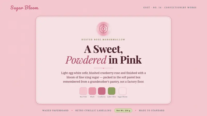 Soviet Zefir ConfectioneryA sweet remembered, not manufactured. Sugar-pink waxed-box ground, berry-rose Playfair serif.
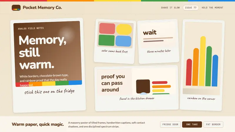 Polaroid InstantMemory made tangible. Photo-white frames tilt on aged paper with a warm rainbow stripe.
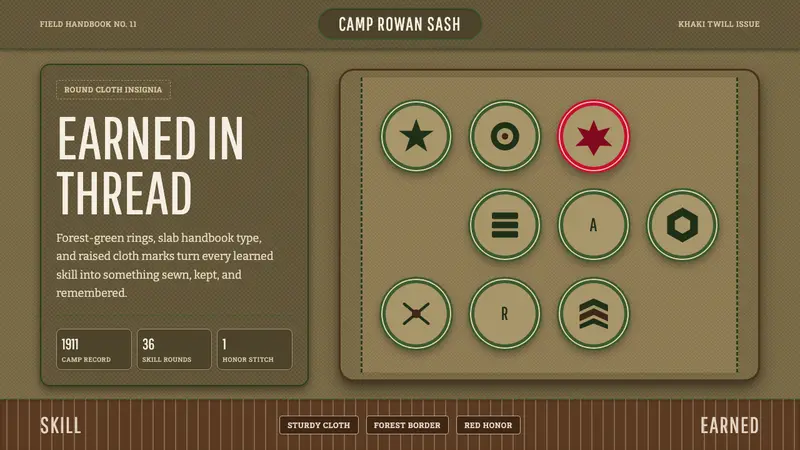 Scout Merit BadgesEarned, not polished. Forest-green rings and khaki twill make every badge feel stitched.
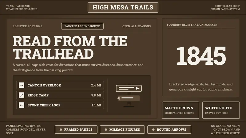 Clarendon Slab SerifBuilt for distance. Routed white slab legends cut into dark park-sign brown.