What is Chillwave Tumblr 2010?什么是 Chillwave Tumblr 2010?
A summer that never quite happened — sun-bleached pastels, faded Polaroid borders, and the warm hiss of a cassette rewinding at the edge of memory.一个从未真正发生过的夏天——褪色的粉彩、泛黄的宝丽来边框,以及记忆边缘磁带倒带时的温暖沙沙声。
Chillwave Tumblr 2010 in briefChillwave Tumblr 2010 速览
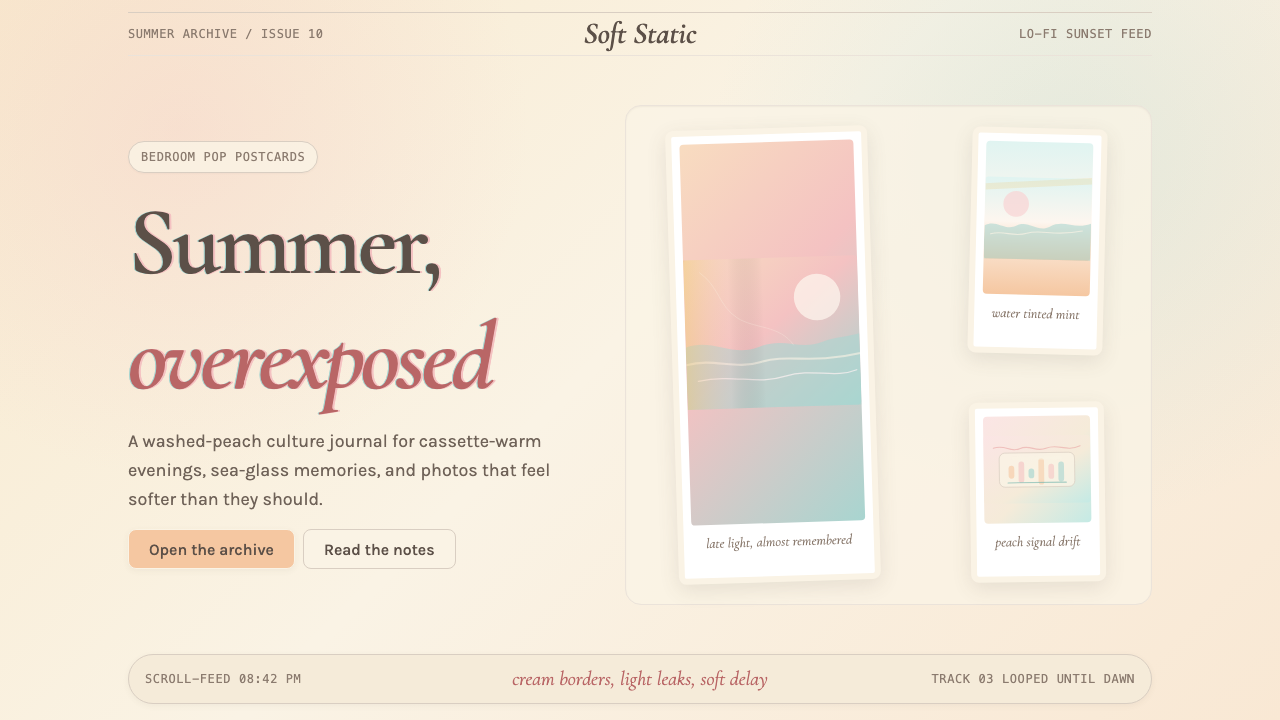
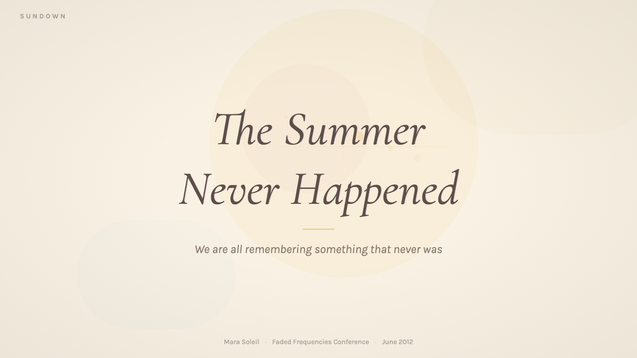
Chillwave Tumblr is the visual language of a specific internet moment: roughly 2009 to 2012, when a loose cluster of bedroom musicians, Tumblr bloggers, and lo-fi aesthetes collectively willed into existence a nostalgic summer that none of them had actually lived. The look is instantly recognizable — overexposed cream and peach tones, washed-out gradients that bleed from warm amber into hazy turquoise, light-leak flares cutting across the frame, and romantic serif lettering that feels less like a typeface and more like handwriting on the back of a postcard found in a thrift-store jacket.Chillwave Tumblr 是一个特定互联网时刻的视觉语言:大约在 2009 年至 2012 年间,一群卧室音乐人、Tumblr 博主和低保真美学爱好者,共同凭空构建了一个他们从未真正经历过的怀旧夏天。这种风格极易辨认——过曝的奶油色与蜜桃色调,从暖琥珀渐变为朦胧松石色的褪色渐变,穿越画面的漏光光晕,以及浪漫的衬线字体,与其说是字体,不如说是在旧货店夹克内袋里发现的明信片背面的手写字迹。
The palette refuses saturation. Where other design movements reach for vibrance, Chillwave Tumblr deliberately bleaches everything — pinks go dusty, blues go muted and coastal, yellows become the color of old paper left in a sunny window. Gradients are essential to the aesthetic, but they are slow, soft, and hazy rather than vivid; they simulate the way film emulsion shifts in overexposed conditions, or the way a summer afternoon light diffuses through a thin curtain. The effect is warmth without heat, brightness without sharpness.这套色板拒绝饱和。其他设计运动追求鲜艳,Chillwave Tumblr 却刻意将一切漂白——粉红变得灰扑,蓝色变得柔和而带有海岸感,黄色成了晒在阳光下的旧纸张的颜色。渐变是这种美学的核心,但它们缓慢、柔软而朦胧,而非鲜明;它们模拟的是胶片乳剂在过曝条件下的色偏,或者夏日午后阳光透过薄薄窗帘漫射的方式。这种效果是温暖而非灼热,是明亮而非锐利的。
Typography in this world leans toward elegantly worn serif letterforms — faces that evoke early-twentieth-century ephemera like travel posters, drugstore receipts, and handset type from small-town newspapers. These are not the confident geometric serifs of editorial modernism but something quieter and more wistful, letterforms that appear to have been handled many times. Layered with translucent washes, scratchy texture overlays, and occasional handwritten annotation, they complete a visual system that feels simultaneously designed and discovered.这个世界里的字体排印倾向于优雅而带有岁月痕迹的衬线字形——让人联想到二十世纪初各种印刷品的字体:旅游海报、药店收据、小镇报纸的手工铸字。这些不是编辑现代主义中自信的几何衬线体,而是某种更安静、更惆怅的存在,仿佛被无数人反复翻阅过的字形。配合半透明色洗、划痕纹理叠层和偶尔的手写批注,它们共同构成了一套既像经过精心设计、又像偶然发现的视觉系统。
See the Chillwave Tumblr 2010 design system查看 Chillwave Tumblr 2010 完整设计系统
Where does Chillwave Tumblr 2010 come from?Chillwave Tumblr 2010 从何而来?
The word 'chillwave' was coined in August 2009 by Carles, the pseudonymous author of the music blog Hipster Runoff, as a partly satirical genre label for a cluster of bedroom-produced synth-pop acts whose music was defined by woozy tape warble, reverb-drenched vocals, and an atmosphere of hazy, sun-drunk nostalgia. The three acts most associated with the founding moment — Toro y Moi (Chazwick Bundick), Washed Out (Ernest Greene), and Neon Indian (Alan Palomo) — each released breakthrough material in 2009 and 2010, and each independently arrived at a sound that evoked cassette-taped summers from a childhood too young to have been theirs.「Chillwave」这个词由匿名音乐博客 Hipster Runoff 的作者 Carles 于 2009 年 8 月创造,作为一个带有半讽刺意味的流派标签,用来描述一批卧室制作的合成器流行乐人——他们的音乐以迷离的磁带颤音、混响浸泡的人声,以及一种朦胧的、阳光醺醺的怀旧氛围为特征。与这一创始时刻联系最为紧密的三位艺术家——Toro y Moi(Chazwick Bundick)、Washed Out(Ernest Greene)和 Neon Indian(Alan Palomo)——均在 2009 至 2010 年间发布了突破性作品,并各自独立地抵达了同一种声音:那是被磁带录制的夏天,一个属于他们年龄还太小、实际上不可能拥有的童年的夏天。
The term 'hypnagogic pop' was proposed around the same time by music critic David Keenan, who used it to describe a broader lineage of artists — including the Caretaker, Ariel Pink, and R. Stevie Moore — working in sounds that simulated the half-dreaming state between sleep and waking. Chillwave sat within this larger hypnagogic tendency but had a more specific generational flavor: it was not just lo-fi but internet lo-fi, made by people who had grown up with Napster and Myspace, who understood the online image as naturally degraded, and who found beauty in jpeg artifacts, low-resolution scans, and the compression noise of early streaming.大约在同一时期,音乐评论人 David Keenan 提出了「催眠流行」(hypnagogic pop)这一术语,用以描述更广泛的一批艺术家——包括 The Caretaker、Ariel Pink 和 R. Stevie Moore——他们的音乐模拟介于睡眠与清醒之间的半梦幻状态。Chillwave 处于这一更宏观的催眠倾向之内,但拥有更鲜明的世代风味:它不只是低保真,而是互联网式的低保真,由那些伴随 Napster 和 Myspace 成长的人所制作——他们将在线图像视为天然降质之物,在 JPEG 压缩痕迹、低分辨率扫描件和早期流媒体的压缩噪声中发现了美。
Tumblr, founded in 2007, was the natural habitat for this aesthetic. The platform's reblog architecture meant that images circulated rapidly and without attribution, accumulating layers of re-saving and re-uploading that subtly degraded them — adding grain, flattening contrast, washing out colors — in ways that only heightened their chillwave resonance. Scan a Polaroid, post it to Tumblr, watch it get reblogged five hundred times: by the end it was somehow more Polaroid than the original. The platform's visual culture in 2010 and 2011 was saturated with sun-flare photography, film-grain textures, pastel color fields, and romantic serif typographic treatments that would become the aesthetic's defining signatures.2007 年创立的 Tumblr,是这种美学的天然栖居地。该平台的转发架构意味着图像在快速流传中丧失了署名——随着无数次的重新保存与上传而悄然降质,增加颗粒感、压缩对比度、冲淡色彩——而这种降质方式只会加深它们的 Chillwave 共鸣。将一张宝丽来扫描后发布到 Tumblr,看它被转发五百次:最终它以某种方式比原作更像宝丽来。2010 至 2011 年间,Tumblr 的视觉文化被阳光耀斑摄影、胶片颗粒纹理、粉彩色域和浪漫衬线字体排印处理所饱和——这些元素后来成为这种美学最具辨识度的标志。
The visual lineage draws from several streams simultaneously. Analog photography of the 1970s and 1980s — particularly the look of consumer-grade film processed in drugstore labs — supplied the color palette: cream, coral, dusty rose, sea-glass teal, and faded sage. The graphic ephemera of that same era — motel postcards, record inner sleeves, mall-arcade flyers — contributed the typography and compositional looseness. The lo-fi revival of the early 2000s, associated with artists like Sufjan Stevens and the Postal Service, had already rehabilitated the cassette tape as an emotional signifier; chillwave simply pushed that nostalgia further back and made it wetter, warmer, and more visual. The result was a design vernacular that felt like memory itself: soft at the edges, slightly wrong in its colors, and overwhelmingly beautiful for reasons you could not quite articulate.这种视觉谱系同时汲取了多条支流。二十世纪七八十年代的模拟摄影——特别是消费级胶片在药店冲印时的色调——提供了色板:奶油色、珊瑚色、灰蒙蒙的玫瑰色、海玻璃般的蓝绿色和褪色的鼠尾草绿。同一时代的印刷品——汽车旅馆明信片、黑胶唱片内页、商场游戏厅传单——贡献了字体和构图上的随意感。二十一世纪初的低保真复兴(以 Sufjan Stevens 和 Postal Service 为代表)已经将磁带盒作为情感符号加以复活;Chillwave 只是将那种怀旧推得更远,使其更潮湿、更温暖、更具视觉性。结果是一套设计方言,感觉就像记忆本身:边缘柔软,色彩略显偏差,却以某种你无法言说的方式无比美丽。
What defines the Chillwave Tumblr 2010 look?Chillwave Tumblr 2010 的视觉特征是什么?
Palette色板
The palette is built around warmth and deliberate fading rather than vibrancy. Cream and warm off-white serve as base grounds. Peach, dusty rose, and coral occupy the warm range; muted teal, sea-glass blue-green, and hazy lavender provide cool counterweights. Nothing is fully saturated — every hue is pulled toward its pastel or washed-out form, as if the image has been left in sunlight too long. The resulting effect is simultaneously warm and melancholy, summer and nostalgia at once.这套色板以温暖感和刻意的褪色感为核心,而非鲜艳。奶油色和偏暖的近白色作为底色。蜜桃色、灰蒙蒙的玫瑰色和珊瑚色占据暖调区间;柔和的蓝绿色、海玻璃般的蓝绿和朦胧薰衣草色提供冷调平衡。没有任何色彩是完全饱和的——每一种色调都被拉向其粉彩或褪色形态,仿佛图像在阳光下搁置太久。由此产生的效果同时是温暖的和忧郁的,是夏天也是乡愁。
Light Leaks and Gradient Washes漏光与渐变色洗
The light leak — a streak of warm amber or rosy pink that bleeds across a corner or edge of the composition — is one of chillwave's most distinctive visual signatures. It derives from a real photographic phenomenon: light entering a camera's film chamber through a gap in the body, leaving an overexposed streak on the negative. In chillwave design, this artifact becomes decorative and intentional, applied as a translucent gradient that softens boundaries and imparts a sense of warmth and accident. Broader gradient washes, moving slowly from peach to lavender or from cream to coastal blue, serve a similar function: they dissolve hard edges and make the image feel like something gently remembered rather than precisely seen.漏光——一道暖琥珀色或玫瑰粉色的光晕,从构图的角落或边缘漫出——是 Chillwave 最具辨识度的视觉标志之一。它源自一种真实的摄影现象:光线通过相机机身的缝隙进入胶片室,在底片上留下过曝的条纹。在 Chillwave 设计中,这种缺陷变成了装饰性和有意为之的元素,以半透明渐变的形式叠加,柔化边界,赋予画面温暖感和偶然感。更大范围的渐变色洗——从蜜桃色缓缓过渡到薰衣草色,或从奶油色过渡到海岸蓝——发挥着相似的作用:它们溶解硬边,让图像感觉像是被温柔地记起,而非被清晰地看见。
Texture and Film Grain纹理与胶片颗粒
Smooth digital surfaces are deliberately broken up with analog imperfection. Film grain — a fine, slightly irregular texture reminiscent of photographic emulsion — is layered over images and color fields to undercut their digital precision. Scratches, dust, and light-bloom artifacts appear as thin overlaid marks that suggest physical film stock. Paper textures may appear in backgrounds, giving the impression that the design has been printed, aged, and scanned rather than rendered on screen. This accumulation of analog noise is not decoration in the conventional sense — it is a kind of deliberate temporal displacement, a signal that says: this came from before.光滑的数字表面被刻意打破,引入模拟的不完美。胶片颗粒——一种细腻、略显不规则的纹理,令人联想到摄影乳剂——叠加在图像和色域之上,以削弱其数字精度。划痕、尘点和光晕痕迹作为细微的叠加标记出现,暗示物理胶片的质感。纸张纹理可能出现在背景中,给人一种设计被打印、经岁月侵蚀后又被扫描的印象,而非在屏幕上直接渲染的感觉。这种模拟噪声的积累不是传统意义上的装饰——它是一种刻意的时间错位,一种信号,说:这来自从前。
Typography字体排印
The typefaces that feel most native to chillwave are worn and warm rather than crisp and geometric. Display type leans toward older serif styles — faces that evoke the hand-set printing of earlier decades, with slightly irregular stroke weights and a sense of gentle craftsmanship. Headline lettering is often large and unhurried, with generous letterspacing that gives words room to breathe like a long exhalation. Handwritten elements — annotations, captions, casual notes in the margin — appear regularly, reinforcing the sense that this is personal correspondence rather than published design. Body text, where it appears, is kept sparse; the aesthetic does not favor density of information.最契合 Chillwave 气质的字体是磨损而温暖的,而非清晰与几何化的。展示性字体倾向于更古老的衬线风格——让人联想到早年手工铸字印刷的字体,笔画粗细略有不规则感,带有一种温柔的手工感。标题文字通常大而从容,宽松的字间距让文字有呼吸的空间,如一次绵长的呼气。手写元素——批注、图注、页边随手记下的笔记——频繁出现,强化了这是私人通信而非正式出版设计的感觉。正文(如果出现)保持稀疏;这种美学不偏爱信息密度。
Photography and Imagery摄影与图像
Photography is central to the chillwave visual vocabulary, but it is always photography that has been processed, distressed, or filtered. The canonical images are overexposed outdoor scenes — sun-bleached beach shots, hazy backlit portraits where the subject dissolves into light, Polaroid-bordered squares with washed-out midtones. Colors within photographs are shifted warm, often toward amber and peach, with the cool tones in shadows desaturated or tinted toward lavender. Double exposures, motion blur, and soft focus are common; the image should feel like a half-remembered dream, not a document.摄影是 Chillwave 视觉词汇的核心,但它始终是经过处理、做旧或滤镜加工的摄影。最具代表性的图像是过曝的户外场景——褪色的海滩照、逆光朦胧的人像(主体溶入光线中)、色调泛白的宝丽来方形照片。照片中的色彩向暖调偏移,通常偏向琥珀和蜜桃,阴影中的冷色调则被去饱和或染上薰衣草色调。多重曝光、动态模糊和软焦点很常见;图像应该感觉像一个半途清醒的梦,而非一份文件。
Composition and Space构图与空间
Chillwave layouts favor openness and drift over rigid structure. There is rarely a hard grid in the sense that modernist design employs one; instead, elements float with generous breathing space, positioned according to a loose intuitive balance rather than mathematical alignment. Borders — particularly the thin, uneven borders that Polaroid photographs have — frame images in ways that emphasize their handmade quality. Negative space is pale and warm rather than stark white, softening the overall impression and giving the layout the quality of a scrapbook page or a collaged zine spread.Chillwave 的版面偏爱开放与漂浮感,而非严格的结构。它很少采用现代主义设计意义上的严格网格;相反,元素漂浮其中,拥有充裕的呼吸空间,按照一种松散的直觉平衡而非数学对齐来定位。边框——尤其是宝丽来照片那种细而不均匀的边框——为图像加框,强调其手工质感。负空间是浅暖色而非纯白,软化了整体印象,赋予版面一种剪贴簿页面或拼贴杂志展开页的品质。
Emotional Register情感基调
If Bauhaus communicates through logic and Swiss Style through precision, Chillwave Tumblr communicates through feeling — specifically a feeling of bittersweet longing for something that may never have existed. The aesthetic deliberately constructs a mood: the warmth of late afternoon, the slight sadness of summer ending, the way a favorite song from ten years ago sounds different now. Every design decision — the washed palette, the soft edges, the grain, the handwriting — contributes to this emotional signal rather than to clarity or efficiency. It is a rare design system whose primary output is an emotion rather than information.如果包豪斯通过逻辑传达,瑞士风格通过精确传达,那么 Chillwave Tumblr 则通过感受传达——具体而言,是对某种或许从未存在之事物的苦甜交织的渴望。这种美学刻意构建一种情绪:午后将晚时的温暖,夏天结束时淡淡的忧伤,十年前最喜欢的一首歌如今听来已然不同的感觉。每一个设计决定——褪色的调色板、柔软的边缘、颗粒感、手写字——都服务于这一情感信号,而非清晰度或效率。这是一个罕见的设计系统,其主要输出是情感而非信息。
See the Chillwave Tumblr 2010 design system查看 Chillwave Tumblr 2010 完整设计系统
Who shaped Chillwave Tumblr 2010?谁塑造了 Chillwave Tumblr 2010?
Carles was the pseudonymous author of Hipster Runoff, a music and culture blog that ran from approximately 2007 to 2013 and whose irony-saturated prose style was inseparable from the chillwave moment it helped name. In August 2009, Carles applied the term 'chillwave' to a cluster of acts including Washed Out, Toro y Moi, and Neon Indian, giving a name to a diffuse aesthetic that bloggers and fans had been circling without language for it. Whether the label was serious or satirical was itself part of the aesthetic — and this ambiguity, this refusal to take nostalgia too earnestly or dismiss it too coolly, captured something essential about how Tumblr culture processed feeling.Carles 是 Hipster Runoff 的匿名作者,这个音乐与文化博客大约从 2007 年运营至 2013 年,其充满反讽的文风与它所命名的 Chillwave 时刻密不可分。2009 年 8 月,Carles 将「Chillwave」一词应用于包括 Washed Out、Toro y Moi 和 Neon Indian 在内的一批艺术家,为一种博主和粉丝们长期在其周围徘徊却苦于无以名之的弥散美学命了名。这个标签究竟是认真的还是讽刺的,本身就是这种美学的一部分——这种模糊性,这种拒绝过于认真地对待怀旧、也拒绝过于冷然地将其挥去的态度,捕捉了 Tumblr 文化处理情感方式中某种至关重要的东西。
Ernest Greene released his debut EP 'Life of Leisure' in early 2010, and the title track became something close to the defining sound of the chillwave moment: slow, saturated synth chords, a vocal so drenched in reverb it is barely distinguishable from the melody, and a sense of suspended summer afternoon that lingered long after the song ended. Greene's visual presentation — tour flyers, album artwork, and early Tumblr-circulated images — drew from the same well as the music: sun-bleached photography, warm gradient fields, and a typography that leaned into aged imperfection. His work demonstrated that the sound and the image were inseparable aspects of a single aesthetic proposition.Ernest Greene 于 2010 年初发布处女 EP《Life of Leisure》,主打曲几乎成为 Chillwave 时刻的定义性声音:缓慢而饱满的合成器和弦,混响浸透的人声几乎与旋律融为一体,以及一种歌曲结束后依然久久悬浮的夏日午后感。Greene 的视觉呈现——巡演传单、专辑封面,以及早期在 Tumblr 上流传的图像——与音乐汲取自同一口井:褪色的摄影、暖调渐变色域,以及倾向于岁月残损感的字体排印。他的作品证明,声音与图像是同一美学主张不可分割的两个面向。
Chazwick Bundick, recording as Toro y Moi, released 'Causers of This' in January 2010, an album whose layered, sample-based production and warm synthesizer textures placed it at the heart of the chillwave conversation. Bundick was notable among the chillwave cohort for having a background in visual arts as well as music — he created much of his own cover artwork and promotional material, and the aesthetic continuity between his visual and sonic output was tighter than most of his peers. His work established the feedback loop between music and image that would define chillwave as a holistic aesthetic rather than just a sound.以 Toro y Moi 为名录音的 Chazwick Bundick 于 2010 年 1 月发布《Causers of This》,这张专辑层次丰富的采样制作和温暖的合成器质感,将其置于 Chillwave 讨论的核心。Bundick 在 Chillwave 同人中的独特之处在于,他同时具有视觉艺术背景——他亲自创作了大部分封面和宣传材料,其视觉与声音输出之间的美学连贯性比大多数同侪更为紧密。他的作品建立了音乐与图像之间的反馈回路,这种回路将 Chillwave 定义为一种整体美学,而非仅仅是一种声音。
Alan Palomo's Neon Indian project — particularly the debut album 'Psychic Chasms,' released in 2009 — brought a more obviously psychedelic and saturated edge to the chillwave palette while remaining within its essential grammar. Where Washed Out leaned toward languor and Toro y Moi toward warmth, Neon Indian introduced a slightly more electric quality: neon against cream, the phosphorescent glow of a television left on in a dark room. Palomo's visual aesthetic, heavy with distorted VHS imagery and glitchy video artifacts, helped expand the chillwave image vocabulary beyond sun-bleached photography into territory that would eventually influence vaporwave.Alan Palomo 的 Neon Indian 项目——尤其是 2009 年发布的处女专辑《Psychic Chasms》——在保持 Chillwave 基本语法的同时,为其调色板带来了更明显的迷幻感和饱和边缘。Washed Out 倾向于慵懒,Toro y Moi 倾向于温暖,而 Neon Indian 则引入了一种稍显电气化的品质:霓虹映衬奶油色,暗室中一台亮着的电视机发出的磷光般的光晕。Palomo 的视觉美学,充满扭曲的 VHS 图像和故障视频痕迹,帮助将 Chillwave 的图像词汇从褪色摄影扩展至更广阔的领域——那片领域最终将影响蒸汽波的诞生。
No single visual artist defined the look of Chillwave Tumblr in the way that a named designer might define a corporate visual identity. The aesthetic was instead produced collectively by thousands of anonymous and pseudonymous Tumblr users — photographers, graphic designers, collage artists, and enthusiastic amateurs — who circulated images, remixed them, applied filters, and layered in typography according to shared aesthetic intuitions that were never formally articulated. This collective, uncredited authorship is itself meaningful: Chillwave Tumblr is perhaps the first major design movement whose primary medium was the reblog and whose canonical works are largely unattributable.没有哪位单一的视觉艺术家像命名设计师定义企业视觉识别那样,定义了 Chillwave Tumblr 的外观。这种美学是由数以千计的匿名和化名 Tumblr 用户——摄影师、平面设计师、拼贴艺术家和热情的业余爱好者——共同生产的,他们流通图像、对其进行再混合、叠加滤镜,并按照从未被正式表述过的共同美学直觉添加字体排印。这种集体性的、无署名的创作本身就意义深远:Chillwave Tumblr 或许是第一个以「转发」作为主要媒介、其经典作品大多无法归属的重要设计运动。
How do you use Chillwave Tumblr 2010 today?今天怎么用 Chillwave Tumblr 2010?
Chillwave Tumblr is not a neutral style — it carries strong emotional freight, and that freight is the point. Applying it well means first deciding whether the emotional register of warm nostalgia and gentle melancholy serves the product or audience in question. It suits brands and experiences that want to evoke a sense of slowness, memory, and authenticity: independent music, boutique lifestyle goods, wellness and retreat concepts, editorial publications aimed at younger creative audiences. It is a poor fit for contexts that demand clarity, urgency, or trust signals — financial services, data-heavy dashboards, enterprise software, medical information.Chillwave Tumblr 不是一种中性风格——它承载着强烈的情感重量,而这种重量本身就是要点所在。正确运用它,意味着首先要判断温暖怀旧与温柔忧郁的情感基调是否服务于所讨论的产品或受众。它适合那些希望唤起慢节奏感、记忆感和真实感的品牌与体验:独立音乐、精品生活方式商品、健康与度假概念、面向年轻创意受众的编辑出版物。对于那些需要清晰、紧迫或信任信号的语境,它是糟糕的选择——金融服务、数据密集型仪表板、企业软件、医疗信息。
For presentation slides, Chillwave Tumblr works best on covers and transitional pages rather than dense content slides. A cover slide should use a full-bleed washed photographic background — overexposed outdoor imagery — with a large, warm-toned serif headline given generous letterspacing. Light-leak gradients can appear in corners to frame without confining. Transitional divider slides benefit from a single slow gradient field — peach fading to lavender, or cream fading to coastal blue — with minimal text. Content slides should be sparse: pull a key phrase large, keep supporting text brief and lightly spaced, and use texture overlays at very low opacity to maintain the ambient warmth without obscuring readability. Data slides are difficult in this aesthetic and should be approached cautiously; if charts are necessary, soften them with muted palette versions of the characteristic colors and avoid gridlines, letting the shapes speak against a warm neutral ground.在演示文稿中,Chillwave Tumblr 最适合封面和过渡页,而非内容密集的幻灯片。封面幻灯片应使用全出血的褪色摄影背景——过曝的户外图像——配以大号暖调衬线标题和充裕的字间距。漏光渐变可以出现在角落,起框定而不束缚的作用。过渡性分隔幻灯片受益于单一的缓慢渐变色域——蜜桃色渐变为薰衣草色,或奶油色渐变为海岸蓝——配以极简的文字。内容幻灯片应保持稀疏:将关键短语放大,支撑文字保持简短和轻松的间距,并以极低不透明度叠加纹理,以维持环境温暖感而不损害可读性。数据幻灯片在这种美学中颇具难度,应谨慎处理;若必须使用图表,以特征色彩的柔和版本对其进行软化处理,避免网格线,让形状在温暖的中性底色上自然呈现。
For web interfaces and digital products, the style is best suited to landing pages, editorial sites, and portfolio presentations rather than functional applications. On a landing page, a full-width header with a warm gradient or sun-bleached photograph, overlaid with a large romantic serif heading, establishes the aesthetic immediately. Pricing and feature sections should use generous vertical spacing, light separator lines rather than heavy borders, and warm off-white backgrounds that feel softer than pure white. Navigation should be typographic, with letterforms given room to breathe. Interactive states — hover, active — should shift color temperature slightly warmer rather than relying on saturated accent colors. Avoid sharp contrasts and hard-shadow components; the entire interface should feel as if it exists slightly out of focus.对于网页界面和数字产品,这种风格最适合落地页、编辑网站和作品集展示,而非功能性应用程序。在落地页上,一个带有暖调渐变或褪色摄影的全宽头图,叠加大号浪漫衬线标题,能立即建立起美学基调。定价和功能区块应使用充裕的纵向间距、轻盈的分隔线(而非厚重的边框)以及感觉比纯白色更柔和的暖近白色背景。导航应是字体排印式的,给字形留有呼吸空间。交互状态——悬停、激活——应将色温向稍暖偏移,而非依赖饱和的强调色。避免强烈对比和硬边投影组件;整个界面应感觉如同存在于微微失焦的状态中。
For editorial and marketing work, the style carries well into print-influenced digital layouts. An editorial spread uses a full-bleed washed image as a visual anchor, with pull quotes set in large, loosely tracked serif type floating in the generous margins. Body text should be set in a warm-toned serif at a comfortable reading size with relaxed line spacing — the text should feel unhurried. Marketing campaigns benefit from the style's poster-like warmth: hero images with light-leak overlays, headlines that feel handwritten or pressed rather than designed, and calls to action that are warm and inviting rather than urgent. The style pairs naturally with product photography that has been treated for warmth and slight overexposure.对于编辑和营销内容,这种风格能很好地融入受印刷影响的数字版面。一个编辑展开页以全出血褪色图像作为视觉锚点,大号松散字距的衬线引言浮于充裕的页边距中。正文应以舒适阅读字号的暖调衬线体排版,行距宽松——文字应感觉不慌不忙。营销活动受益于这种风格的海报式温暖:带有漏光叠层的主视觉图、感觉像手写或压印而非设计出来的标题,以及温暖而邀人参与(而非催促急迫)的行动召唤。这种风格与经过暖调和轻微过曝处理的产品摄影天然相配。
A common mistake is reaching for oversaturation in an attempt to intensify the nostalgic effect. Chillwave's emotional power comes precisely from restraint — from colors that are almost right, from images that are slightly washed out, from warmth that stops just short of sweetness. Cranking saturation or contrast destroys the wistfulness and replaces it with something merely retro. Similarly, mixing too many different textures or gradient overlays at once produces visual chaos rather than layered depth; one or two carefully chosen analog imperfections are more effective than a dozen competing filters. The style rewards subtlety and patience — if it looks overworked, it has been overworked.一个常见错误是为了加强怀旧效果而追求过饱和。Chillwave 的情感力量恰恰来自克制——来自那些近乎正确的色彩,来自那些略显褪色的图像,来自那种恰好在甜腻之前停下的温暖。将饱和度或对比度调得过高,会摧毁那种惆怅感,取而代之的只是一种流于表面的复古。同样,同时叠加过多不同的纹理或渐变,会产生视觉混乱而非层次感;一两种精心挑选的模拟瑕疵,比十几个相互竞争的滤镜更有效。这种风格奖励细腻与耐心——如果它看起来被过度处理,那就是真的被过度处理了。
See the Chillwave Tumblr 2010 design system查看 Chillwave Tumblr 2010 完整设计系统
Chillwave Tumblr 2010 — FAQChillwave Tumblr 2010 · 常见问题
How is Chillwave Tumblr different from vaporwave?Chillwave Tumblr 和蒸汽波有什么不同?
They are close relatives that share a common ancestor — early internet nostalgia aesthetics and lo-fi music production — but they diverge significantly in palette, mood, and cultural reference. Chillwave Tumblr is warm: its palette runs toward cream, peach, dusty rose, and muted teal, and its emotional register is wistful and gentle, evoking the organic heat of summer. Vaporwave is cool and often neon-tinted: it references the air-conditioned corporate interiors of the 1980s and early 1990s, mall architecture, Windows 95 startup screens, and Greek statues placed in digital environments. Chillwave feels like a summer outside; vaporwave feels like a mall in 1991. Temporally, chillwave peaked between 2009 and 2012 and fed into vaporwave's emergence from about 2011 onward — the two movements overlap but chillwave generally came first.它们是关系密切的近亲,共享同一祖先——早期互联网怀旧美学和低保真音乐制作——但在色板、情绪和文化参照上存在显著分歧。Chillwave Tumblr 是温暖的:色板偏向奶油色、蜜桃色、灰扑的玫瑰色和柔和的蓝绿色,情感基调是惆怅而温柔的,唤起夏天有机的热度。蒸汽波是冷峻的,常带有霓虹色调:它参照的是八十年代至九十年代初冷气充足的企业室内空间、商场建筑、Windows 95 开机画面,以及置身于数字环境中的希腊雕塑。Chillwave 感觉像户外的夏天;蒸汽波感觉像 1991 年的一座商场。在时间上,Chillwave 的高峰在 2009 至 2012 年间,随后为大约从 2011 年开始兴起的蒸汽波提供了养分——两种运动有所重叠,但 Chillwave 通常更早出现。
Can this style work for a serious or professional brand?这种风格能用于严肃或专业的品牌吗?
It can, but the application requires careful calibration. The aesthetic's nostalgic warmth can read as authenticity, craftsmanship, and human warmth — all of which are valuable signals in many professional contexts, particularly for creative studios, independent consultancies, boutique agencies, and cultural organizations. The risk is that its lo-fi quality — the grain, the washed tones, the handwritten elements — may undercut perceived precision or authority in contexts where those qualities are expected. The approach for a professional brand is to use chillwave's palette and typographic warmth while treating texture and grain as very light touches rather than dominant elements. A single warm gradient on a white background, paired with a generous serif headline, carries the aesthetic's emotional warmth without the full lo-fi softness.可以,但应用需要仔细校准。这种美学的怀旧温暖感,可以被解读为真实性、工艺感和人文温度——这些都是许多专业语境中的宝贵信号,尤其适合创意工作室、独立咨询机构、精品代理公司和文化组织。风险在于其低保真特质——颗粒感、褪色调、手写元素——在那些人们期待精确性或权威感的语境中,可能会削弱这些感知。面向专业品牌的做法,是使用 Chillwave 的色板和字体排印温暖感,同时将纹理和颗粒处理为极轻的点缀,而非主导元素。白色背景上一抹温暖渐变,配以充裕字距的衬线标题,能传递这种美学的情感温度,而不必承担完整的低保真柔软感。
How do I use gradients in this style without them looking generic?如何在这种风格中使用渐变,同时避免它看起来流于平庸?
The difference between a chillwave gradient and a generic gradient is primarily in the color relationships and the rate of transition. A chillwave gradient moves slowly between colors that are perceptually close in temperature — peach into dusty rose, cream into pale lavender, muted teal into soft sage — rather than leaping between high-contrast complementaries. The transition should be long, soft, and slightly uneven; it should look like something that happened to light on a summer afternoon rather than something that was drawn with a digital tool. Direction matters too: light-leak gradients enter from a corner or edge at an angle, simulating the path of stray light through a lens, rather than running from top to bottom in a perfectly vertical gradient. Layering a very subtle texture or grain over the gradient is what separates the analog feel from a clean digital render.Chillwave 渐变与普通渐变的区别,主要在于色彩关系和过渡速率。Chillwave 渐变在色温上感知接近的颜色之间缓慢移动——蜜桃色过渡为灰扑的玫瑰色,奶油色过渡为淡薰衣草色,柔和蓝绿色过渡为轻柔的鼠尾草绿——而非在高对比度互补色之间跃进。过渡应当漫长、柔软且略显不均匀;它应该看起来像是夏日午后光线偶然落在某处,而非被数字工具精确绘制出来的东西。方向同样重要:漏光渐变从角落或边缘斜向进入,模拟杂散光穿过镜头的路径,而非以完美垂直的方式从上到下延伸。在渐变上叠加极为细微的纹理或颗粒感,正是将模拟质感与干净的数字渲染区分开来的关键。
Is this aesthetic inherently dated, and will it age poorly?这种美学是否本质上已经过时,是否会随时间推移而显得老旧?
Chillwave Tumblr is intentionally nostalgic — it was nostalgic even when it was new. This paradox is actually part of its resilience: a style that explicitly references the past does not age in the same way that a style claiming contemporaneity does. The aesthetic peaked in cultural prominence between 2010 and 2013 and has since settled into a kind of self-aware vintage status — recognizable, associated with a specific cultural moment, and capable of being used either earnestly or with a layer of knowing irony. What ages poorly is the irony-free wholesale adoption of every element simultaneously; what holds up is the underlying grammar of warmth, openness, and wistful softness applied with restraint. The palette and typographic sensibility remain genuinely appealing when used selectively.Chillwave Tumblr 本质上是怀旧的——即便在它诞生之初,它就已经是怀旧的了。这一悖论实际上是其韧性的一部分:一种明确参照过去的风格,与一种自诩当代的风格相比,其过时的方式截然不同。这种美学在 2010 至 2013 年间达到文化影响力的顶峰,此后沉淀为一种自我意识的复古地位——可辨识、与特定文化时刻相关联,能够被真诚地使用,也能以一层会心的反讽来运用。真正会显得陈腐的,是毫无反讽意识地同时全盘照搬每一个元素;真正经得住时间考验的,是以克制的方式运用其温暖、开放和惆怅柔软的底层语法。当被选择性地使用时,这套色板和字体排印感性依然具有真实的吸引力。
What is the single most important principle to get right when working in this style?运用这种风格时,最重要的一条原则是什么?
Restraint with warmth. Every element in the chillwave vocabulary — the gradients, the grain, the warm palette, the soft edges, the handwritten touches — is individually subtle. The mistake is applying all of them at full intensity at once, producing something that feels costume-like rather than authentic. The aesthetic works because its individual elements are held back: a gradient that is barely there, a texture that you feel rather than see, a serif headline that whispers rather than shouts. Think of it as seasoning rather than ingredient — the presence of warmth should be perceptible but not identifiable as a specific technique. When it works, the viewer feels something without being able to say exactly what produced the feeling. That gap between effect and cause is the style's actual achievement.对温暖感的克制。Chillwave 词汇中的每一个元素——渐变、颗粒感、暖调色板、柔软的边缘、手写的笔触——单独来看都是微妙的。错误在于同时将所有这些元素推至满强度,产生的结果感觉像是戏服,而非真实。这种美学之所以有效,是因为其各个元素都被控制住了:一个几乎若有若无的渐变,一种你只能感受而非看见的纹理,一个低语而非呼喊的衬线标题。把它想象成调味品而非食材——温暖感的存在应该是可以感知的,但不能被辨认为某种具体的技术手段。当它奏效时,观者会感受到某种东西,却无法说清楚究竟是什么产生了这种感觉。效果与原因之间的这道间隙,才是这种风格真正的成就所在。
Related design styles相关设计风格
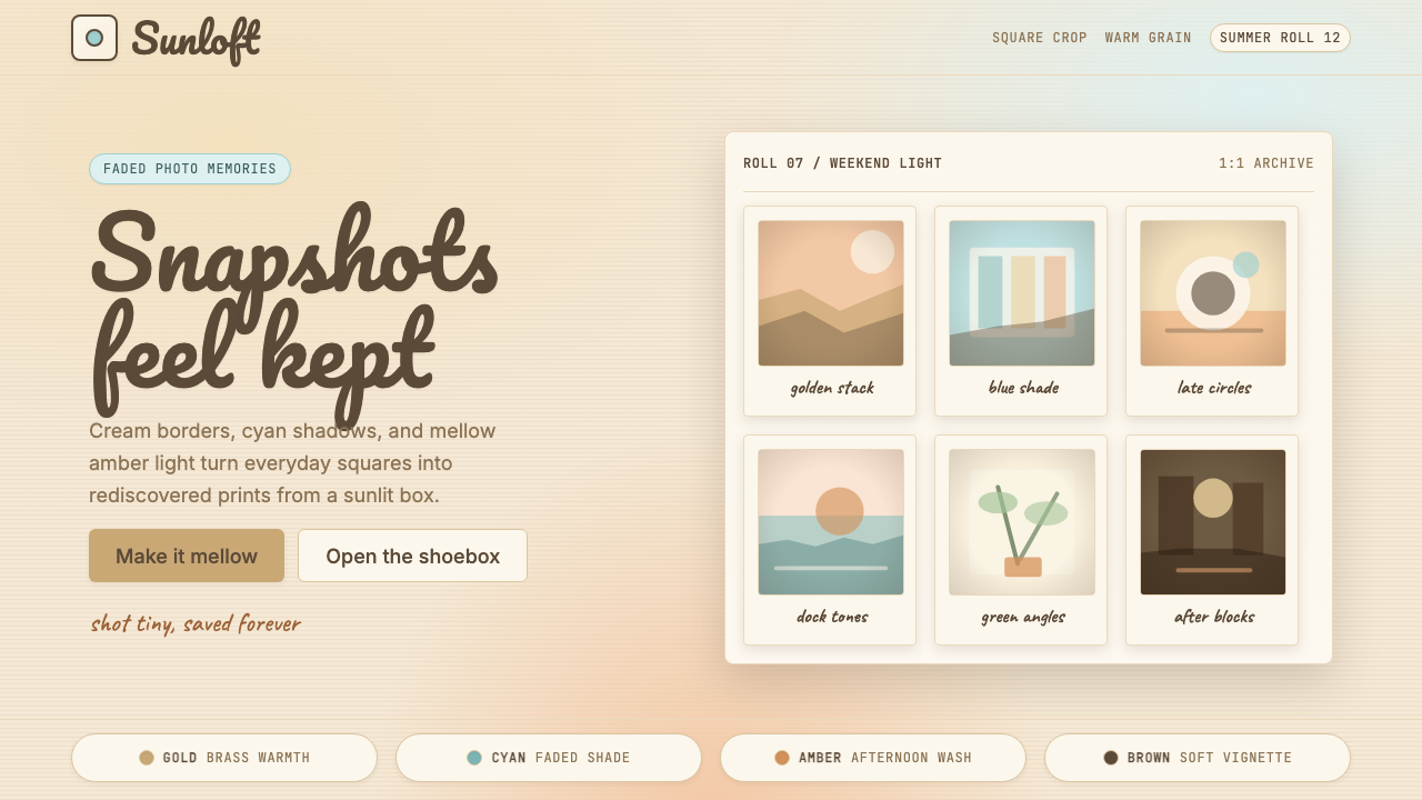 Instagram 2010s FilterWhen photos felt like memories. Faded warmth, dark vignettes, cream-tinted Po…Instagram 滤镜时代的拟物温度:褪色暖调、暗角晕影、宝丽来奶油色相框—…
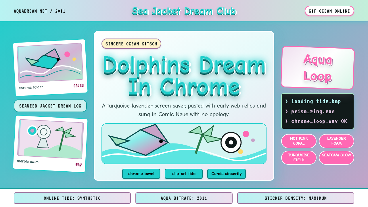 Seapunk 2011Sincere ocean kitsch. Turquoise gradients, Comic Neue chrome, and clip-art do…真诚的海洋俗艳:青绿渐变、Comic Neue 铬字与海豚剪贴画相撞。
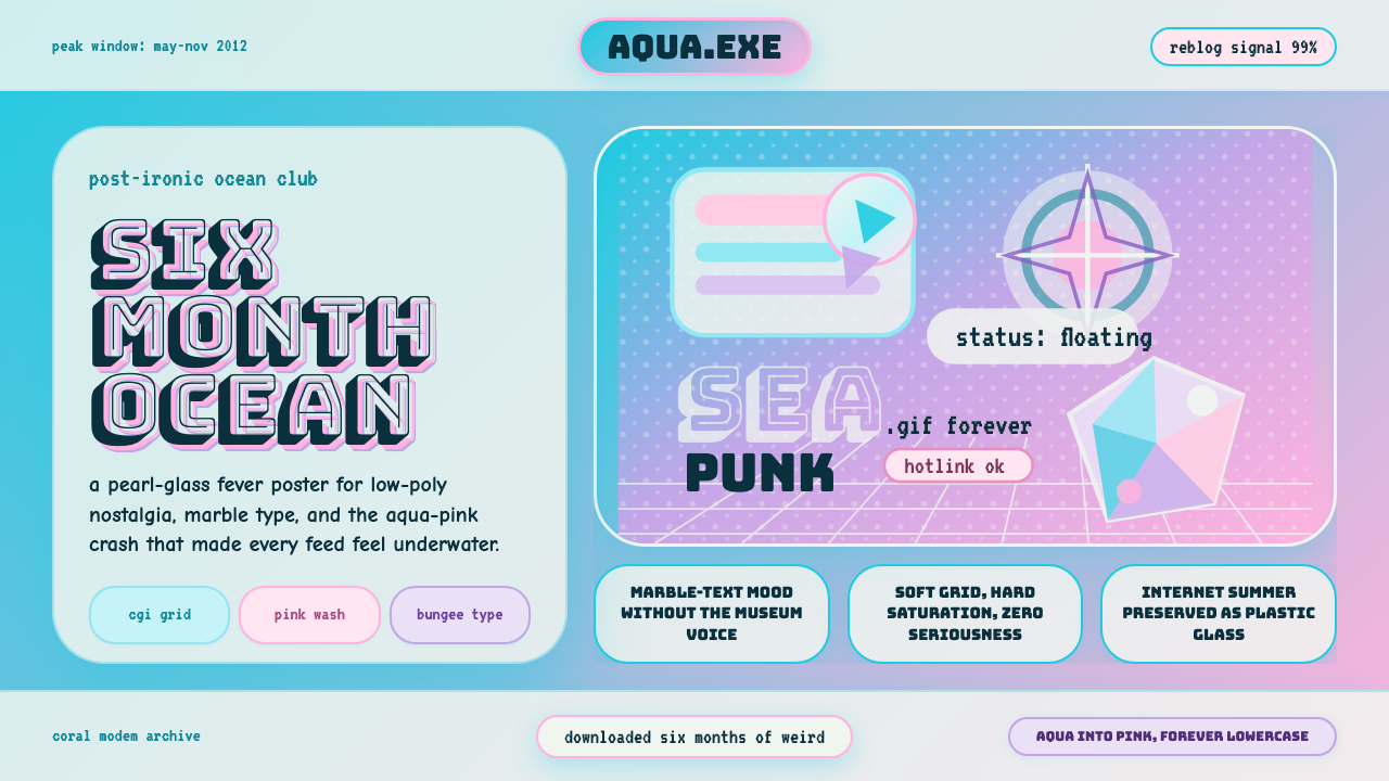 Seapunk Tumblr (2012)Burns bright then crashes. Aqua-pink wash, Bungee type, glassy CGI-grid colla…短暂燃烧后坠落。水蓝粉渐变、Bungee字与玻璃CGI网格拼贴。
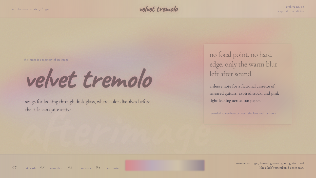 Shoegaze MBV (1991)Sound becomes fog. Hot-pink bleach, mauve blur, and whispered serif type diss…声音化作雾:热粉漂白、淡紫模糊与低语衬线融化画面。
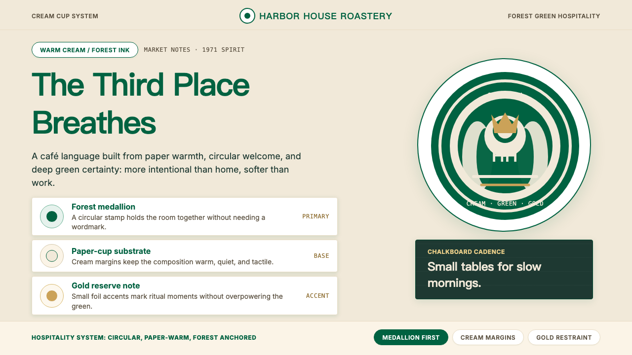 Starbucks (Siren)Hospitality becomes an emblem. Forest green medallion on cream paper, with re…待客之道化为徽章:奶油纸底托起森林绿圆章,金色克制点亮。
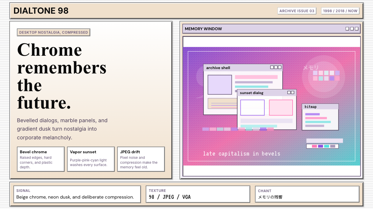 Windows 98 VaporwaveCorporate melancholy glows. Bevelled panels and purple-pink-cyan dusk do the…企业忧郁发光。凸起面板与紫粉青渐变撑起画面。