What is Shoegaze MBV (1991)?
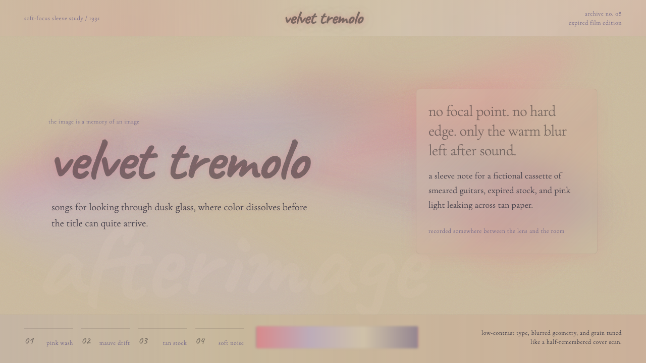
Shoegaze MBV buries every sharp edge in hot-pink motion blur and frosted-glass haze — design that dissolves the frame until sensation is all that remains.
Shoegaze MBV (1991) in brief
Shoegaze MBV is a design language drawn directly from the visual culture of early-1990s British shoegaze music — and most precisely from the sleeve of My Bloody Valentine's 1991 album Loveless. Where most design systems seek clarity, this one pursues the opposite: the deliberate softening of boundaries, the layering of translucent washes over photographic grounds, and the creation of images that feel heard rather than seen.
The aesthetic rests on a small number of recurring gestures: photographic subjects dissolved into motion blur until they become pure color fields, muted off-white or warm tan grounds that suggest aged cardstock rather than clean white paper, type set in quiet serif forms that whisper at the edges of legibility, and a pervasive pink-to-mauve warmth that replaces the sharp shadows and high-contrast edges of more assertive styles.
The result is a visual register that feels emotionally immediate but spatially ambiguous. Objects in a shoegaze composition have weight and presence, but their contours are soft rather than resolved. The viewer's eye searches for a focal point and instead finds sensation — a quality that makes the style unusually effective for conveying mood, intimacy, and the experience of sound translated into image.
Where does Shoegaze MBV (1991) come from?
The word shoegaze was coined by the British music press around 1990, initially as a mild mockery of bands who stood motionless on stage, staring at their feet as they manipulated the banks of effect pedals that defined their sound. The leading bands — My Bloody Valentine, Slowdive, Ride, Lush, Chapterhouse — emerged from a circuit centered on London venues and Reading-area rehearsal spaces, recording for labels like Creation, 4AD, and Dedicated. Their music was defined by heavily processed guitar through tremolo arms and chorus units, dense reverb, and vocal melodies submerged beneath the instrumental wash.
The visual culture of the movement grew organically from the same sensibility as the sound. 4AD's longtime art director Vaughan Oliver had already established a precedent for sleeve design that was deliberately difficult, layered with photographic fragments and typographic restraint, evoking atmosphere over information. When Kevin Shields and photographer Angus Cameron made the Loveless cover in 1991, they pushed this logic further: a tremolo-arm guitar shot in continuous motion produced an image so blurred that color and shape divorced from their source object. The guitar became pure pink sensation. The band name and album title, set in a roman serif, float barely legibly above the blur — as if sound itself were dissolving the capacity to read.
The broader visual grammar of shoegaze drew on several concurrent currents: the faded, oversaturated palette of expired or incorrectly processed photographic film, the soft-focus portraiture of fashion photography from the late 1980s, and the textured, analog warmth of offset printing on uncoated paper stocks. These were not high-production-value aesthetics; they were the aesthetics of limited budgets deployed with intent, and their imperfections — grain, bleed, halation — became signature qualities rather than problems to be solved.
Shoegaze as a discrete movement peaked in the period from 1990 to 1993, when the British music press abruptly turned its attention to grunge and later Britpop, effectively burying the genre under accusations of navel-gazing insularity. The style entered a long dormancy. Its revival from approximately 2013 onward — driven in part by the reissue of Loveless in 2012 and the global spread of lo-fi and dream-pop production on streaming platforms — brought the visual grammar back into contemporary circulation, where it now reads as both archival and freshly relevant.
What defines the Shoegaze MBV (1991) look?
Photographic Blur as Color Field
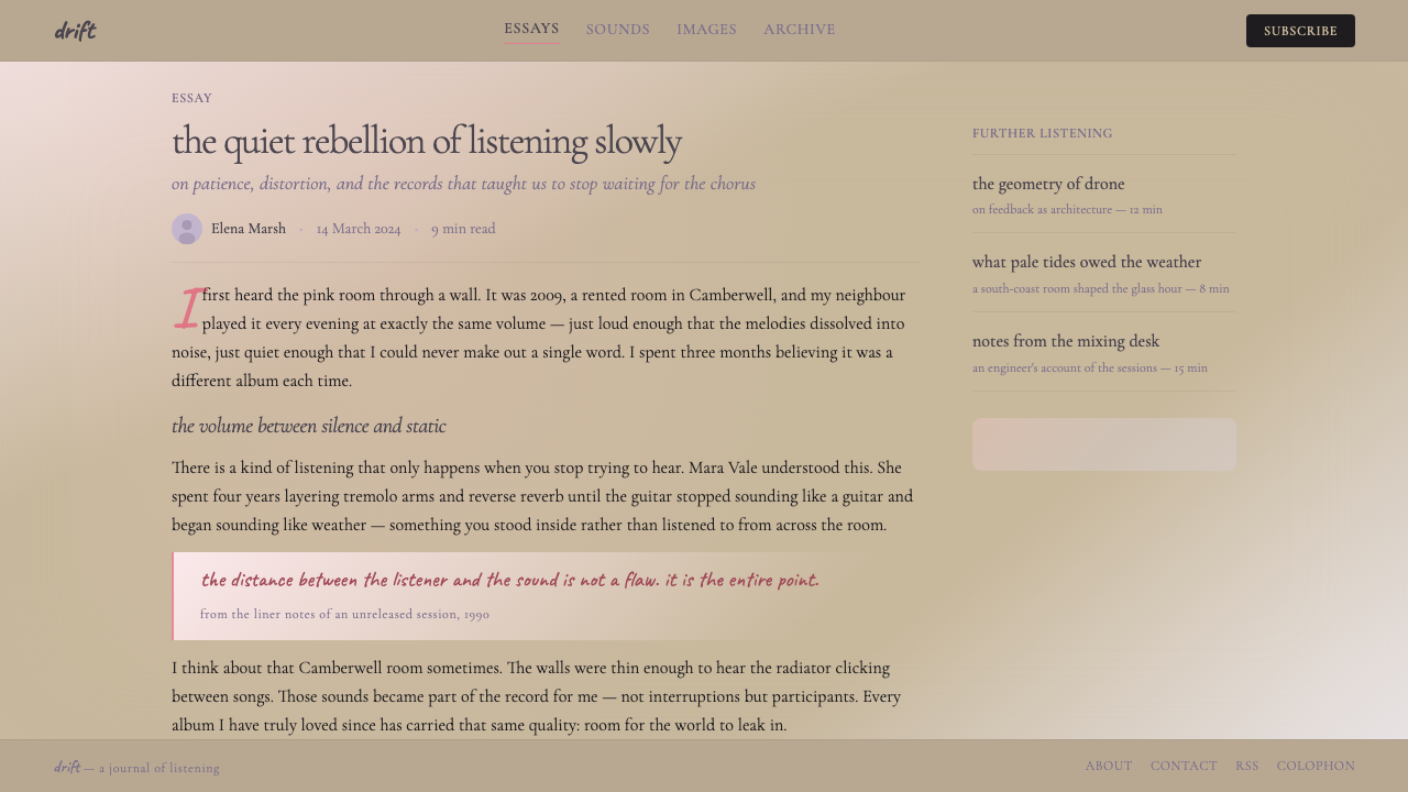
The foundational move of shoegaze design is the transformation of a photographic subject into a color field through motion blur or extreme soft focus. The subject does not disappear; it dissolves — retaining just enough residual form that the viewer senses an object beneath the haze without being able to name it precisely. This produces images that feel both photographic (with all the emotional authority photography carries) and painterly (with the gestural freedom of abstraction).
Warm Off-White and Muted Cardstock Grounds
Shoegaze palettes avoid the sterile neutrality of pure white. Grounds tend toward warm cream, aged paper, or the slightly yellowish cast of uncoated stock. This base color gives the whole composition an analog warmth that reads as tactile — as if the image were something you could hold in your hands. Against this ground, pinks and mauves read as slightly warmer than they would on a cold white field, and any dark type acquires a softness that reduces its assertiveness.
Pink-to-Mauve Chromatic Warmth
The signature hue of shoegaze design is a hot, slightly bleached pink — not the bubblegum pink of consumer packaging nor the dusty rose of vintage decoration, but something closer to overexposed film drenched in warmth. This pink often bleeds into softer mauves, lavenders, and washed-out fuchsias, creating a narrow but intensely atmospheric color family. These colors function less as accent choices and more as the emotional temperature of the entire composition.
Quiet Serif Typography at the Edge of Legibility
In contrast to the loud, bold display type of most rock-era graphic design, shoegaze typography is characteristically understated. Serif faces — the kind associated with literary publishing rather than advertising — are set at modest sizes, often in light or regular weights, and treated as one more soft layer within the composition rather than as a signpost demanding attention. The type whispers. In some compositions it is nearly illegible, sitting at the edge of being read, which gives it a quality more akin to texture than to communication.
Analog Grain, Halation, and Imperfect Process
Where other design styles seek technical precision, shoegaze aesthetics actively embrace the artifacts of imperfect photographic and printing processes: film grain that gives surfaces a living texture, halation around light sources that makes bright areas bloom softly outward, color shifts that suggest cross-processing or expired film, and the slight ink bleed of offset printing on absorbent paper. These imperfections are not incidental — they are the style's warmth and humanity made visible.
Layered Translucency Over Photography
A recurring compositional strategy is the placement of semi-transparent color washes over photographic base layers, creating the sensation of viewing an image through frosted glass or gauze. These washes unify the composition tonally — pulling disparate photographic elements toward a shared warmth — while simultaneously veiling information, creating an atmosphere of partial concealment that invites extended looking without providing full resolution.
Spatial Ambiguity and Absent Focal Point
Classic visual design gives the viewer a hierarchy: a clear entry point, a focal element, secondary information. Shoegaze design deliberately withholds this hierarchy. There is no single focal point; the eye moves across the composition without a dominant anchor, finding different soft details at different moments. This creates a contemplative, durational quality — the image asks to be spent time with rather than quickly scanned and decoded.
Who shaped Shoegaze MBV (1991)?
The primary creative force behind My Bloody Valentine, Shields was responsible for both the sonic innovations that defined shoegaze — the use of the tremolo arm to produce continuous pitch vibrato rather than discrete notes, the layering of dozens of guitar tracks into a single dense wash — and the visual direction of the band's work. His insistence on shooting the Loveless cover in continuous motion, until the guitar image reached the threshold of pure abstraction, produced the definitive visual statement of the genre. Shields's perfectionism extended from studio to sleeve, and the result was a unified artwork in which sound and image operated under the same logic.
Art director at 4AD Records throughout the label's most influential period, Oliver developed a house aesthetic that prioritized atmosphere over clarity — layered photographic imagery, textured surfaces, and typographic restraint in the service of emotional resonance rather than information transfer. His work for Cocteau Twins, Pixies, and Throwing Muses established the visual grammar that shoegaze bands inherited and intensified. Oliver's collaborations with photographer Nigel Grierson under the name 23 Envelope produced some of the most significant sleeve artwork of the 1980s and 1990s, directly seeding the shoegaze visual vocabulary.
Lead vocalist and guitarist of Slowdive, one of the most visually consistent of the shoegaze bands. Slowdive's sleeves — typically featuring washed-out nature photography in bleached greens, blues, and whites — demonstrated that the shoegaze visual language extended beyond the hot pink of MBV into cooler, more pastoral registers. Halstead's approach to the style in both music and visual presentation showed its flexibility: the core principle of dissolution and warmth could be applied across different color temperatures and subject matters without losing its distinctive character.
The second vocalist of My Bloody Valentine, Butcher's presence in the band's imagery — soft-focused, often partially obscured, never the sharp portrait subject of conventional promotional photography — modeled a human presence consistent with shoegaze's anti-focal-point aesthetic. Her visual role in the band's imagery was not to be looked at in the conventional sense but to be part of the atmosphere, which aligned precisely with the style's treatment of the human figure: present but dissolved, felt rather than read.
How do you use Shoegaze MBV (1991) today?
Shoegaze MBV is among the more demanding historical styles to apply faithfully in contemporary design work, because its effect depends on restraint and dissolution rather than bold visual gestures. The common mistake is importing the color palette — soft pinks and mauves — while retaining the crisp edges, high contrast, and information-forward structure of conventional digital design. The result is a layout that uses shoegaze colors but feels nothing like shoegaze. Authentic application requires committing to softness at every level: edges, type, imagery, and spatial hierarchy.
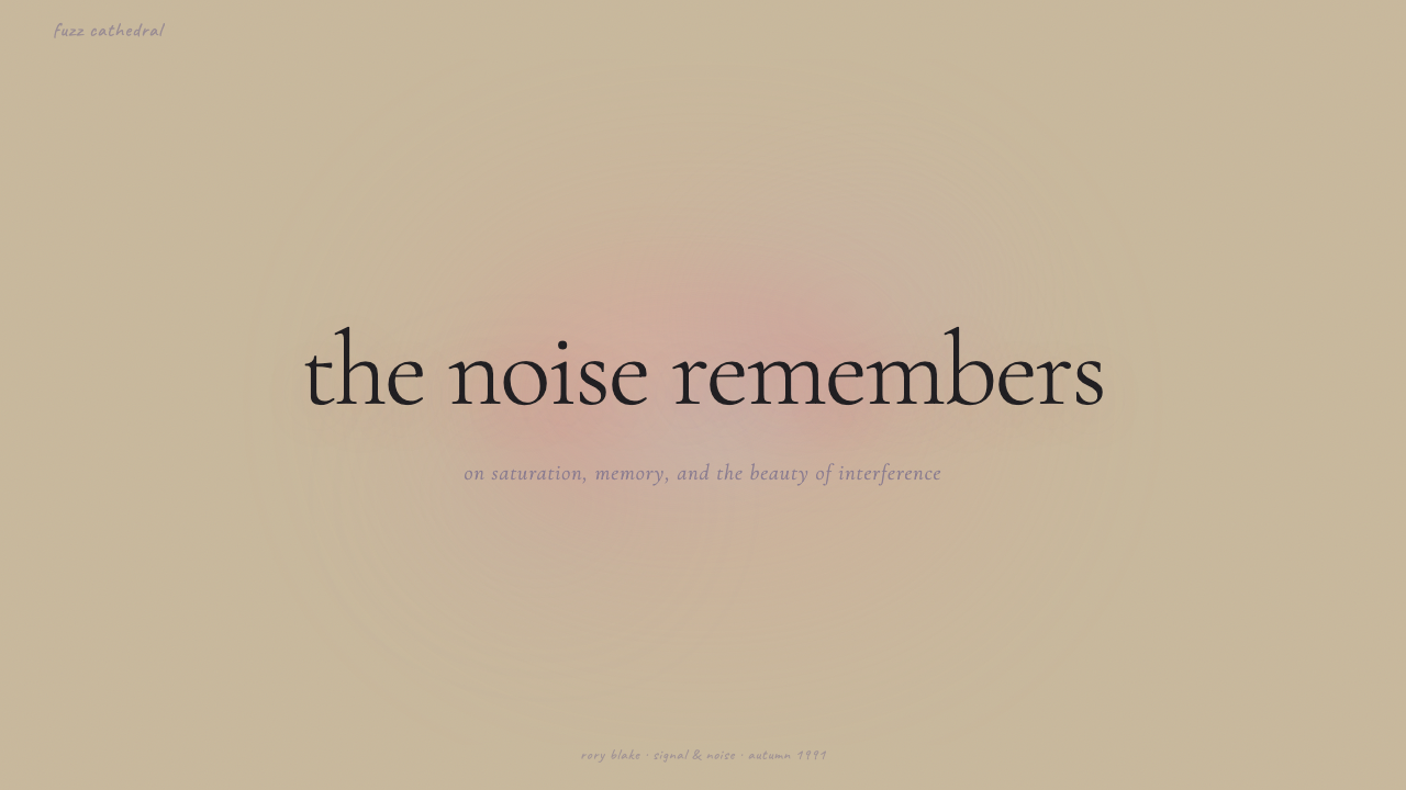
For presentation slides, the style works best on covers and atmospheric section dividers rather than on content-heavy data slides. A shoegaze cover works with a full-bleed photographic image subjected to significant blur or translucent overlay in the signature pink-to-mauve range, with a title set in a quiet serif at a weight that allows it to float above the image without asserting. Content slides work within the style only if content density is low — sparse bullet points or single statistics on a warm off-white ground, never dense grids of information. Data slides are largely incompatible with the style's deliberate illegibility; reserve this aesthetic for narrative slides where mood takes precedence over information transfer.
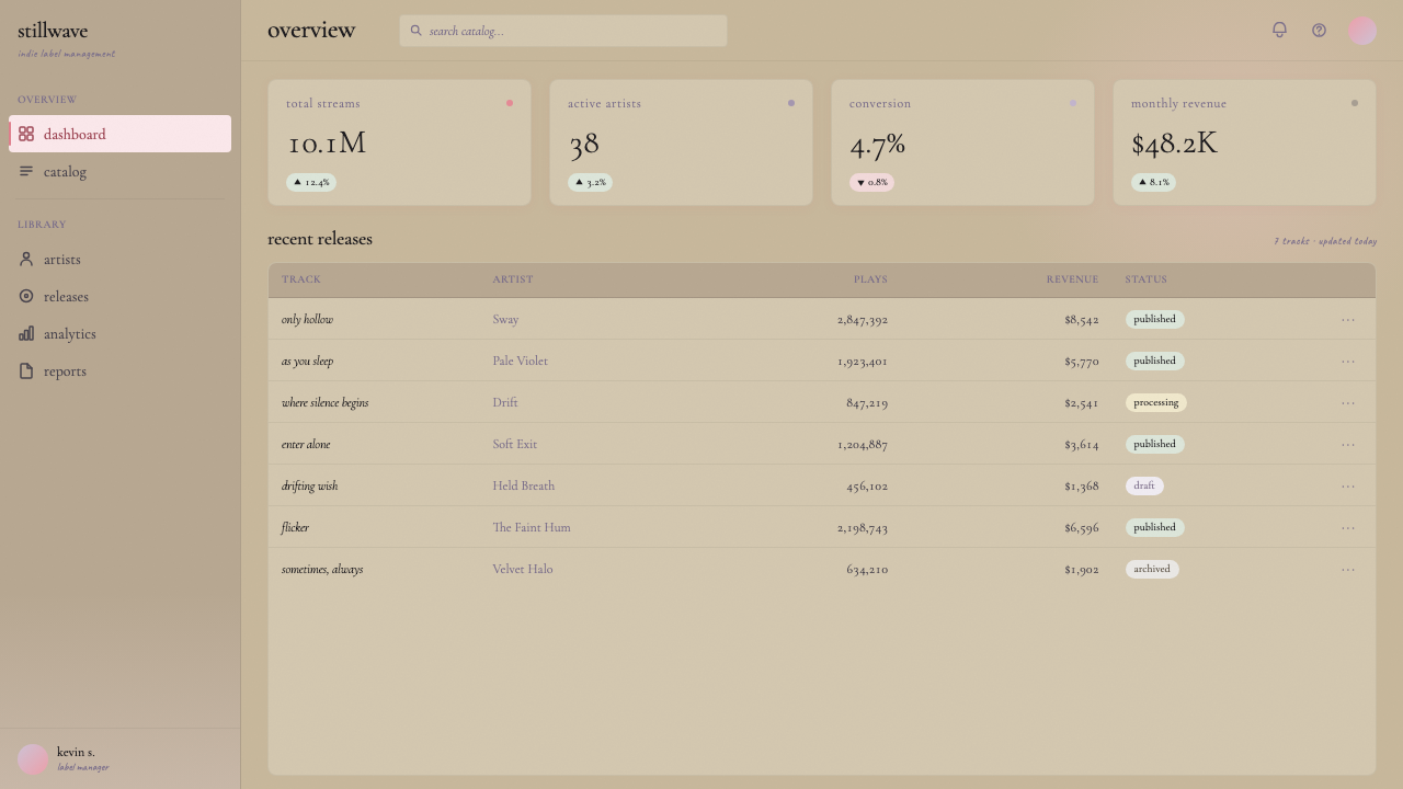
For web interfaces and digital products, shoegaze lends itself to landing pages, editorial features, and portfolio presentations where emotional impact matters more than conversion efficiency. A shoegaze-inflected hero section works with a full-width blurred or overlaid photographic background in warm tones, body copy in a restrained serif, and call-to-action buttons that are quiet rather than demanding — outlined or muted rather than solid and high-contrast. Dashboard interfaces, pricing tables, and functional applications are not natural homes for this style, because its deliberate ambiguity works against the clarity that transactional design requires.
For editorial and marketing contexts, the style excels at music, cultural, and lifestyle brands where the emotional register of the content aligns with the style's sensibility — anything touching on memory, nostalgia, intimacy, or sensory experience. A magazine spread in this mode uses large, heavily processed photographic imagery that spans across the gutter, with pull quotes set in small, whispered type rather than the bold display treatment of more conventional editorial design. Marketing campaigns for music releases, art exhibitions, or fashion labels find the style highly applicable; campaigns for technical products, financial services, or anything requiring trust-through-clarity are poorly served.
A common mistake is applying the blur and pink palette while retaining sharp, readable navigation structures and high-contrast interactive states. The style reads as inauthentic when hard UI conventions are mixed with soft visual treatment — the viewer senses an internal contradiction. If applying this aesthetic to a digital product, the navigation and interactive layer should be simplified to near-invisibility so they do not break the atmospheric register, or kept entirely separate from the styled sections of the page.
Shoegaze MBV (1991) — FAQ
Is shoegaze design only appropriate for music-related projects?
Not exclusively, though its origins in album sleeve culture mean it carries strong associations with music and sound. The style's emotional qualities — intimacy, softness, nostalgia, the sensation of memory dissolving at the edges — translate well into any project dealing with those themes: fashion campaigns, literary publishing, fragrance branding, film promotional material, or personal portfolios for creative practitioners. The style is poorly suited to projects that require signaling authority, modernity, efficiency, or technical precision.
How do you prevent a shoegaze design from simply looking out-of-focus or unfinished?
The difference between deliberate dissolution and accidental blur lies in the consistency of intent. Every element in an authentic shoegaze composition is soft for a reason, and that softness is applied with control — not every image is blurred to the same degree, not every layer of translucency carries the same density. The composition should have internal coherence: a tonal logic that unifies the soft elements, a color palette that is warm and narrow rather than randomly desaturated, and at least one compositional anchor (even a soft one) that gives the viewer something to return to. When blur is applied carelessly or inconsistently, it reads as error; when it is applied as a consistent atmospheric choice, it reads as style.
Can shoegaze aesthetics work in a predominantly dark or night-mode interface?
The historic shoegaze palette was built around off-white and warm light grounds, so dark-mode application requires deliberate adaptation. A dark shoegaze variant works best when the background is not pure black but a very deep warm grey or charcoal, which preserves the style's analog warmth on a dark field. Against such a ground, pinks and mauves glow softly rather than bleaching out, and the overall effect can be intensely atmospheric. The risk is that dark fields tend to sharpen perceived edges — the blur and dissolution that the style depends on read less strongly on dark grounds than on light ones, so extra care must be taken to maintain tonal softness throughout.
What distinguishes Shoegaze MBV from other blurry or lo-fi aesthetics like vaporwave or Y2K?
Vaporwave is defined by its retrofuturist irony — garish colors, classical statues in digital space, the uncanny nostalgia of early consumer computing — and is fundamentally a conceptual style. Y2K aesthetics are defined by their embrace of early digital rendering artifacts: chrome finishes, holographic surfaces, and the particular sheen of turn-of-millennium consumer product design. Shoegaze MBV has neither the irony of vaporwave nor the digital-material specificity of Y2K. Its reference point is analog photography and physical print, not computing; its warmth is sincere rather than ironic; and its blur is a gesture toward sensation and interiority rather than toward retrofuturism or nostalgia for a specific technological moment.
How should typography be selected to stay within the shoegaze register?
The style calls for typefaces associated with literary culture rather than advertising or graphic display — text serifs in the tradition of book setting rather than headline display serifs, and weights that lean toward light or regular rather than bold. The key qualities are: a degree of calligraphic warmth in the letterforms (optical serifs, slight stroke contrast), a texture that reads as handmade or analog at display sizes, and an overall register that is quiet rather than declarative. Geometric sans-serifs, grotesques, and any typeface with strong modernist associations work against the style. Script faces should be used sparingly and only if they carry a soft, faded quality consistent with the rest of the palette.
Related design styles
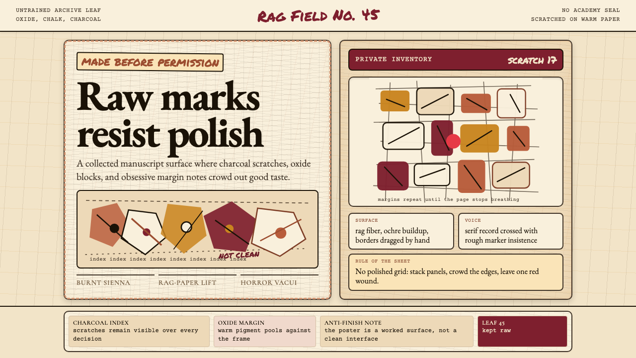 Art Brut (Dubuffet)Polish is refused. Bone-cream paper, earth pigments, scratched borders, dense…
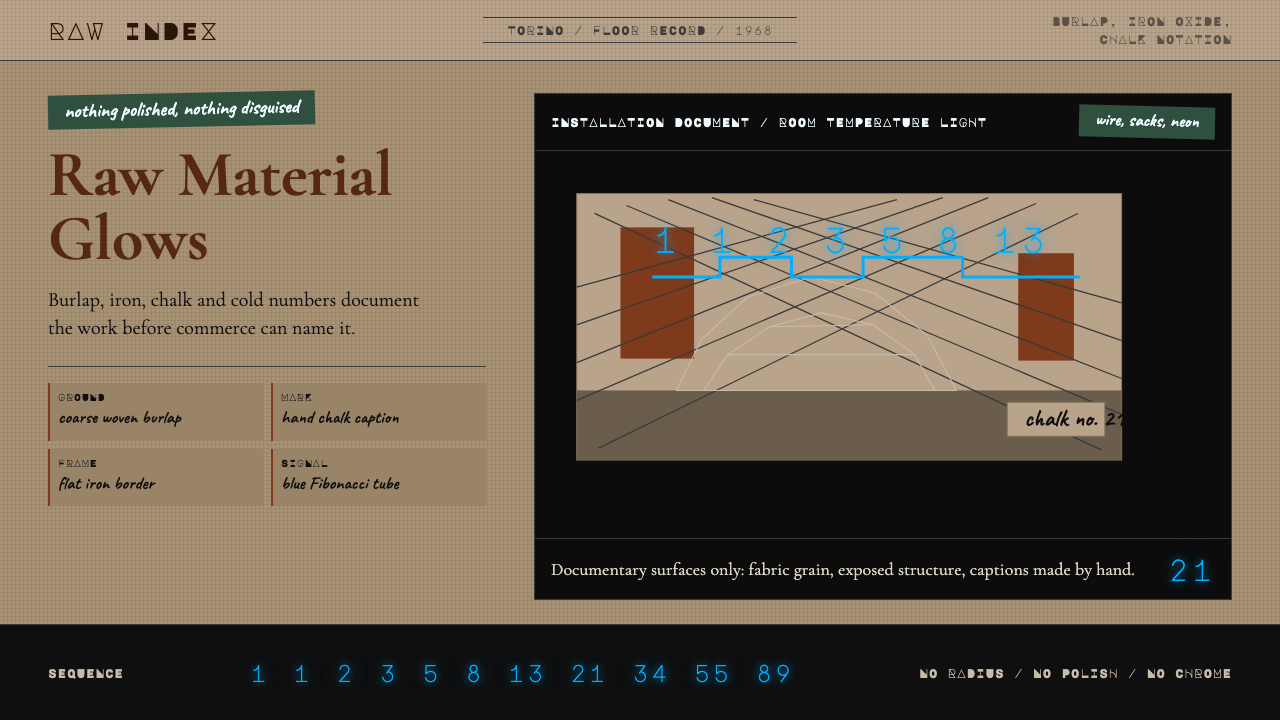 Arte Povera (Merz, 1968)Material refuses polish. Burlap ground, rust serif, chalk marks, neon Fibonac…
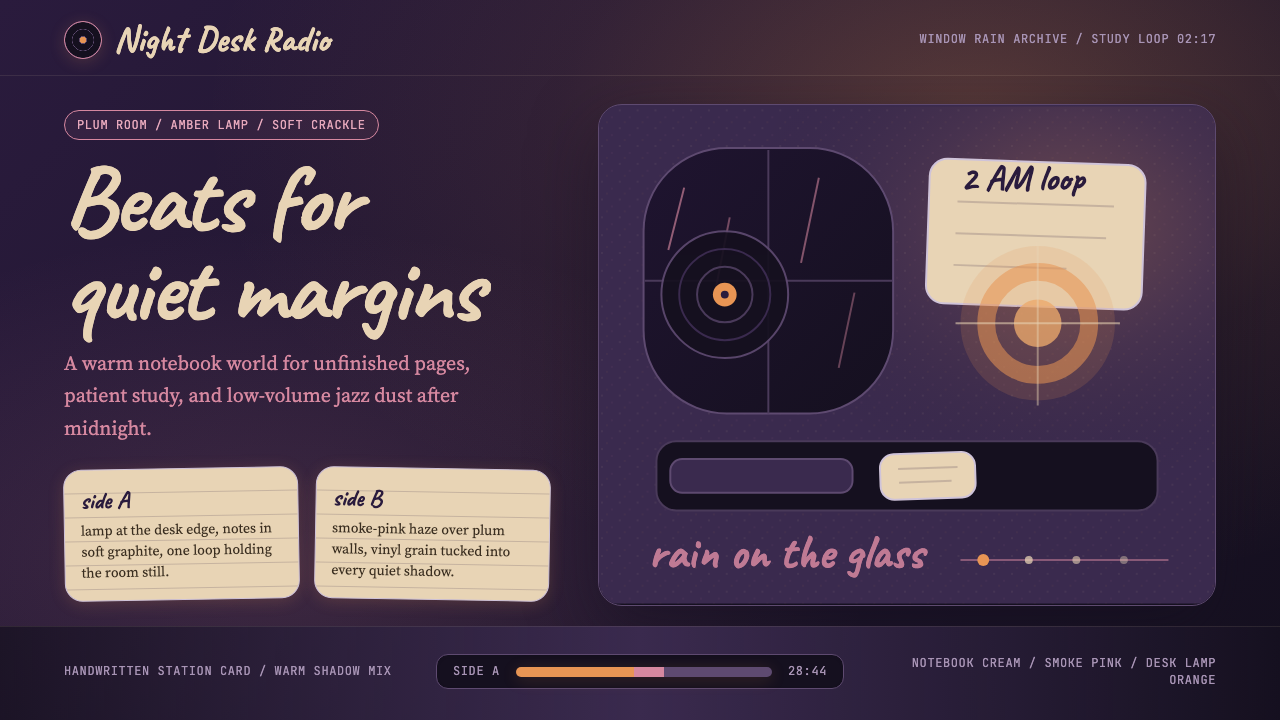 Lofi Hip-Hop Anime Girl (2018)Solitude glows warm. Caveat notes, plum night, and amber geometry loop like v…
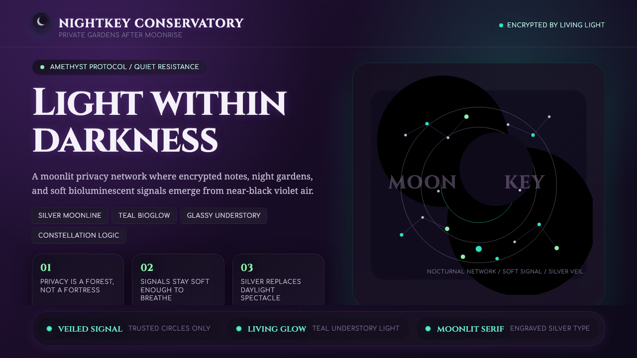 LunarpunkLight hides in darkness. Amethyst night, silver serif, and teal bioglow surfa…
 Norwegian Black Metal (1992)Ritual severity. Bone-white blackletter cuts through black grain with one blo…
 Akira (Otomo)Cyberpunk at impact. Kaneda red, cyan kanji, halftone concrete, and diagonal…