Design style guide设计风格指南
What is Lofi Hip-Hop Anime Girl (2018)?什么是 Lofi Hip-Hop Anime Girl (2018)?
A hand-drawn anime girl studying by lamplight became the internet's most comforting loop — and spawned a design language built entirely from warm amber glow, plum-violet darkness, and the quiet grain of vinyl.一个在台灯下手绘学习的动漫女孩,成为互联网最治愈的循环——由此诞生的设计语言,完全由暖琥珀光芒、梅紫夜色与黑胶唱片的静谧颗粒感构成。
Lofi Hip-Hop Anime Girl (2018) in briefLofi Hip-Hop Anime Girl (2018) 速览
The Lofi Hip-Hop Anime Girl aesthetic — associated with the ChilledCow (later Lofi Girl) YouTube channel and its ever-looping study stream — is a visual system built around a specific emotional state: productive solitude at two in the morning. The aesthetic translates that feeling into a dark, warm, textured palette where a single desk lamp is the sole light source, casting everything in amber and leaving the corners in plum shadow.Lofi Hip-Hop Anime Girl 美学——与 ChilledCow(后改名 Lofi Girl)YouTube 频道及其永恒循环的学习直播流密不可分——是一套围绕特定情绪状态构建的视觉系统:凌晨两点的独处与专注。这套美学将那种感觉转化为黑暗、温暖、充满质感的色调,台灯是唯一的光源,将一切染成琥珀色,让四角沉入梅紫色的阴影。
Unlike design movements that begin with manifesto or principle, this style evolved from a single piece of illustration: Colombian artist Juan Pablo Machado's cozy bedroom drawing, set on loop against an audio stream mixing jazz samples, dusty drums, and crackling vinyl. The visual grammar that emerged — soft paper textures, notebook-card surfaces, hand-lettered type, a cat on a windowsill, rain behind glass — is inseparable from its musical context. It is, first and last, a mood.与那些从宣言或原则出发的设计运动不同,这种风格从一幅插画演变而来:哥伦比亚艺术家 Juan Pablo Machado 画的温馨卧室,配合混合着爵士采样、沙哑鼓点与黑胶噼啪声的音频流循环播放。由此浮现的视觉语法——柔软的纸张纹理、笔记本卡片式界面、手写字体、窗台上的猫、玻璃后的雨滴——与其音乐语境密不可分。它首先是,也始终是一种情绪。
The design system is dark by nature. Its backgrounds are deep plum, dusty navy, or near-black, illuminated only where the lamp reaches. Color is not used symbolically or structurally in the Bauhaus sense; it is used atmospherically — warmth pushing back against darkness, amber and smoke-pink co-existing with inky shadow. Every surface carries the faint ghost of analog imperfection: film grain, vinyl static, worn notebook paper. Nothing is crisp or clinical. The aesthetic is an argument for imperfection as comfort.这套设计系统在本质上是深色的。背景是深沉的梅紫、尘土般的藏青或近乎黑色,只在台灯所及之处才有光亮。色彩不像包豪斯那样被象征性或结构性地使用,而是被氛围性地使用——温暖对抗黑暗,琥珀与烟粉色和墨色阴影共生。每个界面都带着模拟媒介不完美的幽灵印记:胶片颗粒、黑胶噪点、磨损的笔记本纸张。没有什么是清脆或临床的。这套美学是对「不完美即慰藉」的宣言。
See the Lofi Hip-Hop Anime Girl (2018) design system →查看 Lofi Hip-Hop Anime Girl (2018) 完整设计系统 →
Where does Lofi Hip-Hop Anime Girl (2018) come from?Lofi Hip-Hop Anime Girl (2018) 从何而来?
The aesthetic's musical roots run deep and cross continents. In Tokyo, Jun Seba — known by his production name Nujabes — was fusing jazz harmony, hip-hop rhythm, and philosophical melancholy through the 1990s and into the early 2000s. His beats, built from sampled jazz piano and brushed snare, carried a quality of late-night studiousness that would later define the lofi genre's entire emotional register. In Detroit, James Dewitt Yancey — J Dilla — was doing something parallel: slowing the tempo, making drums swing and stutter, and pressing the imperfections of analog hardware into the surface of the music. Both died young (Nujabes in 2010, Dilla in 2006), and their posthumous canonization gave lofi hip-hop a melancholy undertow it has never fully shed.这套美学的音乐根源深远,跨越几个大陆。在东京,Jun Seba——以制作人名 Nujabes 为人所知——在整个九十年代及二十一世纪初不断融合爵士和声、嘻哈节奏与哲学忧郁。他用采样的爵士钢琴与刷鼓构建的节拍,带着一种深夜刻苦学习的气质,这种气质后来定义了 lofi 这一流派整体的情绪坐标。在底特律,James Dewitt Yancey——J Dilla——在做类似但平行的事:放慢节奏,让鼓点摇摆、顿挫,把模拟硬件的不完美压进音乐的表面。两人都英年早逝(Nujabes 2010 年,Dilla 2006 年),他们的身后封神给 lofi 嘻哈注入了一股从未完全消散的忧郁暗流。
The visual component arrived through a different channel. In 2017, the streaming channel ChilledCow launched a YouTube live stream — eventually titled 'lofi hip hop radio — beats to relax/study to' — that would run for years and accumulate hundreds of millions of views. The channel cycled through several visual identities before settling on an illustration by Machado: a young woman in a cozy bedroom, headphones on, bent over a notebook, a cat at her side, rain on the window behind her. This image, animated in a gentle loop, became one of the most recognized images on the internet. YouTube removed the stream briefly in 2020 over copyright claims; public outcry was immediate and international, confirming how culturally embedded the image had become.视觉部分则经由另一条路径抵达。2017 年,流媒体频道 ChilledCow 在 YouTube 上发起了一个直播流——最终以「lofi hip hop radio — beats to relax/study to」为名——连续播放多年,累积数亿次观看。频道更迭了数个视觉形象,最终定格于 Machado 的一幅插画:一个戴着耳机、俯身笔记本的年轻女孩坐在温馨卧室里,猫陪在身旁,身后的窗玻璃外是雨。这幅画面以温柔的循环动画呈现,成为互联网上最广为人知的图像之一。2020 年 YouTube 因版权投诉短暂下架该直播流,随即引发全球范围内的公众抗议,印证了这幅图像已深入文化肌理的程度。
The aesthetic also owes a debt to Japanese anime visual culture — specifically to the quiet domestic scenes of slice-of-life anime (Studio Ghibli interiors, the bedroom aesthetics of shows like 'Toradora' and 'Your Lie in April') where ordinary spaces are rendered with extraordinary warmth. Machado's illustration drew consciously on this tradition, and the resulting visual grammar carries the grain of both analog music culture and Japanese animation: soft line work, expressive eyes, backgrounds full of domestic objects rendered with affectionate detail.这套美学还深受日本动漫视觉文化的滋养——特别是日常系动漫(吉卜力工作室的室内场景、《龙与虎》《四月是你的谎言》等作品的卧室美学)中那些将平凡空间渲染出非凡温度的静谧生活场景。Machado 的插画有意识地汲取了这一传统,由此浮现的视觉语法同时携带着模拟音乐文化与日本动画的纹理:柔和的线条、富有表情的眼睛、用细腻笔触描绘满溢生活物件的背景。
The style's peak cultural moment was roughly 2018 to 2022, when the ChilledCow stream ran continuously and inspired thousands of imitations — other channels, other illustrations, other artists working in the same palette and atmosphere. The term 'lofi aesthetic' entered the vocabulary of independent creators, bedroom musicians, and indie designers who saw in it a visual language that matched the sensibility of making things alone, at night, with headphones on. Dimitri Somoguy, the creative force behind ChilledCow, shaped both the channel's tone and its visual continuity during this period, establishing the aesthetic as a recognizable brand before the style diffused into the wider internet.这种风格文化影响力的顶峰大约在 2018 至 2022 年间——ChilledCow 直播流不间断播放,激发了数以千计的模仿:其他频道、其他插画、其他在同一色调与氛围中创作的艺术家。「lofi 美学」这个词进入了独立创作者、卧室音乐人和独立设计师的词汇表,他们在其中看到了与「独自、夜间、戴着耳机做东西」的感性相匹配的视觉语言。ChilledCow 背后的创意主导人 Dimitri Somoguy 在这一时期同时塑造了频道的基调与视觉连贯性,在这种风格向更广泛互联网扩散之前,就已将它建立为可辨识的品牌。
What defines the Lofi Hip-Hop Anime Girl (2018) look?Lofi Hip-Hop Anime Girl (2018) 的视觉特征是什么?
Warm Amber Light Against Deep Darkness深暗中的暖琥珀光
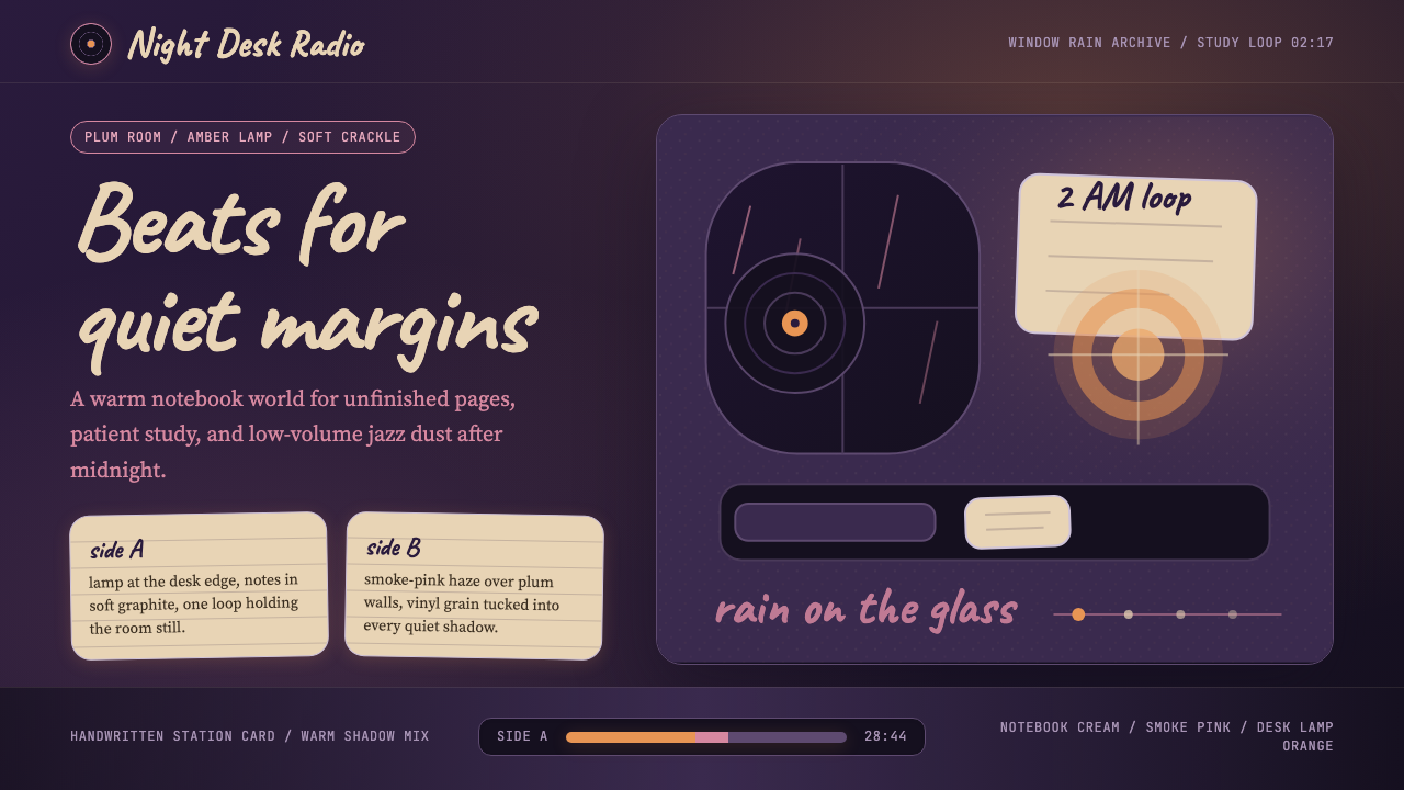
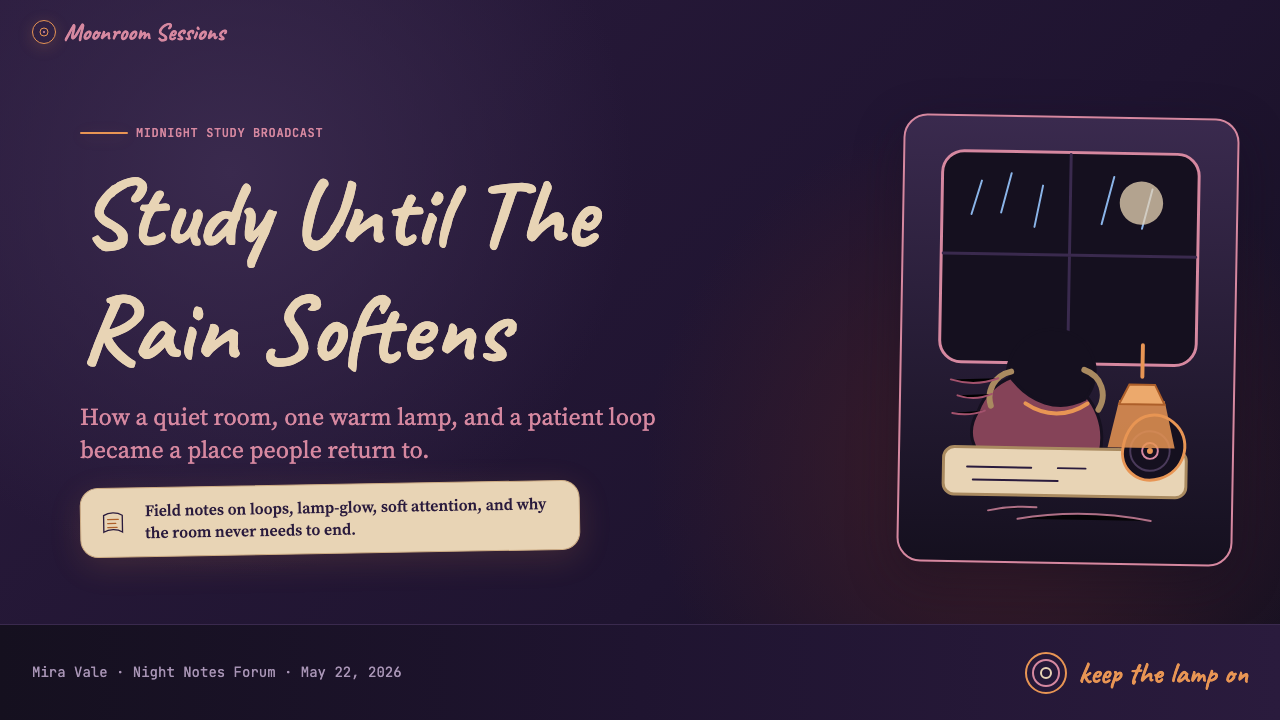
The defining visual tension of this style is the single warm light source — a desk lamp — pushing back against a deep, dark background. The illuminated zone glows in amber and golden tones; the surrounding space recedes into plum violet, dusty navy, or near-black. Color is not distributed evenly across the composition but radiates from one focal point, creating a vignette effect where warmth and darkness exist in constant, comforting tension. This light-against-dark structure gives every composition a sense of intimacy and enclosure.这种风格最核心的视觉张力,来自单一暖光源——台灯——在深沉黑暗背景中向外推压。被照亮的区域在琥珀色与金色调中发光;周围的空间退入梅紫色、沾染尘土的藏青色或近乎纯黑。色彩不是均匀分布在画面上,而是从一个焦点向外辐射,形成晕染效果,使温暖与黑暗在恒久而令人慰藉的张力中共存。这种明暗结构赋予每一幅构图一种亲密感与包裹感。
Analog Texture and Grain模拟质感与颗粒感
Every surface in this aesthetic carries the visible imperfection of analog media. Paper textures breathe through card backgrounds; vinyl grain drifts across the composition like a low haze; soft noise overlays mimic the static of a cassette tape at the end of a side. These textures are not applied for decorative effect — they are the style's emotional mechanism, signaling that something handmade and imperfect is present. Smooth, pristine surfaces feel alien to this system. The grain is what makes it feel warm.这套美学的每一个界面都承载着模拟媒介可见的不完美。纸张纹理透过卡片背景呼吸;黑胶颗粒感如同低沉的朦胧漂浮在构图之上;柔和的噪点叠层模拟着磁带播放到末端时的静电声。这些质感并非为了装饰效果而施加——它们是这种风格的情绪机制,信号着某种手工制作的、不完美的存在。光滑、无瑕的界面在这个系统中显得格格不入。颗粒感,正是使它感到温暖的原因。
Handwritten and Casual Typography手写与随性的字体
Type in this style resists the clean authority of geometric sans-serifs. Handwritten letterforms — rounded, slightly uneven, carrying the human trace of a real pen or pencil — are preferred for headings, labels, and decorative text. The handwriting quality signals informality and personal presence, as though the interface is a notebook being filled in rather than a system being operated. Where mechanical type appears, it tends toward rounded, soft forms rather than sharp geometric construction.这种风格中的字体,抵触几何无衬线字体的利落权威感。手写字形——圆润、略带不均匀、携带着真实钢笔或铅笔的人工痕迹——是标题、标签和装饰性文字的首选。手写质量传递出非正式感与个人在场感,仿佛界面是一本正在被填写的笔记本,而非一个被操作的系统。当机械字体出现时,往往倾向于圆润、柔和的形态,而非尖锐的几何构造。
Notebook and Paper Card Surfaces笔记本与纸质卡片界面
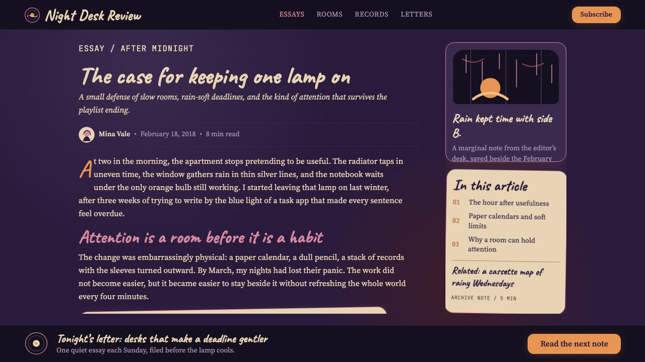
Content is typically contained in surfaces that evoke paper — cards with the slight warmth and roughness of notebook pages rather than the clinical whiteness of a screen. These surfaces are often slightly off-white or cream, with subtle edge shadows that suggest physical stacking rather than digital floating. The metaphor is consistent: this is a study desk, and the elements on screen are the materials on that desk. Even data and interface components take on the quality of handwritten notes or printed ephemera.内容通常被包含在唤起纸张感的界面中——卡片带着笔记本页面那种轻微的温度与粗糙感,而非屏幕的临床白净。这些界面常常略带米白或奶油色,带有微妙的边缘阴影,暗示着物理叠放而非数字悬浮。隐喻始终如一:这是一张书桌,屏幕上的元素就是桌面上的材料。即使是数据与界面组件,也带上了手写笔记或印刷短暂物的质感。
Smoke-Pink Haze and Muted Midtones烟粉色朦胧与柔和中间调
Between the warm amber of the lamp and the deep plum of the shadows lies a range of desaturated, atmospheric midtones — dusty roses, smoky mauves, and hazy lavenders that function like the ambient light of a bedroom at midnight. These muted tones never read as flat or empty; they carry the quality of air, of something slightly out of focus, of the space between wakefulness and sleep. The palette avoids bright, saturated accent colors, preferring instead to let warmth and coolness blur at the edges.在台灯的暖琥珀色与阴影的深梅紫色之间,存在着一系列去饱和的、大气般的中间调——沾满尘土的玫瑰色、烟雾般的淡紫色、朦胧的薰衣草色,如同午夜卧室的环境光在发挥作用。这些柔和的色调从不显得平淡或空洞;它们携带着空气的质感,某种略微失焦的东西,介于清醒与入睡之间的那片空间。这套色板回避明亮、饱和的强调色,更倾向于让暖调与冷调在边缘处模糊交融。
Intimate Domestic Iconography私密的日常图像语汇
The visual vocabulary is populated with objects from a specific, carefully bounded domestic world: a steaming mug, an open notebook, a lamp on a desk, a sleeping cat, books stacked unevenly, rain against a window, potted plants, loose earbuds. These objects are not chosen arbitrarily — each one signals comfort, solitude, and productive absorption. Iconography that suggests urgency, social performance, or consumption is absent. The world of this aesthetic is private, small, and sufficient.这套视觉词汇由来自某个特定、精心划定的私密日常世界的物件构成:冒着热气的马克杯、翻开的笔记本、桌上的台灯、睡着的猫、摆放凌乱的书堆、窗上的雨滴、盆栽植物、散落的耳机。这些物件并非随意选取——每一件都在传递安慰、独处与专注沉浸的信号。暗示紧迫感、社交表演或消费欲望的图像语汇一概缺席。这套美学的世界是私密的、小巧的、自给自足的。
Slow, Cyclical Rhythm缓慢的循环节奏
The style's relationship with time is cyclical rather than progressive. Its origins are a looping animation — the same few seconds of gentle movement playing indefinitely — and this quality bleeds into the design sensibility. Micro-animations, where used, are slow, breathing, and repetitive rather than energetic or directional. Transitions prefer dissolves over cuts. The overall impression is of something that does not begin or end but simply continues — comforting precisely because it makes no demands.这种风格与时间的关系是循环的,而非前进的。它的起源是一段循环动画——同样几秒钟的轻柔运动无限播放——这种品质渗透进了整体的设计感性。微动效(如果使用的话)是缓慢的、呼吸般的、重复的,而非充满活力或有方向感的。过渡偏向溶解而非切换。整体印象是某种没有开始也没有结束、只是持续存在的东西——正因为它不提出任何要求,所以令人慰藉。
See the Lofi Hip-Hop Anime Girl (2018) design system →查看 Lofi Hip-Hop Anime Girl (2018) 完整设计系统 →
Who shaped Lofi Hip-Hop Anime Girl (2018)?谁塑造了 Lofi Hip-Hop Anime Girl (2018)?
A Japanese record producer and DJ based in Tokyo, Nujabes worked through the 1990s and 2000s fusing jazz samples, hip-hop rhythm, and a quality of introspective melancholy that became the defining sonic template for lofi hip-hop. His albums — most notably 'Metaphorical Music' and 'Modal Soul' — built a world that felt both deeply Japanese and universally late-night. His death in a traffic accident in 2010 transformed him into a posthumous icon, and his music's sustained streaming numbers in the 2020s confirmed that the aesthetic he helped create had outlasted him by a generation.日本唱片制作人与 DJ,常驻东京。Nujabes 在整个九十年代与二十一世纪初不断融合爵士采样、嘻哈节奏,以及一种内省忧郁的气质,成为 lofi 嘻哈流派决定性的声音模板。他的专辑——最著名的是《Metaphorical Music》与《Modal Soul》——构建了一个既深具日本特质又普遍属于深夜的世界。2010 年他在一场交通事故中离世,成为身后的标志性人物,而他的音乐在 2020 年代持续攀升的播放数据印证了:他参与缔造的这套美学,在他离去后又延续了整整一代人。
A Detroit producer whose influence on rhythm and sonic texture is foundational to the lofi aesthetic's sound. Dilla's production — characterized by deliberately imperfect drum quantization, warm analog bass tones, and a sense of rhythmic suspension — introduced the idea that musical imperfection could be a form of expression rather than a flaw to be corrected. His posthumously released album 'Donuts', recorded in a hospital bed in the final weeks of his life, became a touchstone of emotional depth matched to sonic simplicity, and its ethos directly shapes the atmosphere that lofi visual design tries to evoke.底特律出身的制作人,他对节奏与声音质感的影响是 lofi 美学声音面向的基础。Dilla 的制作——以刻意不精准的鼓点量化、温暖的模拟低音音色,以及一种节奏悬浮感为特征——引入了一个理念:音乐上的不完美可以是一种表达形式,而非需要修正的缺陷。他在生命最后几周于病床上录制、身后发行的专辑《Donuts》,成为情感深度与声音简洁相互匹配的试金石,其精神气质直接塑造了 lofi 视觉设计试图唤起的那种氛围。
A Colombian illustrator whose bedroom drawing became the face of the ChilledCow channel and one of the most-viewed looping animations in internet history. Machado's style draws from Japanese slice-of-life anime illustration — soft line work, warm interior lighting, domestic objects rendered with careful affection — and applies it to a setting that feels universal enough to belong to anyone studying alone. His illustration is the visual origin point of the entire aesthetic, and its success demonstrated that a single piece of illustration work, if it resonates with a mood, can anchor a global cultural moment.哥伦比亚插画师,他的那幅卧室插画成为 ChilledCow 频道的面孔,也是互联网历史上观看次数最多的循环动画之一。Machado 的风格汲取自日本日常系动漫插画——柔和的线条、温暖的室内光线、以细腻深情描绘的生活物件——并将其应用于一个足够普遍、仿佛属于任何独自学习者的场景。他的插画是整套美学的视觉起源,而其成功证明了:单一一件插画作品,只要与某种情绪产生共鸣,便能锚定一个全球性的文化时刻。
The creative director and chief driving force behind ChilledCow during its defining years, Somoguy shaped both the channel's musical curation and its visual identity. Under his stewardship, ChilledCow moved from generic chill-music channel to a recognizable aesthetic platform, commissioning Machado's illustration, maintaining visual consistency across years of uninterrupted streaming, and eventually rebranding the channel as Lofi Girl. His decisions — particularly the choice to center the channel's identity on a single looping illustration rather than shifting imagery — were instrumental in cementing the aesthetic as a coherent visual language rather than a passing trend.在 ChilledCow 决定性岁月中担任创意总监与核心推动力,Somoguy 同时塑造了频道的音乐策划方向与视觉形象。在他的主导下,ChilledCow 从一个泛类型的轻音乐频道蜕变为一个可辨识的美学平台:委托 Machado 创作插画、在多年不间断直播中维持视觉一致性,并最终将频道更名为 Lofi Girl。他的决策——尤其是选择以单一循环插画而非轮换图像来锚定频道身份——对于将这套美学固化为连贯的视觉语言(而非昙花一现的潮流)起到了关键作用。
How do you use Lofi Hip-Hop Anime Girl (2018) today?今天怎么用 Lofi Hip-Hop Anime Girl (2018)?
The Lofi Hip-Hop Anime Girl aesthetic is not a universal style — it belongs to a specific emotional register, and applications succeed when they match that register rather than simply borrowing its surface. The style works when the product is about quiet focus, creative solitude, personal productivity, or late-night work. Study apps, journaling tools, ambient music players, portfolio sites for independent artists, and bedroom-scale creative products are natural fits. The moment the product calls for urgency, social performance, or corporate authority, the aesthetic works against it.Lofi Hip-Hop Anime Girl 美学并非通用风格——它属于一种特定的情绪音域,成功的应用在于匹配该音域,而非仅仅借用其表面。当产品关乎安静专注、创意独处、个人效能或深夜工作时,这种风格便能发挥作用。学习应用、日记工具、环境音乐播放器、独立艺术家的作品集网站,以及卧室规模的创意产品,都是天然契合的场景。一旦产品需要传递紧迫感、社交表演或企业权威感,这套美学就会反过来与产品目标对抗。
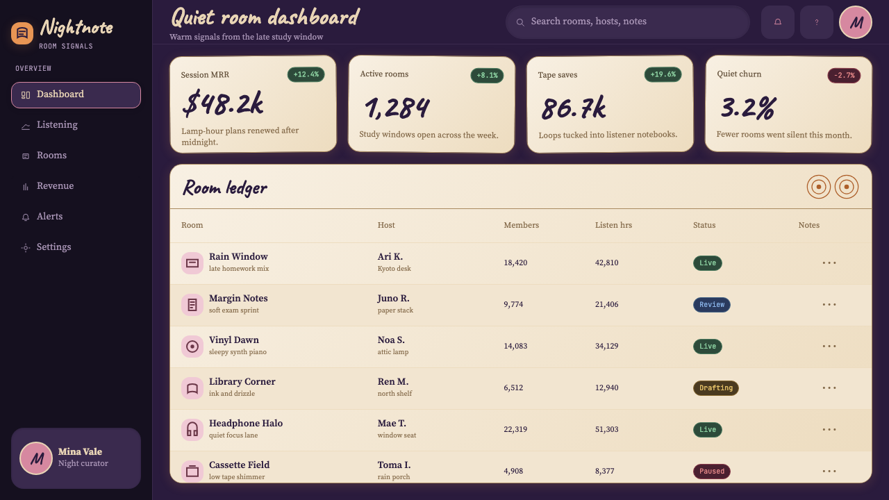
For presentation slides, this style is best applied to personal and creative contexts rather than professional or analytical ones. A cover slide benefits from a dark background with a single warm color zone — amber light blooming from the center or a corner — and type set in a hand-lettered or rounded style. Content slides should carry forward the paper texture metaphor: card-surface containers against a dark background, with a deliberate restriction on the number of colors used simultaneously. Data visualizations work when treated as handmade objects — bar charts that feel chalked rather than rendered, scatter plots with imperfect dot sizes — though the style will struggle on slides requiring precision or formal authority.对于演示文稿,这种风格最适合个人化与创意语境,而非专业或分析性场合。封面幻灯片适合用深色背景配以单一暖色光区——琥珀色从中心或角落向外晕染——搭配手写风格或圆润字体排版。内容幻灯片应延续纸张质感的隐喻:在深色背景上使用带纸感的卡片容器,并刻意限制同时使用的色彩数量。数据可视化在被当作手工制品处理时效果最佳——柱状图带着粉笔而非渲染的质感,散点图的点大小有些许不均匀——但对于需要精确度或正式权威感的幻灯片,这种风格会显得力不从心。
For web interfaces, the style suits personal dashboards, note-taking apps, ambient music and focus tools, and indie creative platforms where the user experience should feel intimate and unhurried. The approach is to establish the dark background first, then define one warm light zone that becomes the primary focus area. Navigation and structural elements should be typographic and understated, receding into the dark rather than asserting themselves. Card components should feel like physical objects — slightly warm in tone, with a gentle depth that suggests paper resting on a surface rather than pixels floating in a void.对于网页界面,这种风格适合个人仪表板、笔记应用、环境音乐与专注工具,以及用户体验应当感到亲密与从容的独立创意平台。方法是:先建立深色背景,再定义一个成为主要焦点区域的暖色光区。导航与结构元素应当是字体性的、低调的,退入黑暗而非主张自身。卡片组件应当有物理存在感——色调略带暖意,带有一种轻微的深度感,仿佛是纸张搁放在桌面上,而非像素悬浮在虚空中。
For editorial and marketing applications, the style works on long-form content that is meant to be read rather than scanned, on artist profiles and creative portfolios, and on brand communication for products associated with focus and calm. Editorial layouts benefit from generous line height, warm-toned backgrounds, and section breaks marked by subtle texture shifts rather than hard rules. Marketing pages for focus tools, music platforms, or creative applications can use the aesthetic to differentiate from the clean, bright, high-saturation language of most consumer software — the darkness and warmth are themselves a product promise.对于编辑与营销应用,这种风格适合用于供人阅读而非浏览扫视的长文内容、艺术家档案与创意作品集,以及与专注和平静相关的产品品牌传播。编辑版面受益于充裕的行高、暖调背景,以及用微妙的质感转换(而非硬性分隔线)标记的章节分隔。专注工具、音乐平台或创意应用的营销页面,可以借助这套美学从大多数消费软件干净、明亮、高饱和的视觉语言中脱颖而出——黑暗与温暖本身就是一种产品承诺。
A common mistake is applying the style's visual surface while ignoring its underlying mood logic. Adding grain filters, dark backgrounds, and handwritten fonts to an interface that is fundamentally urgent — a project management tool, a news feed, an e-commerce checkout flow — will produce visual dissonance rather than atmosphere. Equally, the style loses its power when its palette is brightened: replacing plum and amber with navy and orange, or making the background lighter for readability, removes the late-night intimacy that gives the style its emotional charge. The grain, the darkness, and the single warm light source are not optional elements — they are the style's argument.一个常见错误是:应用了这种风格的视觉表面,却忽视了其背后的情绪逻辑。在本质上充满紧迫感的界面——项目管理工具、新闻推送流、电商结账流程——叠加颗粒滤镜、深色背景和手写字体,产生的是视觉不协调,而非氛围感。同样,当这种风格的色调被提亮时,它的力量也会随之消失:用藏青与橙色替换梅紫与琥珀,或为提高可读性而将背景调浅,会抹去这种风格情感力量的根基——深夜般的亲密感。颗粒感、黑暗,以及单一暖光源,不是可选元素——它们是这套风格的全部论点。
See the Lofi Hip-Hop Anime Girl (2018) design system →查看 Lofi Hip-Hop Anime Girl (2018) 完整设计系统 →
Lofi Hip-Hop Anime Girl (2018) — FAQLofi Hip-Hop Anime Girl (2018) · 常见问题
Is the Lofi Girl aesthetic the same as vaporwave or synthwave?Lofi Girl 美学和蒸汽波或合成波是同一回事吗?
They share an interest in nostalgia and analog media, but they are distinct in mood, palette, and cultural reference. Vaporwave is ironic, lurid, and saturated — it pillages 1980s consumer culture and early internet aesthetics with a sense of detached commentary. Synthwave is energetic, chrome-edged, and cinematic, referencing retrofuturism and the visual vocabulary of 1980s action films. The Lofi Girl aesthetic is intimate, quiet, and genuinely warm rather than nostalgic-as-critique. Its darkness is soft and enclosing rather than neon and exposed. Where vaporwave makes a joke about late capitalism and synthwave makes a film trailer, the Lofi aesthetic makes a cup of tea.三者都对怀旧与模拟媒介抱有兴趣,但在情绪、色调与文化参照上截然不同。蒸汽波是反讽的、刺眼的、高饱和的——它以一种疏离的评论感掠夺八十年代消费文化与早期互联网美学。合成波是充满活力的、铬边的、电影感的,参照复古未来主义与八十年代动作片的视觉词汇。Lofi Girl 美学是亲密的、安静的、真实温暖的,而非以批判形式呈现的怀旧。它的黑暗是柔软而包裹性的,而非霓虹的、裸露的。蒸汽波在开晚期资本主义的玩笑,合成波在制作电影预告片,而 lofi 美学在泡一杯茶。
Can this style work for a product that isn't about studying or music?这种风格可以用于与学习或音乐无关的产品吗?
Yes, but the transfer requires honest assessment of whether the product shares the emotional values of the aesthetic — solitude, quiet focus, personal time, comfort in imperfection — rather than just its visual surface. A journaling app, a sleep tracker, a creative writing tool, an indie game, or a personal finance app framed around calm reflection could all carry this aesthetic credibly. A fast-food ordering interface, a live sports scoreboard, or a real-time collaboration tool cannot — not because of visual incompatibility but because the emotional registers are fundamentally opposed. The style's grain and darkness signal slowness, and slowness is a promise the product must be able to keep.可以,但这种转用需要诚实地评估:产品是否真的与这套美学的情绪价值共享——独处、安静专注、个人时间、在不完美中找到安慰——而不只是借用其视觉表面。日记应用、睡眠追踪器、创意写作工具、独立游戏,或以平静反思为框架的个人理财应用,都可以可信地承载这套美学。快餐点单界面、体育赛事实时比分板或实时协作工具则不行——不是因为视觉不相容,而是因为情绪音域从根本上是对立的。这种风格的颗粒感与黑暗传递的是缓慢,而缓慢是产品必须有能力兑现的承诺。
How do you maintain accessibility in such a dark palette?在如此深色的色调中,如何保持可访问性?
Dark palettes create real accessibility challenges, and the Lofi aesthetic does not exempt itself from them. The key is to treat the warm amber tones — the illuminated zones — as the primary legibility area, and to ensure that any text or interactive element falls within or near that warm zone rather than in the shadowed periphery. Text placed against deep plum or near-black backgrounds must carry sufficient luminance contrast to remain readable; the grain overlay, while atmospheric, cannot be allowed to reduce contrast below acceptable thresholds. The style's own logic actually assists here: if the lamp is the light source, content should be near the lamp.深色色调带来真实的可访问性挑战,Lofi 美学并不能豁免。关键在于将暖琥珀色调——被照亮的区域——视为主要可读区域,并确保所有文字或可交互元素落在该暖色区域内或附近,而非处于阴影中的边缘区域。放置在深梅紫或近乎纯黑背景上的文字,必须保持足够的亮度对比以维持可读性;颗粒叠层虽有氛围感,但不能让对比度降至可接受阈值以下。这种风格自身的逻辑在这里实际上提供了帮助:如果台灯是光源,那么内容就应该靠近台灯。
What is the difference between authentic lofi aesthetic and a generic dark mode?真正的 lofi 美学与普通深色模式有什么区别?
Dark mode is a functional inversion of a light interface, typically using neutral dark grays as backgrounds to reduce eye strain. The Lofi aesthetic is not a functional mode — it is an emotional environment. The difference shows immediately in color temperature: dark mode uses cool to neutral grays; the Lofi style uses warm, chromatic darks — plums, dusty navies, warm near-blacks — combined with amber accent light. The critical addition is texture: the grain, the paper surfaces, and the analog noise overlays are entirely absent from dark mode and essential to the Lofi aesthetic. A dark mode looks like a system. A Lofi interface feels like a room.深色模式是浅色界面的功能性反转,通常以中性深灰色作为背景以减少视觉疲劳。Lofi 美学不是一种功能性模式——它是一种情绪环境。区别在色温上立刻显现:深色模式使用冷调至中性的灰色;Lofi 风格使用暖调的、有色彩的深色——梅紫、带尘土感的藏青、温暖的近纯黑——结合琥珀色的强调光。关键的附加物是质感:颗粒感、纸张界面、模拟噪点叠层在深色模式中完全缺席,却是 Lofi 美学的核心。深色模式看起来像一个系统。Lofi 界面感觉像一个房间。
Does the style age well, or is it tied too closely to a specific cultural moment?这种风格经得住时间考验吗,还是与特定文化时刻绑定太深?
All aesthetics are tied to the cultural moment that produced them — Bauhaus is inseparable from Weimar Germany, and Art Deco is inseparable from interwar prosperity. The question is whether the emotional need the aesthetic addresses is durable. The Lofi aesthetic addresses the desire for calm focus and productive solitude in an environment of distraction and speed — a desire that appears to be intensifying rather than fading. Its specific iconographic markers (the anime girl, the cat, the rain on the window) will date it to the early 2020s in the way that specific motifs always date their moment of origin. But the underlying mood logic — warm darkness, slow texture, intimate scale — is old enough to have appeared in candlelit Dutch interior painting and new enough to be the visual grammar of a generation of digital creators.所有美学都与产生它的文化时刻相连——包豪斯与魏玛德国不可分割,装饰艺术与两次大战间的繁荣不可分割。问题在于:这套美学所回应的情绪需求是否经久不衰。Lofi 美学回应的是在注意力分散、节奏加速的环境中渴望平静专注与独处效能的需求——这种渴望似乎正在增强,而非消退。其具体的图像学标志(动漫女孩、猫、窗上的雨)会将它定位于二十一世纪二十年代初,就像特定母题总会标记其起源时刻一样。但其背后的情绪逻辑——温暖的黑暗、缓慢的质感、亲密的尺度——足够古老,早已出现在烛光下的荷兰室内画中;也足够新颖,成为整整一代数字创作者的视觉语法。
Related design styles相关设计风格
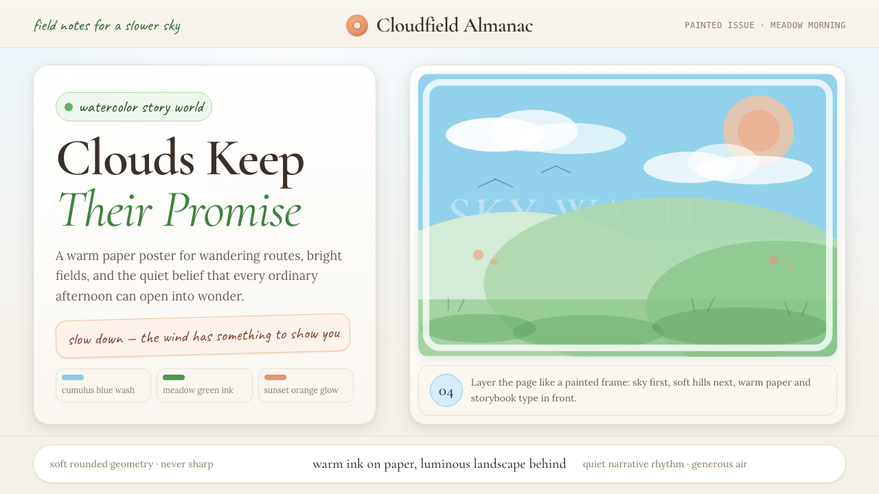 Studio Ghibli (Miyazaki)Hand-painted wonder breathes. Cumulus blue, meadow green, and Cormorant type…手绘奇境会呼吸:积云蓝、草甸绿与Cormorant字体让页面放慢。
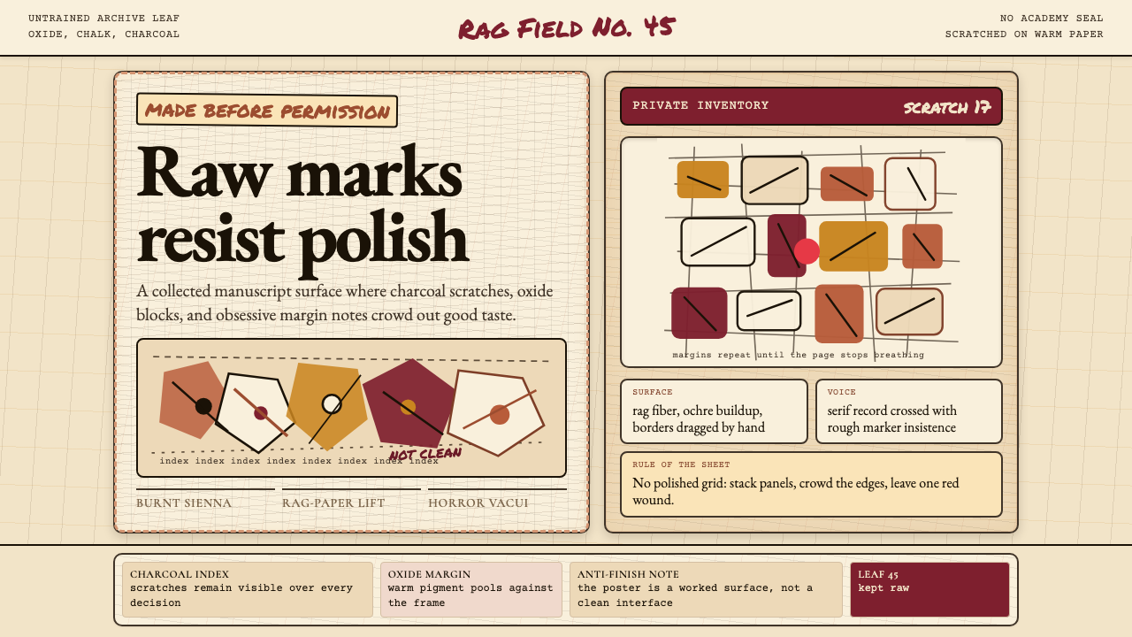 Art Brut (Dubuffet)Polish is refused. Bone-cream paper, earth pigments, scratched borders, dense…拒绝精致。骨白纸、大地颜料、刮痕边框和密集页边。
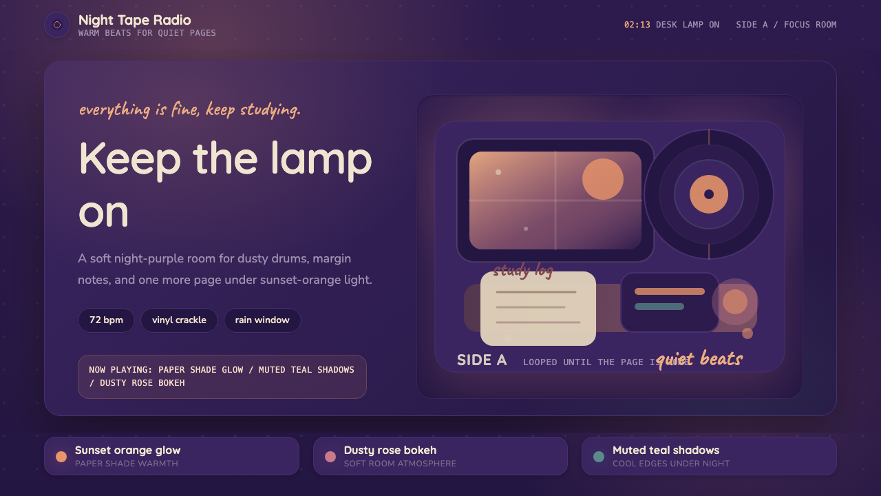 Lo-fi Hip Hop / ChillhopCozy focus at 2am. Night purple, Quicksand type, and sunset-orange lamp glow.凌晨两点的安心感:夜紫底、Quicksand 圆字与夕橙灯光。
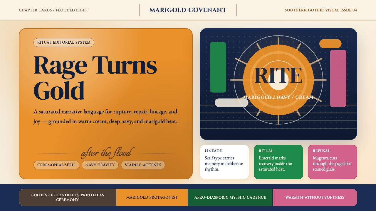 Beyoncé — LemonadeMythic heat refuses restraint. Marigold blocks, navy gravity, serif ceremony.神话般热度拒绝收敛。金盏黄块面、深海军蓝与仪式衬线成形。
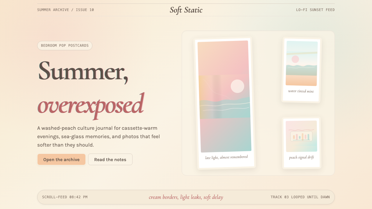 Chillwave TumblrA summer that never happened. Cream Polaroids, washed peach, and turquoise li…从未发生的夏天:奶油宝丽来、褪色蜜桃与松石漏光。
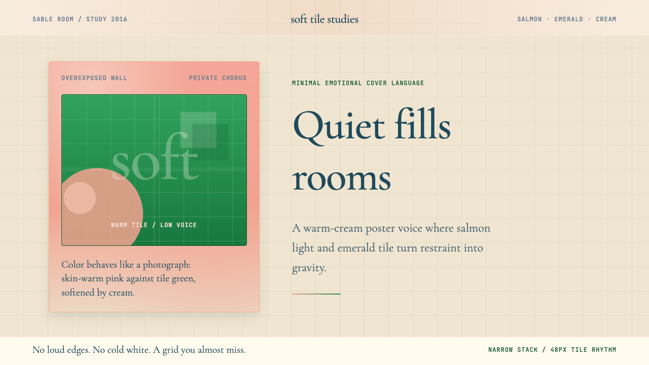 Frank Ocean — BlondeQuiet carries weight. Salmon pink and emerald tile sit on warm cream with air…安静也有重量:鲑鱼粉与翡翠瓷砖落在暖奶油底上,衬线留白呼吸。