What is Frank Ocean — Blonde?什么是 Frank Ocean — Blonde?
Blonde turns intimacy into visual grammar — warm cream, saturated salmon-pink, and a quiet tilt of the head that somehow fills the whole room.《Blonde》将亲密感转化为视觉语法——暖奶油底色、饱和鲑鱼粉,以及一个低头掩面的瞬间,把整个房间都填满了。
Frank Ocean — Blonde in briefFrank Ocean — Blonde 速览
Frank Ocean's Blonde (2016) established a visual identity so precise and so restrained that it became the defining aesthetic reference for an entire era of indie R&B and alternative soul. The cover — Wolfgang Tillmans' soft-focus photograph of Ocean covering his face with both hands, his hair dyed a warm salmon-pink — was paired with art direction by Tom Sachs to produce something that looked nothing like a conventional music release. It looked handmade, intimate, and completely unhurried.Frank Ocean 的《Blonde》(2016)建立了一套如此精准、如此克制的视觉身份,以至于它成为那个时代整整一代独立 R&B 和另类灵魂乐的核心美学参照。封面由摄影师 Wolfgang Tillmans 拍摄:Ocean 用双手掩面,发色染成暖鲑鱼粉,柔焦的画面质感经由 Tom Sachs 的艺术指导赋形,呈现出一种与任何惯常音乐发行都截然不同的面貌——像是手工制作的,私密的,完全不慌不忙的。
The aesthetic operates through a small number of deliberate choices. A warm cream ground — not stark white, but the color of old paper or morning light on a bare wall — carries the central image. Against that ground, the saturated salmon-pink of Ocean's hair and the deep emerald of bathroom tile geometry create a palette that is simultaneously warm and cool, indulgent and austere. Spacing is generous throughout: the cover breathes. Nothing crowds anything else. Text, when it appears, is rendered in wide-set serif letterforms that feel like handwritten notes rather than designed labels.这套美学依赖少数几个深思熟虑的选择。暖奶油底色——不是刺眼的纯白,而是旧纸或晨光映在素墙上的颜色——承托着主体图像。在这底色上,Ocean 发色的饱和鲑鱼粉与浴室瓷砖几何的深翡翠绿共同构建出一套色盘:同时温暖又清冷,既放纵又克制。整体留白充裕,封面本身在呼吸,没有任何元素彼此拥挤。文字一旦出现,便以宽松排布的衬线字体呈现,感觉更像手写便条,而非设计标签。
What distinguishes Blonde's visual language from ordinary minimalism is emotional weight. The restraint is not emptiness — it is the restraint of a person who has chosen very carefully what to say and what to leave out. The bathroom tile motif, the hand covering the face, the muted personal-photograph quality of the image: all of these carry the feeling of something private made briefly visible. The aesthetic asks the viewer to slow down, to look, to be in the same room.《Blonde》视觉语言区别于普通极简主义的,是它的情感重量。这份克制不是空洞——它是一个人经过仔细权衡后决定说什么、省略什么的那种克制。浴室瓷砖的母题、用手遮住的面孔、图像本身那种静默的私人照片质感——这一切都传递出某种私密事物被短暂示人的感受。这套美学邀请观看者放慢速度,凝视,待在同一个房间里。
See the Frank Ocean — Blonde design system查看 Frank Ocean — Blonde 完整设计系统
Where does Frank Ocean — Blonde come from?Frank Ocean — Blonde 从何而来?
Frank Ocean came up through New Orleans, then Los Angeles, where he wrote songs for other artists before signing to Def Jam and releasing the mixtape Nostalgia, Ultra in 2011. That release used sampled beats and free distribution to build an audience entirely outside the conventional label pipeline, establishing an independence of method that would carry forward. His debut studio album Channel Orange followed in 2012 — critically celebrated, Grammy-winning — and its visual language was already reaching toward the personal and the understated. But it was four years of silence, legal disputes with Def Jam, and deliberate self-exile from the industry that made Blonde possible.Frank Ocean 成长于新奥尔良,后来辗转来到洛杉矶,在以自己名义签约 Def Jam 之前,曾为其他艺人撰写歌曲。2011 年,他发布了混音带《Nostalgia, Ultra》,以采样音轨和免费分发的方式在传统唱片公司渠道之外完全自主地积累了听众,确立了一种独立的工作方法,并将贯穿其整个生涯。2012 年的首张录音室专辑《Channel Orange》随之而来——斩获格莱美、广获好评——其视觉语言已经在向个人化与低调倾斜。但正是此后长达四年的沉默、与 Def Jam 的法律纠纷、以及刻意与行业保持距离,才使《Blonde》成为可能。
Blonde was released in August 2016 simultaneously as a visual album and as a streaming exclusive, bypassing traditional retail entirely. This act of structural independence shaped the aesthetic: there was no label art department to satisfy, no standard template to conform to. Ocean worked with Wolfgang Tillmans — the German-British photographer known for his intimate, unposed, technically imperfect images of queer life, domestic spaces, and bodies in private moments — and Tom Sachs, the New York sculptor and artist known for his handmade, lo-fi reinterpretations of consumer culture. The combination was not accidental. Tillmans brought documentary intimacy; Sachs brought an insistence on the visible hand, the human mark, the thing that looks made rather than manufactured.2016 年 8 月,《Blonde》以视觉专辑与流媒体独家发行的双重形式同步面世,完全绕开传统零售渠道。这种结构性独立塑造了它的美学:没有唱片公司艺术部门需要取悦,没有惯例模板需要遵从。Ocean 与 Wolfgang Tillmans 合作——这位德裔英国摄影师以其对酷儿生活、家居空间和私密时刻中身体的亲密、非摆拍、技术上不完美的影像而著称——同时联手纽约雕塑家与艺术家 Tom Sachs,后者以手工制作、低技术再演绎消费文化而闻名。这组合并非偶然:Tillmans 带来了纪录片式的亲密感,Sachs 带来了对可见手迹、人类痕迹、「被制作而非被生产出来」的东西的执著。
The salmon-pink-and-emerald palette had a specific photographic origin: the cover image captures Ocean's dyed hair and the green tiles of a bathroom, photographed under the ambient light of that interior space. The palette was not chosen from a mood board — it was found. This is an important distinction for understanding the aesthetic: the design does not impose a system on the image; the image generates the system. Tillmans' practice of finding rather than constructing images means the visual language of Blonde has an authenticity that purely art-directed covers rarely achieve.鲑鱼粉与翡翠绿的色盘有其具体的摄影起源:封面图像捕捉了 Ocean 染色的发丝与浴室绿瓷砖,在那个室内空间的环境光下拍摄而成。这个色盘不是从情绪板上挑选来的——它是被发现的。这对于理解这套美学是一个重要区别:设计并不将一套系统强加于图像,而是图像生成了系统。Tillmans「发现而非建构」图像的创作方式,意味着《Blonde》的视觉语言具有一种纯粹的艺术指导封面很难企及的真实性。
The cultural moment mattered too. 2016 was the height of the streaming-era fragmentation of the music industry, and the year that saw an extraordinary wave of artistically ambitious Black American music — Beyoncé's Lemonade, Solange's A Seat at the Table, Kendrick Lamar's untitled unmastered. In this context, Blonde's quietness was itself a statement. Where those releases were grand and political, Ocean's was whispered and private. The visual language — intimate, handmade, unhurried — mirrored that posture exactly. The aesthetic became influential not because it was loud, but because it offered a counterpoint to loudness at exactly the moment loudness was everywhere.文化时机同样至关重要。2016 年是流媒体时代音乐产业碎片化的顶峰,也是一个见证了非凡的雄心勃勃的黑人美国音乐浪潮的年份——碧昂斯的《Lemonade》、Solange 的《A Seat at the Table》、Kendrick Lamar 的《untitled unmastered》。在这一背景下,《Blonde》的安静本身就是一种宣言。在那些宏大而政治性的发行面前,Ocean 的是低语的、私密的。视觉语言——亲密、手工、从容——精确地镜像了这种姿态。这套美学之所以具有影响力,不是因为它喧嚣,而是因为它在喧嚣无处不在的时刻,提供了一个对位。
What defines the Frank Ocean — Blonde look?Frank Ocean — Blonde 的视觉特征是什么?
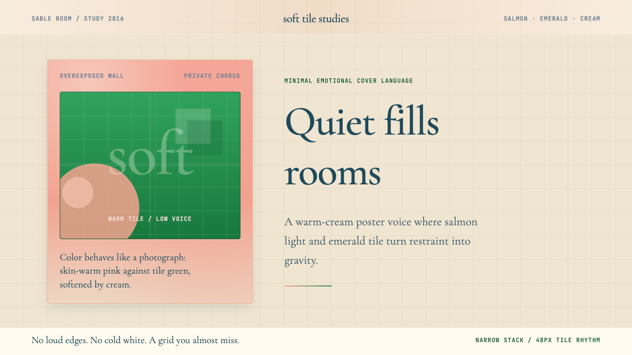
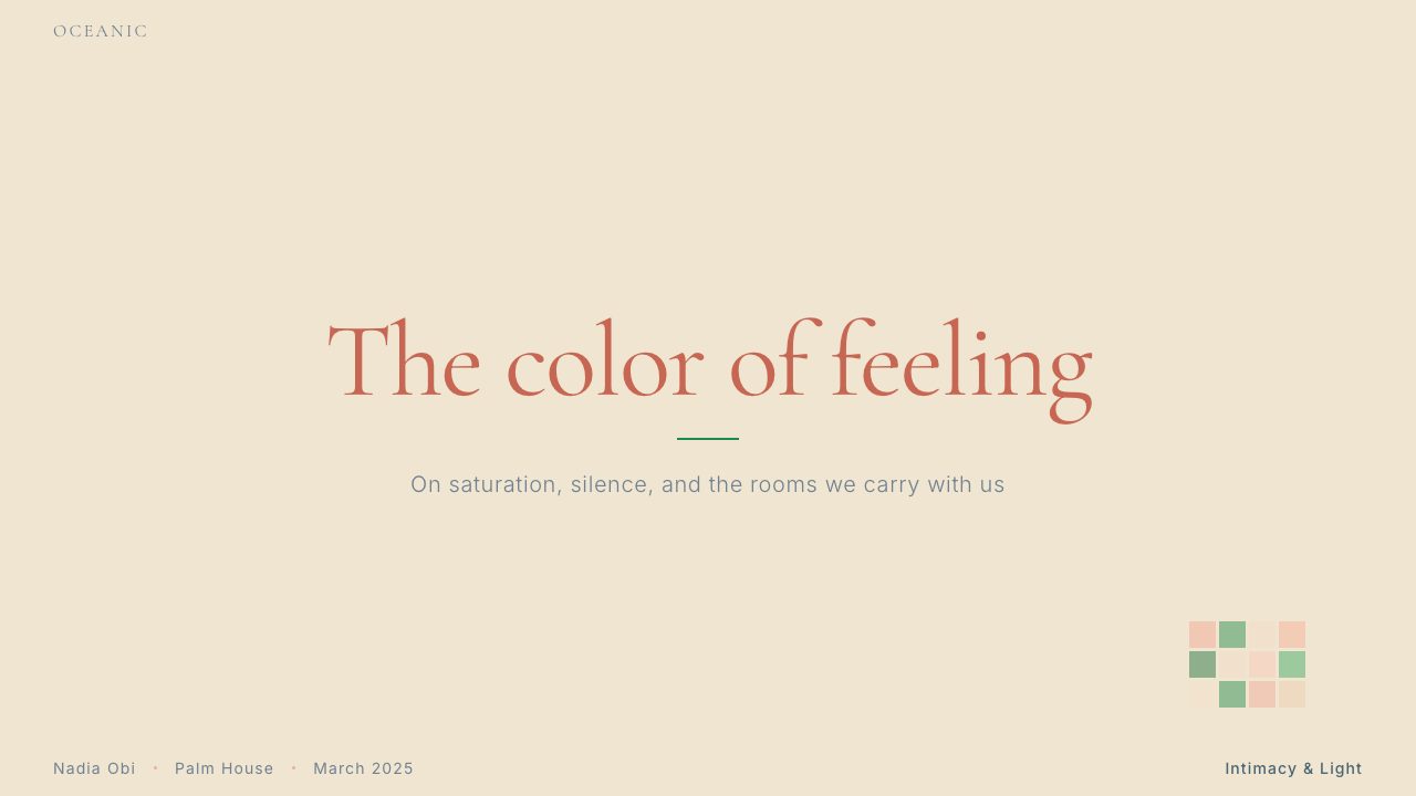
Salmon-Pink and Cream Ground鲑鱼粉与奶油底
The dominant palette is built on two warm tones that sit adjacent rather than in contrast: a saturated salmon-pink carrying the emotional charge, and a warm cream background that softens everything it touches. Neither tone is aggressive — the salmon reads as skin-adjacent, fleshy, personal. The cream prevents the whole from feeling clinical or museum-like. Together they create an atmosphere of warmth-at-a-distance: close, but not crowding.主色盘建立在两个彼此相邻而非对比的暖色调之上:饱和的鲑鱼粉承载情感张力,暖奶油底色则柔化它所触碰的一切。两个色调都不咄咄逼人——鲑鱼粉接近肤色,肉质感,私密感。奶油色则防止整体显得冰冷或博物馆式的疏离。两者共同营造出一种「远距离的温暖」:亲近,却不压迫。
Emerald Tile Geometry翡翠瓷砖几何
The deep emerald green of bathroom tiles introduces the only cool note in the palette, and it arrives as geometry rather than field color. The grid of tile seams creates a quiet structural underpinning — repetitive, domestic, slightly institutional. This geometric pattern grounds the soft photograph in something more concrete, preventing the overall mood from dissolving into pure sentiment. The tiled surface is architectural memory: it recalls specific rooms, specific intimacies.浴室瓷砖的深翡翠绿是色盘中唯一的冷色调,它以几何形态而非大面积色块的方式出现。瓷砖缝隙构成的网格为整体提供了安静的结构支撑——重复的、家居化的、略带机构感的。这种几何图案将柔软的摄影图像锚定在某种更具体的事物上,防止整体氛围溶解成纯粹的情绪。瓷砖表面是建筑的记忆:它唤起特定的房间,特定的亲密。
Intimate Photographic Light亲密的摄影光线
The light in Blonde's visual world is ambient and interior — not studio-controlled, not dramatically directional, but the kind of light that exists in rooms where people actually live. Tillmans' photographic practice rejects the manufactured quality of commercial portraiture; his images feel found rather than constructed. This quality of light gives the aesthetic an air of documentary truth: something was captured here, not staged.《Blonde》视觉世界中的光线是环境光、室内光——不是摄影棚里的受控光,不是戏剧性的定向光,而是真实生活空间里存在的那种光。Tillmans 的摄影实践拒绝商业肖像摄影的人工制造感;他的图像感觉是被发现的,而非被建构的。这种光线品质赋予了这套美学一种纪录片的真实感:这里捕捉到了某件事,而不是某件事被摆拍。
Serif Type with Generous Spacing宽松排布的衬线字体
Where text appears in Blonde's extended visual identity, it does so in serif letterforms set with wide letter-spacing and generous surrounding whitespace. This typographic posture is the opposite of corporate or authoritative — it reads as contemplative, almost handwritten in feel. The choice of serifs over sans-serifs signals warmth and literary tradition rather than rationality and system. The wide tracking prevents crowding and allows each word to breathe as an individual object.在《Blonde》延伸视觉身份中,文字以宽松字间距、充裕留白的衬线字体呈现。这种排版姿态与企业化或权威性恰恰相反——它读来是沉思的,甚至在感觉上接近手写。选择衬线而非无衬线,传递的是温暖与文学传统,而非理性与系统。宽松的字距防止拥挤,让每个词都作为独立的对象自由呼吸。
Visible Hand — Handmade Quality可见的手迹——手工制作感
Tom Sachs' art direction brings a deliberate imperfection to the overall visual language — an insistence that the thing looks made by a person, not produced by a machine. This does not mean sloppiness; it means that the traces of human decision-making remain visible in the final object. Slight asymmetries, textures that feel physical rather than digital, an overall looseness that resists the smooth finish of corporate design. The aesthetic explicitly positions itself against the polish of mainstream commercial visual culture.Tom Sachs 的艺术指导为整体视觉语言带来了一种刻意的不完美——坚持让作品看起来像是由人制作,而非由机器生产。这不意味着粗糙;它意味着人类决策的痕迹在最终作品中保持可见。轻微的不对称、感觉是物质性而非数字性的质感、一种整体上的松弛感——这些都抵抗着企业设计的光滑完成度。这套美学明确将自身定位于对抗主流商业视觉文化的抛光感。
Restraint as Emotional Language克制作为情感语言
Perhaps the most important characteristic of the Blonde aesthetic is what it does not do. It does not explain itself. It does not fill silence with decoration. It does not reach for the viewer's attention; it waits for the viewer to arrive. This restraint is not emptiness — it is the fullness of withheld feeling. Every decision to leave space, to not add another element, to let a quiet image carry its own weight without supporting graphics or explanatory text, constitutes a form of emotional expression.《Blonde》美学最重要的特征,或许是它不做的事情。它不解释自己。它不用装饰填满沉默。它不主动争取观看者的注意——它等待观看者自己走近。这种克制不是空洞——它是被压抑的情感的饱满。每一个留出空间的决定,每一个不添加另一个元素的决定,每一个让安静的图像自己承担重量而不依赖辅助图形或解释文字的决定,都构成了一种情感表达。
Domestic and Private Scale家居与私密的尺度
Unlike aesthetics built for spectacle — the stadium-scale grandeur of arena rock, the maximalist visual noise of commercial pop — Blonde operates at the scale of the domestic interior. The bathroom, the bedroom, the quiet afternoon. The visual elements are not monumental; they are personal-scale. This choice of register is itself meaningful: the aesthetic is not performing for a crowd, it is speaking to one person at a time.与那些为奇观而建的美学不同——竞技场摇滚体育场级别的宏大、商业流行的最大化视觉噪音——《Blonde》在家居室内的尺度上运作。浴室、卧室、安静的午后。视觉元素不是纪念碑式的;它们是个人尺度的。这种语域选择本身即是有意义的:这套美学不是在为人群表演,它是一次只对一个人说话。
See the Frank Ocean — Blonde design system查看 Frank Ocean — Blonde 完整设计系统
Who shaped Frank Ocean — Blonde?谁塑造了 Frank Ocean — Blonde?
Born Christopher Edwin Breaux in Long Beach, California, and raised in New Orleans, Ocean moved to Los Angeles as a teenager and quietly established himself as a songwriter before anyone knew his name. His 2011 mixtape Nostalgia, Ultra — released for free, bypassing Def Jam entirely — demonstrated the structural independence that would define his career. The 2012 album Channel Orange made him a critical darling and introduced a visual sensibility already moving toward intimacy and understatement. Blonde, released in 2016 after four years of deliberate silence, is widely regarded as one of the defining artistic statements of the 2010s: not just musically but as a total aesthetic object whose visual language, distribution strategy, and emotional register all cohere into a singular and unrepeatable act.原名 Christopher Edwin Breaux,生于加利福尼亚州长滩,成长于新奥尔良。Ocean 少年时移居洛杉矶,在任何人知道他名字之前便已悄然确立了自己作为词曲作者的地位。2011 年免费发布、完全绕开 Def Jam 的混音带《Nostalgia, Ultra》展示了贯穿其整个生涯的结构性独立。2012 年的专辑《Channel Orange》令他成为乐评界的宠儿,并引入了一套已然向亲密感与低调倾斜的视觉感性。经历四年刻意沉默后于 2016 年发布的《Blonde》,被广泛视为 2010 年代最具定义性的艺术宣言之一:不仅在音乐上,更作为一个完整的美学对象——其视觉语言、发行策略与情感语域共同凝聚成一个奇异而不可重复的行为。
Wolfgang Tillmans was born in Remscheid, Germany in 1968 and is among the most influential photographers of the last four decades. His work — intimate, unposed, technically imperfect in ways that feel purposeful — established a visual language for queer life, youth culture, and domestic space that became enormously influential on editorial photography, fashion, and album art. His photographs feel found rather than made: a detail of fabric, a body in an unguarded moment, the interior of a room at a specific time of day. Tillmans won the Turner Prize in 2000 — the first photographer to do so — and has exhibited widely at institutions including Tate Modern and MoMA. His collaboration with Frank Ocean on Blonde brought his documentary intimacy to bear on popular music at a moment when popular music rarely looked to fine art photography for its visual language.Wolfgang Tillmans 1968 年生于德国雷姆沙伊德,是过去四十年间最具影响力的摄影师之一。他的作品——亲密、非摆拍、技术上的不完美感觉是刻意为之——为酷儿生活、青年文化和家居空间建立了一套视觉语言,对编辑摄影、时尚和专辑封面艺术产生了深远影响。他的照片感觉是被发现的而非被制作的:织物的细节、身体在无防备时刻的状态、某一特定时刻室内的光线。Tillmans 于 2000 年获得特纳奖——第一位获此殊荣的摄影师——并在泰特现代美术馆、MoMA 等机构广泛展出。他与 Frank Ocean 在《Blonde》上的合作,在流行音乐很少向纯艺术摄影借取视觉语言的时刻,将他的纪录片式亲密感带入了大众音乐领域。
Tom Sachs is a New York-based sculptor and artist born in 1966, known for handmade, lo-fi reinterpretations of consumer culture and institutional authority. His studio practice involves meticulous craft applied to unexpected materials — he has built functional space stations out of plywood and domestic hardware, recreated luxury brand packaging in foam core, and constructed elaborate ceremonial systems with deliberate DIY aesthetics. The thread connecting Sachs' art practice to his art direction on Blonde is his insistence on visible process: the thing should look like someone made it, and the marks of making should remain. This quality — what critics sometimes call 'bricolage' — translates in Blonde's visual language as the handmade imperfection and anti-corporate warmth that distinguishes the album's aesthetic from the polished visual production of mainstream music releases.Tom Sachs 是生于 1966 年的纽约艺术家与雕塑家,以对消费文化和机构权威进行手工制作、低技术再诠释而著称。他的工作室实践将精细的手艺应用于出人意料的材料——他曾用胶合板和家居五金建造可运行的空间站,用泡沫板重制奢侈品牌包装,并以刻意的 DIY 美学构建精密的仪式体系。将 Sachs 的艺术实践与他在《Blonde》上的艺术指导联结起来的,是他对可见过程的坚持:作品应该看起来像是某人制作的,制作的痕迹应当留存。这种品质——批评家有时称之为「拼凑法」——在《Blonde》的视觉语言中转化为手工制作的不完美感和反企业的温度,这使得这张专辑的美学区别于主流音乐发行的抛光视觉生产。
Homer — the zine published by Frank Ocean accompanying the Blonde release — extended the album's visual language into print. Distributed to select Apple Music subscribers and later circulated widely online, the zine features photography by Tillmans alongside other images, fragments of text, and graphic elements consistent with the album's restrained, personal aesthetic. Homer established the precedent for Ocean's subsequent creative ventures (including the Homer jewelry brand launched in 2021) and demonstrated that the Blonde visual system was not a one-off album cover but a coherent, expandable aesthetic world. The zine format itself — small, limited, physical — reinforced the intimate and anti-mass-market character of the release.《Homer》——随《Blonde》发行的同名杂志小志——将专辑的视觉语言延伸至印刷品领域。这份小志分发给部分 Apple Music 订阅用户,后来在网络上广泛流传,内含 Tillmans 的摄影作品及其他图像、文字片段,以及与专辑克制、私密美学一致的图形元素。《Homer》为 Ocean 此后的创意项目(包括 2021 年创立的 Homer 珠宝品牌)奠定了先例,并表明《Blonde》的视觉系统不是一次性的专辑封面,而是一个连贯的、可扩展的美学世界。小志的形式本身——小巧、限量、实体——强化了这次发行亲密和反大众市场的特质。
While Wolfgang Tillmans shot the canonical Blonde cover, the photographer and director Nabil Elderkin had been a key visual collaborator with Frank Ocean since Channel Orange, and his work shaped the evolving visual language that culminated in Blonde. Elderkin, who has also worked extensively with Kanye West, Bon Iver, and other artists associated with thoughtful visual practice, brings a similar preference for natural light, documentary texture, and emotional restraint. His contribution to Ocean's extended visual world illustrates that the Blonde aesthetic was not the product of a single moment of inspiration but emerged from sustained, consistent creative partnerships in which visual values were held to and refined across multiple projects and years.尽管 Wolfgang Tillmans 拍摄了《Blonde》的经典封面,摄影师兼导演 Nabil Elderkin 自《Channel Orange》时代起便是 Frank Ocean 的核心视觉合作者,他的工作塑造了最终在《Blonde》中达到顶峰的演进中的视觉语言。Elderkin 还与 Kanye West、Bon Iver 及其他与深思熟虑的视觉实践相关联的艺术家有大量合作,他带来了对自然光、纪录片质感和情感克制的相似偏好。他对 Ocean 延伸视觉世界的贡献表明,《Blonde》的美学不是某一瞬间灵感的产物,而是在持续、一致的创意伙伴关系中涌现出来的——视觉价值观在多个项目和多年间被坚守并提炼。
How do you use Frank Ocean — Blonde today?今天怎么用 Frank Ocean — Blonde?
The Blonde aesthetic transfers most naturally to contexts that share its fundamental posture: quiet, personal, unhurried. It is the wrong tool for work that needs to project authority, urgency, or systemic rationality. Applying it correctly requires internalizing the emotional register first — ask what kind of experience the design is supposed to create for the person looking at it, and whether that experience is compatible with warmth, intimacy, and restraint. If the answer is yes, the visual toolkit is available. If the answer is no, a different reference is needed.《Blonde》的美学最自然地迁移到那些与它共享基本姿态的语境中:安静、私密、从容不迫。它不适合需要投射权威、紧迫感或系统理性的工作。正确应用它,需要首先内化其情感语域——问自己:这个设计应该为看到它的人创造什么样的体验?那种体验是否与温暖、亲密、克制相容?如果答案是肯定的,这套视觉工具箱是可用的。如果答案是否定的,则需要另一个参照。
For presentation slides, the Blonde aesthetic works exceptionally well on title and section-break pages but requires discipline on content pages. A title slide should use the cream-ground approach: a single photographic or illustrative image with generous surrounding space, the title in wide-set serif type, no supporting graphics or decorative borders. Section breaks can carry the salmon-pink or emerald as a field color behind minimal text. Content slides require restraint: one idea per slide, body text in a weight and size that feels readable rather than bold, generous margins, and no decorative elements. Data visualizations should be kept visually quiet — use the palette's warm and cool tones to distinguish data series, but do not crowd the chart. The overall rhythm of the deck should feel like turning pages in a book rather than advancing through a presentation.在演示文稿中,《Blonde》美学在标题页与章节分隔页上表现出色,但在内容页上需要严格的自律。标题页应采用奶油底色方案:一张图像或插图配以充裕的周围空间,标题以宽松衬线字体排布,无辅助图形或装饰边框。章节分隔页可用鲑鱼粉或翡翠绿作为大面积色块衬于极简文字之后。内容页要求克制:每页一个想法,正文字重与字号以易读而非醒目为准,充裕留白,无装饰元素。数据可视化应保持视觉上的安静——用色盘的暖色调与冷色调区分数据系列,但不要让图表拥挤。整体节奏应像翻阅一本书,而非在幻灯片之间切换。
For web interfaces and dashboards, the Blonde visual language adapts well to products whose primary relationship with the user is personal rather than transactional. A wellness application, a personal finance tool, a reading or journaling app — these contexts invite the warm cream ground, the restrained typography, and the generous whitespace. Navigation should be typographic and minimal: no icon-heavy sidebars, no color-coded badges fighting for attention. Interactive states — hover, active, focus — can use the salmon-pink as an accent without saturating the whole interface. Pricing pages work with the style if tiers are distinguished through typography and spacing rather than competing color blocks.在网页界面与仪表板方面,《Blonde》的视觉语言适合那些与用户主要建立个人化而非交易性关系的产品。健康应用、个人财务工具、阅读或日记 App——这些语境欢迎暖奶油底色、克制的字体排印和充裕的留白。导航应当字体化、极简:无图标密集的侧边栏,无争夺注意力的色彩编码徽章。交互状态——悬停、激活、聚焦——可以将鲑鱼粉作为强调色,但不要让整个界面饱和。如果层级通过字体排印和间距而非竞争的色块来区分,定价页面也能与这种风格配合。
For editorial and marketing contexts, the aesthetic supports long-form and brand-building work better than it supports short-form conversion-focused content. A brand story page, an about-us section, a feature article about a founder or product philosophy — these formats reward the slow, accumulative quality of the Blonde approach. Full-width imagery in a warm, documentary style alternates with text blocks set in wide-measure serif, and the overall page rhythm breathes. Marketing headlines work in wide-set serif at a scale that commands attention without shouting. One consistent accent color — the salmon-pink — used only for primary calls to action, with all other interactive elements handled typographically.在编辑与营销语境中,这套美学支持长篇和品牌构建工作,胜于支持以转化为核心的短篇内容。品牌故事页面、关于我们章节、关于创始人或产品哲学的专题文章——这些形式奖励《Blonde》方式的缓慢、积累性品质。温暖、纪录片风格的全宽图像与宽行宽衬线排版的文字块交替出现,整体页面节奏在呼吸。营销大标题以宽松衬线字体大字号呈现,命令关注而不呼喊。鲑鱼粉作为唯一一致的强调色,仅用于主要行动号召,所有其他交互元素通过字体排印处理。
A common mistake is treating the Blonde palette as an invitation to softness everywhere. The aesthetic is not pastel — the salmon-pink is saturated, the emerald is deep, the cream is warm but not sugary. Desaturating the palette to achieve a gentle or soothing effect produces something that looks more like generic wellness branding than like Blonde. Another frequent error is over-applying the photographic quality: Blonde's intimacy works because it is selective. One or two images carrying the full documentary weight of the aesthetic is more powerful than a page saturated with soft-focus personal photography. And the generous spacing that defines the aesthetic requires actual restraint in the number of elements — generous spacing around too many elements does not read as Blonde, it reads as clutter with wide margins.一个常见错误是将《Blonde》色盘理解为在所有地方都追求柔软感的邀请。这套美学不是粉彩——鲑鱼粉是饱和的,翡翠绿是深沉的,奶油色是温暖的但不是甜腻的。将色盘降饱和以达到温柔或舒缓效果,产生的是看起来更像通用健康品牌而非《Blonde》的东西。另一个常见错误是过度应用摄影质感:《Blonde》的亲密感之所以有效,是因为它是有选择性的。一两张承载美学全部纪录片重量的图像,比一页饱和的柔焦私密摄影更有力量。而定义这套美学的充裕间距,需要在元素数量上的真正克制——围绕过多元素的充裕间距读起来不像《Blonde》,它读起来像是有宽边距的杂乱。
Finally, the handmade quality that Tom Sachs brings to the art direction is easy to misread as an invitation to visible imperfection everywhere. In practice, the handmade quality is precise: it is not messiness, it is the decision to leave certain marks visible that a more corporate aesthetic would sand away. Applied to digital design, this translates as a slight looseness in layout — not a rigid grid, but not chaos — and a willingness to let asymmetries stand when they feel right. The discipline is knowing the difference between an intentional mark and a mistake.
See the Frank Ocean — Blonde design system查看 Frank Ocean — Blonde 完整设计系统
Frank Ocean — Blonde — FAQFrank Ocean — Blonde · 常见问题
How does the Blonde aesthetic differ from general minimalism?《Blonde》美学与一般极简主义有何不同?
General minimalism tends toward coldness, precision, and the systematic removal of the personal. The Blonde aesthetic is restrained but not cold — its restraint is emotional rather than rational, expressive of feeling rather than expressive of order. The warm cream ground, the salmon-pink of skin and hair, the domestic bathroom setting: these are choices that invite personal association rather than pure formal appreciation. Minimalism says 'nothing unnecessary exists here.' The Blonde aesthetic says something quieter: 'I chose not to say more.'一般极简主义倾向于冷感、精确,以及对个人性的系统性去除。《Blonde》美学是克制的,但不是冷感的——它的克制是情感性的而非理性的,表达的是感受而非秩序。暖奶油底色、皮肤与发丝的鲑鱼粉、家居浴室的场景:这些选择邀请个人联想,而非纯粹的形式欣赏。极简主义说「这里没有任何不必要的东西」。《Blonde》美学说的是更安静的一句话:「我选择不多说了。」
Can the Blonde style work in a dark-mode or dark-background context?《Blonde》风格能在深色模式或深色背景下使用吗?
The Blonde palette is fundamentally warm-ground: the cream is structural, not decorative. A dark inversion is possible but requires significant adaptation. On a deep background, the salmon-pink reads differently — it becomes more fragile, almost translucent — and the warm intimacy that makes the palette effective can break down. If a dark mode is required, the most faithful approach is to use a very dark warm brown rather than a neutral dark or pure black, and to reduce the palette to the salmon-pink as a single accent. The emerald geometry can survive on dark grounds but should be used even more sparingly. The handmade, photographic quality is harder to preserve in dark mode and may require custom photography with compatible lighting.《Blonde》色盘从根本上是暖底色的:奶油色是结构性的,不是装饰性的。深色反转是可能的,但需要显著调整。在深色底面上,鲑鱼粉读起来不同——它变得更脆弱,几乎是半透明的——使色盘有效的那种温暖亲密感可能随之瓦解。如果必须使用深色模式,最忠实的方式是使用非常深的暖棕色,而非中性深色或纯黑,并将色盘减少到鲑鱼粉作为唯一强调色。翡翠几何在深色底面上可以存续,但应使用得更为克制。手工制作的、摄影式的品质在深色模式中更难保持,可能需要具有兼容光线的定制摄影。
What kinds of photography pair well with the Blonde aesthetic?什么样的摄影作品与《Blonde》美学搭配得好?
Photography that pairs well with the Blonde aesthetic shares three qualities: it is shot under ambient rather than artificial light, it captures unguarded moments rather than posed subjects, and it is technically imperfect in ways that feel considered rather than careless — slight softness, grain, an unconventional angle. The subject matter should be domestic or personal rather than grand or spectacular. Portraits work well when the subject is not looking directly at the camera. Still lifes work when the objects have personal rather than commercial significance. Fashion or editorial photography becomes compatible when it abandons the studio and moves into real spaces with real light.与《Blonde》美学搭配良好的摄影,共享三种品质:在环境光而非人工光下拍摄,捕捉无防备的时刻而非摆拍的主体,技术上的不完美感觉是经过深思的而非粗心的——轻微的柔焦、颗粒感、非常规的角度。主题应当是家居化的或个人性的,而非宏大或奇观式的。当被摄者不直视相机时,肖像效果良好。当物体具有个人意义而非商业意义时,静物效果良好。时尚或编辑摄影在放弃摄影棚、走入有真实光线的真实空间时,与这套美学变得相容。
Is the Blonde aesthetic appropriate for brand identity work, or only for one-off creative projects?《Blonde》美学适合品牌视觉识别工作,还是只适合一次性创意项目?
The aesthetic is absolutely applicable to brand identity, but the brands it suits are specific. It is appropriate for brands whose value proposition centers on authenticity, craft, personal connection, or emotional depth — independent publishers, artisan product brands, personal creative practices, certain hospitality or lifestyle concepts. It is not appropriate for brands that need to project scale, authority, or rational credibility — financial services, enterprise software, institutional organizations. The critical test is whether the brand's core promise involves the kind of intimate, personal relationship with its audience that the aesthetic implies.这套美学完全可以应用于品牌视觉识别,但它适合的品牌是特定的。它适合那些价值主张以真实性、工艺、个人联结或情感深度为核心的品牌——独立出版商、手工产品品牌、个人创意实践、某些酒店或生活方式概念。它不适合需要投射规模、权威或理性可信度的品牌——金融服务、企业软件、机构组织。关键的检验是:品牌的核心承诺是否涉及这套美学所暗示的那种与受众的亲密、个人化关系。
How do you avoid the aesthetic feeling dated rather than timeless?如何避免这套美学给人过时而非经典的感觉?
The risk of Blonde-inspired work feeling dated lies primarily in over-reliance on surface markers that were specific to a cultural moment — the warm filter tones of 2016 Instagram, certain low-fi lo-fi tropes that became ubiquitous by 2020. The deeper principles of the aesthetic — warmth without sweetness, restraint without coldness, human presence without performance — do not date in the same way. Work that applies those principles through contemporary materials and contexts, rather than mimicking the specific visual gestures of 2016, tends to hold up. The reference point should be the emotional intention, not the surface style.受《Blonde》启发的作品给人过时感的风险,主要在于过度依赖那些属于某一特定文化时刻的表面标志——2016 年 Instagram 的暖滤镜色调,到 2020 年已变得泛滥的某些低保真陈套。这套美学更深层的原则——温暖而不甜腻、克制而不冷感、人的存在而非表演——不会以同样的方式过时。将这些原则通过当代材料和语境加以应用,而非模仿 2016 年的具体视觉姿势的作品,往往经得起时间检验。参照点应当是情感意图,而非表面风格。
Related design styles相关设计风格
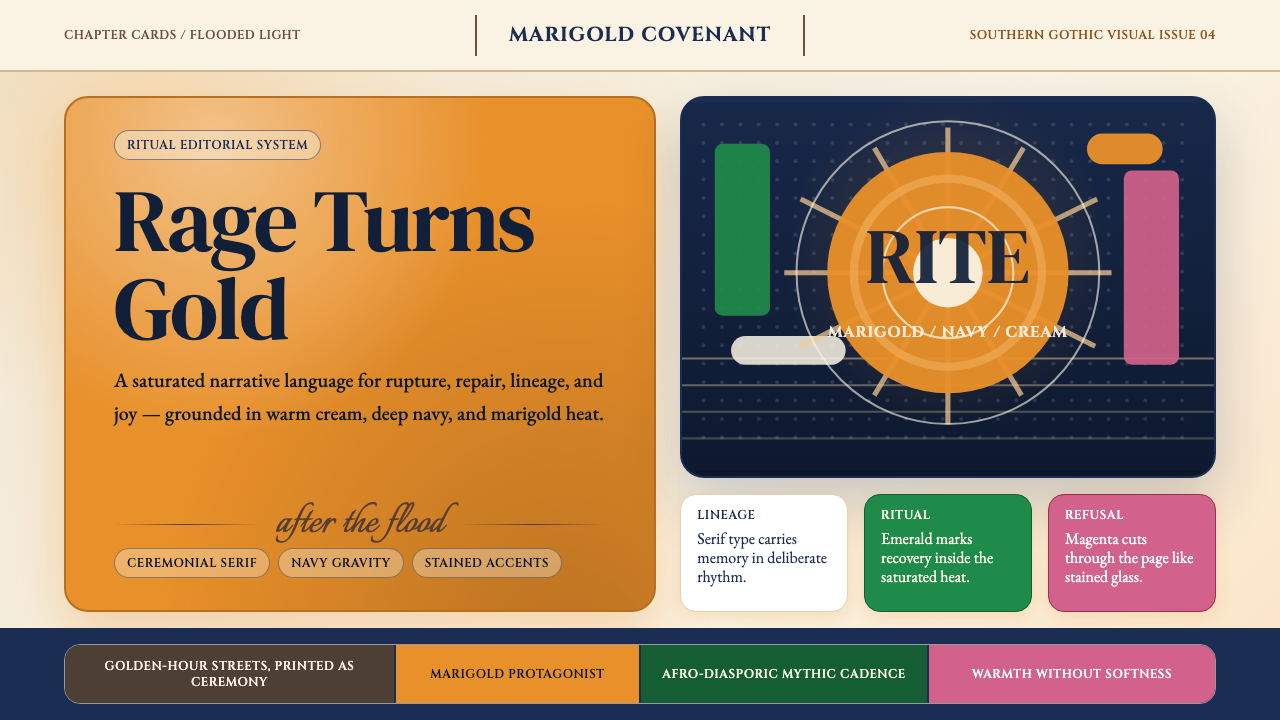 Beyoncé — LemonadeMythic heat refuses restraint. Marigold blocks, navy gravity, serif ceremony.神话般热度拒绝收敛。金盏黄块面、深海军蓝与仪式衬线成形。
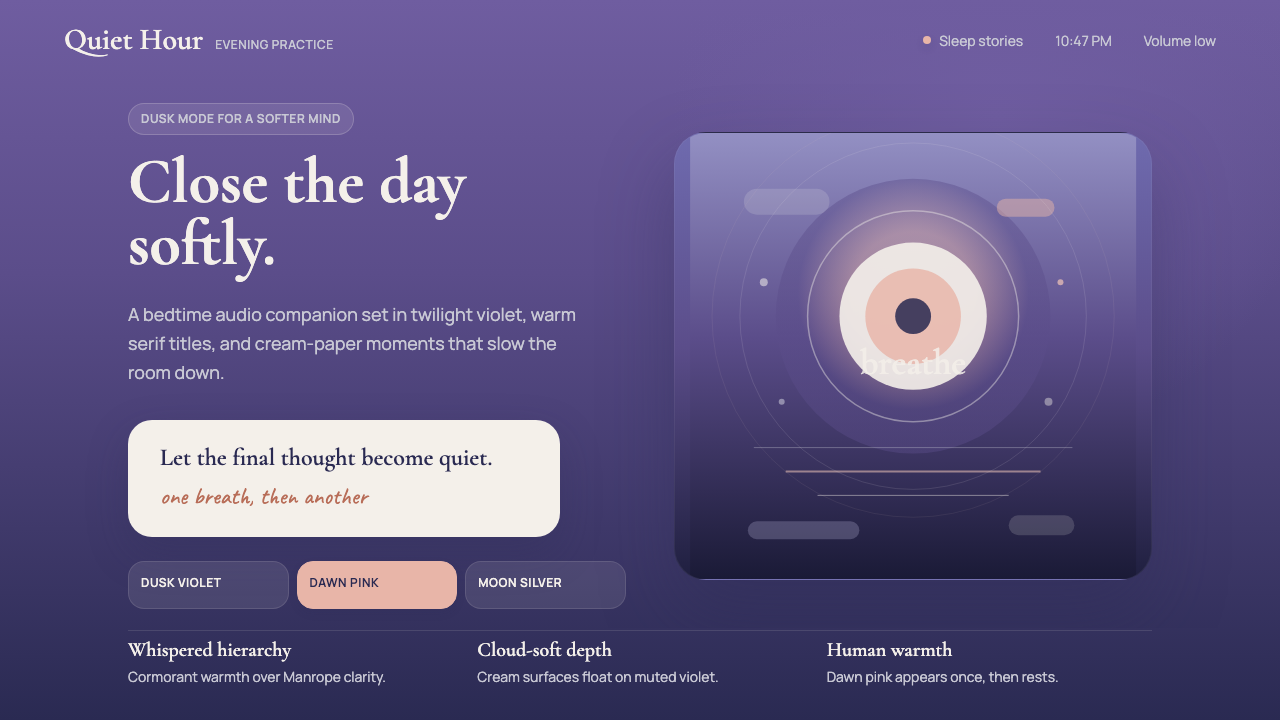 Calm App Purple MeditationWhispers at bedtime. Dusk-purple gradients, cream serif type, and dawn-pink w…睡前低语。暮紫渐变、奶油衬线与黎明粉暖意。
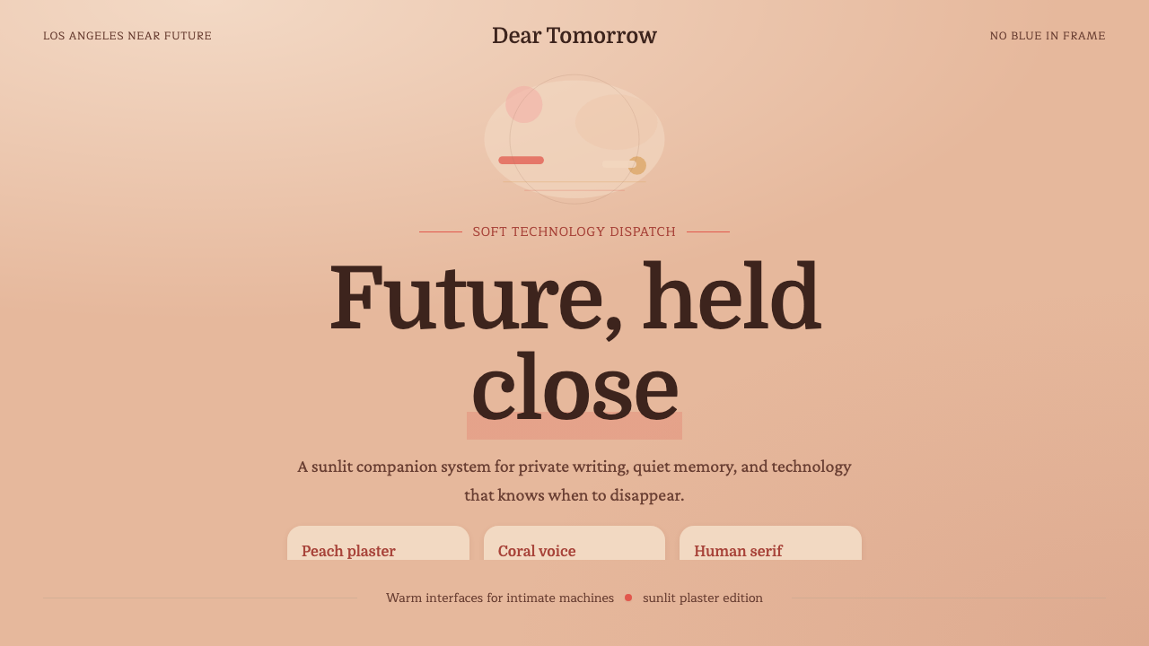 Her — Soft FutureTender future, no chill. Peach plaster, coral serif type, and soft stacked sp…温柔近未来,无冷感。桃色灰泥、珊瑚衬线与松弛纵向排布。
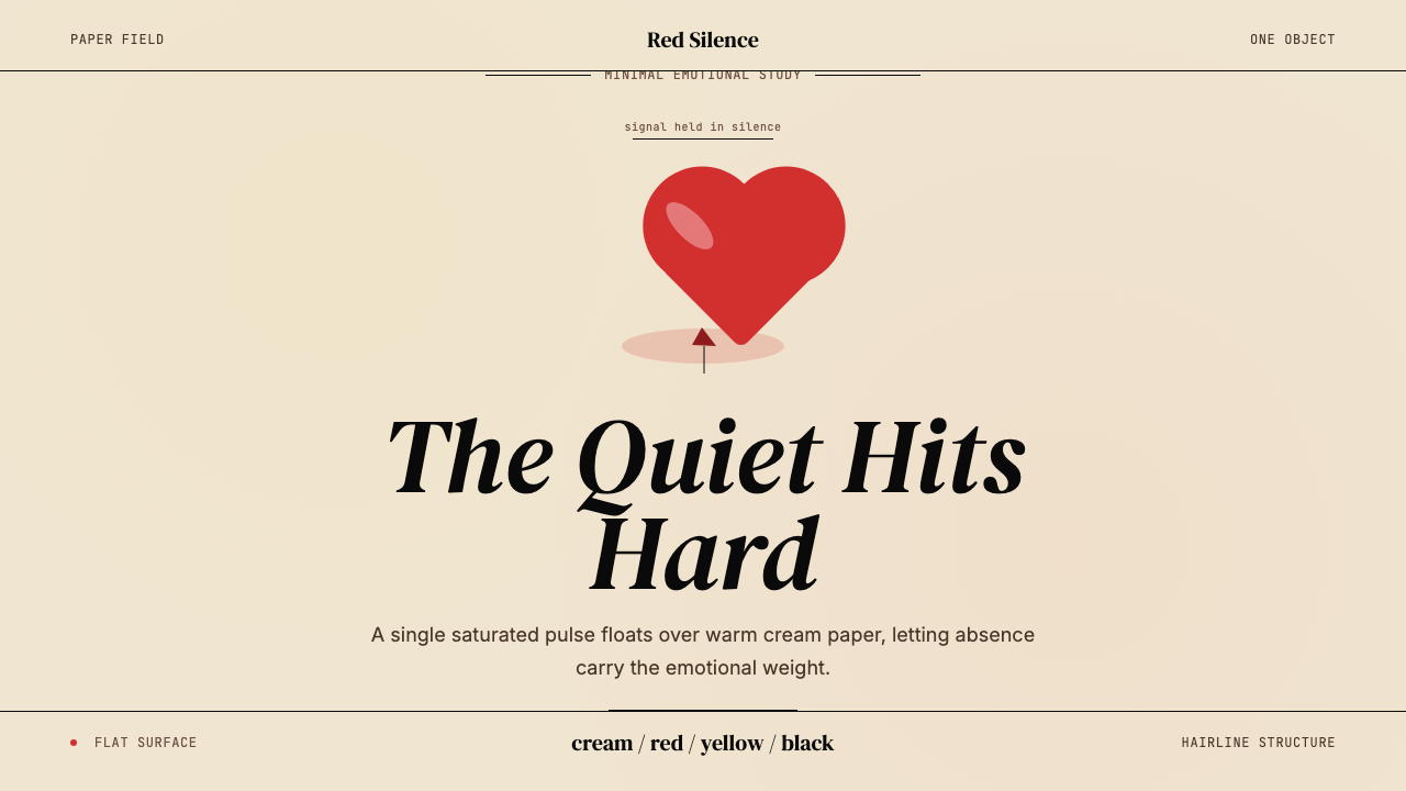 Kanye — 808s & HeartbreakGrief in restraint. Cream paper, one red heart, yellow heat, and a black hair…克制承载悲伤:奶油纸、红心、热黄与黑色细线。
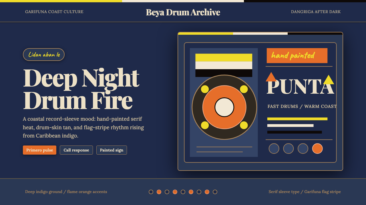 Belizean Garifuna PuntaNight rhythm burns. Indigo fields, flame-orange serif type, and flag stripes…深夜节奏燃起:靛蓝场、火焰橙衬线字与旗纹推进鼓点。
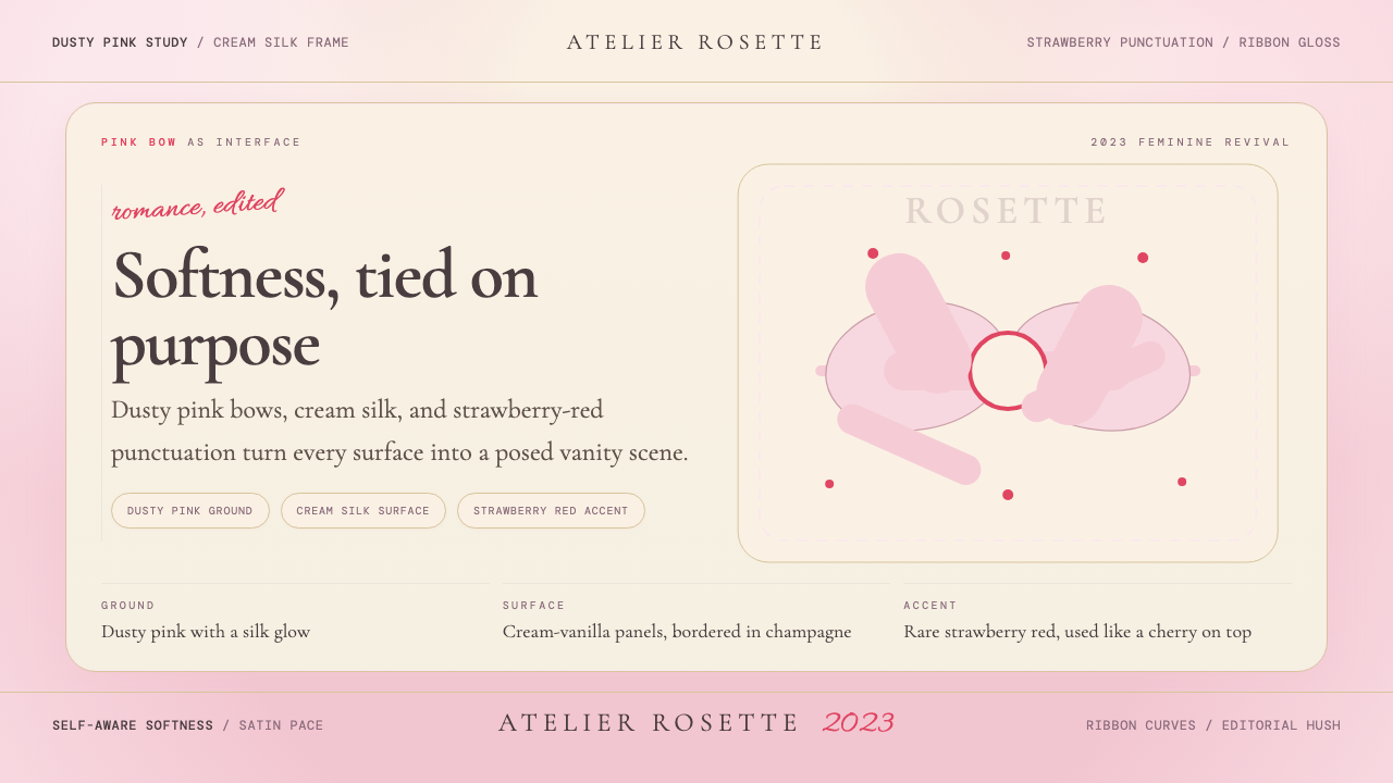 Coquette Aesthetic Pink Bow (2023)Softness is deliberate. Dusty pink, cream silk, and strawberry red frame ever…柔软是刻意的。尘粉、奶油丝绸与草莓红框住每个蝴蝶结。