What is Her — Soft Future?
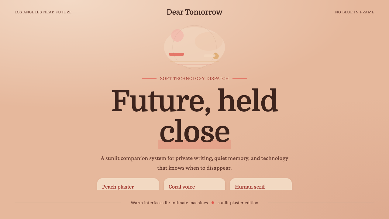
Her imagined a near future stripped of chrome and blue light — a world rendered instead in sun-warmed peach plaster and coral red, where technology finally felt tender.
Her — Soft Future in brief
Her — Soft Future is the visual language of Spike Jonze's 2013 film, a design palette built around a single, deceptively simple idea: remove blue from the frame entirely, and a vision of the future stops feeling cold. What remains is warm plaster, coral red, and a soft, diffuse light that never casts a hard edge.
The style belongs to a broader tendency sometimes called soft retro-futurism — imagined technology that looks approachable rather than sterile, domestic rather than industrial. Where most science-fiction design reaches for glass, steel, and blue-white glow to signal advancement, this palette reaches for the opposite: plaster walls, knitwear textures, and high-waisted tailoring borrowed from mid-century domestic life. The future, in this vision, is not a laboratory. It is a sunlit apartment.
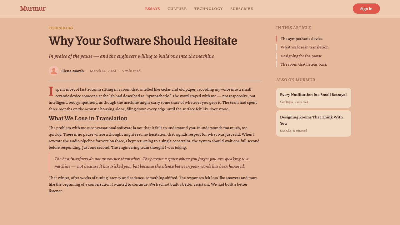
Visually, the system is anchored by a single wall color — a muted, salmon-leaning ochre plaster that reads as lived-in rather than styled. Coral red is the one saturated note allowed into the frame, used sparingly and always with emotional intent. Typography leans toward soft humanist serifs rather than geometric sans-serifs, and space is generous and vertically stacked rather than tightly packed. Nothing in the system is sharp; everything is diffused, muted, and unhurried.
Where does Her — Soft Future come from?
Her premiered in 2013, directed by Spike Jonze and set in a near-future Los Angeles left deliberately unspecified in year. The film follows a lonely writer who falls in love with an artificially intelligent operating system, and its visual world was built to make that premise feel plausible rather than dystopian — a future where intimacy with technology feels natural because the technology itself has stopped looking like technology.
Much of the film's distinctive atmosphere comes from a production design choice credited to Jonze and production designer K.K. Barrett: banning blue from the palette almost entirely. Blue is the default shorthand for screens, circuitry, and synthetic futures in nearly all science-fiction cinema; removing it forced every other choice — walls, wardrobe, light — toward warmer, more organic territory. Cinematographer Hoyte van Hoytema reinforced this with soft, diffused lighting that avoids the hard specular highlights typical of futuristic or tech-forward imagery.
Production also traveled to Shanghai to film exterior cityscapes, blended almost seamlessly with Los Angeles locations to suggest a future city that is dense, walkable, and pedestrianized in ways neither city currently is. This hybrid geography reinforced the film's central visual argument: the future is built from familiar, warm materials rearranged, not from invented, alien ones.
The costume design reinforced the same logic. High-waisted trousers, tucked shirts, and a near-total absence of collars and neckties recalled an earlier, more genteel silhouette rather than a futuristic uniform — a deliberate nod to mid-century tailoring reimagined for a gentler, screen-mediated future. Together, architecture, costume, and cinematography built a coherent world where advancement reads as comfort rather than spectacle.
What defines the Her — Soft Future look?
Color
The palette is built around a warm, muted salmon-ochre plaster as its dominant ground, with coral red reserved as the one saturated accent. Blue is deliberately absent — not merely underused but structurally excluded, which is what gives the system its signature warmth. Where a typical tech-future palette would introduce cool neutrals for contrast, this one stays entirely within the warm register, using tonal variation in peach and coral rather than temperature contrast to create depth.
Typography
Type leans humanist and softly serifed rather than geometric or technical. The letterforms carry rounded terminals and gentle stroke contrast, avoiding the rigid, engineered feel of typefaces typically associated with software or futuristic branding. This choice signals the film's central argument in miniature: intelligence and warmth are not opposites, and a typeface can feel considered and precise without feeling cold or mechanical.
Space and Composition
Layouts favor generous, vertically stacked space over dense horizontal arrangement. Elements are given room to breathe, echoing the film's unhurried pacing and its interiors — apartments and offices that feel spacious, softly lit, and uncluttered rather than saturated with information or ornament. This unhurried spatial logic is as central to the style as the color choices; density and blue undercut the mood equally.
Light
Light in this system is diffuse and directionless rather than specular or dramatic. Surfaces glow softly rather than reflect sharply, and shadows, where present, are soft-edged and gentle rather than crisp. This treatment of light does the same work as the color restriction: it strips away the visual markers — hard highlights, cool reflections — that usually signal a synthetic or technological environment.
Texture and Material
Plaster, knitwear, and soft tailored fabric stand in for the glass and brushed metal typical of futuristic design. These materials read as tactile and domestic, reinforcing the sense that the future depicted is one to be lived in rather than admired from a distance. Material choice here functions the way color does elsewhere in the system — a deliberate substitution that redirects the entire emotional register of the design.
Silhouette
The costume logic — high-waisted trousers, tucked shirts, an absence of collars and neckties — translates into a broader compositional preference for simple, unbroken silhouettes over fussy, layered detail. Applied beyond fashion, this becomes a preference for clean outlines and uncluttered forms rather than intricate ornament, a quieter cousin to minimalism that still carries warmth rather than austerity.
Who shaped Her — Soft Future?
Jonze wrote and directed Her, and the film's warm, blue-free visual identity originates from his direction alongside his production design team. His broader body of work — music videos and features that favor intimate, handmade textures over slick spectacle — set the tone for a science-fiction film that deliberately avoids the genre's usual cold, technical visual vocabulary in favor of something closer to domestic realism.
Barrett served as production designer on Her and is widely credited with the decision to exclude blue from the palette, a constraint that shaped nearly every set, prop, and wardrobe choice in the film. His production design career spans music videos and features built around distinctive, tactile worlds, and Her stands as one of the clearest examples of a single material constraint generating an entire coherent visual system.
Van Hoytema served as cinematographer on Her, crafting the film's soft, diffused lighting that avoids hard specular highlights and cool reflections. His broader career includes work on large-scale, visually ambitious features, but Her showcases a different register of his craft — restrained, warm, and intimate lighting in service of emotional interiority rather than scale or spectacle.
How do you use Her — Soft Future today?
This palette is highly specific in mood, which makes it powerful when the goal is warmth and approachability, and easy to misapply when treated as a generic pastel or retro theme. Applying it well means preserving the central constraint — no blue, warm ground, one coral accent — rather than simply softening a palette with pastel tones.
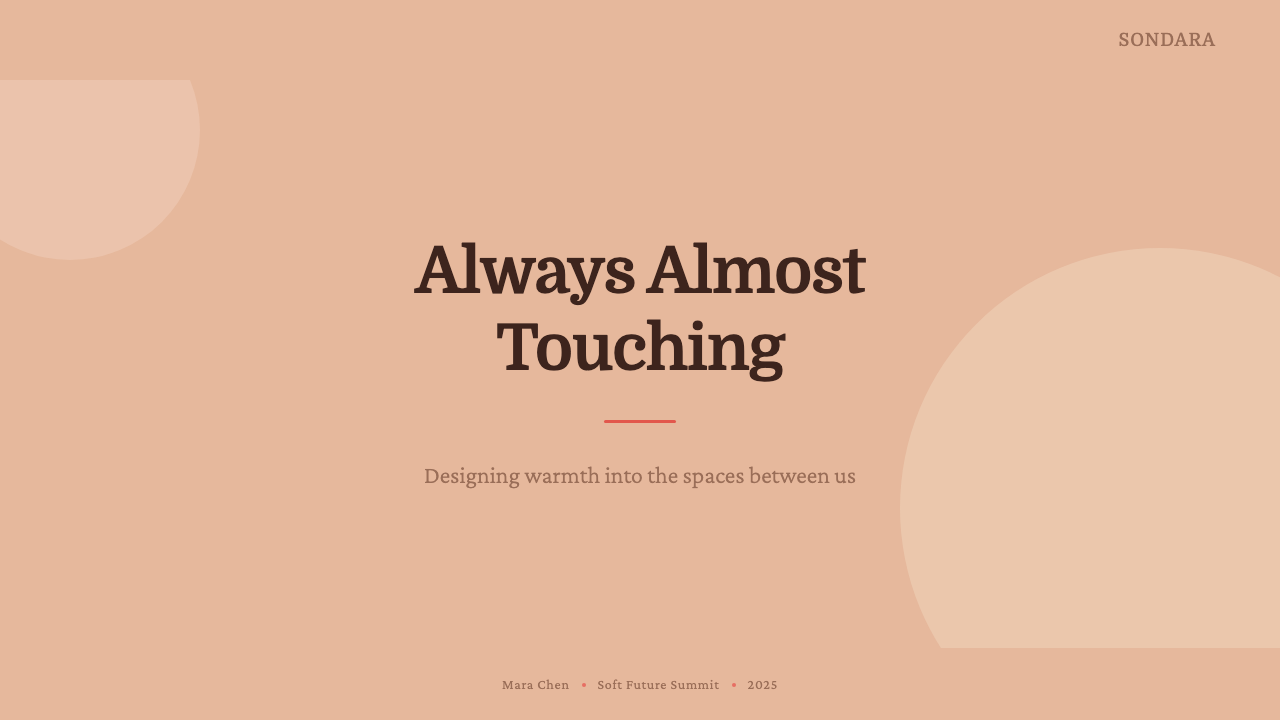
For presentation slides, the style suits cover pages built around a single warm plaster-toned field with a short, humanist-serif title and minimal ornament — the composition should feel like a still frame from an interior scene rather than a corporate title card. Content and data slides should keep the same restraint: generous vertical spacing between points, coral used only for the single most important figure or callout on a slide, and charts rendered as soft, muted forms rather than saturated infographic color-coding.
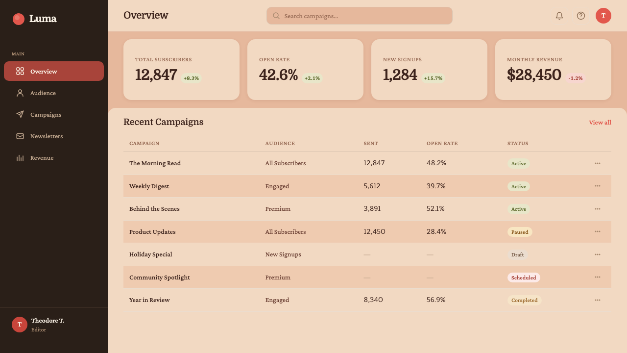
For web interfaces, the palette works well for dashboards and pricing pages aimed at a calm, human-centered product experience — wellness, personal productivity, or any tool that wants to feel considerate rather than commanding. Backgrounds should stay in the warm plaster register, cards and panels should avoid hard drop-shadows in favor of soft, barely-there elevation, and coral should be reserved for a single primary action per view rather than spread across multiple buttons and badges.
For editorial and marketing work, the style suits narrative, first-person content — personal essays, lifestyle features, product stories that lean emotional rather than technical. A hero image or header field in the plaster tone, paired with humanist serif headlines and generous line spacing, sets a tender, unhurried register well before a reader reaches the body copy.
The most common mistake is treating this as a generic peach-and-coral retro palette and reintroducing blue somewhere in the system — in a link color, an icon set, or a chart's second data series. Any reintroduction of blue immediately undercuts the effect the entire system depends on. A second common mistake is overusing coral: the style spends its saturated accent sparingly, using it once with intent rather than scattering it across every interactive element.
Her — Soft Future — FAQ
Is Her — Soft Future the same as general 1970s-inspired retro design?
They overlap but are not identical. General 1970s-inspired retro design often draws on a broader, more varied palette — mustard, avocado, burnt orange — and leans decorative. This style is narrower and more deliberate: it is defined by the specific exclusion of blue and the dominance of a single warm plaster ground, in service of a near-future rather than a nostalgic mood. The high-waisted, collarless silhouettes borrow from mid-century tailoring, but the overall effect reads forward-looking and tender rather than overtly retro or novelty-driven.
Why does removing blue make such a large difference to how futuristic design feels?
Blue is deeply embedded as visual shorthand for technology — screen glow, LED indicators, cool metal, holographic interfaces all default to blue in most design and film language. Removing it forces every other choice in the system away from that shorthand, toward warmer, more organic materials and light. The absence is noticeable precisely because the association is so strong; audiences read 'no blue' as 'not cold' almost instinctively, even without consciously registering the substitution.
Does this style require literal peach and coral, or can it be adapted to other warm hues?
The specific hues matter less than the underlying logic: one muted warm ground, one saturated warm accent, and a hard exclusion of cool tones — especially blue. The exact plaster tone can shift toward a slightly different warm neutral depending on context, and the accent could shift toward a different warm saturated color, as long as the system commits to a single accent used sparingly rather than a competing palette of several bright hues.
What kinds of products or brands does this style suit best?
It suits products that want to feel considerate, personal, and human rather than powerful or cutting-edge — wellness apps, personal journaling or writing tools, relationship or communication products, and lifestyle or editorial brands built around intimacy rather than performance. It is a poor fit for products that need to project speed, technical authority, or high-stakes precision, such as financial trading tools or developer infrastructure, where the softness would read as a mismatch with the product's actual promise.
Related design styles
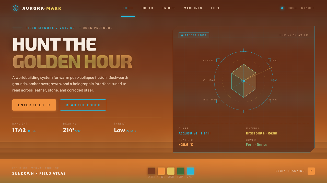 Horizon Zero DawnGolden-hour post-apocalypse. Dusk-earth grounds, amber overgrowth, glowing ho…
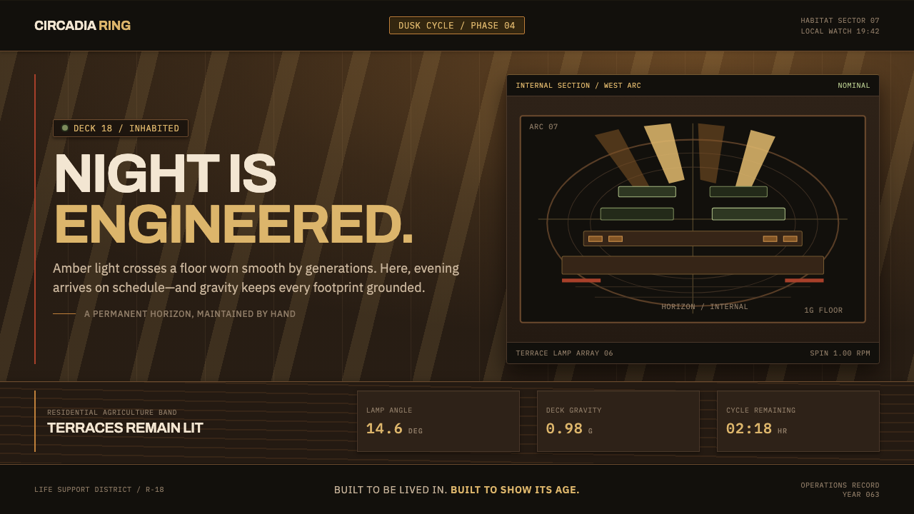 Generation Ship InteriorNight is engineered. Amber louvres rake across timber decks and stacked habit…
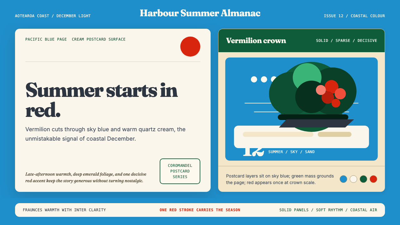 NZ Pōhutukawa SummerSummer arrives in one red stroke. Pacific blue and Fraunces type frame cream…
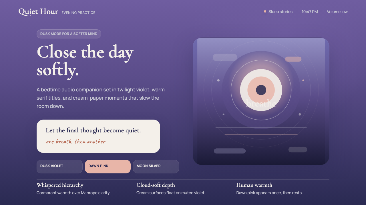 Calm App Purple MeditationWhispers at bedtime. Dusk-purple gradients, cream serif type, and dawn-pink w…
 Chefchaouen Blue MedinaCalm becomes architecture. Chalky cyan, Reem Kufi type, and offset steps hold…
 Frank Ocean — BlondeQuiet carries weight. Salmon pink and emerald tile sit on warm cream with air…