What is NZ Pōhutukawa Summer?
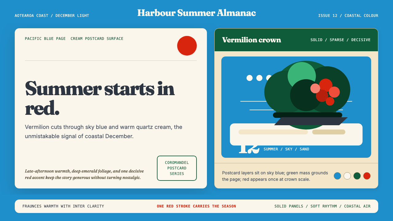
New Zealand's Christmas tree erupts in vermilion blooms each December, and this design style bottles that singular coastal moment — bold red against Pacific blue, anchored in the warm cream of a postcard summer.
NZ Pōhutukawa Summer in brief
NZ Pōhutukawa Summer is a design style rooted in the natural drama of Aotearoa New Zealand's coastline. It centers on the pōhutukawa tree — a native species whose brush-like crimson flowers crown basalt cliffs and white-sand beaches each December, earning it the popular name 'Christmas tree'. The style translates this natural spectacle into a composed visual language: saturated vermilion as the decisive accent, deep sclerophyll green as the anchoring canopy, Pacific blue as the expansive ground, and cream as a warm, postcard-like surface for content.
The aesthetic is neither minimalist nor maximalist. It has the confident simplicity of a landscape reduced to its most essential elements — the single red stroke of a flowering branch against an open sky — yet it carries genuine warmth and place-specificity that set it apart from generic primary-color systems. Every color choice is accountable to its natural counterpart: the red is not abstract but botanical, the blue is not corporate but oceanic, the green is not neutral but coastal and chlorophyll-rich.
Visually, the style is immediately legible. Compositions tend to use the vermilion sparingly but decisively, the way a pohutukawa in full bloom commands attention without filling every inch of the view. The cream ground softens what could otherwise be a harsh tropical contrast, lending the overall impression a quality of warm afternoon light rather than high-noon glare.
Where does NZ Pōhutukawa Summer come from?
The pōhutukawa (Metrosideros excelsa) has been part of the Māori worldview for centuries. In te ao Māori — the Māori world — the tree holds deep spiritual significance: it grows at Te Reinga, the northernmost tip of the North Island, where the spirits of the dead descend into the underworld via its roots. This layering of botanical fact and ancestral meaning gave the tree a presence in New Zealand culture long before European settlement arrived in the 1840s.
Settler imagery from the mid-nineteenth century onward began translating the pohutukawa into visual shorthand for a distinctly New Zealand summer. By the late nineteenth and early twentieth century, the tree appeared regularly in illustrated magazines, postcard photography, and decorative arts as an emblem of the colonial holiday season — a southern-hemisphere inversion of European Christmas imagery, the crimson flowers serving the role that holly and snow played elsewhere. This postcard tradition is a direct ancestor of the style's warm cream surfaces and its sense of a composed, idealized coastal scene.
The most significant artistic engagement with the pōhutukawa in the modern era came through Don Binney (1940–2012), a New Zealand painter whose monumental canvases depicted native birds within flowering pōhutukawa crowns, set against the hard Pacific light of the Coromandel Peninsula and Northland. Binney's work — stylized, flat, and posterlike — treated the tree not as a naturalistic backdrop but as a formal structure: a canopy of deep greens holding a sky of saturated blue, with the red of the flowers functioning as the compositional pivot. His influence on this style's graphic sensibility is direct and acknowledged.
The conservation movement Project Crimson, launched in 1990, positioned the pōhutukawa as a flagship species for native ecological restoration. The project's name — 'crimson' referring to the tree's flowers — helped consolidate the color association in national consciousness. By the 1990s and 2000s, the tree's crimson-blue-green palette had become part of what cultural historians call 'Kiwiana': a repertoire of distinctly New Zealand visual and material symbols that include the silver fern, the kiwi bird, and the red pohutukawa in bloom. Photographer Robin Morrison's coastal documentary work and environmental writer Geoff Park's engagement with pōhutukawa ecology further deepened the tree's cultural resonance during this period.
What defines the NZ Pōhutukawa Summer look?
Color
The palette is built around a saturated botanical red — the precise hue of the pōhutukawa's brush-like stamens at peak bloom — deployed against a Pacific blue ground and a deep sclerophyll green. Cream serves as the warm neutral surface for body content, pulling the otherwise strong contrast into coastal warmth rather than tropical intensity. The red is used sparingly: one decisive mark, not a field. The blue is expansive and confident, the green rich without becoming forest-dark. No brown, no grey, no desaturated intermediaries enter the system.
Composition
Compositions tend toward the postcard horizontal — a wide, settled framing that echoes the coastal panorama. The red element, however small, anchors the eye the way a flowering tree anchors a cliff face: it does not need to fill space to dominate. Negative space — open sky, open water — is a first-class design element, not an afterthought. Layouts resist crowding; breathing room is part of the message.
Surface and Warmth
The cream ground distinguishes this style from cold primary-color systems. It introduces an analogue warmth — the warmth of a postcard, of photographic paper, of sand in afternoon light — that modulates the otherwise bold palette. Text on cream reads with less visual tension than text on pure white, giving the style an ease that suits editorial and lifestyle contexts as naturally as it suits information design.
Botanical Flatness
Inspired by Binney's posterlike canvases, imagery in this style is flattened and abstracted rather than photorealistic. Shapes are simplified: a tree crown becomes a mass of deep green, a shoreline becomes a clean horizon line. This flatness is not a deficit — it is an editorial choice that amplifies the graphic impact of color. Shadows, where used, are hard and minimal. Gradients are absent; the light in this system is even, coastal, and clear.
Typography Register
The style favors display typefaces with a serif sensibility that leans toward the editorial and classical — the kind of letterform associated with postcard lettering, travel posters, and illustrated magazines of the early twentieth century. This is not decorative in an ornate sense but rather grounded and legible. Headlines carry authority; body text sits quietly on cream. The overall typographic register is warm, confident, and slightly vintage without being costumed.
Spatial Generosity
The Coromandel coastline this style references is defined by open horizon, unbroken sky, and long views. This spatial generosity translates into liberal use of whitespace and margin. Columns are not crammed; sections breathe. The style resists the information-density instinct that characterizes many data-forward digital styles, and instead treats openness as a signal of quality and unhurried attention.
Seasonal and Place Specificity
Unlike generic tropical or coastal palettes, this style is pinned to a specific moment in a specific place: the New Zealand summer, which begins when the Northern Hemisphere is in winter. The December bloom inverts the usual association of red with Christmas cold; here red means sun and warmth. This specificity is an asset — the style communicates an origin story that is culturally legible and geographically distinct, giving it authenticity that cannot be generically assembled.
Who shaped NZ Pōhutukawa Summer?
Don Binney (1940–2012) is the artist most directly responsible for translating the pōhutukawa into a graphic language. His large-scale canvases placed native birds — kererū, tūī, kōtare — within stylized crowns of flowering pōhutukawa, set against skies of intense Pacific blue. Binney's style was flat, simplified, and posterlike: he reduced coastal landscapes to bold planes of color and hard contours, treating the tree crown and sky as complementary formal masses rather than naturalistic depictions. His influence on New Zealand graphic design extended well beyond fine art, and his compositional logic — a mass of deep green holding a saturated blue sky, punctuated by the hard red of flowers — maps directly onto this style's visual grammar.
Robin Morrison (1944–1993) was New Zealand's defining documentary photographer, best known for a series of coastal and rural portraits that captured the textures of Kiwi life in the 1970s and 1980s. His images — warm, slightly faded, deeply humanist — established a visual register for New Zealand summer that balances the boldness of the natural landscape with the quieter, sun-bleached tones of lived coastal experience. Morrison's work contributed the style's warmth and its association with an unhurried, generous sense of time.
Geoff Park (1941–2009) was a New Zealand ecologist and writer whose work on native landscapes — particularly his book Ngā Uruora: The Groves of Life — brought the pōhutukawa's ecological and cultural significance to broader public awareness. Park's writing framed the tree not merely as scenery but as a living index of coastal health, historical continuity, and Māori-Pākehā relationship with land. His influence on the style is less visual than conceptual: he helped establish the pōhutukawa as a symbol weighted with meaning beyond its appearance.
Project Crimson, founded in 1990, is a conservation initiative dedicated to restoring pōhutukawa and northern rātā populations across New Zealand's coastlines. By adopting the tree's flower color as its name and identity, the project solidified the association between crimson red and native coastal ecology in national consciousness. Its communications — signage, educational materials, campaign imagery — contributed to cementing the pōhutukawa palette as a recognized national visual vocabulary, bridging conservation, tourism, and cultural identity.
Stephen King, in the context of New Zealand design, refers to a practitioner associated with the consolidation of Kiwiana visual culture into contemporary design application. The Kiwiana movement drew on postcards, tourist posters, and natural imagery — including the pōhutukawa — to forge a distinctly local design identity that stood apart from both British heritage aesthetics and American commercial modernism. This movement represents the style's immediate design-history context, making Kiwiana not a nostalgic footnote but a living visual grammar.
How do you use NZ Pōhutukawa Summer today?
NZ Pōhutukawa Summer is a style that works best when the brief calls for warmth, place-specificity, and confident but unhurried energy. It is not a cold or corporate aesthetic — it is coastal, seasonal, and humanly scaled. Understanding this emotional register is the first requirement for applying it well.
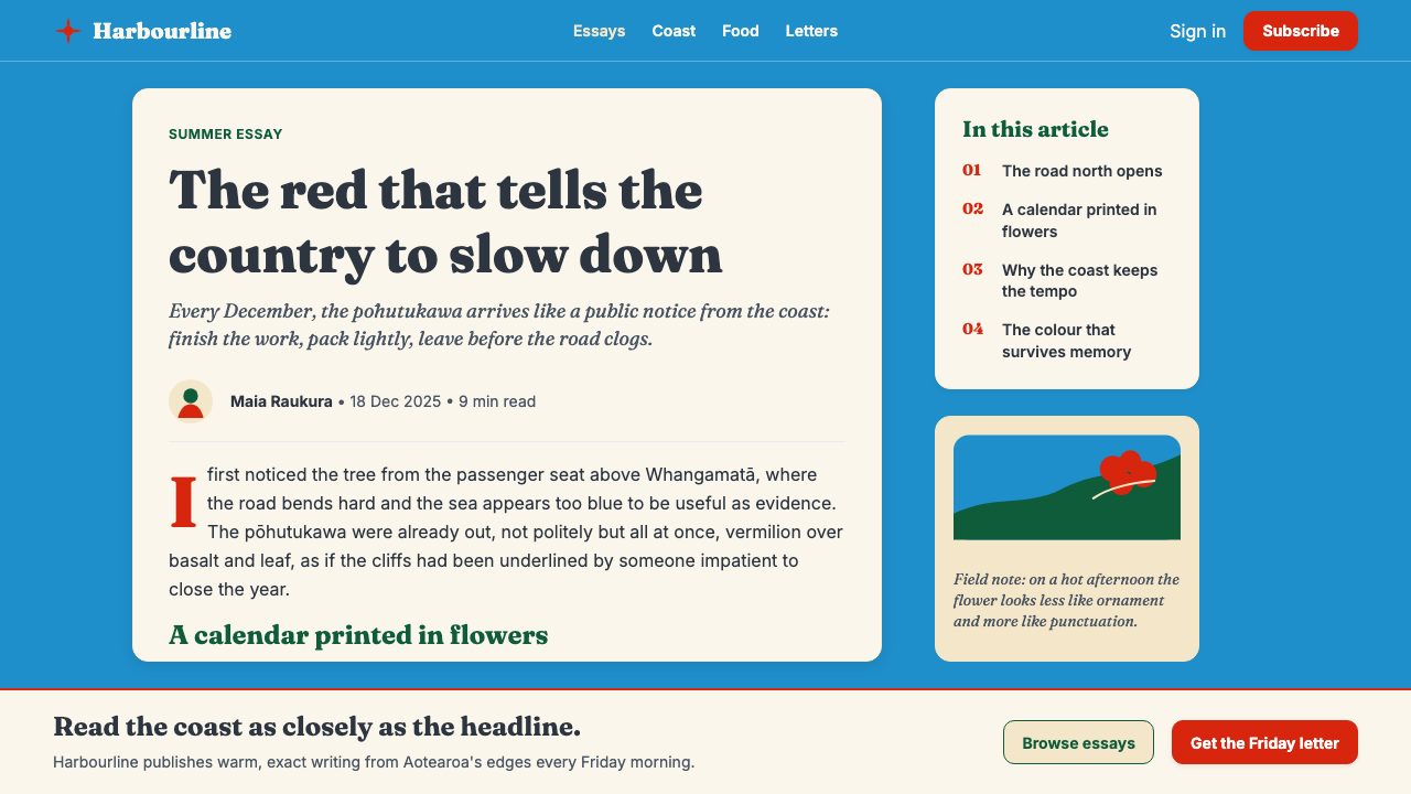
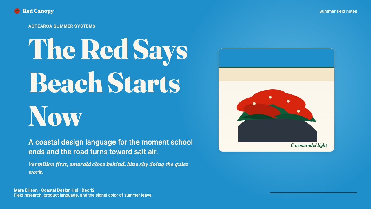
For presentation slides, the style is particularly effective on cover pages and section openers. A cover benefits from the wide horizontal composition: a generous expanse of blue or cream ground, the red used as a single, carefully placed accent — a title line in vermilion, a geometric shape, a cropped botanical element — and a headline in a seriffed display face that echoes the warmth of vintage travel typography. Content slides should lean on cream backgrounds, black body text, and one accent element per slide to maintain the palette's intentional restraint. Data slides work well when chart elements are colored with the core palette — the red reserved for the most critical data point, blue and green for context — treating data visualization as a form of landscape rather than a technical diagram.
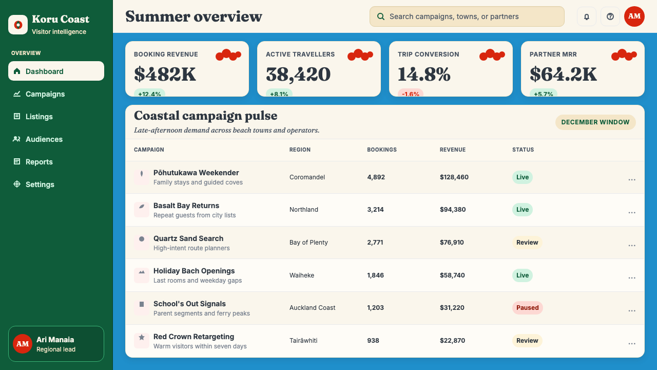
For web interfaces, the style is best suited to lifestyle brands, travel and hospitality pages, cultural organizations, and editorial platforms. Dashboards are possible but require discipline: the system's generous spacing instinct can conflict with information-dense interfaces, so the sweet spot is in landing pages, about sections, and feature presentations where breathing room enhances rather than competes with message. Navigation and headers work well in cream or deep green, with vermilion reserved for active states or primary calls to action. Card components should avoid hard-bordered frames — shadow or gentle tonal separation is more in keeping with the style's warmth.
For editorial and marketing use, the style's postcard heritage gives it a natural fit with travel writing, sustainability communication, cultural journalism, and any context where authenticity and place matter. A Pōhutukawa-style editorial layout uses wide margins, a warm cream column ground, pull quotes in vermilion, and section headings in display type with a confident serif stance. Marketing pages can use the full-bleed blue or deep green for hero sections, with cream content sections alternating below — the red appearing only in calls to action or as a deliberate visual punctuation mark.
A common mistake is saturating the design with too much red. In the natural reference, the pōhutukawa's flowers are vivid but they occupy a fraction of the total scene — the tree's canopy, the sky, and the open beach each hold more visual territory than the blooms themselves. The same proportion should hold in design: red as a decisive accent, not a dominant field. A second mistake is using cold or grey-neutral whites instead of cream, which strips the warmth that distinguishes this system from generic tropical or primary-color palettes. The cream ground is not optional — it is the style's thermal signature.
NZ Pōhutukawa Summer — FAQ
Is this style appropriate for non-New Zealand brands?
Yes, with intentionality. The style's cultural specificity is actually an asset for any brand that wants to communicate authenticity, place-consciousness, and a rejection of generic global aesthetics. A brand does not need to be New Zealand in origin to use it, but it should have a genuine reason to invoke coastal warmth, natural boldness, and a southern-hemisphere seasonal sensibility — or should use the style in a way that explicitly acknowledges and celebrates its origins. What it should not do is strip the style down to 'red, blue, and cream' without the postcard warmth and compositional restraint that give it identity.
How does this style differ from other Pacific or tropical design aesthetics?
Most Pacific and tropical design palettes lean into lush saturation, organic pattern, and energetic warmth — they celebrate abundance. The Pōhutukawa style is more restrained and more specifically ecological: it is built around one tree, one moment, and one geographical coastline. Its color moves are deliberate rather than exuberant. The cream ground and generous negative space give it a quality of editorial calm rather than tropical vitality. It shares the Pacific's openness but channels it toward contemplation rather than celebration.
Can the style work in dark-mode or dark-background layouts?
A dark inversion is possible but requires careful handling of the color relationships. On a deep navy or black ground, the vermilion retains its impact but the cream loses its warmth — it tends toward harsh white, which strips the style's postcard quality. The most successful dark variant uses the deep sclerophyll green as the background, with cream type and vermilion accents — this preserves the sense of looking out through a tree canopy at a bright sky. The Pacific blue becomes an accent rather than the ground. Avoid dark grey backgrounds, which dilute the palette's natural vibrancy without offering the lush depth of the green alternative.
How should the style handle photography and real imagery?
Photography integrates best when it is treated as a flat, graphic element rather than a naturalistic window. High-contrast coastal photography — hard Pacific light, clear silhouettes — is compatible with the style's flatness. Heavily styled lifestyle photography with rich shadows and complex mid-tones tends to fight the palette rather than harmonize with it. When using photography, crop aggressively to foreground the graphic qualities: sky, water, and the tree's silhouette rather than complex interior detail. Tonal treatment should warm toward cream and coral rather than cool toward blue-grey. The Don Binney approach — reduce a landscape to its most essential color planes — is the right orientation.
What kinds of products or brands are a poor fit for this style?
The style struggles wherever authority, neutrality, or high information density are the primary requirements. Financial services, medical or pharmaceutical applications, and enterprise software typically need the cool, grey-neutral assurance of Swiss-derived systems rather than the coastal warmth here. The style also resists the very dark or very dramatic — it is not suited to nightlife brands, gaming aesthetics, or any context where urgency and edge are valued over calm and warmth. Finally, brands that need genuine cultural invisibility — that want to signal universal modernity rather than specific place — will find this style too rooted to serve them.
Related design styles
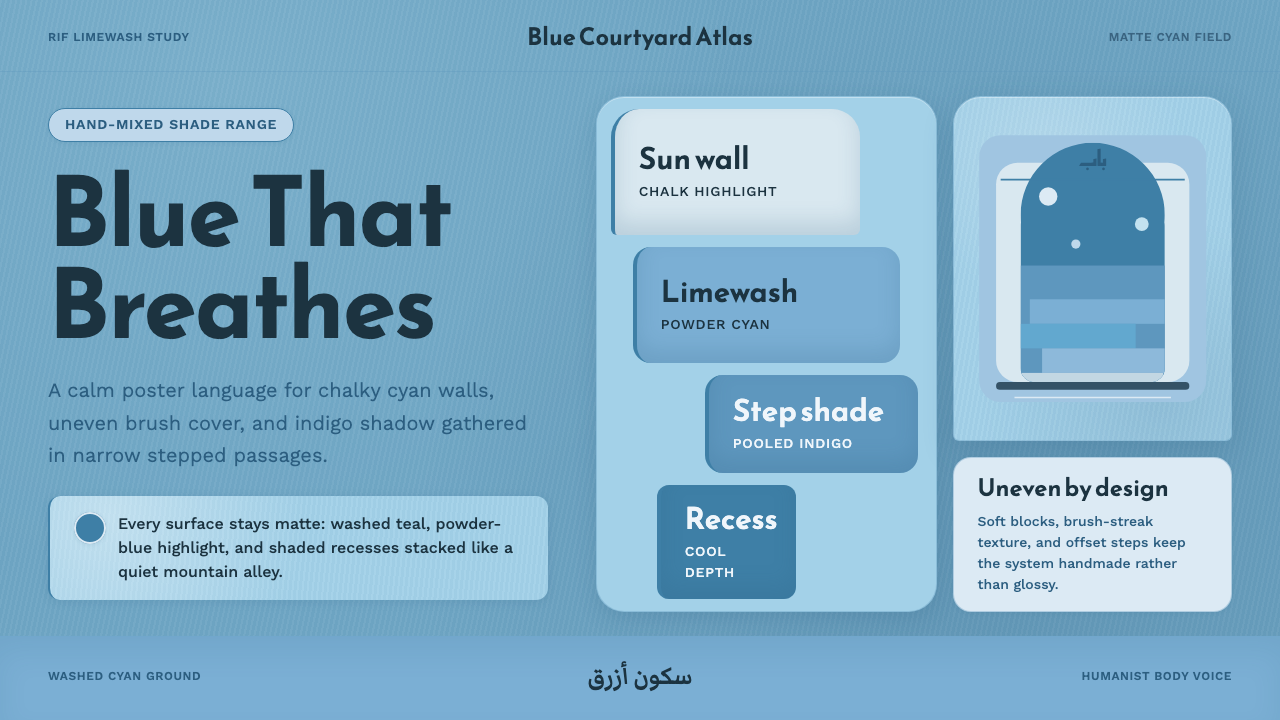 Chefchaouen Blue MedinaCalm becomes architecture. Chalky cyan, Reem Kufi type, and offset steps hold…
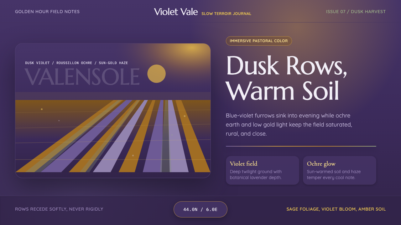 Provence LavenderSaturated pastoral dusk. Violet rows, ochre soil, and sun-gold haze build the…
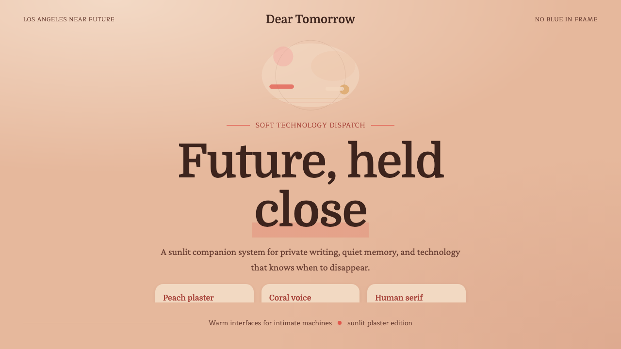 Her — Soft FutureTender future, no chill. Peach plaster, coral serif type, and soft stacked sp…
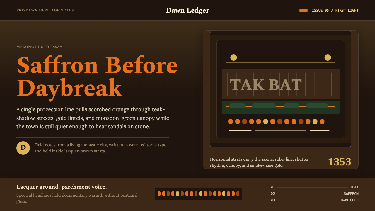 Luang Prabang Saffron AlmsDawn has weight. Saffron bands cut through teak brown and smoke-gold editoria…
 Akubra Outback (1970s Stockman)Worn honesty. Leather brown, Pilbara orange, and cream catalogue frames carry…
 Audubon Birds of AmericaAged natural history breathes. Buff rag paper, sepia rules, and italic binomi…