Design style guide设计风格指南
What is Akubra Outback (1970s Stockman)?什么是 Akubra Outback (1970s Stockman)?
The Akubra Outback design system is a love letter to the 1970s Australian cattle country — rabbit-fur felt, stained leather, and the honest grit of a mail-order catalogue page.Akubra Outback设计系统是一封写给1970年代澳大利亚牧区的情书——兔毛毡帽、皮革染色,以及邮购目录页所承载的那份诚实粗粝。
Akubra Outback (1970s Stockman) in briefAkubra Outback (1970s Stockman) 速览
The Akubra Outback design system distils the visual language of Australia's pastoral golden age — the 1970s and early 1980s — when working-stockman culture became the country's most powerful brand of self-identity. It is rooted in three interlocking sources: the handmade Akubra felt hat that had been manufactured in Kempsey since 1874; the RM Williams mail-order catalogue that dressed drovers, jackaroos, and city romantics alike; and the vast heat-scorched landscapes of the Pilbara, Kimberley, and Channel Country that formed the backdrop of drover photography across that era.Akubra Outback设计系统提炼了澳大利亚牧区黄金时代——1970年代至1980年代初——的视觉语言。那个年代,牧民文化成为这个国家最有力的自我认同品牌。它的根植于三个相互交织的源头:自1874年起在新南威尔士州肯普西手工制作的Akubra毡帽;为牧人、牧场学徒和城市浪漫主义者共同服务的RM Williams邮购目录;以及皮尔巴拉、金伯利和沟渠地区那片炙热荒蛮的大地景观——它们构成了那个时代牧人摄影作品的永恒背景。
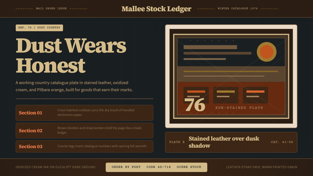
Visually, the system is built around a palette of deep stained-leather brown, Pilbara dust-orange, cream, and the cool blue-black of eucalypt shadow at dusk. Every surface reads as though it has been touched by sun, sweat, and decades of honest use. Components carry leather-strap borders, photography sits in cream-edged frames with printed-grain warmth, and typography pairs sturdy slab serif with clean, legible sans-serif — the combination of a stock-station ledger and a country newspaper. The overall register is warm, worn, and unashamedly authentic.从视觉上看,这套系统围绕深色皮革棕、皮尔巴拉尘橙、奶油色以及黄昏桉树投影的蓝黑色调构建。每一个表面都像被阳光、汗水和数十年诚实劳作所触摸过。组件带有皮带扣式边框,摄影作品嵌在奶油色边框中散发着印刷颗粒的温暖,排版将厚重的衬线体与干净可读的无衬线体配对——那是牧场账册与乡村报纸的组合。整体基调温暖、历经风霜、毫不矫饰地真实。
This is a heritage system in the truest sense: it does not romanticise a fictional past but traces a specific documented aesthetic — one that circulated through catalogues, station noticeboards, country fair programs, and livestock auction posters across a decade. It draws its authority from the real objects of that world: pressed rabbit-fur felt, hand-stitched kangaroo leather, and the yellowed newsprint of a 1976 catalogue page.这是最纯粹意义上的传承系统:它并非在美化一个虚构的过去,而是追溯一种有据可查的特定美学——一种在整整十年间流通于目录册、牧场公告栏、乡间集市节目单和牲畜拍卖海报上的视觉语言。它的权威来自那个世界的真实物件:压制的兔毛毡、手工缝制的袋鼠皮革,以及1976年目录页那泛黄的新闻纸。
See the Akubra Outback (1970s Stockman) design system →查看 Akubra Outback (1970s Stockman) 完整设计系统 →
Where does Akubra Outback (1970s Stockman) come from?Akubra Outback (1970s Stockman) 从何而来?
The hat itself is the oldest thread in this story. The Akubra brand traces to 1874, when a Hobart tanner named Benjamin Dunkerley began producing rabbit-fur felt hats for working men in rural Tasmania. The rabbit — an introduced pest that had colonised the Australian continent at catastrophic scale — provided an unexpected raw material of remarkable quality: soft, tightly matted, and highly resistant to rain, dust, and radiant heat. In 1912, Dunkerley relocated production to Kempsey on the New South Wales mid-north coast, and the factory remains there today. The word 'Akubra' is derived from an Aboriginal term for 'head covering', though the precise linguistic attribution has been debated by scholars.这顶帽子本身就是这段历史中最古老的线索。Akubra品牌可追溯至1874年,当时霍巴特的一位皮革匠本杰明·邓克利开始为塔斯马尼亚乡村劳动者生产兔毛毡帽。兔子——一种在澳大利亚大陆造成灾难性扩张的外来入侵物种——意外地提供了品质卓越的原材料:柔软、紧密毡合,对雨水、尘土和辐射热的抵抗力极强。1912年,邓克利将生产迁至新南威尔士州中北部海岸的肯普西,工厂至今仍在那里运营。「Akubra」一词源自原住民语言中「头部覆盖物」的说法,尽管确切的语言归属至今仍有学术争议。
Throughout the first half of the twentieth century, the Akubra was workwear, not icon — as unremarkable and functional as a pair of moleskin trousers or a stockwhip. The visual transformation happened in the 1960s and reached its height in the 1970s, driven by two forces working in tandem. The first was the rise of outback photography as a genre: photographers commissioned by pastoral companies, government tourism bodies, and newspapers began producing large-format images of drovers and jackaroos at work — mending fences, mustering cattle from horseback, watering livestock at remote bores. These images circulated widely in calendars, newspaper supplements, and exhibition prints. The Akubra, worn low over the eyes against the sun, became the central symbol: not just a hat but a stance toward the land.在二十世纪上半叶,Akubra是劳动用品,而非图腾——和一条鼹鼠皮裤或一根牧牛鞭同样平凡而实用。视觉上的转变发生在1960年代,并在1970年代达到顶峰,由两股力量协力推动。第一股力量是内陆摄影作为一个独立题材的兴起:受牧业公司、政府旅游机构和报纸委托的摄影师开始拍摄大画幅的牧人和牧场学徒劳作画面——修缮围栏、骑马驱赶牛群、在偏远水井边为牲畜饮水。这些图像通过挂历、报纸增刊和展览版画广泛流通。那顶低压在眼睛上方遮挡阳光的Akubra帽成了核心象征:不仅仅是一顶帽子,更是一种面对土地的姿态。
The second force was commercial. Stephen Keir III, who took over the company in the mid-twentieth century, invested in the Akubra's identity at a moment when pastoral Australia was being positioned as a romantic and authentically national image. The brand aligned naturally with RM Williams — the saddler and bush outfitter founded by Reginald Murray Williams in Adelaide in 1932 — whose mail-order catalogues became definitive documents of outback aesthetic during the 1970s. The RM Williams catalogue was a visual system in its own right: warm-tinted photographic portraits, slab-serif headings, cream newsprint backgrounds, and leather-textured product borders. Clothing and equipment were photographed on real working stockmen, not models, anchoring the catalogue's authority in documented authenticity rather than aspiration.第二股力量来自商业层面。在二十世纪中叶接手公司的斯蒂芬·基尔三世,在牧区澳大利亚被塑造为浪漫而真实的民族形象的关键时刻,大力投资于Akubra的品牌身份建设。这一品牌与RM Williams自然契合——那是雷金纳德·默里·威廉斯于1932年在阿德莱德创立的马具商与丛林装备商——其邮购目录在1970年代成为内陆美学的权威文献。RM Williams目录本身就是一套完整的视觉系统:暖色调摄影肖像、粗衬线标题字体、奶油色新闻纸背景和皮革质感的产品边框。服装和装备由真正的在职牧民而非模特来展示,使目录的权威建立在有记录的真实性而非向往之上。
Country music provided a third cultural amplifier. Slim Dusty, who had recorded 'A Pub with No Beer' in 1957 and became Australia's most beloved bush balladeer, was photographed wearing the Akubra throughout his career. His image — wide-brimmed hat tilted against the light, sun-weathered face, easy authority — became inseparable from the hat itself. Dusty's commercial success through the 1970s turned the Akubra from regional workwear into a national emblem recognised across the continent. The visual system this design style draws on is precisely that convergence: catalogue typography, drover photography, country music imagery, and the physical texture of the hat and the land it was made for.乡村音乐提供了第三个文化放大器。斯利姆·达斯蒂在1957年录制了《没有啤酒的酒馆》,成为澳大利亚最受爱戴的丛林民谣歌手,在整个演艺生涯中都被拍摄到戴着Akubra帽的形象。他的形象——宽檐帽倾斜着抵挡阳光、饱经风霜的面容、从容的气场——已与那顶帽子本身浑然一体、难以分割。达斯蒂在整个1970年代的商业成功,将Akubra从地区性劳动用品转变为举国皆知的民族标志。这套设计风格所汲取的视觉系统,正是那种汇流:目录版式排印、牧人摄影、乡村音乐图像,以及帽子本身和它为之而生的土地所具有的物质质感。
What defines the Akubra Outback (1970s Stockman) look?Akubra Outback (1970s Stockman) 的视觉特征是什么?
Palette色彩
The color world is built around stained leather brown — a deep, warm, slightly reddened brown that reads as the surface of a well-used saddle — and Pilbara dust-orange, the scorched orange of iron-rich earth under afternoon sun. Against these two anchor tones, cream provides relief: the color of unbleached paper, of a catalogue page printed on newsprint, of the inside of a hat band. Blue-black appears in shadows, in the cool dark of eucalypt canopy at dusk, and as a structural contrast to the warm tones. No color in this system is fresh or artificially vivid; every hue has been aged, warmed, or dried by imaginary exposure to sun and use.整套色彩世界围绕皮革棕——一种深沉温暖、略带红调的棕色,如同一副久经使用的马鞍表面——以及皮尔巴拉尘橙,即午后阳光下富铁土地的灼烤橙色。在这两种锚定色之外,奶油色提供了缓冲:那是未漂白纸张的颜色,是印在新闻纸上的目录页,是帽带内侧的颜色。蓝黑色出现在阴影中,在黄昏时分桉树树冠的幽暗深处,以及作为暖色调的结构性对比。这套系统中没有任何一种颜色是新鲜的或人为鲜亮的;每一个色调都经过了想象中的日晒和使用所带来的老化、加温或干燥。
Texture质感
Texture is the signature quality that separates this system from other heritage styles. Every surface is read as having been touched: felt has a pressed-grain quality, leather has stitching and grain marks, paper has the slight tooth of newsprint, photography carries a halftone grain that implies offset printing rather than digital reproduction. Even flat color fields suggest the imperfect, slightly fibrous surface of a dyed cloth rather than the smooth uniformity of a screen fill. This textural register is not decoration — it is the primary carrier of authenticity, the visual equivalent of a product that has been broken in by use.质感是将这套系统与其他传承风格区别开来的标志性品质。每一个表面都被理解为曾被触碰过:毡料有压制的纹理感,皮革有针脚和纹路痕迹,纸张有新闻纸那略微粗糙的纸齿,摄影带有半色调颗粒,暗示的是胶版印刷而非数字复制。即便是平涂的色彩区域,也让人联想到染色布料那不完美、略带纤维感的表面,而非屏幕填充那种光滑均匀。这种质感语调不是装饰——它是真实性的主要承载者,是经使用磨合过的产品在视觉上的等价物。
Typography字体排印
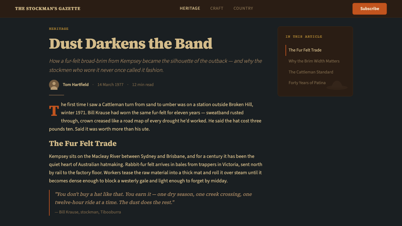
Type in this system pairs two contrasting voices: a sturdy slab serif for headings and labels, and a clean, upright sans-serif for body content and captions. The slab serif carries the authority of a stock station ledger or a country newspaper masthead — squared serifs, regular stroke contrast, and enough weight to hold its own against the textured backgrounds. The sans-serif brings legibility and order, the functional voice of a catalogue specification. The combination reads as a page that was set with care and competence but no decorative aspiration — the typography of a place that trusted content over style.这套系统的排版将两种对比鲜明的声音配对:用于标题和标签的厚重粗衬线体,以及用于正文和说明文字的干净、直立的无衬线体。粗衬线体承载了牧场账册或乡村报纸报头的权威感——方形衬线、均匀的笔画对比,以及足以在质感背景上站稳脚跟的字重。无衬线体带来可读性和秩序感,是目录规格文字的功能性声音。两者的组合读来像一个被用心、有能力但无装饰野心地排版出来的页面——一个相信内容胜于风格的地方的排印方式。
Photography and Framing摄影与框架
Photographs in this system are treated as objects with physical edges. Images sit in cream or bone-white frames with a slight inner border that suggests the white edge of a photographic print, or the inked border of a catalogue illustration. The printing-grain quality of the image surface — warm-tinted, slightly soft in the shadows, with slightly blown-out sky tones — implies a photograph taken on film and reproduced in ink rather than on a backlit screen. Subjects are real, unposed-feeling, and contextual: people at work, landscapes without human figures, close details of tools or materials. Nothing looks cast or styled.这套系统中的照片被当作有实体边缘的物件来处理。图像嵌在奶油色或骨白色的边框里,带有一道细小的内框,暗示照片印刷品的白色边缘,或是目录插图的墨色边界。图像表面那种印刷颗粒感——暖色调、阴影部分略微柔和、天空色调略微过曝——暗示这是一张以胶片拍摄、以油墨复制而非在背光屏幕上显示的照片。被摄主体是真实的,感觉没有刻意摆拍,并带有情境感:在劳作中的人、没有人物的风景、工具或材料的细节特写。没有任何东西看起来经过刻意选角或风格化处理。
Borders and Structural Ornament边框与结构性装饰
Where ornament exists in this system, it is structural and material-derived rather than decorative. Borders reference leather strap edges: they are thick, warm-toned, and occasionally carry a stitching detail or blind emboss. Section dividers are horizontal rules that read as the printed line of a catalogue — straightforward, unpretentious, legible. Corner brackets, where they appear, suggest the metal reinforcement corners of a stockman's leather wallet or the pressed-tin border of a station notice. Nothing is ornamental for its own sake; every decorative element has a referent in the real material world of the pastoral station.这套系统中的装饰元素,是结构性的、源自材质的,而非单纯为了装饰。边框参照皮带的边缘:厚实、暖色调,偶尔带有针脚细节或盲压纹。章节分割线是水平直线,读来像目录上的印刷线条——直接、朴实、清晰可辨。角落括形(若出现)令人联想到牧民皮革钱包的金属加固角,或是牧站公告的压锡边框。没有任何东西是为装饰而装饰;每一个装饰性元素在牧站真实的物质世界中都有其现实参照。
Warmth and Aging温暖感与岁月感
Unlike heritage systems that treat aging as distress (deliberately worn, cracked, or faded surfaces), this system treats aging as honest testimony. Colors are warm-shifted rather than desaturated or faded. Surfaces are worn but not damaged. The overall effect is of something that has been used properly and cared for — a hat that has been re-blocked, a saddle that has been oiled, a catalogue that has been read multiple times and kept. The system avoids both the pristine quality of the new and the aggressive decay of deliberate distress; it occupies the dignified middle ground of honest wear.与那些将岁月感表现为做旧效果(刻意磨损、开裂或褪色的表面)的传承风格不同,这套系统将岁月感视为诚实的见证。颜色是暖色偏移的,而非去饱和或褪色的。表面是磨损的但不是损坏的。整体效果是某种被正确使用且精心保养的东西——一顶被重新整形过的帽子,一副涂了油的马鞍,一本被多次翻阅、妥善保存的目录。这套系统既回避全新品的完好无瑕,也回避刻意做旧的激进衰败感;它占据的是诚实磨损那有尊严的中间地带。
Restraint and Specificity克制与特定性
The system achieves its authority through specificity, not breadth. It does not attempt to represent all of Australia or all heritage aesthetics — it is precisely the aesthetic of a particular object, a particular region, and a particular decade. This narrowness is a strength: every element decision refers back to the source world, and nothing is generic. The restraint extends to the palette (no turquoise, no deep forest green, no Australian-flag blue), to the typography (no scripts, no novelty display faces), and to the photographic treatment (no dramatic color grading, no golden-hour warmth pushed to orange). The more faithfully the system is applied within its own logic, the more distinctive it becomes.这套系统的权威来自特定性,而非宽泛性。它并不试图代表整个澳大利亚或所有传承美学——它精确地是一件特定物件、一个特定地区和一个特定年代的美学。这种窄小性是一种力量:每一个元素决策都回指其源头世界,没有任何东西是泛化的。这种克制延伸至色彩(无青绿色、无深森林绿、无澳大利亚国旗蓝)、排版(无书写体、无新奇展示字体)以及摄影处理(无戏剧性的色彩调级、无被推至橙色的黄金时刻暖调)。系统在其自身逻辑内被越忠实地应用,就越与众不同。
See the Akubra Outback (1970s Stockman) design system →查看 Akubra Outback (1970s Stockman) 完整设计系统 →
Who shaped Akubra Outback (1970s Stockman)?谁塑造了 Akubra Outback (1970s Stockman)?
The founder of the hat-making tradition that would become Akubra. Dunkerley was a Hobart tanner who recognised in the 1870s that rabbit-fur felt — made from the skins of the continent's devastating rabbit plague — could be pressed and shaped into hats of exceptional durability and weather resistance. His decision to relocate production to Kempsey in 1912 planted the brand in the mid-north coast of New South Wales, where it remains. Dunkerley's commercial insight was essentially material: he found a high-quality product in an environmental nuisance, and built a manufacturing tradition around it that has outlasted the era in which it was founded by more than a century.将成为Akubra的制帽传统之创始人。邓克利是一位霍巴特皮革匠,在1870年代认识到兔毛毡——由席卷这片大陆的兔灾的皮毛制成——可以被压制成形,制造出耐久性和防风雨性能卓越的帽子。他在1912年将生产迁至肯普西的决定,将这个品牌植根于新南威尔士州中北部海岸,至今仍在那里。邓克利的商业洞察本质上是材料性的:他在一种环境祸害中发现了高品质产品,并围绕它建立起一套制造传统,在其创立的时代已逝去一个多世纪后仍然延续。
Reginald Murray Williams founded his saddlery and outfitting business in Adelaide in 1932, initially making hand-tooled leather boots and stockwhips for drovers in the South Australian outback. Over the following decades, the RM Williams mail-order catalogue became the primary document of outback aesthetic for a national audience. Williams — himself a man who had worked as a drover and boundary rider — insisted that equipment be photographed on real working stockmen and that the copy be written without inflated claims. The catalogue's authority derived from this discipline: it was read as evidence of real use, not as advertising. The visual conventions of the RM Williams catalogue — cream stock, slab-serif headings, leather-toned product borders, warm-shifted photography — are the direct visual ancestors of this design system.雷金纳德·默里·威廉斯于1932年在阿德莱德创立了他的马具和户外装备生意,最初为南澳大利亚内陆的牧人制作手工皮靴和驱牛鞭。在随后的数十年间,RM Williams邮购目录成为向全国受众呈现内陆美学的首要文献。威廉斯本人曾当过牧人和边界骑手,他坚持要求装备由真正的在职牧民来展示拍摄,文案也不夸大宣传。目录的权威性源于这种自律:它被阅读为真实使用的证据,而非广告。RM Williams目录的视觉惯例——奶油纸张、粗衬线标题、皮革色调产品边框、暖色偏移摄影——是这套设计系统的直接视觉祖先。
David Gordon Kirkpatrick, known professionally as Slim Dusty, was Australia's most commercially successful country music artist and — through his lifelong association with the Akubra — one of the most powerful image-makers of the outback identity. His recording of 'A Pub with No Beer' in 1957 gave him a platform that he sustained through the 1970s and 1980s with albums and concert tours that covered the continent. Dusty was photographed wearing the Akubra across decades of publicity materials, album covers, and live performances, and his image — wide-brimmed hat, weathered face, easy geniality — became the popular face of stockman culture for an audience that had never set foot on a cattle station. The visual conventions of his promotional material overlapped precisely with the catalogue aesthetic this system captures.本名大卫·戈登·柯克帕特里克、艺名斯利姆·达斯蒂的他,是澳大利亚商业上最成功的乡村音乐艺人,也通过与Akubra帽长达一生的关联,成为内陆身份认同最有力的形象塑造者之一。他于1957年录制的《没有啤酒的酒馆》为他提供了一个平台,并以遍历整个大陆的专辑和巡演将这一平台延续至1970至80年代。在数十年的宣传材料、专辑封面和现场演出中,达斯蒂始终戴着Akubra帽被拍摄,他的形象——宽檐帽、风霜面孔、从容亲切的气场——成为牧民文化面向从未踏上过牧场的普通观众的通俗面孔。他宣传材料的视觉惯例与这套系统所捕捉的目录美学完全重合。
The member of the Keir family who stewarded the Akubra company through the critical decades of the mid-to-late twentieth century, during which the hat transitioned from regional workwear to national symbol. Under the family's management, the company maintained its production in Kempsey and resisted the pressure to industrialise the felt-making process fully — a decision that preserved the handmade quality that became central to the brand's heritage identity. The Keir family's investment in the Akubra identity during the 1970s, when drover photography and country music were converging to create a powerful outback aesthetic, was decisive in establishing the hat as an enduring national icon rather than a fading piece of occupational dress.基尔家族中在二十世纪中后期关键数十年间掌舵Akubra公司的成员——正是在那些年间,这顶帽子从地区性劳动用品转变为民族标志。在家族管理下,公司维持着在肯普西的生产,并抵住了将制毡工艺完全工业化的压力——这一决策保留了手工制作品质,而这一品质后来成为品牌传承身份的核心。在1970年代,当牧人摄影与乡村音乐汇聚、共同塑造出强大的内陆美学之际,基尔家族对Akubra品牌身份的投入,对于将这顶帽子确立为经久不衰的民族图腾——而非一件逐渐淡出的职业服装——起到了决定性作用。
Not a single individual but a broad cultural current that gathered momentum through the 1970s — the working-stockman heritage movement — which sought to document, preserve, and celebrate the practical material culture of Australia's pastoral industry before it was transformed by mechanisation, aerial mustering, and the decline of long-distance droving. Photographers, writers, and museum curators who participated in this movement created the visual archive that is this design system's primary source: large-format photographs of men at work, inventories of hand-made equipment, oral histories of droving routes. The movement's documentation instinct is partly why the aesthetic of that era feels so complete and retrievable today — it was being consciously recorded even as it was being lived.这不是单一个人,而是一股在1970年代蓄积势头的宏大文化潮流——工作牧民传承运动——它寻求在澳大利亚牧业的实用物质文化被机械化、空中放牧和长途赶牛路线的衰落所彻底改变之前,将其记录、保存和颂扬。参与这一运动的摄影师、作家和博物馆馆长创造了视觉档案——这正是这套设计系统的主要来源:劳作中男性的大画幅照片、手工装备的清单目录、关于赶牛路线的口述历史。这一运动的记录本能,在某种程度上解释了为什么那个时代的美学在今天感觉如此完整、如此可追溯——它在被亲历的同时,也在被有意识地记录。
How do you use Akubra Outback (1970s Stockman) today?今天怎么用 Akubra Outback (1970s Stockman)?
The Akubra Outback system is most powerful when applied with the discipline of its source world: restraint in color, specificity in material reference, and a consistent commitment to the warm, worn, honest register that defines the 1970s pastoral aesthetic. Applying it correctly means understanding what each element is doing — not layering brown and orange over a generic layout, but building surfaces that feel as though they have been made from, or at least touched by, the materials of that world.Akubra Outback系统在以其源头世界的自律精神应用时最为有力:色彩上的克制、材料参照上的特定性,以及对那种温暖、历经磨砺、诚实的基调——1970年代牧区美学的定义特征——的持续坚守。正确应用它意味着理解每个元素在做什么——不是把棕色和橙色叠加在一个通用版面上,而是构建那些感觉上似乎由那个世界的材质制成、或至少被那些材质触碰过的表面。
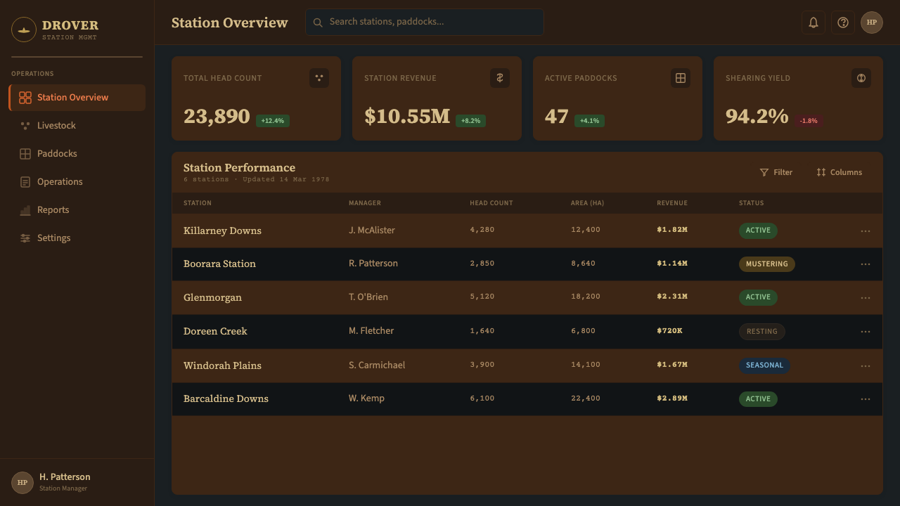
For presentation slides, the system works exceptionally well on covers that establish a strong editorial tone. A cover built in this style uses a large warm-toned photographic image in a cream-bordered frame as the anchoring element, with the title set in slab-serif at generous scale against the natural leather-brown ground. Content slides should be treated as catalogue pages: a clean grid, two type sizes, slab-serif labels above the content, and ruled lines separating sections. Data slides benefit from the system's material honesty — charts and diagrams should read as drawn or printed rather than rendered, using the palette's warm tones for category differentiation. Avoid any visual effect that implies digital precision or high-gloss rendering; this system reads as handmade and grounded, not screen-optimised.对于演示文稿,这套系统在建立强烈编辑基调的封面上表现尤为出色。以这种风格构建的封面,以一张嵌在奶油色边框中的大型暖色调摄影图像作为锚定元素,标题以宽大尺度的粗衬线体置于自然的皮革棕底色上。内容页应当被当作目录页处理:干净的网格、两种字号、内容上方的粗衬线标签,以及分隔各部分的直线。数据页受益于这套系统的材料诚实性——图表和示意图应读来像是绘制或印刷的而非渲染的,使用调色板的暖色调来区分类别。避免任何暗示数字精确度或高光泽渲染的视觉效果;这套系统读来是手工制作的、接地气的,而非为屏幕优化的。
For web and digital interfaces, this aesthetic is well-suited to product pages, editorial sites, and brand identity platforms for goods and services with a genuine heritage story. The approach: use a warm cream or very light bone tone as the base background, reserve leather brown for navigation bars and structural elements, and use the dust-orange as the primary interactive accent. Card components should feel like catalogue entries — cream ground, slab-serif label at the top, photographic image in a bordered frame, plain descriptive text below. Avoid hover effects that feel digital and clean; instead, use subtle texture shift or shadow deepening that references the weight of physical materials. Navigation should be typographic and unadorned.对于网页和数字界面,这种美学非常适合产品页面、编辑类网站,以及拥有真实传承故事的商品和服务的品牌识别平台。方法如下:以温暖奶油色或非常浅的骨白色作为底色背景,将皮革棕保留给导航栏和结构性元素,将尘橙色用作主要交互强调色。卡片组件应有目录条目的感觉——奶油色底、顶部粗衬线标签、带边框的摄影图像、下方朴素的描述性文字。避免那些感觉数字化而干净的悬停效果;应代之以细微的质感变化或阴影加深,参照实体材质的重量感。导航应是字体性的、无装饰的。
For editorial and marketing work, the system excels at the kind of long-form, deeply contextual content that benefits from an aesthetic that implies time, patience, and authenticity. An article or campaign built in this style uses wide margins for pull-quotes or contextual annotations, section breaks marked with a thick ruled line rather than decorative ornaments, and photography treated as documentary evidence rather than styled imagery. Marketing campaigns that use this system work best when the copy commits to the same register — plain, specific, free of hyperbole — because the visual language is so strongly associated with honest craft that inflated language reads as a contradiction.对于编辑和营销内容,这套系统在那种长篇幅、深度情境化的内容中表现出色——这类内容受益于一种暗示时间、耐心和真实性的美学。以这种风格构建的文章或营销活动,使用宽阔的边距来放置引文或情境注释,章节分隔以粗直线而非装饰元素标记,摄影被当作纪录性证据而非风格化图像处理。使用这套系统的营销活动在文案也坚守同样基调时效果最佳——朴素、具体、没有夸大——因为这种视觉语言与诚实工艺的关联如此强烈,以至于浮夸的语言读来像一种矛盾。
A common failure mode when working with heritage and pastoral aesthetics is to push the warmth too far toward sepia and nostalgia, producing an image that reads as theatrical vintage rather than lived heritage. The Akubra system is not sepia: its leather brown is deep and genuine, its orange is scorched and direct, and its cream is warm but not yellow. A second error is to mix this aesthetic with unrelated heritage cues — linen textures from a different tradition, serif letterforms that reference European editorial rather than Australian print culture, or photographic treatments that imply Americana rather than the Southern Hemisphere. The specificity of this system is its strength; generic heritage dilutes it.在处理传承类和牧区美学时,一种常见的失误是将暖色推得过于偏向棕褐色和怀旧感,产生出一种读来像戏剧性复古而非活生生的传承的形象。Akubra系统不是棕褐色的:它的皮革棕是深沉而真实的,它的橙色是炙烤的、直接的,它的奶油色是温暖的但不是黄色的。第二个错误是将这种美学与无关的传承元素混合——来自不同传统的亚麻质感、参照欧洲编辑传统而非澳大利亚印刷文化的衬线字形,或暗示美国主义而非南半球的摄影处理方式。这套系统的特定性是它的力量;泛化的传承会稀释它。
See the Akubra Outback (1970s Stockman) design system →查看 Akubra Outback (1970s Stockman) 完整设计系统 →
Akubra Outback (1970s Stockman) — FAQAkubra Outback (1970s Stockman) · 常见问题
Is this system appropriate only for Australian brands, or can it be applied more broadly?这套系统只适合澳大利亚品牌,还是可以更广泛地应用?
The system is rooted in a very specific cultural and geographic context, but its applicability is broader than that origin suggests. Any brand whose core values include honest craftsmanship, material quality, heritage authenticity, and practical durability can draw on this aesthetic — regardless of geographic origin. Leather goods, workwear, outdoor equipment, agricultural products, and long-established family businesses in any region may find that the system's visual language aligns well with their positioning. The caution is that the more the specific Australian referents (the landscape palette, the catalogued pastoral imagery) are used literally, the more the system reads as Australian rather than universally heritage. Applied at a higher level of abstraction — prioritising the texture register, the typographic voice, and the honest aging — it becomes more transferable.这套系统植根于非常特定的文化和地理背景,但其适用性比那个原点所暗示的更为宽广。任何以诚实工艺、材质品质、传承真实性和实用耐久性为核心价值的品牌,都可以借鉴这种美学——无论地理起源如何。皮革商品、工作服装、户外装备、农业产品,以及任何地区历史悠久的家族企业,都可能发现这套系统的视觉语言与其定位契合。需要注意的是:具体的澳大利亚参照物(地景调色板、经目录化的牧区图像)被越字面地使用,这套系统就越被读作澳大利亚而非普世的传承风格。在更高抽象层次上应用——优先考虑质感语调、排版声音和诚实的岁月感——会使它更具可移植性。
How does this system relate to other heritage Australian design aesthetics?这套系统与其他澳大利亚传承设计美学有何关系?
Australia has several distinct design heritage traditions that should not be conflated. The Akubra Outback system is specifically pastoral and working-class — it belongs to the tradition of the drover, the jackaroo, and the mail-order catalogue, not to the mid-century modernism of Sydney Opera House architecture, the Indigenous visual traditions of different Aboriginal nations, or the coastal beach culture that defines a different strand of Australian identity. Mixing these traditions produces incoherence. A designer choosing this system is choosing the cattle-country interior, not the coastal city or the First Nations tradition, and that choice should be made deliberately and with respect for the distinctions between these distinct cultures.澳大利亚有几种截然不同的设计传承传统,不应将其混为一谈。Akubra Outback系统特定地属于牧区和工人阶级传统——它属于牧人、牧场学徒和邮购目录的传统,而不属于悉尼歌剧院建筑的中世纪现代主义、不同原住民族群的土著视觉传统,或定义澳大利亚身份另一面的沿海海滩文化。混合这些传统会产生语义混乱。选择这套系统的设计师,选择的是内陆牧区而非沿海城市或第一民族传统,这个选择应当审慎地、带着对这些截然不同文化之间差异的尊重来做出。
Can this system work in digital-first products that have no physical dimension?这套系统能在完全以数字为主的、没有实体维度的产品中奏效吗?
Yes, but with one important adjustment in intent. The system's power in its original context came from the fact that the materials were real — the felt, the leather, the newsprint — and the visual language was a direct record of those materials. In a purely digital product, the texture references become intentional artifice rather than documentation. This is not a contradiction of the system, but it does mean that the designer must be thoughtful about which elements to carry over and which to leave behind. Texture patterns should suggest rather than simulate; the photographic treatment can be achieved through warm color grading and border conventions without requiring the grain to look literally printed. The key is to maintain the honesty of the system — no element should feel decorative or arbitrary — while accepting that the digital medium cannot fully replicate the tactility of the original.可以,但在意图上需要做一项重要的调整。这套系统在其原始语境中的力量,来自材料是真实的这一事实——毡料、皮革、新闻纸——视觉语言是对这些材料的直接记录。在纯数字产品中,质感参照变成了有意为之的人为创造,而非文献性记录。这并不是对系统的矛盾,但确实意味着设计师必须审慎思考哪些元素可以延续、哪些应当放下。质感图案应当暗示而非模拟;摄影处理可以通过暖色调色和边框惯例来实现,无需要求颗粒感看起来真的像印刷效果。关键是在接受数字媒介无法完全复制原始触感的同时,维持系统的诚实性——没有任何元素应感觉是装饰性的或任意的。
What is the biggest mistake designers make when working with this style?设计师在使用这种风格时最常犯的错误是什么?
The most common mistake is treating the palette as interchangeable with other warm, earthy heritage palettes — reaching for terracotta, mustard, sage green, or barn red alongside the Akubra tones, producing a generic 'rustic heritage' look rather than the specific pastoral Australian one. The Akubra palette is precise: stained leather, scorched earth-orange, cool eucalypt shadow, and catalogue cream. A second frequent error is softening the typography — replacing the slab serif with a rounded or humanist sans-serif that reads as approachable and contemporary rather than authoritative and documentary. The slab serif is load-bearing in this system; replacing it undermines the system's foundational reference to printed matter. A third error is adding decorative elements that feel crafted and artisanal — hand-drawn borders, brush-stroke textures, ink-bleed effects — which import the visual vocabulary of a different tradition (Americana, letterpress revival) and conflict with the system's clean catalogue logic.最常见的错误是将这套调色板视为可以与其他温暖、大地色系传承调色板互换的东西——将赤陶橙、芥末黄、鼠尾草绿或谷仓红与Akubra色调混搭,产生一种泛化的「乡村传承」感,而非特定的澳大利亚牧区感。Akubra调色板是精确的:皮革染色、灼烤大地橙、清凉的桉树阴影色以及目录奶油色。第二个常见错误是软化排版——将粗衬线体替换为圆润或人文主义无衬线体,读来亲切而当代,而非权威而纪录性的。粗衬线体在这套系统中承载着结构重量;替换它会破坏系统对印刷品那个根本性的参照。第三个错误是添加感觉手工艺术的装饰元素——手绘边框、笔触质感、墨水渗透效果——这些引入了另一种传统(美国主义、活字印刷复兴)的视觉词汇,与这套系统干净的目录逻辑相冲突。
How should this system handle dark backgrounds if the original aesthetic was light-ground?如果原始美学是浅色底面的,这套系统应该如何处理深色背景?
The canonical ground for this system is warm cream or light bone — the colour of catalogue newsprint and unbleached paper. A dark-mode or night variant is possible but requires deliberate adaptation rather than simple inversion. The leather brown, when placed on a near-black ground, becomes a mid-tone structural element rather than a dominant field. The dust-orange, which is aggressive and warm, needs to be used sparingly as an accent rather than as a large-field tone, because it generates too much visual tension against a dark background. The cream, rather than being a background, becomes a foreground type colour — which is appropriate, because catalogue type was always dark on light. The eucalypt blue-black, which was a shadow accent in the light-ground version, effectively disappears into the background in a dark variant; a cooler dark-teal or near-black with a slight warm cast replaces it as the primary ground. The most important rule: do not simply invert the palette. Rethink each element's role in the new ground condition.这套系统的标准底色是温暖奶油色或浅骨白色——目录新闻纸和未漂白纸张的颜色。深色模式或夜间变体是可能的,但需要刻意的适应性调整,而非简单反转。皮革棕在接近黑色的底面上,变成了一个中间色调的结构性元素,而非主导性的大面积色块。尘橙色本身具有攻击性和暖调,需要被节制地用作强调色而非大面积基调色,因为它在深色背景上会产生过强的视觉张力。奶油色不再作为背景,而是成为前景文字颜色——这是合适的,因为目录文字一向是浅底深字的。桉树蓝黑色在浅色底面版本中是阴影强调色,在深色变体中会有效地融入背景;一种偏冷的深青绿或带有轻微暖调的近黑色替代它成为主要底色。最重要的规则:不要简单地反转调色板。在新的底色条件下,重新思考每个元素的角色。
Related design styles相关设计风格
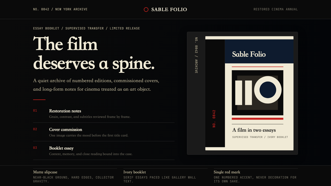 Criterion CollectionMuseum-grade cinema. Matte black, ivory serif, and one red numbered spine set…博物馆级电影感:哑黑底、象牙衬线与一枚红色编号书脊定调。
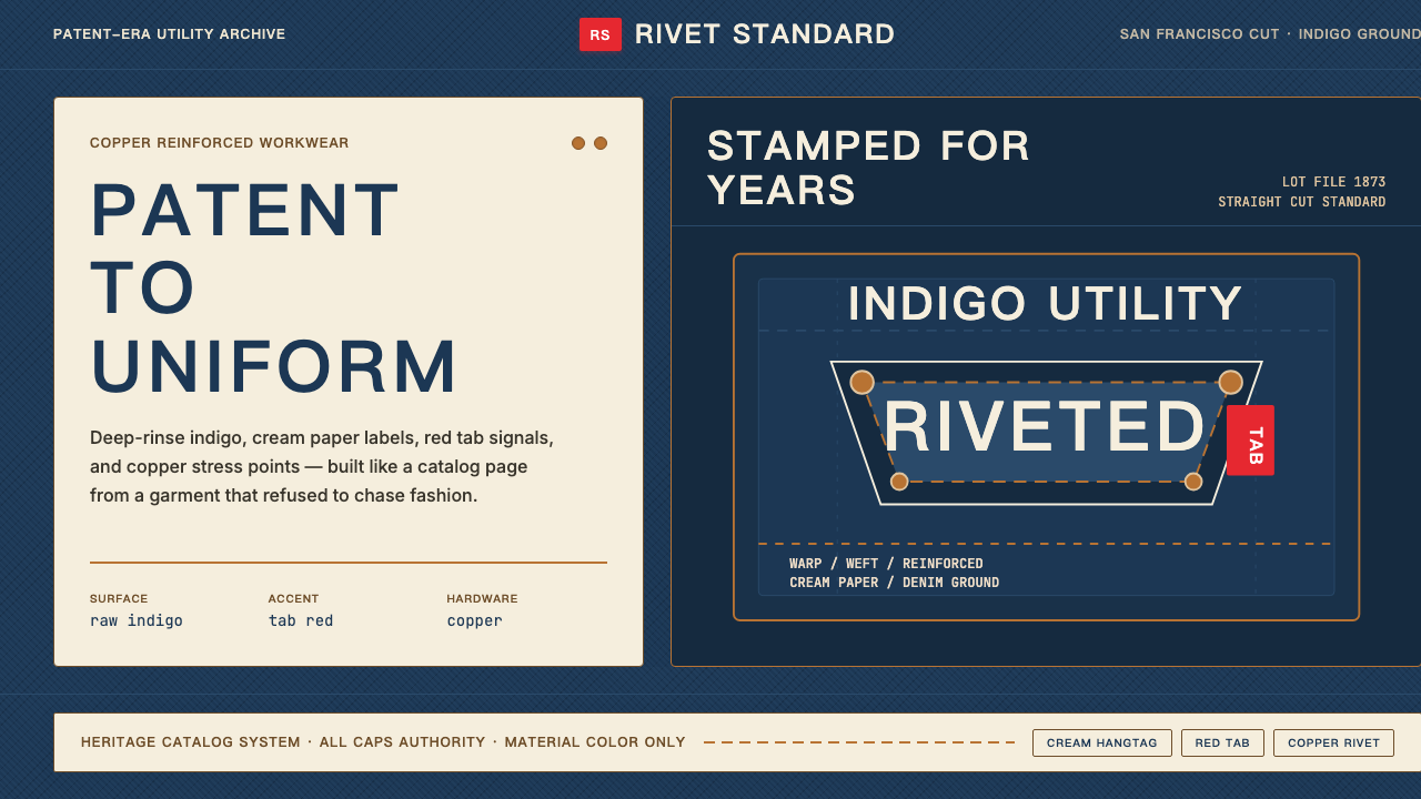 Levi's 501Utility becomes permanent. Indigo ground, cream hangtag panels, red tab and c…实用成为恒久。靛蓝底、奶油吊牌、红标与铜铆钉。
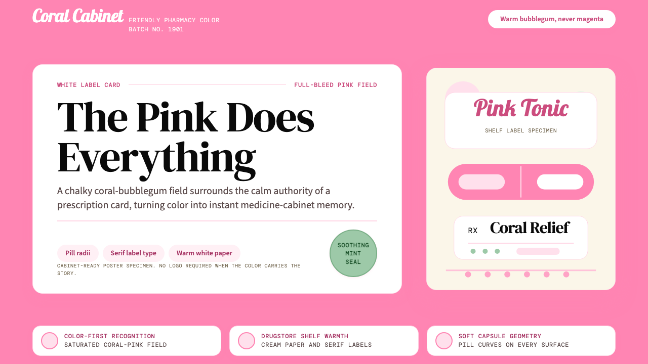 Pepto-Bismol Pink (1901)Color is the cure. Bubblegum pink floods the field; white label cards and pil…颜色就是招牌:泡泡糖粉铺满画面,白色标签卡和药丸弧度稳住信任。
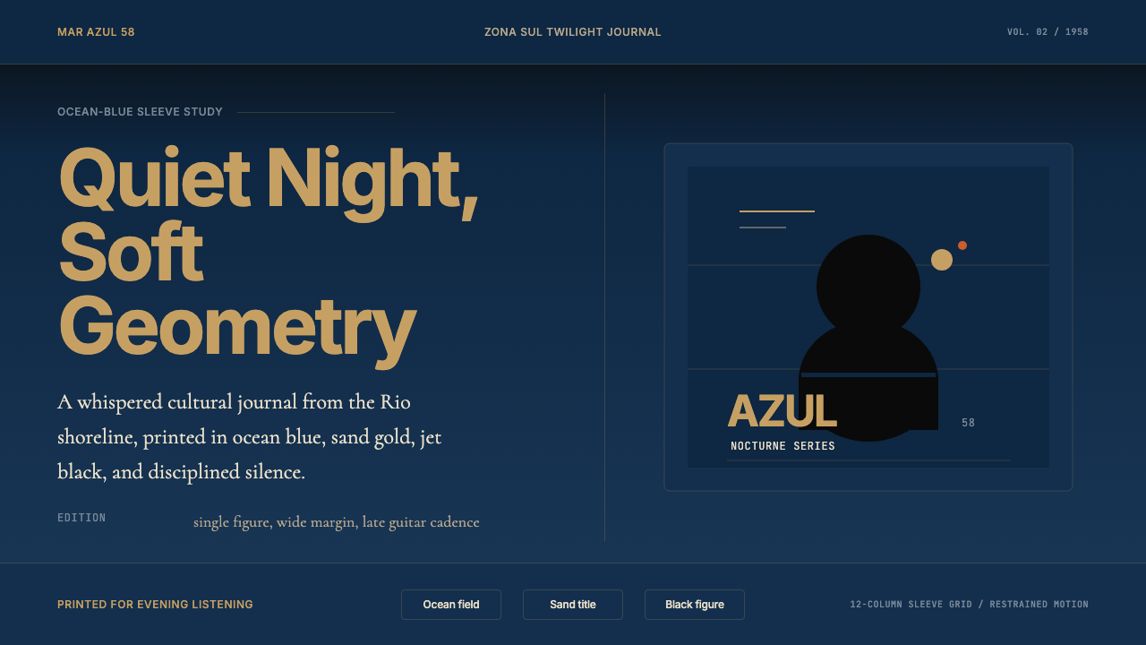 Brazilian Bossa Nova Cool 1958Twilight cool. Ocean blue, sand-gold Inter, one black silhouette with LP-slee…黄昏冷调:海蓝底、沙金 Inter 与黑色剪影,留出唱片封套般呼吸。
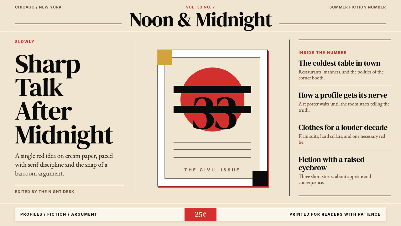 Esquire MagazineConceptual punch on paper. Cream stock, black hairlines, and one saturated re…纸上的观念重拳。米色纸、黑细线与一记饱和红。
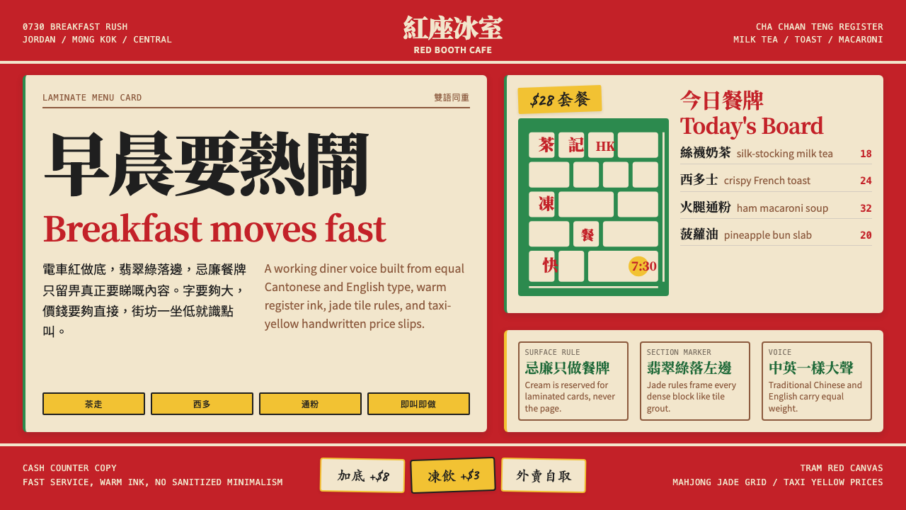 Hong Kong Cha Chaan TengDemocratic diner warmth. Tram red, jade rules, cream menu cards, equal Canton…街坊飯堂的熱度:電車紅、翡翠綠線、忌廉餐牌,中英並重。