What is Esquire Magazine?什么是 Esquire Magazine?
Cream stock, a single saturated red, and ninety-two covers that changed what an American magazine could say.米色纸、一记饱和红,以及九十二张改写了美国杂志边界的封面。
Esquire Magazine in briefEsquire Magazine 速览
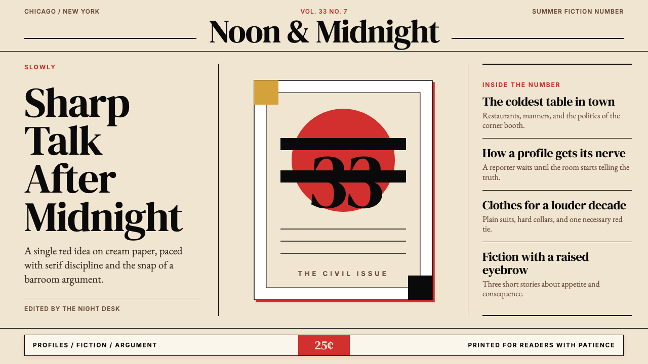
Esquire is America's most iconic mid-century men's magazine, founded in Chicago in 1933 and carried to the peak of design history by art director George Lois between 1962 and 1972. Its visual language is mid-century modern editorial: warm cream or off-white paper, one concentrated saturated red used as a conceptual weapon, deep black for type and structure, and generous letter-spacing on serif headlines that gives the page an air of measured authority. Composition is not decorative — it is argumentative. Every cover, every spread, makes a claim.Esquire(绅士)是美国最具标志性的中世纪现代男士杂志,1933年创刊于芝加哥,1962至1972年间在传奇艺术总监George Lois手中攀上设计史的顶峰。它的视觉语言是中世纪现代编辑美学:温暖的米色或近白色纸张,一种作为概念武器使用的饱和正红,用于文字与结构的深黑,以及宽松的衬线标题字距——赋予页面一种从容而有分量的权威感。构图不是装饰性的,而是论辩性的。每一个封面、每一个跨页,都在表达一种立场。
What distinguishes Esquire from other mid-century editorial styles is the marriage of New Journalism literary ambition with the blunt graphic force of a protest poster. The writers — Tom Wolfe, Gay Talese, Norman Mailer — supplied long-form prose of unusual intensity. Lois supplied covers that compressed the same intensity into a single image, often provocative to the point of controversy. The result was a magazine whose design and editorial voice were inseparable: the layout did not illustrate the text, it argued alongside it.Esquire有别于其他中世纪编辑风格之处,在于它将新新闻主义的文学抱负与抗议海报式的直接图形力量融为一体。Tom Wolfe、Gay Talese、Norman Mailer等作家提供了密度罕见的长篇散文;George Lois则提供了将同样密度压缩进单张图像的封面设计,常常激烈到引发争议。由此诞生的杂志,其设计声音与编辑声音浑然一体——版式不是文字的图解,而是与文字并肩的论辩。
The core aesthetic rests on economy of means. A restrained palette of cream, black, and red is not a limitation — it is a discipline that forces every element to earn its place. Conceptual graphic compositions — a figure in an unexpected context, a symbol inverted, a headline that reframes the image — replace decorative arrangement. The style rewards confidence and punishes clutter. When applied correctly, it produces work that feels authoritative, cultured, and slightly dangerous.这套核心美学依赖手段的节制。米色、黑色与红色的克制色板并非限制,而是一种纪律——迫使每个元素自证其存在价值。概念性图形构图——出现在意外语境中的人物、被反转的符号、重新定义图像的标题——取代了装饰性排布。这种风格回报自信,惩罚堆砌。正确应用时,它产生的作品令人感到权威、有教养,而且略带危险气息。
See the Esquire Magazine design system查看 Esquire Magazine 完整设计系统
Where does Esquire Magazine come from?Esquire Magazine 从何而来?
Esquire was founded in October 1933 in Chicago by David A. Smart, William H. Weintraub, and editor Arnold Gingrich. The launch was a calculated risk: the United States was in the depths of the Great Depression, and a quarterly men's magazine priced above competing publications seemed a dubious proposition. Smart bet on quality — both editorial and physical. The first issue, printed on heavy coated stock with color illustrations and contributions from Ernest Hemingway, F. Scott Fitzgerald, and John Dos Passos, sold out its print run of approximately one hundred thousand copies within days. The magazine's material presence — its weight, its paper, its illustrations — was itself an argument that men with refined tastes still existed and still spent money.Esquire由David A. Smart、William H. Weintraub与编辑Arnold Gingrich于1933年10月在芝加哥创刊。这是一次经过计算的冒险:彼时美国正深陷经济大萧条,一本定价高于同类刊物的季刊男士杂志,听上去是个可疑的提案。Smart押注品质——无论是编辑还是物质层面。创刊号以重磅铜版纸印刷,配有彩色插图,刊载了Ernest Hemingway、F. Scott Fitzgerald与John Dos Passos的文章,约十万册的印量在数日内售罄。这本杂志的物质存在感——其重量、纸张、插图——本身就是一个论点:有品位的男性仍然存在,并且仍然消费。
Through the 1940s and 1950s, Esquire established its literary identity and its visual credibility. Alberto Vargas contributed his celebrated pin-up illustrations, which became a signature feature; the magazine published fiction by Hemingway, Steinbeck, and later Nabokov. The art direction of this period was elegant but not yet revolutionary — sophisticated use of illustration, careful headline typography, and a consistent commitment to the cream-and-black color architecture that would later become the canvas for Lois's experiments.整个四五十年代,Esquire确立了自己的文学身份与视觉公信力。Alberto Vargas的著名钉板女郎插图成为招牌特色;杂志相继刊载了Hemingway、Steinbeck以及后来Nabokov的小说。这一时期的美术指导优雅而尚未革命性——对插图的精致运用,谨慎的标题排印,以及对米色与黑色色彩结构的一贯坚守——这一画布日后将成为Lois实验的舞台。
The decisive transformation came in 1962, when Harold Hayes became editor and George Lois began his decade-long collaboration with the magazine. Lois, born in the Bronx to a Greek immigrant family, had trained under the art director Herschel Levit and worked at agencies before striking out independently. His approach to the Esquire cover was conceptual before the word was common currency in design: he did not illustrate the issue's contents, he constructed a single image-idea that commented on American culture. The 1968 cover depicting Muhammad Ali pierced by arrows in the pose of Saint Sebastian — a reference to Ali's persecution for refusing military induction — was named by a Columbia University survey as the best magazine cover of the twentieth century. Of the ninety-two covers Lois designed for Esquire, dozens entered the permanent collection of the Museum of Modern Art.决定性的转变发生在1962年。Harold Hayes出任主编,George Lois开始了他与这本杂志长达十年的合作。Lois在布朗克斯出生于一个希腊移民家庭,师从美术指导Herschel Levit,在广告公司历练后独立创业。他对Esquire封面的处理方式是概念性的——彼时这个词在设计领域尚未流通:他不图解当期内容,而是构建一张评论美国文化的单一图像-观念。1968年的封面将穆罕默德·阿里画成被箭矢穿体的圣塞巴斯蒂安——影射阿里因拒服兵役而遭受的迫害——被哥伦比亚大学的一项调查评为二十世纪最佳杂志封面。在Lois为Esquire设计的九十二张封面中,数十张进入纽约现代艺术博物馆的永久馆藏。
The New Journalism movement that ran parallel to Lois's visual revolution gave the magazine its editorial philosophy. Gay Talese's 1966 profile of Frank Sinatra, published without a single interview with its subject, and Tom Wolfe's reports from the counterculture front redefined what magazine journalism could do. The design responded: text-heavy layouts with clear hierarchy, generous white space treated as active composition rather than empty margin, and the sense that every page was a considered visual argument. This dual legacy — conceptual cover art and literary long-form — defines what it means to work in the Esquire aesthetic.与Lois视觉革命并行的新新闻主义运动赋予了这本杂志编辑哲学。Gay Talese 1966年发表的Frank Sinatra侧写——全文未曾采访当事人——以及Tom Wolfe从反文化前线发回的报道,重新定义了杂志新闻学所能做到的事。设计随之回应:层级清晰的重文字版面,宽阔留白被当作主动构图而非空白边距,以及每一页都是一份经过深思熟虑的视觉论点的感觉。这一双重遗产——观念性封面艺术与文学长篇——定义了在Esquire美学框架下工作的含义。
What defines the Esquire Magazine look?Esquire Magazine 的视觉特征是什么?
Color Economy色彩节制
The Esquire palette is deliberately narrow: warm cream or off-white as the ground, deep black for typography and structural elements, and one saturated red deployed as a conceptual accent. The red is never decorative — it marks the thing the image argues about. Secondary colors appear rarely, if ever, and when they do they are muted rather than competing with the primary tension. This economy is what gives the style its punch: with so little color in play, every chromatic decision carries full visual weight.Esquire的色板刻意狭窄:温暖的米色或近白色作为底面,深黑用于排印与结构元素,一种饱和正红作为概念性强调色。这抹红从不是装饰性的——它标记出图像所论辩的那件事。次级色彩极少出现,一旦出现也是经过降调的,不与主要张力竞争。正是这种节制赋予了这种风格以力量:当色彩游戏如此有限,每一个色彩决定都承载着全部的视觉重量。
Conceptual Composition观念性构图
The defining compositional move in Esquire design is the single conceptual image: one figure, one symbol, one juxtaposition that carries a complete argument. This is not photographic reportage and not decorative illustration — it is graphic rhetoric. The composition is built around a central visual idea that the viewer must decode, making the act of looking itself active. Backgrounds are minimal or absent; the conceptual figure occupies the field with nothing to dilute its authority.Esquire设计中最具定义性的构图手法,是单一观念图像:一个人物、一个符号、一种并置,承载一个完整的论点。这不是摄影报道,也不是装饰性插图,而是图形修辞。构图围绕一个观看者必须解码的核心视觉观念构建,使观看行为本身变得主动。背景极简或缺席;观念性主体占据画面,没有任何事物稀释其权威。
Serif Typography with Breathing Room有呼吸感的衬线排印
Esquire's typographic sensibility is rooted in the mid-century editorial tradition of the quality press: serif typefaces for headlines and body text, set with generous letter-spacing that signals unhurried authority rather than tabloid urgency. The headline scale is bold — large enough to command the page — but the spacing prevents it from feeling aggressive. This combination of confident scale and restrained spacing is the typographic equivalent of speaking slowly and clearly. Subheads and captions are lean and precise, providing structure without competing for attention.Esquire的排印感性植根于优质出版物的中世纪现代编辑传统:标题与正文使用衬线字体,配以宽松字距,传递一种从容权威而非小报式紧迫。标题的字号大胆——足以统领页面——但字距阻止了它显得咄咄逼人。这种自信的字号与克制的字距的组合,是缓慢清晰地说话在排印上的等效物。副标与图说精练准确,提供结构感而不争夺注意力。
Editorial White Space编辑性留白
Esquire treats white space — or more precisely, cream space — as an active compositional element, not as the absence of content. Generous margins, breathing room between headline and body text, and deliberate voids around conceptual images all communicate seriousness and confidence. A page that is crowded signals anxiety; a page with room to breathe signals authority. This editorial generosity with space is one of the clearest markers of the style and one of the most commonly violated when imitated.Esquire将留白——更准确地说是米白空间——视为主动的构图元素,而非内容的缺失。宽阔的页边距、标题与正文之间的呼吸空间、观念性图像周围刻意保留的空白,共同传递出严肃与自信。拥挤的页面传递焦虑;有呼吸空间的页面传递权威。这种对空间的编辑性慷慨是该风格最清晰的标志之一,也是被模仿时最常遭到破坏的特质之一。
Provocative Image-Text Relationship挑衅性的图文关系
In authentic Esquire-style work, the image and headline do not simply illustrate each other — they create meaning through friction. The image sets a scene or makes a claim; the headline reframes it, contradicts it, or provides the key that unlocks its meaning. This tension between visual and verbal is the engine of the conceptual cover format and applies equally to interior spreads. A headline that merely describes the image it accompanies is a missed opportunity; a headline that reorients the image produces the signature Esquire effect.在真正的Esquire风格作品中,图像与标题并非简单地互相图解——它们通过摩擦创造意义。图像设定场景或提出主张;标题重新定框它、与之矛盾,或提供解锁其含义的钥匙。这种视觉与文字之间的张力是概念性封面形式的引擎,同样适用于内页跨版。仅仅描述所配图像的标题是错失机会;重新定向图像的标题才产生Esquire标志性的效果。
Material Quality Signaling材质品质信号
From its first issue, Esquire used paper weight and print quality as meaning-making tools. The warm cream stock — heavier, warmer, and more tactile than newsprint — positioned the magazine as an object worth keeping, not discarding. In digital and presentation contexts, this material quality translates into careful attention to background tone (cream rather than pure white), text contrast, and the overall sense that nothing is cheap or rushed. The aesthetic communicates that its maker believes the work deserves the reader's sustained attention.从创刊号起,Esquire就将纸张克重与印刷品质作为意义制造工具。温暖的米色纸张——比新闻纸更厚重、更温暖、更具触感——将这本杂志定位为值得保留而非丢弃的物件。在数字与演示场景中,这种材质品质转译为对背景色调(米色而非纯白)、文字对比度,以及整体上无一处廉价或仓促的精心关注。这种美学传递出:其创作者相信这项作品值得读者持续专注。
Restrained Wit克制的机智
Esquire's visual wit is never obvious and never self-congratulatory. The conceptual twist in a Lois cover — Ali as Saint Sebastian, Andy Warhol drowning in a can of soup — is sharp and dark, not light and playful. The humor, where it exists, is the kind that makes the viewer think before laughing. This tone of restrained, knowing wit pervades the style: it shows sophistication without announcing it, and it privileges the reader's intelligence by assuming they will complete the thought.Esquire的视觉机智从不显眼,也从不自我陶醉。Lois封面中观念性的转折——阿里化身圣塞巴斯蒂安,安迪·沃霍尔溺于汤罐之中——是锐利而黑暗的,而非轻盈嬉戏的。那种幽默(若存在)是让观看者先思考、后发笑的那种。这种克制而老练的机智贯穿整套风格:它展示品位而不宣告品位,并通过假设读者将自行完成思路来尊重其智识。
See the Esquire Magazine design system查看 Esquire Magazine 完整设计系统
Who shaped Esquire Magazine?谁塑造了 Esquire Magazine?
Lois served as Esquire's primary cover art director from 1962 to 1972, producing ninety-two covers that transformed the magazine cover from an illustration format into a medium for conceptual argument. Born in the Bronx to Greek immigrant parents, he developed a combative, idea-first approach to visual communication at advertising agencies before applying it to editorial design. His covers — including the Muhammad Ali as Saint Sebastian image of 1968, the 1965 cover of Sonny Liston as a Black Santa Claus, and the 1969 cover showing Lieutenant Calley surrounded by smiling Vietnamese children — used graphic shock to carry political meaning. Many entered the permanent collection of the Museum of Modern Art. Lois went on to a long career in advertising and continued to argue, until his death in 2022, that design without an idea is mere decoration.Lois担任Esquire首席封面美术总监长达十年(1962—1972),设计了九十二张封面,将杂志封面从插图形式转变为观念论辩的媒介。他在布朗克斯出生于希腊移民家庭,在广告公司历练出对抗性的、观念优先的视觉传达方式,随后将其应用于编辑设计。他的封面——包括1968年的穆罕默德·阿里化身圣塞巴斯蒂安、1965年索尼·利斯顿扮演黑人圣诞老人,以及1969年卡利中尉被微笑越南儿童环绕的封面——以图形震撼承载政治含义。多张作品进入纽约现代艺术博物馆永久馆藏。Lois此后在广告界度过了漫长的职业生涯,直至2022年辞世,始终坚持主张:没有观念的设计不过是装饰。
Hayes served as editor of Esquire from 1963 to 1973, the period that coincides precisely with the magazine's creative peak. Where Lois provided the visual argument, Hayes provided the editorial philosophy: he believed that a magazine could operate at the highest literary and intellectual level while remaining a commercial object with popular reach. He commissioned the landmark works of New Journalism — Gay Talese's Frank Sinatra profile, Tom Wolfe's reports from the counterculture, Norman Mailer's essays on America — and he trusted Lois enough to give him covers that the magazine's sales team sometimes found alarming. Hayes understood that the design and the writing were making the same argument by different means, and he protected that alignment.Hayes于1963至1973年出任Esquire主编,这一时期与杂志创造力顶峰精确重合。Lois提供视觉论点,Hayes提供编辑哲学:他相信一本杂志能够在保持商业影响力的同时,在最高文学与智识水准上运作。他委托创作了新新闻主义的里程碑作品——Gay Talese的Frank Sinatra侧写、Tom Wolfe关于反文化的报道、Norman Mailer关于美国的文章——并充分信任Lois,允许他设计那些杂志销售团队有时感到惶恐的封面。Hayes理解:设计与写作在以不同手段表达同一个论点,他捍卫了这种一致性。
Gingrich was Esquire's founding editor, the man who set its tone from the first issue in 1933. His instinct was to treat male readers as a genuinely literary audience — capable of engaging with serious fiction and long-form journalism — at a moment when most men's publications offered lighter fare. He secured contributions from Hemingway, Fitzgerald, and Dos Passos for the first issue, establishing an editorial precedent that would carry through to the New Journalism era three decades later. Gingrich's belief that quality writing and quality design reinforced each other laid the philosophical foundation for what Lois and Hayes would build.Gingrich是Esquire的创刊主编,从1933年第一期起就确立了杂志的基调。他的本能是将男性读者视为真正的文学受众——能够与严肃小说和长篇新闻写作相遇——而彼时多数男性出版物提供的是更轻松的读物。他为创刊号争取到了Hemingway、Fitzgerald与Dos Passos的稿件,确立了编辑先例,并在三十年后延续至新新闻主义时代。Gingrich关于优质写作与优质设计相互强化的信念,为Lois与Hayes后来的建树奠定了哲学基础。
Wolfe was the New Journalism movement's most flamboyant stylist and one of Esquire's signature contributors during the magazine's peak years. His essays — on stock car racing, the counterculture, the astronaut program, the New York art world — brought a novelistic immediacy and satirical energy to reportage that had no precedent in American magazine writing. For Esquire's design team, Wolfe's long-form prose presented a productive constraint: how do you lay out five thousand words of maximum-density journalism in a way that respects both the text and the reader? The answer the magazine developed — clear typographic hierarchy, generous measure, white space as pacing device — became a template for serious editorial design.Wolfe是新新闻主义运动中风格最华丽的散文家,也是Esquire鼎盛时期的标志性撰稿人之一。他关于赛车文化、反文化运动、宇航员计划与纽约艺术界的文章,为报道带来了小说式的直接感与讽刺能量,在美国杂志写作中前所未有。对Esquire设计团队而言,Wolfe的长篇散文提出了一个富有创造性的约束:如何将五千字的最高密度新闻以尊重文字与读者的方式排版?杂志由此摸索出的答案——清晰的排印层级、宽裕的行宽、留白作为节奏装置——成为严肃编辑设计的模板。
Talese's 1966 Esquire profile of Frank Sinatra — published without a single direct quote from its subject, constructed entirely from observation and secondary sources — is one of the foundational texts of American narrative journalism and a demonstration of the editorial courage that Hayes and Esquire represented. The piece ran at a length and with a typographic seriousness that signaled to readers that what they were about to read was literature, not celebrity coverage. Talese's work, alongside Wolfe's, defined the editorial standard that Esquire's design language was built to support: writing that rewards sustained, unhurried attention deserves a layout that commands the same.Talese 1966年在Esquire发表的Frank Sinatra侧写——全文没有一句对当事人的直接引语,完全由观察与二手来源构建——是美国叙事新闻学的奠基文本之一,也是Hayes与Esquire所代表的编辑勇气的明证。这篇文章以其篇幅与排印的严肃性向读者传递信号:你即将阅读的是文学,而非名人报道。Talese的作品与Wolfe的作品一道,确立了Esquire设计语言被构建来支撑的编辑标准:值得持续、从容专注的写作,应得到要求同等专注的版式。
How do you use Esquire Magazine today?今天怎么用 Esquire Magazine?
The Esquire aesthetic translates most naturally into contexts where authority, cultural seriousness, and a degree of provocation are desirable. It is not a style for everything — it is a style for work that has a point of view and is not afraid to make it visible. Applied correctly, it produces decks, pages, and layouts that feel considered rather than decorated, argumentative rather than merely attractive.Esquire美学最自然地转译到权威感、文化严肃性与适度挑衅性为可欲价值的场景中。它不是适合一切的风格,而是适合有立场、且不惧将立场显现出来的作品的风格。正确应用时,它产生的幻灯片、页面与版式令人感到经过深思熟虑而非装饰堆砌,是在论辩而非仅仅悦目。
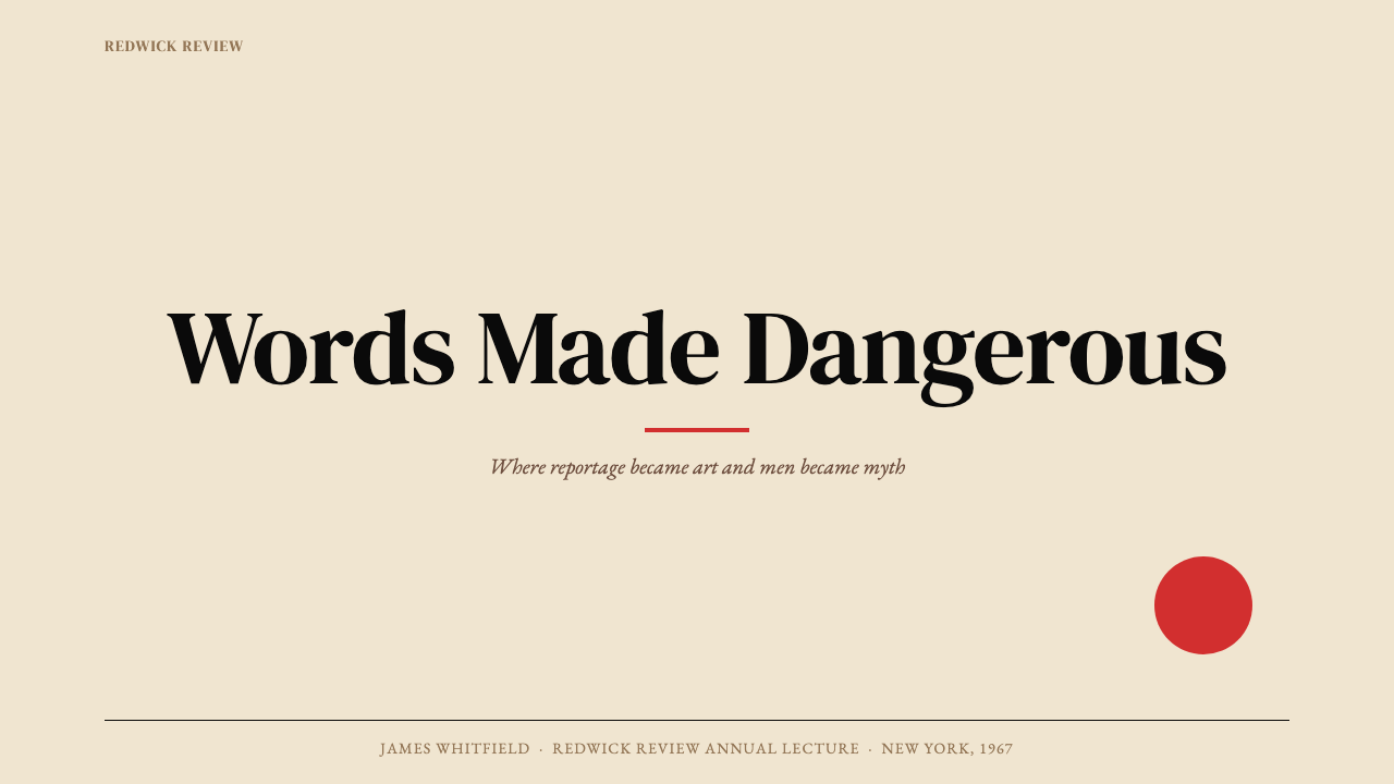
For presentation slides, the cover page is the highest-leverage opportunity. A single conceptual image or graphic — one strong visual idea, not a collage — against a cream or near-white ground, with the title in a large serif at generous letter-spacing and one accent element in red. The image should not illustrate the title; it should reframe it or create tension with it. Content slides follow a strict hierarchy: one organizing idea per slide, body text in a readable serif with open line-spacing, section markers as bold rules rather than decorative ornaments. Data slides work best when charts are treated as designed objects — clean axes, color used to highlight the one datapoint that matters, no decorative grid lines.在演示文稿中,封面页是杠杆最高的机会。在米色或近白色底面上置放单一观念图像或图形——一个强烈的视觉观念,而非拼贴——标题以大号衬线字体配宽松字距排设,以红色点亮一处强调元素。图像不应图解标题;它应当重新定框标题,或与之制造张力。内容页遵循严格层级:每张幻灯片一个组织性观念,正文以可读衬线字体配开阔行距排设,段落标记以粗线条而非装饰元素呈现。数据页最好将图表视为设计物件——干净的坐标轴,色彩仅用于高亮那一个关键数据点,无装饰性网格线。
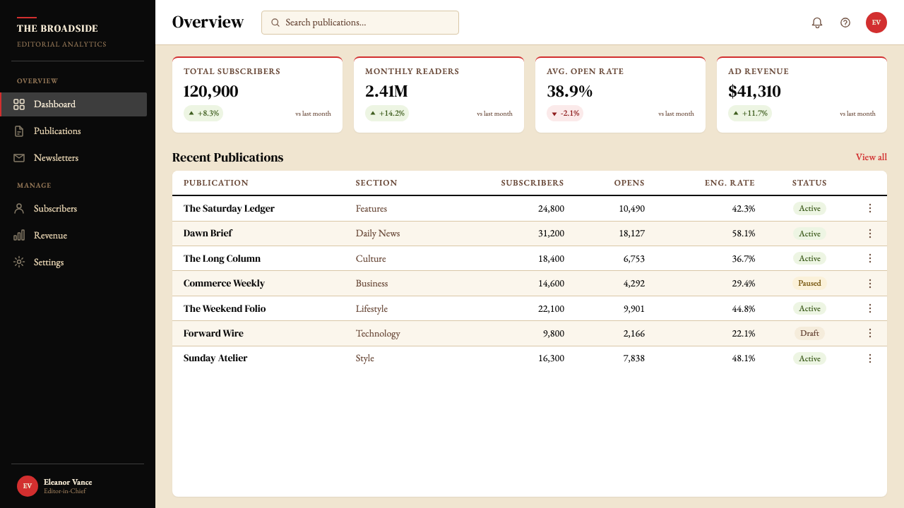
For web interfaces and dashboards, the Esquire approach demands restraint and hierarchy. Use a cream or warm off-white background rather than pure white to soften screen fatigue; reserve black for all primary text. Navigation should be typographic — names and labels at consistent size and weight — with no icon clutter. Red appears only for the one thing that requires immediate attention: an alert, an active state, a primary call to action. Pricing pages benefit from the style's poster-like directness: large, confident type states the price; supporting detail is set smaller and given breathing room; no gradient cards or soft-shadow flourishes compete with the message.对于网页界面与仪表板,Esquire方式要求克制与层级。使用米色或温暖的近白色背景而非纯白色,以缓解屏幕疲劳;保留黑色用于所有主要文字。导航应当是字体性的——以一致字号与字重排设名称与标签——无图标杂乱。红色仅出现在那一件需要立即关注的事物上:一条警示、一个激活状态、一个主要行动号召。定价页面得益于这种风格的海报式直接感:大号自信的字体陈述价格;支撑性细节以较小字号排设并给予呼吸空间;无渐变卡片或柔和阴影装饰与信息竞争。
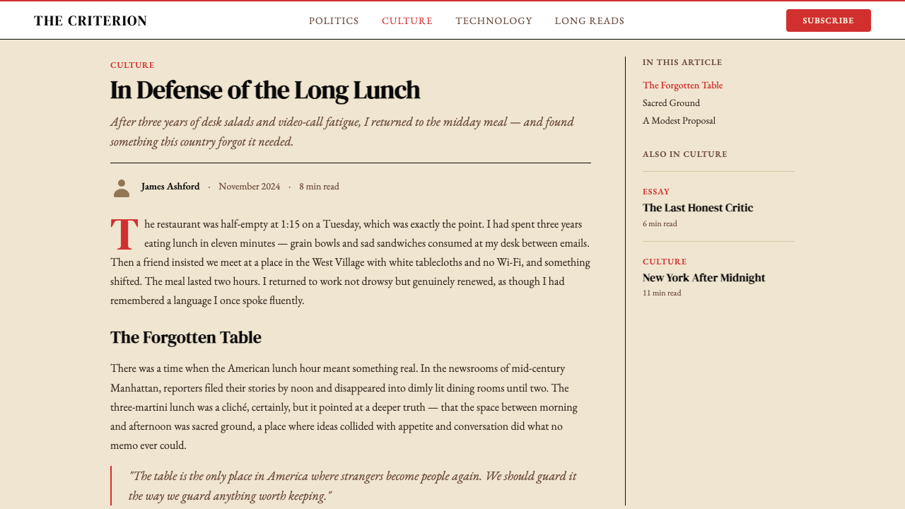
For editorial and marketing materials, the style supports long-form content presented with confidence. An article layout in this mode uses a wide left margin for running heads or pull quotes, a narrow body text column with careful leading, and section breaks marked by a single bold horizontal rule. Marketing applications work well with the cover-poster logic: one full-width conceptual image, a headline in large serif that argues rather than describes, and a supporting line in smaller type that completes the thought. The red accent should appear once — on the call to action or on the element that deserves to be remembered.对于编辑与营销内容,这种风格支持以自信方式呈现的长篇内容。这种模式下的文章版式在左侧保留宽阔留白用于页眉或引用语,正文列以窄行宽配精心控制的行距排设,段落分隔以单条粗水平线标记。营销应用适合封面海报的逻辑:一张全宽概念性图像,一行大号衬线标题在论辩而非描述,一行较小字号的支撑文案完成这个思路。红色强调应当只出现一次——在行动号召上,或在那个值得被记住的元素上。
A common mistake is reducing the Esquire aesthetic to its surface elements — cream background, red accent, big type — without understanding the conceptual logic underneath. The style does not work if the image is merely decorative and the headline merely descriptive. The visual-verbal tension that defines the style requires that image and text create meaning together that neither creates alone. A second common error is over-applying the red: one saturated accent in the right place is powerful; two competing red elements cancel each other. The economy of the palette is the source of its authority, not a limitation to be expanded.一个常见错误是将Esquire美学简化为其表面元素——米色背景、红色强调、大号字体——而不理解其下的概念逻辑。如果图像仅仅是装饰性的,标题仅仅是描述性的,这种风格就失效了。定义这种风格的图文张力要求图像与文字共同创造出任何一方单独无法创造的意义。第二个常见错误是过度使用红色:一处饱和强调放在正确位置是有力量的;两处竞争的红色元素相互抵消。色板的节制是其权威的来源,而非待突破的限制。
See the Esquire Magazine design system查看 Esquire Magazine 完整设计系统
Esquire Magazine — FAQEsquire Magazine · 常见问题
Is the Esquire style the same as general mid-century editorial design?Esquire风格与泛泛的中世纪现代编辑设计是同一回事吗?
Not quite. Mid-century editorial design is a broad category that includes everything from Life magazine's photojournalism layouts to Harper's Bazaar's fashion spreads and Time's newsweekly grids. What distinguishes the Esquire style specifically is the conceptual cover logic — the idea that image and text should argue rather than illustrate — and the very restricted palette centered on cream, black, and one saturated red. Many mid-century publications used richer color, more decorative typography, and illustrative rather than conceptual image strategies. Esquire's distinctiveness is its intellectual edge: it borrowed the tools of advertising (bold graphics, provocative imagery) in service of literary journalism.不完全是。中世纪现代编辑设计是一个宽泛的类别,涵盖从《生活》杂志的图片新闻版式到《时尚芭莎》的时装跨版,再到《时代》的新闻周刊网格。Esquire风格的独特之处在于观念性封面逻辑——图像与文字应当论辩而非图解——以及围绕米色、黑色与一种饱和红的极度受限色板。许多中世纪出版物使用了更丰富的色彩、更具装饰性的排印,以及图解性而非概念性的图像策略。Esquire的独特性在于其智识锋芒:它借用广告的工具(大胆图形、挑衅性图像)服务于文学新闻学。
Can this style work for brands outside publishing and media?这种风格能用于出版与媒体之外的品牌吗?
Yes, with careful alignment between the style's values and the brand's values. The Esquire aesthetic communicates authority, cultural seriousness, wit, and a degree of confidence that borders on provocation. It works well for brands that want to position themselves as the smart, principled choice in a crowded market — premium financial services, high-end consultancies, literary or arts institutions, and technology products targeting sophisticated professional users. It works poorly for brands where warmth, accessibility, playfulness, or broad-demographic appeal are primary goals. The style is inherently selective in who it speaks to, which is a feature when the brand is selective, and a liability when it is not.可以,但需要仔细对齐这种风格的价值观与品牌的价值观。Esquire美学传递权威、文化严肃性、机智,以及一种接近挑衅的自信。它适合希望将自身定位为拥挤市场中明智而有原则选择的品牌——高端金融服务、顶级咨询机构、文学或艺术机构,以及面向成熟专业用户的科技产品。它不适合以温暖感、亲近性、趣味性或广泛人群吸引力为首要目标的品牌。这种风格在其所面向的受众上天生具有选择性——当品牌本身具有选择性时,这是优势;当品牌不具备时,则是负担。
How do you handle photography in this style without making it look generic?在这种风格中如何处理摄影,而不让它显得平庸?
The Esquire approach to photography is conceptual rather than documentary. The image is chosen or directed to make a specific argument, not to illustrate the general topic. This means selecting photographs that have an inherent visual idea — an unexpected juxtaposition, a figure in an incongruous context, a moment of tension captured at precisely the right instant — rather than photographs that are merely competent or beautiful. Cropping is aggressive: dead air around a subject is cut, and the figure is given the full weight of the frame. Color photography should typically be desaturated toward the palette's tonal range, or used at full saturation only for the red accent elements; competing saturated colors undermine the palette's authority.Esquire对摄影的处理是概念性的而非记录性的。图像的选择或拍摄是为了表达一个特定论点,而非图解一般主题。这意味着选择那些内含视觉观念的照片——意外的并置、处于不协调语境中的人物、在精确瞬间捕捉到的张力——而非仅仅技术过关或好看的照片。裁剪是激进的:主体周围的死角被切除,人物获得画框的全部重量。彩色摄影通常应向色板的色调范围降饱和度处理,或仅在红色强调元素上使用全饱和度;竞争性的饱和色会削弱色板的权威。
What is the most common mistake when trying to apply the Esquire look to a corporate presentation?将Esquire外观应用于企业演示时最常见的错误是什么?
Importing the palette without the conceptual logic. A cream background with a red accent and a large serif headline will look Esquire-adjacent, but it will not feel like Esquire if the image is a stock photo of a handshake and the headline is a literal description of the slide's content. The style's authority comes from the relationship between image and text, not from any individual element. A second common error is timidity with scale — the style requires commitment to large type, generous space, and strong contrast. A headline that is only slightly larger than the body text, a red accent that is faint to avoid looking 'too bold,' and a cream that has drifted to pure white are all signs that the style has been applied halfheartedly. Esquire's aesthetic is one that rewards conviction.引入了色板,却没有引入观念逻辑。米色背景加红色强调加大号衬线标题,会显得接近Esquire,但如果图像是握手的素材照、标题是对幻灯片内容的字面描述,它就不会有Esquire的感觉。这种风格的权威来自图像与文字的关系,而非任何单一元素。第二个常见错误是对尺度的胆怯——这种风格需要对大号字体、宽裕空间与强烈对比的承诺。一个只比正文略大一点的标题,一个因担心「太大胆」而调淡的红色强调,以及一个已经漂移至纯白色的米色,都是风格被敷衍应用的迹象。Esquire的美学是回报信念的美学。
Does the style work in dark mode or on dark backgrounds?这种风格适用于深色模式或深色背景吗?
The historic Esquire palette is unambiguously light-ground: cream or off-white is the canonical base. A dark inversion — black ground with cream or white type and a red accent — is possible and occasionally used effectively, but it shifts the style's character significantly. On a dark ground, the warmth of the cream is lost and the overall effect becomes colder and more confrontational. The red accent tends to vibrate more aggressively against black than against cream, which can be used deliberately for emphasis but easily becomes fatiguing. If a dark treatment is required, commit to a single warm light accent against a very dark (not pure black) ground, and reduce the use of red to the absolute minimum — one element, one moment.历史上的Esquire色板明确是浅色底面:米色或近白色是标准底面。深色反转版本——黑色底面配米色或白色文字与红色强调——是可行的,偶尔也能有效使用,但它显著改变了风格的性格。在深色底面上,米色的温暖感消失,整体效果变得更冷、更具对抗性。红色强调在黑色上比在米色上更容易产生震颤感,这可以被刻意用于强调,但也很容易令人疲倦。如果确实需要深色处理,应在非纯黑的极深色底面上使用单一温暖浅色强调,并将红色的使用减至绝对最低——一个元素,一个瞬间。
Related design styles相关设计风格
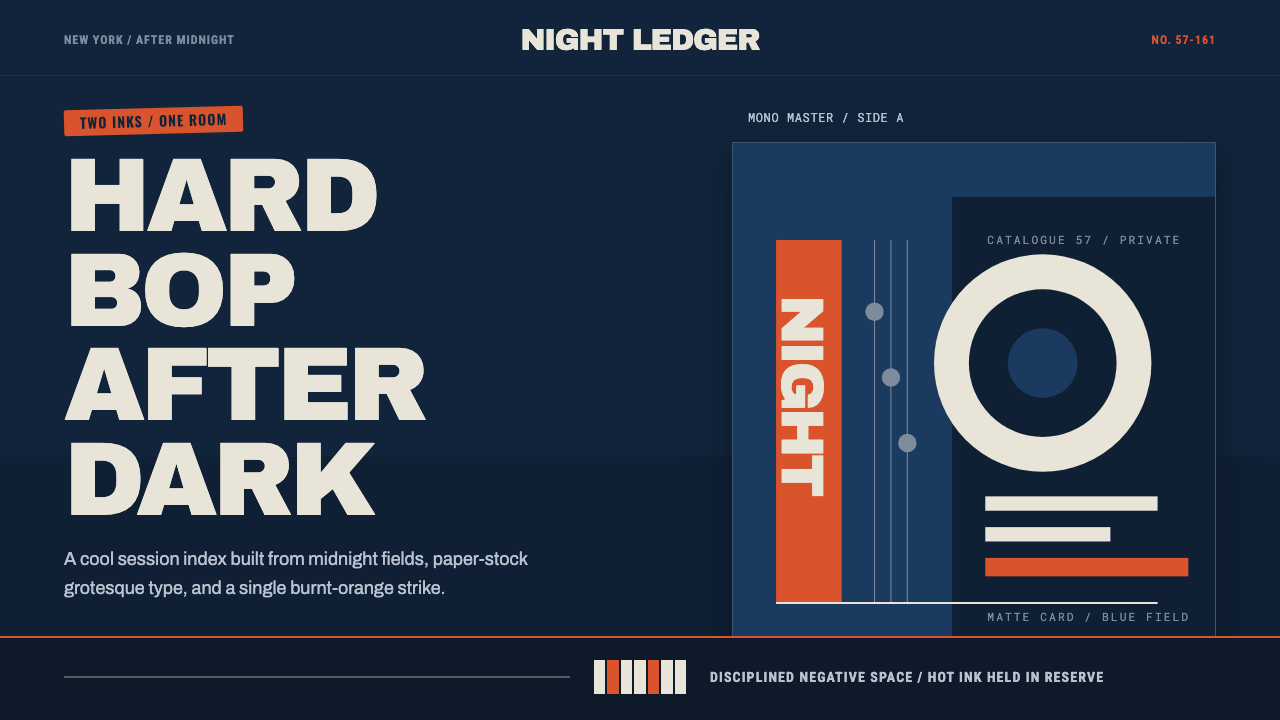 Blue Note JazzCool intelligence, printed flat. Midnight blue, paper type, and one burnt-ora…冷静而智性的平面感:午夜蓝、纸白粗体与一抹焦橙油墨。
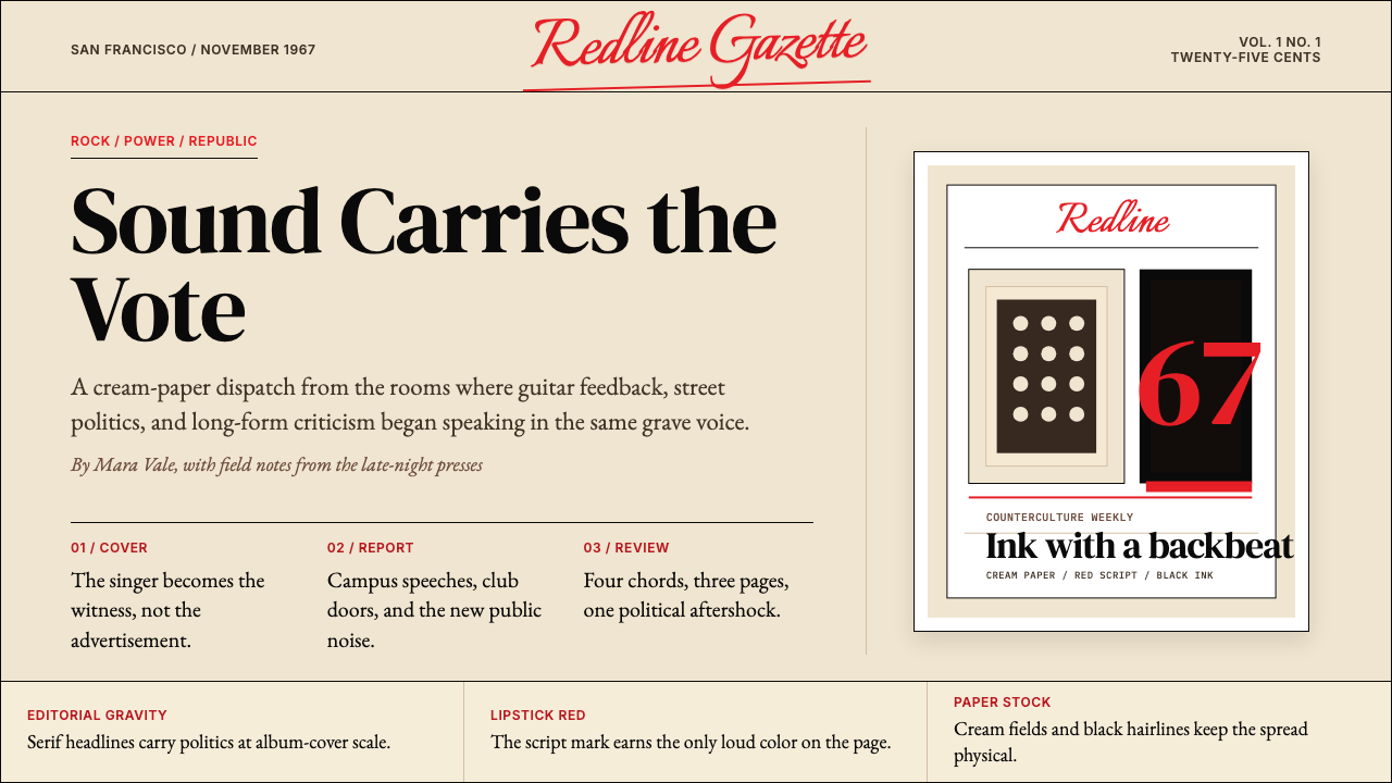 Rolling Stone MagazineCounterculture gets editorial weight. Cream paper, lipstick red script, serif…反主流文化有编辑重量:奶油纸、口红红手写体与粗衬线标题。
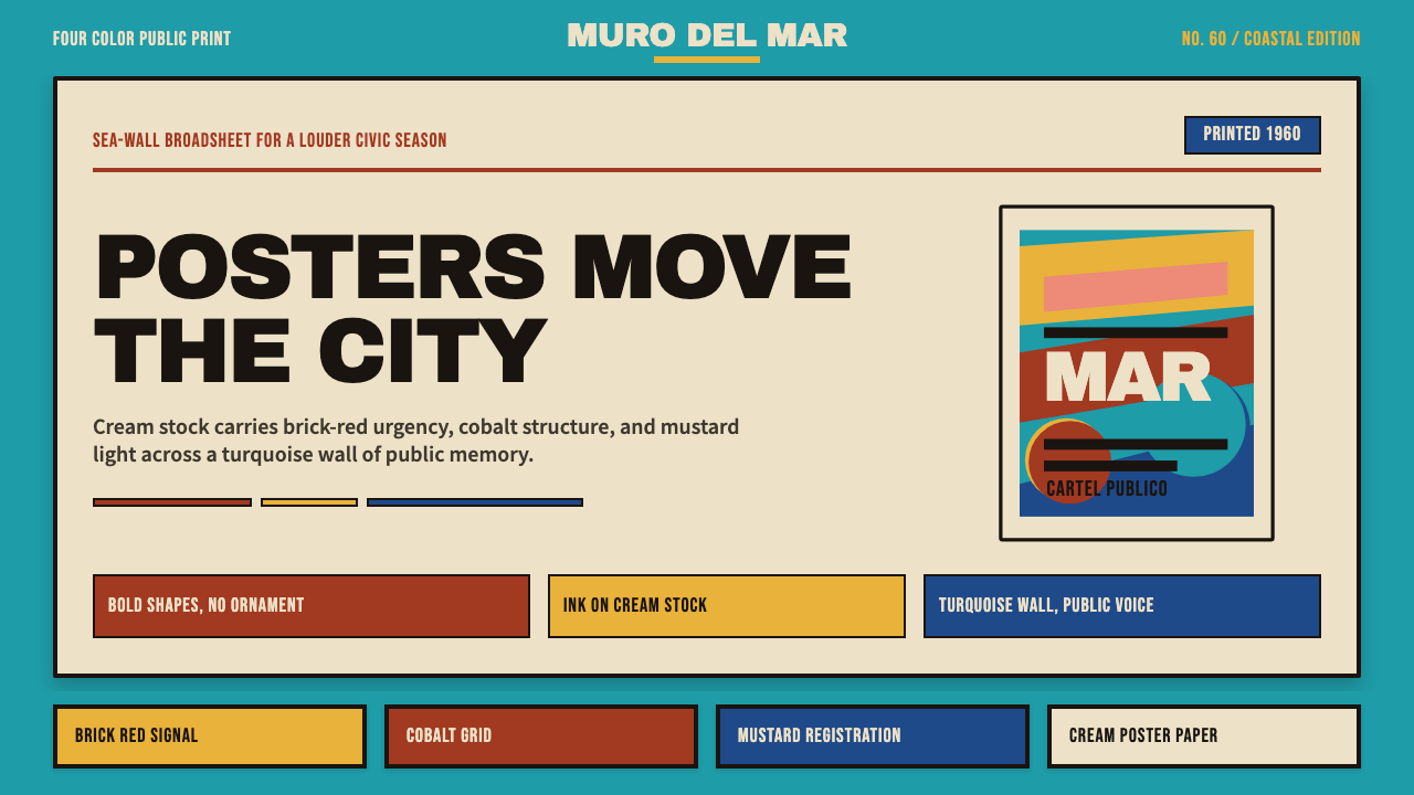 Cuban Malecón 1960 PosterPublic voice in flat ink. Turquoise wall, cream stock, brick red and cobalt b…平面油墨的公共之声:绿松石墙、奶油纸、砖红与钴蓝色条。
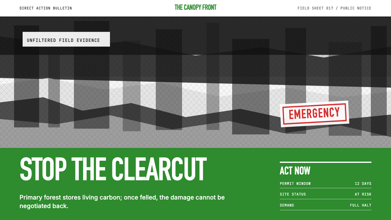 Greenpeace (Activist Poster)Protest without softness. Forest-green caps over monochrome newsprint, one de…抗议毫不柔化。森林绿大写字压住黑白画面,只留一个诉求。
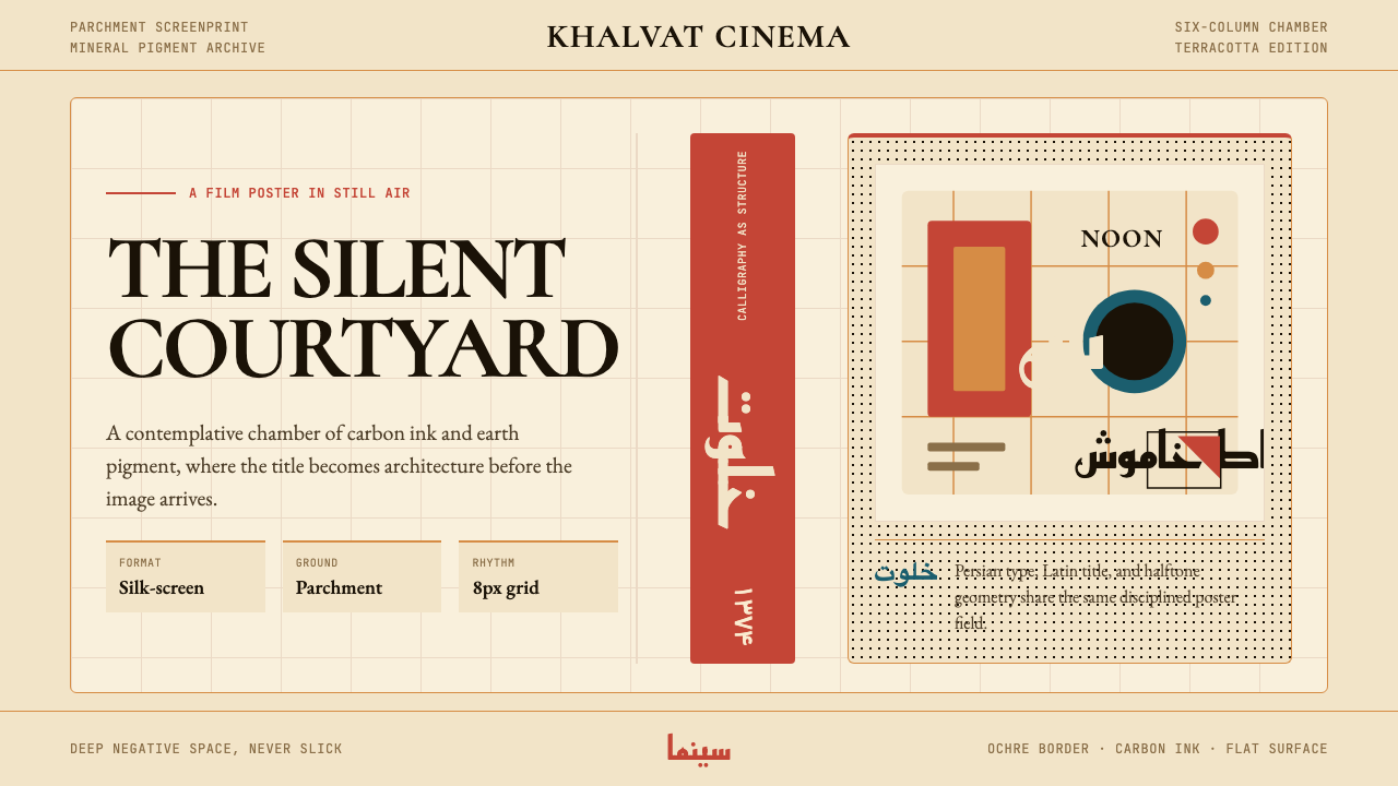 Iranian Modernist Cinema PosterStillness becomes monumental. Terracotta Kufi type breathes inside a Swiss pa…静默成碑。赤陶库法字在羊皮纸瑞士网格中呼吸。
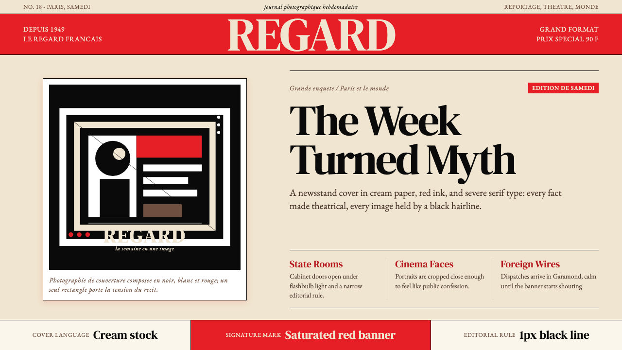 Paris MatchThe cover shouts in one red slab. Cream paper, serif headlines, and black rul…一块红色横幅在呐喊。奶油纸、衬线标题与黑色细线制造戏剧。