What is Headspace?什么是 Headspace?
Headspace proved that calm could be sold through optimism — sunrise orange, wobbly hand-drawn characters, and a cream canvas that made mindfulness feel like a friendly morning rather than a meditation retreat.Headspace 证明了平静可以用乐观来传递——日出橙、手绘摇摆角色,以及一块让正念感觉像友好清晨而非冥想静修的奶油色画布。
Headspace in briefHeadspace 速览
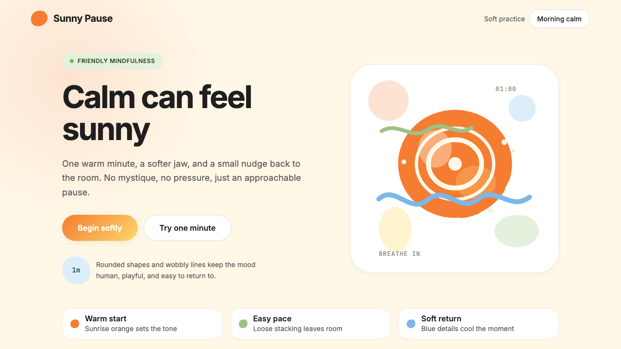
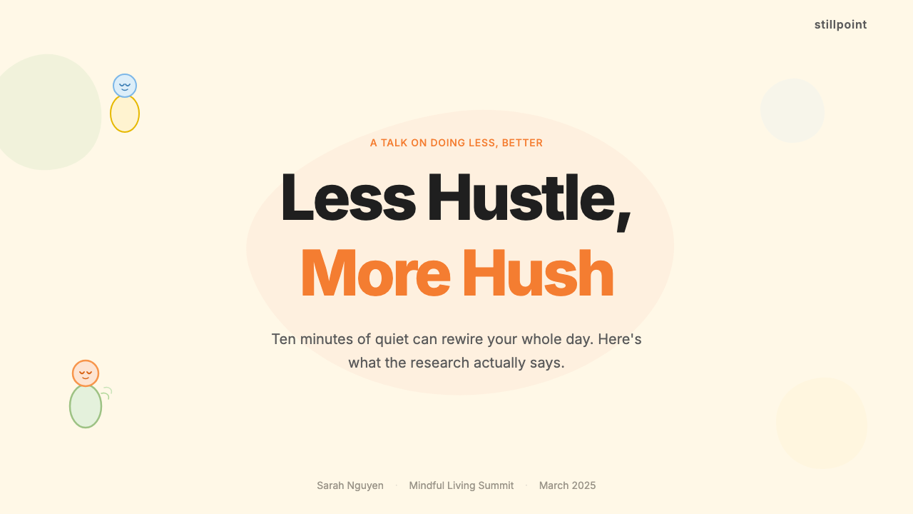
Headspace is a visual design system born inside a meditation and mental-wellness app, developed collaboratively between the Headspace product team and the London-based animation studio Animade from roughly 2015 onward. Its vocabulary — warm cream backgrounds, a signature sunrise orange, soft coral and sky-blue accents, fat rounded shapes, and deliberately imperfect hand-drawn character illustrations — amounts to one of the most recognizable wellness aesthetics of the 2010s and 2020s.Headspace 是一套诞生于冥想与心理健康应用内部的视觉设计体系,由 Headspace 产品团队与总部位于伦敦的动画工作室 Animade 自 2015 年前后合作开发。其词汇表——温暖奶油色背景、标志性日出橙、柔和珊瑚色与天空蓝点缀、圆润饱满的形状,以及刻意不完美的手绘角色插画——构成了 2010 至 2020 年代最易辨识的健康美学之一。
What makes the Headspace system distinctive is its deliberate rejection of the dominant visual language of meditation: no lotus flowers, no incense smoke, no muted earth tones signaling retreat from the world. In their place, the style offers cheerful round characters — limbless, expressive blobs of color — that embody emotional states through posture and weight rather than facial detail. The palette reads warm and inviting, like a ripe fruit or a morning sky, deliberately choosing optimism over austerity to make mindfulness feel accessible rather than austere.Headspace 体系的独特之处在于它对冥想主流视觉语言的刻意拒绝:没有莲花、没有香炉烟雾、没有暗示退隐世界的静默大地色。取而代之的是活泼的圆形角色——无四肢、富有表现力的彩色圆团——通过姿态与重心而非面部细节传递情绪状态。色板温暖而具邀请感,像一颗成熟的果实或一片晨曦天空,刻意以乐观取代克制,让正念感觉可亲而非严苦。
The typographic side of the system pairs a geometric humanist sans-serif with generous line spacing and unhurried hierarchies. Body text is set at comfortable, readable sizes; headlines carry weight without aggression. The overall impression is of a system designed to reduce rather than stimulate anxiety — every element rounded, every transition gentle, every surface breathing.体系的字体排印部分将几何人文无衬线字体与充裕的行间距及从容的层级结构相配合。正文以舒适易读的尺寸排设,标题有分量而不咄咄逼人。整体印象是一套为降低而非刺激焦虑而设计的系统——每个元素圆润,每个过渡柔和,每个界面都在呼吸。
Where does Headspace come from?Headspace 从何而来?
Headspace was founded in 2010 in Santa Monica, California, by former Buddhist monk Andy Puddicombe and entrepreneur Rich Pierson. Puddicombe had spent a decade studying meditation in monasteries across Asia and Europe; Pierson had a background in advertising. Their collaboration produced a product concept premised on a single insight: the largest barrier to meditation was not skepticism but intimidation. People wanted to try mindfulness but felt they were doing it wrong, that it was too spiritual, too quiet, too foreign. The solution was not to simplify the practice but to change its emotional framing entirely.Headspace 由前佛教僧侣安迪·普迪科姆(Andy Puddicombe)与企业家里奇·皮尔森(Rich Pierson)于 2010 年在美国加利福尼亚州圣莫尼卡共同创立。普迪科姆曾在亚洲和欧洲的寺院中花费十年时间研习冥想;皮尔森则有广告从业背景。两人的合作产生了一个基于单一洞察的产品概念:冥想最大的障碍不是怀疑,而是畏惧。人们想尝试正念,但感觉自己做错了——太精神化、太安静、太陌生。解决方案不是简化练习本身,而是彻底改变它的情感框架。
The visual identity that eventually defined Headspace globally came into focus through a sustained partnership with Animade, a UK illustration and animation studio known for its characterful, warmly textured work. The studio developed the cast of rounded, blob-like characters — nicknamed 'Headspace people' — that became the app's emotional ambassadors. These figures appeared in guided meditation animations, onboarding flows, app store previews, and marketing campaigns, giving the brand a consistent animated personality across every touchpoint. The collaboration produced a visual language that was deliberately optimistic and approachable: soft, rounded, imperfect in the way a friendly illustration always is.最终定义 Headspace 全球品牌的视觉识别,是通过与英国插画动画工作室 Animade 的持续合作逐渐成形的。Animade 以富有个性、质感温暖的作品著称,为 Headspace 开发了一套圆润的、类圆团的角色形象——被昵称为「Headspace 人」——成为应用的情感大使。这些角色出现于引导式冥想动画、引导流程、应用商店预览和营销活动中,赋予品牌在每个触点上一致的动态人格。这次合作产生的视觉语言刻意乐观而易于亲近:柔软、圆润,带着友好插画特有的那种刻意不完美。
The palette choices were not arbitrary. Sunrise orange, the brand's dominant hue, was selected to evoke energy and warmth without aggression — closer to the feeling of morning light on skin than to the urgency of a warning signal. Cream backgrounds replaced clinical white, softening the environment and reducing the sense of digital sterility. The accent colors — sky blue, coral, soft yellow, gentle greens — were chosen to expand the emotional range without fragmenting the system's coherence, each one warm and slightly desaturated compared to its pure-hue equivalent.色板的选择并非随意。日出橙——品牌的主色调——被选中是为了唤起充满活力与温暖的感受,同时避免攻击性,更接近晨光洒在皮肤上的感觉,而非警告信号的紧迫感。奶油色背景取代了临床感的纯白,软化了环境,减少了数字化的生硬感。强调色——天空蓝、珊瑚色、柔和黄、轻柔绿——被选来扩展情感范围,同时不破坏体系的整体性;每种颜色都是温暖且略微降低饱和度的,比其纯色相版本更加温柔。
The style emerged at a specific cultural moment: the post-2010 wellness-tech wave that also produced Calm, Peloton, and a generation of consumer health products designed to look nothing like traditional healthcare. Designers in this space were solving a shared problem: how do you make self-improvement feel like self-compassion? The Headspace answer — optimistic illustration, warm color, rounded form, gentle type — became one of the defining visual answers to that question, widely imitated across the wellness, mental health, and consumer-health design landscape throughout the following decade.这种风格在一个特定的文化时刻涌现:2010 年后的健康科技浪潮同期还孕育了 Calm、Peloton,以及一代刻意与传统医疗保健视觉彻底切割的消费者健康产品。这一领域的设计师们在解决一个共同的问题:如何让自我提升感觉像自我关怀?Headspace 给出的答案——乐观插画、温暖色调、圆润形态、柔和字体——成为那个时代最具代表性的视觉答案之一,在此后十年里被整个健康、心理健康与消费健康设计领域广泛效仿。
What defines the Headspace look?Headspace 的视觉特征是什么?
Palette色彩
The color system anchors on a warm sunrise orange that reads energetic but never harsh — closer to ripe citrus than to a traffic signal. This primary color sits against cream backgrounds rather than pure white, softening the environment and reducing visual tension. Accent colors expand the range: a calm sky blue provides contrast and coolness, coral offers emotional warmth, and muted yellows and greens extend variety without fragmenting coherence. All hues are pulled slightly toward warmth and away from full saturation, giving the palette its distinctly approachable, analog-feeling character.色彩体系以温暖的日出橙为锚点——充满活力但从不刺目,更接近成熟柑橘而非交通信号灯。这一主色调落在奶油色背景上而非纯白,软化了整体环境,减少了视觉张力。强调色扩展了色域:平静的天空蓝提供对比与凉感,珊瑚色带来情感温度,柔和的黄色与绿色在不破坏整体性的前提下增添变化。所有色相都略微向温暖方向偏移、远离满饱和状态,赋予色板鲜明的亲切感与手工质感。
Illustration and Character插画与角色
The defining visual element is a cast of rounded, limbless character blobs developed with Animade. These figures communicate emotion through posture, weight distribution, and subtle deformation rather than through facial features — a drooping form signals fatigue, a buoyant bounce conveys joy, a still and centered mass represents calm. The line work is deliberately imperfect: slightly wobbly, as if drawn by a careful but human hand, rejecting the mechanical precision of vector illustration in favor of felt warmth.最具定义性的视觉元素是一套与 Animade 共同开发的圆润无肢体角色圆团。这些形象通过姿态、重心分布和细微形变传递情绪,而非借助面部特征——塌陷的形体表达疲惫,轻盈的弹跳传递喜悦,安静居中的形态代表平静。线条刻意不完美:略微摇摆,仿佛由一只认真而有温度的人手所绘,拒绝矢量插画的机械精准,以换取可感知的温暖。
Shape and Form形态与造型
Every geometric element in the system is softened. Squares become rectangles with generously rounded corners, circles and ovals dominate, and even structural layout shapes avoid sharp 90-degree edges wherever possible. This rounding is not merely decorative — it is a systematic commitment to reducing visual sharpness and implied aggression across the entire interface. Fat, full shapes carry a sense of comfort and solidity; the aesthetic is plush rather than lean.体系中的每一个几何元素都经过柔化处理。正方形变为圆角矩形,圆形与椭圆形占主导地位,就连结构性布局形状也尽可能避免锐利的直角。这种圆润化并非单纯的装饰——而是在整个界面中系统性减少视觉锐度和隐含攻击性的承诺。饱满圆润的形状传递出安慰感与稳固感;整体美学是丰厚的而非纤薄的。
Typography字体排印
The typographic approach pairs a geometric humanist sans-serif with generous spacing — wide line height, comfortable letter spacing, and unhurried hierarchies. The weight range used across the system tends toward medium and regular cuts rather than heavy extremes; even headlines are set with care for legibility over impact. The overall typographic mood is calm and even, reinforcing the brand's core proposition: nothing here is trying to rush you.字体排印方案将几何人文无衬线字体与充裕的间距相配合——行高宽松、字间距舒适、层级结构从容。体系中使用的字重范围倾向于中等与常规字重,而非极端粗重;即便是标题也以易读性优先于视觉冲击力来设定。整体排印氛围平静而匀称,强化了品牌的核心主张:这里没有任何东西在催促你。
Motion and Breathing动态与呼吸感
The Headspace visual language was designed for motion from the start. Animations are slow, elastic, and organic — characters inflate and deflate with simulated breath, transitions ease in and out with gentle curves rather than linear speed changes, and idle states involve subtle continuous movement like soft floating or rhythmic pulsing. Even in static applications, this sensibility manifests as compositions that feel airy and spacious: no surface is crowded, every element has room to exist.Headspace 视觉语言从一开始就为动态而设计。动画缓慢、富有弹性且有机——角色随着模拟的呼吸而膨胀收缩,过渡以柔和曲线而非线性速度变化缓入缓出,闲置状态中有轻柔漂浮或节律脉动等细微的持续运动。即便在静态应用中,这种感性也体现为通透、宽敞的构图:没有界面是拥挤的,每个元素都有存在的空间。
Surface and Texture表面与质感
Unlike the clinical flatness of mainstream UI design in the 2010s, Headspace illustrations carry a subtle handmade quality — slight texture in flat color fills, deliberate irregularities in line weight, and compositional looseness that references analog media like gouache or screen printing. This gentle texture differentiates the system from both mechanical minimalism and overly polished digital realism, occupying a warm middle ground that feels crafted.与 2010 年代主流 UI 设计的临床感平面性不同,Headspace 插画带有一种微妙的手工质感——平色填充中的轻微纹理、线宽的刻意不规律,以及参照不透明水彩或丝网印刷等模拟媒介的构图松弛感。这种温柔的质感使体系既有别于机械极简主义,也区别于过度精致的数字写实风格,占据了一个温暖的中间地带,令人感到是被精心制作的。
Whitespace and Calm留白与平静
Negative space is used with structural intention throughout the system. Layouts are open, with generous margins and padding that prevent any sense of crowding or urgency. Information is introduced incrementally rather than all at once; screens tend to carry one primary idea at a time. This use of restraint in composition mirrors the app's core practice — the act of clearing space — and ensures that the visual experience itself models the mental state it is trying to encourage.留白在整个体系中被有意识地作为结构性元素使用。版面开阔,充裕的页边距与内边距防止任何拥挤感或紧迫感。信息逐步引入而非一次呈现;每个界面倾向于承载一个主要概念。这种构图上的克制与应用的核心练习——清空空间的行为——相互呼应,确保视觉体验本身就在示范它试图鼓励的心理状态。
Who shaped Headspace?谁塑造了 Headspace?
A former Buddhist monk ordained in the Tibetan tradition, Puddicombe spent a decade training in monasteries across Asia and Europe before co-founding Headspace in 2010. As the brand's most visible voice — appearing in guided sessions, marketing campaigns, and a Netflix documentary — he established the tonal and philosophical foundation that the visual system had to express: approachable, secular, optimistic, and grounded in genuine contemplative practice rather than lifestyle aspiration.普迪科姆是藏传佛教传统的前僧侣,在亚洲和欧洲各地的寺院修行十年后,于 2010 年联合创立了 Headspace。作为品牌最具曝光度的声音——出现于引导练习、营销活动和 Netflix 纪录片中——他确立了视觉体系所必须表达的语调与哲学基础:亲切、世俗、乐观,并扎根于真实的冥想修行而非生活方式的向往。
Pierson brought an advertising and brand-strategy background to the partnership, translating the practice of meditation into a mass-market consumer product. His contribution was fundamentally one of framing: recognizing that the visual and verbal identity of mindfulness tools needed to change before mainstream adoption was possible. The decision to lead with optimism and color — rather than the austere visual language typical of wellness — was as much a business strategy as a design philosophy.皮尔森为合作关系带来了广告与品牌策略背景,将冥想练习转化为大众市场的消费产品。他的贡献从根本上是一种框架塑造:认识到正念工具的视觉与语言身份需要先行改变,大众接受度才能成为可能。选择以乐观与色彩为主导——而非健康领域惯用的克制视觉语言——既是商业策略,也是设计哲学。
The London-based animation and illustration studio was the primary creative partner responsible for the character system and animated identity that define Headspace visually. Animade's house style — warm, characterful, technically precise but emotionally loose — aligned closely with what Headspace needed: a visual register that communicated complex inner states without words or facial expression. The studio's influence on the broader wellness design aesthetic of the 2010s extended well beyond Headspace, as their approach was widely cited and emulated.这家总部位于伦敦的动画与插画工作室是主要的创意合作伙伴,负责开发从视觉上定义 Headspace 的角色体系与动态识别。Animade 的工作室风格——温暖、富有个性、技术精准但情感松弛——与 Headspace 的需求高度契合:一套无需文字或面部表情、却能传递复杂内心状态的视觉语域。这家工作室对 2010 年代更广泛健康设计美学的影响远不止于 Headspace,他们的方法被广泛引用与效仿。
As a key design leader within Headspace's in-house team, Lohiya helped systematize and extend the visual language developed with Animade into a scalable product design system. The challenge was significant: translating a character-and-illustration-led brand identity into functional UI components, interaction patterns, and a coherent system that could scale across platforms and product lines while retaining the warmth and approachability of the original illustrated work.作为 Headspace 内部团队的核心设计负责人,洛希娅帮助将与 Animade 共同开发的视觉语言系统化,扩展为可规模化的产品设计体系。这一挑战相当显著:将一套以角色与插画为主导的品牌识别转化为功能性的 UI 组件、交互模式,以及一套能够跨平台和产品线扩展的连贯体系,同时保留原始插画作品的温暖与亲切感。
How do you use Headspace today?今天怎么用 Headspace?
The Headspace design language is among the more technically forgiving historical wellness aesthetics to apply, because its warmth comes from palette and character rather than from rigid structural rules. That said, applying it correctly requires internalizing its emotional premise first: every visual decision should reduce friction and anxiety, not merely look friendly. Rounded corners, warm backgrounds, and character illustrations are symptoms of this principle, not the principle itself.Headspace 设计语言是应用难度相对较低的健康美学风格之一,因为它的温暖感来自色板与角色,而非来自严格的结构规则。即便如此,正确应用它仍需要先内化其情感前提:每一个视觉决策都应减少摩擦与焦虑,而不仅仅是看起来友好。圆角、温暖背景和角色插画是这一原则的外在表现,并非原则本身。
For presentation slides, the Headspace aesthetic works exceptionally well on cover slides that need to communicate approachability and emotional intelligence. A cover built in this style might use the warm cream background as its ground, place a single rounded character illustration at the center, and set the title in a medium-weight geometric sans-serif below it — unhurried, generous in spacing, with the orange accent reserved for a single keyword or highlight. Content slides should carry one idea per page, with wide margins and generous line heights that resist the temptation to pack information densely. Data slides work best when charts are given soft, rounded bar shapes and drawn in the warm accent palette rather than the default application colors.在演示文稿中,Headspace 美学在需要传递亲切感和情感智慧的封面页上表现出色。以这种风格制作的封面可以用温暖奶油色作为底面,在中心放置一个圆润的角色插画,在其下方以中等字重的几何无衬线字体排设标题——从容、间距充裕,橙色强调色只保留给单个关键词或高亮部分。内容页每页承载一个概念,宽阔的页边距和充裕的行高抵制密集填充信息的诱惑。数据页最好将图表柱状形状处理为柔和圆润的,并以温暖的强调色系绘制,而非使用应用程序默认颜色。
For web and product UI, the Headspace style is most naturally suited to onboarding flows, wellness dashboards, subscription or pricing pages, and any context where the user is managing emotional state or personal progress. The approach: use the cream or off-white ground throughout, reserve white for card surfaces, deploy the orange for primary interactive elements like buttons and progress indicators, and use sky blue or coral as secondary accent for states and tags. Corners should be consistently rounded across all card and button components. Iconography, where needed, should feel illustrated rather than utilitarian — slightly irregular, slightly warm in line weight.对于网页和产品 UI,Headspace 风格最自然地适用于引导流程、健康仪表板、订阅或定价页面,以及任何用户在管理情绪状态或个人进展的场景。方法如下:全程以奶油色或接近白色的底色为基础,白色保留给卡片表面,橙色用于按钮和进度指示器等主要交互元素,天空蓝或珊瑚色作为次级强调色用于状态标签。所有卡片和按钮组件的圆角应保持一致。图标(如有需要)应感觉像插画而非工具性图符——略微不规则,线条粗细略带温度感。
For editorial, marketing, and social content, the style lends itself to short-form communication where a single illustration and a single sentence carry the message. Campaign assets in this aesthetic work well at a large scale — a full-bleed cream background with an oversized character centered and a minimal headline in orange — and equally well as small-format cards. The style is less suited to long-form editorial layouts where text density is required, as the generous spacing and minimal hierarchy can make sustained reading feel under-structured.对于编辑、营销和社交内容,这种风格适合一幅插画加一句话承载信息的短形式传播。这种美学的活动素材在大尺寸下效果好——以奶油色满版背景衬托居中的超大角色形象,配以简约的橙色标题——在小尺寸卡片格式下同样有效。这种风格不太适合需要大量文字密度的长篇编辑版面,因为充裕的间距和简洁的层级结构会使持续阅读感觉缺乏结构支撑。
A common mistake when applying the Headspace aesthetic is conflating rounded forms and warm color with the aesthetic itself, then adding digital polish that contradicts the system's handmade warmth: sharp gradients, high-gloss button states, overly precise illustration geometry, or mechanical animation easing. The result looks corporate-wellness rather than genuinely warm. To avoid this, treat every element with slight imperfection — let illustrations breathe, let spacing be generous to the point of spaciousness, let typography be unhurried. The system communicates trust through restraint and warmth, not through finish.应用 Headspace 美学时最常见的错误,是将圆润形态和温暖色彩与这套美学本身混为一谈,然后添加与体系手工温度相矛盾的数字精致感:锐利渐变、高光泽按钮状态、过于精准的插画几何形,或机械化的动画缓动曲线。结果看起来像是企业化的健康品牌,而非真正温暖的。为了避免这种情况,对每个元素都给予轻微的不完美感——让插画呼吸,让间距充裕到接近宽敞,让排版从容不迫。这套体系通过克制与温暖传递信任,而非通过精致的完成度。
Headspace — FAQHeadspace · 常见问题
Is the Headspace style appropriate for products outside wellness and mental health?Headspace 风格适合用在健康与心理健康领域之外的产品吗?
It can work well in any context where approachability and emotional warmth are genuine product values — children's education, family finance tools, community platforms, entry-level learning apps. The aesthetic struggles in contexts where authority, expertise, or precision is the dominant value signal: enterprise dashboards, legal or financial tools aimed at professionals, medical diagnostics, or any product where users need to feel they are engaging with something rigorous and technically serious. The style communicates friendliness and calm so effectively that it can undermine trust signals in high-stakes professional contexts.在任何以亲切感和情感温度作为真实产品价值的场景中都可以奏效——儿童教育、家庭理财工具、社区平台、入门级学习应用。这种美学在权威感、专业性或精准度是主导价值信号的场景中会力不从心:企业仪表板、面向专业人士的法律或金融工具、医疗诊断,或任何需要用户感受到严谨与技术可信度的产品。这种风格传递友好与平静的效果过于突出,在高风险专业场景中可能反而削弱信任信号。
How does Headspace differ from other warm, rounded wellness aesthetics that followed it?Headspace 与其后涌现的其他温暖圆润健康美学有什么不同?
The primary distinguishing quality is the character system. Most wellness aesthetics that followed Headspace's success adopted the warm palette and rounded forms but replaced character-driven illustration with abstract shapes, gradients, or photography. The Headspace system's emotional communication depends fundamentally on those limbless, posture-expressive blobs — remove them, and you have a pleasant color palette, not a distinctive visual identity. A second distinguishing quality is the system's deliberate imperfection: the slightly wobbly line work that references handmade media, which is harder to fake than surface color or corner radius.主要的区分品质在于角色体系。大多数跟随 Headspace 成功而出现的健康美学都采用了温暖色板和圆润形态,但以抽象形状、渐变或摄影图像取代了角色驱动的插画。Headspace 体系的情感传达从根本上依赖那些无肢体、以姿态表达情绪的圆团——去掉它们,你只剩下一套令人愉悦的色板,而非一套独特的视觉识别。第二个区分品质是体系刻意保留的不完美感:参照手工媒介的略微摇摆的线条,这比表面色彩或圆角半径更难复制。
Can the Headspace aesthetic work on a dark background?Headspace 美学可以在深色背景上使用吗?
With significant care. The light-ground palette — cream and warm white — is central to the system's warmth and legibility. A dark inversion is possible, and some Headspace nighttime or sleep-focused product screens have explored deeper, more muted grounds, but the shift changes the aesthetic character substantially: the orange becomes more intense and alert, the imperfect line work loses some of its softness against dark backgrounds, and the cream-white character fills can read as stark rather than gentle. Dark variants work best when they shift the palette toward deeper warm neutrals rather than cool or pure blacks, and when character illustrations are redrawn or recolored for the dark ground rather than simply inverted.需要相当谨慎。浅色底面——奶油色与暖白色——是体系温度与可读性的核心。深色反转版本是可能的,Headspace 一些夜间或睡眠主题的产品界面确实探索过更深沉、更静默的底色,但这种转变会实质性地改变美学特质:橙色变得更强烈、更具警觉性,不完美的线条在深色背景上失去部分柔和感,而奶油色与白色的角色填充可能显得突兀而非柔和。深色变体最好将色板向更深的暖中性色而非冷色或纯黑色方向偏移,并为深色底面重新绘制或调色角色插画,而非简单地做颜色反转。
How do you apply the Headspace aesthetic to data visualization without losing its warmth?如何在数据可视化中应用 Headspace 美学而不失去其温暖感?
Data visualization is one of the more challenging applications of this aesthetic, because conventional charting tends toward precision and density that conflicts with the style's spaciousness. The key adjustments: use the warm accent palette for chart elements rather than standard visualization colors, round bar chart corners and use circular rather than square dot markers in scatter plots, give charts generous padding that treats them more like illustrations than instruments, and reduce the number of data points or series visible at one time so that each chart reads as a single clear idea. Avoid gridlines where possible — or draw them in a very light warm neutral — so the chart ground reads as breathing rather than ruled.数据可视化是这种美学较具挑战性的应用场景之一,因为传统图表倾向于与这种风格的通透感相冲突的精准与密度。关键调整如下:为图表元素使用温暖的强调色系而非标准可视化颜色;将柱状图圆角化,散点图中使用圆形而非方形点标记;为图表留出充裕的内边距,将其当作插画而非仪器来对待;减少单次显示的数据点或系列数量,使每张图表呈现为一个清晰的单一概念。尽可能避免网格线——或将其绘制为极浅的暖中性色——使图表底面呈现呼吸感而非被标尺划定的感觉。
What is the most common error designers make when trying to evoke the Headspace style?设计师尝试还原 Headspace 风格时最常见的错误是什么?
The most consistent error is prioritizing the palette over the character work. Designers see sunrise orange on cream and replicate the colors, add some rounded shapes, and call the result Headspace-inspired — but the system's emotional power comes from the animated personality of its character illustrations, not from the color combination alone. A second error is applying digital polish: clean vector curves, precisely sized components, symmetrical layouts. The Headspace system's warmth is inseparable from its deliberate imperfection. Without the wobbly line, the slightly uneven fill, the compositional looseness, the style reads as another rounded minimal aesthetic rather than as something genuinely crafted and human.最普遍的错误是将色板优先于角色工作。设计师看到奶油底上的日出橙,复制了色彩,添加一些圆润形状,就将结果称为受 Headspace 启发的设计——但这套体系的情感力量来自角色插画的动态人格,而非色彩组合本身。第二个错误是应用数字精致感:整洁的矢量曲线、精确尺寸的组件、对称的版面布局。Headspace 体系的温暖感与其刻意的不完美密不可分。没有摇摆的线条、略微不均匀的填充、构图的松弛感,这种风格就只是另一种圆润极简美学,而非真正有手工感、有人情味的东西。
Related design styles相关设计风格
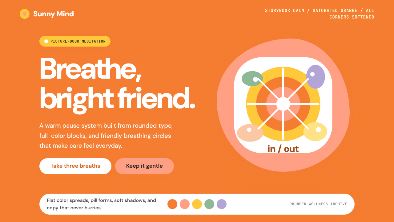 Headspace Orange MeditationMeditation becomes friendly. Orange blocks, DM Sans, and pill shapes soften e…冥想变得亲切:橙色块、DM Sans 与药丸圆角软化一切。
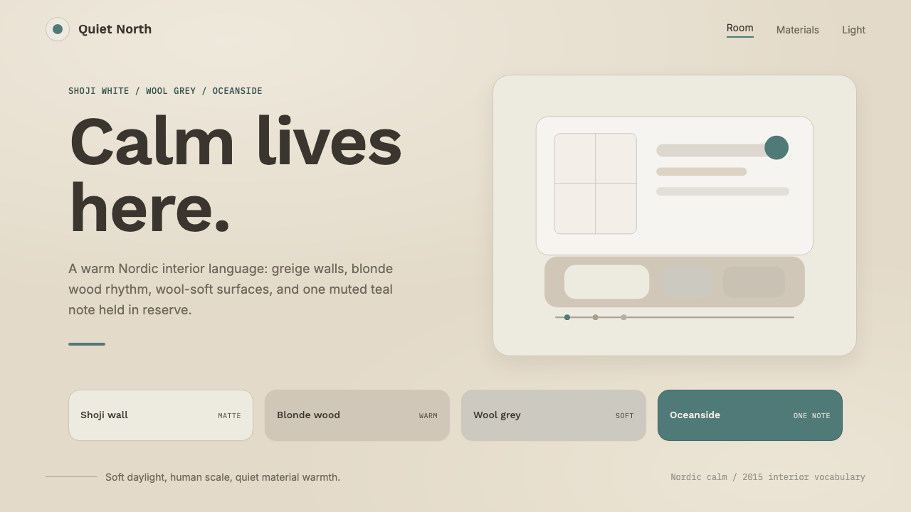 Scandinavian HyggeCalm is the brief. Greige walls, wool-grey cards, and one muted teal line.平静就是命题:灰米墙面、羊毛灰卡片与一抹灰青线。
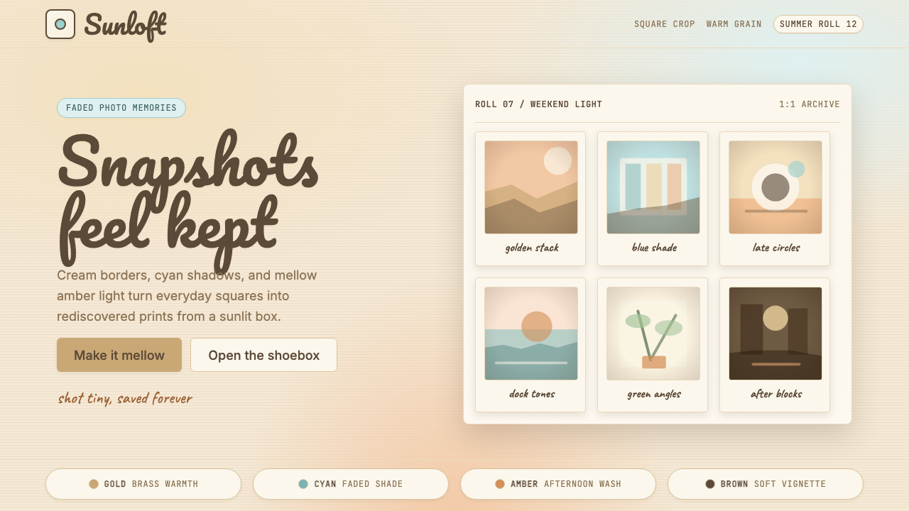 Instagram 2010s FilterWhen photos felt like memories. Faded warmth, dark vignettes, cream-tinted Po…Instagram 滤镜时代的拟物温度:褪色暖调、暗角晕影、宝丽来奶油色相框—…
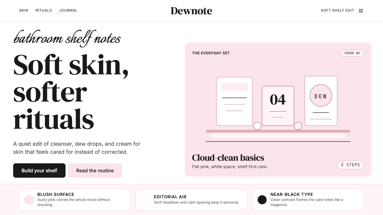 GlossierBeauty as a friend's conversation. Dusty pink (never bubblegum), editorial se…美妆是闺蜜间的私语:唯一标志性的灰粉色(不是泡泡糖粉)、编辑式衬线字体、纯平面…
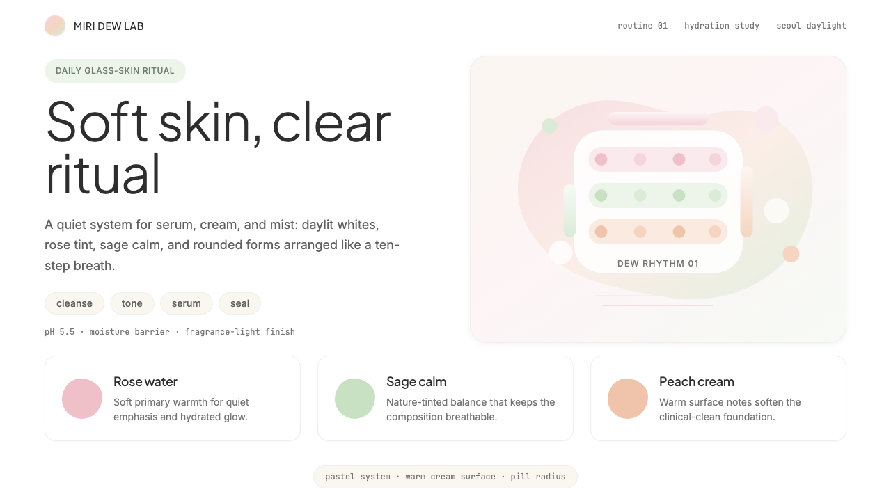 K-Beauty CleanCalm arrives dewy. Rose, sage, and peach pastels float through airy rounded f…水润的平静:玫瑰、鼠尾草与蜜桃粉彩在圆润留白中漂浮。
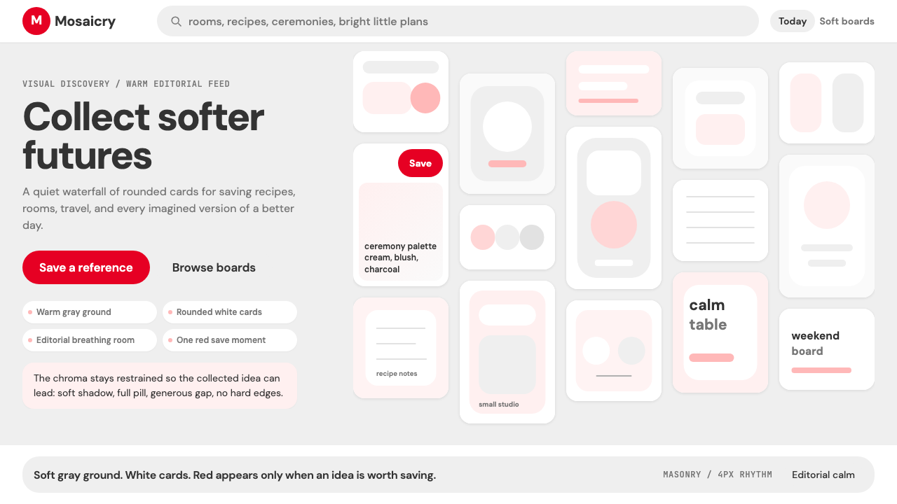 Pinterest 2024Aspirational calm. Warm gray masonry, rounded white pins, one surgical red sa…向往感很安静:暖灰瀑布流、白色圆角卡片、一颗红色保存按钮。