What is K-Beauty Clean?什么是 K-Beauty Clean?
K-Beauty Clean translates the dewy, glass-skin glow of Seoul's skincare revolution into a design language built on soft pastels, generous white space, and typography as calm as a freshly cleansed face.K-Beauty Clean 将首尔护肤革命标志性的水光肌光泽,转译为一套由柔和粉彩、充裕留白与清透字体排印构成的设计语言。
K-Beauty Clean in briefK-Beauty Clean 速览
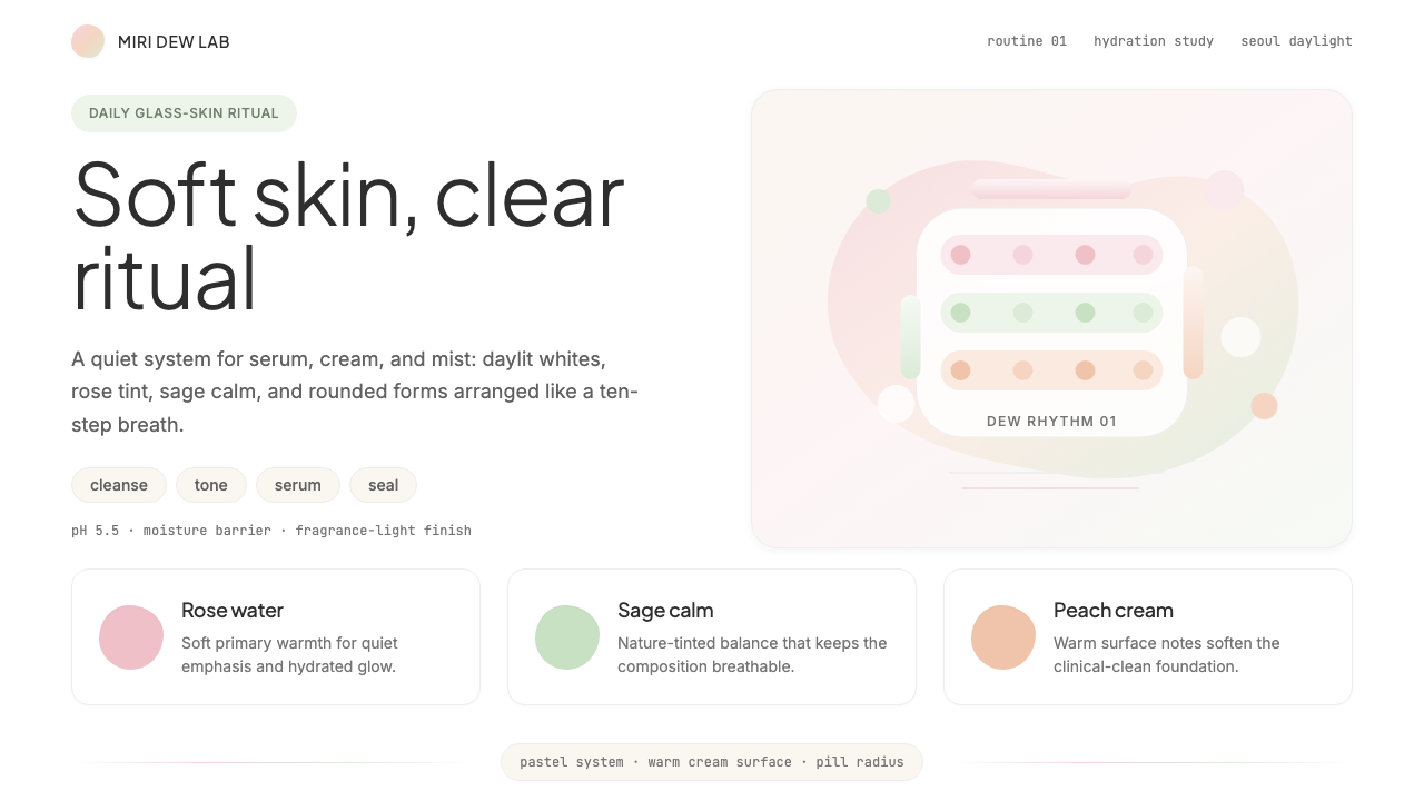
K-Beauty Clean is a visual design system derived from the global wave of South Korean skincare culture. It draws on the packaging, retail identity, and digital presence of brands that made 'glass skin' — luminous, hydrated, poreless-looking skin — a worldwide aspiration. The palette runs through soft rose, sage, peachy beige, and milky white, anchored by crisp off-white grounds that evoke freshly washed skin rather than clinical sterility. Every surface feels moisturized: smooth, light-reflective, never harsh.K-Beauty Clean 是一套源自韩国护肤文化全球浪潮的视觉设计系统,汲取了那些将「玻璃肌」——通透、水润、毛孔细腻的肌肤状态——带入全球视野的品牌的包装、零售形象与数字界面。色板流淌于柔雅玫瑰、薄荷鼠尾草、蜜桃米白与奶白之间,以清爽的米白色底面为基调,唤起的是刚洁面后的肌肤质感,而非冷冽的诊所气息。每一个界面都仿佛刚涂抹了精华:细腻、有光泽,绝无刺眼的生硬。
The aesthetic philosophy at the core of K-Beauty Clean is skincare-as-self-care. Korean beauty culture reframed the daily skincare routine from an obligation into a ritual of gentle attentiveness — and the visual language follows. Forms are rounded and organic rather than angular. Layouts breathe with intentional white space. Interactive elements like pill-shaped buttons and softly rounded cards feel approachable and friendly. Nothing shouts; everything invites.K-Beauty Clean 的核心美学哲学是护肤即自我关爱。韩国美妆文化将日常护肤程序从一种义务重新定义为一种温柔专注的仪式——其视觉语言也随之而来。形态是圆润而有机的,而非棱角分明。版面因刻意留白而自由呼吸。胶囊形按钮、边角柔和的卡片等交互元素,传递着亲切与包容。没有任何元素在喧嚷;每一处都在邀请。
Unlike minimalism that achieves restraint through severity, K-Beauty Clean achieves restraint through softness. It is refined without being cold, clean without being blank. The result is a system that works equally well for a ten-step skincare brand, a wellness subscription app, or a beauty editorial — anywhere the experience needs to feel nurturing, trustworthy, and effortlessly elegant.与通过严肃感实现克制的极简主义不同,K-Beauty Clean 通过柔软感实现克制。它精炼而不冰冷,干净而不空洞。这使它成为一套在护肤品牌、健康订阅应用乃至美妆编辑内容中同样适用的系统——只要体验需要传递关怀、可信赖感与毫不费力的优雅,它都游刃有余。
See the K-Beauty Clean design system查看 K-Beauty Clean 完整设计系统
Where does K-Beauty Clean come from?K-Beauty Clean 从何而来?
The visual language of K-Beauty Clean cannot be separated from the rise of the Hallyu wave — the Korean Wave of cultural exports, including K-pop, K-drama, and K-beauty — that accelerated through the 2010s and reached peak global mainstream influence between roughly 2014 and 2020. South Korean skincare brands, which had long developed sophisticated multi-step routines and innovative formulations at home, found themselves suddenly in global demand. Brands like Innisfree, Laneige, Cosrx, and Sulwhasoo were forced to develop design identities that could communicate across cultural contexts while retaining the distinctly Korean sensibility of their origin.K-Beauty Clean 的视觉语言无法与韩流——包括K-pop、K-剧与K-美妆在内的韩国文化输出浪潮——的崛起割裂来看。这股浪潮贯穿2010年代,在大约2014至2020年间达到全球主流影响力的顶峰。韩国护肤品牌长期在本土深耕精细的多步骤护肤程序与创新配方,突然发现自身面临全球市场的强烈需求。Innisfree、兰芝、Cosrx、雪花秀等品牌不得不构建能够跨越文化语境传播的设计形象,同时保留其源产地独特的韩式感性。
The aesthetic roots of K-Beauty Clean reach into Hanji paper culture, celadon ceramics, and the restrained color philosophy of traditional Korean court dress — where soft, undyed or lightly tinted fabric was prized over vivid color. These cultural textures informed the palette choices of early K-beauty packaging designers: muted tones, gentle gradations, and forms that feel hand-touched rather than factory-stamped. The influential Innisfree design team, working from the brand's Jeju island nature positioning, pioneered the use of botanical photography on minimal, breathing white grounds that became a template across the industry.K-Beauty Clean 的美学根系延伸至韩纸文化、青瓷器物与韩国宫廷服饰克制的色彩哲学之中——那里,柔和的未染色或轻染色织物远比浓艳色彩更受珍视。这些文化质感渗透进早期韩妆包装设计师的色彩选择:低饱和的色调、轻柔的渐变、以及那种手工触感而非流水线印记的形态。Innisfree 设计团队以品牌的济州岛自然定位为出发点,率先将植物摄影置于极简呼吸的白色底面之上,开创了一套在行业内被广泛效仿的视觉模板。
The American beauty editor Emily Weiss and the global clean beauty movement of the mid-2010s played an important amplifying role. Weiss's Glossier, though American, absorbed and rebroadcast many K-beauty visual codes — the skin-first philosophy, the dewy glow, the soft millennial pink — to an English-speaking audience already primed by K-drama aesthetics on streaming platforms. This cross-pollination meant that K-Beauty Clean as a design language became genuinely international: a synthesis of Seoul's product innovation and a global appetite for gentle, sensorial self-care.美国美妆编辑 Emily Weiss 与2010年代中期兴起的全球清洁美妆运动发挥了重要的放大作用。Weiss 创立的 Glossier 虽是美国品牌,却吸收并向英语世界受众再广播了许多韩妆视觉密码——肌肤优先的哲学、水润光泽感、柔和的千禧粉——而这批受众早已通过流媒体平台上的K-剧建立起审美预期。这种跨文化交融使 K-Beauty Clean 作为设计语言真正国际化:它是首尔产品创新与全球对温柔感官自我关爱之渴望的综合产物。
The digital maturation of the style happened alongside the rise of Instagram and YouTube beauty content from approximately 2015 onward. Skincare influencers filming their ten-step routines needed backgrounds and branding that felt consistent with the products: softly lit, pastel-toned, uncluttered. Brand digital channels — Instagram grids, product landing pages, app interfaces — developed a coherent visual grammar in response: rounded thumbnails, tonal palettes, generous padding, and type that felt as light as a serum. By the early 2020s, K-Beauty Clean had become a recognized and widely imitated global aesthetic, applied far beyond beauty into wellness tech, food and beverage, and lifestyle subscription products.这一风格的数字成熟,与大约2015年起 Instagram 和 YouTube 美妆内容的爆发同步发生。记录十步护肤程序的护肤博主需要与产品气质一致的背景与品牌形象:柔和的打光、粉彩色调、简洁无杂。品牌数字渠道——Instagram 九宫格、产品落地页、应用界面——随之发展出连贯的视觉语法:圆角缩略图、同色系色板、宽裕的内边距,以及像精华液一样轻盈的字体排印。至2020年代初,K-Beauty Clean 已成为被广泛辨识与模仿的全球美学,其应用范围早已超越美妆,延伸至健康科技、食品饮料与生活方式订阅产品。
What defines the K-Beauty Clean look?K-Beauty Clean 的视觉特征是什么?
Palette色彩
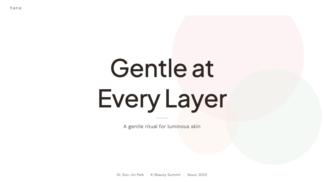
The color vocabulary runs through soft, desaturated pastels — powder rose, celadon sage, peachy beige, and lavender mist — layered over milky white or warm off-white grounds. Accents are kept within the same low-saturation family rather than introduced as sharp contrast. The overall effect is tonal and harmonious, evoking a skincare flatlay rather than a graphic poster. Black is used sparingly and only for body text or fine structural lines; it never dominates.色彩词汇流淌于低饱和的柔和粉彩之间——粉玫瑰、青瓷鼠尾草、蜜桃米色与薰衣草雾感——层叠于奶白或暖米白的底面之上。强调色保持在同一低饱和色系内,而非以强烈对比引入。整体效果是同色调的、和谐的,唤起的是护肤品平铺照的意境而非平面海报的冲击感。黑色用量极少,仅用于正文或细线结构;它从不主导版面。
Form and Shape形态与造型
Rounded corners and pill-shaped elements are the signature of K-Beauty Clean. Buttons, cards, tags, and containers all carry generous border-radius, softening the visual field into something that feels touchable and gentle. Organic blob-like shapes — irregular, asymmetrical, echoing water droplets or facial serums — appear as background motifs and decorative accents. Angular or perfectly geometric forms are avoided; everything curves slightly, breathing warmth into the layout.圆角与胶囊形元素是 K-Beauty Clean 的标志。按钮、卡片、标签与容器均采用大圆角,将视觉场域软化为触感亲近、温柔可及的质地。不规则的有机「水滴」形态——不对称、回响着精华液或水珠轮廓——作为背景母题与装饰点缀出现。棱角或完全几何化的形态被刻意回避;一切都微微弯曲,为版面注入温度。
Typography字体排印
Type selection leans toward clean, geometric sans-serif faces with friendly proportions — slightly wide letterforms with open apertures that feel approachable rather than authoritative. Weight contrast is gentle: headlines step up in size without turning heavy or imposing. Letter-spacing in headings is slightly open, adding to the airy, unhurried quality of the layout. Korean Hangul script, where present, is chosen for its rounded, balanced stroke structure that harmonizes naturally with the overall softness of the system.字体选用倾向于比例亲切的几何无衬线字体——字形略宽、字腔开放,令人感到温和可亲而非权威庄重。字重对比是轻柔的:标题以字号放大,而非以字重加重。标题字距略为舒展,为版面增添空气感与从容感。在出现韩文的场合,字体选择以笔触圆润、结构平衡的字形为准,与整套系统的柔和气质自然和谐。
White Space and Layout留白与版面
Generous white space is not a secondary concern but a primary design material in K-Beauty Clean. Elements are given room to breathe; nothing crowds. Column widths are comfortable for reading, with wide margins that let the eye rest. Vertical rhythm is slow and unhurried, with ample space between sections. This spacing philosophy mirrors the pacing of a skincare routine — deliberate, attentive, never rushed — and signals that the brand cares about the user's experience of calm.大量留白在 K-Beauty Clean 中不是次要考量,而是首要的设计材料。每个元素都有充裕的呼吸空间;没有任何元素显得拥挤。栏宽舒适易读,宽阔的页边距让眼睛得以休憩。垂直节奏缓慢从容,段落之间空间充裕。这种留白哲学呼应着护肤程序的节奏——专注、细致,从不仓促——传递着品牌对用户平静体验的用心。
Surface and Texture质感与肌理
K-Beauty Clean favors surfaces that suggest luminosity without introducing literal texture. A very subtle gradient on a card background — shifting from milky white to the palest pink — evokes the light-reflective quality of well-moisturized skin. Frosted glass effects and soft, diffused glows replace hard shadows. Where shadows appear, they are barely-there, pale, and cool-toned — more like the shadow under a floating petal than a structural anchor. This treatment makes the interface feel fresh and skin-like, never flat or matte.K-Beauty Clean 偏爱能暗示光泽感而不引入字面质感的界面表面。卡片背景上极为细腻的渐变——从奶白过渡至最淡的粉调——唤起的是滋润肌肤的光反射质感。磨砂玻璃效果与柔和漫射光晕取代了硬边阴影。偶尔出现的阴影,淡得几乎不可察觉,以冷色调呈现——更像花瓣下方的阴翳而非结构性锚定。这种处理方式让界面感觉清新如肌肤,而不沉闷或哑光。
Imagery and Photography图像与摄影
Photography in K-Beauty Clean is styled with consistent intentionality: soft, diffused natural light — never harsh studio strobes — on pale backgrounds. Products are arranged in flatlay compositions with botanical props — dried florals, fresh herbs, translucent serum drops — that reinforce the natural and gentle positioning. Skin photography is dewy and close-toned, avoiding high-contrast dramatic lighting. Illustrations, when used, tend toward delicate line work or watercolor-adjacent washes in the pastel palette, never bold graphic shapes.K-Beauty Clean 中的摄影风格有一贯的刻意感:柔和漫射的自然光——绝非刺眼的棚灯——打在浅色背景上。产品以平铺构图呈现,搭配植物道具——干花、新鲜草本、通透的精华液液滴——强化自然与温柔的品牌定位。肌肤摄影呈水润光泽感,色调相近,规避戏剧化的强对比打光。插画若出现,倾向于细腻的线条画或接近水彩晕染的粉彩色块,而非大胆的平面几何形。
Tone and Micro-copy语气与微文案
The written voice that accompanies K-Beauty Clean design is warm, personal, and gently encouraging — a friend who knows skincare rather than a clinical expert issuing instructions. Button labels use soft imperatives ('Discover your routine', 'Start glowing') rather than transactional commands ('Buy now', 'Submit'). Error messages are apologetic and helpful, not curt. Onboarding copy acknowledges the user's individuality. This voice consistency is as much a part of the aesthetic system as the color palette.与 K-Beauty Clean 设计相配的书面语气,是温暖的、有个人感的、轻柔鼓励的——像一位了解护肤的朋友,而非发号施令的临床专家。按钮文案使用柔和的祈使语气(「发现你的护肤程序」、「开始焕发光泽」),而非交易性的命令(「立即购买」、「提交」)。错误提示带着歉意且富有帮助,而不是简短生硬。新手引导文案承认每位用户的独特性。这种语气的一致性,与色板同等重要,都是美学系统的组成部分。
See the K-Beauty Clean design system查看 K-Beauty Clean 完整设计系统
Who shaped K-Beauty Clean?谁塑造了 K-Beauty Clean?
The design team behind Innisfree — AmorePacific's nature-focused brand anchored in Jeju Island — created some of the most widely imitated packaging and digital templates in K-beauty history. Their approach of placing minimal, botanically-detailed product photography on spacious white grounds, pairing it with clean rounded type and a restrained green-and-cream palette, defined what international audiences recognized as the K-beauty aesthetic from the mid-2010s onward. Their work influenced how the entire industry presented skincare as a gentle, nature-connected ritual.Innisfree——爱茉莉太平洋旗下以济州岛自然为根基的品牌——背后的设计团队,创造了韩妆史上被模仿最广泛的包装与数字模板。他们将精细植物摄影置于留白充裕的白色底面上,搭配圆润干净的字体与克制的绿与奶白色板的方式,定义了2010年代中期以来国际受众所认知的韩妆美学。他们的工作影响了整个行业将护肤呈现为温柔自然仪式的方式。
Laneige, another AmorePacific flagship, became globally synonymous with the 'water bank' and dewy glow concept that underpins much of K-Beauty Clean's visual identity. The brand's design team developed a visual system built around deep water blues, luminous whites, and translucent product photography that literally showed the glistening texture of hydration. Their campaign imagery — often featuring water, light reflections, and a cool, clean atmosphere — established a template for how Korean beauty brands communicate the sensation of moisture through design rather than just copy.兰芝,另一爱茉莉太平洋旗舰品牌,在全球范围内成为「水酷」与水润光泽概念的代名词,而这一概念是 K-Beauty Clean 视觉形象的重要基石。品牌设计团队围绕深邃水蓝、通透白与能直观呈现水润质感的产品摄影,建立了一套视觉系统。他们的广告图像——常以水、光反射与清冷洁净的氛围为主题——确立了韩妆品牌如何通过设计而非仅靠文案来传达水润感受的模板。
Cosrx represents a different strand of K-Beauty Clean — the clinical-minimal variation that strips back even the soft pastels in favor of stark white, pharmaceutical packaging aesthetics, and ingredient-first transparency. Their design philosophy, which deliberately avoided luxury signaling and emphasized the functional honesty of what was inside the bottle, influenced a generation of direct-to-consumer skincare brands worldwide. Cosrx demonstrated that K-Beauty Clean could communicate trust and efficacy through restraint just as effectively as it could communicate indulgence through softness.Cosrx 代表着 K-Beauty Clean 的另一个分支——临床极简变体,它甚至将柔和粉彩也剥去,转而以纯白、类药妆的包装美学与成分优先的透明度为主。他们刻意回避奢侈感信号、强调瓶内成分功效诚实的设计哲学,影响了全球一代直面消费者的护肤品牌。Cosrx 证明,K-Beauty Clean 可以通过克制传达信任与功效,与通过柔软传达享受同样有力。
Though American, Emily Weiss — founder of Into The Gloss and Glossier — acted as a crucial cultural translator between the Korean beauty world and the English-speaking West. Her editorial and brand work absorbed and rebroadcast K-beauty visual codes — the skin-first philosophy, the dewy flatlay aesthetic, the millennial pink tones, the conversational copy voice — to an audience primed by K-drama and K-pop through streaming platforms. Glossier's visual identity helped establish K-Beauty Clean as a globally legible aesthetic language, not just a Korean export.尽管身为美国人,Emily Weiss——Into The Gloss 与 Glossier 的创始人——在韩国美妆世界与英语西方世界之间扮演了关键的文化翻译者角色。她的编辑与品牌工作吸收并向受众再广播了韩妆视觉密码——肌肤优先的哲学、水润平铺图美学、千禧粉色调、对话式文案语气——而这批受众早已通过流媒体平台上的K-剧与K-pop建立了审美预期。Glossier 的视觉形象帮助 K-Beauty Clean 成为全球可读的美学语言,而不只是韩国的文化输出。
Sulwhasoo, AmorePacific's luxury Korean herbal skincare brand, developed the premium end of the K-Beauty Clean spectrum. Their design team blended traditional Korean craft references — celadon glazes, hanji paper texture, the asymmetric elegance of Korean lacquerware — with modern minimal packaging to create a visual language that was unmistakably Korean yet globally luxurious. Sulwhasoo demonstrated how K-Beauty Clean could carry deep cultural specificity without sacrificing international accessibility, and influenced how global luxury beauty brands began integrating East Asian craft aesthetics.雪花秀,爱茉莉太平洋旗下的奢华韩方护肤品牌,发展出了 K-Beauty Clean 光谱的高端面向。其设计团队将韩国传统工艺参照——青瓷釉色、韩纸质感、韩国漆器的不对称优雅——与现代极简包装相融合,创造出一套无疑是韩国的、同时也是全球奢华的视觉语言。雪花秀证明,K-Beauty Clean 可以承载深厚的文化特殊性而不牺牲国际可达性,并影响了全球奢侈美妆品牌开始整合东亚工艺美学的方式。
How do you use K-Beauty Clean today?今天怎么用 K-Beauty Clean?
K-Beauty Clean is among the most versatile contemporary styles for digital products that need to feel trustworthy, approachable, and premium simultaneously. The key to applying it correctly lies in understanding that its restraint comes from softness rather than severity — the goal is warmth through refinement, not minimalism through subtraction. Every design decision should ask: does this feel gentle? Does this breathe? Does this invite rather than demand?K-Beauty Clean 是当代数字产品中适用性最广的风格之一,尤其适合那些需要同时传递可信赖感、亲切感与高端感的场景。正确应用它的关键,在于理解它的克制源自柔软而非严肃——目标是通过精炼实现温度,而非通过减法实现极简。每一个设计决策都应该追问:这感觉温柔吗?这能呼吸吗?这是在邀请,还是在要求?
For presentation slides, K-Beauty Clean excels on cover slides that establish an immediate mood: a full-bleed pastel ground, a single organic shape as a background element, and a title set in clean rounded type with generous letter-spacing. The dewy, airy quality should feel immediate. Content slides work best when treated as breathing galleries — one key idea per slide, generous padding around all elements, and a tonal illustration or product-quality photograph as the visual anchor. Data slides should adopt a soft-primary palette for charts, with rounded bar corners and gentle grid lines that feel like guide marks rather than cage bars. Avoid dense tables; translate data into simple, visually calm forms.在演示文稿中,K-Beauty Clean 在封面页上表现出色,能立即建立情绪基调:满版粉彩底色、一个有机形态作为背景元素、标题以圆润干净的字体设置并保持舒展的字距。水润通透的质感应当是即时可感的。内容页最好被当作呼吸式的展廊来处理——每页一个核心想法,所有元素四周保留充裕的内边距,以同色调插图或产品质感的摄影作为视觉锚点。数据页应以柔和粉彩色板为图表着色,柱状图边角圆润,网格线柔和得像引导标记而非牢笼栅栏。避免密集表格;将数据转化为视觉上平静的简洁形式。
For web interfaces — particularly dashboards, wellness app home screens, and subscription product landing pages — K-Beauty Clean delivers its clearest value. The recommended approach is a warm off-white or milky base, a restrained two or three-tone pastel accent system, rounded card components with barely-there shadows, and typography that favors generous line-height and unhurried spacing. Pricing pages benefit from the style's inherent trustworthiness: soft pastel tier cards, a rounded highlight state for the recommended plan, and copy that speaks to the user's wellbeing rather than the transaction.对于网页界面——尤其是仪表板、健康应用首页与订阅产品落地页——K-Beauty Clean 能发挥最清晰的价值。推荐方案是:暖调米白或奶白作为底色,克制的二至三色粉彩强调系统,圆角卡片组件搭配若有若无的投影,字体排印倾向于宽行距与从容的字间距。定价页面受益于这一风格内在的可信度:柔和粉彩色调的套餐卡,推荐套餐以圆润高亮状态呈现,文案关注用户的健康感受而非交易本身。
For editorial and marketing use, K-Beauty Clean supports high-quality lifestyle photography with minimal graphic intervention. The design's role is to frame and breathe — to give images room and to provide quiet typographic scaffolding rather than competing for attention. A K-Beauty editorial layout typically leads with a full-width hero image in natural light, followed by narrow body columns with wide margins, section breaks marked by soft tonal dividers rather than bold lines, and callouts set in a slightly larger, spaced version of the body face. Marketing email templates work well with a single accent-color call-to-action button — pill-shaped, never rectangular — against a pale background.对于编辑与营销用途,K-Beauty Clean 支持高质量生活方式摄影以最少的图形干预为框架。设计的角色是框定与呼吸——为图像提供空间,提供安静的排印支架,而非与其争夺注意力。K-Beauty 编辑版面通常以自然光下的全宽主图开场,随后是窄栏正文搭配宽阔页边距,段落分隔以柔和同色调分割线标记而非粗线条,引用文字以略大、字距舒展的正文字体呈现。营销邮件模板适合以单一强调色的行动按钮——胶囊形,绝不用矩形——置于浅色背景上。
A common mistake when applying K-Beauty Clean is over-saturating the palette. The style's pastels are inherently low in saturation; introducing even one color at full vibrancy immediately breaks the tonal harmony and makes the design feel cheap rather than refined. A related mistake is using too many pastel tones at once — the system works best with a primary neutral ground, one dominant pastel accent, and one secondary accent used sparingly. Designers also frequently underestimate the importance of spacing: the dewy, airy quality of the style depends entirely on generous white space. Shrinking margins or tightening padding to fit more content destroys the atmosphere that makes the style work.应用 K-Beauty Clean 时最常见的错误是过度饱和色板。这一风格的粉彩色本质上饱和度极低;哪怕引入一个全饱和度的色彩,也会立即打破同色调和谐,让设计感觉廉价而非精炼。另一个相关错误是同时使用过多粉彩色调——这套系统最有效的做法是:一个主导中性底色、一种主要粉彩强调色、一种次要强调色节制使用。设计师也常常低估留白的重要性:这一风格水润通透的质感完全依赖于充裕的留白。收缩页边距或压缩内边距以容纳更多内容,会彻底摧毁让这种风格奏效的氛围。
See the K-Beauty Clean design system查看 K-Beauty Clean 完整设计系统
K-Beauty Clean — FAQK-Beauty Clean · 常见问题
Is K-Beauty Clean only appropriate for beauty and wellness brands?K-Beauty Clean 只适合美妆和健康品牌吗?
Not at all — the style has migrated well beyond its origin category. Its core values (softness, trust, clarity, approachability) translate cleanly to any product where the user's emotional state matters: food and beverage subscription services, fertility and women's health apps, journaling and mindfulness tools, and premium lifestyle e-commerce. It works less well for products that need to signal power, precision, or technical authority — engineering tools, financial trading platforms, or cybersecurity products — where the gentle aesthetic can feel misaligned with what users need to feel confident in the product.完全不是——这种风格早已超越其起源品类迁移至更广泛的场景。它的核心价值(柔软感、信任感、清晰感、亲切感)可以清晰地转译至任何用户情绪状态至关重要的产品:食品饮料订阅服务、女性健康应用、日记与正念工具、高端生活方式电商。它在需要传递力量感、精确感或技术权威感的产品中则不那么适用——工程工具、金融交易平台或网络安全产品——在这些场景中,温柔的美学可能与用户对产品建立信心所需的感受产生错位。
How do I prevent K-Beauty Clean from looking generic or bland?如何避免 K-Beauty Clean 看起来千篇一律或平淡无奇?
The style's widespread adoption has produced many imitations that capture the surface markers — pink, rounded, lots of white space — without the underlying discipline. Differentiation comes from three areas. First, specificity of palette: choose a narrow two or three-tone combination and apply it consistently rather than pulling from a generic blush-and-sage library. Second, typographic voice: invest in the micro-copy and heading language; warmth of voice is a major differentiator when the visuals are quiet. Third, photography quality: the style amplifies great photography and exposes mediocre photography mercilessly; a truly distinctive K-Beauty Clean design usually has a signature photographic style developed specifically for the brand.这一风格的广泛流行催生了大量模仿作品,它们捕捉到了表面标志——粉色、圆角、大量留白——却缺乏内在的设计自律。差异化来自三个方面。其一,色板的特殊性:选择窄幅的二至三色组合并一贯执行,而非从通用的腮红与鼠尾草色库中随意取用。其二,字体排印的语气:投入于微文案和标题语言;当视觉趋于安静时,语气的温度是重要的差异化因素。其三,摄影品质:这一风格会放大优质摄影,也会毫不留情地暴露平庸摄影;真正有辨识度的 K-Beauty Clean 设计,通常有一套专门为品牌开发的标志性摄影风格。
Can K-Beauty Clean work in a dark-mode interface?K-Beauty Clean 能用于深色模式界面吗?
A dark adaptation is possible but requires a significant shift in approach. True dark K-Beauty Clean does not simply invert the palette — a cream-on-black reversal tends to feel clinical or futuristic rather than warm. The more successful approach is a deep, warm charcoal or muted navy as the base, with the pastel accents shifted slightly more luminous (as if lit from within) and all shadows removed in favor of subtle, warm glows. Product photography needs to be reshot or re-graded for dark grounds. Expect that roughly half the visual warmth of the light version will be lost, and compensate through particularly careful typographic spacing and warmer accent tones.深色适配版本是可能的,但需要对方法进行根本性调整。真正的深色 K-Beauty Clean 并非简单地反转色板——奶白与黑色的反转版本往往让人感觉更接近临床或科技感,而非温暖。更成功的方法是以深沉温暖的深炭灰或低饱和海军蓝作为底色,粉彩强调色略微提亮(如同由内部发光),并移除所有阴影以换取细腻的暖色光晕。产品摄影需要针对深色背景重新拍摄或调色。可以预期浅色版本约一半的视觉温度将会流失,需通过特别细心的字体排印间距与更温暖的强调色调来弥补。
How does K-Beauty Clean differ from generic 'millennial pink' design?K-Beauty Clean 与泛化的「千禧粉」设计有何不同?
Millennial pink as a trend (roughly 2016–2019) was primarily a color phenomenon — a specific dusty rose tone applied across industries with little underlying system. K-Beauty Clean is a full design system: the color choices are part of a coherent philosophy that also governs form (rounded, organic), spacing (generous), typography (friendly, unhurried), imagery (naturally lit, dewy), and voice (warm, personal). A millennial pink design might use the right color while getting everything else wrong. K-Beauty Clean without the pink still reads as K-Beauty Clean, because the system's character is carried primarily by form, spacing, and imagery rather than by any single color.千禧粉作为一种流行趋势(大约2016至2019年间),本质上是一种色彩现象——一种特定的沙粉玫瑰色调,在几乎没有底层系统的情况下被应用于各行各业。K-Beauty Clean 是一套完整的设计系统:色彩选择是一套连贯哲学的组成部分,这套哲学同时管辖着形态(圆润、有机)、间距(充裕)、字体排印(亲切、从容)、图像(自然打光、水润)与语气(温暖、有个人感)。一个千禧粉设计可能用了对的颜色,却把其他一切都做错了。K-Beauty Clean 去掉粉色之后依然读起来像 K-Beauty Clean,因为这套系统的气质主要由形态、间距与图像承载,而非由任何单一色彩决定。
What are the most important things to get right when using this style for a data-heavy product?在数据密集型产品中使用这一风格时,最需要把握哪些关键点?
Data-heavy interfaces are among the harder contexts for K-Beauty Clean because the style's strength — generous spacing, gentle contrast, minimal visual hierarchy — can work against information density. The keys are: first, use the pastel palette as a semantic system for data (one tone for each category or state) rather than decoratively; second, maintain the generous spacing within individual components even while fitting more components on screen — internal padding matters more than external margins when density is needed; third, replace hard data grid lines with very soft tonal bands that organize information without feeling like cages; and fourth, use the typographic hierarchy aggressively for data labels and metrics — size contrast is the primary organizing tool when color contrast must stay low.数据密集型界面是 K-Beauty Clean 较为挑战的应用场景之一,因为这一风格的强项——充裕留白、轻柔对比、简洁视觉层级——可能与信息密度的需求产生张力。关键点有以下几处:其一,将粉彩色板作为数据的语义系统使用(每种色调对应一个类别或状态),而非装饰性使用;其二,即使在屏幕上容纳更多组件时,也要在单个组件内部保持充裕的间距——当密度是需求时,内边距比外边距更重要;其三,以极为柔和的同色调色带替代硬性数据网格线,以组织信息而非形成笼栅感;其四,在数据标签与指标上积极运用字体层级——当色彩对比必须保持低调时,字号对比是首要的组织工具。
Related design styles相关设计风格
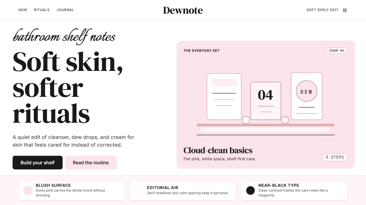 GlossierBeauty as a friend's conversation. Dusty pink (never bubblegum), editorial se…美妆是闺蜜间的私语:唯一标志性的灰粉色(不是泡泡糖粉)、编辑式衬线字体、纯平面…
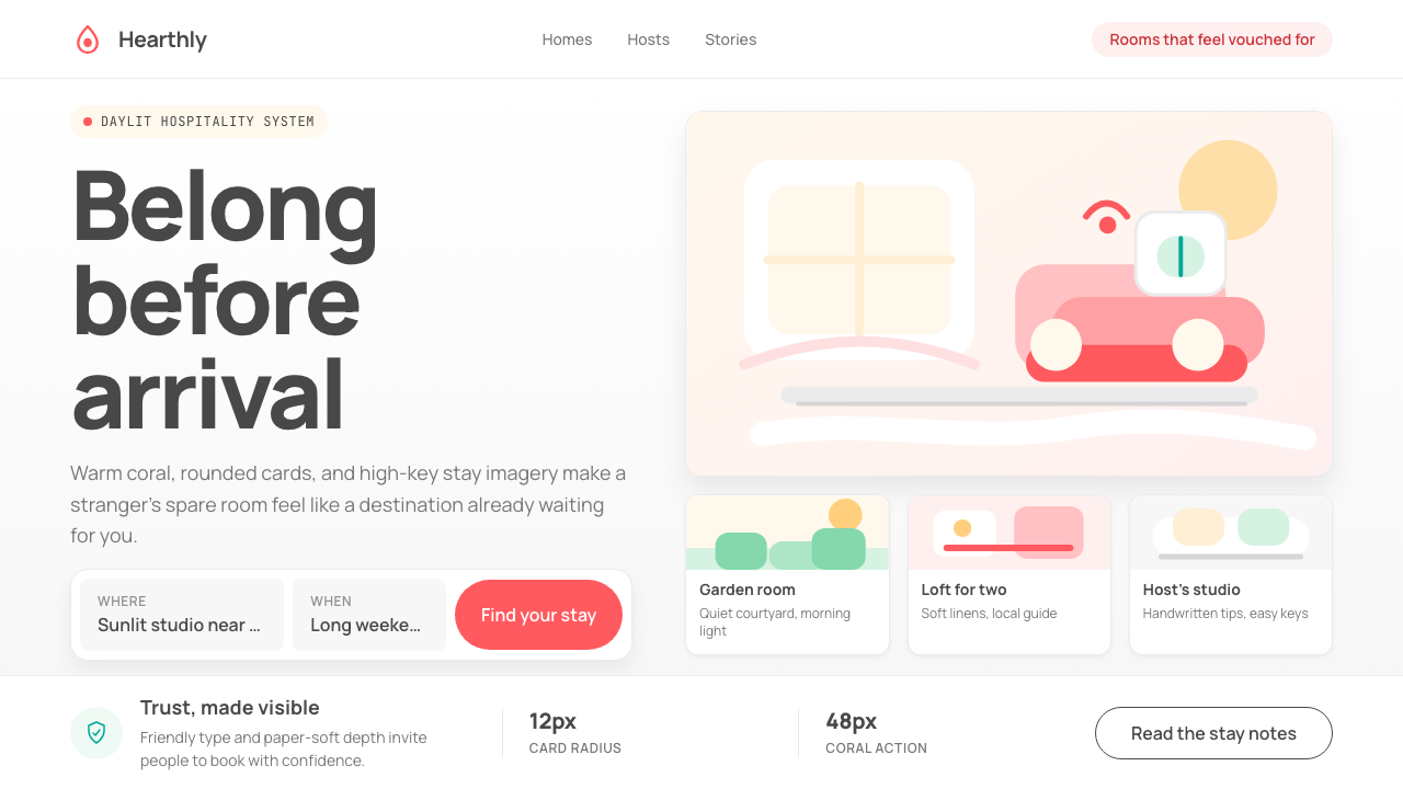 Airbnb 2014Coral red, soft pill cards, Cereal type. The Bélo wraps strangers in warm, da…Bélo 时代的珊瑚红与圆润 Cereal 字体——把陌生人之间的房间包装成阳…
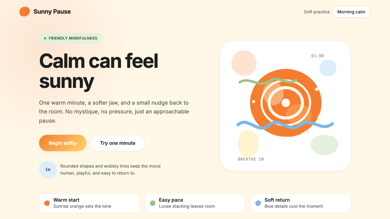 HeadspaceOptimism makes calm approachable. Sunrise orange and wobbly rounded forms bre…乐观让平静亲近:日出橙与摇摆圆形在奶油底上呼吸。
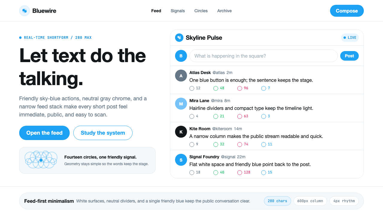 Twitter (Classic Bird)Text takes the stage. Sky blue actions, white feed stack, and hairline divide…文字占据舞台:天蓝动作、白色信息流与细分割线让表达清晰。
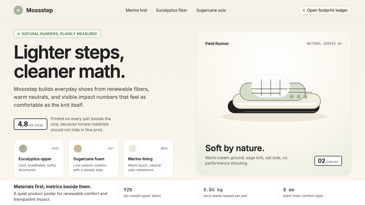 AllbirdsSustainability that breathes. Cream-and-sage tones, carbon labels next to pri…可持续,但绝不说教:奶油色与鼠尾草绿、碳足迹标签与价格并排——一种深呼吸般的诚…
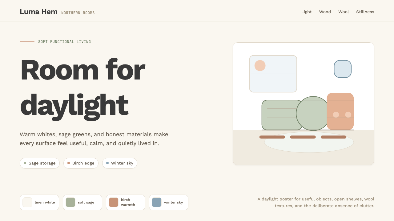 Scandi Hygge (IKEA)Warmth from restraint. Sage, linen white, Work Sans, and wide breathing room.克制中有温度:鼠尾草绿、亚麻白与 Work Sans 留出呼吸感。