What is Allbirds?什么是 Allbirds?
Allbirds proved that sustainability could be soft-spoken — a cream-and-sage palette, carbon labels beside price tags, and never a lecture in sight.Allbirds 证明了可持续可以不声张——奶油色与鼠尾草绿、碳足迹标签与价格并排,从不说教。
Allbirds in briefAllbirds 速览
Allbirds is a San Francisco-based footwear and apparel brand founded in 2014 by Tim Brown and Joey Zwillinger. Its visual identity is built around a single conviction: that environmental transparency should feel warm and approachable, not clinical or moralistic. The brand's palette of warm off-whites, muted sage greens, and soft earthy neutrals mirrors the natural materials at the heart of its products — merino wool, eucalyptus tree fiber, and sugarcane-derived foam.Allbirds 是2014年由蒂姆·布朗与乔伊·兹威林格在美国旧金山创立的鞋服品牌。其视觉识别建立在一个核心信念之上:环境透明度应该令人感到温暖、亲近,而非冷峻或说教。品牌的暖白色、柔和鼠尾草绿与大地中性色调色板,是其核心材料——美利奴羊毛、桉树纤维与甘蔗衍生泡沫——的视觉回响。
What makes the Allbirds visual system distinctive is its insistence on honesty as an aesthetic act. Carbon-footprint labels appear beside price tags the way nutrition facts appear on food packaging — matter-of-fact, unadorned, and genuinely informative. Product photography favors warm neutral backdrops over aspirational lifestyle staging. Copy stays conversational rather than evangelical. The cumulative effect is a brand that feels like it has nothing to hide, which, deliberately, it does not.Allbirds 视觉系统的独特之处在于将诚实变为一种美学行为。碳足迹标签出现在价格旁边,就像营养成分表出现在食品包装上——简洁直白、不加粉饰、真正传递信息。产品摄影偏爱暖色中性背景,而非充满雄心壮志的生活方式场景。文案语气平易近人,而非布道式。积累起来的效果是:一个品牌看起来没有什么需要隐瞒,而这正是它刻意为之的。
By the time the brand refreshed its visual identity through the early 2020s, it had established one of the more coherent 'eco-modern' design languages in consumer retail — one that other sustainable brands have since adopted and diluted. The original is distinguished by its restraint: fewer colors, softer tones, and a refusal to let environmental claims crowd out the product itself.到2020年代初品牌视觉系统更新之时,Allbirds 已在消费零售领域建立起最为连贯的「生态现代」设计语言之一——此后许多可持续品牌纷纷效仿,却往往稀释了原有的精髓。原版设计的辨识度在于其克制:更少的颜色、更柔和的色调,以及拒绝让环保主张喧宾夺主遮盖产品本身。
Where does Allbirds come from?Allbirds 从何而来?
The brand emerged from a frustration Tim Brown felt as a New Zealand professional footballer turned entrepreneur: he could not find a shoe made from natural materials that did not apologize for it aesthetically. His early experiments with merino wool led to a Kickstarter campaign in 2014 that was quickly oversubscribed, confirming that the market was ready for footwear that wore its material origins openly. Joey Zwillinger, a biotech engineer, joined Brown to scale the operation, bringing a rigorous scientific approach to material sourcing and carbon accounting.品牌的诞生源于蒂姆·布朗的一种挫败感——这位由新西兰职业足球运动员转型创业的人发现,他找不到一双用天然材料制成却不在外观上「道歉」的鞋子。他早期对美利奴羊毛的探索促成了2014年的众筹活动,并迅速超额认购,证明市场已经准备好接受一双公开展示材料来源的鞋。生物技术工程师乔伊·兹威林格随后加入布朗,共同扩展业务规模,并将严谨的科学方法引入材料采购与碳核算。
The visual identity that coalesced around the brand in its first years was in many ways a reaction against the dominant design vocabulary of that moment in Silicon Valley consumer tech — the flat bold gradients, the neon accents, the aggressive whitespace. Allbirds chose the opposite register: soft, warm, slightly imperfect, like a hand-pressed linen card rather than a polished app screen. The brand's New Zealand roots contributed a particular antipodean sensibility — open, unpretentious, closer to a farmer's market stall than a luxury boutique.品牌最初几年形成的视觉识别,在许多方面是对彼时硅谷消费科技主流设计语言的一种反应——那些大胆的渐变色块、霓虹强调色、激进的留白。Allbirds 选择了截然相反的调性:柔和、温暖、略带不完美感,像一张手工压制的亚麻名片,而非一块抛光的应用界面。品牌的新西兰根源带来了一种特别的南半球气质——开放、不做作,更接近一个农贸市场摊位,而非奢侈品精品店。
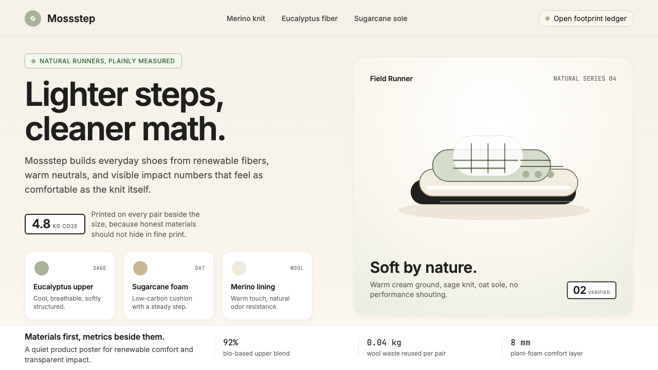
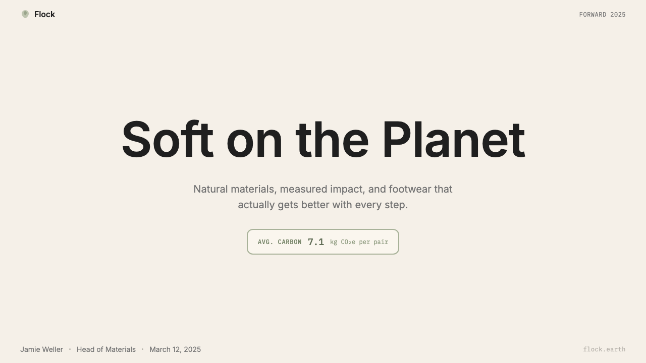
The carbon-labeling initiative, which began in earnest around 2020, became the most structurally important design decision the brand made after its initial palette. Rather than burying its environmental impact in a footnote, Allbirds placed a carbon score on every product page with the same visual weight as the price. This created a design system demand: a label typographically equivalent to a price tag, legible at a glance, and devoid of the green-washing iconography — leaves, globes, recyclable arrows — that crowds competitors' packaging.约于2020年正式启动的碳标签计划,成为品牌在初始色板之后最具结构性影响的设计决策。Allbirds 没有将环境影响埋进脚注,而是在每个产品页面上标注碳排放分数,其视觉权重与价格完全对等。这对设计系统提出了具体要求:一个在排版上与价格标签等量齐观的标签,一眼可读,且摒弃了竞品包装上常见的「洗绿」图标——树叶、地球、可回收箭头。
By the mid-2020s, Allbirds had become a case study in what B-Corp brand identity looks like in practice. Its certification as a B Corporation — a legal designation for for-profit companies meeting high standards of social and environmental performance — shaped every brand touchpoint, from the recycled shipping bags to the way in which the brand discusses its failures publicly alongside its achievements. The visual system is less a logo-and-color exercise than an argument: that the details of how a thing is made are as important to show as the thing itself.到2020年代中期,Allbirds 已成为B类企业品牌识别在实践层面的标准案例。其B型企业认证——一种对满足高社会与环境绩效标准的营利性公司的法律认定——塑造了每一个品牌触点,从循环利用的快递袋到品牌公开讨论自身失败与成就的方式。这套视觉系统与其说是一项徽标与色彩练习,不如说是一个论点:一件东西是如何被制造出来的,与这件东西本身同样值得展示。
What defines the Allbirds look?Allbirds 的视觉特征是什么?
Palette色板
The Allbirds palette is built on warm off-whites and creams as the dominant ground, with muted sage and olive greens serving as the primary brand accent. Earthy taupes, oat tones, and soft terracotta appear as supporting naturals. There are no saturated primaries, no neon accents, and no cool-toned grays — every hue is slightly warm, as if slightly exposed to sun or hand-touched. The palette communicates natural origin without resorting to the clichéd bright greens of conventional eco-branding.Allbirds 的色板以温暖的米白色与奶油色作为主要底色,柔和的鼠尾草绿与橄榄绿作为主要品牌强调色。大地棕褐、燕麦色调与柔和砖红作为辅助自然色出现。没有饱和的原色,没有霓虹强调色,也没有冷灰调——每一种色相都略带暖意,仿佛经过日照或人手触摸。色板传递天然来源感,却不借助传统环保品牌常用的鲜亮绿色这一俗套。
Typography字体排印
Allbirds typography is warm and slightly rounded — soft without being playful, modern without being cold. Headline type sits with comfortable weight at generous sizes, giving the brand voice room to breathe without crowding the product. Body text is set at relaxed line spacing and modest measure, prioritizing readability over density. The brand avoids both the razor-thin letterforms of luxury fashion and the heavy geometric slabs of tech hardware; the tone lands closer to a well-designed independent magazine than a corporate annual report.Allbirds 的字体排印温润而略带圆润感——柔和但不俏皮,现代但不冷峻。标题字以舒适的字重和宽裕的尺寸呈现,让品牌声音有喘息空间而不遮盖产品。正文以宽松的行距和适中的行宽排版,优先考虑可读性而非信息密度。品牌既回避了奢侈时尚的极细字形,也回避了科技硬件的重磅几何字体;整体调性更接近一本设计精良的独立杂志,而非公司年报。
Carbon Label as Design Element碳标签作为设计元素
The most original contribution of the Allbirds visual system is the carbon-footprint label — a small, typographically clean score displayed with the same prominence as the product price. The label eschews green iconography and relies entirely on numeral and unit to communicate impact. This design decision converts a piece of supply-chain data into a brand signal: the willingness to display it plainly, without softening imagery, is itself the message. It also imposes a useful formal discipline — the label must be legible at small sizes and integrate cleanly into price-tag layouts across digital and print contexts.Allbirds 视觉系统最具独创性的贡献是碳足迹标签——一个排版简洁的小型分数,以与产品价格相当的显著程度展示。标签摒弃绿色图标,完全依靠数字与单位来传达影响。这一设计决策将一项供应链数据转化为品牌信号:愿意直白地展示它、不用软化图像加以掩盖,本身就是这条信息。它还施加了一种有益的形式纪律——标签必须在小尺寸下清晰可读,并能在数字与印刷环境的价格标签版式中干净地整合。
Photography and Texture摄影与质感
Allbirds product photography favors close-cropped, tactile shots that show the texture of materials — the weave of merino, the grain of natural rubber — over polished, highly retouched studio composites. Backgrounds are warm neutrals: raw linen, unbleached cotton, pale stone. This approach communicates material honesty visually: you are shown what the shoe is made of, not just what it looks like at arm's length. Lifestyle photography, where it appears, tends toward natural light, outdoor settings, and an unhurried pace — consistent with the brand's antipodean sensibility.Allbirds 的产品摄影偏爱紧凑裁切、具有触感的近景镜头,展示材料质感——美利奴羊毛的编织纹理、天然橡胶的颗粒感——而非高度修饰的棚拍合成图。背景是暖色中性调:原色亚麻、未漂白棉布、浅色石材。这一手法在视觉上传递材料诚实:你看到的是这双鞋用什么制成,而不只是它在一臂之距外的样子。生活方式摄影(当它出现时)倾向于自然光、户外场景和从容不迫的节奏——与品牌的南半球气质一脉相承。
Packaging and Materiality包装与物质性
Physical brand touchpoints — shoeboxes, bags, tissue, receipts — are made from recycled or renewable materials and carry that fact quietly, without ceremonial announcement. The shoebox doubles as a shipping box, eliminating a layer of packaging and a layer of branding in the same move. Color on packaging follows the brand palette: warm neutral grounds with minimal print, carrying only the information necessary. The material choice is itself the graphic statement: the unbleached cardboard and uncoated paper are the aesthetic, not a substrate awaiting decoration.实体品牌触点——鞋盒、购物袋、包装纸、收据——由回收或可再生材料制成,且悄然承载这一事实,不作仪式性宣告。鞋盒同时用作快递外箱,一举省去一层包装与一层品牌印刷。包装用色遵循品牌色板:暖色中性底面配以极简印刷,只承载必要信息。材料选择本身就是图形陈述:未漂白纸板与无涂层纸张就是美学本身,而非等待装饰的基底。
Conversational Tone对话式语气
The verbal identity is as important as the visual system and directly shapes how the visual system is designed. Allbirds copy is informal, self-deprecating, and specific — it will tell you the exact carbon score and then acknowledge that the brand is still working to reduce it. This honesty-as-personality approach means that the design system cannot be pompous or aspirational in the conventional luxury sense; it must stay legible, matter-of-fact, and grounded. Marketing layouts that are crowded, heavily layered, or visually dramatic are incompatible with the verbal register.语言识别与视觉系统同等重要,并直接塑造视觉系统的设计方式。Allbirds 文案非正式、带有自我解嘲感且具体——它会告诉你确切的碳排放分数,然后坦承品牌仍在努力减少这一数值。这种以诚实为个性的方式意味着,设计系统不能在传统奢侈品意义上表现得浮夸或充满渴望感;它必须保持清晰、平实而接地气。拥挤的、多层叠加的或视觉戏剧化的营销版面与这种语言调性格格不入。
Restraint and Negative Space克制与负空间
The most consistent formal discipline across all Allbirds design touchpoints is restraint in the deployment of elements. Digital pages carry generous white space around product images and text blocks. Marketing layouts resist the temptation to fill every available zone with brand content. The visual system relies on comfortable breathing room to signal confidence: a brand that is not anxious about being seen has no need to fill every corner. This negative space is not accidental emptiness — it is an active choice to let the product and the material story do the work.贯穿Allbirds所有设计触点最一以贯之的形式纪律,是元素运用上的克制。数字页面在产品图片与文字块周围保留充裕的留白。营销版面抵制将每个可用区域填满品牌内容的诱惑。视觉系统依靠舒适的呼吸空间来传递自信:一个对被看见不感到焦虑的品牌,无需填满每个角落。这种负空间不是无意识的空白——它是一种主动选择,让产品与材料故事自己说话。
Who shaped Allbirds?谁塑造了 Allbirds?
Brown co-founded Allbirds after a career as a New Zealand international footballer, bringing an outsider's impatience with the footwear industry's conventions. His original insight — that merino wool was an underused material with exceptional comfort properties — drove the first product, and his intuition that sustainable design should be honest rather than aspirational shaped the brand's visual register. He has served as CEO and as the primary public voice for the brand's environmental commitments, including its advocacy for an industry-wide carbon labeling standard.布朗在结束新西兰国家级职业足球生涯后联合创立了Allbirds,带来了一个外来者对鞋业惯例的不耐烦。他最初的洞见——美利奴羊毛是一种被低估的、具有卓越舒适性能的材料——推动了第一款产品的诞生;而他对可持续设计应当诚实而非充满渴望感的直觉,塑造了品牌的视觉调性。他担任首席执行官,并作为品牌环境承诺最主要的公众声音,包括倡导建立行业通用碳标签标准。
Zwillinger, a biotech engineer and Brown's co-founder, brought the scientific and operational rigor that transformed the brand from a single-product wool shoe into a materials-innovation company. His background in renewable energy and biotechnology directly shaped the brand's carbon-accounting framework — the infrastructure behind the carbon labels that became the brand's most distinctive design element. Zwillinger's insistence on measuring and disclosing actual lifecycle emissions, rather than offsetting or approximating, gave the visual system its factual backbone.兹威林格是生物技术工程师,也是布朗的联合创始人,他带来了科学与运营严谨性,将品牌从单一产品的羊毛鞋转型为一家材料创新公司。他在可再生能源与生物技术领域的背景直接塑造了品牌的碳核算框架——即碳标签背后的基础设施,而碳标签已成为品牌最具辨识度的设计元素。兹威林格坚持测量和披露实际生命周期排放数据,而非依赖碳抵消或估算,赋予了视觉系统其事实支柱。
The in-house brand team is responsible for translating the founders' material and ethical commitments into a coherent visual language across digital, retail, and packaging contexts. Unlike many DTC brands that outsource brand identity to a single agency, Allbirds developed its visual system iteratively, refining the palette, photography approach, and label system over multiple product cycles. The team's ongoing work includes maintaining the discipline of the warm-neutral palette against commercial pressures to introduce louder seasonal colors, and managing the visual integration of ever-more-specific sustainability metrics into product-level communication.品牌内部团队负责将创始人的材料与伦理承诺,转化为贯穿数字、零售与包装场景的连贯视觉语言。与许多将品牌识别外包给单一代理机构的直接面向消费者品牌不同,Allbirds 以迭代方式发展其视觉系统,在多个产品周期中持续打磨色板、摄影手法与标签系统。团队的持续工作包括:在引入更响亮季节性颜色的商业压力下坚守暖色中性色板的纪律,以及管理将日益具体的可持续性指标整合进产品级传播的视觉呈现。
While not a designer or brand figure in the conventional sense, B Lab — the nonprofit organization that administers B Corporation certification — has functioned as an external structural constraint on Allbirds' brand decisions. Meeting and maintaining B Corp certification requires public transparency about impact metrics, which in turn demands that those metrics be communicated legibly. The certification's reporting requirements effectively mandated the design problem that the carbon label solves: how to present environmental data with the same prominence as commercial data, at every customer-facing touchpoint.B实验室——负责管理B型企业认证的非营利组织——在传统意义上并非设计师或品牌人物,但它作为一种外部结构性约束,影响着Allbirds的品牌决策。获得并维持B型企业认证,要求对影响指标保持公开透明,这反过来要求这些指标必须以清晰可读的方式传达。认证的报告要求实际上规定了碳标签所要解决的设计问题:如何在每个面向消费者的触点上,以与商业数据同等的显著程度呈现环境数据。
How do you use Allbirds today?今天怎么用 Allbirds?
Applying the Allbirds design language to presentation decks works best when the deck's subject matter shares the brand's values of transparency, considered craft, and a willingness to show the work behind the product. Cover slides benefit from a warm off-white or cream ground with a single product or material photograph cropped to show texture rather than context. The title sits in comfortable, unhurried type — not dramatically oversized. A muted sage or earthy green accent can anchor section headers or call-out blocks without competing with the imagery. Avoid bold geometric shapes or dynamic diagonals; the cover should feel like a deep breath, not an announcement.将Allbirds设计语言应用于演示文稿,最有效的场景是当幻贝的主题与品牌的透明度、考究工艺和愿意展示产品幕后故事等价值观相契合时。封面页受益于温暖的米白色或奶油色底面,配以单张裁切精准、展示质感而非情境的产品或材料照片。标题以从容、不急促的字体呈现——不做戏剧性的超大处理。柔和的鼠尾草绿或大地绿调强调色可以锚定章节标题或引用块,而不与图像竞争。避免大胆的几何形状或动感的斜线构图;封面应感觉像一次深呼吸,而非一次宣告。
For content slides, the organizing principle is radical clarity with room to breathe. Use one hierarchical level of heading, a second level of body copy, and resist adding a third level of bullet sub-points. Leave generous margins. If a slide contains a single statistic or a single product claim, let it live alone — surrounded by warm neutral space rather than crowded by supporting visual elements. Data slides should follow the same discipline: simple bar or line charts, labeled with clear text rather than a legend, colored in the brand's warm neutrals with a single sage accent for the primary data series.对于内容幻贝,组织原则是极度清晰加上充足的呼吸空间。使用一个标题层级、一个正文层级,抵制添加第三个项目符号子层级的冲动。留下充裕的页边距。如果一张幻贝包含单一统计数据或单一产品主张,让它独立存在——被暖色中性空间包围,而非被支撑性视觉元素拥挤。数据幻贝应遵循同样的纪律:简洁的柱状图或折线图,用清晰的文字标注而非图例,以品牌暖色中性调着色,以单一的鼠尾草绿强调主要数据系列。
Web interfaces designed in the Allbirds register work well for sustainability-focused product pages, DTC brand stores, and any context where consumer trust is built through information rather than aspiration. The layout approach: generous vertical spacing between sections, product imagery that shows material texture at close range, and a pricing module that sits cleanly alongside secondary information (carbon score, material origin) at equivalent visual weight. Dashboards for impact reporting — internal or public — can use the same palette: warm ground, clear tabular data, sage accents for positive metrics and a warm terracotta for areas requiring attention.以Allbirds风格设计的网页界面,适用于关注可持续性的产品页面、直销品牌商店,以及任何通过信息而非渴望感建立消费者信任的场景。版面手法:章节之间留有充裕的垂直间距,产品图像在近距离展示材料质感,定价模块与次要信息(碳排放分数、材料来源)以等量的视觉权重并排呈现。用于影响力报告的仪表板——无论内部还是公开——可以使用相同的色板:暖色底面、清晰的表格数据、积极指标用鼠尾草绿强调,需要关注的领域用暖砖红。
Editorial and marketing applications suit long-form storytelling about supply chains, material science, or environmental commitments — the kind of content the brand publishes about its own manufacturing process. An editorial layout in this mode uses wide body text measure with a warm off-white ground, generous leading, and pull-quotes set in the same typeface at a larger size rather than switching to an accent face. Marketing pages for product launches work with the brand's texture-forward photography and a minimal overlay of type — a single product name, a single carbon score, a single price. Resist adding taglines, icons, or secondary descriptors that compete with the core product and data pairing.编辑与营销应用适合关于供应链、材料科学或环境承诺的长篇叙事——即品牌本身会发布的关于其制造过程的内容。这种模式下的编辑版面使用较宽的正文行宽、暖米白底面、充足的行距,以及用同一字体以更大字号排版的引用语,而非切换到强调字体。产品发布营销页面结合品牌质感优先的摄影与极简的文字叠加——单一产品名称、单一碳排放分数、单一价格。抵制添加与核心产品和数据组合竞争的标语、图标或次要描述语的冲动。
The most common mistake when working in the Allbirds visual register is introducing the color palette's warmth while abandoning its restraint — using the cream and sage tones as a permission structure to add visual richness through texture overlays, multiple type weights, floating cards, and ambient shadows. The palette is warm but the system is sparse. Any design that feels busy or layered has drifted from the source. The second most common mistake is using generic eco-iconography — illustrated leaves, recycling arrows, globe icons — alongside the brand's typographic data elements. The carbon label works precisely because it does not look like traditional environmental communication; adding that iconography erodes the honesty signal the whole system depends on.在Allbirds视觉风格中工作时最常见的错误,是引入色板的温暖感的同时放弃其克制——将奶油色与鼠尾草绿色调作为通过质感叠加、多重字重、悬浮卡片和环境阴影增添视觉丰富性的许可证。色板是温暖的,但系统是稀疏的。任何感觉繁忙或多层叠加的设计都已偏离源头。第二个最常见的错误是在品牌的字体数据元素旁边使用通用的环保图标——插图树叶、回收箭头、地球图标。碳标签之所以有效,正是因为它看起来不像传统的环境传播;添加这类图标会侵蚀整个系统所依赖的诚实信号。
Allbirds — FAQAllbirds · 常见问题
How is Allbirds' visual style different from other eco-brands?Allbirds 的视觉风格与其他环保品牌有何不同?
Most eco-brands lean heavily on bright greens, recycling symbols, illustrated nature motifs, and a general visual language that signals environmental consciousness through iconographic convention. Allbirds does the opposite: its palette is warm and earthy rather than bright-green, its environmental communication is typographic and data-driven rather than iconographic, and it applies no visual flourishes that announce its sustainability credentials. The result is a brand that communicates environmental commitment through structural design decisions — the carbon label, the material photography, the unbleached packaging — rather than through borrowed symbolism.大多数环保品牌大量依赖鲜亮绿色、回收符号、自然主题插图,以及通过图标惯例传递环保意识的普遍视觉语言。Allbirds 反其道而行:其色板是温暖的大地色而非鲜亮绿色,环境传播是字体化、数据驱动的而非图标化的,且不添加任何宣示其可持续资质的视觉装饰。结果是:一个通过结构性设计决策——碳标签、材料摄影、未漂白包装——而非借用符号学来传达环境承诺的品牌。
Can the Allbirds palette work for a dark-mode interface?Allbirds 的色板能用于深色模式界面吗?
The brand's native mode is light-ground — the warm off-whites and creams are central to its identity, and a dark inversion requires care. If a dark mode is necessary, the most faithful approach is to use a very dark warm neutral (a charcoal with a slight brown undertone rather than a cool-gray or pure black) as the ground, and bring the sage and earthy tones forward as mid-tone accents. The typography should remain light and readable without becoming stark. The key is maintaining the warm temperature across all values — cold darks feel inconsistent with the brand's sensibility even if the color choices are otherwise correct.品牌的原生模式是浅色底面——温暖的米白色与奶油色是其识别的核心,深色反转需要谨慎处理。如果必须使用深色模式,最忠实的做法是使用非常深的暖中性色(带有轻微棕色底调的木炭色,而非冷灰或纯黑)作为底面,并将鼠尾草绿和大地色调推进为中调强调色。字体应保持清晰可读而不显得刺目。关键是在所有明度值上维持暖温度——即便色彩选择在其他方面是正确的,冷调深色感觉与品牌气质也是不协调的。
How prominently should the carbon label feature in brand-inspired designs?在受品牌启发的设计中,碳标签应该占多大的视觉比重?
The carbon label's power comes from its equivalence with the price — it is not a badge or a certification stamp but a data field given equal status to commercial information. In designs inspired by the Allbirds system, the equivalent principle is: any environmental or impact metric you choose to display should receive the same typographic treatment as your primary commercial metric, placed in spatial proximity rather than relegated to a footer or secondary panel. If you cannot give it equal weight, consider not displaying it at all — a half-hearted disclosure communicates less confidence than no disclosure.碳标签的力量来自于它与价格的等量齐观——它不是一枚徽章或认证印章,而是一个被赋予与商业信息同等地位的数据字段。在受Allbirds系统启发的设计中,等效原则是:你选择展示的任何环境或影响指标,都应获得与主要商业指标相同的排版处理,以空间邻近的方式呈现,而非被降格至页脚或次要面板。如果你无法给予它同等的权重,请考虑完全不展示它——半心半意的披露所传达的信心,不如没有披露。
Is Allbirds' style appropriate for luxury or premium product positioning?Allbirds 的风格适合奢侈品或高端产品定位吗?
The Allbirds visual language occupies a particular zone: premium in quality signal but deliberately anti-aspirational in affect. It communicates that the product is well-made and worth paying for, but it does not use the visual registers of exclusivity — dark grounds, gold accents, dramatic typography, imagery of status — that conventional luxury relies on. Applying this style to a genuinely luxury product would likely underserve the brand, as it reads as approachable and democratic rather than exclusive and elevated. Conversely, it works very well for products positioned as considered purchases: the kind of thing a thoughtful buyer spends more on because it is better made, not because it signals social status.Allbirds 的视觉语言占据了一个特定的区间:在品质信号上是高端的,但在情感调性上刻意反渴望感。它传达出产品制作精良、值得付出溢价,但不使用传统奢侈品所依赖的排他性视觉符码——深色底面、金色强调、戏剧化字体、地位场景图像。将这种风格应用于真正的奢侈品,可能会令品牌降格,因为它读起来是平易近人、面向大众的,而非排他性和高高在上的。反之,它非常适合定位为「经过深思熟虑的购买」的产品:那种有想法的买家愿意多花钱的东西,是因为它制作更好,而非因为它彰显社会地位。
How do you avoid the style feeling dated as sustainability branding evolves?随着可持续品牌设计的演变,如何避免这种风格显得过时?
The Allbirds visual system has aged well because its core decisions are structural rather than trend-dependent. The warm neutral palette, the carbon label as a data element, the texture-forward photography, and the conversational tone are all grounded in the brand's material reality rather than in a particular moment's aesthetic fashions. Design that ages poorly typically relies on what is visually current — a particular gradient style, a specific illustration trend, a fashionable typeface — rather than on what is functionally right for the content. To keep brand-inspired work from dating: anchor every visual decision to a content reason rather than a trend reason. If you can explain why a design choice serves the product's story, it will remain defensible as fashions shift.Allbirds 视觉系统经久耐看,因为其核心决策是结构性的,而非依赖潮流。温暖的中性色板、作为数据元素的碳标签、质感优先的摄影,以及对话式语气,都植根于品牌的材料现实,而非某一特定时刻的美学时尚。容易过时的设计,通常依赖的是视觉上的当下流行——某种特定的渐变风格、某种特定的插图趋势、某种时髦的字体——而非内容上的功能正确性。要让受品牌启发的设计不随时间过时:将每一个视觉决策锚定于内容理由,而非潮流理由。如果你能解释为什么一个设计选择服务于产品的故事,那么随着时尚更迭,它将依然站得住脚。
Related design styles相关设计风格
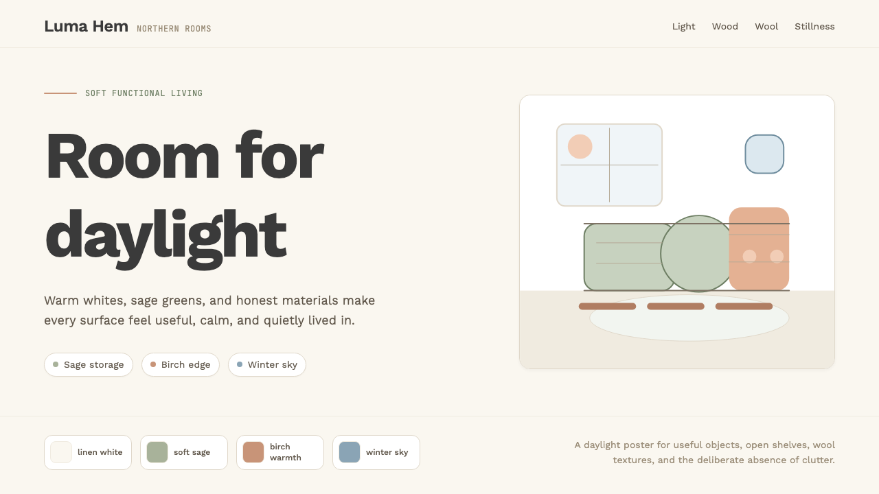 Scandi Hygge (IKEA)Warmth from restraint. Sage, linen white, Work Sans, and wide breathing room.克制中有温度:鼠尾草绿、亚麻白与 Work Sans 留出呼吸感。
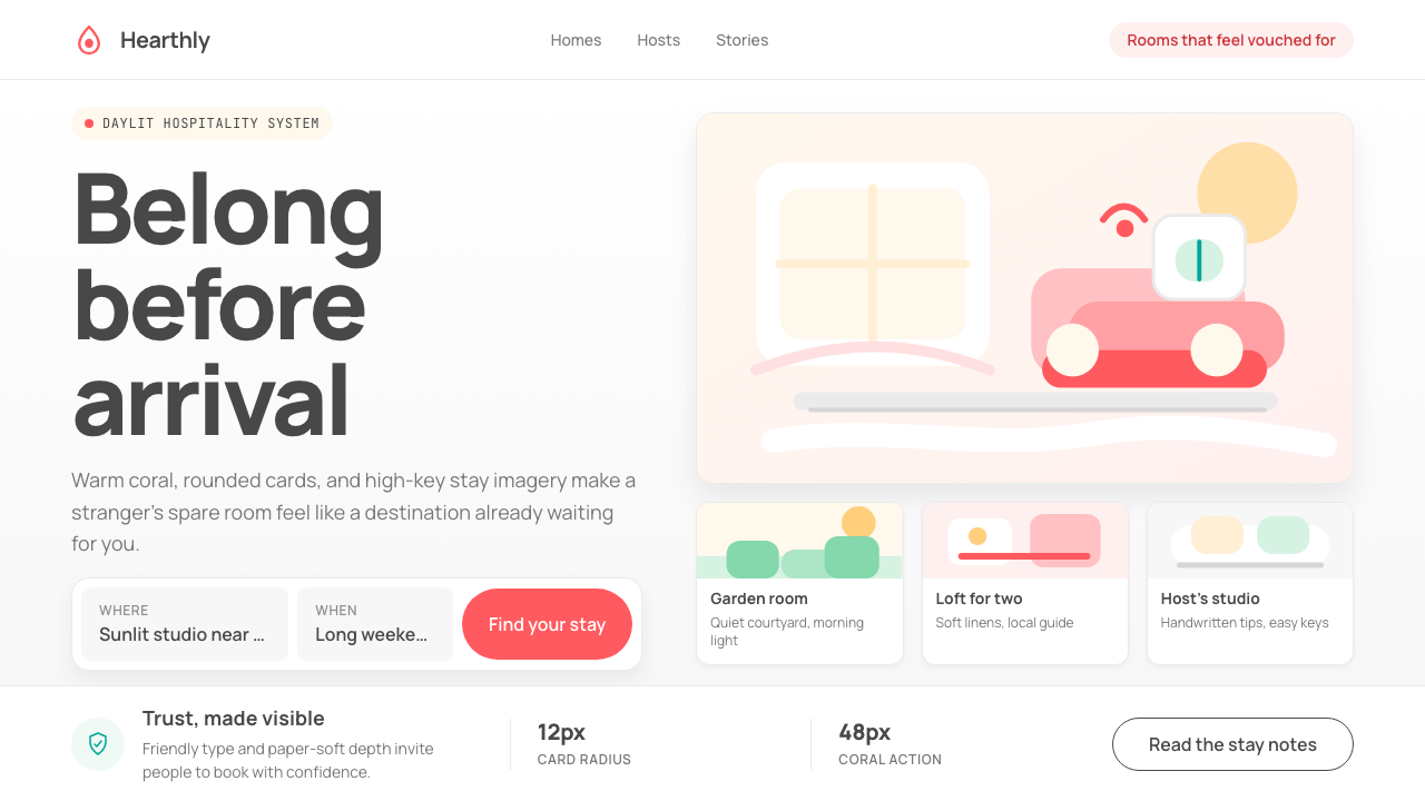 Airbnb 2014Coral red, soft pill cards, Cereal type. The Bélo wraps strangers in warm, da…Bélo 时代的珊瑚红与圆润 Cereal 字体——把陌生人之间的房间包装成阳…
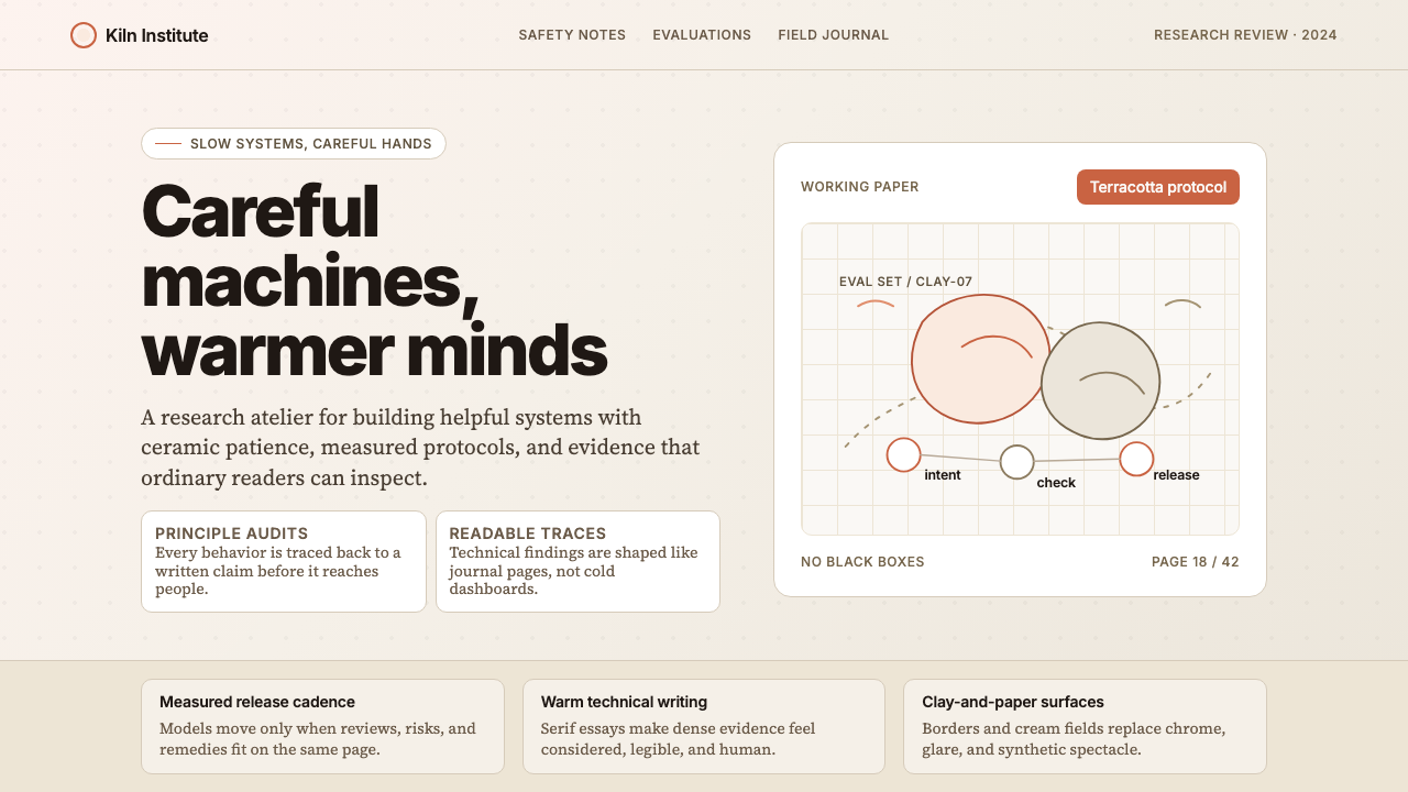 Anthropic ClayAI safety in handmade clay. Sand backgrounds, terracotta accents, serif body…用手工陶土包裹的 AI 安全感:沙色背景、赤陶点缀、衬线正文——缓慢、刻意、有…
 AsanaCalm productivity breathes. Cream canvas, lavender panels, coral-blue-yellow…安静生产力会呼吸:奶油画布、薰衣草面板与三色圆点。
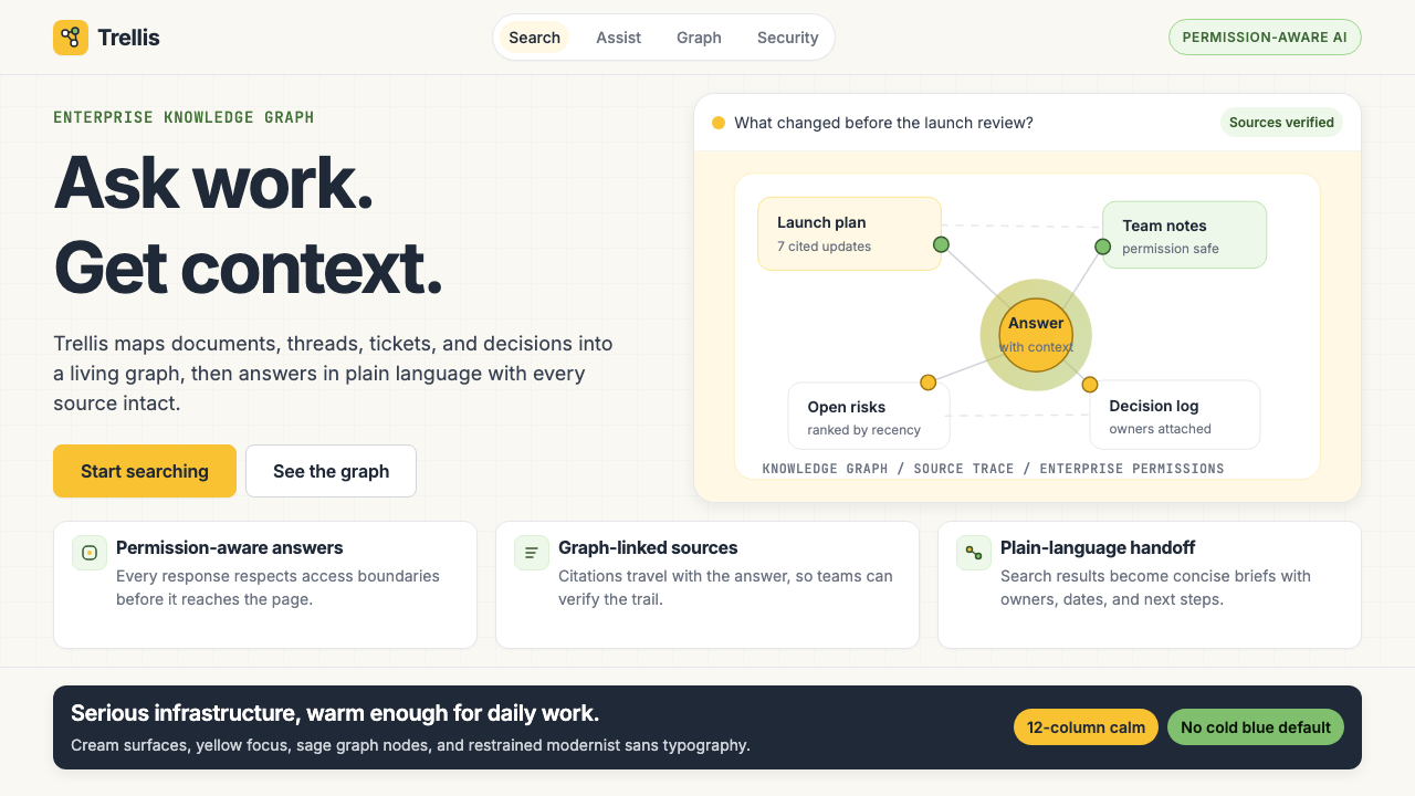 Glean Enterprise-SearchWarm enterprise AI. Cream ground, yellow focus, sage graph nodes, and sans ca…温暖的企业 AI:奶油底、黄焦点、鼠尾草节点与无衬线克制。
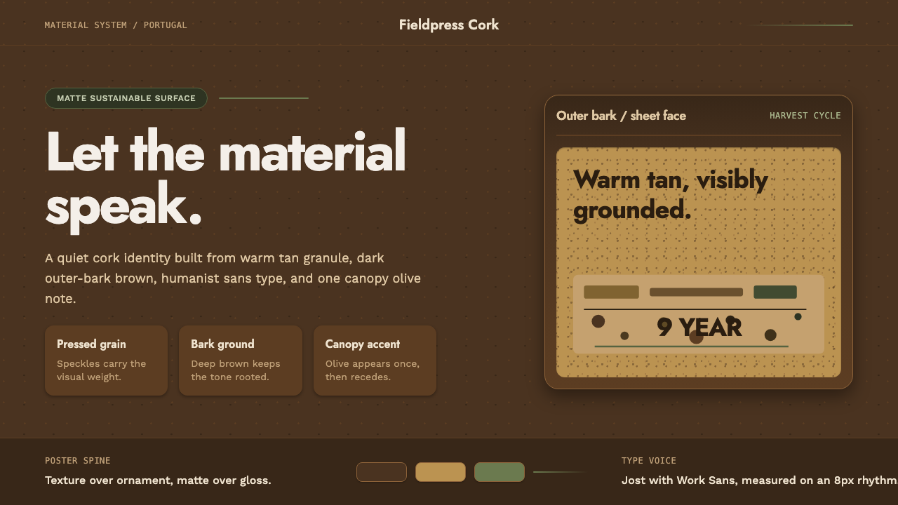 Portuguese CorkGrounded by texture. Cork tan speckles on bark brown, with one olive rule.质感踏实:软木棕斑点落在焦褐树皮底上,一道橄榄绿收束。