What is Portuguese Cork?
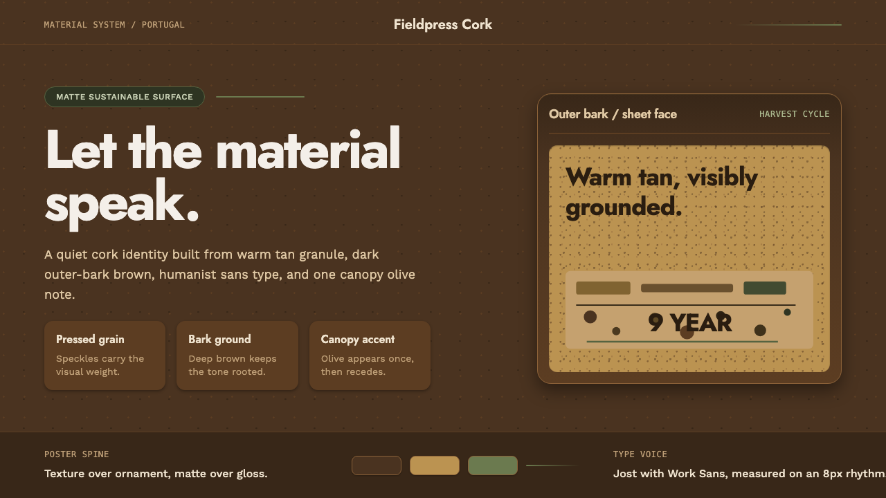
Portuguese Cork borrows its entire visual logic from a single harvested material — the bark of the cork oak — and trusts that texture, warmth, and honest contrast are enough. No ornament is added because none is needed.
Portuguese Cork in brief
Portuguese Cork is a contemporary design aesthetic derived from the visual character of harvested cork bark — specifically the contrast between the warm, speckle-dense inner face of a peeled cork sheet and the darker, charred-brown outer surface of the cork-oak plank. The style treats this material pairing as a complete visual system: the lighter tone becomes the background field, the darker tone grounds structure and type, and a single olive-green accent, drawn from the canopy of the montado cork-oak forests of southern Portugal, keeps the palette rooted in its landscape of origin.
The style belongs to the broader wave of sustainable-materials branding that rose to prominence in the 2010s, a period when companies and designers sought authenticity through the direct visual language of natural, traceable resources. Unlike other earth-tone aesthetics that assemble mood boards of many organic textures, Portuguese Cork is unusually disciplined: it commits to one material, reads its surface with care, and derives the entire system from what that surface actually looks like. The result is specific rather than generic, grounded rather than decorative.
Typographically, the style pairs geometric and humanist sans-serif letterforms — open, legible, warm without being casual — with generous breathing room and a deliberate matte quality. Glossy finishes, hard shadows, and digital-looking glow effects are structurally excluded: they would contradict the material logic that the whole system is built on. The style is quiet but not timid. Everything in it has a source you can point to.

Where does Portuguese Cork come from?
Cork harvesting in Portugal has a history stretching back to at least the thirteenth century, when Cistercian monks in the Alentejo region began using cork to stopper vessels and line cold stone floors. But the cork-oak landscape — the montado — is far older. These open parkland woodlands of Quercus suber, interplanted with wild grasses and grazed by Iberian pigs and cattle, are a human-managed ecosystem that has persisted across the Alentejo, Algarve, and Extremadura regions for over a millennium. The montado is one of Europe's most biodiverse terrestrial ecosystems, home to the black stork, the Iberian lynx, and hundreds of endemic plant species. Crucially for design history, it is also a landscape whose management rhythm — trees harvested on a nine-year cycle by skilled workers called descortiçadores — shaped the economic and cultural identity of southern Portugal.
Industrial-scale cork production began in earnest in the nineteenth century, driven by the wine-bottling industry's explosive demand for natural stoppers. By the early twentieth century, Portugal was supplying roughly half the world's cork, and the industry had concentrated in firms along the Douro and Tejo river corridors. Corticeira Amorim, founded in 1870 in Santa Maria de Lamas near Porto, grew through successive generations to become the world's largest cork producer, processing roughly a third of all harvested cork globally. The Amorim family's stewardship — expanding into composite cork products, insulation, flooring, aerospace components, and fashion materials — defined the contemporary understanding of cork as a premium, multi-application sustainable resource rather than merely a bottle closure.
The design aesthetic now identified as Portuguese Cork emerged in the early 2010s as a direct response to the branding needs of this expanded cork industry. Amorim and peer companies commissioned identities and product packaging that could communicate the material's warmth, sustainability credentials, and handcrafted origin without resorting to rustic cliché or greenwashing minimalism. The design briefs asked for something that looked like the material itself — and designers, observing the actual surface of a freshly peeled cork sheet, found there an already-resolved visual system: the speckled tan face, the charred-brown underside, the faint cellular pattern across both. The palette, the texture logic, and the matte finish were already there. The designer's job was to read them carefully and trust them.
The style's emergence coincided with a broader cultural turn toward traceable, material-honest branding — the same moment that produced raw-concrete interiors, unbleached packaging, and visible-seam furniture. In Portugal specifically, it connected to a national design conversation about how to present Portuguese craft and material heritage at international scale without either freezing it in folk nostalgia or laundering it into generic Scandinavian minimalism. Cork offered a third path: specific, contemporary, and indelibly Portuguese.
What defines the Portuguese Cork look?
Color
The palette has exactly three roles. The speckled tan of the cork face — warm, mid-toned, and never pure beige — serves as the dominant ground. The charred brown of the outer bark acts as the structural contrast tone, used for type, borders, and anchoring elements. A single muted olive-green, referencing the cork-oak canopy, appears as an accent line or small call-out element, never as a fill. Secondary colors do not enter the system. The palette's discipline is what makes it feel material rather than assembled.
Texture
The defining characteristic of real cork is its cellular microstructure — millions of air-filled cells that give the material its compressibility and acoustic quality. In digital and print applications, this texture is referenced through fine, irregular speckle patterns in the background fields rather than through photographic reproduction. The speckle is subtle: visible on close inspection, dissolved into an even warmth at reading distance. This is one of the few contemporary design styles where surface texture is not decorative but structurally defining.
Typography
Typeface selection favors geometric and humanist sans-serifs with open apertures and warm proportions — letterforms that have the same quiet, purposeful character as the material itself. Heavy headline weights contrast with lighter body text, but the contrast operates by weight and scale rather than by mixing families. All-caps setting is used sparingly and only for short labels; long-form text always runs in mixed case. Tracking is generous — the style breathes.
Layout and Space
Portuguese Cork compositions favor generous margins and asymmetric arrangements that feel considered rather than engineered. The material logic demands respect: a cork surface is not crowded, and neither are the layouts that derive from it. Vertical rhythm is established through consistent line spacing and unhurried section breaks rather than through decorative dividers. The overall impression is that of a well-designed label on a bottle of wine — calm, legible, and confident in its identity.
Finish and Surface Quality
Matte is the only acceptable surface treatment. Cork is inherently matte — it absorbs rather than reflects light — and any gloss or sheen effect contradicts the material logic at the foundation of the style. In screen applications, this translates to flat background fills without gradients, no glow or bloom on type, and interface elements that sit on the surface rather than appearing to float above it. The matte commitment is also what separates this style from generic earth-tone branding, which often falls back on gradient warmth to compensate for the absence of true material character.
Accent and Restraint
The olive-green accent operates like a single thread in a weave: pull it and the whole piece would unravel slightly. It appears in thin horizontal rules, small category labels, or the occasional highlighted word — always thin, always brief, always pulled back before it accumulates into an independent color story. This discipline is not about minimalism as a philosophical stance; it is about staying true to what the montado landscape actually looks like: mostly warm brown, mostly sky, with occasional flashes of green.
Material Honesty
The Portuguese Cork style's deepest principle is that visual systems can be derived from, and should be accountable to, their material sources. The colors are not chosen; they are found. The texture is not invented; it is observed. This accountability distinguishes the style from earth-tone pastiche: any element that could not be explained by reference to the actual surface of a cork-oak plank is an intrusion. Applied with fidelity, the style communicates craft, care, and a kind of environmental rootedness that is impossible to fake with a color picker.
Who shaped Portuguese Cork?
Founded in 1870 and headquartered in Mozelos, Portugal, Corticeira Amorim is the world's largest cork-processing group. Its transformation from a family bottle-cork business into a global sustainable-materials company — producing cork-based flooring, insulation, aerospace seals, fashion soles, and wine stoppers — did more to shape the contemporary design vocabulary of cork than any single designer or studio. Amorim's brand investment from the 2010s onward, including design partnerships and sustainability communications, established the visual canon that Portuguese Cork branding now draws on.
The montado is not a person or a studio but a landscape, and in the Portuguese Cork aesthetic it functions like a founding document. This open woodland ecosystem of southern Portugal and southwestern Spain — millennia-old, managed on nine-year harvest cycles — is the literal source of the palette, the texture logic, and the unhurried spatial sensibility of the style. Any designer working in this aesthetic who has not spent time with the actual landscape is working at second hand. The montado is the reference against which every design decision in this style should be checked.
The skilled workers who harvest cork bark by hand — using long-handled axes to score and peel the outer layers without damaging the living tree beneath — are a visible, celebrated part of Portuguese cork culture. Their craft, which must be learned over years and cannot be mechanized without quality loss, is frequently referenced in the brand communications of premium cork producers. In design terms, the care and deliberateness of the harvesting act is an analogy for the style's own insistence on purposeful, unhurried decisions.
The research and development arm of Corticeira Amorim that pioneered industrial applications of cork beyond the bottle stopper — including the insulation tiles used on the exterior of NASA space shuttles, cork-rubber composites for vibration damping in rail and construction, and lightweight cork-filled panels for automotive interiors. This expansion of cork into advanced engineering contexts is design-historically significant because it shifted the material's cultural register from rustic and regional to precision and technical — a shift that contemporary Portuguese Cork branding reflects in its clean, confident presentation.
Portuguese design did not arrive at the cork aesthetic in isolation. The country has a long tradition of surface-material expressiveness — from the azulejo tile programs of Lisbon facades to the hand-painted ceramics of Alentejo — that treats pattern and texture derived from craft processes as legitimate visual vocabulary rather than decoration applied after the fact. The Portuguese Cork style is a contemporary continuation of this tradition: material-first, process-visible, never embarrassed by evidence of how something was made.
How do you use Portuguese Cork today?
Portuguese Cork translates well into design work precisely because its principles are material-derived rather than taste-derived. Applying it correctly requires asking, at each decision point: does this element have a counterpart in the material? A background tone, a structural contrast, a thin olive accent — yes. A gradient wash, a drop shadow, a secondary typeface for variety — no. The discipline is easier to maintain than it sounds because the material itself is the brief.
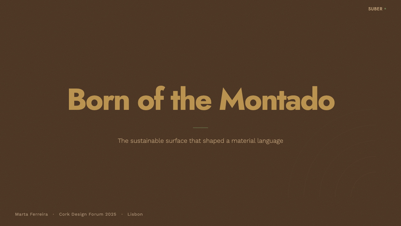
For presentation slides, the style works best when the dark-on-light contrast hierarchy is respected throughout. Cover slides should use the darker bark tone for the title against the lighter cork face — not the reverse, which would lose the material logic. Content slides benefit from wide left margins that echo the spatial generosity of a well-composed label, with body text kept to a comfortable line length. Data visualizations should use the olive accent sparingly for the one metric that most needs attention; all other data elements stay in the two-tone bark palette. Avoid adding a fourth color for categories — the palette is designed for restraint, and category-coding should use pattern or position instead.
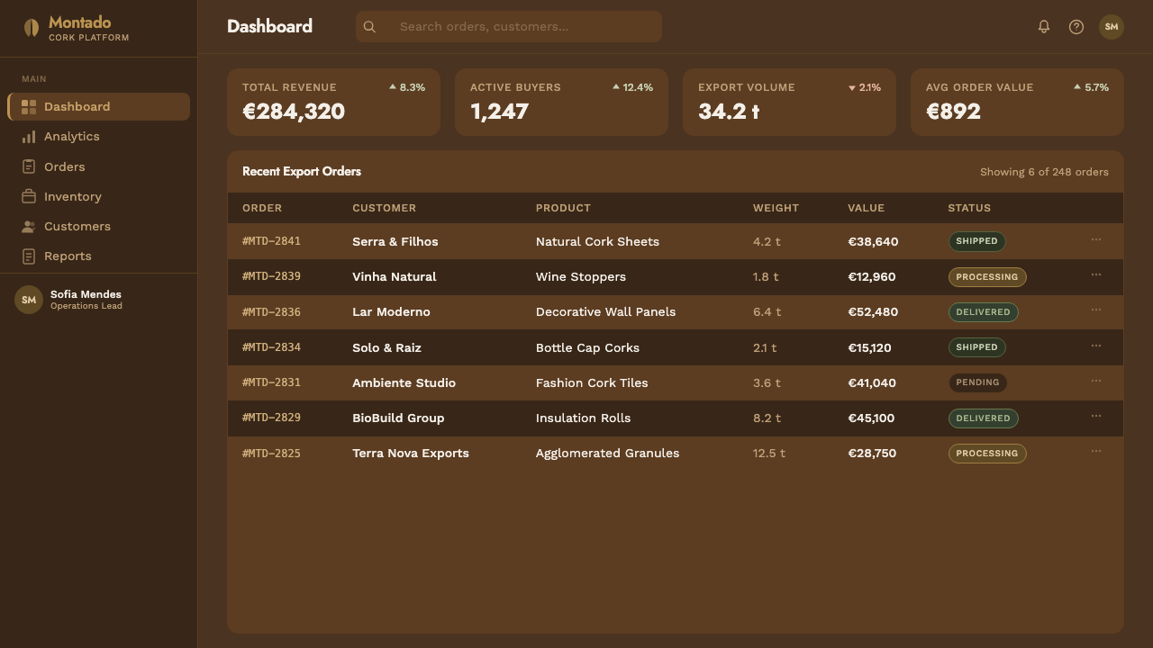
For web and digital interfaces, Portuguese Cork suits brand and marketing pages, about pages, and any context where the product story involves craftsmanship, sustainability, or physical material. Dashboards and dense data interfaces are a poor fit: the style's warmth and texture character slow scanning, and the matte finish logic conflicts with the hover states and interactive affordances that data-dense interfaces require. For appropriate contexts, use the lighter tone as the page background, the darker tone for headers and rule lines, and the olive as the single interactive accent color — applied to links, active states, and primary buttons only.
For editorial and packaging design — the contexts closest to the style's origin — the approach is straightforward. The palette handles both light and reversal well: dark ground with light type reads correctly as long as the same material logic applies in both directions. Labels for wine, olive oil, cork-based consumer products, and sustainable goods are the natural home of this aesthetic. The key production consideration is that the style loses almost nothing in single-color or two-color print: the speckle texture can be screened at low density in the primary tone, and the olive line can be dropped without structural damage.
The most common mistake when applying Portuguese Cork is importing warm earth tones from other traditions — terracotta, ochre, sand — and mixing them in on the grounds that they are also natural and earthy. They are not this material. The palette of Portuguese Cork is narrow because cork itself has a narrow palette: the speckled tan and the charred brown are specific, not generic. Adding colors that feel thematically appropriate but are not materially derived immediately softens the style's specificity into the ambient earth-tone mood that the style was designed to escape.
Portuguese Cork — FAQ
Is Portuguese Cork only for brands that literally use cork as a material?
No, but the further you move from material or sustainability contexts, the harder the style is to justify. The aesthetic is coherent precisely because it has a real material referent — every color, texture, and finish decision traces back to something that exists. Brands in food, craft, natural wellness, sustainable packaging, and heritage goods can apply it with full fidelity. For technology companies, financial services, or fashion brands with no material connection to cork or the land, the style risks reading as appropriation of an aesthetic without its underlying logic. In those contexts, the visual signals are there but the accountability is not, and careful audiences can feel the difference.
How does Portuguese Cork differ from other warm, natural earth-tone aesthetics?
Most earth-tone aesthetics are assembled from mood-board selections — terracotta, oat, sand, clay, parchment — chosen because they feel warm and organic in combination. Portuguese Cork is derived from a single, specific material surface. The speckled tan is not interchangeable with beige or oat; it is the precise tone of a freshly peeled Quercus suber inner face. The charred brown is not generic dark wood; it is the outer bark after air-oxidation. This specificity means the style cannot be diluted by adding other earthy tones without dissolving what makes it itself. The discipline is the point.
Can the style work in a predominantly dark or inverted layout?
It can, but with important adjustments. In a dark inversion, the charred-brown outer bark tone becomes the dominant background, and the speckled tan is used for type and primary elements — this preserves the material logic in reverse. What does not work is using pure black as the background, which has no material counterpart in cork and makes the palette feel assembled rather than derived. The olive accent, already subtle at full saturation on a light ground, should be treated as purely structural in dark mode — thin rules and small labels only, never as a large fill.
Does this style work for digital product interfaces, or is it mainly for branding and print?
It is primarily a branding and editorial aesthetic. For dense digital product interfaces — data tables, complex navigation, high-frequency interactive states — the warm palette and matte logic work against the need for rapid visual parsing and crisp interactive feedback. The style works well for a product's public-facing marketing site, onboarding flow, or settings screens where the pace is slower and brand character matters more than data density. Component libraries built in this style tend to work well for form-heavy flows (checkout, profile setup, preference selection) and struggle with analytical views, real-time data, or competitive-game interfaces.
What is the relationship between Portuguese Cork as a design style and the sustainability of cork as a material?
The relationship is direct and should be taken seriously. Cork is genuinely one of the most sustainable commercial materials in use: harvested without felling the tree, sequestering carbon in the bark as it regrows, supporting the extraordinary biodiversity of the montado. Brands that adopt this visual language are implicitly borrowing the credibility of that ecological record. This is a responsibility, not a free resource. Applying the Portuguese Cork aesthetic to greenwash a product with poor environmental credentials is a misuse that careful consumers recognize. The style should be reserved for products and brands whose values actually align with what the montado represents.
Related design styles
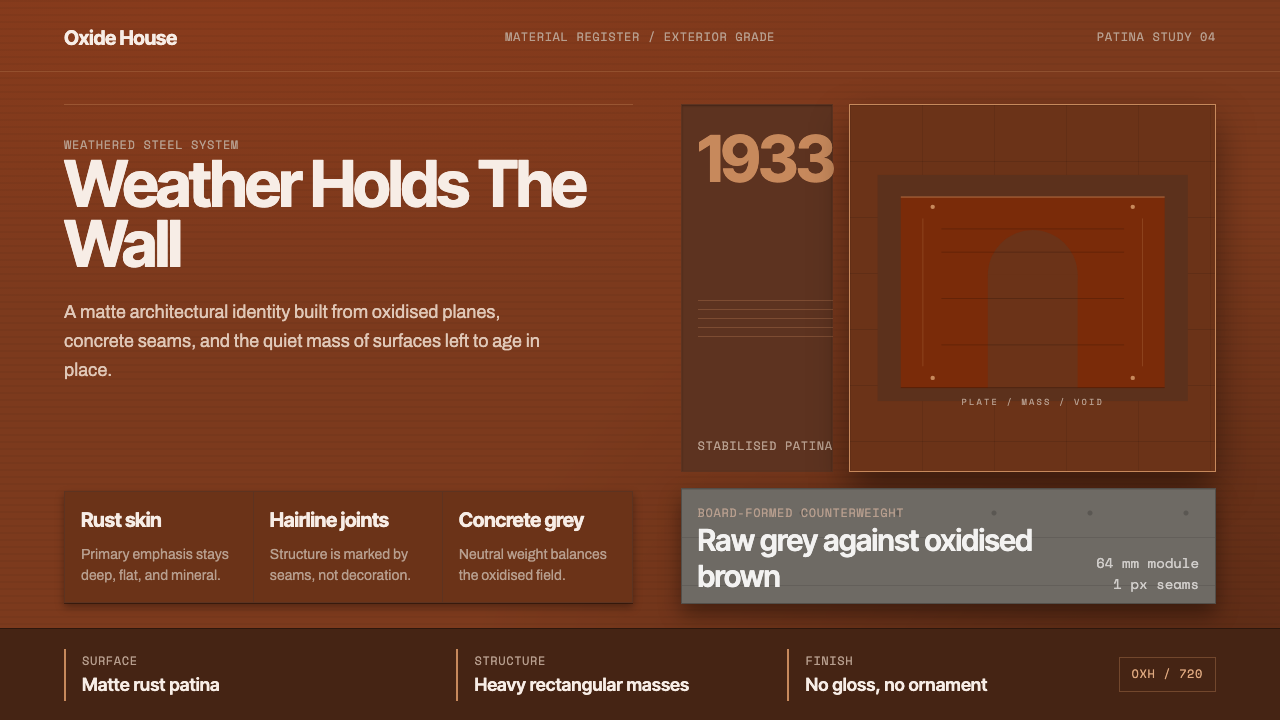 Corten Weathering SteelWeight over ornament. Rust-brown planes and concrete-grey seams make mass vis…
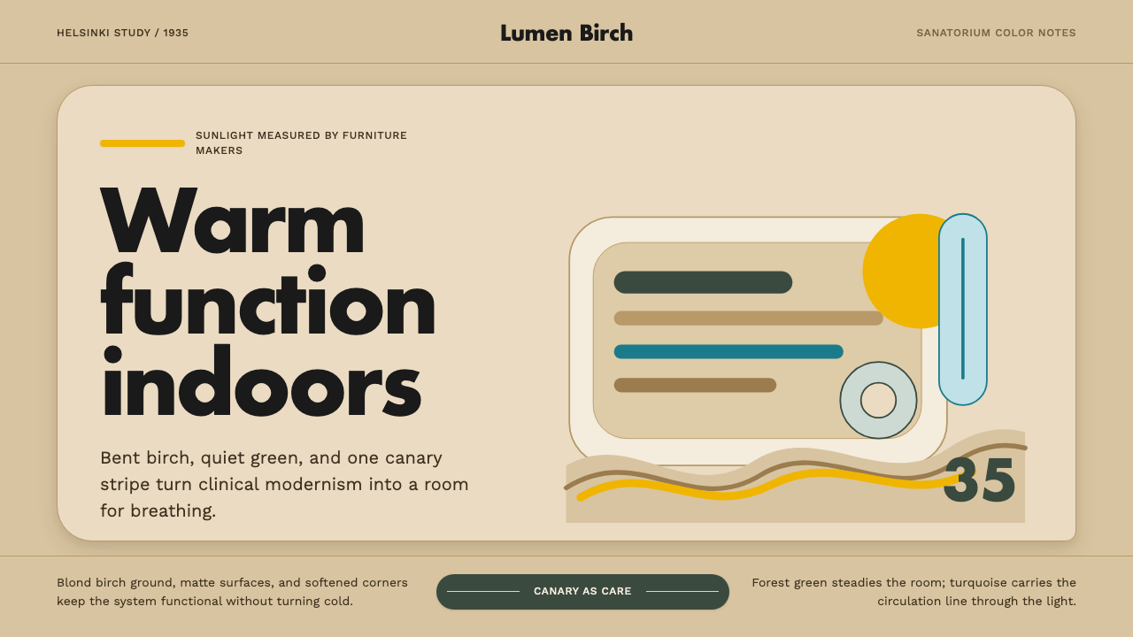 Aalto Finnish ModernModernism made humane. Birch fields, canary yellow, and soft plywood curves b…
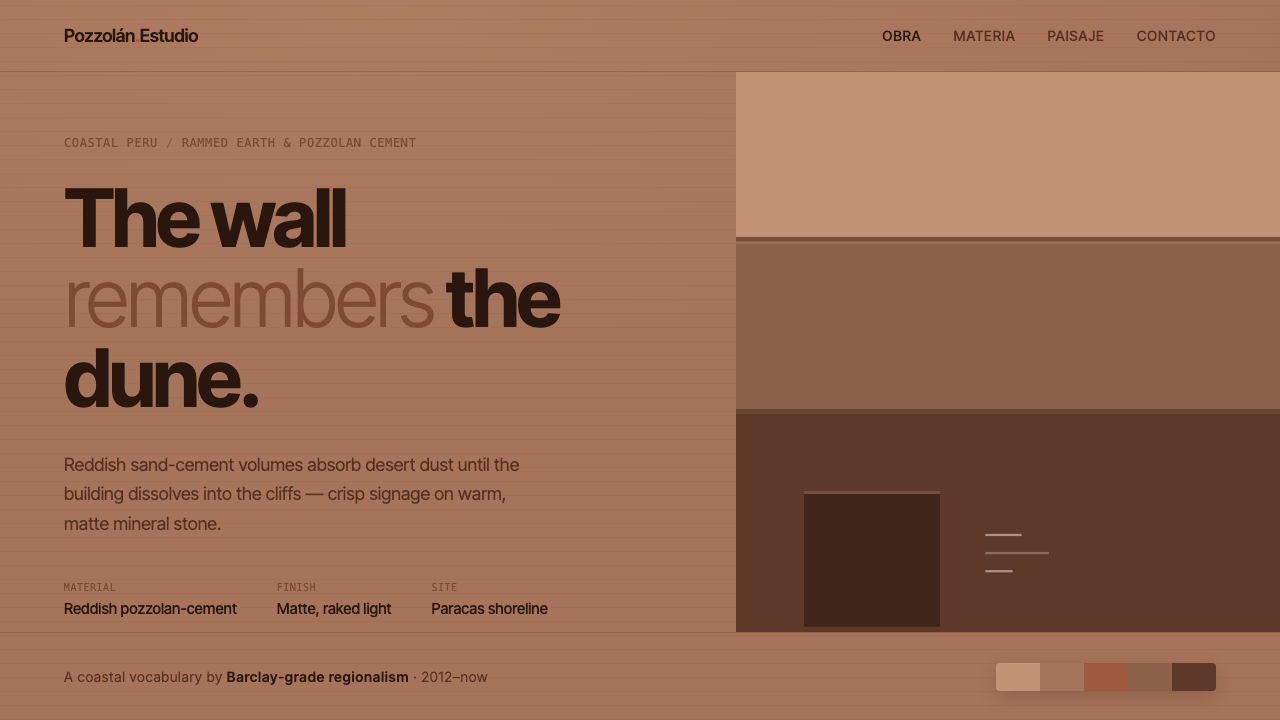 Peruvian Contemporary Adobe-ModernThe building dissolves into the dune. Reddish pozzolan-cement planes, matte r…
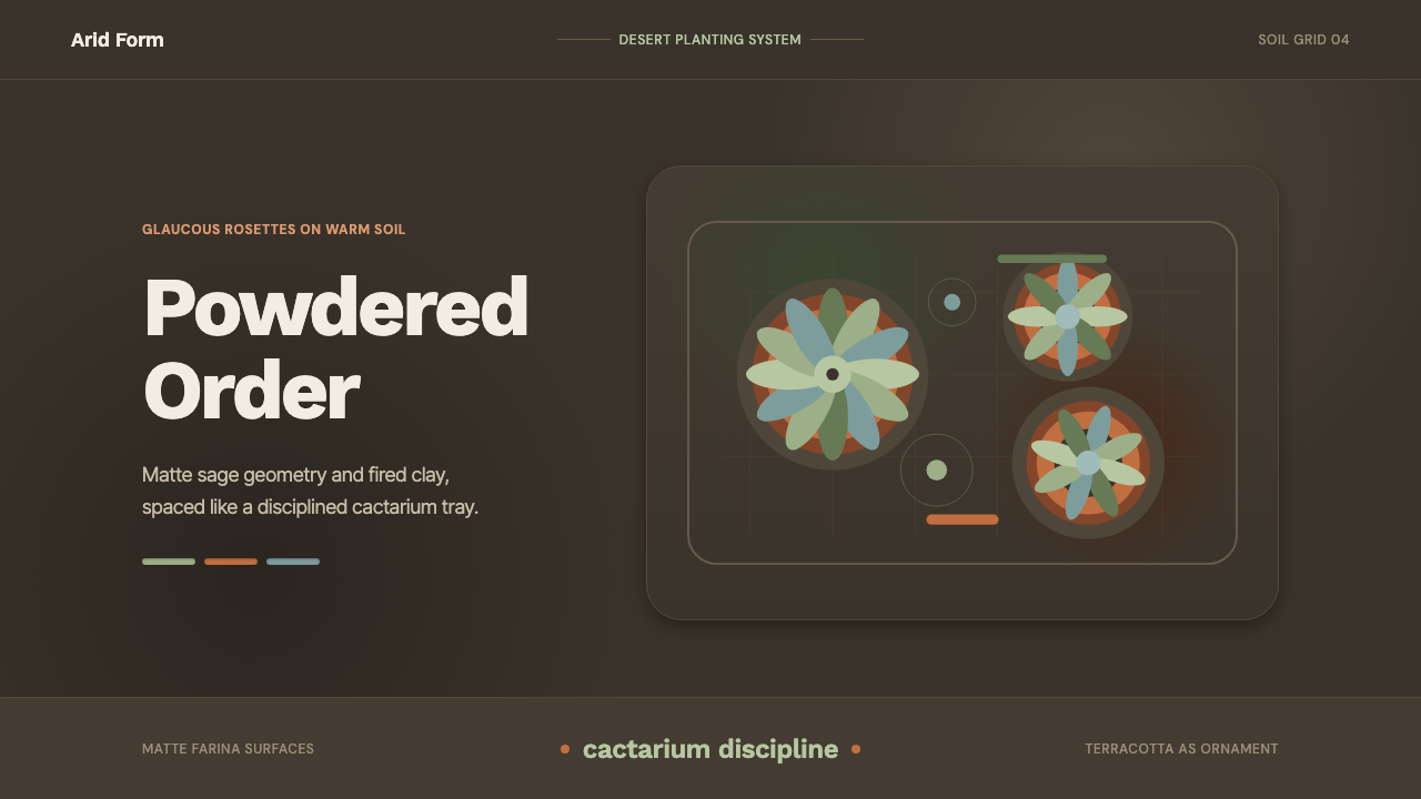 Succulent CactariumQuiet desert order. Sage rosettes and terracotta rings rest on dark warm soil.
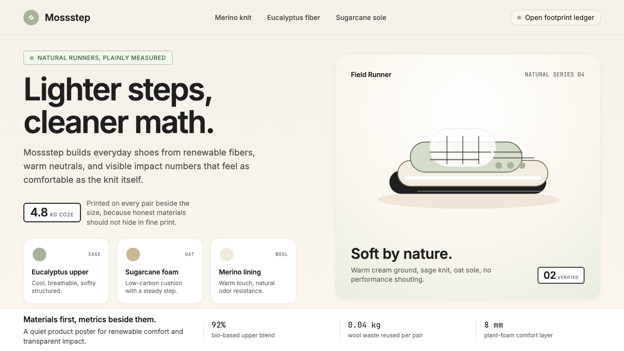 AllbirdsSustainability that breathes. Cream-and-sage tones, carbon labels next to pri…
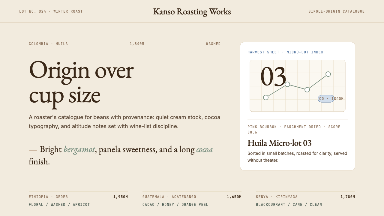 Third Wave CoffeeCoffee as catalogue. Cream paper, cocoa serif, mono origin specs, one sage no…