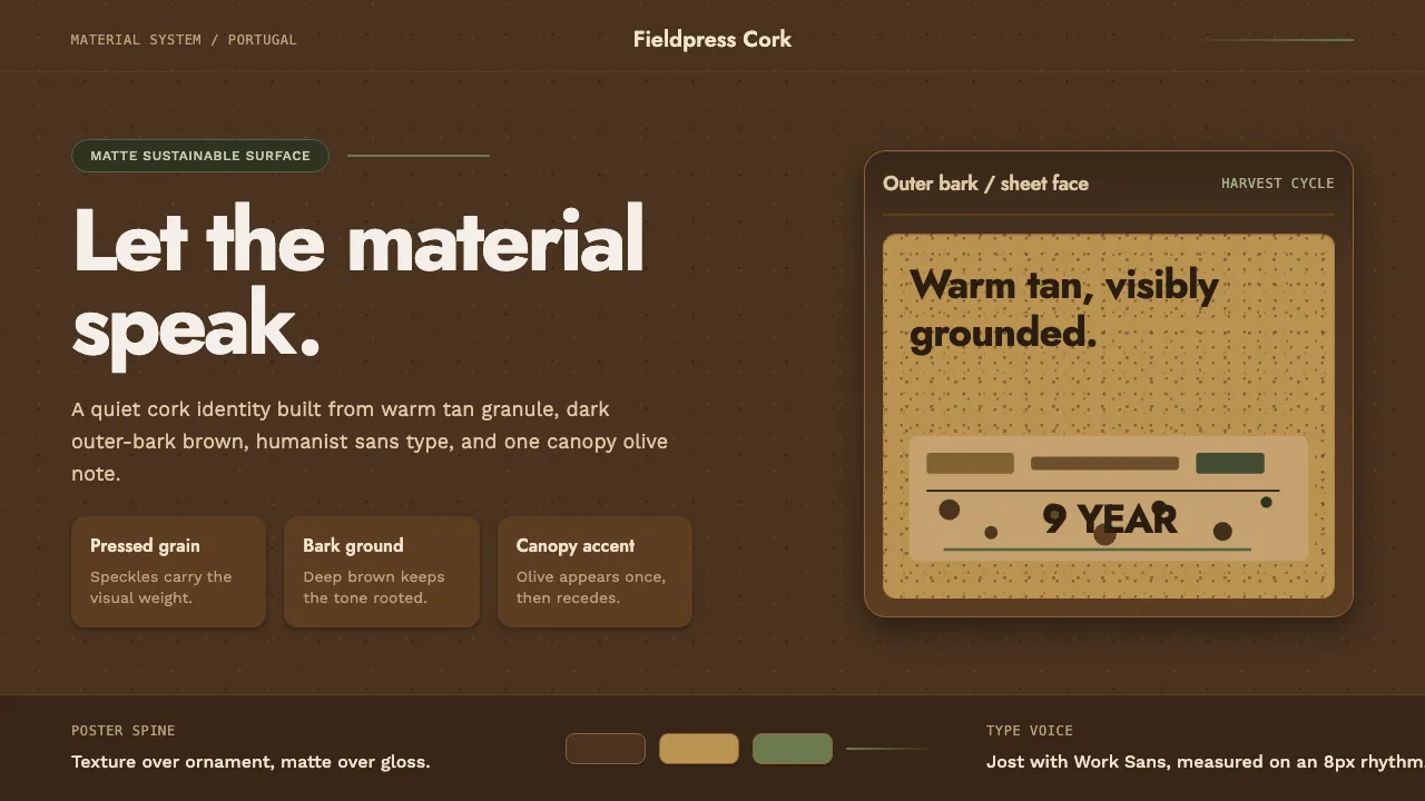
About Portuguese Cork
Portuguese cork is the look of a harvested material doing its own talking. The warm, lightly speckled tan face of a cork sheet sits against the darker, charred-brown outer bark of the cork-oak plank, and the whole system leans on that contrast — texture over ornament, matte over gloss.
Born from the contemporary sustainable-materials moment, it reads as clean, humanist, and tactile. Geometric and humanist sans-serifs carry the type, generous breathing room surrounds the content, and a single olive-green pulled from the oak canopy keeps the earthy palette honest. Nothing here is loud; everything is grounded.
- Origin
- Portugal — the montado cork-oak landscape, Western Europe
- Era
- 2010–now (contemporary sustainable-materials branding; the Amorim era)
- Key figures
- Corticeira Amorim
- Movements
- Sustainable / natural-material design · Contemporary humanist-sans branding
Portuguese Cork design spec
Colors
Typography
The other 11 sections — buttons, cards, spacing, motion, techniques and more — open once you unlock. Download the DESIGN.md or send it to your AI in one click. Unlock once, yours forever.
Sign up nowStyles similar to Portuguese Cork
Also inspired by design movements, with a close feel.
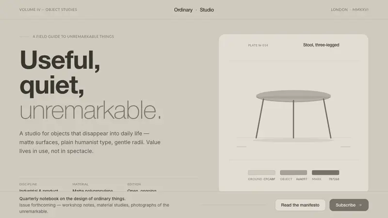 Jasper Morrison Super NormalRefuses spectacle. Matte greige ground, plain Helvetica, gentle 20px radii — value lives in use.
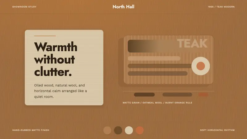 Scandinavian Teak ModernWarmth without clutter. Teak grain, oatmeal wool, and one burnt-orange rule hold the room.
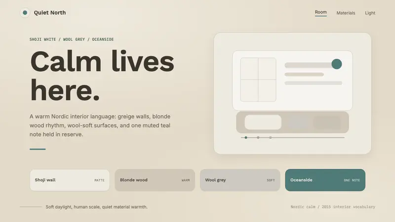 Scandinavian HyggeCalm is the brief. Greige walls, wool-grey cards, and one muted teal line.
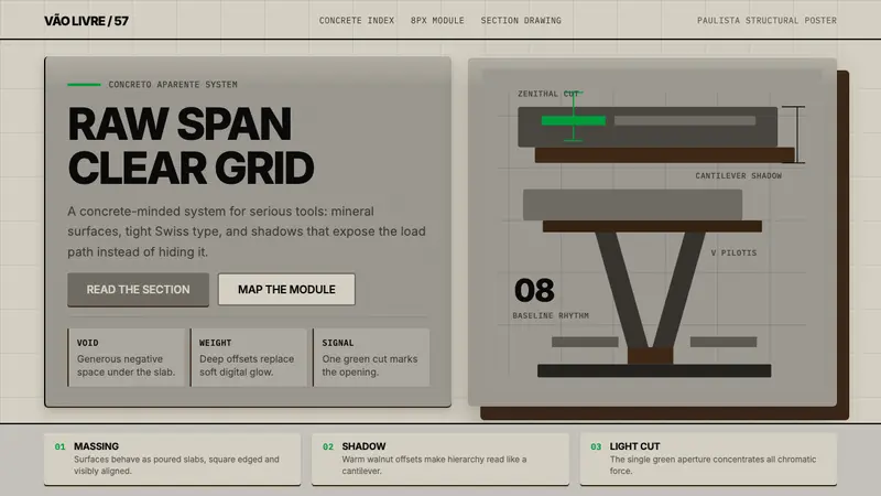 Paulista BrutalismStructural honesty, made heavy. Mineral grays, Inter grids, and walnut cantilever shadows.