What is Aalto Finnish Modern?
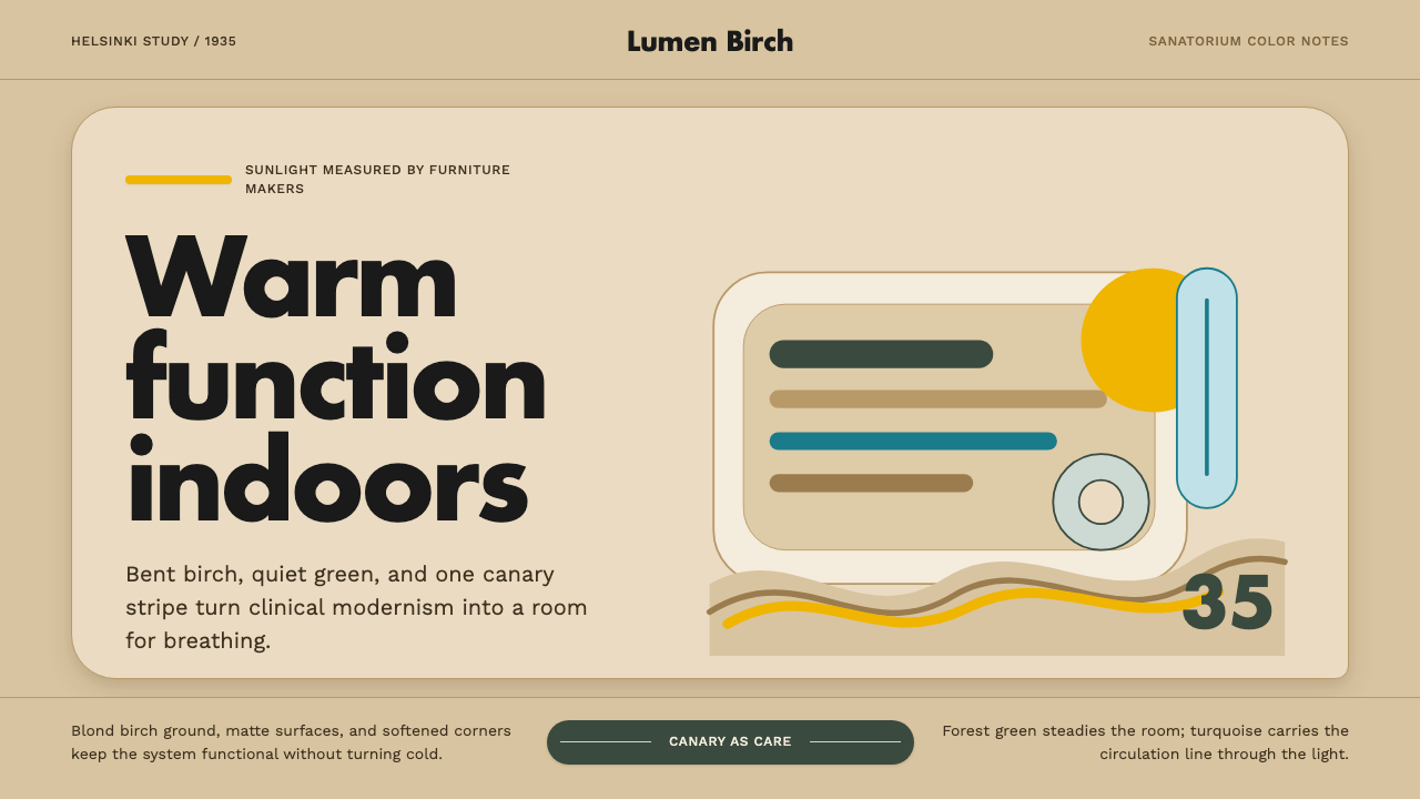
Aalto Finnish Modern is modernism that forgot to be cold — bent birch, sanatorium yellow, and a belief that a well-placed color could help a body heal.
Aalto Finnish Modern in brief
Aalto Finnish Modern is the design language built around Alvar Aalto and Aino Aalto and the furniture company they founded together, Artek, in 1935. Where much of European modernism in the same decades reached for chrome, steel tube, and glass, the Aaltos reached for birch — Finland's own tree — and bent it, steamed it, and laminated it into curves that no steel frame could manage as gently. The visual result is modernism with grain, warmth, and a human hand still visible in it.
The style rests on three convictions held simultaneously. First, that natural materials belong in modern design, not as a nostalgic throwback but as a technical and sensory upgrade. Second, that organic, free-flowing curves are as rigorous a design language as the right angle, provided they come from function rather than whim. Third — and this is the conviction that separates Aalto from nearly every other modernist of his generation — that color is not decoration but a kind of medicine, capable of calming a nervous patient or lifting a gray Nordic winter indoors.
Visually, the style reads as pale wood grounds punctuated by a small number of confident, saturated colors, most famously a clear canary yellow, set against greens drawn from Finnish forests and an occasional cool blue-green accent. Forms are soft-edged and wave-like rather than boxy. Nothing is chrome-hard or glass-cold; everything invites a hand to rest on it.
Where does Aalto Finnish Modern come from?
The style's origin point is unusually precise for a design movement: the Paimio Sanatorium, a tuberculosis hospital designed by Alvar Aalto in the Finnish town of Paimio and built between 1929 and 1933. Tuberculosis in the early twentieth century was treated primarily with rest, fresh air, and light — there were no antibiotics yet that could cure it — so the building itself was conceived as part of the treatment. Aalto approached the commission less as an architect decorating a hospital and more as a designer solving a medical problem: what environment helps a horizontal, immobile, frightened patient get better?
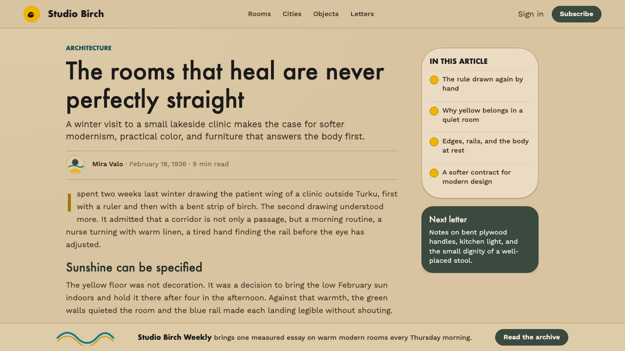
His answers became the founding vocabulary of the style. Ceilings were painted a duller, warmer tone than clinical white because a patient lying on their back stares at the ceiling for hours and glossy white glare was found harsh on the eyes. Wards were oriented for maximum daylight. Most famously, a bright yellow — now widely known as "Paimio yellow" — was used on floors and stairwells, chosen deliberately to lift mood in a building full of people confronting serious illness through long Nordic winters. Forest green and a cool turquoise accent appeared elsewhere, evoking the pine woods surrounding the sanatorium. None of this was arbitrary decoration; every color choice was argued for as therapeutic.
Out of the same commission came Aalto's furniture innovations, since standard hospital furniture did not exist in a form gentle enough for recovering patients. Working with his wife and design partner Aino Aalto, and cabinetmaker Otto Korhonen, Alvar developed techniques for bending solid birch and laminating birch plywood into continuous curves — solving how to make wood, a material that naturally splits along its grain, behave like a springy material closer to steel. The resulting furniture needed no separate frame; the wood itself curved into legs, seat, and back in one unbroken gesture.
In 1935, Alvar and Aino Aalto formalized this body of work by co-founding Artek with art historian Nils-Gustav Hahl and patron Maire Gullichsen. The company's name fused "art" and "technology," declaring the two were not in tension. Artek put the sanatorium's furniture into production for a wider public, and the style — pale birch, bent curves, a disciplined palette of therapeutic color — spread from one Finnish hospital into homes and public buildings across the Nordic countries and eventually the world, becoming a founding text of what is now called Nordic functionalism.
What defines the Aalto Finnish Modern look?
Color
The palette is small and purposeful rather than decorative: a clear, sunlit yellow is the signature note, set against forest green and grounded by pale, warm wood tones that function almost as a neutral. A cool blue-green sometimes appears as a single accent, echoing water or sky rather than competing with the yellow. Colors are used the way a doctor might prescribe them — one strong note at a time, chosen to lift mood rather than to impress — never as an all-over riot of saturated hues.
Material — Birch and Wood Grain
Pale, blond birch is the defining ground of the style, standing in for the neutral white or gray that other modernisms rely on. Crucially, the grain is left visible rather than painted over or veneered into anonymity — the material's origin as a living tree is part of the message. Where hard modernism prizes the machined, faceless surface, this style prizes a surface you can tell was once wood, warmed rather than industrialized.
Form — Organic Curves
The signature gesture is a continuous, free-flowing curve — most famously the cantilevered curve of a bent-wood chair leg that sweeps from floor to seat in a single unbroken line, with no visible joint or separate frame. These curves are not whimsical flourishes; they follow the physical logic of steamed and laminated wood bending under controlled tension. The result reads as organic rather than geometric, closer to the shape of a wave, a leaf, or a lake shoreline than to a ruled line or a right angle.
Light and Daylight Logic
Because the founding commission was a hospital built around the therapeutic value of daylight, the aesthetic carries an implicit preference for generous, evenly distributed light over dramatic artificial contrast. Surfaces are chosen to diffuse and soften light rather than glare or reflect it harshly — pale wood and matte color both serve this end. Where a more theatrical style might chase deep shadow, this one chases the flat, even daylight a convalescing patient would have found gentlest.
Composition — Calm, Uncrowded Layouts
Compositions favor generous space around a small number of elements rather than dense arrangement, following the sanatorium logic: a recovering patient's room was furnished sparingly, each piece given room to be seen without visual competition. Applied more broadly, the style avoids crowding a surface with too many colors or textures at once, preferring one or two confident gestures — a curved chair, a yellow floor — surrounded by calm, uninterrupted pale ground.
Texture — Soft, Tactile Surfaces
Beyond the wood itself, the style favors materials that invite touch — woven seat webbing, soft plain-weave upholstery, and matte rather than glossy finishes throughout. Nothing is meant to look untouchable or precious. This tactile warmth is part of why the style reads as humane even when its underlying logic — steamed, engineered, mass-producible wood — is thoroughly modern and industrial.
Restraint as Care, Not Austerity
The style's restraint is easy to misread as minimalism, but its motivation is different. Hard-edged modernism restrains ornament because ornament is considered wasteful or dishonest; this style restrains because a recovering, anxious person benefits from calm, uncluttered surroundings. The two philosophies can look similar on a mood board — pale grounds, few colors, clean forms — but one is arguing against decoration on principle, and the other is arguing for comfort as a design goal in itself.
Who shaped Aalto Finnish Modern?
Aalto was the architect of the Paimio Sanatorium and the driving design mind behind the style's furniture and color logic. Trained as an architect, he treated furniture design as an extension of architecture, solving problems of comfort and healing with the same rigor he applied to buildings. His insistence that bent birch could be engineered into forms as structurally sound as steel while remaining warm to the touch is the technical foundation the whole style stands on.
Aino Aalto was Alvar's wife, professional partner, and co-founder of Artek, and her contributions are inseparable from the style's development though long under-credited relative to her husband's fame. She led much of the practical furniture and glassware work, bringing a disciplined, quietly functional sensibility that balanced Alvar's more expressive gestures, and helped define the calmer, more domestic register of the style as it moved from hospital ward to ordinary home.
Korhonen was the cabinetmaker and technical collaborator who worked with Alvar Aalto to solve the manufacturing problem at the heart of the style: bending solid birch and laminating veneers into continuous curved forms without the wood splitting or losing strength. His workshop experimentation turned Aalto's design ambitions into a repeatable, production-ready technique, without which the signature bent-wood furniture could not have existed beyond a one-off prototype.
Hahl was an art historian and one of the four founders of Artek in 1935, and it was Hahl who helped frame the company's mission in terms broader than furniture retail — positioning it as a project to bring modern art and design into everyday life. His curatorial eye helped Artek present the Aaltos' work internationally as a coherent design philosophy rather than a single product line.
Gullichsen was an art patron and industrialist whose backing helped make Artek's founding possible, and whose own home, Villa Mairea — designed by Alvar Aalto — became one of the fullest built expressions of the style outside the sanatorium context. Her patronage connected the Aaltos' hospital-born design language to private domestic life and Finland's broader cultural elite.
How do you use Aalto Finnish Modern today?
Aalto Finnish Modern travels well into contemporary work wherever the goal is to feel warm and calm rather than sharp or corporate. Applying it well means resisting the urge to treat it as "just add wood texture and yellow" — the logic underneath is restraint, daylight, and touchable materials, and surface choices should serve that logic rather than decorate over it.
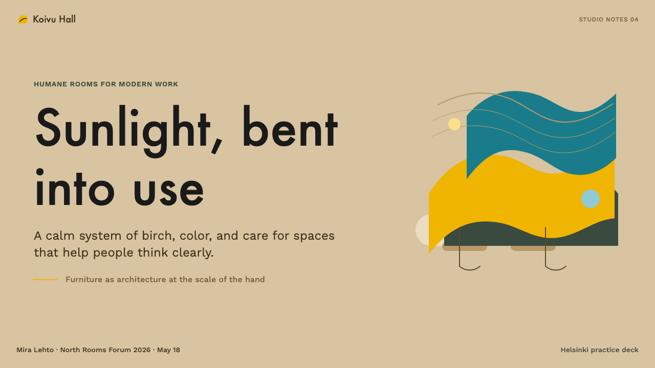
On presentation slides, the style suits cover pages that want to feel considered and human rather than aggressive — a pale, warm wood-toned ground with a single confident yellow or green shape, and generous empty space around the title, evokes a calm ward rather than a boardroom. Content and data slides should keep the same restraint: one accent color per chart rather than a rainbow of categories, soft rounded edges rather than hard geometric ones, and plenty of breathing room between data points.
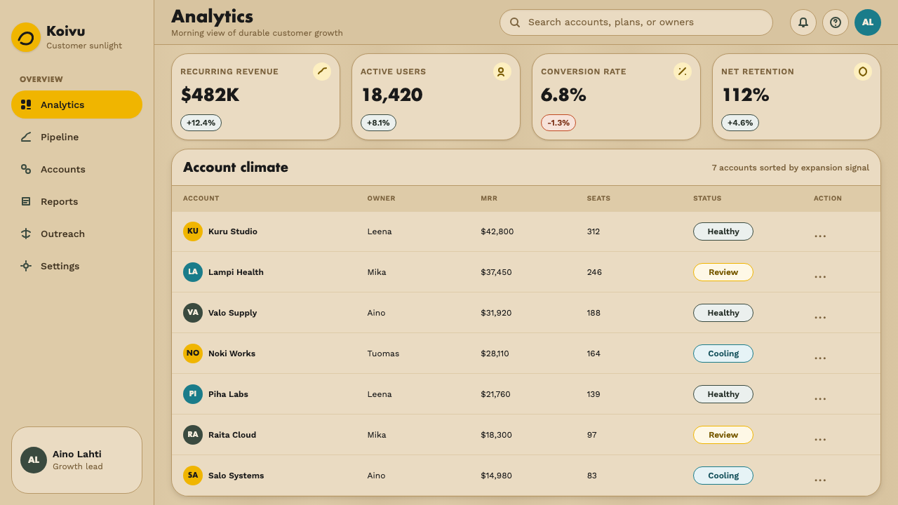
For web interfaces, the style suits dashboards and pricing pages that want to soften an otherwise data-dense or transactional experience — wellness apps, hospitality booking flows, and healthcare portals all benefit from its calm register. Cards should favor soft, rounded corners over sharp rectangles, backgrounds should stay pale and warm rather than stark white, and a single accent color — most naturally a clear yellow or forest green — should be reserved for primary actions or the current plan, not spread across every element.
In editorial and marketing work, the style supports long-form, unhurried layouts: generous margins, a calm and legible body typeface, and photography that favors natural materials and daylight over glossy studio artifice. Feature sections read well as wide, uncluttered blocks of pale ground punctuated by a single strong color moment rather than a busy collage of competing colors.
A common mistake is over-saturating the style — using bent-wood silhouettes as generic "Scandinavian" wallpaper, or piling on several accent colors until the calm it's built around disappears. The warmth comes from restraint: one confident color used sparingly against quiet, pale, wood-toned space reads as authentically Aalto; several loud accents competing for attention read as generic Nordic pastiche instead.
Aalto Finnish Modern — FAQ
How is Aalto Finnish Modern different from generic "Scandinavian design"?
Generic Scandinavian design, as marketed today, tends to mean pale wood plus an all-white or all-gray palette plus minimal ornament — a look, more than a philosophy. Aalto Finnish Modern is a specific historical style with a documented origin (a tuberculosis hospital), a technical innovation (bent and laminated birch), and a belief system (color is therapeutic, used deliberately rather than avoided). It uses confident, saturated color — especially yellow — far more deliberately than the muted palette generic Scandinavian minimalism usually settles into, and its curves are structurally motivated rather than stylistic flourish.
Why does this style use a fairly saturated yellow when most modernist styles avoid strong color?
Because the yellow's origin was medical, not decorative. At Paimio Sanatorium, Aalto was solving a real problem — how to keep patients confined to bed for months, through dark Nordic winters, from sinking into despair. A bright, sun-evoking yellow was chosen deliberately as a psychological intervention, not a fashion statement. That is why the color reads as generous rather than garish: it is used sparingly, against a great deal of calm pale wood, the way a doctor prescribes a specific dose rather than an unlimited one.
Can this style work in a fully digital product with no physical wood or furniture involved?
Yes, because what carries over is the underlying logic, not the literal material. A digital product can evoke the style through warm, pale, wood-adjacent background tones, soft rounded shapes instead of sharp rectangles, generous uncluttered spacing, and one deliberate accent color used the way Paimio used its yellow — sparingly, for a purpose, such as marking the primary action. What should not carry over is a literal wood-grain texture slapped onto a screen; that reads as costume rather than design logic.
How does this style handle geometry and grid structure, given how much it relies on organic curves?
The curves sit inside a fairly ordered, calm structure rather than replacing structure altogether — a single curved chair placed deliberately within an otherwise rectilinear room, not a room where every surface undulates. In applied design, this means keeping the underlying grid fairly simple and legible, and reserving the organic gesture for one or two focal elements — a shape, a divider, an image crop — rather than curving every edge on the page.
Is this style suited to every kind of product, or does it struggle in some contexts?
It excels wherever calm, trust, and a sense of care are valuable — healthcare and wellness products, hospitality, education, and home or lifestyle brands. It struggles where a product needs to feel urgent, high-energy, or cutting-edge — trading platforms or brands built around speed and disruption will find its calm, wood-warm register works against the mood they want. Matching the style's value of gentle care to a product that actually wants that quality matters more than any single color or shape choice.
Related design styles
 Portuguese CorkGrounded by texture. Cork tan speckles on bark brown, with one olive rule.
 Corten Weathering SteelWeight over ornament. Rust-brown planes and concrete-grey seams make mass vis…
 Succulent CactariumQuiet desert order. Sage rosettes and terracotta rings rest on dark warm soil.
 Peruvian Contemporary Adobe-ModernThe building dissolves into the dune. Reddish pozzolan-cement planes, matte r…
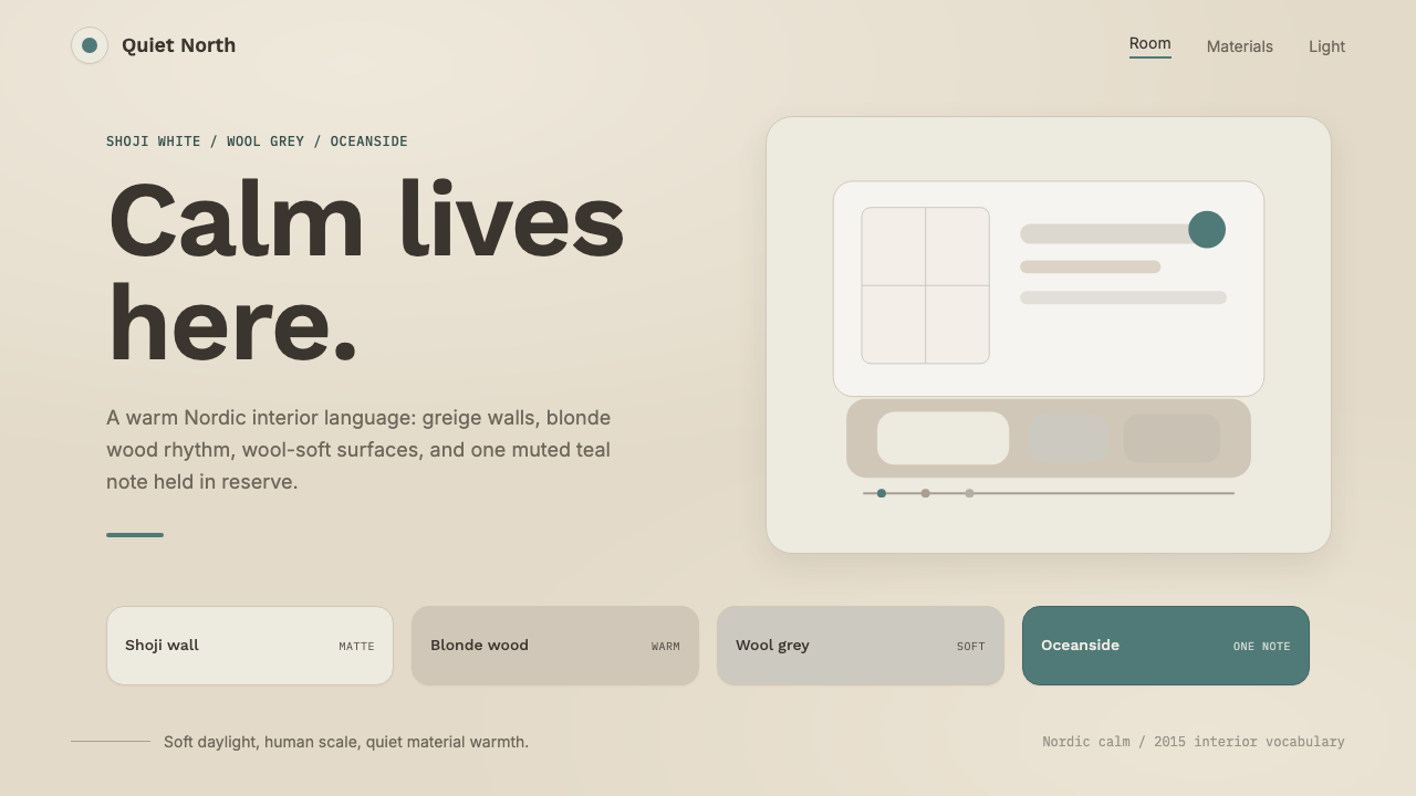 Scandinavian HyggeCalm is the brief. Greige walls, wool-grey cards, and one muted teal line.
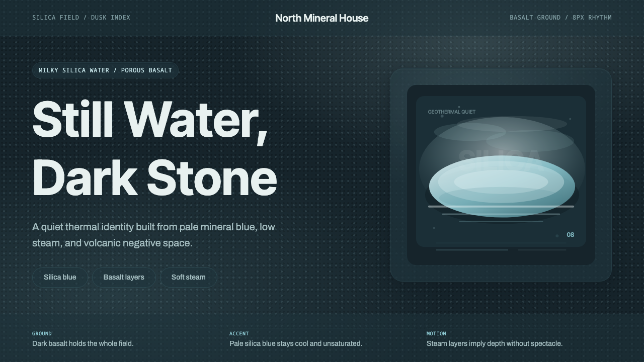 Glacial Teal LagoonQuiet feels elemental. Basalt darks and milky silica blue drift in a low-cont…