What is Scandinavian Teak Modern?
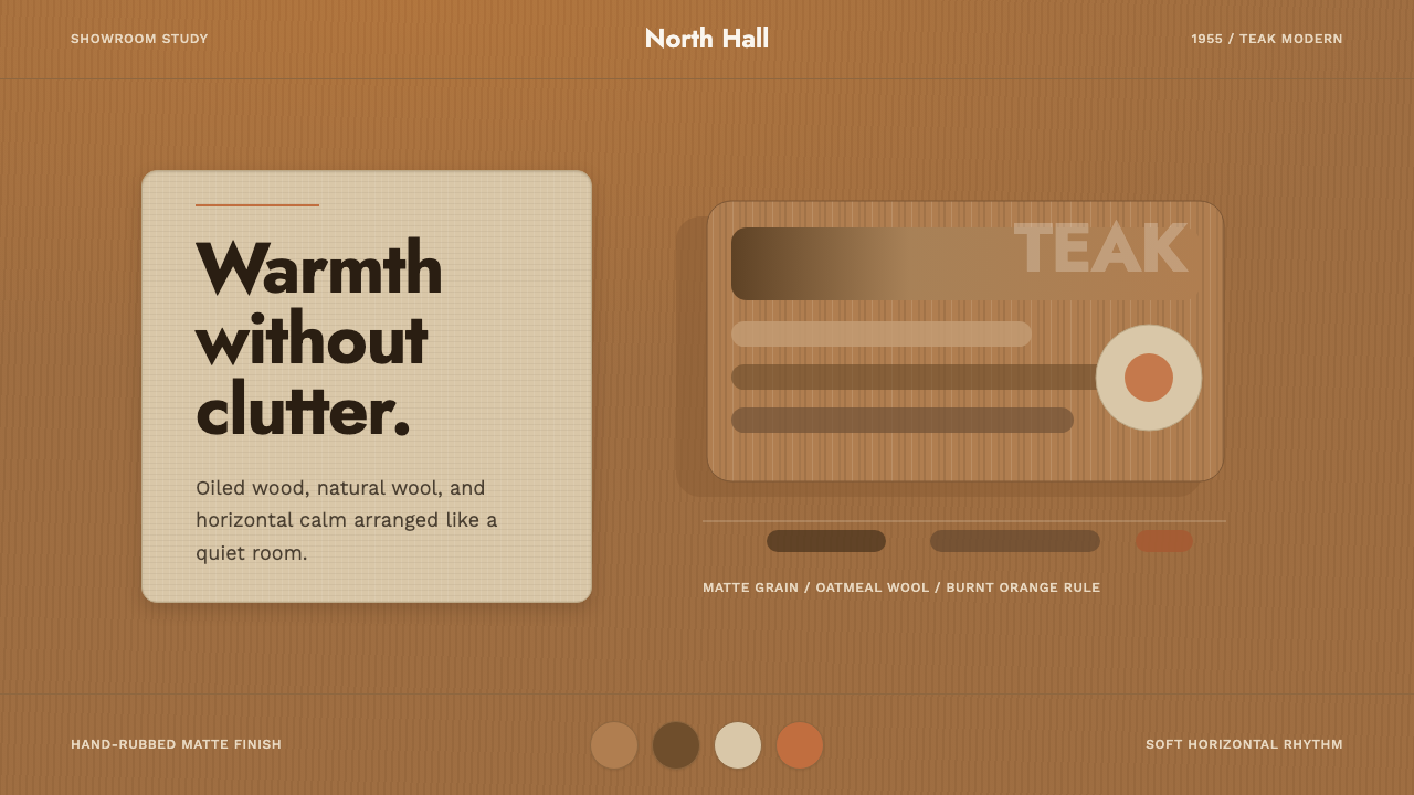
Post-war Denmark turned a chair into a quiet argument for craft — oiled teak grain left visible, organic curves, and a single burnt-orange line to hold the room together.
Scandinavian Teak Modern in brief
This system draws on classic Danish modern furniture design of the 1950s, when cabinetmakers turned furniture-making into a quiet art form built on honest material and restrained craftsmanship rather than ornament or industrial gloss. Its central material is oiled teak — a warm wood running from honey to walnut in tone, with its natural grain deliberately left visible rather than painted over or heavily lacquered.
That teak sits against natural wool textiles and pale plaster-toned surfaces, forms that are organic and gently curved rather than sharply geometric, and lines kept clean and predominantly horizontal. Finishes throughout are matte and hand-rubbed rather than glossy — the entire point of oiling rather than lacquering teak was to let the wood feel alive and touchable, not sealed behind a shiny surface.
Against that quiet, warm base, a single note of burnt-orange functions as the room's one accent — present but never dominant. The overall effect reads less like a furniture catalogue and more like a showroom built around a single conviction: that everyday objects, made with enough care, deserve to be beautiful without needing to shout.
Where does Scandinavian Teak Modern come from?
Danish furniture design entered its defining period in the years following the Second World War, when a generation of cabinetmakers and architects — trained in traditional joinery but working with a modernist eye — set out to make furniture that was simultaneously honest about its materials, comfortable for ordinary daily life, and beautiful without relying on applied decoration. This period is now remembered as the high point of Danish, and more broadly Scandinavian, mid-century modern design.
Teak became the signature material of this era largely because of its combination of durability, workability, and rich, visible grain. Danish cabinetmakers oiled rather than heavily lacquered their teak pieces, a finishing choice that let the wood darken and develop character with age and use rather than staying frozen behind a glossy seal — furniture meant to be lived with and to visibly age well, not simply photographed once and forgotten.
Hans Wegner and Finn Juhl are among the era's most significant figures, each associated with chairs that treated the human body's comfort as a design problem to be solved through form, not padding — organic, sculptural silhouettes achieved through skilled joinery rather than upholstery bulk. Their work, and that of their contemporaries, was produced within a strong Danish tradition of craft guilds and cabinetmaker competitions, which rewarded technical mastery and pushed designers to refine already-successful forms rather than chase novelty for its own sake.
This mid-century Danish modern tradition went on to have enormous international influence, shaping what much of the world still recognizes as 'Scandinavian design' decades later — and its emphasis on visible natural material, organic curves, and matte hand-finished surfaces remains distinct from, and considerably warmer than, both the starker geometric modernism that preceded it and the more overtly 'cozy' Scandinavian interior trends that followed much later, in the 2010s.
What defines the Scandinavian Teak Modern look?
Color
Warm teak tones running from honey to walnut dominate, paired with oatmeal wool textiles and pale plaster-like neutrals. A single burnt-orange note serves as the room's one accent color, used sparingly rather than repeated across multiple surfaces.
Visible Wood Grain
The natural grain of teak is left visible and legible rather than hidden under paint or heavy lacquer, treated as a decorative element in its own right. This honesty about material is central to the entire style — nothing pretends to be a material it isn't.
Organic, Curved Form
Shapes favor gentle, organic curves over sharp geometric angles, echoing the sculptural silhouettes mid-century Danish cabinetmakers achieved through skilled joinery. Curves feel considered and human rather than decorative flourish.
Clean Horizontal Lines
Structural lines run predominantly horizontal and stay clean and unfussy, giving pieces a grounded, calm quality even where forms curve. This horizontality anchors the more organic elements of the style within a legible, orderly structure.
Matte, Hand-Rubbed Finish
Surfaces are finished matte rather than glossy, echoing the oiled — rather than heavily lacquered — treatment classic Danish teak received. This finish is meant to feel warm and touchable, inviting contact rather than reflecting light back at a viewer.
Restraint Over Ornament
Beauty here comes from proportion, material honesty, and craftsmanship rather than applied decoration. Nothing is added purely for visual richness — every detail earns its place through function or refined form.
Who shaped Scandinavian Teak Modern?
Wegner is among the most celebrated Danish furniture designers of the mid-century period, known for chairs that treated comfort as a problem to be solved through carefully sculpted form and skilled joinery rather than heavy upholstery. His work exemplifies the era's commitment to organic curves and visible, honestly finished natural wood.
Juhl was known for furniture with sculptural, almost floating forms, where seat and frame appear structurally separate from one another — a visual lightness achieved through precise joinery rather than material reduction. His work helped define the sculptural, organic strand of Danish modern design alongside Wegner's more structurally integrated approach.
How do you use Scandinavian Teak Modern today?
This system reads as warm, refined, and quietly confident, so it suits products and brands that want to feel established and considered rather than trendy or disposable. Its strength comes from material honesty and restraint — visible grain, organic curves, one accent color — so it rewards a light touch rather than heavy layering of texture or color.
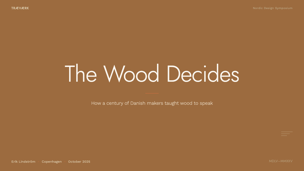
On a slide cover, a warm teak-toned field with a single organic curved shape and a thin burnt-orange rule makes an understated, confident title treatment — closer to a well-made object than a corporate template. Content slides should keep to clean horizontal structure and generous, calm spacing, letting oatmeal and plaster-toned neutrals carry most of the composition. Data visuals suit this system well when rendered in warm wood-toned bars or lines with the burnt-orange accent reserved for a single highlighted data point, rather than a full rainbow palette.
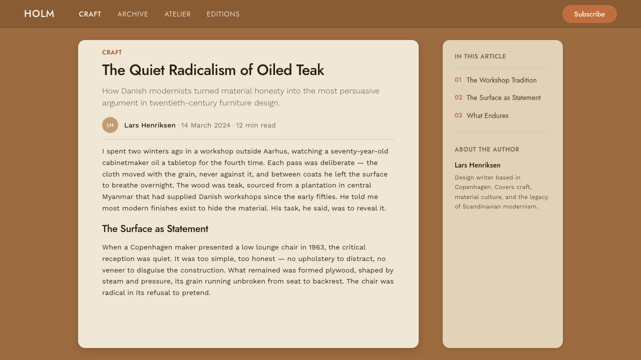
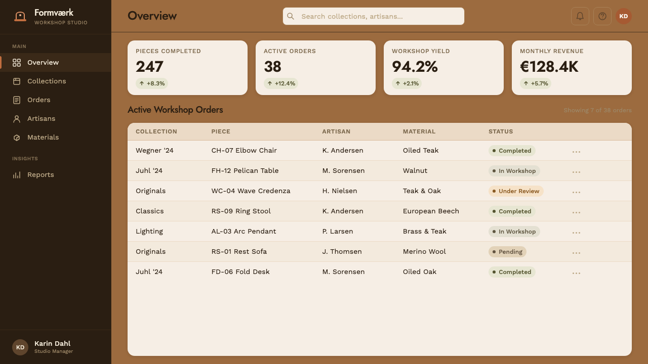
For web interfaces, this palette suits dashboards, pricing pages, and product sites where a sense of quality and craftsmanship matters — furniture and home goods brands, premium subscription products, and any service wanting to feel established rather than start-up-flashy. Keep teak and oatmeal tones as the dominant surface colors, use soft matte card treatments rather than glossy gradients, and reserve burnt-orange strictly for primary actions.
In editorial and marketing contexts, this system suits stories about craftsmanship, heritage, design history, and considered living particularly well. A full-width teak-toned section with a single curved graphic element and a headline in clean type can carry real warmth and authority without needing elaborate imagery.
A common mistake is adding gloss or high-contrast lacquer-like shine to surfaces that should read matte — doing so breaks the material honesty this style depends on and pushes it toward a generic 'wood theme' rather than the specific, hand-finished quality of mid-century Danish teak. A second mistake is treating burnt-orange as a supporting palette rather than a single accent — spreading it across multiple elements dilutes the restraint that gives this style its quiet confidence.
Scandinavian Teak Modern — FAQ
Why teak specifically, rather than another wood?
Teak became the signature material of mid-century Danish furniture because it combined durability, good workability for the curved, sculptural forms designers favored, and a particularly rich, warm grain that ran from honey to walnut in tone. That combination made it especially suited to the era's core value: furniture whose beauty came from the material itself, left visible and honestly finished, rather than from applied decoration.
Why is the finish matte instead of glossy?
Classic Danish teak furniture was typically oiled rather than heavily lacquered, a choice that let the wood age and deepen in color with use rather than staying sealed under a shiny surface. A glossy, lacquer-like finish would misrepresent that tradition — the matte, hand-rubbed quality is not a stylistic afterthought but a direct reflection of how the actual furniture this style references was made and cared for.
How does this differ from the contemporary hygge interior style?
This system references 1950s mid-century Danish furniture craftsmanship specifically — teak, joinery, sculptural form — while contemporary hygge interiors are a distinct, later trend from the 2010s built primarily around wall color and textile softness rather than furniture-making tradition. The two share a Scandinavian origin and a warm, restrained sensibility, but this style is about wood, form, and craft technique, where hygge is about ambient color and cozy atmosphere.
What kinds of products or brands does this style suit best?
It suits furniture and home goods brands, premium craft-oriented products, and any brand wanting to project quality, heritage, and considered longevity rather than trend-chasing. It is a poor fit for products that need to feel fast, disposable, or aggressively modern, since the entire visual language is built around material honesty and patient, refined craftsmanship rather than novelty.
Can multiple accent colors be used instead of a single burnt-orange note?
Adding multiple accent colors dilutes the restraint that defines this style. Classic mid-century Danish interiors typically let a single warm accent do the work of drawing the eye, trusting the wood grain and organic form to carry the rest of the visual interest. Spreading several saturated colors across a layout shifts the feeling toward busy decoration and away from the quiet, material-led confidence this system is built to convey.
Related design styles
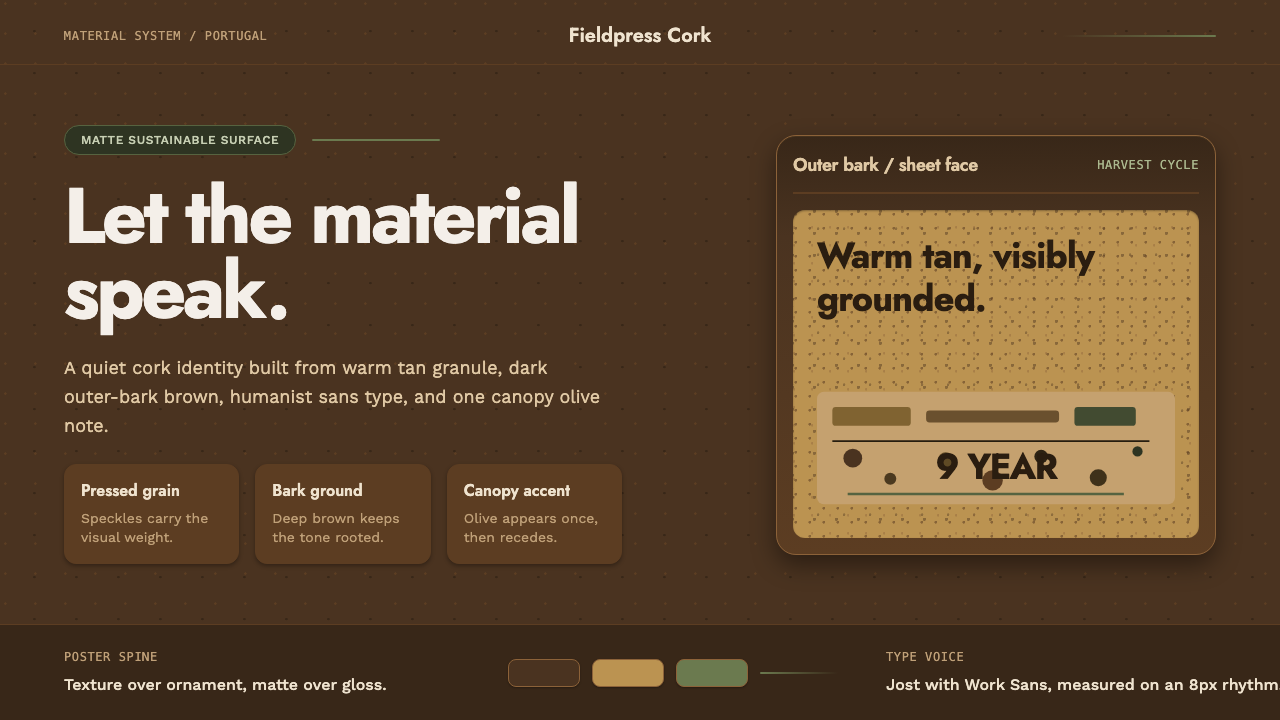 Portuguese CorkGrounded by texture. Cork tan speckles on bark brown, with one olive rule.
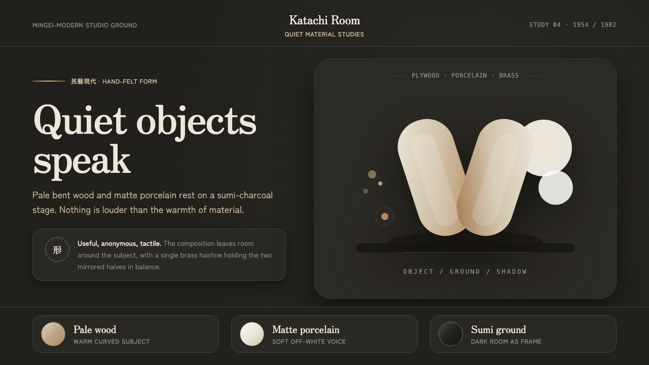 Sori Yanagi ButterflyQuiet objects speak. Pale plywood and matte porcelain glow on a sumi-charcoal…
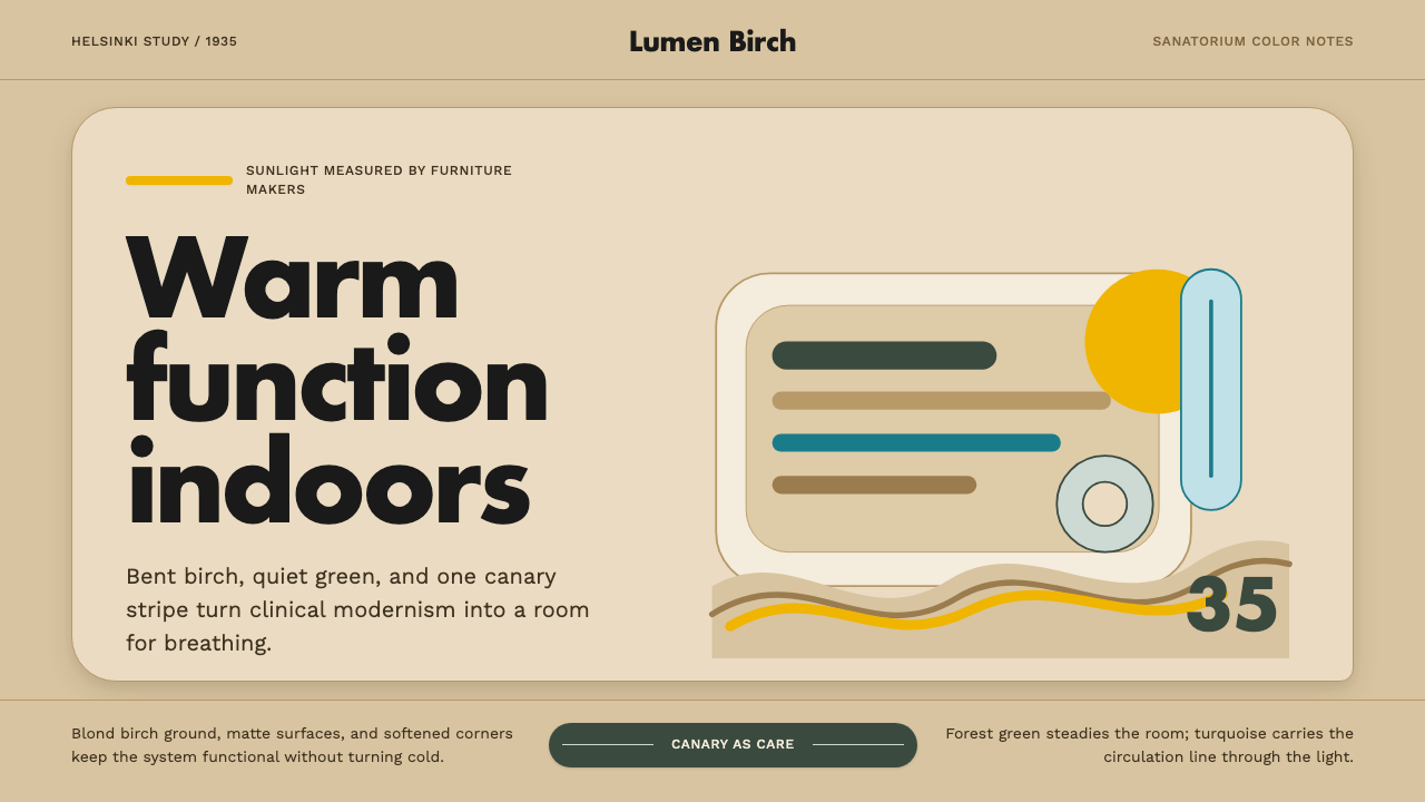 Aalto Finnish ModernModernism made humane. Birch fields, canary yellow, and soft plywood curves b…
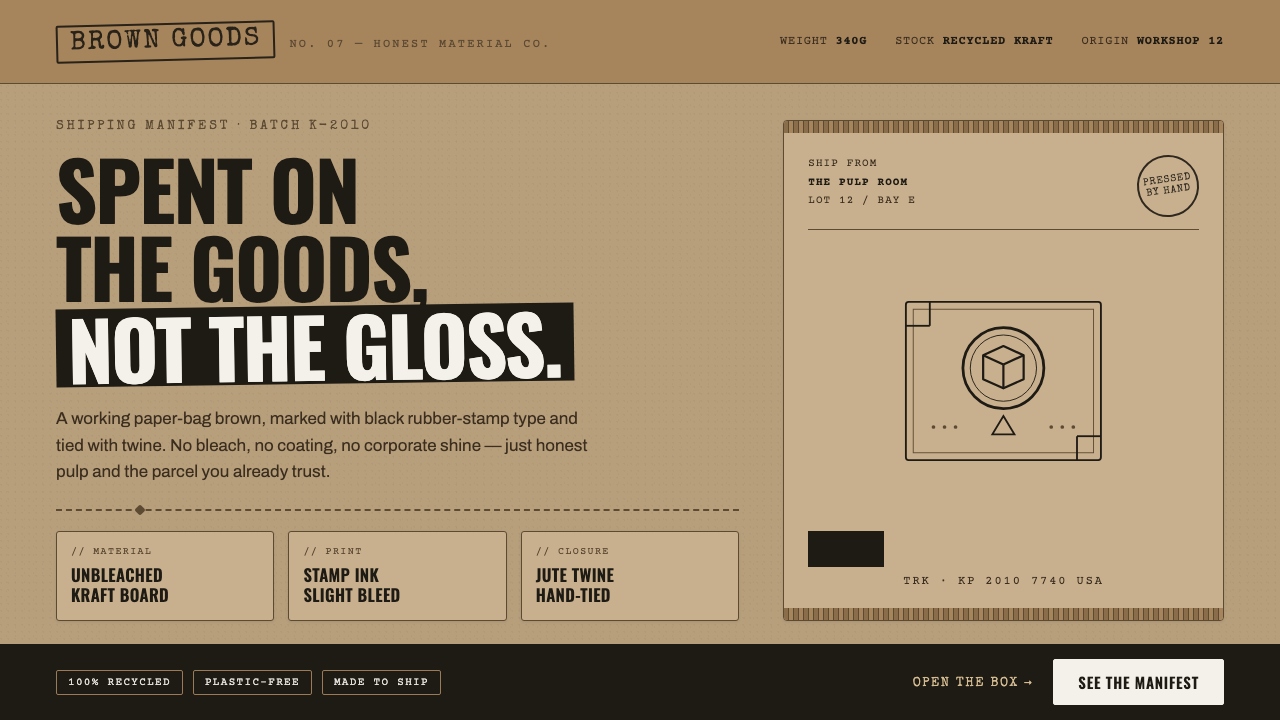 Kraft Paper PackagingThe goods, not the gloss. Mid kraft-brown fields, black rubber-stamp type, co…
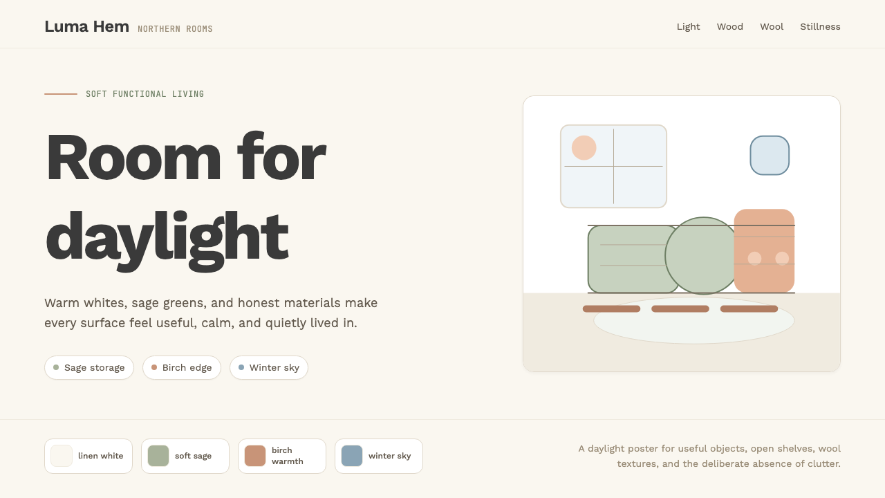 Scandi Hygge (IKEA)Warmth from restraint. Sage, linen white, Work Sans, and wide breathing room.
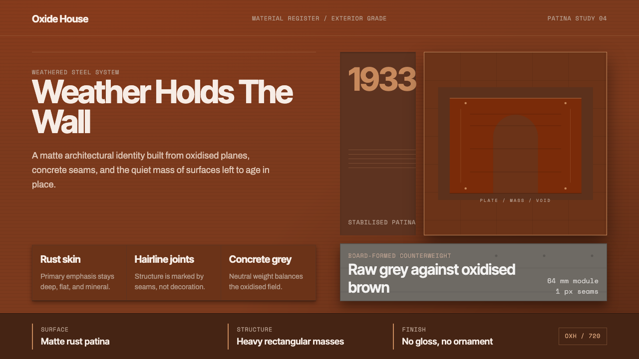 Corten Weathering SteelWeight over ornament. Rust-brown planes and concrete-grey seams make mass vis…