Design style guide设计风格指南
What is Uruguayan Yerba Mate?什么是 Uruguayan Yerba Mate?
Uruguay's mate culture turned a daily ritual into one of the world's most quietly assured packaging languages — deep herbal greens, warm gourd tones, and humanist restraint rooted in sixty years of Montevideo modernism.乌拉圭的马黛茶文化将一种日常仪式转化为世界上最沉静自信的包装语言之一——深邃的草本绿、温暖的葫芦色调,以及植根于蒙得维的亚六十年现代主义传统的人文克制。
Uruguayan Yerba Mate in briefUruguayan Yerba Mate 速览
Uruguayan Yerba Mate is a design system distilled from the visual identity of South America's most mate-saturated country. Uruguay consumes more yerba mate per capita than any nation on earth, and that ubiquity has given its leading brands — Canarias, Sara, Del Cebador — decades to settle into a visual language as settled and unhurried as a shared gourd passed around a rambla bench at dusk. The system draws directly from that language: deep dried-herb greens that recall the plant itself, warm wood-tan tones derived from the traditional gourd and bombilla, and a humanist typographic sensibility that never raises its voice.乌拉圭马黛茶是一套从南美马黛茶消费最密集国家的视觉身份中提炼而来的设计系统。乌拉圭的人均马黛茶消费量居全球之首,这种无处不在使其主要品牌——Canarias、Sara、Del Cebador——有了数十年时间沉淀出一套视觉语言,如同黄昏时分滨河长椅上众人传递的共享葫芦壶一般从容不迫。这套系统直接从那种语言中汲取:让人想起植物本身的深沉草本绿、源自传统葫芦壶与金属吸管的温暖木棕色调,以及从不抬高嗓门的人文主义排版感性。
What distinguishes this system from generic Latin American packaging is its specific rootedness in Montevideo's mid-century modernist graphic tradition. Uruguayan commercial printing in the 1960s was shaped by designers influenced by the Río de la Plata school — a current that absorbed European constructivism and Swiss international typography while remaining grounded in gaucho material culture and the quiet civic temperament of a small, literate, egalitarian country. The result is not loud or folkloric. It is steady, warm, and deeply considered.将这套系统与普通拉美包装设计区别开来的,是它对蒙得维的亚中世纪现代主义平面传统的深度植根。1960年代的乌拉圭商业印刷受到拉普拉塔河流派设计师的塑造——这股潮流吸收了欧洲建构主义与瑞士国际主义字体排印,同时扎根于高乔人的物质文化和一个小型、高识字率、平等主义国家的安静公民气质。其结果既不喧嚣也不民俗,而是稳重、温暖、深思熟虑。
The design vocabulary emphasizes organic calm over geometric assertiveness. Where Bauhaus reaches for primary color and hard geometric contrast, Uruguayan Yerba Mate reaches for natural analogy and tonal quietness. The palette evokes things you can touch and smell: dried leaves, worn timber, bleached linen, the dark ceramic of a traditional mug. Type is legible and grounded rather than spectacular. Space is used generously, in the manner of something that has nothing to prove.这套设计语汇强调有机的平静而非几何的张扬。包豪斯追求三原色与硬边几何对比,乌拉圭马黛茶则追求自然类比与色调的宁静。色板唤起的是可以触摸和嗅闻的事物:干燥的叶片、磨损的木材、漂白的亚麻布、传统马克杯的深色陶瓷。字体清晰而踏实,不追求奇观。留白的使用慷慨而自然,带着一种无需证明自身的从容。
See the Uruguayan Yerba Mate design system →查看 Uruguayan Yerba Mate 完整设计系统 →
Where does Uruguayan Yerba Mate come from?Uruguayan Yerba Mate 从何而来?
Yerba mate — the dried leaves of Ilex paraguariensis — has been cultivated and consumed in the Río de la Plata basin for centuries, long before European contact. The Guaraní people prepared it as a cold infusion called chimarrão, drinking from gourds through filtered reed straws. Spanish colonists adopted the habit in the seventeenth century and spread it across what would become Argentina, Uruguay, Paraguay, and southern Brazil. By the nineteenth century, mate had become the defining ritual of gaucho culture: the thermos, the gourd, and the bombilla were as essential to the mounted herder's kit as the facón knife.马黛茶——冬青属巴拉圭冬青的干燥叶片——早在欧洲接触之前数百年间便已在拉普拉塔河流域种植和饮用。瓜拉尼人将其作为一种称为「chimarrão」的冷浸液饮用,以葫芦为容器,通过过滤用的芦苇吸管啜饮。西班牙殖民者在十七世纪接受了这一习惯,并将其传播至后来成为阿根廷、乌拉圭、巴拉圭和巴西南部的地区。到十九世纪,马黛茶已成为高乔文化的核心仪式:保温壶、葫芦壶和金属吸管对骑马牧人来说,与腰间的「facón」刀同等不可或缺。
Uruguay's particular relationship with mate intensified through the twentieth century. Unlike Argentina, where coffee culture competes strongly in urban centers, Uruguay retained mate as the dominant social beverage across all classes and regions. State campaigns in the mid-twentieth century promoted domestic consumption, and cooperative packaging operations — including the Canarias cooperative, which dates its graphic identity to the early 1960s — developed visual standards that remained essentially stable for decades. These cooperatives were design clients with unusual constraints: budgets were modest, print runs were enormous, and the audience was the entire country. The result was packaging designed for legibility, durability, and recognition across every context from a rural almacén to a city supermarket.乌拉圭与马黛茶的特殊关系在二十世纪不断深化。与城市中咖啡文化强力竞争的阿根廷不同,乌拉圭在所有阶层和地区都保持马黛茶作为主导社交饮料。二十世纪中叶的国家宣传推动国内消费,合作社包装运营——包括图形身份可追溯至1960年代初的Canarias合作社——建立了在数十年间基本保持稳定的视觉标准。这些合作社是有着非凡约束条件的设计委托方:预算有限,印刷量巨大,受众是全国人民。其结果是为清晰性、耐用性和在每个场景下的可识别性而设计的包装——从乡村杂货店到城市超市。
The graphic design backdrop matters. Uruguay in the 1960s had a small but serious design community centered around ADGU (Asociación de Diseñadores Gráficos del Uruguay), which connected local practitioners to the international modernist conversation. Designers such as Tito Sequeira worked in a visual language that balanced European rigor with local material warmth — a sensibility directly legible in the mate brands of the period. The color choices were not arbitrary: the deep greens of the yerba plant, the tans and ochres of dried grass and timber, and the cream of unbleached paper were practical and culturally resonant simultaneously.平面设计背景举足轻重。1960年代的乌拉圭拥有一个以ADGU(乌拉圭平面设计师协会)为核心的规模不大却严肃认真的设计社群,将本地从业者与国际现代主义对话相连接。Tito Sequeira等设计师使用一种平衡欧洲严谨与本地材料温度的视觉语言——这种感性在同时期的马黛茶品牌中清晰可读。色彩选择并非随意:马黛草植物的深绿、干燥牧草与木材的棕褐与赭石,以及未漂白纸张的奶油色,既有实用考量又具文化共鸣。
The 2010s brought a wave of cooperative and artisan rebranding across the Southern Cone. Hermanos Estudio and similar Montevideo design practices revisited the classic mate brands with a contemporary minimalist sensibility, stripping away the accumulated decorative layers of intervening decades while preserving the essential palette and material references. This rebrand wave is the system's most direct design ancestor: it explains why the visual language feels both historically grounded and contemporary, rooted in the 1960s but refined through a twenty-first-century lens that removed sentimentality and tightened hierarchy.2010年代在南锥体掀起了一波合作社与工匠品牌焕新浪潮。Hermanos Estudio等蒙得维的亚设计事务所以当代极简主义感性重访经典马黛茶品牌,剥去几十年积累的装饰层次,同时保留本质色板与材料参照。这次焕新浪潮是该系统最直接的设计祖先:它解释了为何这套视觉语言既有历史根基又具当代感——植根于1960年代,但经由二十一世纪的眼光精炼,去除了感伤主义,收紧了层级关系。
What defines the Uruguayan Yerba Mate look?Uruguayan Yerba Mate 的视觉特征是什么?
Color — Herbal and Earthy色彩——草本与泥土
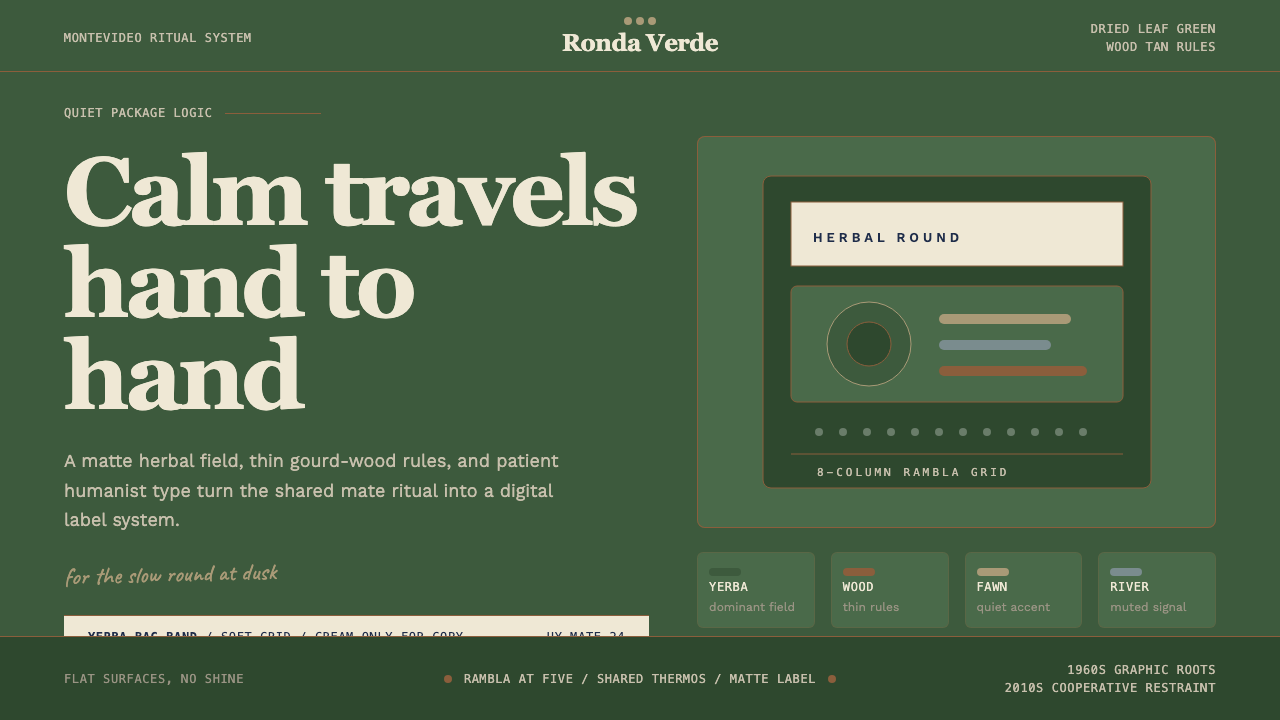
The palette is anchored by a deep dried-herb green that sits closer to olive than to emerald — a color you associate with dried plant matter rather than living foliage. Against this, warm wood-tan tones derived from the gourd and the bombilla provide the dominant accent, ranging from pale straw to burnished amber. A quiet cream provides the ground for most typographic elements, and near-black is used for primary text. The palette is warm-neutral overall: nothing is cool, nothing is synthetic, and saturated color appears only in small, purposeful doses as a signal rather than a mood.色板以深沉的干草本绿为锚点,这种绿色更接近橄榄而非祖母绿——它让人联想到干燥的植物材料而非鲜活的叶片。与之对应,源自葫芦壶与金属吸管的温暖木棕色调提供主要的强调色,从淡稻草色到深琥珀色不等。安静的奶油色为大多数排版元素提供底面,近黑色用于主要文字。整体色板是温暖的中性调:没有冷色,没有合成感,饱和色仅在小面积、有目的的场合作为信号出现,而非作为情绪渲染。
Typography — Humanist and Unhurried字体排印——人文且从容
Type choices favor humanist letterforms — designs where the geometry is guided by the hand and the breath rather than the compass. This creates a warmth that geometric sans-serifs lack: letterforms feel lived-in rather than constructed. Hierarchy is established through size and weight contrast that is pronounced but not aggressive, and generous leading gives body text room to settle. All-caps settings appear in label and header contexts with comfortable tracking, conveying authority without severity. The overall effect is legible from a distance, like text on a label designed to be read across a kitchen shelf.字体选择偏向人文主义字形——其几何形态受手与呼吸的引导,而非圆规的支配。这创造出几何无衬线字体所缺乏的温度:字形给人以历经岁月的感觉,而非被构建出来的感觉。层级通过明显但不具攻击性的大小与字重对比来建立,慷慨的行间距给正文以安定的空间。全大写设置出现在标签与标题场景,带有舒适的字距,传递权威而不失温和。整体效果是远距离可读的,如同一个设计用于从厨房架子对面阅读的标签上的文字。
Texture and Material Reference质感与材料参照
Unlike purely geometric design systems, Uruguayan Yerba Mate carries an implicit material memory. Surface treatments evoke kraft paper, unbleached linen, and weathered timber — the substrate of cooperative packaging before gloss finishes became standard. In digital contexts this translates not to simulated textures but to tonal warmth: backgrounds that read as slightly organic rather than clinically white, borders that feel like printed edges rather than CSS lines, and component surfaces that suggest tactility without resorting to skeuomorphism.与纯几何设计系统不同,乌拉圭马黛茶携带着隐性的材料记忆。表面处理唤起牛皮纸、未漂白亚麻布和风化木材的感觉——这是光泽饰面成为标准之前合作社包装的底材。在数字语境中,这不转化为模拟质感,而是转化为色调上的温度:背景读起来略显有机而非临床级别的白,边框感觉像是印刷边缘而非CSS线条,组件表面暗示触觉而不诉诸拟物化。
Rhythm and Ritual Spacing节奏与仪式间距
Mate is consumed slowly, in repeated rounds, with deliberate pauses. The spacing system internalizes this rhythm. Elements are not crowded; margins are wide enough to suggest ceremony rather than efficiency. Vertical rhythm is consistent and calm, with section breaks that feel like the pause before the next pour rather than hard interruptions. Component padding is generous without being wasteful. The system is opposed to urgency: call-to-action elements exist without visual alarm, positioned with confidence that the user will find them at their own pace.马黛茶是缓慢饮用的,在反复的轮次中,伴随着刻意的停顿。间距系统将这种节奏内化。元素不拥挤;留白足够宽阔,暗示仪式感而非效率。垂直节奏一致而平静,段落分隔感觉像是下一次倒水前的停顿,而非生硬的中断。组件内边距慷慨而不浪费。这套系统反对紧迫感:行动号召元素不带视觉警报地存在,定位带着自信——用户会按自己的节奏找到它们。
Iconography and Emblem图标与徽章
Where symbols appear, they draw from the material culture of the practice itself: the silhouette of the gourd, the arc of the bombilla, the simplified frond of the yerba plant. These are used sparingly and with the same restraint applied to color. Decorative borders, when present, reference the woodblock printing tradition of cooperative labels — simple repeated unit patterns derived from natural forms, not abstract geometry. The overall emblem vocabulary is warm and recognizable rather than novel: it builds on visual memory rather than demanding attention for its own originality.当符号出现时,它们从仪式本身的物质文化中汲取:葫芦壶的轮廓、金属吸管的弧线、马黛草植物的简化叶状体。它们的使用同样克制,与色彩的处理保持一致的节制。装饰性边框(若出现)参照合作社标签的木版印刷传统——源自自然形态的简单重复单元图案,而非抽象几何。整体徽章语汇温暖而易于识别,而非追求新奇:它建立在视觉记忆之上,而非要求关注其自身的原创性。
Tone — Cooperative, Not Luxury调性——合作社式,而非奢华
The emotional register of this system is deliberately collective and egalitarian. Mate is a shared beverage — the same gourd passes from hand to hand — and the visual language refuses the signals of premium exclusivity that dominate contemporary packaging. There is no gold, no high-gloss finish, no aggressively narrow type suggesting aspiration. The system communicates quality through restraint and material honesty rather than through markers of status. It feels like something owned by everyone who uses it, not by the brand that sells it.这套系统的情感基调刻意是集体性和平等主义的。马黛茶是一种共享饮料——同一个葫芦壶从一双手传到另一双手——而其视觉语言拒绝了主导当代包装的溢价排他性信号。没有金色,没有高光饰面,没有暗示上进心的攻击性窄字体。系统通过克制与材料诚实而非身份标志来传递品质。它给人的感觉像是属于所有使用它的人,而非销售它的品牌。
See the Uruguayan Yerba Mate design system →查看 Uruguayan Yerba Mate 完整设计系统 →
Who shaped Uruguayan Yerba Mate?谁塑造了 Uruguayan Yerba Mate?
One of the defining figures of mid-century Uruguayan graphic design, Sequeira worked across commercial, editorial, and cultural contexts in Montevideo during the period when the country's packaging aesthetic was being established. His work exemplifies the Río de la Plata school's ability to absorb European modernist influences — Swiss typography, constructivist composition — and translate them through a local material and cultural sensibility, producing work that felt international in rigor and Uruguayan in warmth. His influence is traceable in the typographic restraint and earthy palette choices that became standard across Uruguayan cooperative packaging.乌拉圭中世纪平面设计的奠基人物之一,塞凯拉在蒙得维的亚从事商业、编辑和文化等多领域设计工作,正值该国包装美学的确立时期。他的作品体现了拉普拉塔河流派吸收欧洲现代主义影响——瑞士字体排印、构成主义构图——并将其转化为本地材料与文化感性的能力,产生出在严谨性上国际化、在温度上具乌拉圭特质的作品。他的影响可在排版克制与泥土色调选择中追溯,这些特质成为乌拉圭合作社包装的标准语言。
A Montevideo-based design practice that became emblematic of the 2010s mate brand renewal wave. Hermanos Estudio's approach to heritage brands — particularly in the yerba mate and food cooperative sector — combined deep respect for existing visual equity with a rigorous contemporary edit: reducing decorative accumulation, tightening typographic hierarchy, and returning attention to the essential material palette that had made the original designs endure. Their work demonstrated that the 1960s Uruguayan packaging language needed refinement, not replacement, and that its humanist warmth was a competitive advantage in a design landscape dominated by geometric cool.蒙得维的亚设计事务所,成为2010年代马黛茶品牌焕新浪潮的标志性代表。Hermanos Estudio对传统品牌的处理方式——尤其是在马黛茶与食品合作社领域——将对现有视觉资产的深度尊重与严格的当代编辑相结合:减少装饰积累,收紧排版层级,将注意力带回使原始设计经久耐用的本质材料色板。他们的工作证明,1960年代的乌拉圭包装语言需要的是精炼而非替换,其人文主义温度在一个被几何冷酷主导的设计格局中是一种竞争优势。
The Canarias cooperative is not a single designer but a collective enterprise that, over six decades of continuous operation, produced one of the most stable and trusted graphic identities in Uruguayan consumer goods. The cooperative's packaging decisions — constrained by cooperative economics, domestic print technology, and the need to survive unchanged on shelves for years at a time — became an involuntary design system: consistent, durable, and deeply absorbed into the national visual memory of what mate looks like. Its graphic history is a case study in how practical constraints can produce aesthetic discipline.Canarias合作社不是单一设计师,而是一个集体企业,在六十年的持续运营中,产生了乌拉圭消费品中最稳定、最受信赖的视觉身份之一。合作社的包装决策——受合作社经济、国内印刷技术以及需要在货架上多年保持不变的约束——形成了一套无意为之的设计系统:一致、耐用,并深深融入马黛茶外观的国家视觉记忆。其平面历史是实践约束如何产生美学纪律的一个案例研究。
The professional association of Uruguayan graphic designers, ADGU played a formative role in connecting Montevideo practitioners to international modernist discourse from its founding in the mid-twentieth century. By creating a community of practice and facilitating access to international design publications and exhibitions, ADGU helped establish shared standards of craft and critical vocabulary among designers who otherwise worked in relative isolation from European and North American centers. Its influence is visible in the consistent professional quality of Uruguayan packaging design during the decades when the mate brand aesthetic was being solidified.乌拉圭平面设计师专业协会,ADGU在二十世纪中叶成立以来,在将蒙得维的亚从业者与国际现代主义话语相连接方面发挥了奠基性作用。通过建立实践社群、促进国际设计出版物和展览的获取,ADGU帮助在设计师群体中建立了共同的工艺标准和批评词汇,而这些设计师在其他情况下与欧美中心相对隔绝地工作。其影响在马黛茶品牌美学固化的数十年间,体现于乌拉圭包装设计一贯的专业品质之中。
Del Cebador — named for the person who prepares and serves mate in the traditional round — represents the lineage of artisan and regional mate brands that maintained hand-drawn lettering, regional color associations, and material reference long after the cooperative giants had standardized their packaging. These smaller brands preserved design decisions that later rebranders would rehabilitate: irregular baselines, slightly imprecise registration, and the visual warmth of letterpress printing. Del Cebador's graphic history documents how regional character persisted in Uruguayan packaging even as international modernism exerted pressure toward uniformity.Del Cebador——以传统轮次中准备和传递马黛茶的人命名——代表了工匠和地方马黛茶品牌的传承,这些品牌在合作社巨头规范化包装之后很久,仍保持手绘字体、地方色彩联想和材料参照。这些小品牌保留了后来的品牌焕新者所要复兴的设计决策:不规则的基线、略显不精确的套印,以及活版印刷的视觉温度。Del Cebador的平面历史记录了地方特色如何在国际现代主义施压走向统一的过程中,在乌拉圭包装中持续留存。
How do you use Uruguayan Yerba Mate today?今天怎么用 Uruguayan Yerba Mate?
The Uruguayan Yerba Mate system is most at home in contexts that value earned trust, collective warmth, and material honesty over novelty or luxury signaling. It is the right choice for products and services that want to feel like a long-standing cooperative rather than a venture-backed startup — consumer food and beverage, community platforms, health and wellness applications that emphasize ritual over optimization, and editorial projects rooted in cultural specificity. The system performs best when the product genuinely shares its values: if the brand is actually egalitarian and slow-paced, the visual language will feel authentic; if it is a premium brand borrowing cooperative aesthetics as a marketing strategy, the mismatch will be perceptible.乌拉圭马黛茶系统最适合那些重视赢得的信任、集体温度和材料诚实而非新奇或奢华信号的场景。它适合那些希望感觉像是历史悠久的合作社而非风投支持的初创公司的产品和服务——消费类食品饮料、社区平台、强调仪式而非优化的健康应用,以及植根于文化特殊性的编辑项目。当产品真正与系统分享其价值观时,它表现最佳:如果品牌确实是平等主义的和从容的,视觉语言就会感觉真实;如果是溢价品牌借用合作社美学作为营销策略,不匹配会显而易见。
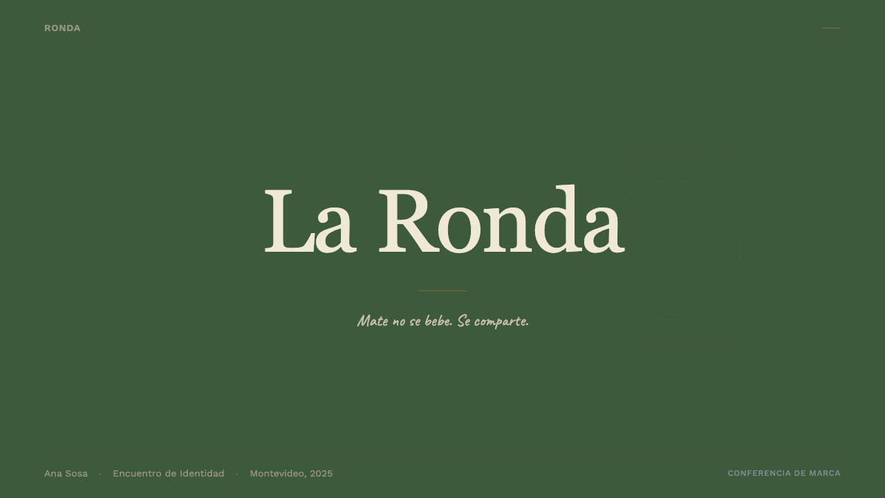
For presentation slides, the system's palette and typographic hierarchy produce covers and content pages that feel grounded and authoritative without visual aggression. A cover works well with a full-bleed deep green ground, the presentation title in warm cream type at generous scale, and a single material-reference emblem — a simplified gourd silhouette or a botanical frond — placed asymmetrically as an anchor rather than a decoration. Content slides should maximize white or cream space, using a single strong typographic hierarchy rather than competing visual systems. Data slides should treat charts as objects in the material palette — bars in the wood-tan range, key values in deep green, with generous padding between elements so the data has room to breathe in the way the system treats everything.对于演示文稿,该系统的色板和排版层级产生的封面和内容页面感觉踏实而有权威,不带视觉攻击性。封面适合以深绿色满铺为底,演示标题以大尺度温暖奶油色字体呈现,一个材料参照性徽章——简化的葫芦壶轮廓或植物叶状体——以非对称方式置于一角作为锚点而非装饰。内容页应最大化白色或奶油色空间,使用单一有力的排版层级而非相互竞争的视觉系统。数据页应将图表视为材料色板中的对象——柱状图用木棕色系,关键数值用深绿,元素之间保持慷慨的内边距,让数据有足够的呼吸空间,如同这套系统对待一切事物的方式。
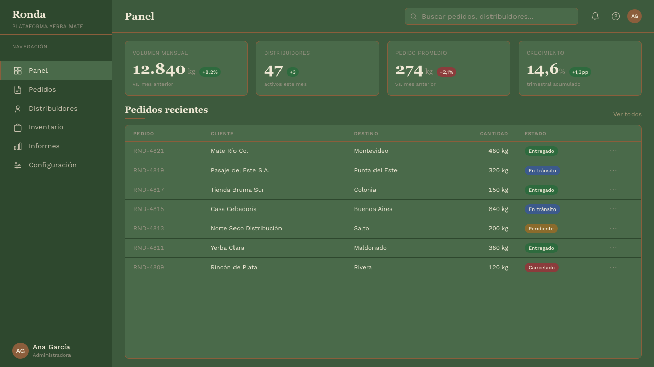
For web interfaces and dashboards, the system's warmth and generous spacing make it particularly effective for applications where users spend extended time — long-form reading interfaces, journaling tools, community forums, and cooperative management platforms. The approach is: warm off-white backgrounds rather than pure white, generous body text leading, and interactive states that use the deep green as a focus indicator rather than the electric blue that dominates contemporary UI. Cards use soft shadow over hard border; navigation is typographic and unhurried. Avoid urgent visual patterns — no red badges on non-emergency notifications, no animated attention-grabbers, no density that implies the user should feel rushed.对于网页界面和仪表板,该系统的温度和慷慨间距使其特别适合用户长时间停留的应用——长篇阅读界面、日记工具、社区论坛和合作社管理平台。方法如下:温暖的非纯白背景而非纯白,慷慨的正文行间距,以深绿作为焦点指示符的交互状态而非主导当代UI的电光蓝。卡片使用柔和投影而非硬边框;导航是字体性的、从容的。避免紧迫的视觉模式——非紧急通知不加红色角标,无动态注意力吸引器,无密度造成的用户被催促感。
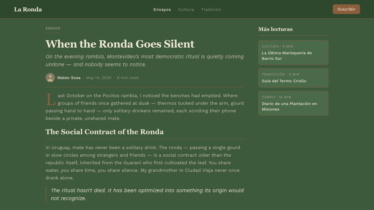
For editorial and marketing work, the system excels at projects where heritage and continuity are values: cultural journalism, cooperative annual reports, food and agriculture publications, and brand campaigns for products with genuine long histories. A Uruguayan Yerba Mate editorial layout uses a wide measure for body text on cream ground, positions pull-quotes in the warm wood-tan range, and uses the deep green sparingly for section headers and structural dividers. Marketing pages feel most authentic when they resist the temptation to accelerate: hero sections with generous vertical space, feature blocks that give each claim room to land before the next begins, and calls to action that invite rather than demand.对于编辑和营销工作,该系统在传承与延续性是价值观的项目中表现出色:文化新闻、合作社年报、食品与农业出版物,以及有真实悠久历史的产品品牌活动。乌拉圭马黛茶编辑版面在奶油底面上为正文使用宽行宽,在温暖木棕色系中放置引文,深绿仅用于章节标题和结构性分隔。当营销页面抵抗加速诱惑时感觉最真实:hero区段有慷慨的垂直空间,功能区块给每个主张足够的空间落地再开始下一个,行动号召是邀请而非命令。
A common mistake when applying this system is reaching for the palette while ignoring the spacing and typographic rhythm that give it meaning. Deep greens and wood tans applied at high density on a tight grid produce something that reads as earthy without conveying the ritual calm that is the system's actual distinguishing quality. The system requires generosity of space to work: if the layout feels crowded, the palette alone cannot rescue it. A secondary error is adding decorative folklore elements — cacti, gauchos, maps — that the original system explicitly avoids. The visual language earns its cultural specificity through material reference and typographic temperament, not through illustration. The moment explicit regional imagery appears, the system tips from quietly rooted to costume.应用这套系统时最常见的错误是:拿到色板就用,却忽略了赋予其意义的间距和排版节奏。深绿与木棕色在紧密网格上高密度应用,产生出有泥土气息的东西,却无法传达仪式平静——而这才是该系统真正的区别性品质。这套系统需要空间的慷慨才能奏效:如果版面感觉拥挤,色板单独无法拯救它。第二个错误是加入系统明确回避的民俗装饰元素——仙人掌、高乔人、地图。视觉语言通过材料参照和排版气质获得其文化特殊性,而非通过插图。一旦明确的地域图像出现,系统就从安静地植根于文化,变成了穿上了戏服。
See the Uruguayan Yerba Mate design system →查看 Uruguayan Yerba Mate 完整设计系统 →
Uruguayan Yerba Mate — FAQUruguayan Yerba Mate · 常见问题
How is Uruguayan Yerba Mate different from other Latin American design styles?乌拉圭马黛茶与其他拉美设计风格有何不同?
Most Latin American design traditions lean toward warmth through chromatic richness — vivid yellows, terracottas, saturated magentas — and figurative imagery drawn from regional iconography. Uruguayan Yerba Mate is unusual in achieving warmth through material restraint rather than chromatic exuberance. The palette is narrow and desaturated by regional standards; the typography is humanist and quiet rather than expressive and folkloric; the imagery is material rather than symbolic. This reflects the specific character of Uruguayan culture — a small, literate, European-inflected country with a strong cooperative tradition — rather than a pan-Latin aesthetic. The system is closer in spirit to Scandinavian cooperatives or Japanese folk craft traditions than to Mexican or Brazilian visual cultures.大多数拉美设计传统通过色彩丰富性获得温度——鲜艳的黄色、赤陶色、饱和的洋红——以及从地方图像学中汲取的具象图像。乌拉圭马黛茶的不寻常之处在于通过材料克制而非色彩丰盛来实现温度。按地区标准,色板是窄且低饱和度的;字体排印是人文主义的、安静的,而非表达性的和民俗性的;图像是材料性的而非象征性的。这反映了乌拉圭文化的特殊性——一个小型的、高识字率的、深受欧洲影响且有强大合作社传统的国家——而非泛拉美美学。这套系统在精神上更接近斯堪的纳维亚合作社或日本民艺传统,而非墨西哥或巴西的视觉文化。
Can this style work for digital products, or is it too rooted in physical packaging?这种风格适用于数字产品吗?还是说它过于扎根于实体包装?
The style translates well to digital contexts precisely because its core principles — material warmth, generous spacing, typographic restraint, structural calm — are not dependent on physical substrate. What needs translation is the tactile quality: in digital contexts, this becomes tonal warmth in background colors, consistent border-radius choices that feel organic rather than sharp, and a typography scale that never feels compressed. The system avoids features that are exclusively digital — aggressive hover effects, animated transitions for their own sake, notification badges — not because they are impossible to do in the style but because they introduce urgency that contradicts the system's fundamental temperament. Used in a long-form reading application, a community platform, or a wellness product, it can feel as appropriate digitally as it does on a kraft-paper label.这种风格能很好地转化为数字语境,正是因为其核心原则——材料温度、慷慨间距、排版克制、结构平静——并不依赖实体底材。需要转化的是触觉品质:在数字语境中,这转化为背景色调上的温度、感觉有机而非尖锐的统一圆角选择,以及从不让人感到压缩的字体比例。这套系统回避专属数字的功能——攻击性的悬停效果、为了动态而动态的过渡效果、通知角标——不是因为无法以这种风格实现,而是因为它们引入了与系统基本气质相矛盾的紧迫感。用于长篇阅读应用、社区平台或健康产品时,它在数字场景中可以和在牛皮纸标签上一样贴切。
Is this system appropriate for brands that have no connection to Uruguay or mate culture?这套系统适合与乌拉圭或马黛茶文化毫无关联的品牌吗?
Yes, as long as the application avoids explicit cultural signifiers and engages with the underlying values the style expresses rather than its surface imagery. The system's core — cooperative warmth, material honesty, unhurried pacing, egalitarian tone — is universal. A food brand in Japan, a community platform in Sweden, or a wellness application in Canada can use the typographic and color principles authentically if the brand genuinely shares those values. The risk arises when a brand borrows the visual surface while contradicting the underlying values: a luxury product using cooperative aesthetics to simulate accessibility, or an urgency-driven product using the calm palette to appear more considered than it is. The question to ask is not whether the brand is Uruguayan but whether it is genuinely slow, collective, and honest — if those words describe it accurately, the system will feel earned.可以,只要应用回避明确的文化符号,并与风格所表达的深层价值观而非其表面图像产生关联。这套系统的核心——合作社温度、材料诚实、从容节奏、平等主义调性——是普世的。日本的食品品牌、瑞典的社区平台或加拿大的健康应用,如果品牌确实分享这些价值观,就能真实地使用这套排版和色彩原则。风险在于品牌借用视觉表面却违背深层价值观的情况:奢华产品使用合作社美学模拟亲民感,或以紧迫性驱动的产品使用平静色板来显得比实际更有考量。要问的问题不是品牌是否来自乌拉圭,而是它是否真正缓慢、集体化且诚实——如果这些词准确地描述了它,这套系统就会感觉是应得的。
How should this style handle dark mode?这种风格应该如何处理深色模式?
Dark mode is possible but requires care. The canonical form of the system is light-ground — cream and near-white backgrounds are load-bearing to the material warmth. A dark inversion should not simply swap cream for black, because pure black backgrounds remove the tonal warmth that the system depends on and make the deep green palette element disappear. A successful dark variant uses a very deep, slightly warm near-black as the ground — something closer to very dark olive or dark charcoal with a warm undertone — and brings the cream and wood-tan tones forward as primary text and accent colors. The deep green can shift toward a lighter, muted sage for visibility. The key constraint is preserving warmth throughout: if the dark variant starts reading as cool or tech-forward, the system's identity has been lost.深色模式是可行的,但需要谨慎处理。该系统的标准形态是浅色底面——奶油和近白色背景对材料温度具有承重作用。深色反转不应简单地将奶油色换成黑色,因为纯黑背景消除了系统所依赖的色调温度,并使深绿色板元素消失。成功的深色变体使用极深、略带温度的近黑色作为底面——接近非常深的橄榄色或带有暖色调的深炭色——并将奶油色和木棕色调提升为主要文字和强调色。深绿可以向更浅、更柔和的灰绿色偏移以提高可见度。关键约束是在整体上保持温度:如果深色变体开始读起来像冷色调或技术前沿感,系统的身份就已经丢失。
What makes this system feel different from general 'natural' or 'organic' design trends?是什么让这套系统感觉不同于普通的「自然」或「有机」设计潮流?
Contemporary 'natural' and 'organic' design trends often achieve their effect through simulated textures, grain overlays, illustrated botanicals, and a kind of deliberate imperfection that reads as hand-crafted. Uruguayan Yerba Mate achieves its organic quality through entirely different means: palette choices rooted in actual material reference, typographic decisions grounded in humanist rather than geometric forms, and spacing that mirrors the pacing of the cultural practice it draws from. There is no grain texture, no illustrated leaf, no deliberate imperfection. The warmth comes from proportion and color temperature rather than from surface decoration. This makes the system more durable and more transferable: it ages better than trend-driven organicism because it is not imitating craft — it is practicing the design principles that craft produces.当代「自然」和「有机」设计潮流通常通过模拟质感、颗粒叠加、植物插图以及一种被解读为手工制作的刻意不完美来达到效果。乌拉圭马黛茶通过完全不同的方式实现其有机品质:植根于真实材料参照的色板选择、基于人文主义而非几何形态的字体决策,以及镜像其所汲取文化实践节奏的间距。没有颗粒质感,没有插图叶片,没有刻意的不完美。温度来自比例与色温,而非来自表面装饰。这使该系统更为耐用和可移植:它比趋势驱动的有机主义更经久,因为它不是在模仿手工艺——它在实践手工艺所产生的设计原则。
Related design styles相关设计风格
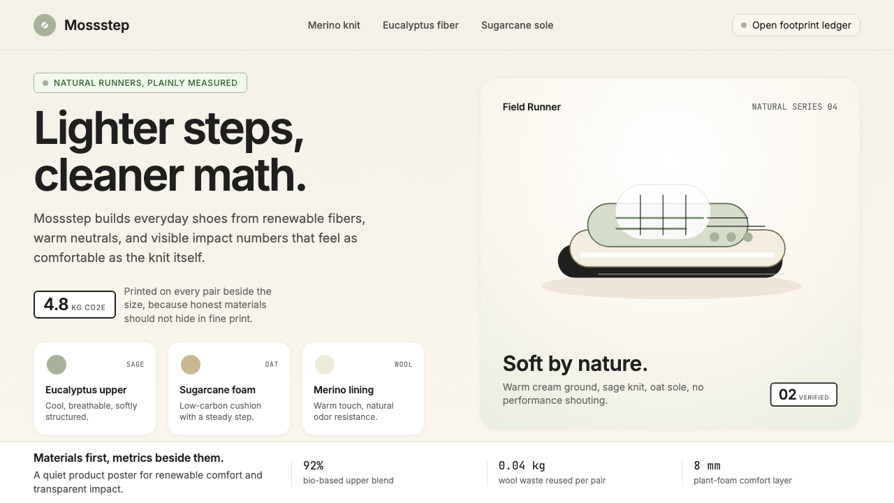 AllbirdsSustainability that breathes. Cream-and-sage tones, carbon labels next to pri…可持续,但绝不说教:奶油色与鼠尾草绿、碳足迹标签与价格并排——一种深呼吸般的诚…
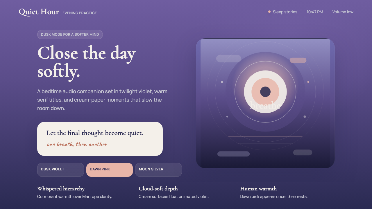 Calm App Purple MeditationWhispers at bedtime. Dusk-purple gradients, cream serif type, and dawn-pink w…睡前低语。暮紫渐变、奶油衬线与黎明粉暖意。
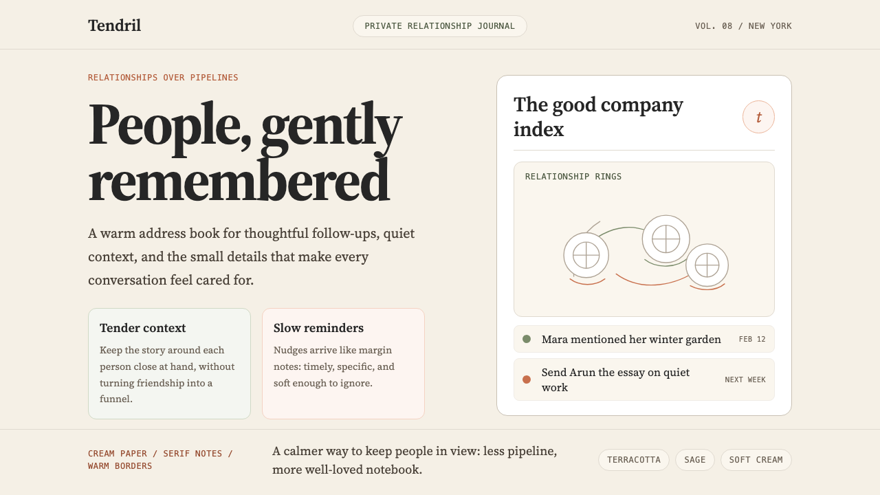 Clay 2024CRM as a sketchbook, not a sales pipeline. Cream backgrounds, terracotta, han…把 CRM 重新想象为安静的私人速写本:奶油底色、陶土点缀、手绘人物线描——拒…
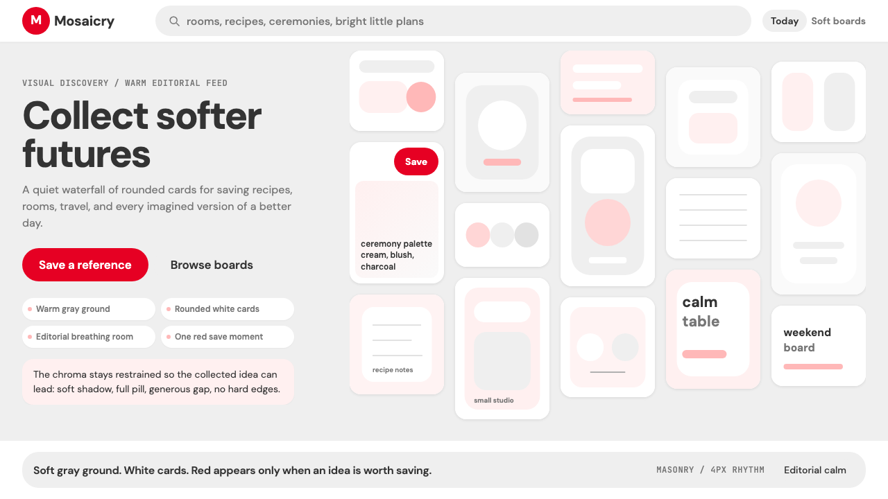 Pinterest 2024Aspirational calm. Warm gray masonry, rounded white pins, one surgical red sa…向往感很安静:暖灰瀑布流、白色圆角卡片、一颗红色保存按钮。
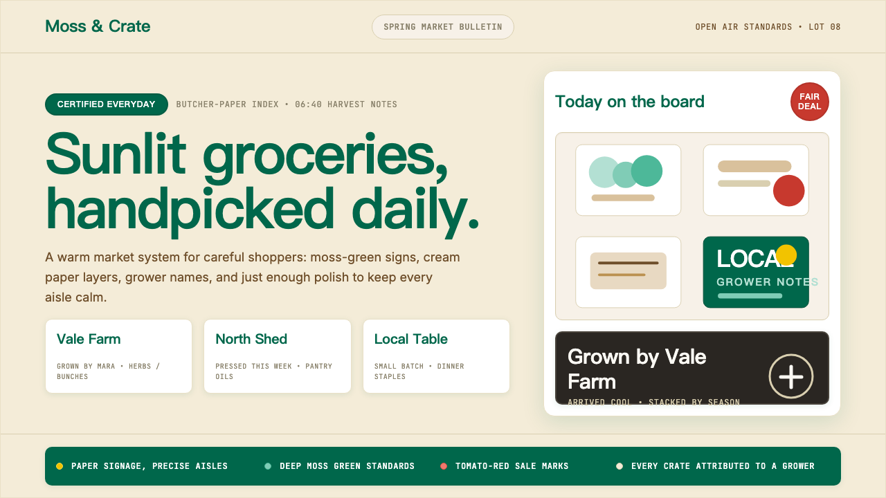 Whole Foods MarketFarmer’s-market polish. Moss green on butcher-paper cream, white cards, growe…农贸市集的精致感:苔藓绿配牛皮纸奶油底,白卡片写下农场主。
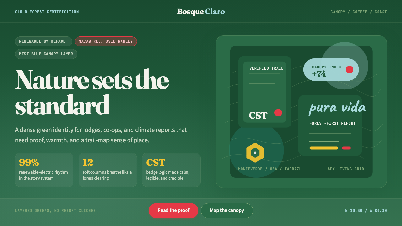 Costa Rica Pura Vida EcoAlive without greenwash. Cloud-forest green, Fraunces serif, and scarlet acce…拒绝漂绿:云雾森林绿、Fraunces衬线与猩红点缀撑起生机。