What is Whole Foods Market?什么是 Whole Foods Market?
Whole Foods Market dresses premium organic retail in the warmth of a sun-dappled farmer's market — deep mossy greens, butcher-paper creams, and chalkboard lettering that makes grocery shopping feel like a Saturday morning ritual.全食超市将高端有机零售包裹在阳光斑驳的农贸市场温度里——深苔藓绿、牛皮纸奶油色与黑板手写字,让买菜这件事变得像周六清晨的仪式。
Whole Foods Market in briefWhole Foods Market 速览
Whole Foods Market's visual identity is the rare retail design system that succeeds at fusing two normally contradictory impulses: handcrafted authenticity and corporate operational polish. Its palette centers on a deep, earthy mossy green paired with warm butcher-paper cream, accented by natural whites and rich soil tones. The result reads less like a supermarket brand and more like the visual language of the organic farming movement itself — earthy, grounded, and quietly aspirational.全食超市的视觉识别系统,是零售设计中罕见地将两种通常相互矛盾的冲动成功融合的案例:手工质感的真实性与企业级运营的精致度。其色盘以深沉、质朴的苔藓绿为核心,搭配温暖的牛皮纸奶油色,辅以自然白与丰沛的泥土调。最终呈现出来的不像一个超市品牌,更像有机农业运动本身的视觉语言——踏实、接地,带着一种低调的向往感。
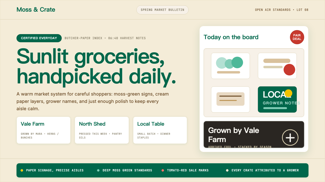
The system draws heavily on market-stall typography: chalkboard hand-lettering naming individual growers, kraft-paper tags, and cards that attribute produce to specific farms and regions. This attribution design — telling you not just what you're buying but who grew it and where — is the visual equivalent of the conscious-consumer ethos the brand embodies. Typography moves between a sturdy, warm serif for editorial moments and handwritten or chalk-style lettering for product callouts, giving the identity an artisanal range that few retail brands achieve.这套系统大量借鉴市集摊位的排版语言:用黑板手写字标注各位种植者的名字,用牛皮纸标签与卡片将产品溯源到具体农场与产地。这种溯源式设计——不仅告诉你买的是什么,还告诉你谁种的、在哪里种的——在视觉层面呈现了品牌所承载的有意识消费理念。字体在厚实温暖的衬线体(用于编辑语境)与手写或粉笔风格字(用于产品标注)之间切换,赋予品牌一种手工艺质的多元性,这是大多数零售品牌难以企及的。
What distinguishes the Whole Foods aesthetic from generic 'natural' branding is its sense of material specificity. Textures evoke real things — the rough weave of burlap, the soft grain of unbleached paper, the matte surface of a chalkboard. Even in digital contexts, the design system preserves this texture-forward sensibility, favoring warm-toned photography of actual food and farms over flat illustrations or abstract patterns. The overall feeling is abundance without excess, quality without coldness.将全食美学与泛化的「天然」品牌区别开来的,是其对材料质感的高度特异性。纹理唤起真实的事物——粗麻布的粗粝编织、未漂白纸张的柔软纹理、黑板的哑光表面。即便在数字语境中,这套设计系统依然保持这种以质感为先的感受,偏好真实食材与农场的暖调摄影,而非平面插图或抽象图案。整体感受是丰盛而不过度,有品质而不冷漠。
See the Whole Foods Market design system查看 Whole Foods Market 完整设计系统
Where does Whole Foods Market come from?Whole Foods Market 从何而来?
Whole Foods Market was founded in Austin, Texas in 1980, when John Mackey and Renee Lawson Hardy merged their small natural foods store, SaferWay, with a local competitor, Clarksville Natural Grocery. The timing placed the brand at the center of a cultural shift: the American natural foods movement was gaining mainstream traction, and a growing number of middle-class consumers were beginning to connect what they ate with their values around health, environment, and social responsibility. The original store, at roughly twelve thousand square feet, was unprecedented in scale for a natural foods retailer — a deliberate signal that organic food could be a serious, abundant commercial proposition rather than an austere countercultural alternative.全食超市于1980年在美国德克萨斯州奥斯汀创立,由约翰·麦基与蕾妮·劳森·哈迪将他们的小型天然食品店SaferWay与当地竞争对手克拉克斯维尔天然杂货店合并而成。创立时机恰逢一场文化转型的中心:美国天然食品运动正在赢得主流关注,越来越多的中产消费者开始将饮食选择与他们在健康、环境与社会责任方面的价值观相联结。最初的门店约有一万两千平方英尺,对天然食品零售商而言规模前所未有——这是一个蓄意的信号:有机食品可以是严肃的、丰盛的商业主张,而非苦涩的反主流文化替代品。
The visual identity that emerged over the company's first decades was rooted in the visual grammar of the farmer's market and the whole earth movement. The Whole Earth Catalog, published from 1968 onward by Stewart Brand, had established a particular visual language for the alternative lifestyle movement: kraft paper, hand-lettered type, illustrated engravings, and a commitment to showing the provenance of goods. Whole Foods inherited and commercialized that sensibility — taking its earthy palette, its attributional typography, and its ethos of knowing your source, and applying them at grocery chain scale.公司最初数十年间涌现出的视觉识别,根植于农贸市场与全地球运动的视觉语法。斯图尔特·布兰德自1968年起出版的《全球概览》,为另类生活方式运动确立了一套特定的视觉语言:牛皮纸、手写字体、版画插图,以及对展示商品来源的执念。全食继承并商业化了这种感受性——沿用其质朴色盘、溯源式排版与追问来源的精神,将它们应用于连锁超市的规模。
The company expanded aggressively through the 1990s and 2000s, and with growth came the challenge of maintaining the handcrafted, market-stall feeling across hundreds of locations. Walter Robb, who became co-CEO alongside John Mackey in 2010, oversaw a period in which the brand's operational systems were professionalized without sacrificing the artisanal character of its store environments. Each location retained the visual vocabulary — chalkboards, grower cards, wooden produce displays — while store design became increasingly codified. The tension between local authenticity and national consistency became a defining design challenge.公司在1990年代和2000年代快速扩张,规模增长带来了一个挑战:如何在数百家门店中保持手工质感的市集氛围。2010年与约翰·麦基共同出任联席首席执行官的沃尔特·罗伯,主导了一个将品牌运营系统专业化同时未牺牲门店手工艺气质的时期。每家门店保留着视觉词汇——黑板、种植者卡片、木质蔬果陈列——而门店设计变得日益编码化。本地真实性与全国一致性之间的张力,成为这套设计系统最核心的挑战。
The most significant shift in the brand's recent history came with Amazon's acquisition in 2017, for approximately thirteen billion dollars. Jeff Bezos's involvement brought data-driven retail logic and Prime member integration to a brand built on handcrafted warmth — a pairing that many observers found incongruous. The visual identity had undergone a notable refresh around 2016, led by design agency Concrete, which sharpened the green palette, refined the typographic system, and brought greater consistency to signage and packaging. This refreshed system had to absorb the Amazon integration without losing the farmer's-market feeling that justified the brand's premium positioning. The result is a dual character that is now central to what the Whole Foods aesthetic represents: artisanal visual warmth as a scalable system.品牌近年史上最重大的转变,是2017年亚马逊以约一百三十亿美元完成的收购。杰夫·贝佐斯的介入,为这个建立在手工温度上的品牌引入了数据驱动的零售逻辑与Prime会员整合——许多观察者认为这种组合颇为违和。视觉识别在2016年前后经历了一次显著焕新,由设计机构Concrete主导,将绿色色盘打磨得更为锐利,精炼了排印系统,并为标识与包装带来更强的一致性。这套焕新后的系统必须吸收亚马逊整合,同时不丢失为品牌高端定位提供正当性的农贸市场感受。最终结果是一种双重性格,如今已成为全食美学最核心的特征:手工视觉温度,作为可规模化的系统。
What defines the Whole Foods Market look?Whole Foods Market 的视觉特征是什么?
Color Palette色彩体系
The foundational palette pairs a deep, earthy mossy green — somewhere between forest floor and aged sage — with warm butcher-paper cream as the primary ground. This pairing anchors the brand in the natural world without reaching for the artificial brightness of conventional grocery retail. Supporting tones include rich soil browns, warm off-whites, and occasional barn reds or harvest golds used as secondary accents. The overall palette reads as warm, grounded, and seasonal — the colors of a produce table at peak harvest rather than the colors of a branded system.基础色盘以深沉质朴的苔藓绿——介于林地地面与老鼠尾草之间——搭配温暖的牛皮纸奶油色作为主底色。这一配对将品牌锚定于自然世界,而不借助传统食品零售的人工亮色。辅助色调包括丰沛的泥土棕、温暖的近白色,以及偶尔作为次级强调的谷仓红或丰收金。整体色盘传递出温暖、踏实与季节感——那是盛产时节蔬果摊上的颜色,而非一套品牌系统的颜色。
Typography字体排印
Whole Foods typography occupies a deliberately artisanal register, moving between several registers within a single layout. A sturdy, slightly humanist serif carries the weight of product names and editorial headlines, lending warmth and readability at large scales. Hand-lettered or chalk-style display type appears on chalkboards, signage, and promotional materials — its slight imperfection a deliberate signal of human involvement. Body text is kept clean and unhurried. The mix reads as curated rather than designed: a typographic market stall where each voice is distinct but the overall effect is harmonious.全食的排印刻意占据一种手工艺质的语调,在单一版面中于多种声调之间切换。一款厚实、略带人文气息的衬线体承担产品名称与编辑标题的重量,在大尺寸时赋予版面温度与可读性。手写或粉笔风格展示字体出现在黑板、标牌与促销材料上——其轻微的不完美,是人为参与的蓄意信号。正文字体保持干净从容。这种混合读来像是经过遴选而非设计:一个字体的市集摊位,每种声音各有特色,整体效果却和谐统一。
Material Texture材料质感
Texture is a primary carrier of meaning in the Whole Foods system, not a decorative afterthought. Kraft paper, burlap, unbleached wood, and chalkboard surfaces recur across packaging, signage, and environmental design. These materials are chosen not for visual novelty but for their associations: they evoke farmstand simplicity, pre-industrial craft, and the physical weight of real goods. In digital contexts, the texture vocabulary is preserved through warm-toned photography and matte-finish treatment rather than glossy or flat abstraction.在全食的设计系统中,质感是意义的主要载体,而非装饰性的事后点缀。牛皮纸、粗麻布、未漂白木材与黑板表面,反复出现于包装、标牌与环境设计中。这些材料的选择并非追求视觉新奇,而是因为其联想:它们唤起农场摊位的朴素感、前工业时代的手工性,以及真实商品的物理重量。在数字语境中,这套质感词汇通过暖调摄影与哑光处理得以保留,而非借助光泽或平面抽象。
Provenance Typography溯源式排印
One of the most distinctive typographic conventions in Whole Foods design is the grower attribution: small-scale cards, chalkboard notes, or shelf tags naming the farm, the farmer, and often the specific region or growing method. This practice turns a grocery label into a narrative — and the typographic treatment reinforces that narrative quality. Names appear in a warmer, more personal typeface than product specifications; the layout gives personal attribution visual priority over price. The net effect is a design system that encodes trust and transparency as visual values.全食设计中最具辨识度的排印惯例之一,是种植者溯源:小尺寸卡片、黑板注记或货架标签,标注农场名称、农场主姓名,通常还包括具体产地或种植方式。这种做法将一张食品标签转化为一段叙事——而排印处理强化了这种叙事品质。姓名以比产品规格更温暖、更具个人感的字体呈现;版面在视觉优先级上将个人溯源置于价格之上。最终效果是一套将信任与透明度编码为视觉价值的设计系统。
Abundance Composition丰盛式构图
Whole Foods environmental and marketing design favors a sense of generous abundance: produce displayed in heaped wooden crates, photography that fills the frame with color and texture, layouts that suggest plenty without feeling crowded. This is the opposite of minimalist restraint — it is a designed harvest aesthetic. The composition logic asks: does this feel like a table at peak season? Rather than reducing elements, the approach layers them, always maintaining warmth and legibility within the abundance.全食的环境与营销设计偏爱一种慷慨丰盛的感受:堆满木箱的蔬果陈列,充满色彩与质感的满构图摄影,给人丰饶感而不显拥挤的版面。这与极简主义的克制恰恰相反——它是一种被设计出来的丰收美学。构图逻辑的追问是:这是否有一张盛产时节餐桌的感觉?这种方式不是减少元素,而是将元素层叠,在丰盛中始终保持温度与易读性。
Environmental Wayfinding环境导视
In-store wayfinding at Whole Foods is typographic rather than iconographic — department names are set in generous, warm type against dark green or chalkboard-toned grounds, with little reliance on symbols or pictograms. This typographic directness contributes to a feeling of knowledgeable welcome: the store communicates as a host would, in words, rather than resorting to the reductive symbol language of a transit system. Seasonal and regional specials are called out with handwritten emphasis, breaking the regularity of the system just enough to signal freshness and curation.全食门店内的导视系统以排版为主,而非图标驱动——部门名称以宽松温暖的字体设置于深绿或黑板调底色上,极少依赖符号或象形图。这种排版式直接性,营造出一种内行者的热情欢迎感:门店像主人一样用文字与顾客交流,而非退回到交通系统式的简化符号语言。季节性与产地特供商品以手写强调方式标注,恰好打破系统的规律性,以此传递新鲜感与遴选感。
Photography Direction摄影方向
Whole Foods photography is consistently warm-toned, close-cropped, and tactile in quality. Subjects are real food and real environments — not studio composites or overly lit packshots. Light appears natural and directional, often raking across surfaces to reveal texture. Color grading leans warm without crossing into golden-hour excess. The camera favors depth and imperfection: a bruise on a peach, the irregular shape of an heirloom tomato, the shadow across a wooden board. These photographic choices make the brand's premium positioning feel earned rather than aspirational.全食摄影一贯暖调、近景裁切,在质感上贴近触感。拍摄对象是真实食材与真实环境,而非棚拍合成或过度打光的产品照。光线呈现自然而有方向感,常常以掠射方式划过表面以呈现质感。色彩调色偏暖,但不越过黄金时刻滤镜的界限。镜头青睐深度与不完美:桃子上的一处瘀斑,祖传西红柿的不规则形状,木板上的阴影。这些摄影选择让品牌的高端定位显得是实至名归,而非遥不可及。
See the Whole Foods Market design system查看 Whole Foods Market 完整设计系统
Who shaped Whole Foods Market?谁塑造了 Whole Foods Market?
Mackey co-founded Whole Foods Market in Austin in 1980 and served as CEO for most of the company's history, shaping both its business philosophy and its brand identity. His conscious capitalism framework — the idea that a corporation should simultaneously serve customers, employees, suppliers, communities, and investors — was not just a business theory but a design brief: it mandated a brand experience that felt genuinely values-driven rather than commercially calculated. The farmer attribution cards, the grower partnership stories, and the environmental certifications that populate Whole Foods stores are all expressions of the design philosophy Mackey embedded from the beginning.麦基于1980年在奥斯汀共同创立全食超市,并在公司历史的大部分时间担任首席执行官,塑造了品牌的商业哲学与视觉识别。他的「有意识资本主义」框架——企业应同时服务顾客、员工、供应商、社区与投资者的理念——不仅是商业理论,更是一份设计委托书:它要求品牌体验必须感觉是真实价值驱动的,而非商业算计的结果。遍布全食门店的农场主溯源卡片、种植者合作故事与环境认证,都是麦基从创始之初就嵌入品牌的设计哲学的表达。
Hardy was Mackey's co-founder and partner in the original SaferWay natural foods store, which merged with Clarksville Natural Grocery to become the first Whole Foods Market. Her contribution established the small-store, community-oriented character of the brand's origins — the sense that Whole Foods was born from an alternative retail culture rather than engineered as a corporate concept. That founding character, rooted in the Austin natural foods community of the late 1970s, continues to inform the design system's preference for local warmth over generic retail polish.哈迪是麦基在原始SaferWay天然食品店的联合创始人与合伙人,该店与克拉克斯维尔天然杂货店合并后成为第一家全食超市。她的贡献确立了品牌起源的小店社区导向特质——全食诞生于另类零售文化而非被设计成企业概念的感觉。这种根植于1970年代末奥斯汀天然食品社区的创始性格,至今仍影响着这套设计系统对本地温度而非泛化零售精致感的偏好。
Robb joined Whole Foods in 1991 and rose to become co-CEO alongside Mackey from 2010 to 2017. During his tenure, he oversaw the period of most intensive national expansion and the design challenge that came with it: how to codify a handcrafted, market-stall aesthetic for replication across hundreds of stores while preserving the local feeling that justified the brand's premium. Robb's leadership shaped the operational design systems — the signage standards, the store layout templates, the product display protocols — that made the Whole Foods visual language scalable without becoming generic.罗伯于1991年加入全食,并于2010年至2017年间与麦基共同出任联席首席执行官。在其任期内,他主导了公司扩张最密集的时期,以及随之而来的设计挑战:如何将一套手工市集美学编码化,使其能在数百家门店中复制,同时保留为高端定位提供正当性的本地感受。罗伯的领导塑造了运营层面的设计系统——标牌规范、门店布局模板、产品陈列规程——使全食的视觉语言在规模化的同时不流于通用。
Amazon's 2017 acquisition of Whole Foods for approximately thirteen billion dollars brought Bezos into the brand's story as the figure whose influence most tests the design system's integrity. The Amazon integration — Prime member discounts, Amazon Lockers in stores, algorithmic inventory management — introduced a data-driven retail logic that sits in visible tension with the handcrafted-market aesthetic. Bezos represents the commercial pressure that forces the Whole Foods design system to prove its resilience: can artisanal warmth survive at Amazon scale? The answer, so far, has been a qualified yes — the visual identity has remained largely intact even as the operational logic has shifted.亚马逊于2017年以约一百三十亿美元收购全食,使贝佐斯成为品牌故事中对设计系统完整性构成最大考验的人物。亚马逊整合——Prime会员折扣、门店内的Amazon Lockers、算法化库存管理——引入了一套数据驱动的零售逻辑,与手工市集美学之间存在显而易见的张力。贝佐斯代表着迫使全食设计系统证明其韧性的商业压力:手工温度能在亚马逊规模下存活吗?迄今为止的答案是一个有条件的「是」——即便运营逻辑已经转变,视觉识别大体上保持了完整。
The Toronto- and New York-based design agency Concrete led the brand identity refresh that was implemented around 2016, refining and systematizing the visual language Whole Foods had developed organically over three decades. Concrete's work sharpened the green palette, brought typographic consistency to the signage system, and developed the packaging design guidelines that allowed individual store-made products to feel coherent at national scale. The refresh is notable for what it preserved as much as what it changed: the chalkboard lettering, the grower attribution, the kraft-paper textures — all the signals of market-stall authenticity — survived the systematization intact.总部位于多伦多与纽约的设计机构Concrete主导了约2016年实施的品牌视觉焕新,精炼并系统化了全食在三十年间有机生长出的视觉语言。Concrete的工作打磨了绿色色盘,为标牌系统带来了排印一致性,并制定了包装设计规范,使各门店自制产品在全国规模下感觉连贯。这次焕新因其保留了什么而同样值得注意:黑板手写字、种植者溯源、牛皮纸质感——所有市集真实感的信号——在系统化过程中完好留存。
How do you use Whole Foods Market today?今天怎么用 Whole Foods Market?
The Whole Foods aesthetic is one of the most useful historical retail references for contemporary designers working on brands where quality, provenance, and values-alignment are the primary positioning levers. Applying it correctly requires understanding its underlying logic: the design communicates trust through specificity — specific farms, specific growers, specific growing methods — and warmth through material reference, not color sweetness. Surface-level imitation (adding green and kraft paper to any layout) produces generic 'natural' branding; authentic application requires understanding what the system is actually saying.全食美学是当代设计师在从事以品质、溯源与价值观契合为主要定位杠杆的品牌时,最有价值的历史零售参考之一。正确应用它,需要理解其底层逻辑:这套设计通过具体性传递信任——具体的农场、具体的种植者、具体的种植方式——并通过材料指涉而非色彩甜蜜感传递温度。表面模仿(在任何版面上加入绿色与牛皮纸)只会产生泛化的「天然」品牌;真实应用需要理解这套系统实际上在表达什么。
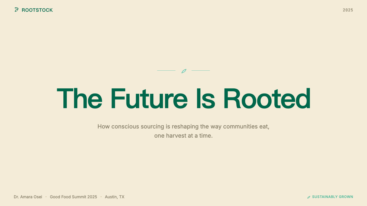
For presentation slides, the Whole Foods aesthetic works especially well when the content is itself about quality, sustainability, provenance, or community. A cover slide benefits from warm-toned photography treated with a slightly desaturated, matte quality — food, landscape, or a producer portrait — set against a deep mossy green ground with a generous, slightly imperfect serif for the headline. Content slides should favor warmth and legibility over complexity: a two-column layout with a generous margin, body text in a warm off-white or cream against green, or dark text against a paper-cream ground. Data slides can adopt a tactile quality by treating charts as though they were hand-drawn on a chalkboard ground — the bars and lines rendered in warm greens and soil tones rather than synthetic primaries.对于演示文稿,全食美学在内容本身涉及品质、可持续性、溯源或社区时尤为出色。封面幻灯片适合使用略微降饱和、哑光处理的暖调摄影——食材、风景或生产者肖像——设置于深苔藓绿底色上,标题使用宽松、略带不完美感的衬线体。内容页应以温度与易读性优先于复杂性:双栏版面配宽松留白,正文使用暖调近白色或奶油色对绿色底,或深色文字对牛皮纸奶油色底。数据页可以通过将图表处理为黑板底上的手绘感来获得触感品质——柱条与折线以暖绿色与泥土调呈现,而非合成的原色。
For web interfaces, the style suits brands in food, wellness, sustainability, agriculture, and premium consumer goods where the buyer journey requires trust-building and the audience skews toward values-conscious consumers. Apply a ground of warm cream or soft white; use the mossy green as a primary action color and section divider. Typography should mix a warm serif for headings with a clean, slightly humanist sans-serif for body text — never a cold geometric sans. Navigation and product cards should feel generous in padding, with ample breathing room; tight grids undermine the market-stall abundance that makes the aesthetic work. Pricing pages benefit from the provenance convention: each tier should read as though it includes a brief story, not just a feature checklist.对于网页界面,这种风格适合食品、健康、可持续性、农业与高端消费品领域的品牌——在这些领域中,购买旅程需要建立信任,受众也偏向于价值观导向的消费者。采用温暖奶油色或柔和白色作为底色;将苔藓绿用作主要操作色与板块分割色。排版应将暖调衬线体(用于标题)与干净、略带人文气息的无衬线体(用于正文)混合使用——绝不选用冷感的几何无衬线体。导航与产品卡片应感觉内距宽裕,留有充分的呼吸空间;紧凑网格会破坏使这套美学奏效的市集丰盛感。定价页面得益于溯源惯例:每个价格层级应读来像包含一段简短故事,而非仅仅是功能清单。
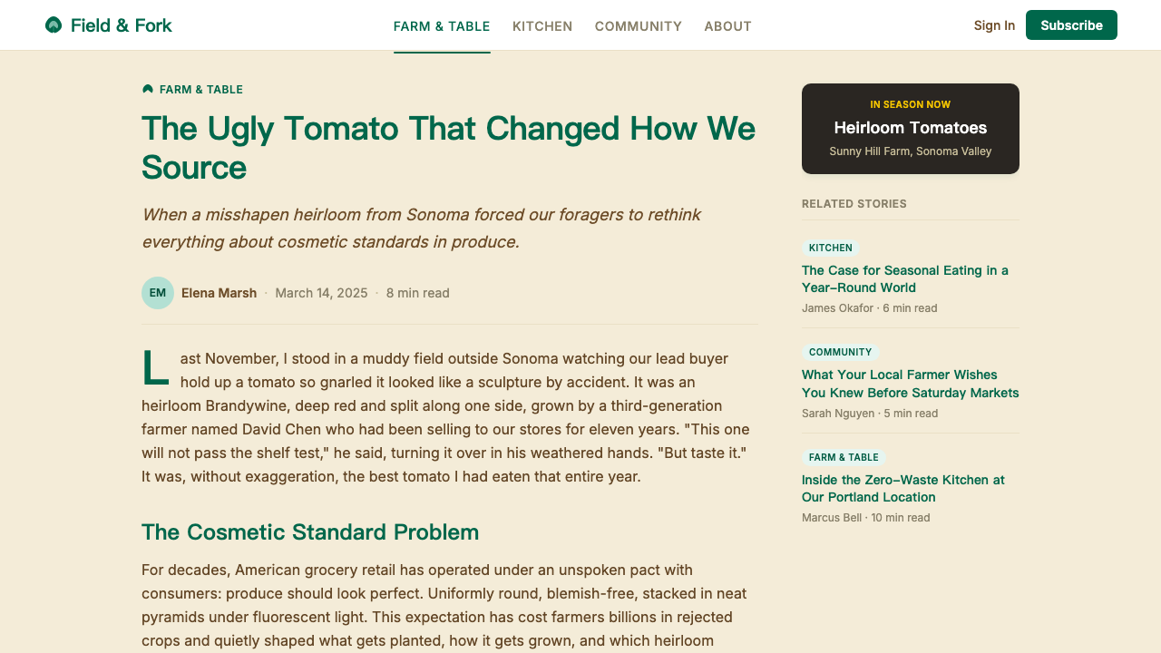
For editorial and marketing work, the aesthetic enables strong storytelling. A feature article in the Whole Foods mode opens with a full-bleed warm-toned photograph, runs body text at a comfortable width with generous leading, and uses pull quotes set in chalk-style or hand-lettered display type. Marketing campaigns borrow the attribution card logic: a single strong image of a product or producer, accompanied by a few lines of specific provenance copy in a warm typeface, is more persuasive in this aesthetic than a polished product shot with abstract taglines. The system rewards specificity — the more concrete the detail, the more authentic the execution.对于编辑与营销内容,这套美学能够支持强叙事。全食模式的特稿以满版暖调摄影开篇,正文以舒适的行宽与宽松的行距排版,引用语以粉笔风格或手写展示字体排印。营销活动借鉴溯源卡片的逻辑:一张产品或生产者的单一强势图片,配以几行以暖调字体排印的具体溯源文案,在这套美学中比精修产品照搭配抽象标语更具说服力。这套系统奖励具体性——细节越具体,执行越真实。
A common mistake when applying the Whole Foods aesthetic is confusing warmth with visual busyness. The style's market-stall reference point suggests abundance, but successful executions are in fact quite restrained: one or two colors, one or two typeface registers, focused photography, and generous white (or cream) space. A second common error is treating all texture as interchangeable — layering multiple simulated textures (wood grain over burlap over kraft paper) produces visual noise rather than authenticity. The textures in the Whole Foods system work because they reference specific materials; mixing them arbitrarily breaks that specificity and tips the aesthetic into pastiche.应用全食美学时最常见的错误,是将温度与视觉繁忙混淆。这种风格的市集参照暗示着丰盛,但成功的执行实际上相当克制:一两种颜色、一两种字体语调、聚焦的摄影,以及宽裕的白色(或奶油色)空间。第二个常见错误是将所有质感视为可互换的——叠加多种模拟质感(木纹覆盖粗麻布覆盖牛皮纸)产生的是视觉噪音而非真实感。全食系统中的质感之所以有效,是因为它们指涉具体的材料;随意混合打破了这种具体性,让美学滑向拼贴仿作。
See the Whole Foods Market design system查看 Whole Foods Market 完整设计系统
Whole Foods Market — FAQWhole Foods Market · 常见问题
Is the Whole Foods aesthetic the same as generic 'natural' branding?全食美学和泛化的「天然」品牌风格是一回事吗?
No, and the distinction matters practically. Generic natural branding typically signals its values through palette alone — greens and browns and kraft paper applied indiscriminately. The Whole Foods system goes further: its distinguishing feature is attribution and specificity. Named farms, named growers, named regions, named growing methods — the design communicates trust by being specific rather than by simply looking earthy. When you apply a kraft-paper texture and call it done, you get natural branding. When you design a system that makes specificity itself the visual value, you approach the Whole Foods register.不是,而且这个区别在实践中很重要。泛化的天然品牌通常仅通过色盘来传递价值观——绿色、棕色与牛皮纸被不加区分地应用。全食系统走得更远:其显著特征是溯源与具体性。具名的农场、具名的种植者、具名的产地、具名的种植方式——这套设计通过具体性而非仅仅看起来质朴来传递信任。当你加上牛皮纸质感就算完成时,你得到的是天然品牌风格。当你设计一套将具体性本身作为视觉价值的系统时,你才接近全食的语调。
Can the Whole Foods aesthetic work for non-food brands?全食美学适用于非食品品牌吗?
Yes, with care. The system's core values — provenance, quality, transparency, and community — are not inherently food-specific, and the visual language translates well to adjacent categories: wellness and personal care products, sustainable fashion, craft beverages, farm-to-table hospitality, and even financial services that position around ethical investment or community banking. The key is whether the brand's actual values support the aesthetic's promises. Using the Whole Foods visual language for a product or service that cannot deliver genuine provenance or quality claims produces a credibility gap that attentive consumers will notice.可以,但需要谨慎。这套系统的核心价值——溯源、品质、透明度与社区——并非本质上专属于食品领域,视觉语言能够良好迁移到邻近品类:健康与个人护理产品、可持续时尚、精酿饮品、农场到餐桌的酒店业,甚至定位于道德投资或社区银行的金融服务。关键在于品牌的实际价值观是否支撑这套美学的承诺。将全食视觉语言用于无法提供真实溯源或品质主张的产品或服务,会产生一个细心消费者能够察觉的可信度缺口。
How does the Whole Foods aesthetic handle digital contexts, where real textures are impossible?全食美学如何处理无法呈现真实质感的数字语境?
The system's digital translation works through photography and color temperature rather than through simulated texture. The key directive is warmth and specificity: real food photographed with natural light and visible texture, real environments (market tables, farm scenes, producer portraits) rather than composited studio imagery, and a color grading approach that preserves the warmth of the natural palette without adding artificial golden-hour saturation. Typography carries the texture role digitally — the imperfection of a slightly irregular serif or the humanist quality of a carefully chosen sans-serif does for digital what chalkboard lettering does for physical spaces.这套系统的数字化转译通过摄影与色温而非模拟质感来实现。核心指令是温度与具体性:以自然光拍摄、可见质感的真实食材,真实环境(市集桌台、农场场景、生产者肖像)而非合成棚拍图像,以及保留自然色盘温度而不添加人工黄金时刻饱和感的色彩调级方式。排版在数字端承担质感角色——一款略带不规则感的衬线体的不完美,或一款精心挑选的无衬线体的人文气质,在数字空间中起到的作用与黑板手写字在实体空间中相同。
Does the Amazon acquisition undermine the visual authenticity of Whole Foods design?亚马逊的收购是否削弱了全食设计的视觉真实性?
This is a genuine tension, not a settled question. The visual identity itself has largely survived the acquisition intact — the green palette, the grower attribution, the market-stall typography are all still present. What has changed is the operational context in which the design exists: algorithmic pricing, Prime discounts, and Amazon Locker integration all introduce signals that sit uneasily alongside the handcrafted aesthetic. Perceptive observers will note the contradiction. For designers, the Whole Foods case is a useful study in the difference between a visual system and the values it claims to express — and in how long a strong visual identity can maintain its associations when the underlying business model shifts.这是一种真实的张力,而非已有定论的问题。视觉识别本身在收购后大体完好留存——绿色色盘、种植者溯源、市集式排版都依然在场。改变的是这套设计所处的运营语境:算法定价、Prime折扣与Amazon Locker整合,引入了与手工美学并不和谐的信号。敏锐的观察者会注意到这一矛盾。对于设计师而言,全食案例是研究视觉系统与其声称表达的价值观之间差异的有益样本——以及当底层商业模式发生转变时,一套强有力的视觉识别能维持其关联感多久的思考材料。
What is the single most important thing to get right when applying the Whole Foods aesthetic?应用全食美学时,最重要的一件事是什么?
Specificity over generality. The system's entire credibility rests on its willingness to name things: this farm, this grower, this region, this method. Every design decision in the Whole Foods vocabulary — the attribution cards, the chalkboard lettering, the close-cropped produce photography — serves the goal of making things feel known rather than marketed. When adapting the aesthetic, the question to ask is not 'does this look natural?' but 'does this feel specific?' A layout that names its sources and tells its stories in concrete detail will always outperform one that applies the palette and textures without the substance.具体性优于泛化。这套系统的全部可信度,建立在它愿意为事物命名的意愿上:这个农场、这位种植者、这处产地、这种方式。全食词汇中的每一个设计决定——溯源卡片、黑板手写字、近景裁切的蔬果摄影——都服务于让事物感觉是「被了解的」而非「被营销的」这一目标。在改编这套美学时,值得追问的不是「这看起来够天然吗?」,而是「这感觉够具体吗?」一套为其来源命名、以具体细节讲述故事的版面,永远胜过那些仅仅套用色盘与质感却无实质内容的版面。
Related design styles相关设计风格
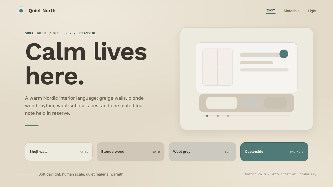 Scandinavian HyggeCalm is the brief. Greige walls, wool-grey cards, and one muted teal line.平静就是命题:灰米墙面、羊毛灰卡片与一抹灰青线。
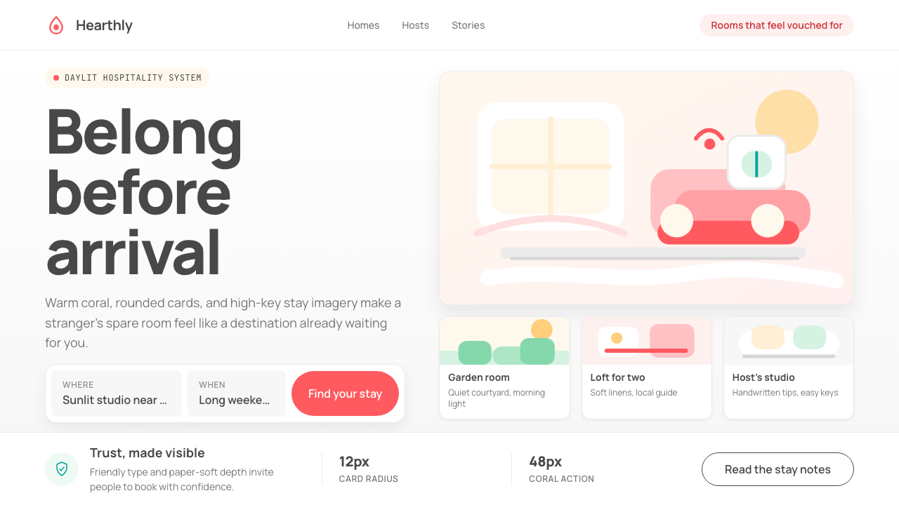 Airbnb 2014Coral red, soft pill cards, Cereal type. The Bélo wraps strangers in warm, da…Bélo 时代的珊瑚红与圆润 Cereal 字体——把陌生人之间的房间包装成阳…
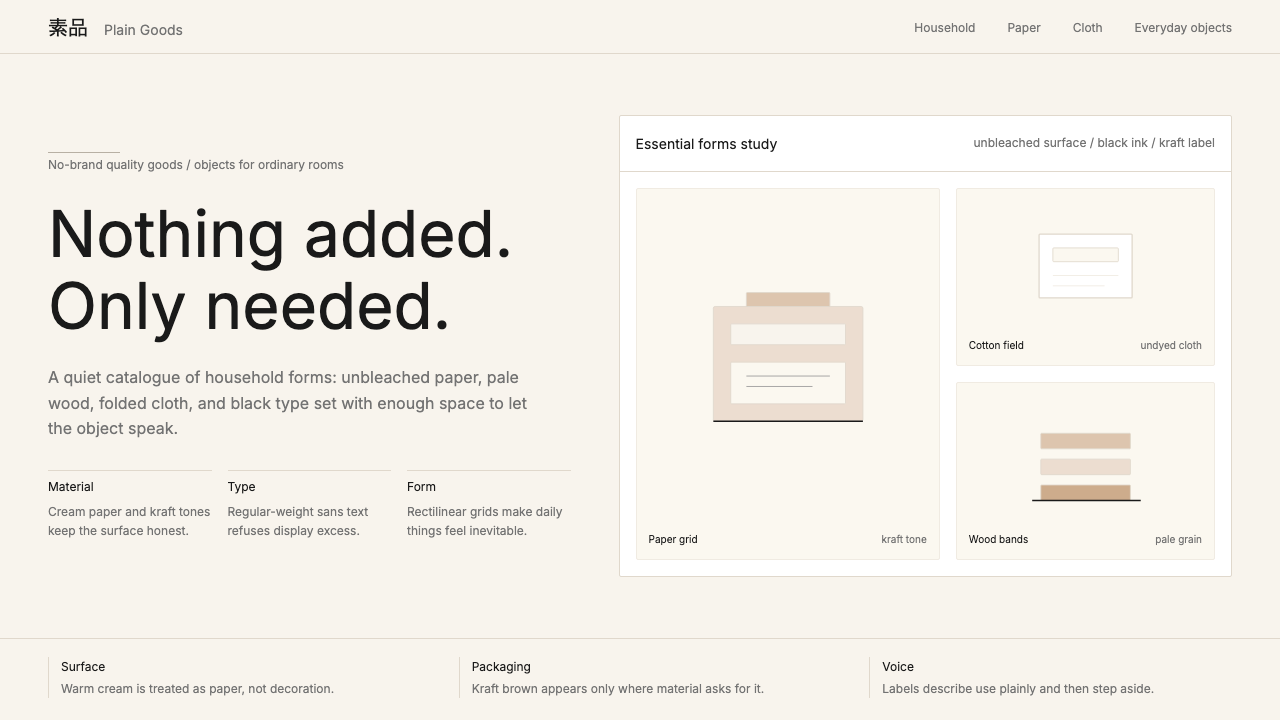 MUJIAnti-brand restraint. Cream paper, kraft brown, and regular Inter leave only…反品牌的克制:米白纸底、牛皮纸棕与常规字重,只留下必要。
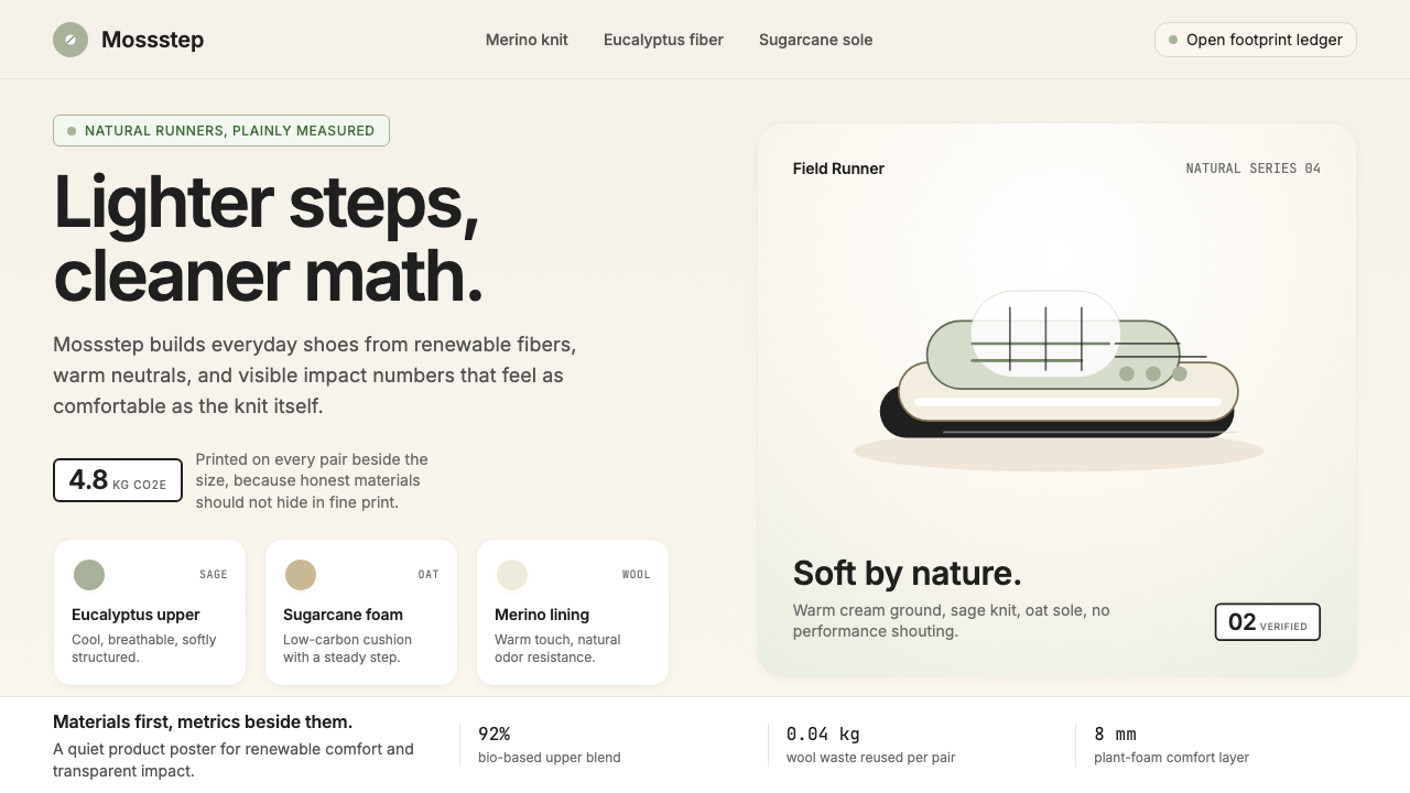 AllbirdsSustainability that breathes. Cream-and-sage tones, carbon labels next to pri…可持续,但绝不说教:奶油色与鼠尾草绿、碳足迹标签与价格并排——一种深呼吸般的诚…
 HeadspaceOptimism makes calm approachable. Sunrise orange and wobbly rounded forms bre…乐观让平静亲近:日出橙与摇摆圆形在奶油底上呼吸。
 Photographer Light FolioMakes the browser a gallery wall. Warm cream, hairline serif type, and one im…浏览器即画廊墙:暖奶油底、纤细衬线与单幅影像。