What is MUJI?什么是 MUJI?
MUJI built a global visual language out of what it refused — no brand marks, no decorative color, no ornament that could not justify its presence.無印良品用它所拒绝的东西构建出一套全球性的视觉语言——没有品牌标识,没有装饰性色彩,没有无法为自身存在找到理由的装饰。
MUJI in briefMUJI 速览
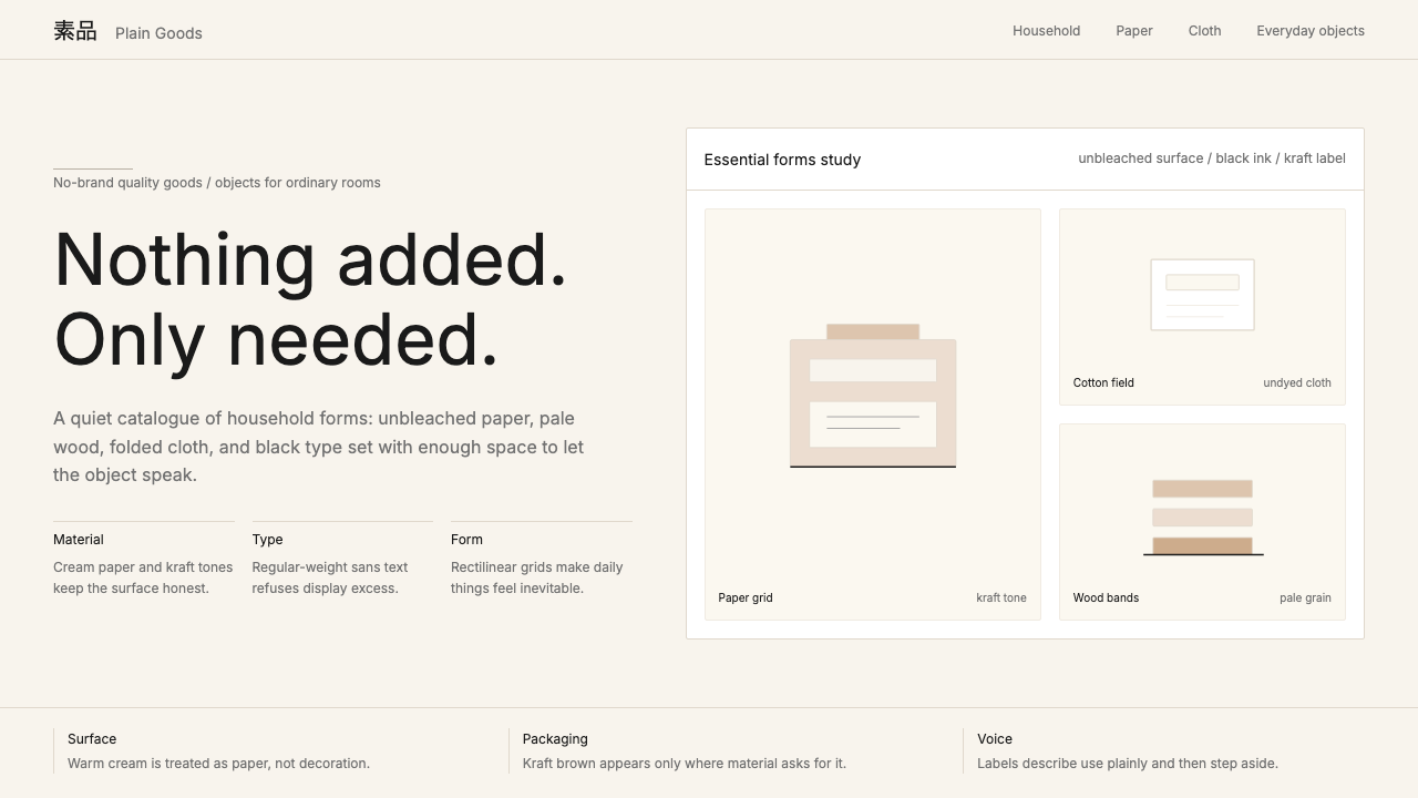
MUJI — Mujirushi Ryōhin, literally 'no-brand quality goods' — is a Japanese retail and design philosophy that treats visual restraint as a form of honesty. Where most consumer brands compete through vivid color, proprietary typefaces, and carefully engineered emotional associations, MUJI deliberately removes all of these signals. Packaging reveals the thing inside rather than advertising an aspiration. Typography is neutral and editorial. Backgrounds are the color of unbleached paper or undyed cotton. The effect is not austerity so much as clarity — a visual environment in which objects are allowed to speak for themselves.無印良品(MUJI,Mujirushi Ryōhin,字面意为「没有品牌的优质商品」)是一套将视觉克制视为诚实之形式的日本零售与设计哲学。大多数消费品牌通过鲜艳色彩、专属字体与精心设计的情感联结来竞争,而無印良品则刻意抹去所有这些信号。包装呈现内容物本身,而非推销某种向往。排版中立而具编辑性。背景是未漂白纸张或未染色棉布的颜色。这种效果并非严苛,而是清澈——一个允许物品自我言说的视觉环境。
The style's characteristic palette runs from warm cream through kraft brown to the near-black of dense ink on newsprint. These are not chosen for drama but for their relationship to natural, minimally processed materials — the same logic that governs MUJI's products, which favor unbleached cotton, raw wood, unpainted aluminum, and clear glass. Color, when it appears at all, is functional: a pale sage or dusty blue that marks a category boundary, never a branding flourish.这种风格的标志性色调从温润的米白延伸至牛皮纸棕,再到浓墨印在新闻纸上近乎黑色的深沉。这些颜色的选择并非为了戏剧效果,而是源于它们与自然、低加工材料的关系——与支配無印良品产品的逻辑相同:未漂白棉、原木、未涂装铝材与透明玻璃。色彩一旦出现,必定是功能性的:一抹淡雅的灰绿或浅灰蓝,用于标示品类边界,绝不用于品牌炫耀。
Typographically, MUJI favors letterforms with no extraneous weight — fonts that sit on the page the way a well-made tool sits in the hand, undemonstrative and balanced. Japanese text is set with the density and editorial precision of a quality magazine, while Latin text is handled with equivalent restraint. The result is a system that feels editorially composed rather than marketed — closer in spirit to a museum label or a craft goods catalog than to consumer advertising.在字体排印上,無印良品偏爱没有多余分量的字形——字体落在页面上,如同一件做工精良的工具握在手中,低调而均衡。日文文字以优质杂志的密度与编辑精准度排布,拉丁文字同样以等量的克制处理。最终呈现的是一个感觉像经过编辑构建而非被营销驱动的系统——在精神气质上更接近博物馆标签或工艺品目录,而非消费品广告。
Where does MUJI come from?MUJI 从何而来?
MUJI was created in 1980 not as a standalone brand but as an in-house product line for Seiyu, one of Japan's major supermarket chains. The concept was conceived by Seiji Tsutsumi, then chairman of the Saison Group, and developed with the creative direction of advertising executive Kazuko Koike. The founding premise was deliberately anti-commercial: forty products, packaged without logos or decorative graphics, priced as low as possible through simplified manufacturing and the use of previously discarded raw materials. The name itself was a declaration — Mujirushi Ryōhin meant 'no-brand quality goods,' which in a culture where brand marks carried enormous status was a radical inversion of received consumer value.無印良品诞生于1980年,最初并非独立品牌,而是日本大型超市连锁西友(Seiyu)的自有产品线。这一概念由当时的西武集团董事长堤清二提出,并由广告人小池一子担任创意指导加以发展。创立前提刻意反商业:四十款产品,包装上没有标志,没有装饰性图形,通过简化制造工艺和使用原本被废弃的原材料将价格压至最低。品牌名称本身就是一份宣言——「无印良品」意为「没有品牌标记的优质商品」,在一个品牌标记承载巨大地位意义的文化中,这是对既有消费价值观的一次激进颠覆。
The early visual language was governed by a kind of negative discipline. Without a brand mark to carry meaning, the packaging itself had to do the work — and it did so through material honesty rather than graphic invention. Craft paper, simple black typography, and the deliberate absence of color differentiated MUJI products from the vivid, highly branded goods around them on the shelf. This original restraint was as much a commercial strategy as a design philosophy: cost savings from eliminating decoration could be passed to the consumer, and the aesthetic plainness became a form of counter-positioning in a market saturated with visual noise.早期的视觉语言受一种否定性纪律支配。没有品牌标记来承载意义,包装本身必须完成这一工作——而它依靠材料诚实而非图形创造来完成。牛皮纸、简洁的黑色排版,以及刻意缺席的色彩,使無印良品产品在货架上与周围那些色彩鲜艳、品牌强烈的商品截然区分。这种原初的克制既是商业策略,也是设计哲学:省去装饰的成本节约可以转移给消费者,而美学上的朴素成为一种在视觉噪声饱和的市场中的反向定位。
MUJI became an independent company in 1983 and expanded steadily through the late 1980s and 1990s, opening stores in the United Kingdom in 1991 and establishing itself internationally as a design brand rather than simply a value retailer. The aesthetic became more intentional and more sophisticated as the company grew. The turn that shaped the mature MUJI visual identity came in 2002, when Kenya Hara — one of Japan's most influential graphic designers — became art director for the brand's advertising campaigns. Hara brought a philosophical coherence to the visual language that had previously been implicit: he articulated the concept of 'emptiness' (mu) as MUJI's core aesthetic principle, arguing that the brand's whiteness and blankness were not absence but invitation — a ground onto which any life could be projected.无印良品于1983年成为独立公司,在1980至90年代稳步扩张,1991年在英国开店,并以设计品牌而非单纯的平价零售商的身份在国际上确立地位。随着公司成长,美学变得更加有意识、更加精致。塑造成熟無印良品视觉形象的转折点出现在2002年——日本最具影响力的平面设计师之一原研哉出任品牌广告活动的艺术总监。原研哉为此前隐而不彰的视觉语言带来了哲学上的连贯性:他将「空」(mu)阐释为無印良品的核心美学原则,认为品牌的白与空并非缺席,而是邀请——一块可以投射任何生活的底色。
Kenya Hara's direction crystallized several elements that now define the style internationally: the preference for warm cream over pure white, the use of expansive negative space as an active compositional tool rather than mere background, and a typographic approach that treats letterforms as objects with their own material presence rather than transparent carriers of meaning. His advertising campaigns often featured vast, empty natural landscapes — salt flats, fog-filled valleys, snow plains — in which a single MUJI product appeared at a scale almost too small to see. The message was philosophical: the product exists within the world, does not dominate it, and asks only to be used. This visual philosophy drew directly on Japanese aesthetic traditions — wabi-sabi's appreciation of unadorned materials, ma's embrace of meaningful emptiness, and the mingei folk craft movement's insistence that objects of daily use deserve the same consideration as fine art.原研哉的艺术指导将若干元素凝结为如今在国际上定义这种风格的特征:对温润米白而非纯白的偏好,将大面积留白用作积极的构图工具而非单纯背景,以及一种将字形视为具有自身物质存在的对象——而非意义的透明载体——的排版取向。他的广告活动常常以广袤空旷的自然风景为主题——盐滩、雾霭弥漫的山谷、雪原——其中一件無印良品产品以几乎难以察觉的尺度出现。这一信息是哲学性的:产品存在于世界之中,不主宰它,只请求被使用。这一视觉哲学直接汲取自日本美学传统——侘寂(wabi-sabi)对未加修饰材料的珍视,「间」(ma)对有意义的空白的拥抱,以及民艺运动对日常用品应获得与纯艺术同等重视的坚持。
What defines the MUJI look?MUJI 的视觉特征是什么?
Palette色调
The MUJI palette is built on the colors of natural, minimally processed materials: warm cream, the buff of unbleached paper, the medium brown of kraft and undyed wood, and the near-black of dense ink. These tones are not chosen from a color system but derived from material reality — they describe what things look like before they are dyed, bleached, or coated. Color as emphasis or decoration is almost entirely absent. When a categorical accent is needed — to distinguish a product family or mark an interactive state — it is drawn from the same muted, low-saturation register: a dusty sage, a pale clay, an ashen blue that reads as a slightly warmer gray.無印良品的色调建立在自然、低加工材料的颜色之上:温润的米白、未漂白纸张的米黄、牛皮纸与未染色木材的中棕,以及浓墨的近黑。这些色调并非从色彩系统中遴选,而是源自材料现实——它们描述的是事物在被染色、漂白或涂层之前的本来面目。作为强调或装饰的色彩几乎完全缺席。当需要类别性点缀时——用于区分产品系列或标示交互状态——它同样取自低饱和度的沉静色域:灰绿、浅陶土、略带暖意的浅灰蓝。
Negative Space留白
Emptiness in MUJI's visual language is not passive background but an active compositional element. Layouts allocate space generously — often more to the empty field than to the content — because the openness is itself the message. A product placed in a wide cream field feels considered, unhurried, and sufficient. A block of text surrounded by abundant margin has room to be read rather than scanned. This commitment to open space requires discipline: the temptation to fill, to add a secondary message or a supplementary graphic, must be actively resisted. The negative space does not serve the content; together, they constitute the whole.在無印良品的视觉语言中,空白并非被动的背景,而是积极的构图元素。版面慷慨地分配空间——往往留白多于内容——因为开阔本身就是信息。一件产品置于宽阔的米白底面,显得经过深思、从容不迫、自足完整。一段文字被充裕的页边距环绕,有空间被阅读而非被扫视。这种对开放空间的承诺需要自律:填充的冲动——添加一条副信息或一个辅助图形——必须被主动抵制。留白不是服务于内容的手段;两者共同构成整体。
Typography字体排印
MUJI's typographic choices favor letterforms that are quiet and even in weight — neither aggressively geometric nor expressively humanist. The objective is legibility without personality, as if the type aspires to be invisible in the way that a clean window is invisible: you see through it to the content beyond. Japanese and Latin texts are set at densities and spacings derived from quality publishing rather than advertising conventions. Hierarchy is established through scale differences and weight distinctions rather than through color or ornament. Headlines are larger than body text, but not dramatically so; the overall impression is one of measured restraint rather than typographic performance.無印良品的字体选择偏向字重平均而安静的字形——既非咄咄逼人的几何体,也非富于表达性的人文主义体。目标是无个性的易读性,仿佛字体渴望像洁净的玻璃一样隐形:你透过它看见背后的内容。日文与拉丁文按照优质出版而非广告惯例的密度与字距排设。层级通过尺寸差异与字重区别来确立,而非依靠色彩或装饰。标题大于正文,但并非大幅夸张;整体印象是有节制的克制,而非字体排印上的表演。
Material Honesty材料诚实
The MUJI aesthetic holds that surfaces should look like what they are. Printed matter should look printed, not simulated as three-dimensional. Products should display their material — wood grain, aluminum brushing, cotton weave — rather than concealing it under paint or laminate. In graphic work, this principle translates to an absence of skeuomorphic effects: no fake paper textures applied as overlays, no artificial aging, no simulated materials that the actual medium cannot provide. Texture, where it appears at all, is the texture of the actual substrate — the slight roughness of uncoated stock, the softness of natural cotton — rather than a decorative illusion imposed on top.無印良品的美学主张表面应呈现其本质。印刷品应看起来是被印制的,而非被模拟为三维体。产品应展示其材质——木纹、铝材拉丝纹、棉布编织纹——而非将其掩藏在涂料或贴膜之下。在平面设计中,这一原则转化为拟物化效果的缺席:没有叠加的假纸张纹理,没有人工做旧,没有实际媒介无法提供的模拟材质。纹理一旦出现,必是实际基底的纹理——非涂布纸的略微粗糙,天然棉的柔软触感——而非强加其上的装饰性幻觉。
Functional Color功能性色彩
Where Bauhaus deploys color symbolically and the Swiss International Style uses it systematically for wayfinding, MUJI uses color functionally and sparingly — almost as an apology for its own presence. A color accent in MUJI design tends to do one thing: distinguish one category from another, or mark one state as different from a default. It does not decorate, does not express brand energy, and does not exist for sensory pleasure. The low saturation of permitted accent tones ensures that they register as information rather than stimulation — they are quiet signals, not announcements.包豪斯象征性地使用色彩,瑞士国际主义风格将其系统化用于指引,而無印良品对色彩的使用则功能性而节省——几乎像是在为自身的存在道歉。無印良品设计中的色彩点缀往往只做一件事:区分一个类别与另一个,或标示某一状态区别于默认状态。它不用于装饰,不用于表达品牌活力,也不以感官愉悦为目的。允许使用的点缀色调低饱和度,确保它们作为信息而非刺激被感知——它们是安静的信号,不是公告。
Editorial Composition编辑性构图
MUJI layouts read as curated rather than designed — the distinction being that curation implies selection and restraint, while 'design' can imply the addition of style. Each element on the page appears because it was chosen; nothing appears because it fills space or adds visual interest. This editorial approach produces compositions that are often asymmetric but never restless: a single image, placed off-center, balanced by an expanse of cream ground and a single well-set block of text. The visual weight of empty space is treated as equivalent to the visual weight of content — a principle that requires confidence to execute, since every instinct of conventional graphic production pushes toward fullness.無印良品的版面读来像是「策划」而非「设计」的——区别在于策划意味着选择与克制,而「设计」可能意味着风格的添加。页面上的每个元素出现,是因为它被选择;没有任何元素出现是因为它填补空间或增加视觉趣味。这种编辑性取向产生的构图往往非对称但绝不浮躁:一张图片偏离中心放置,由大片米白底面和一段排设精良的文字所平衡。空白的视觉重量被视为等同于内容的视觉重量——这一原则执行起来需要自信,因为传统平面制作的每一种本能都在推向充实与丰满。
Wabi-Sabi Sensibility侘寂气质
MUJI's visual philosophy is grounded in the Japanese aesthetic concept of wabi-sabi: the beauty of things that are imperfect, incomplete, and impermanent. In practice, this means a preference for materials that show their making — paper with visible fiber, wood with natural grain variation, ceramics with slight irregularity — over materials that have been processed to uniform perfection. In graphic terms, the equivalent is a compositional modesty that accepts incompleteness as a quality rather than a deficiency. A layout does not need to be filled; an image does not need to be explained by a caption; a product does not need to be accompanied by a lifestyle aspiration.無印良品的视觉哲学根植于日本的侘寂(wabi-sabi)美学概念:不完美、未完成、无常之物所具有的美。在实践中,这意味着偏好显现其制作痕迹的材料——可见纤维的纸张、带有自然纹理变化的木材、略有不规则的陶瓷——而非被加工至均一完美的材料。在平面语汇中,与此对应的是一种构图上的谦逊:接受未完成性为品质而非缺陷。版面不需要被填满;图片不需要被说明文字解释;产品不需要被某种生活方式向往所伴随。
Who shaped MUJI?谁塑造了 MUJI?
Kenya Hara has served as art director for MUJI's advertising since 2002 and is the single figure most responsible for crystallizing the brand's visual philosophy into a coherent global language. A graduate of Musashino Art University, Hara brought to MUJI a theoretical framework rooted in his concept of 'emptiness' — arguing that a blank, open visual field is not absence but a space of infinite possibility. His most celebrated MUJI campaigns feature minimal objects placed in vast natural landscapes, communicating the brand's philosophy without a word of advertising copy. Beyond MUJI, Hara directs the Nippon Design Center in Tokyo and has written extensively on design theory, including the influential book 'Designing Design,' which articulates the philosophy underlying much of his MUJI work.原研哉自2002年起担任無印良品广告艺术总监,是将品牌视觉哲学凝结为连贯全球语言的核心人物。毕业于武藏野美术大学的原研哉,为無印良品带来了植根于其「空」(emptiness)概念的理论框架——他主张,空白开阔的视觉场域并非缺席,而是无限可能的空间。他最著名的無印良品广告活动将极简的物品置于广袤的自然风景之中,无需一字广告文案即传达品牌哲学。此外,原研哉还主持东京日本设计中心,并广泛撰写设计理论,包括极具影响力的著作《设计中的设计》,书中阐述了支撑其大量無印良品工作的哲学。
Naoto Fukasawa is one of Japan's most internationally recognized industrial designers and has been a long-term collaborator with MUJI, serving on its advisory board. His design philosophy — encapsulated in the concept he terms 'without thought' — holds that the best-designed objects integrate so naturally into daily life that their use requires no conscious attention. A wall-mounted CD player he designed for MUJI, in which play is initiated by pulling a cord exactly as one operates a ventilation fan, became a canonical example of how MUJI objects could embody an entire philosophy of use. Fukasawa's collaboration extended the brand's reach from packaging and graphic identity into product form itself, ensuring that the visual and material principles were unified rather than parallel.深泽直人是日本最具国际知名度的工业设计师之一,长期与無印良品合作,担任其顾问委员会成员。他的设计哲学——凝结于他所称的「无意识」概念——主张最好的设计物如此自然地融入日常生活,以至于其使用无需任何有意识的注意。他为無印良品设计的壁挂式CD播放器——通过拉绳启动播放,与操作换气扇的动作如出一辙——成为無印良品物品如何体现一整套使用哲学的经典案例。深泽直人的合作将品牌的影响力从包装与视觉形象延伸至产品形态本身,确保视觉原则与材料原则是统一的而非并行的。
Ikko Tanaka was one of Japan's foremost graphic designers of the twentieth century and contributed foundational creative direction to MUJI in its early years. Known for his ability to synthesize traditional Japanese visual culture — woodblock print composition, calligraphic density, the spatial logic of Japanese painting — with the tools and formats of modern graphic design, Tanaka brought a distinctly Japanese compositional intelligence to the brand before Kenya Hara formalized its philosophical framework. His broader influence on Japanese graphic design, particularly his work integrating traditional aesthetics with contemporary commercial communication, established many of the visual conventions that MUJI would later refine into its mature identity.田中一光是二十世纪日本最重要的平面设计师之一,在早期为無印良品贡献了奠基性的创意指导。以善于将日本传统视觉文化——木版画构图、书法密度、日本绘画的空间逻辑——与现代平面设计的工具和形式相融合而著称,田中一光在原研哉将哲学框架系统化之前,已为品牌注入了鲜明的日式构图智识。他对日本平面设计的更广泛影响——尤其是将传统美学与当代商业传达融合的工作——确立了许多视觉惯例,而無印良品后来正是将这些惯例提炼为其成熟的视觉形象。
Seiji Tsutsumi, as chairman of the Saison Group that owned Seiyu supermarkets, was the founding conceptual force behind MUJI in 1980. A poet and novelist as well as a businessman, Tsutsumi approached the creation of MUJI as a cultural project as much as a commercial one — a response to the excess and disposability of Japan's high-growth consumer economy. His decision to build the brand around the explicit rejection of branding was a genuinely unusual strategic choice at a time when Japanese consumer marketing was dominated by imported status brands and aggressively designed domestic products. Without Tsutsumi's willingness to commit to an anti-brand stance at the company ownership level, the aesthetic discipline that defines MUJI today would have had no institutional foundation to rest on.堤清二以西武集团(旗下拥有西友超市)董事长的身份,成为1980年無印良品创立背后的概念性原动力。作为同时身兼诗人与小说家的商人,堤清二将無印良品的创建视为一个文化项目,与商业项目同等重要——它是对日本高增长消费经济中过度与一次性文化的一次回应。他在以进口地位品牌和强设计感国产商品主导的日本消费市场营销语境中,决意以明确拒绝品牌化来构建品牌,是一个真正不寻常的战略选择。若非堤清二在公司所有者层面愿意坚持反品牌立场,如今定义無印良品的美学纪律将无处为根基。
Kazuko Koike was the advertising executive who worked with Seiji Tsutsumi to develop MUJI's founding concept and early creative direction. Her background in advertising gave the project a practical commercial intelligence that balanced Tsutsumi's more philosophical intentions — she understood that restraint, to be legible as a choice rather than a limitation, had to be communicated actively rather than simply enacted. The early MUJI packaging and in-store communication systems that established the brand's visual vocabulary were developed under her guidance. Koike also co-founded MUJI's product advisory council, the framework through which external designers have contributed to the brand's product line throughout its history.小池一子是与堤清二共同发展無印良品创立概念与早期创意方向的广告人。她的广告从业背景为这一项目带来了务实的商业智识,平衡了堤清二更具哲学性的意图——她深知,克制若要被解读为一种选择而非局限,就必须主动传达,而非仅仅付诸实践。确立品牌视觉词汇的早期無印良品包装与店内传达系统,均在她的指导下发展而成。小池一子还联合创立了無印良品的产品顾问委员会,这一框架使外部设计师在品牌历史中持续为其产品线贡献力量。
How do you use MUJI today?今天怎么用 MUJI?
MUJI's visual language is among the more demanding historical styles to apply correctly, because its power depends entirely on what is absent. Most visual systems give the designer things to add — colors, shapes, textures, type treatments — that build toward an effect. MUJI gives the designer things to remove, and the discipline required to keep removing, to resist the pull of visual completeness, is the actual skill the style demands. Applied superficially, it produces work that looks plain and underdesigned. Applied with understanding, it produces work that reads as considered, confident, and honest.無印良品的视觉语言是较难正确应用的历史风格之一,因为它的力量完全依赖于缺席的事物。大多数视觉系统给设计师提供可以添加的东西——色彩、形状、纹理、字体处理——叠加出某种效果。無印良品给设计师的是可以移除的东西,而持续移除所需的自律——抵抗视觉完整感的吸引力——才是这种风格真正要求的技能。浅尝辄止地应用,产出的作品看来朴素而设计不足;在理解支撑下应用,产出的作品读来经过深思、充满自信、诚实可信。
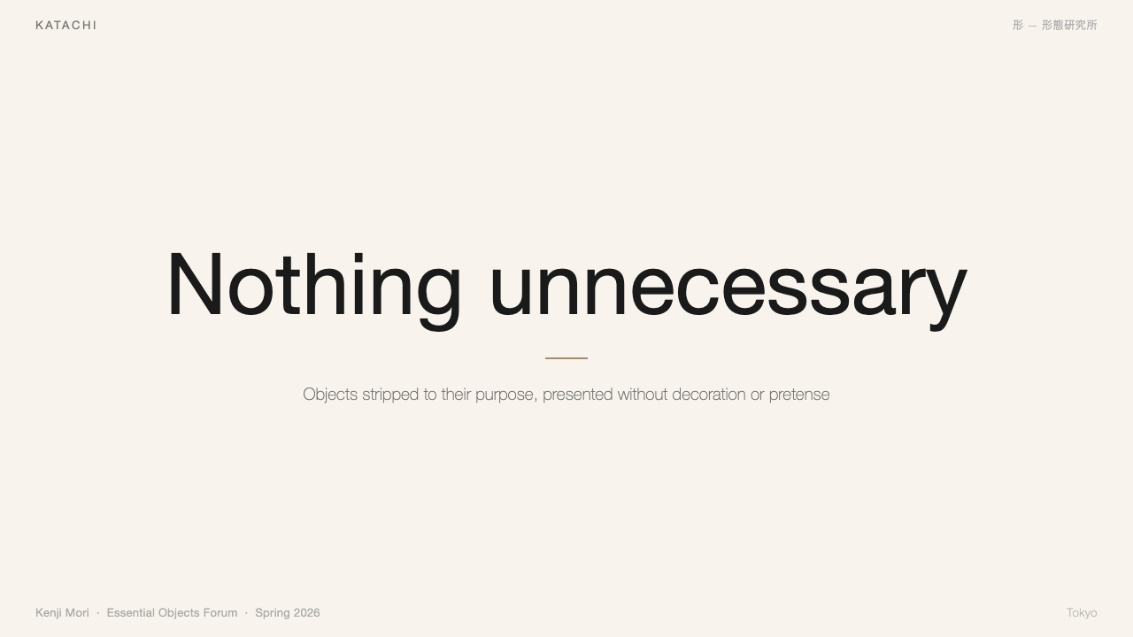
For presentation slides, MUJI is most effective when the deck is conceived as a sequence of editorial pages rather than information containers. A cover slide works best with a single image placed asymmetrically in a wide cream field, the title set in a modest weight at a scale that does not compete with the image, and nothing else. Content slides should use a narrow column for body text with wide margins held open rather than filled with secondary content. Data slides benefit from the MUJI approach of treating charts as objects rather than visualizations: restrained axis labels, bars or segments in the natural palette of cream and brown with a single muted accent for the key metric, and sufficient white space around the chart that it reads as a considered thing rather than a space-filling element.对于演示文稿,無印良品风格在将整套幻灯片构思为编辑页面序列而非信息容器时最为有效。封面幻灯片的最佳方案是:一张图片不对称地置于宽阔的米白底面,标题以不与图片竞争的适中字重排设,仅此而已。内容幻灯片应为正文文字使用窄栏,页边距保持开放而非填入次要内容。数据幻灯片受益于無印良品将图表视为对象而非可视化物的取向:克制的坐标轴标签,柱条或扇区采用米白与棕色的自然色调配以单一沉静点缀色标示关键指标,图表四周保留充足空白,使其读来是一个被用心对待的事物,而非一个填充空间的元素。
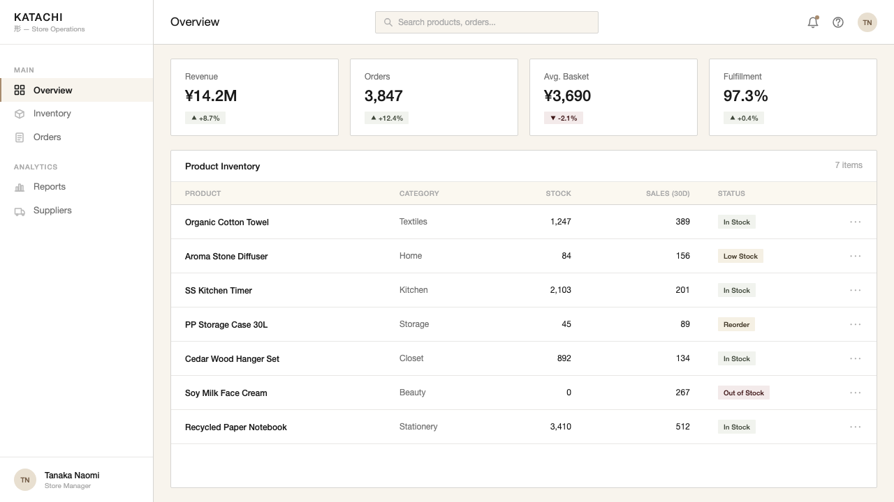
For web interfaces, MUJI translates well to product pages, editorial sites, and any context where the content itself should dominate over the chrome. The approach is to strip navigation to its functional minimum — wordmarks and text labels, no icon decoration, no gradient backgrounds on navigation bars — and to give product images or editorial photography the room they need to read clearly. Dashboards and data-heavy interfaces can use the MUJI palette's neutral base to reduce visual noise and allow color-coded information to register without competition. Pricing and feature comparison pages benefit from the style's editorial clarity: structured as a well-set table rather than a marketing display, with the differences between tiers made legible through hierarchy and position rather than through saturated color contrast.对于网页界面,無印良品风格转化应用于产品页面、编辑类网站,以及任何内容本身应主导于界面框架的场景。方法是:将导航精简至功能性最低限度——文字标识与文字标签,无图标装饰,导航栏无渐变背景——并给产品图像或编辑类摄影以足够的空间来清晰呈现。仪表板与数据密集型界面可利用無印良品色调的中性底色来降低视觉噪声,使色彩编码信息得以在无竞争的环境中被感知。定价与功能对比页面受益于这种风格的编辑性清晰度:以排设精良的表格而非营销展示来构建,等级之间的差异通过层级与位置而非高饱和度色彩对比来呈现。
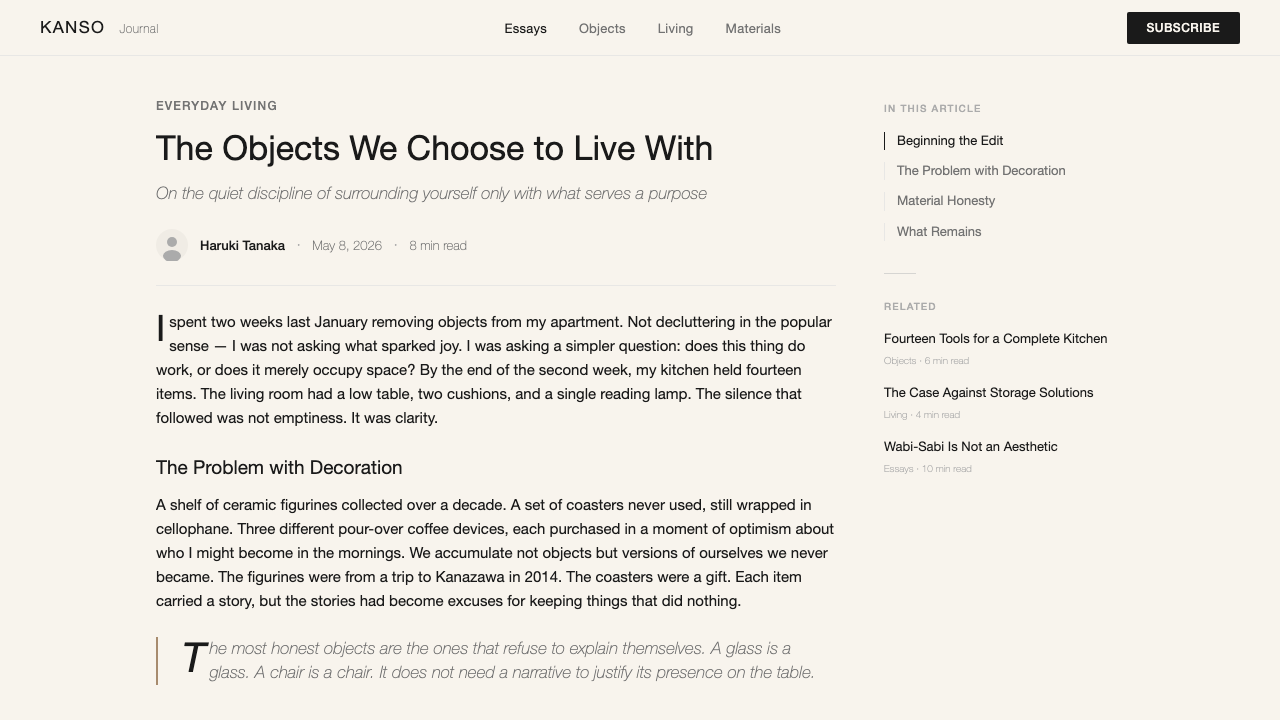
For editorial and marketing work, the MUJI style supports long-form content better than short, high-energy formats. An article or editorial layout in this style uses generous page margins as a compositional element in their own right — pull quotes or chapter headings can float in the margin, treating the margin as a secondary reading channel rather than dead space. Marketing pages can use the style's restraint strategically: in a visual environment saturated with high-saturation graphics and motion, a page that holds still and offers space reads as confident and premium. The mistake to avoid is attempting to use MUJI's quiet palette for high-urgency conversion contexts — calls to action embedded in muted cream fields rarely communicate the necessary sense of immediate value.对于编辑与营销内容,無印良品风格比起简短、高能量的形式,更能支撑长篇内容。这种风格的文章或编辑版面将充裕的页边距本身视为构图元素——引用语或章节标题可以漂浮在页边距中,将其视为次级阅读通道而非死区。营销页面可以战略性地利用这种风格的克制:在一个被高饱和度图形与动态内容饱和的视觉环境中,一个静止并提供空间的页面,读来充满自信而高级感十足。需要避免的错误是试图将無印良品的安静色调用于高紧迫性转化场景——嵌入在沉静米白底面中的行动号召,很少能传达出必要的即时价值感。
The most common mistake when applying MUJI is confusing restraint with emptiness. Removing decoration does not mean removing care — every decision that remains after decoration is stripped away must be more considered, not less. Font pairing matters more when there is no color to distract from typographic inconsistency. Spacing decisions are more visible when there is no ornament to mediate between elements. Image selection becomes load-bearing when there is nothing else on the page to carry meaning. Designers new to the style frequently produce work that is sparse without being intentional, empty without being open. The test is whether every element that remains can justify its presence — not by filling space, but by contributing meaning that no other element could provide.应用無印良品风格时最常见的错误,是将克制与空洞混为一谈。去除装饰并不意味着去除用心——装饰被剥去后剩余的每一个决定,必须比之前更经过深思,而非相反。当没有色彩来分散对排版不一致性的注意时,字体搭配的重要性更加凸显。当没有装饰来调和元素之间的关系时,间距决策的可见度更高。当页面上没有其他东西来承载意义时,图像选择成为承重结构。初接触这种风格的设计师常常产出疏朗但无意识、空旷但不开放的作品。检验标准是:每一个留存下来的元素能否证明其存在的正当性——不是通过填充空间,而是通过贡献其他任何元素无法提供的意义。
MUJI — FAQMUJI · 常见问题
Is MUJI the same as minimalism?無印良品风格等同于极简主义吗?
MUJI and minimalism share a reduction of visual elements, but their motivations and aesthetic results differ significantly. Contemporary minimalism — as practiced in much digital product design — tends to reduce as a formal exercise, pursuing clean lines and open space as aesthetic qualities in their own right. MUJI's reduction is philosophically motivated: it proceeds from the conviction that objects and communications should not claim more than they are, that the unnecessary conceals rather than enhances the essential. The result is that MUJI-derived work is warmer and more material than most minimalism — it accepts the cream tone of unbleached paper rather than defaulting to pure white, and it favors natural material references over clinical neutrality. Minimalism empties. MUJI clarifies.無印良品风格与极简主义都在减少视觉元素,但两者的动机与美学结果有显著差异。当代极简主义——如在大量数字产品设计中所实践的那样——倾向于将减法作为形式练习,将清晰的线条与开放的空间本身视为审美品质。無印良品的减法具有哲学动机:它出发于这样的信念——物品与传达不应宣称超越其本质的东西,不必要之物遮蔽而非增强本质之物。结果是,源自無印良品的作品比大多数极简主义作品更温润、更有材料感——它接受未漂白纸张的米白色调,而非默认纯白,并且偏好自然材料参照而非临床式中性。极简主义是清空。無印良品是澄清。
Can the MUJI style work for digital products and interfaces, or is it mainly suited to print?無印良品风格适用于数字产品和界面吗,还是主要适合印刷品?
MUJI's principles transfer well to digital, but require thoughtful adaptation. The style's warm cream backgrounds work on screen as effectively as on paper, provided the display is calibrated correctly — they read as intentionally warm rather than as an uncorrected white point. The editorial approach to typography, with its emphasis on generous line spacing and wide margins, tends to produce interfaces that are highly legible and notably calm by the standards of most consumer digital products. The difficulty comes in interactive states: MUJI's low-saturation palette makes it harder to communicate hover states, focus rings, and active selections without importing colors from outside the system. The solution is to use value contrast — darker and lighter tones within the same neutral family — rather than hue shift to signal interactivity. Used this way, the style produces digital interfaces that feel considered and trustworthy rather than flat and uninspiring.無印良品的原则可以很好地迁移至数字领域,但需要有思虑的适配。这种风格的温润米白背景在屏幕上与在纸张上同样有效,前提是显示器经过正确校准——它们被解读为刻意的温暖,而非未校正的白场。编辑性的排版取向——强调充裕的行间距与宽阔的页边距——往往产出按大多数消费类数字产品标准而言高度可读且异常平静的界面。难点在于交互状态:無印良品的低饱和度色调使在不引入系统外色彩的情况下传达悬停状态、焦点环与激活选择更为困难。解决方案是使用明度对比——同一中性色系内的深浅色调变化——而非色相偏移来传达可交互性。如此使用,这种风格产出的数字界面感觉经过深思且值得信赖,而非平淡乏味。
How does MUJI differ from Scandinavian design, which also emphasizes simplicity and natural materials?無印良品风格与同样强调简洁与天然材料的北欧设计有何不同?
Both traditions value functional simplicity and material honesty, but they arrive from different cultural contexts and produce distinct aesthetic results. Scandinavian design — rooted in the Nordic design movement of the mid-twentieth century — tends toward cleaner geometry, a brighter palette (including the distinctive Scandinavian use of cool whites and fresh blues), and forms that express a kind of rational optimism about the relationship between good design and democratic society. MUJI's visual philosophy is more inward-facing and philosophically quieter: it draws on Japanese aesthetics of incompleteness and impermanence rather than on the Scandinavian model of design as social uplift. MUJI objects and layouts often contain a deliberate incompleteness — a margin that extends further than seems necessary, a product that makes no gesture toward display — that Scandinavian design, with its focus on considered craftsmanship and social utility, tends not to share.两种传统都重视功能性简洁与材料诚实,但它们来自不同的文化语境,产生截然不同的美学结果。北欧设计——植根于二十世纪中叶的北欧设计运动——倾向于更清晰的几何形态、更明亮的色调(包括北欧设计标志性的冷白与清新蓝),以及表达一种关于优质设计与民主社会关系的理性乐观主义的形态。無印良品的视觉哲学更加内向且哲学性更为平静:它汲取的是日本关于不完整与无常的美学传统,而非北欧将设计视为社会提升的模式。無印良品的物品与版面常常包含一种刻意的未完整性——一个延伸得似乎超出必要的页边距,一件对展示毫无姿态的产品——而以用心工艺与社会效用为中心的北欧设计,通常并不具备这一特质。
What is the role of photography in the MUJI visual system?摄影在無印良品视觉系统中扮演什么角色?
Photography is central to MUJI's communication, but it is used in ways that deliberately suppress the conventions of commercial product photography. MUJI product images typically show objects in ambient light rather than studio lighting, against neutral grounds rather than styled environments, and without the selective focus, color grading, or retouching that commercial photography uses to make products look more desirable than they are. The goal is to show the thing as it is rather than as it might ideally appear. Campaign photography, under Kenya Hara's direction, has gone further — placing products in vast natural landscapes to communicate scale, transience, and the smallness of designed objects relative to the world they inhabit. In both cases, photography in the MUJI system is asked to be honest rather than persuasive, which is a fundamentally different brief than most product photography receives.摄影在無印良品的传达中居于核心位置,但其使用方式刻意抑制了商业产品摄影的惯常做法。無印良品的产品图像通常在环境光而非影棚灯光下呈现物品,背景是中性底面而非经过布置的生活场景,也没有商业摄影用于使产品看起来比实际更令人渴望的选择性对焦、色彩分级或修图。目标是展示事物本来的样子,而非其理想状态下可能的样貌。原研哉指导下的广告活动摄影走得更远——将产品置于广袤的自然风景中,传达尺度感、无常感,以及设计物相对于它们所栖居的世界的渺小。在两种情形中,無印良品体系中的摄影被要求是诚实的而非说服性的——这与大多数产品摄影所接受的创作指引存在根本性差异。
Does the MUJI style work for brands or products that are not Japanese?無印良品风格适用于非日本品牌或产品吗?
The style's underlying principles — restraint, material honesty, functional color, editorial composition — are not culturally restricted and have been adopted successfully by brands across Europe, North America, and East Asia. What is culturally specific is the philosophical grounding: MUJI's aesthetic makes most sense when it is understood as an expression of values — anti-consumption, sufficiency, respect for the user's own projection onto objects — rather than as a set of visual conventions to be mimicked. A brand that adopts MUJI's palette and spacing but continues to use aggressive promotional language, artificial scarcity, or conspicuous brand marks will produce a result that reads as incoherent. The style works for non-Japanese brands when those brands genuinely share the values the style expresses, not merely when they borrow its surface features.这种风格的底层原则——克制、材料诚实、功能性色彩、编辑性构图——并无文化限制,已被欧洲、北美与东亚的品牌成功采用。具有文化特殊性的是其哲学根基:無印良品的美学在被理解为一套价值观的表达时最为合理——反消费主义、知足、尊重用户对物品的自我投射——而非一套可以模仿的视觉惯例。一个品牌若采用了無印良品的色调与间距,却继续使用强势的促销语言、人工稀缺性或显眼的品牌标识,产出的结果将读来前后矛盾。当非日本品牌真正认同这种风格所表达的价值观时,它对这些品牌有效——而非仅仅借用其表面特征时。
Related design styles相关设计风格
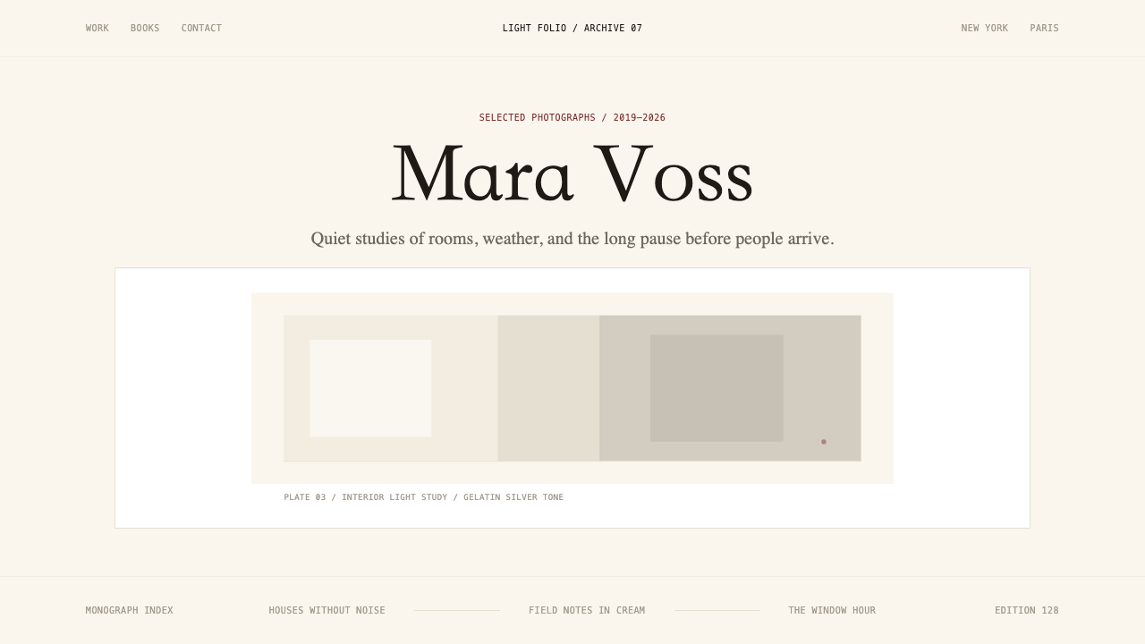 Photographer Light FolioMakes the browser a gallery wall. Warm cream, hairline serif type, and one im…浏览器即画廊墙:暖奶油底、纤细衬线与单幅影像。
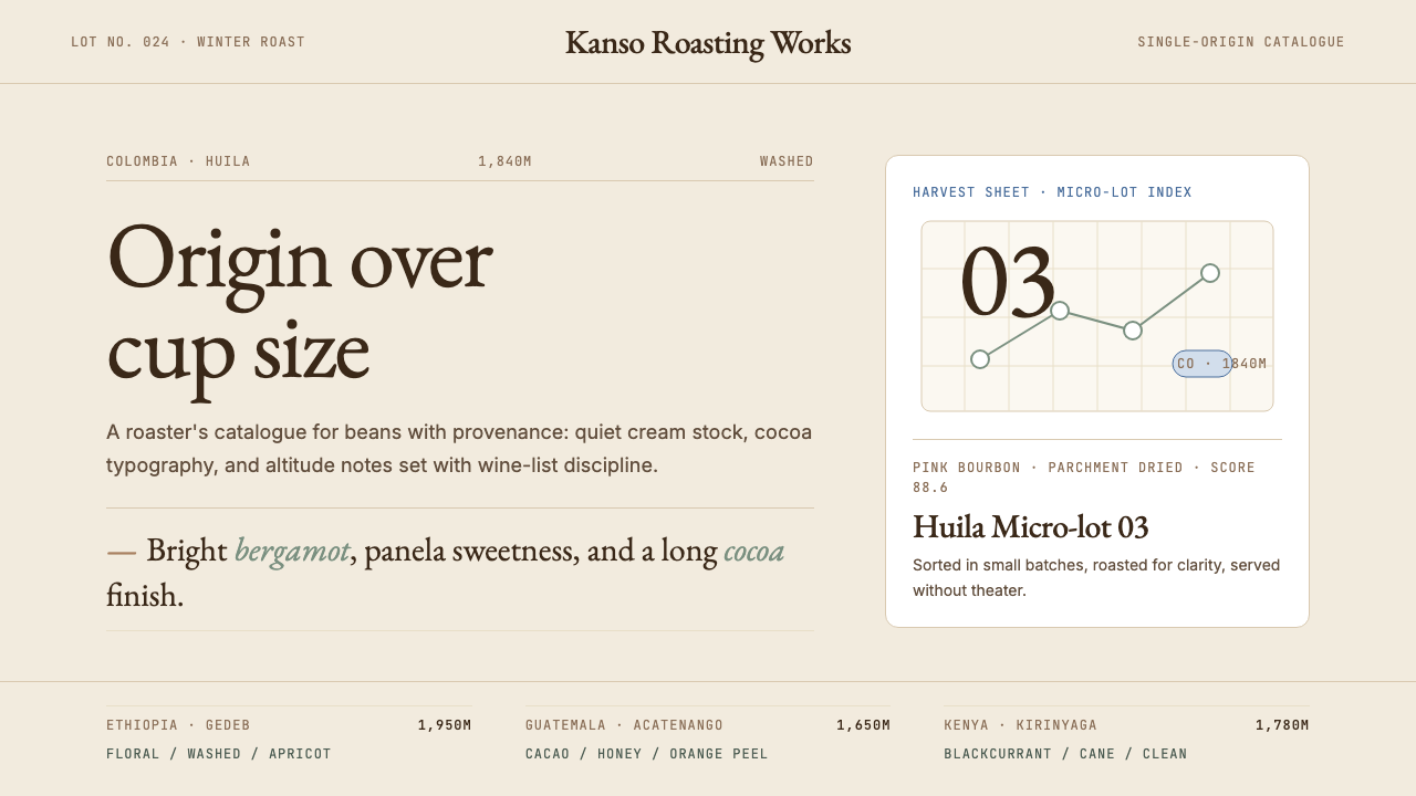 Third Wave CoffeeCoffee as catalogue. Cream paper, cocoa serif, mono origin specs, one sage no…咖啡如图录:奶油纸底、可可衬线、等宽产地规格与鼠尾草绿。
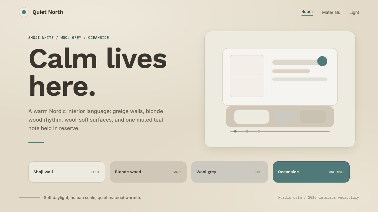 Scandinavian HyggeCalm is the brief. Greige walls, wool-grey cards, and one muted teal line.平静就是命题:灰米墙面、羊毛灰卡片与一抹灰青线。
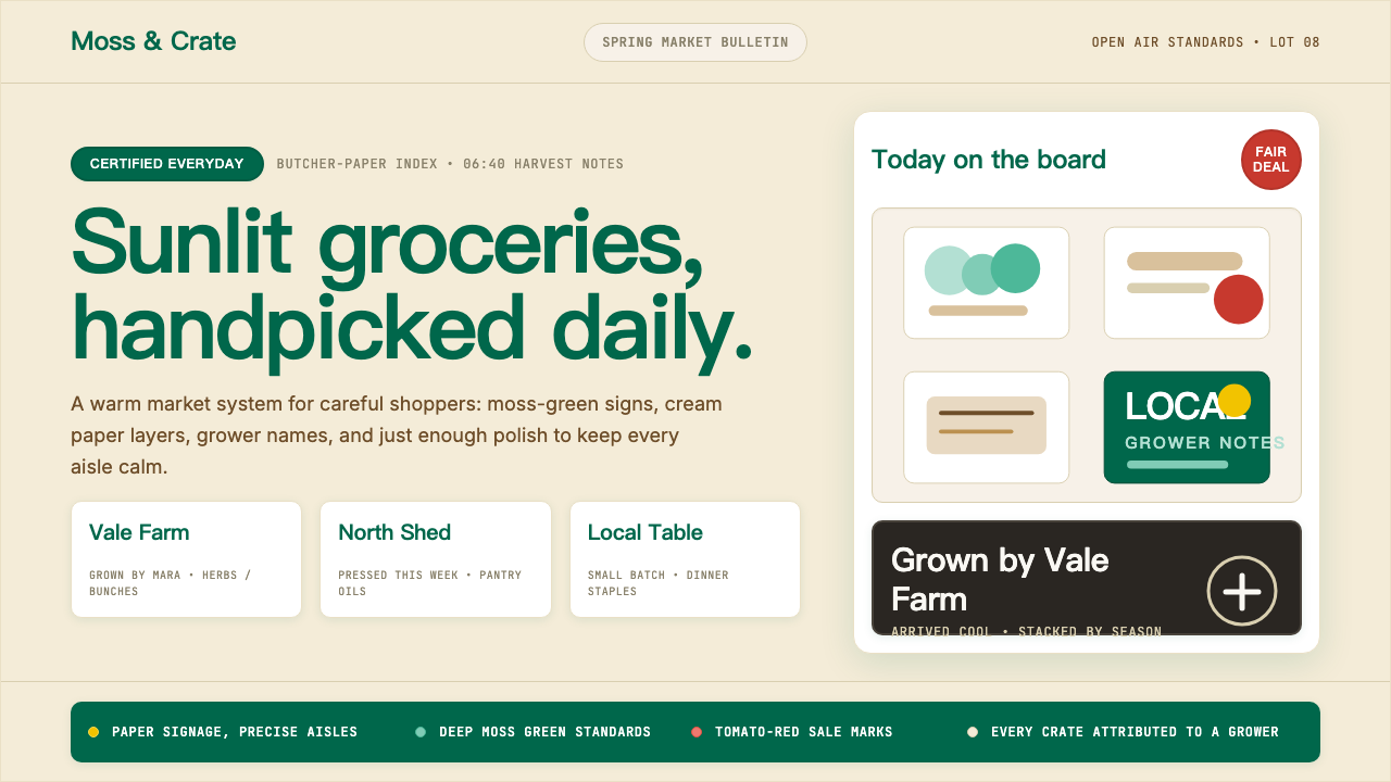 Whole Foods MarketFarmer’s-market polish. Moss green on butcher-paper cream, white cards, growe…农贸市集的精致感:苔藓绿配牛皮纸奶油底,白卡片写下农场主。
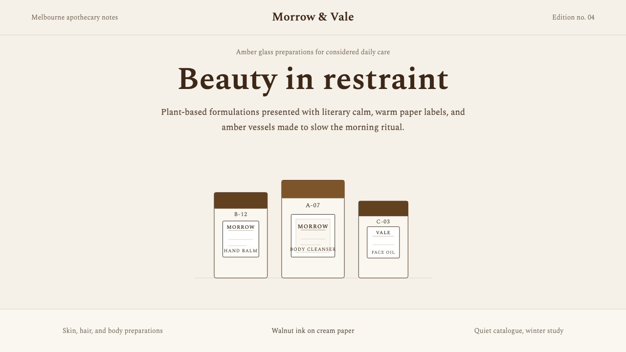 AesopRefuses urgency. Walnut serif on cream paper — every surface paced like a 19t…拒绝急迫的视觉语言:胡桃棕衬线落于奶油纸底,每个界面如 19 世纪药剂房般缓慢…
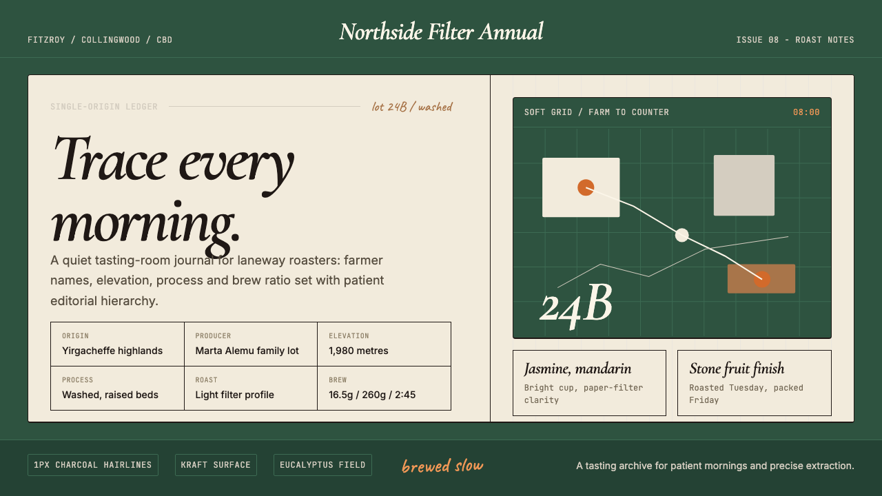 Melbourne Third-Wave Coffee ModernQuiet provenance. Eucalyptus green, cream cards and italic serif tables pace…安静溯源。桉树绿底、奶油纸卡与斜体衬线排出烘焙路线。