What is Aesop?什么是 Aesop?
Aesop refuses urgency. Every surface — amber glass, walnut-brown serif, warm cream paper — is calibrated to the unhurried pace of a nineteenth-century apothecary.Aesop 拒绝急迫。每一个界面——琥珀色玻璃、胡桃棕衬线、温润奶油纸底——都被调校至 19 世纪药剂房那种不慌不忙的节奏。
Aesop in briefAesop 速览
Aesop is an Australian skincare brand whose visual identity has, since its founding in Melbourne in 1987, functioned as one of the most coherent and consistently maintained design languages in contemporary retail. What makes it distinctive is not innovation in the modernist sense — there are no novel typefaces, no experimental layouts — but rather a principled refusal to adopt any visual convention that implies speed, impulse, or novelty.Aesop 是一家澳大利亚护肤品牌,自 1987 年创立于墨尔本以来,其视觉语言始终是当代零售设计中最连贯、最一以贯之的体系之一。使它与众不同的,不是现代主义意义上的创新——没有新奇字体,没有实验性版面——而是有原则地拒绝采纳任何暗示速度、冲动或新鲜感的视觉惯例。
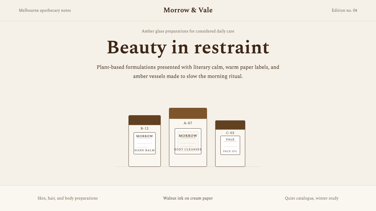
The system is built around a warm two-tone palette of deep brown and amber on cream, a classical book serif used at every typographic scale, rectangular apothecary-label geometry, and editorial whitespace calibrated to slow the eye. The result reads less like a brand and more like a carefully preserved institution — something that has been doing exactly this for a very long time and sees no reason to change.整套系统围绕几个核心元素构建:奶油底面上的深棕与琥珀暖色双调、在每一排印层级上一贯使用的古典书籍衬线体、方正的药瓶标签几何感,以及刻意放慢视线的编辑式留白。最终的观感与其说是一个品牌,不如说是一座被精心保存的机构——一种仿佛就是这样做了很久、也看不出任何改变理由的存在。
In digital and print applications alike, Aesop's design language signals expertise through restraint. Nothing competes for attention; there are no gradients, no rounded pill shapes, no urgent sans-serif headlines. Every element earns its place through function and precedent, lending the whole system an atmosphere of quiet authority that most consumer brands spend decades trying to approximate.无论是数字还是印刷应用,Aesop 的设计语言都通过克制来传递专业感。没有任何东西在争夺注意力:没有渐变、没有圆润的药丸形状、没有无衬线字体的催促式标题。每个元素都以功能与惯例为正当理由立足于此,赋予整个系统一种沉静的权威氛围——而大多数消费品牌要花数十年才能勉强接近这种感觉。
Where does Aesop come from?Aesop 从何而来?
Aesop was founded in 1987 by Dennis Paphitis, a hairdresser who opened a small salon in the Melbourne suburb of Armadale. The early product formulations drew on botanical ingredients, and the original packaging was deliberately utilitarian — dark amber glass bottles with plain rectangular paper labels printed in a single color. This was not a stylistic choice driven by trend research; it was, by Paphitis's own account, a practical and philosophical refusal of the cosmetics industry's prevailing language of glamour, luxury signaling, and aggressive visual differentiation.Aesop 由 Dennis Paphitis 于 1987 年创立。他是一名发型师,在墨尔本阿玛代尔郊区开了一家小型沙龙。早期产品配方以植物原料为基础,原始包装刻意保持实用主义风格——深琥珀色玻璃瓶,搭配朴素的方形纸质标签,单色印刷。这并非源于趋势研究的风格选择;据 Paphitis 本人所言,这是对化妆品行业流行语言——魅力、奢华暗示与激进视觉差异化——的一次务实而哲学性的拒绝。
The apothecary aesthetic that became Aesop's signature emerged from this refusal. Pharmaceutical packaging — with its classical serif labels, its amber glass designed to protect light-sensitive contents, its terse ingredient listings — implied scientific rigor and functional purpose rather than aspiration. Paphitis and his collaborators took this language and applied it with the care of a bibliophile: the serif type was chosen for its classical authority, the warm brown tones for their earthen honesty, the rectangular label geometry for its echo of the printed book.成为 Aesop 标志的药剂房美学,正是从这种拒绝中生长出来的。药品包装——以其古典衬线标签、保护光敏内容物的琥珀色玻璃、简洁的成分列表——传递的是科学严谨与功能目的,而非渴望与憧憬。Paphitis 和他的合作者以爱书人的细心将这套语言加以运用:选用衬线字体是为了其古典权威感,选用温暖的棕色调是为了其大地般的诚实,选用方形标签几何感是为了对印刷书籍的呼应。
As the brand grew through the 1990s and 2000s, the retail store environment became an extension of the same design philosophy. Aesop stores worldwide — designed in collaboration with architects including Rodolfo Dordoni and various local firms — are each site-specific but share a commitment to honest materials, restrained palette, and the kind of deliberate visual calm that the brand's packaging projects. The store-as-art-installation approach, guided in part by Suzanne Santos, who joined early and shaped the brand's cultural positioning, reinforced the packaging language at architectural scale.随着品牌在 1990 至 2000 年代的成长,零售店铺环境成为同一设计哲学的延伸。全球各地的 Aesop 门店——与 Rodolfo Dordoni 等建筑师及各地本土事务所合作设计——每一家都因地制宜,却共同坚守对诚实材料、克制色调以及品牌包装所投射的那种刻意视觉宁静的承诺。这种“店铺即艺术装置”的做法,在很大程度上由早期加入并塑造品牌文化定位的 Suzanne Santos 推动,将包装语言放大至建筑尺度。
The typographic identity consolidated around a classical book serif that carries the weight of nineteenth-century scholarly publishing without the self-consciousness of a period revival. Set in a warm dark brown against cream, it evokes the printed page of a well-made book — an association that Aesop has consistently leaned into through its in-store reading materials, its bibliographic references on product packaging, and its longstanding practice of commissioning literary collaborations. By the 2010s, when the brand was acquired by Natura and later by L'Oréal, the visual language was robust enough to survive ownership changes intact: its logic was too internally consistent to dilute without destroying it entirely.排印身份逐渐以一种古典书籍衬线字体为核心凝固——它承载着 19 世纪学术出版的分量,却没有历史复古风格特有的自我意识。以温暖深棕色印在奶油底面上,它唤起一本制作精良的书的印刷页面感——而 Aesop 通过店内阅读材料、包装上的书目引用,以及长期委托文学合作的惯例,始终坚定地倚靠这一联想。到 2010 年代,当品牌先后被 Natura 和欧莱雅收购时,这套视觉语言已足够强健,能够完好无损地延续:它的内在逻辑过于自洽,以至于若不彻底摧毁便无法稀释。
What defines the Aesop look?Aesop 的视觉特征是什么?
Palette色调
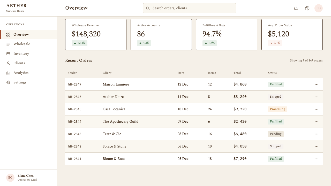
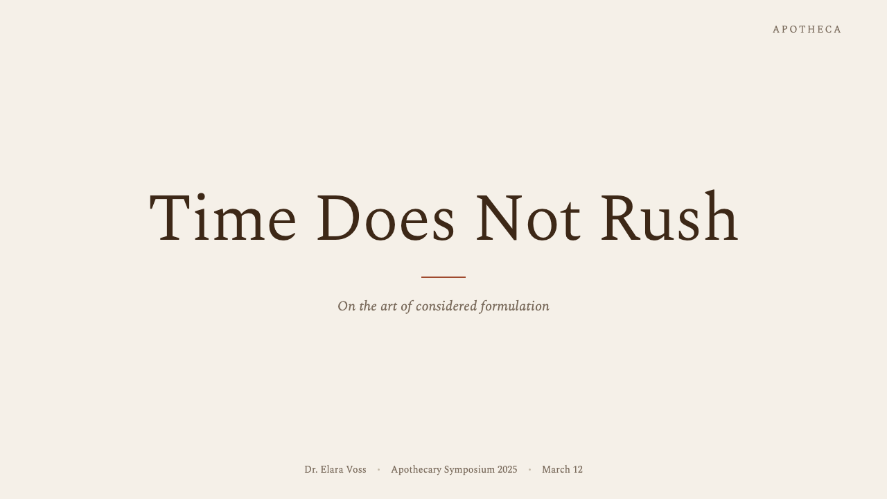
The palette is anchored by two warm tones: a deep walnut-brown that reads as ink on the page, and a warm amber that functions as both a highlight and a material reference to the brand's glass bottles. These sit against cream or off-white grounds rather than pure white, which softens the contrast and keeps the whole system from reading as clinical. No cool grays, no blues, no greens appear in the core identity — the warmth is absolute and deliberate.色调由两种暖色锚定:一种深胡桃棕,如同印在纸面上的墨色;一种温暖琥珀,既充当点缀色,又呼应品牌标志性玻璃瓶的材质。这两种颜色铺陈于奶油色或米白色底面上,而非纯白,柔化了对比度,让整套系统不至于显得冷峻或医疗感。核心识别体系中不出现冷灰、蓝色或绿色——这种温暖是绝对的,也是刻意为之的。
Typography字体排印
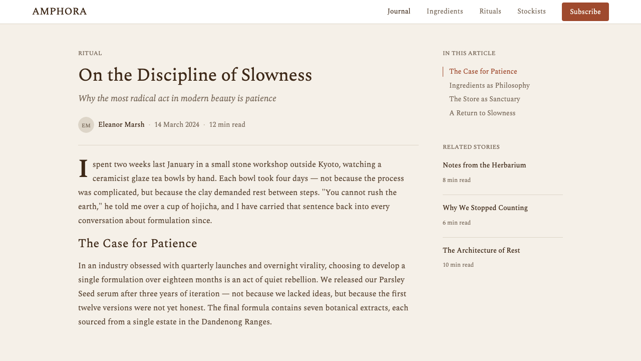
A classical book serif governs every scale of text, from the dense ingredient listings on product labels to the open, generous headlines of editorial campaigns. The typeface carries associations with nineteenth-century scholarly printing — authoritative without being ostentatious. It is never paired with a contrasting sans-serif family; the system achieves hierarchy purely through size, weight, and spacing. Capital letters are used sparingly, often for proper names and section headings only, reinforcing the tone of a well-edited book rather than an advertisement.一种古典书籍衬线字体统治着每一个文字层级,从产品标签上密集的成分列表,到编辑活动中开阔大气的标题均不例外。这款字体承载着 19 世纪学术印刷的联想——权威而不炫耀。它从不与反差鲜明的无衬线字体搭配;整套系统仅凭字号、字重与间距实现层级区分。大写字母使用克制,通常仅用于专有名词与章节标题,强化的是精心编辑的书籍基调,而非广告的气质。
Geometry几何形态
Rectangles dominate. The canonical apothecary label — a tall narrow oblong printed with aligned text and a ruled border — is the governing shape. It appears not only on packaging but in the proportions of editorial columns, image crops, and store signage. The rectangle implies order, legibility, and the printed page rather than the digital interface. Rounded corners, circles, and organic curves are almost entirely absent; where a frame appears, its corners are square and its edges are ruled.矩形主导一切。那个标志性的药剂标签——印有对齐文字与线框的高窄长方形——是支配性形态。它不仅出现在包装上,也体现在编辑专栏的比例、图片裁切与店铺标牌中。矩形暗示秩序、易读性以及印刷页面,而非数字界面。圆角、圆形与有机曲线几乎完全缺席;凡是出现边框,其角必是直角,其边必是直线。
Whitespace留白
Whitespace — or more precisely, cream space — is used with editorial generosity. Text does not crowd the edges of its container; margins are wide enough to suggest a premium printed publication. Images are placed with deliberate isolation, allowed to breathe rather than tiled or overlapped. This spaciousness is not passive emptiness but an active signal: it communicates that each element has been placed with intention, and that there is no urgency to fill every available surface.留白——更准确地说是「奶油色空间」——以编辑式的慷慨加以运用。文字不会挤到容器的边缘;页边距足够宽阔,足以暗示一本高端印刷出版物。图像被刻意隔离放置,留有呼吸空间,而非平铺或叠压。这种宽阔感并非消极的空洞,而是主动的信号:它传达的是每一个元素都经过有意为之的安置,并没有任何填满每一寸空白的急迫感。
Material Honesty材料诚实
In physical products, the brand insists on materials that read as what they are: amber glass that is actually glass, paper labels that are actually paper, metal caps that show their metal character. No chrome effects, no laminate shine, no embossed logos that imply more than the material can honestly offer. In digital applications, this principle translates to flat surfaces — no simulated textures, no soft depth illusions — and a deliberate avoidance of skeuomorphic conventions that make interfaces look more substantial than they are.在实体产品中,品牌坚持使用一目了然的材料:琥珀色玻璃就是真正的玻璃,纸质标签就是真正的纸张,金属瓶盖就展现其金属本质。没有镀铬效果,没有压膜光泽,没有超出材料诚实承受范围的浮雕标识。在数字应用中,这一原则转化为平面的界面——没有模拟纹理,没有柔和的深度幻觉——以及对那些让界面看起来比实际更厚重的拟物化惯例的刻意回避。
Tone of Voice文字腔调
The copy register is formal, literary, and unhurried — closer to an essay than to marketing copy. Product descriptions cite botanical sources, historical uses, and sensory qualities with the precision of a well-researched natural history text. There are no superlatives, no urgency phrases, no promotional exclamation. The voice signals that the brand and its reader share a certain cultivated curiosity, and that neither party is in a hurry.文字调性正式、文学性强、不疾不徐——更接近散文而非营销文案。产品描述以精准的语言引述植物来源、历史用途与感官品质,如同一本考证严谨的博物学著作。没有最高级形容词,没有催促语气,没有促销感叹号。这种文字腔调传达出品牌与读者之间共享某种有教养的好奇心,双方都不着急。
Stillness and Motion静止与动效
Animation is used sparingly and with deliberate slowness — a gentle opacity fade, a quiet underline reveal on hover. There are no slide-ins, no scale bounces, no particle effects. The brand communicates through stillness; motion appears only as the quietest possible confirmation of interaction, never as spectacle. The pace of any transition mirrors the pace of the typography itself: unhurried, resolved, without urgency.动效使用克制,过渡刻意缓慢——一个轻柔的透明度渐隐,一条悬停时静静出现的下划线。没有滑入效果,没有弹跳缩放,没有粒子特效。品牌通过静止来传达;动效仅作为能想象到的最安静的交互确认出现,绝不充当视觉奇观。任何过渡的节奏都与排版本身的节奏相呼应:不急不徐,有始有终,毫无紧迫感。
Who shaped Aesop?谁塑造了 Aesop?
Paphitis founded Aesop in Melbourne in 1987 and remained its creative and philosophical anchor for three decades. His insistence on botanical formulations and utilitarian packaging from the outset established the brand's counter-cultural stance toward the cosmetics industry. A voracious reader with wide-ranging literary interests, Paphitis shaped the brand's distinctive bibliographic identity — the practice of printing literary quotes on packaging, the curation of in-store reading materials, the essayistic register of product copy. His conviction that good design is inseparable from honest intent runs through every design decision the brand has made.Paphitis 于 1987 年在墨尔本创立 Aesop,并在此后三十年间始终是品牌的创意与哲学核心。他从一开始就坚持植物配方与实用主义包装,确立了品牌对化妆品行业的反文化姿态。作为一个涉猎广泛的热忱读者,Paphitis 塑造了品牌独特的书目身份——在包装上印刷文学引语的惯例、店内阅读材料的策划、产品文案的散文腔调。他的信念——好的设计与诚实的意图不可分割——贯穿于品牌做出的每一个设计决定之中。
Santos joined Aesop in its earliest years and became a key architect of its retail and cultural identity. She oversaw the development of the store-as-art-installation concept, which turned each Aesop shop into a site-specific spatial composition guided by the same principles as the packaging: honest materials, restrained palette, deliberate calm. Her influence extended to the brand's broader cultural programming — literary partnerships, philanthropic initiatives, the cultivation of a brand persona that reads as curator rather than marketer.Santos 在 Aesop 创立初期加入,成为品牌零售与文化身份的重要建筑师。她主导了「“店铺即艺术装置”」概念的发展,将每一家 Aesop 门店变成以与包装相同原则为指引的场所特定空间构成:诚实的材料、克制的色调、刻意的宁静。她的影响力延伸至品牌更广泛的文化项目——文学合作、公益倡议,以及对一种读来更像策展人而非营销人的品牌人格的培育。
The Milanese architect and designer collaborated with Aesop on several store interiors, bringing a refined Italian modernist sensibility that complemented rather than overrode the brand's established language. His work with Aesop is notable for its material intelligence: warm stone, aged timber, polished concrete, and dark metal are composed with the same economy of means that governs the packaging. Dordoni's stores demonstrate how a two-dimensional design system can be translated into three-dimensional space without losing its essential character.这位米兰建筑师与设计师与 Aesop 合作了多家门店室内设计,带来一种精致的意大利现代主义感性,与品牌既有语言相辅相成而非凌驾其上。他与 Aesop 的合作以其材料智慧著称:温润石材、做旧木材、抛光混凝土与深色金属,以与包装相同的节制方式加以组合。Dordoni 的门店展示了一套二维设计系统如何在不失其本质特性的情况下,被转译为三维空间。
The Italian marble studio has supplied materials for Aesop store interiors, representing the brand's commitment to sourcing materials with their own histories and material integrity rather than manufactured substitutes. The collaboration exemplifies Aesop's approach to craft partnerships: finding producers whose standards of making align with the brand's values, and allowing the material's inherent qualities to carry meaning without decoration or embellishment.这家意大利大理石工作室为 Aesop 门店室内提供材料,体现了品牌对拥有自身历史与材料完整性的材质的承诺,而非使用人造替代品。这次合作示范了 Aesop 与工艺合作伙伴的相处方式:寻找那些制作标准与品牌价值观一致的生产者,让材料本身的固有品质承载意义,无需任何装饰或点缀。
How do you use Aesop today?今天怎么用 Aesop?
Applying Aesop's design language correctly requires understanding that its restraint is active, not passive — every absence is a decision. The temptation when working with this system is to add: a pop of color, a bolder typeface, a bit of visual energy to prevent the layout from feeling static. Resist this entirely. The system's power comes from its consistency; introducing contrast that the original language does not sanction will collapse the effect immediately.正确应用 Aesop 的设计语言,需要理解它的克制是主动的而非被动的——每一处缺席都是一个决定。使用这套系统时,最大的诱惑是添加:一抹色彩的跳动、一种更醒目的字体、一点视觉能量以防止版面显得停滞。彻底抵抗这种冲动。这套系统的力量来自其一致性;引入原始语言不授权的反差,会立刻瓦解这种效果。
For presentation slides, the Aesop language works best when treated as a long-form editorial experience rather than a series of discrete slides. Cover pages benefit from generous margins, a single typographic statement in the classical serif at a commanding scale, and the warm cream-on-brown or brown-on-cream palette used without ornamentation. Content slides should adopt a narrow text column with wide margins — the reading experience of a well-typeset book page. Data slides work within this system when charts are kept minimal: bars and lines in the deep brown or amber tones, labels in the same serif, axes undecorated. Avoid color-coded comparisons that introduce new hues outside the core palette.对于演示文稿,Aesop 语言在被当作长篇编辑体验而非一系列独立幻灯片来处理时效果最佳。封面页适合慷慨的页边距、一句用古典衬线体以支配性尺度书写的排印陈述,以及不加任何装饰地使用奶油底深棕字或深棕底奶油字的色调方案。内容页应采用窄文字栏配宽页边距——如同一本排版精良的书的阅读体验。在这套系统中,数据页应保持图表极简:以深棕或琥珀色调绘制柱状与折线,标注使用同款衬线字体,坐标轴不加装饰。避免引入核心色板之外新色调的色彩编码对比。
For web interfaces, the style is well-suited to contexts that benefit from perceived expertise and considered quality: consulting services, editorial platforms, luxury goods, financial tools, and wellness applications positioned as calm and intentional rather than reactive. Dashboards in this language use generous line heights, ruled horizontal dividers rather than card shadows, and amber or warm-brown accent elements for interactive states. Pricing pages read cleanly when the hierarchy is established through the serif at scale rather than through color contrast or card borders.对于网页界面,这种风格尤其适合受益于专业感知与审慎品质的场景:咨询服务、编辑平台、奢侈品、金融工具,以及将自身定位为沉静而有意为之而非应激反应的健康应用。这种语言下的仪表板使用慷慨的行高、直线水平分割线(而非卡片投影),以及琥珀色或暖棕色的强调元素标示交互状态。定价页在层级由大字号衬线体而非色彩对比或卡片边框建立时,阅读感最为干净。
For editorial and marketing work, the Aesop language supports long-form content with exceptional grace. Article layouts should use a measure that mirrors the proportions of a printed book page — narrow enough to be comfortable to read but wide enough to feel substantial. Pull quotes in the larger serif scale break the text column without requiring graphic decoration. In marketing applications, the language works best when the campaign has a narrative arc — an essay about the origin of an ingredient, a literary collaboration, a seasonal reflection — rather than a product feature list. The warmth of the palette and the literary register of the copy reinforce each other; break either one and the system loses coherence.对于编辑与营销内容,Aesop 语言承托长篇内容的能力格外出色。文章版面应使用与印刷书籍页面比例相仿的行宽——窄到读来舒适,又宽到感觉有分量。以较大衬线体尺度呈现的引语,可在不依赖图形装饰的情况下打断正文栏。在营销应用中,这种语言在活动有叙事弧度时效果最佳——一篇关于某种成分起源的文章、一次文学合作、一段季节性的沉思——而非产品功能列表。色调的温暖感与文案的文学腔调相互强化;破坏其中任何一个,整套系统就会失去连贯性。
The most common mistake is applying the color palette and typeface while preserving digital-native layout conventions: rounded cards, soft box shadows, gradient buttons, icon-heavy navigation. These elements signal a different set of values — approachability, friendliness, digital modernity — that are fundamentally at odds with the apothecary-literary world Aesop constructs. If the layout feels like it could have been built from a contemporary UI component library, the conversion is incomplete. The test is whether the result could plausibly have been printed on paper: if yes, the system is working; if no, something from outside the language has been allowed in.最常见的错误,是在应用色调和字体的同时保留了数字原生的版面惯例:圆角卡片、柔和阴影、渐变按钮、图标繁多的导航。这些元素传递的是另一套价值观——亲切感、友好性、数字现代性——而这套价值观与 Aesop 构建的药剂房-文学世界根本上相悖。如果版面感觉像是用当代 UI 组件库搭建出来的,那么转化就是不完整的。检验的标准是:结果是否看起来有可能被印刷在纸上?如果是,系统在正常运转;如果否,就是有什么语言之外的东西被引进来了。
Aesop — FAQAesop · 常见问题
Is the Aesop design language the same as minimalism?Aesop 的设计语言等同于极简主义吗?
They overlap but are not the same. Contemporary minimalism typically removes visual elements in service of clarity and cognitive ease — it is optimization-minded. Aesop's restraint is philosophically different: it removes elements that would compromise a specific world it is constructing — the apothecary-literary world of honest materials, scholarly authority, and unhurried attention. A minimalist design can be made in cool grays on pure white with a geometric sans-serif and be entirely coherent. An Aesop-derived design built on the same foundations would feel wrong immediately: the warmth, the serif, the cream — these are not optional parameters but load-bearing elements of the identity.两者有交叠,但并不相同。当代极简主义通常以清晰性与认知便利为目的去除视觉元素——它以优化为导向。Aesop 的克制在哲学上有所不同:它去除的是任何会损害它正在构建的那个特定世界的元素——那个由诚实材料、学术权威与不疾不徐的专注所构成的药剂房-文学世界。一个极简主义设计可以用冷灰搭配纯白底面和几何无衬线字体,并完全自洽。而在相同基础上建构的 Aesop 派生设计,立刻就会感觉哪里不对:温暖感、衬线体、奶油色——这些不是可选参数,而是身份认同中承重的结构元素。
Can this style work for a technology product or software interface?这种风格能用于科技产品或软件界面吗?
It can, but with significant adaptation costs. Software interfaces operate under functional constraints — interactive states, error messages, density requirements, accessibility standards — that create pressure to introduce conventions the Aesop language does not support: bright accent colors for alerts, icon-based navigation for efficiency, sans-serif type for high-density data. A partial application tends to undermine the system: the warmth and authority the language generates depend on total commitment to its logic. The most successful technology applications of this aesthetic tend to be in contexts where the software is itself positioned as a premium, considered product — creative tools, editorial systems, high-end service platforms — rather than utility software.可以,但需要付出相当大的适应代价。软件界面受到功能性约束——交互状态、错误提示、信息密度要求、无障碍标准——这些都会带来引入 Aesop 语言不支持的惯例的压力:用于警示的亮色强调、提升效率的图标导航、适合高密度数据的无衬线字体。局部应用往往会削弱整个系统:这套语言所产生的温暖感与权威感,依赖于对其逻辑的全面承诺。这种美学在科技领域最成功的应用,往往出现在软件本身被定位为高端、经过审慎考量的产品的场景中——创意工具、编辑系统、高端服务平台——而非实用工具软件。
Why does Aesop use a serif typeface when most luxury brands have switched to sans-serif?为什么 Aesop 使用衬线字体,而大多数奢侈品牌已经转向无衬线字体?
Because Aesop is not positioning itself within the luxury-goods world; it is positioning itself within the scholarly-literary world. The wave of luxury brand rebranding toward geometric sans-serifs — Burberry, Saint Laurent, Balmain, and others — was driven by a desire to appear contemporary, accessible, and digital-native. Aesop's serif is a deliberate refusal of that repositioning. A classical book serif carries the weight of academic publishing, natural history texts, and nineteenth-century pharmacopoeia — exactly the associations the brand wants. The choice is not nostalgic but strategic: the serif signals that Aesop's authority comes from knowledge and time, not from fashion or market position.因为 Aesop 不是在奢侈品世界中寻找自身定位,而是在学术-文学世界中。奢侈品牌转向几何无衬线字体的浪潮——Burberry、Saint Laurent、Balmain 等——背后是显得当代、亲切、数字原生的渴望。Aesop 的衬线体是对这种重新定位的刻意拒绝。古典书籍衬线字体承载着学术出版、博物学著作与 19 世纪药典的分量——这恰恰是品牌所期望的联想。这个选择不是怀旧的,而是战略性的:衬线体传递的信号是,Aesop 的权威来自知识与时间,而非时尚或市场地位。
How does the Aesop visual system handle color in data visualization?Aesop 视觉系统如何处理数据可视化中的色彩?
Data visualization in the Aesop language must work within the constraint of the warm two-tone palette, which limits categorical differentiation. For data that requires distinguishing three or more categories, the approach is to use variations within the brown-amber range — from a deep walnut anchor through mid-amber to a pale warm tone near the cream — rather than introducing exterior hues. This works well for ordinal data showing degrees of something, but less well for categorical data with no intrinsic order. When categorical differentiation is genuinely necessary, the alternative is to use form rather than color: different line weights, different geometric markers, text labels placed directly on the data rather than in a legend.Aesop 语言下的数据可视化必须在暖色双调色板的约束内运作,这限制了类别区分的手段。对于需要区分三种或以上类别的数据,正确做法是在棕-琥珀色域内使用变体——从深胡桃棕的锚点,经过中性琥珀,延伸至接近奶油色的浅暖色调——而不是引入外来色调。这对序列性数据(展示某事物的程度)效果很好,对没有内在顺序的类别性数据则效果较弱。当类别区分确实必要时,替代方案是用形态而非色彩:不同的线条粗细、不同的几何标记、将文字标注直接置于数据上而非依靠图例。
What happens when this design language is applied to a younger or more energetic brand?当这种设计语言被应用于一个更年轻或更有活力的品牌时,会发生什么?
It tends to create a mismatch between form and content that audiences read as affectation. The Aesop language communicates age, patience, and accumulated expertise — associations that are earned through decades of consistent behavior, not borrowed through aesthetic choice alone. A young brand applying this language without the accompanying substance risks appearing pretentious: the slowness reads as studied rather than genuine, the literary register as performance rather than conviction. This does not mean younger brands cannot use restrained palettes or classical type — they can — but the specific combination of apothecary geometry, warm scholarly color, and unhurried whitespace has a semantic weight that works against energy, immediacy, and novelty.它往往会在形式与内容之间制造一种错位,让受众读出矫饰感。Aesop 的语言传递的是年岁、耐心与积累而来的专业——这些联想是通过数十年一以贯之的行为赢得的,不是仅凭美学选择借用而来的。一个缺乏相应底蕴就贸然应用这套语言的年轻品牌,有装腔作势之嫌:那种缓慢会读起来像刻意为之而非发自本真,文学腔调会显得像表演而非信念。这并不意味着年轻品牌不能使用克制的色调或古典字体——它们当然可以——但药剂房几何感、温暖学术色调与不急不徐的留白这一特定组合,有着与活力、即时性和新鲜感根本相悖的语义重量。
Related design styles相关设计风格
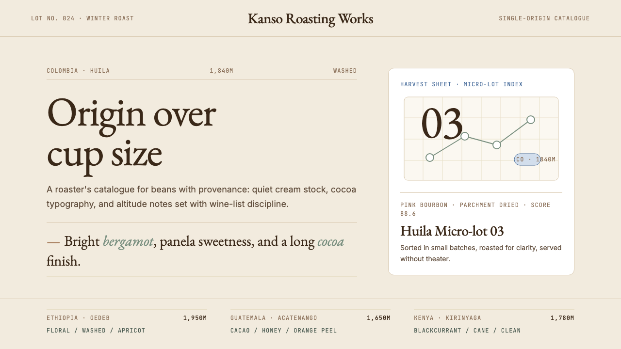 Third Wave CoffeeCoffee as catalogue. Cream paper, cocoa serif, mono origin specs, one sage no…咖啡如图录:奶油纸底、可可衬线、等宽产地规格与鼠尾草绿。
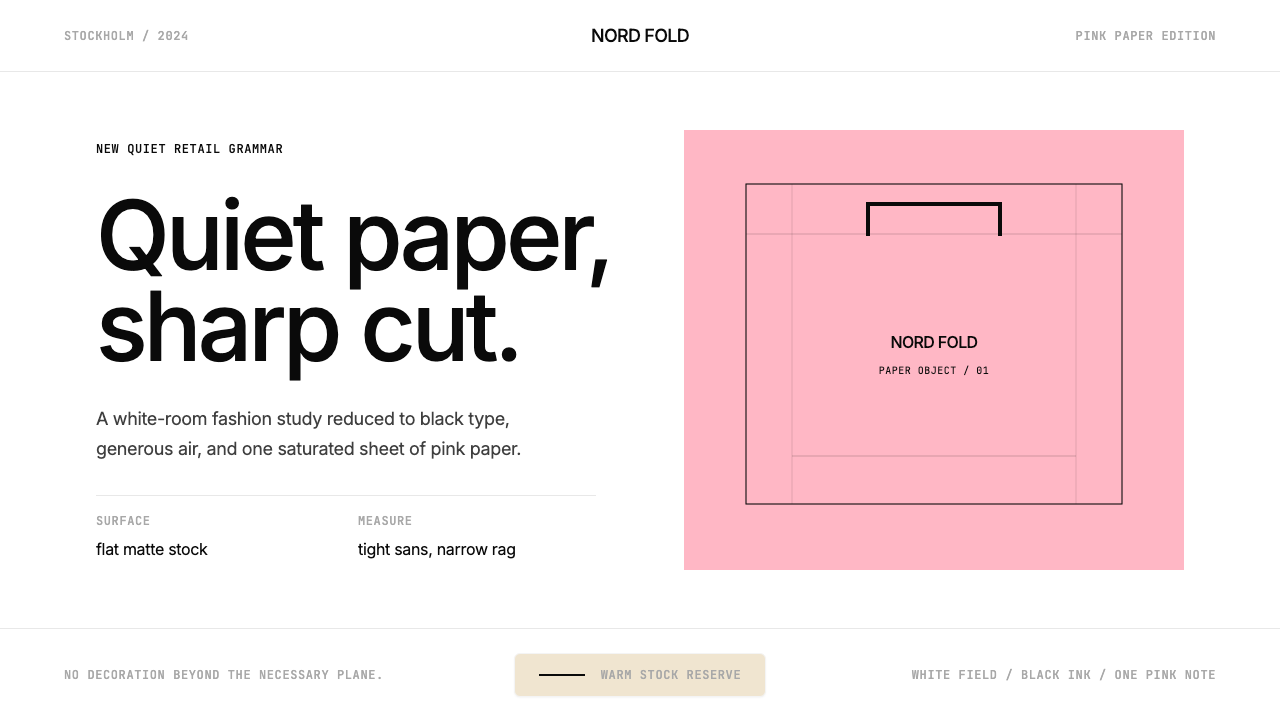 Acne Studios Pink-PaperQuiet luxury in one pink plane. Inter type floats on white with a bag-like re…粉色平面定义安静奢华:Inter 黑字漂浮于白场,像一只纸袋。
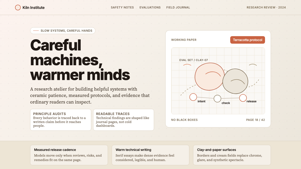 Anthropic ClayAI safety in handmade clay. Sand backgrounds, terracotta accents, serif body…用手工陶土包裹的 AI 安全感:沙色背景、赤陶点缀、衬线正文——缓慢、刻意、有…
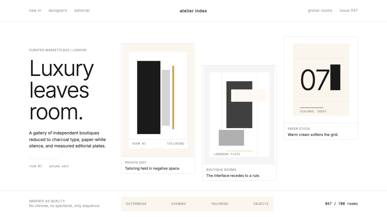 FarfetchLuxury as absence. Charcoal type, white canvas, and hairline editorial plates.奢华即留白。炭灰字、纯白画布与发丝线编辑图版。
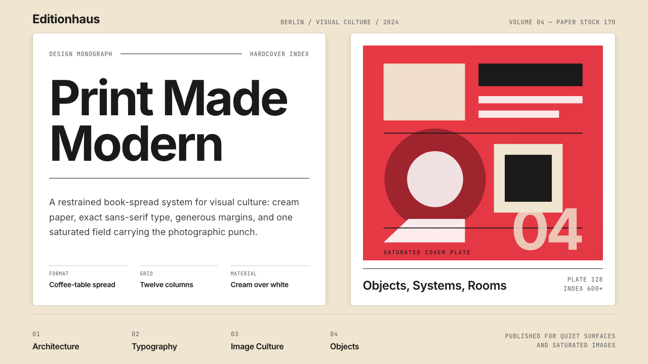 Gestalten Design BookCoffee-table calm. Cream paper, tight sans, one saturated block, and a strict…咖啡桌式冷静。奶油纸、紧凑无衬线、单一高饱和色块与严格网格。
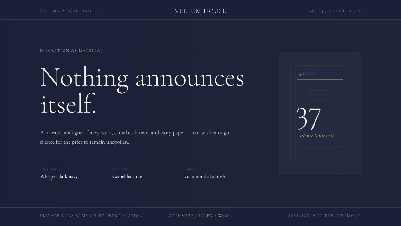 Quiet Luxury / Old MoneyLuxury refuses to raise its voice. Navy fields, camel hairlines, and thin Gar…奢华拒绝扬声:海军蓝底、驼色发丝线与纤细Garamond低语。