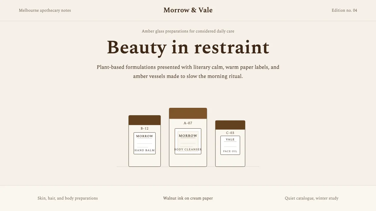
About Aesop
Aesop's visual identity is the rare brand language that refuses urgency. Founded in Melbourne in 1987, every element — the amber-glass bottles, the walnut-brown Spectral serif, the cream-paper backgrounds — is calibrated to feel like walking into a 19th-century apothecary that happens to sell modern skincare.
The design system prizes editorial whitespace, rectangular apothecary-label geometry, and a warm two-tone palette of deep brown and amber. There are no gradients, no pills, no sans-serif headlines. Every surface reads like a slow-fashion lookbook printed on fine paper.
- Origin
- Melbourne, Australia
- Era
- 1987 founded; visual heritage consistent through 2024
- Key figures
- Dennis Paphitis · Suzanne Santos · Marsotto Edizioni
- Movements
- indie skincare · store-as-art-installation · apothecary aesthetics
Aesop design spec
Colors
Typography
The other 11 sections — buttons, cards, spacing, motion, techniques and more — open once you unlock. Download the DESIGN.md or send it to your AI in one click. Unlock once, yours forever.
Sign up nowStyles similar to Aesop
Also inspired by brands & products, with a close feel.
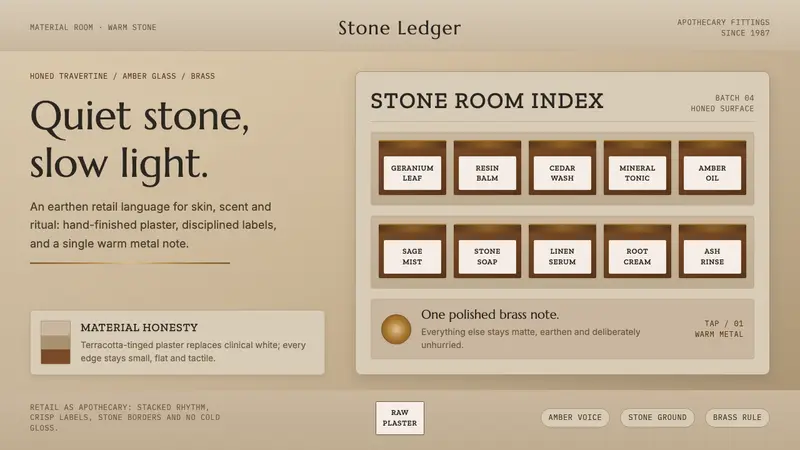 Aesop Store TravertineQuiet material honesty. Warm plaster, amber glass and a single brass line pace the shelf.
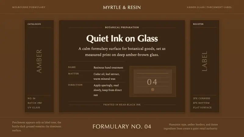 Aesop Apothecary AmberQuiet authority in glass. Amber-brown ground, parchment labels, and humanist type.
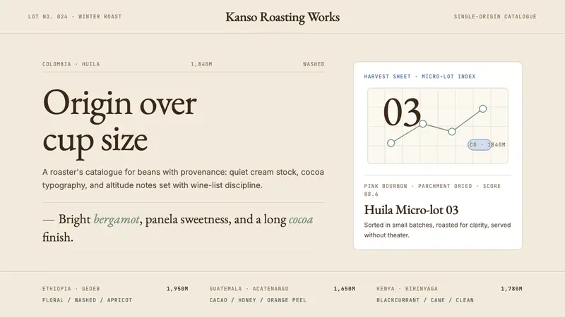 Third Wave CoffeeCoffee as catalogue. Cream paper, cocoa serif, mono origin specs, one sage note.
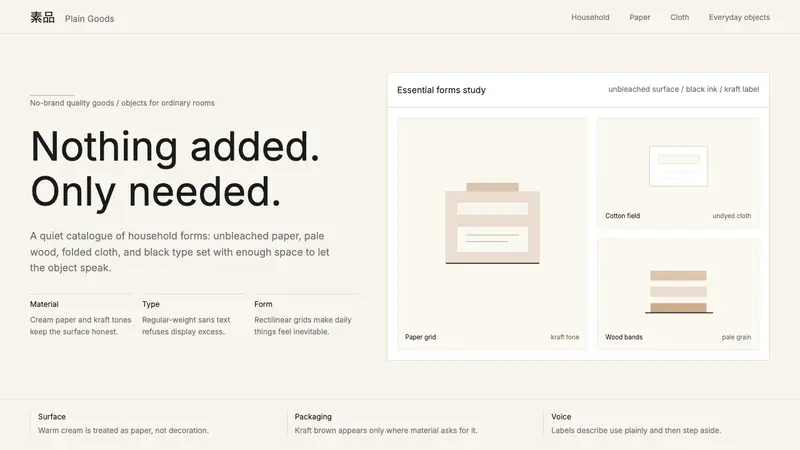 MUJIAnti-brand restraint. Cream paper, kraft brown, and regular Inter leave only essentials.