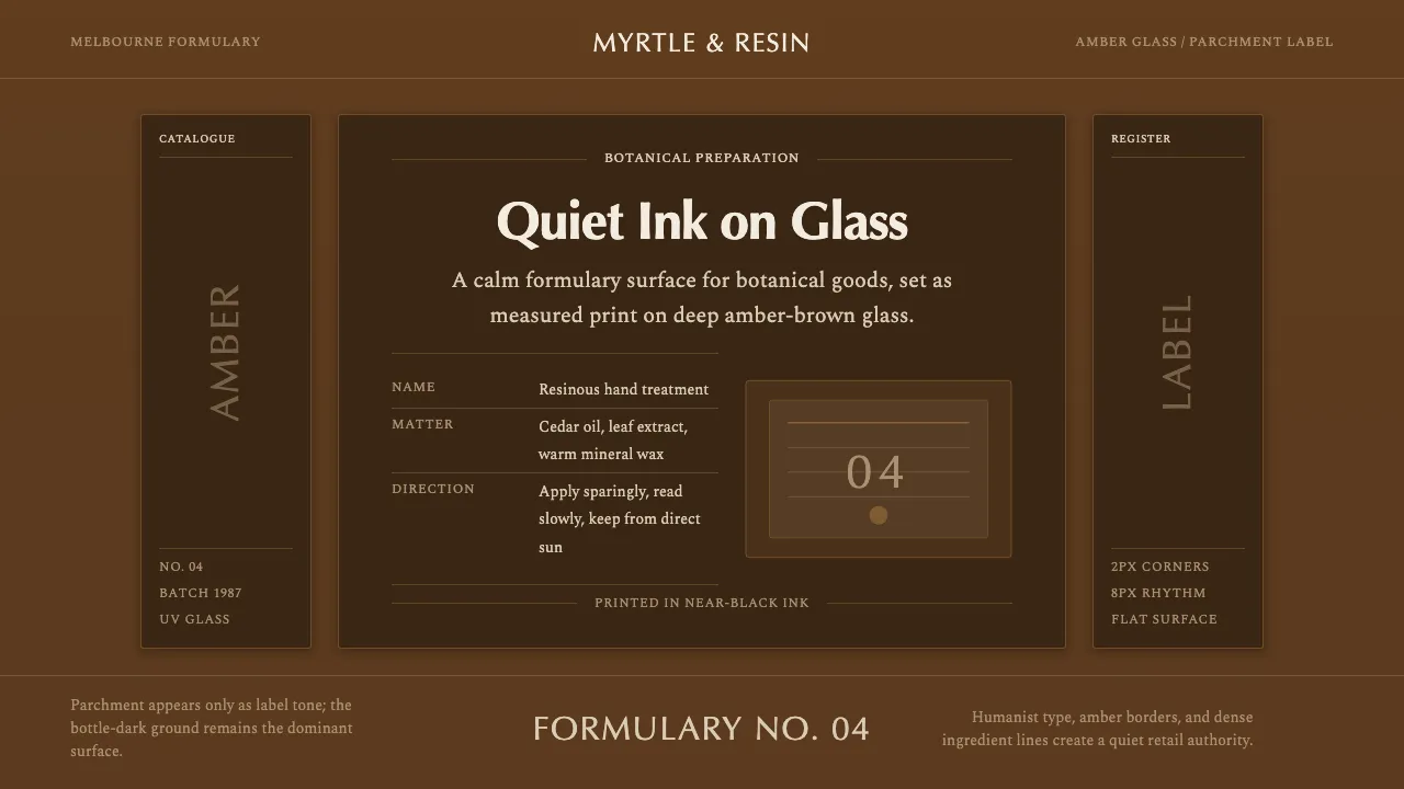
About Aesop Apothecary Amber
Aesop, founded in Melbourne in 1987 by Dennis Paphitis, made the amber-brown UV-protective glass bottle its entire brand surface. A printed apothecary label in black ink lists name, ingredients, and directions; the logotype is set in Optima with restrained typographic minimalism throughout.
This system treats the deep amber-brown bottle glass as the ground, never cream. The parchment label tone and near-black ink live in support — quiet rectangular panels, generous editorial whitespace, and humanist serif type carry the calm, formulary voice of a modern apothecary.
- Origin
- Melbourne, Australia, Oceania
- Era
- 1987 founded; signature amber-glass identity carried through the 2010s to now
- Key figures
- Dennis Paphitis
- Movements
- Apothecary-minimalist skincare branding · Ink-on-paper label typography · Amber UV-glass packaging
Aesop Apothecary Amber design spec
Colors
Typography
The other 11 sections — buttons, cards, spacing, motion, techniques and more — open once you unlock. Download the DESIGN.md or send it to your AI in one click. Unlock once, yours forever.
Sign up nowStyles similar to Aesop Apothecary Amber
Also inspired by brands & products, with a close feel.
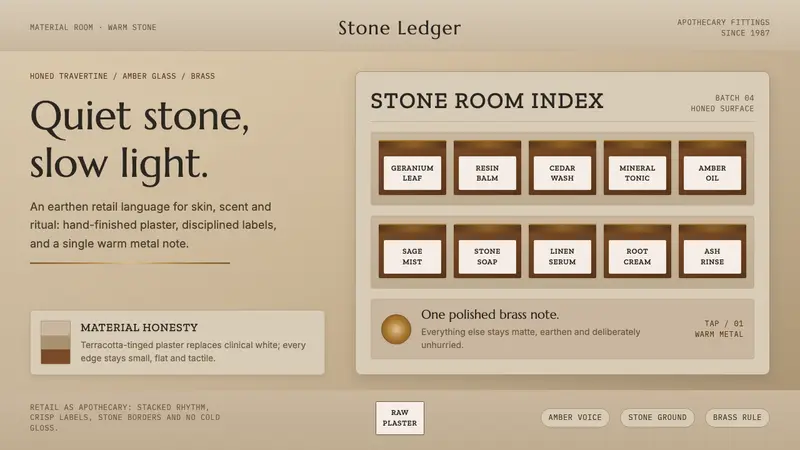 Aesop Store TravertineQuiet material honesty. Warm plaster, amber glass and a single brass line pace the shelf.
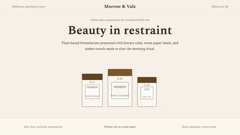 AesopRefuses urgency. Walnut serif on cream paper — every surface paced like a 19th-century apothecary.
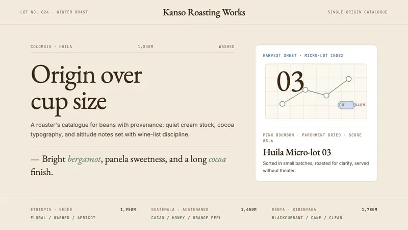 Third Wave CoffeeCoffee as catalogue. Cream paper, cocoa serif, mono origin specs, one sage note.
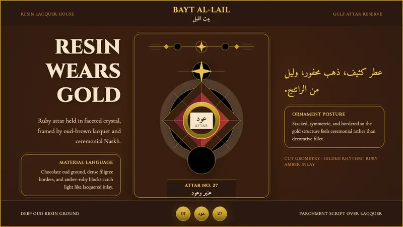 Arabian Oud Attar BottleResinous luxury, gilded. Chocolate oud lacquer frames Cinzel caps and ruby-amber facets.