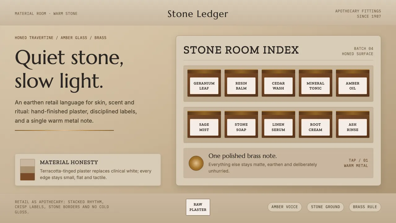
About Aesop Store Travertine
Aesop's travertine stores treat retail as apothecary. Raw troweled plaster, honed limestone and warm-gray travertine form an earthen ground — terracotta-tinged, deliberately never cream — against which the brand's amber bottles and a single polished brass tap glow. The palette is warm stone and burnt amber; the mood is quiet, tactile and unhurried. Typography carries the same restraint: an Optima-like display for the wordmark, a slab for apothecary labels, and a clean grotesque for running text. Nothing glossy, nothing cold. Every surface reads as hand-finished material honesty.
- Origin
- Melbourne-founded, global store network
- Era
- 2010–now (retail concept ongoing)
- Key figures
- Aesop · naturehumaine
- Movements
- apothecary retail design · material-honest interiors
Aesop Store Travertine design spec
Colors
Typography
The other 11 sections — buttons, cards, spacing, motion, techniques and more — open once you unlock. Download the DESIGN.md or send it to your AI in one click. Unlock once, yours forever.
Sign up nowStyles similar to Aesop Store Travertine
Also inspired by brands & products, with a close feel.
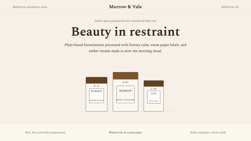 AesopRefuses urgency. Walnut serif on cream paper — every surface paced like a 19th-century apothecary.
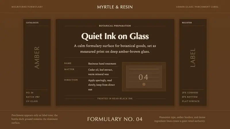 Aesop Apothecary AmberQuiet authority in glass. Amber-brown ground, parchment labels, and humanist type.
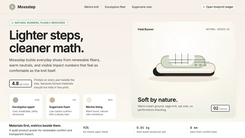 AllbirdsSustainability that breathes. Cream-and-sage tones, carbon labels next to prices, never preachy.
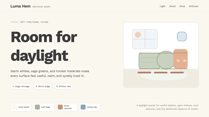 Scandi Hygge (IKEA)Warmth from restraint. Sage, linen white, Work Sans, and wide breathing room.