What is Aesop Store Travertine?
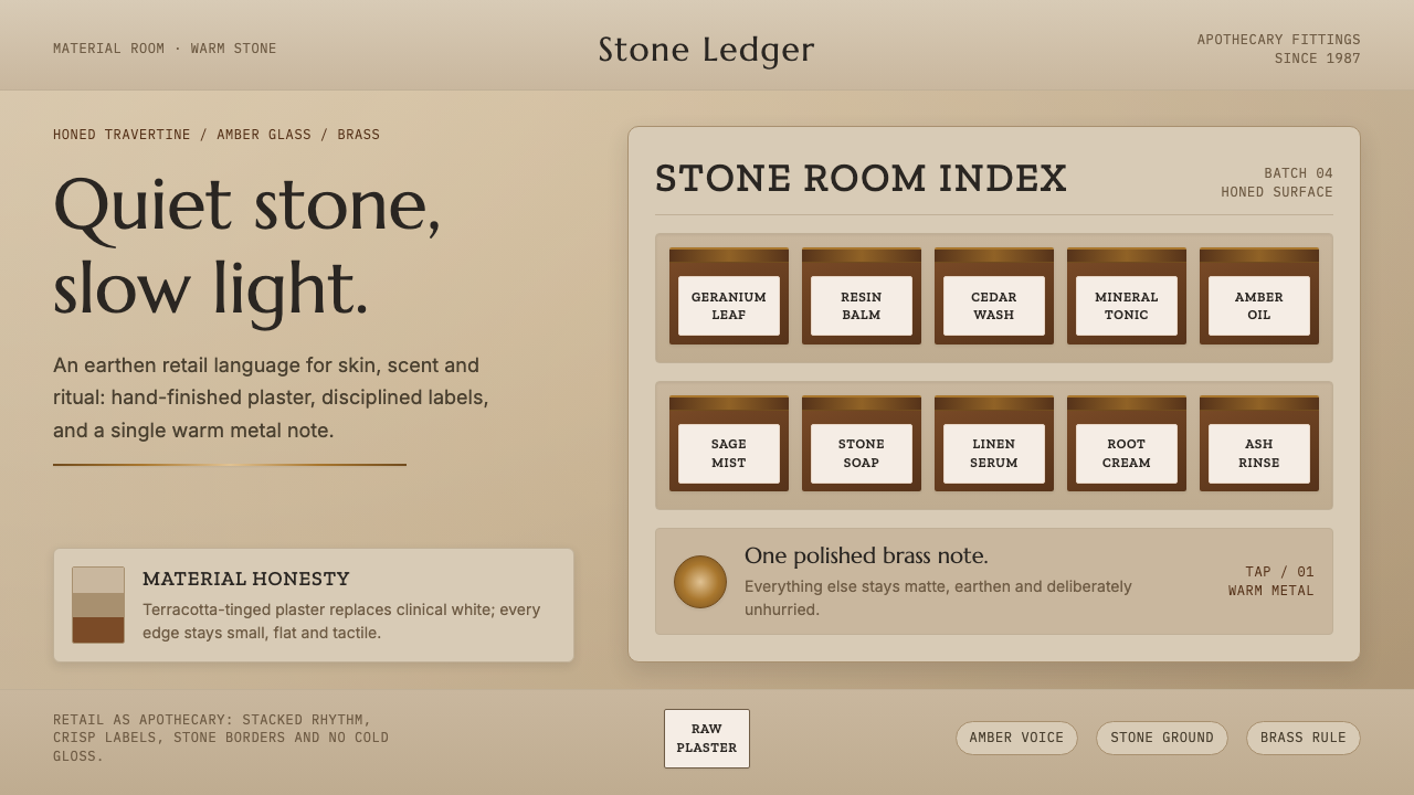
Aesop Store Travertine turns retail into an unhurried apothecary: warm stone, amber glass, and hand-finished surfaces make care feel physical before a product is even opened.
Aesop Store Travertine in brief
Aesop Store Travertine is a retail-interior language built around quiet material honesty. Raw troweled plaster, honed limestone, and warm-gray travertine create an earthen setting with a terracotta cast. This is not the pale, pristine world often associated with luxury retail. The ground is intentionally warmer, denser, and more mineral, allowing the amber bottles to read as luminous objects rather than packaged stock.
The source material describes these stores as apothecaries, and that framing explains their restraint. An apothecary interior does not need to persuade through spectacle; it needs to make objects legible, ordered, and worthy of close attention. Shelves become a measured rhythm for bottles, labels, and material intervals. A polished brass tap acts as a focused point of brightness, not as a decorative flourish competing with the products.
Typography continues the same atmosphere across signage and labels. An Optima-like display face gives the wordmark a composed, lightly classical presence; a slab serif suggests the practical authority of an apothecary label; a clean grotesque keeps running information direct and calm. Together, warm stone, burnt amber, brass, and restrained type reject gloss and coldness in favor of surfaces that appear made, handled, and allowed to retain their character.
Where does Aesop Store Travertine come from?
The concept belongs to an ongoing retail period beginning in 2010 and extending to the present. Its geographic identity begins with Aesop in Melbourne, Australia, while its setting is a global store network. That combination matters: the visual language is not tied to a single local room or one temporary installation. It is a repeatable way of making a retail encounter feel grounded in material rather than in standardized polish.
Its stated movements are apothecary retail design and material-honest interiors. The first supplies the behavioral model: products are presented with the composed attention associated with bottles, labels, shelves, and ritual. The second supplies the visual ethic: plaster should read as plaster, limestone as stone, travertine as travertine, and brass as brass. The interior does not ask materials to impersonate something smoother, brighter, or more precious.
The supplied material identifies Aesop and naturehumaine as key figures for the theme. Within the public description, their importance is best understood through the system itself rather than through unsupported authorship claims: retail is treated as an atmospheric environment, and atmosphere is produced through tactile surfaces, muted warmth, amber glass, and disciplined typographic roles. The result is a contemporary store language whose continuity comes from restraint rather than from a fixed decorative motif.
What defines the Aesop Store Travertine look?
Earthen Ground
The dominant ground is warm, mineral, and terracotta-tinged. Raw plaster, honed limestone, and warm-gray travertine prevent the room from becoming cream, ivory, or clinically white. This background gives the space weight and lets every object appear placed within material rather than floated over a neutral retail shell.
Amber as Product Light
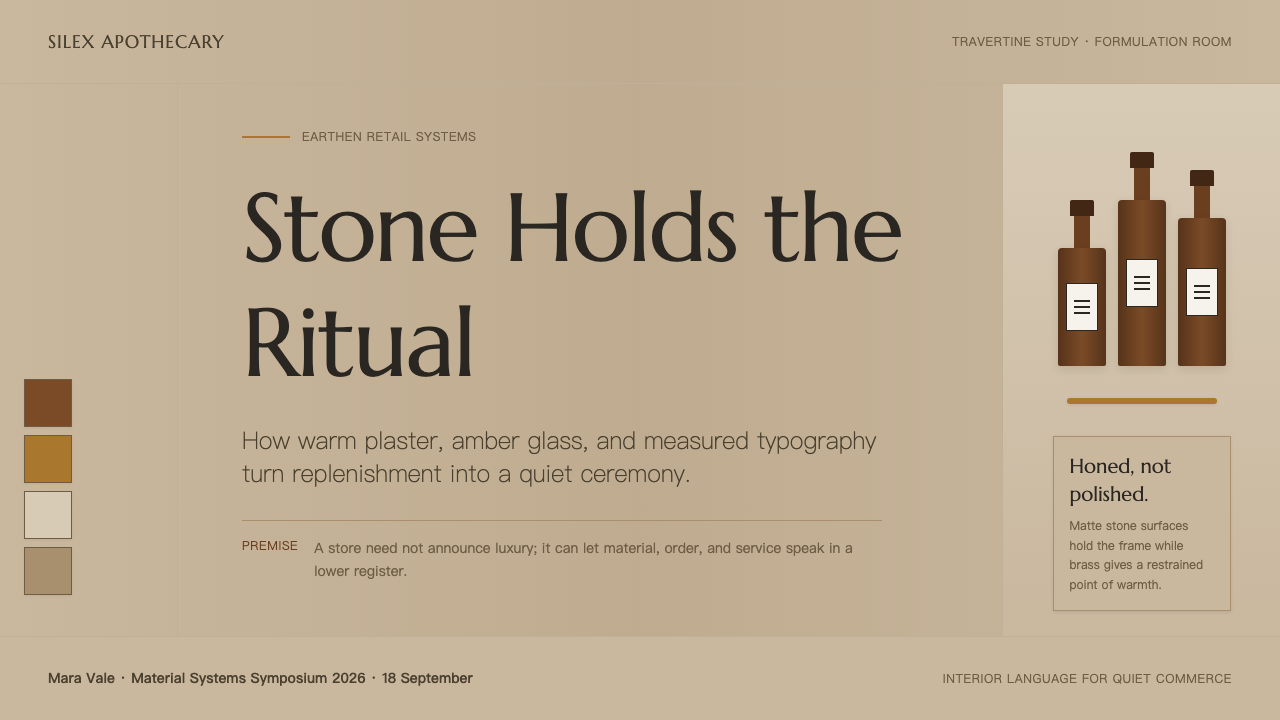
Amber glass is the visual warmth that emerges from the stone rather than sitting on top of it. The bottles provide concentrated color and a sense of glow, while the surrounding palette stays subdued. Their role is not to turn the store into a colorful display, but to make product presence feel measured and precious.
Brass Punctuation
A single polished brass tap creates a precise interruption in the matte, earthen field. Because brass is used sparingly, its reflective quality reads as punctuation: a pause in the shelf rhythm, a practical focal point, and a small counterweight to the softness of plaster and stone.
Tactile Finish
Surfaces are meant to read as hand-finished, not factory-perfect. Troweled plaster carries the implication of touch and process; honed stone favors a quiet, softened presence over showy shine. The room gains its richness from the distinction between materials, not from glossy coatings or ornamental layers.
Apothecary Typography
Typography uses distinct voices without becoming theatrical. The Optima-like display treatment gives the wordmark poise, the slab serif supports the practical character of labels, and the clean grotesque makes extended information easy to follow. The hierarchy feels editorial and useful rather than branded for attention alone.
Unhurried Rhythm
The mood is quiet, tactile, and unhurried. Shelf intervals, bottle repetition, and the limited material vocabulary encourage looking slowly. Empty areas are not treated as missing merchandise or wasted opportunity; they allow stone, plaster, glass, and type to be perceived as separate participants in the retail experience.

Who shaped Aesop Store Travertine?
Aesop is identified in the source material as a key figure and as the Melbourne-founded brand behind the global store network. In this theme, its role is expressed through a retail vocabulary that treats bottles, labels, shelving, and sensory material as parts of one composed environment.
naturehumaine is named as a key figure in the supplied material. Its presence anchors the theme within a considered interior-design context, where the principal expressive tools are warm stone, hand-finished plaster, amber glass, brass, and a deliberately calm retail atmosphere.
Material-honest interiors are named as one of the theme’s movements. Here the movement functions as a guiding figure: surfaces retain their own visual identity, and the interior gains warmth from actual plaster, limestone, travertine, glass, and brass rather than from artificial finish or decorative excess.
How do you use Aesop Store Travertine today?
For presentation covers, use the style as a composed material scene rather than a retail imitation. Let a warm stone-like field carry the title, then introduce amber imagery or a restrained brass-like line as the focal interruption. Content slides should keep the same hierarchy: an Optima-like display treatment for the title, a clean grotesque for explanation, and a slab serif only where a label or category needs apothecary authority. Avoid filling the page with bottle imagery; the atmosphere depends on intervals and quiet.
For data and explanatory slides, translate the shelf rhythm into information rhythm. Group related content as calm runs of repeated forms, keep supporting notes subordinate, and use amber as a selective signal rather than a general fill. Charts should feel like measured objects on a mineral ground, not bright dashboard widgets. The useful question is whether the viewer can sense order, material weight, and patience before noticing the decorative treatment.
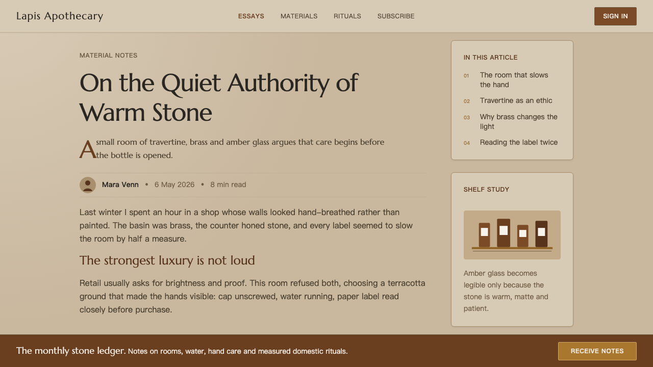
For web interfaces, this language suits product catalogues, care-focused commerce, editorial storefronts, and dashboards that need a tactile alternative to cool software minimalism. Use a warm stone ground, dark readable text, and amber emphasis around product states or important actions. Panels should feel like fields of plaster or cut stone, with clean edges and room around their contents. Navigation is strongest when it is typographic and plainly named rather than crowded with glossy iconography.
For editorial and marketing work, use the palette and material cues to make a page feel considered instead of luxurious by default. A long article can pair a restrained display heading with a clear grotesque text face, using slab-serif labels for notes, product families, or small editorial markers. Marketing blocks can alternate quiet mineral fields with close amber product details, while a brass-like line marks transitions or calls to attention. The common mistake is treating the style as beige minimalism: cream grounds, generic pale surfaces, excessive gold effects, and polished luxury gloss all erase the earthen, hand-finished specificity that makes this theme work.
Aesop Store Travertine — FAQ
Is Aesop Store Travertine simply a neutral luxury style?
No. Neutral luxury often depends on pale cream, polished surfaces, and generalized refinement. This theme explicitly avoids cream and ivory in favor of terracotta-tinged, earthen warmth. Its richness comes from plaster, honed limestone, warm-gray travertine, amber glass, and restrained brass, all of which should remain recognizable as materials rather than become a generic backdrop.
How should amber be used without making the layout feel heavy?
Treat amber as concentrated product light. It works best when it appears against a broad, quiet stone field and is allowed to remain a point of visual warmth. If amber becomes the background, the distinction between earthen setting and luminous bottle disappears. Preserve the contrast between subdued materials and the glow of glass.
Can this style work for a digital dashboard?
Yes, when the dashboard benefits from calm hierarchy and tactile warmth. Use the mineral ground to reduce visual noise, reserve amber for meaningful states, and keep labels exceptionally clear. The interface should borrow the apothecary model of ordered attention, not reproduce a physical shop with decorative stone textures or product photography everywhere.
Why use three typographic voices instead of one?
The three roles divide the work cleanly. The Optima-like display treatment gives the wordmark composure, the slab serif gives labels practical character, and the clean grotesque supports sustained reading. The effect is not typographic variety for its own sake; it is a restrained division between identity, classification, and information.
Related design styles
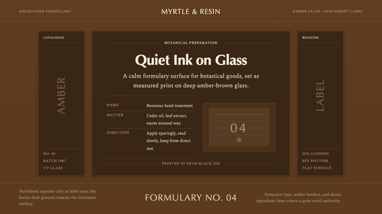 Aesop Apothecary AmberQuiet authority in glass. Amber-brown ground, parchment labels, and humanist…
 Tiffany Robin-Egg BlueBlue is the luxury signal. Robin-egg ground, white satin rules, Garamond rest…
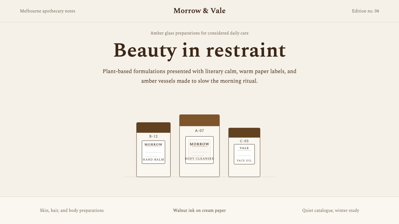 AesopRefuses urgency. Walnut serif on cream paper — every surface paced like a 19t…
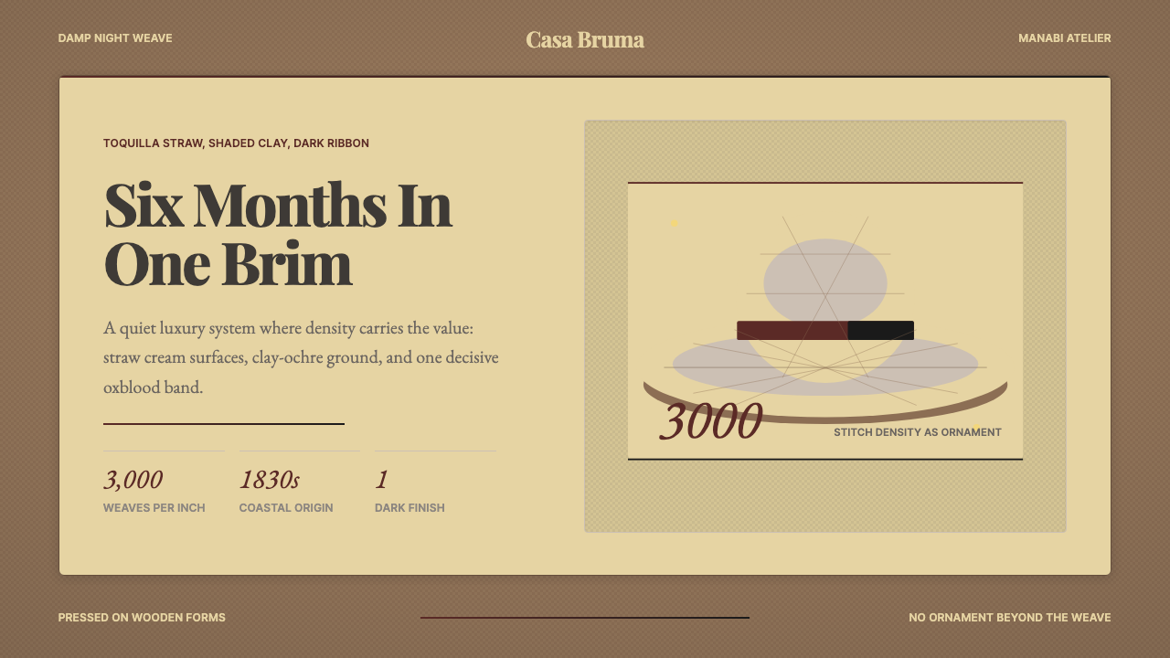 Ecuadorian Montecristi Panama HatLuxury disappears into density. Straw cream, clay ochre, and one oxblood ribb…
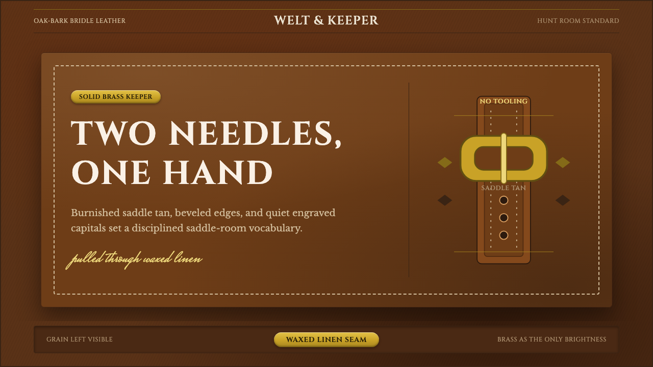 English Saddlery TanQuiet hand-made luxury. Saddle tan leather, brass accents, and waxed-linen st…
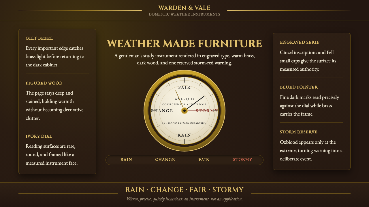 Aneroid BarometerMeasures weather as furniture. Gilt rings and Cinzel engraving glow on dark w…