What is Tiffany Robin-Egg Blue?

Tiffany Robin-Egg Blue turns a single proprietary color into the entire ground of luxury — pale cyan-turquoise filling the page while crisp white cards and satin-ribbon white carry the content.
Tiffany Robin-Egg Blue in brief
Tiffany Robin-Egg Blue is a luxury-jewelry design system distinguished by one unusual decision: the brand's proprietary pale cyan-turquoise is used as the page's dominant ground, not as an accent color layered onto a neutral background. Most brand systems reserve their signature color for a logo mark or a highlight; this one lets it fill the entire visual field, so that the color itself becomes the setting content is presented within.
Against that field, crisp white cards and a satin-ribbon white carry the actual product or message — text, imagery, packaging shapes — the way a jewelry box lining sets off the object nested inside it. The relationship is intentionally similar to a display case: the surrounding color exists to make the presented object look more valuable by contrast, not to compete with it for attention.
The typographic voice reinforces the same idea of restraint as luxury. High-contrast Garamond and Bodoni-style serifs, set with generous space around each line, avoid any sense of crowding. Ornament is almost entirely absent — value here is communicated through space, proportion, and the singularity of one unmistakable color rather than through decorative flourish.

Where does Tiffany Robin-Egg Blue come from?
The color traces back to the founding of the firm in 1837 by Charles Lewis Tiffany in New York City, initially as a stationery and fancy-goods store before it grew into the jewelry house recognized today. The proprietary pale blue became formally associated with the brand through the 1845 publication of the Tiffany Blue Book, one of the first mail-order catalogues of its kind in the United States, which used the color on its cover and established the visual link between that specific hue and the company's identity.
The signature color was refined and consistently applied through the following decades, coinciding with the American Gilded Age — a period when a newly wealthy merchant and industrial class in cities like New York sought visible signals of taste and status, and jewelry houses on streets like Fifth Avenue positioned themselves as arbiters of that taste. Tiffany's growth during this era cemented Fifth Avenue as the physical and symbolic home of the brand.
Louis Comfort Tiffany, son of the founder, extended the family's design reputation into glassware and decorative arts, broadening the house's association with color, craft, and luxury materials even as the jewelry business remained the core of the brand identity. Through the twentieth and twenty-first centuries, the specific pale blue was refined into one of the most closely guarded brand-color trademarks in American commerce.
This makes the style a case study in brand-color trademark practice more broadly: a hue so consistently and exclusively applied over more than a century that it functions as a proprietary asset in its own right, recognizable even without any accompanying logo or wordmark — a benchmark against which other brand-color strategies are often measured.
What defines the Tiffany Robin-Egg Blue look?
Color
The proprietary pale cyan-turquoise dominates as the ground itself, not an accent. Crisp white and a satin-ribbon white carry cards and content, while black or deep charcoal is reserved for type. No secondary hues appear; the entire system runs on this single deliberate blue plus neutrals.
Typography
High-contrast serifs in the Garamond and Bodoni tradition set the tone — thin hairline strokes against thicker stems, a look historically associated with fine print and engraved stationery. Letter and line spacing is generous throughout, avoiding any sense of a crowded page.
Composition
Layouts favor symmetry and centered composition, treating each element like an object placed for display rather than a block of information competing for space. This symmetry reinforces the sense of formal presentation over casual browsing.
Fine Rules
Where dividers appear, they are thin and unobtrusive — a satin-ribbon quality rather than a heavy structural line. Rules serve to separate content quietly, echoing the fine ribbon used to tie the brand's physical packaging.
Generous White Space
Space around every element is treated as part of the presentation, not wasted area. This is the mechanism by which the style signals value — objects that need no crowding to justify their presence read as inherently significant.
Ornament Banished
There is no decorative border, texture, or pattern anywhere in the system. Value is communicated purely through color, proportion, and space — any added ornament would undercut the sense of restrained confidence the style depends on.
Card-as-Object
Content containers are treated as discrete white or ribbon-white objects set against the blue field, echoing a jewelry box or gift card resting on a display surface, rather than borderless panels blending into the background.

Who shaped Tiffany Robin-Egg Blue?
Founder of the company in 1837, Tiffany built the firm from a stationery and fancy-goods shop into a jewelry house whose name became synonymous with a specific shade of blue. His decision to feature that pale blue on the cover of the 1845 Blue Book catalogue is the origin point of the entire brand-color association.
Son of the founder, Louis Comfort Tiffany extended the family name's association with color and craft into glassware and decorative art, most famously through his stained-glass and lamp work. While distinct from the jewelry business, his output reinforced the broader Tiffany identity as a house defined by exacting color sense and material luxury.
How do you use Tiffany Robin-Egg Blue today?
This style suits any content that wants to signal luxury through restraint rather than abundance. On a presentation cover slide, the pale blue field should fill the entire frame with a single centered white card holding the title in high-contrast serif — resisting the temptation to add a second accent color or a background pattern. Content slides work best as a series of these white or ribbon-white cards on the blue ground, each one holding a single idea, echoing the display-case logic of the source style.
For web interfaces, the approach is well suited to pricing pages, product detail pages, and account or checkout flows for premium goods — contexts where the product itself should feel like the valuable object being presented. A pricing tier can be rendered as a white card floating on the blue field, with the highest tier given slightly more surrounding space rather than a louder color treatment, since space itself signals premium status in this system.
In editorial and marketing work, the style supports gift-oriented or celebratory content — engagement announcements, gift guides, occasion-based campaigns — where the emotional register is aspirational rather than urgent. A hero section can use the blue field as a near full-bleed background with a single small, centered product image, letting scale and space do the work that a bold headline might do in a louder style.
The style struggles in contexts that need to feel energetic, urgent, or budget-conscious — its entire visual argument rests on unhurried space and a single expensive-feeling color, and cramming in multiple calls to action or discount messaging breaks that logic immediately. Content-dense pages, such as long articles or data-heavy dashboards, should borrow only the color and typographic restraint rather than the low-density layout, which does not scale to large amounts of information.
A common mistake is treating the pale blue as one accent color among several rather than as the dominant ground. Adding a second bright color, a photographic background, or heavy iconography defeats the purpose — the style's power comes specifically from a single unmistakable hue carrying the entire visual field uncontested.

Tiffany Robin-Egg Blue — FAQ
Why does using the brand color as a background feel more luxurious than using it as an accent?
When a color is used sparingly as an accent, it competes for attention with everything else on the page. When it becomes the entire ground instead, it stops competing and starts framing — everything else is understood as being presented within that color, the way a gift sits inside tissue paper of a specific shade. That framing relationship, rather than the color's rarity on the page, is what reads as considered and expensive.
Does this style require the exact proprietary Tiffany blue, or can any pale blue work?
The specific hue matters historically because it is legally and culturally trademarked to one company, so directly copying it for another brand raises both legal and ethical issues. The transferable design principle, however, is the strategy itself: choosing one distinctive, carefully calibrated pale color and using it as a dominant ground rather than an accent. A different brand should develop its own signature pale hue and apply the same compositional logic rather than reusing the exact color.
How does this style handle content-heavy pages like long product descriptions?
It is not naturally built for high density — the entire system depends on generous space around a small number of elements. For content-heavy pages, the better approach is to break long text into several distinct white cards on the blue field, each holding a manageable chunk, rather than filling one card with a long unbroken block of text, which would fight against the style's low-density, display-case logic.
Is symmetry required, or can this style work with an asymmetric layout?
Symmetry is a strong convention of the style but not an absolute requirement — what matters more is that any asymmetry still reads as deliberate placement rather than casual arrangement, preserving the sense of an object being formally presented. An off-center product photo can still work if the surrounding space is balanced with intent, but a cluttered or busy asymmetric layout would undercut the formal, display-case quality the style depends on.
Related design styles
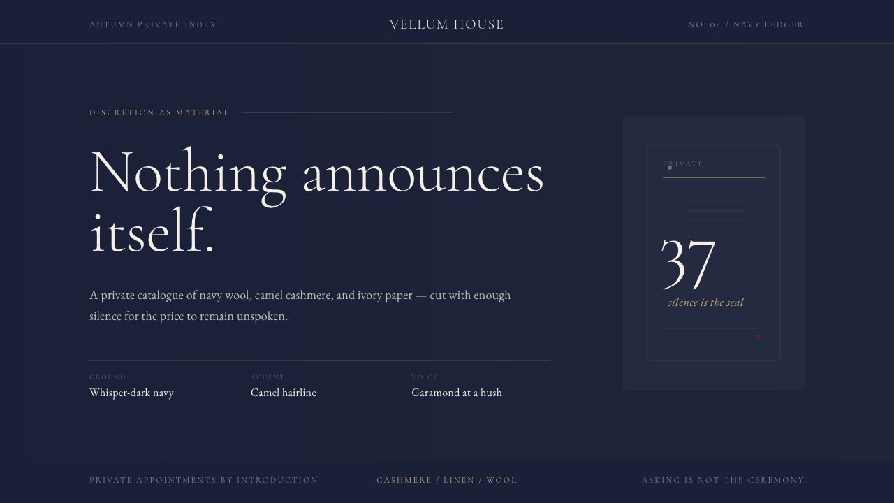 Quiet Luxury / Old MoneyLuxury refuses to raise its voice. Navy fields, camel hairlines, and thin Gar…
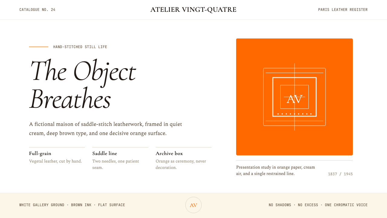 HermèsTwo centuries of restraint in orange. Brown serif on cream, gallery-quiet, ne…
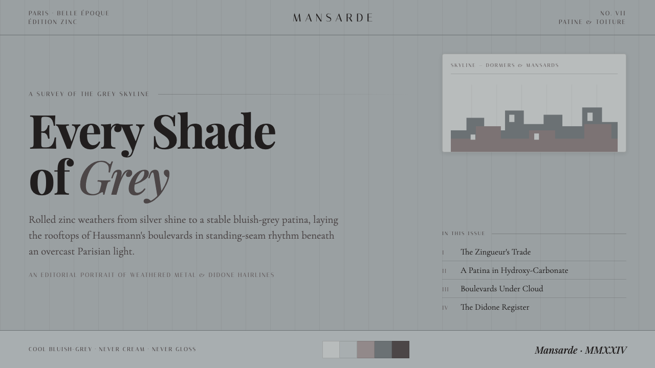 Paris Zinc RooftopsEvery shade of grey. One weathered zinc palette, set in high-contrast Playfai…
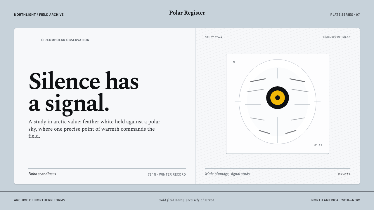 Snowy Owl TundraCold precision, one warm signal. Feather white and charcoal frame a lone lemo…
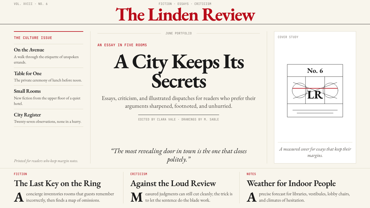 The New Yorker ClassicQuiet authority. Cream paper, EB Garamond columns, ink cartoons, and one red…
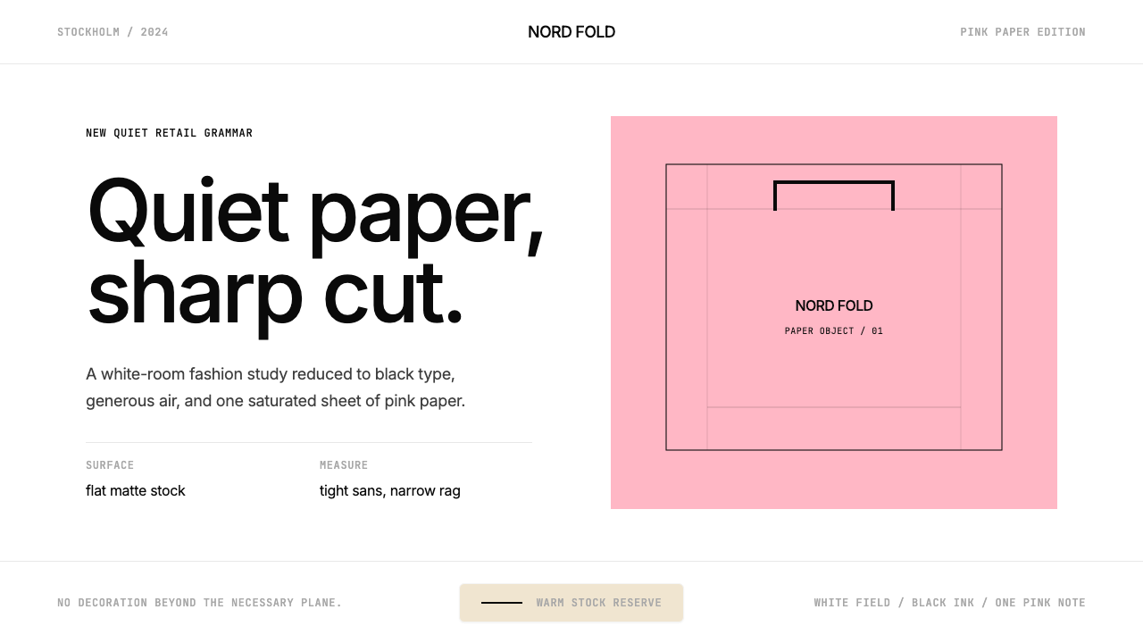 Acne Studios Pink-PaperQuiet luxury in one pink plane. Inter type floats on white with a bag-like re…