What is The New Yorker Classic?什么是 The New Yorker Classic?
For a century, The New Yorker has proved that intellectual authority needs no ornament — only cream paper, deep ink, a single red rule, and type that trusts itself.一个世纪以来,《纽约客》证明了知识权威无需装饰——只需奶油纸、深黑墨、一抹红线,以及自信从容的字体。
The New Yorker Classic in briefThe New Yorker Classic 速览
The New Yorker Classic is the visual language of American literary editorial restraint — a system built on cream-toned grounds, deep black ink, classical serif typography, and a palette so disciplined it admits only the occasional flash of masthead red. Nothing in the system competes with the writing. Every design decision defers to readability and the quiet confidence that characterizes intellectual publication at its best.《纽约客》经典风格是美国文学编辑克制美学的视觉语言——一套建立于奶油色底面、深黑墨印、古典衬线排版之上的体系,其色彩纪律严苛到只允许偶尔一抹刊头红的出现。体系中没有任何元素与文字竞争主角地位,每一个设计决定都服务于可读性,以及优质知识出版物特有的沉静从容。
Where many editorial styles announce themselves through decoration, this one asserts authority through what it withholds. Hairline rules divide columns without interrupting flow. Drop capitals signal the opening of a piece without theatrics. White space is distributed generously, not as an aesthetic gesture, but because the text requires room to breathe. The result is a page that feels considered and unhurried — the visual equivalent of a long-form essay read on a Sunday afternoon.许多编辑风格通过装饰来宣告自身,这套体系却通过克制来确立权威。发丝般的细线划分栏目而不打断阅读流。首字下沉标示文章起点,不带任何戏剧感。留白慷慨分布,不是美学姿态,而是因为文字需要呼吸的空间。页面呈现出深思熟虑、从容不迫的气质——如同周日下午捧读一篇长文的视觉感受。
The style draws on a century of accumulated typographic decisions refined across thousands of issues, each building on the last without veering into novelty. Its visual consistency is itself a form of editorial statement: this publication does not chase trends. That conservatism, applied with genuine craft, produces a design language that feels neither stale nor fashionable — it simply feels authoritative.这种风格建立在一个世纪的排印决策积累之上,历经数千期杂志打磨,每一期都在前一期的基础上延续,从不追逐新奇。视觉上的一致性本身就是一种编辑立场:这份刊物不追赶潮流。这种保守主义以真诚的工艺实施,产生的设计语言既不陈腐也不时髦——它只是权威。
See the The New Yorker Classic design system查看 The New Yorker Classic 完整设计系统
Where does The New Yorker Classic come from?The New Yorker Classic 从何而来?
The New Yorker was founded in February 1925 by Harold Ross, a Wyoming-born editor who had previously run Stars and Stripes, the American military newspaper. Ross conceived of a magazine for a sophisticated metropolitan readership — what he called the 'little old lady in Dubuque' not reading, meaning a publication written for urban, educated adults rather than a general national audience. From the very first issue, the design bore the imprint of Rea Irvin, a cartoonist and art director who would define the magazine's visual identity for decades.《纽约客》由哈罗德·罗斯于1925年2月创刊。罗斯是一位出生于怀俄明州的编辑,此前曾主持美军报纸《星条旗》。他设想的是一本面向精致都市读者的杂志——用他的话说,是一本不为“杜比克的小老太太”而写的刊物,意即一本为受过教育的城市成年人而非普通大众准备的出版物。从第一期起,杂志的设计便打上了雷·欧文的烙印。欧文是一位漫画家兼艺术总监,他此后数十年间持续定义着杂志的视觉身份。
Rea Irvin designed the iconic masthead lettering and the first cover, which depicted a Regency-era dandy examining a butterfly through a monocle — a figure who came to be known as Eustace Tilley and who appears on the anniversary cover every year. Irvin's masthead typeface, created specifically for the publication, combined old-style serif proportions with a slightly archaic, gentlemanly character that placed the magazine visually in the tradition of nineteenth-century literary periodicals while remaining readable and fresh. This typographic decision established the tonal register that every subsequent art director would inherit.雷·欧文设计了标志性的刊头字体和第一期封面——封面描绘了一位摄政时代的花花公子用单片眼镜审视蝴蝶的场景,这个人物后来被称为尤斯塔斯·蒂利,每年在周年纪念封面上重新亮相。欧文专为杂志创作的刊头字体,以旧式衬线比例结合略带古雅的绅士气质,将杂志的视觉定位置于十九世纪文学期刊的传统之中,同时保持清晰可读。这一排印决定确立了此后每位艺术总监所继承的基调。
During the long editorship of William Shawn, who succeeded Ross after Ross's death in 1951 and remained at the helm until 1987, the magazine's visual identity deepened into something close to institutional permanence. Shawn was famously protective of the editorial atmosphere and resistant to visual change that might distract from the writing. Under his watch, the pen-and-ink cartoon became the magazine's most distinctive recurring visual element — single-panel drawings rendered in confident, economical line, punctuating prose and poetry alike with wit and compression. The cartoons established a graphic vocabulary as recognizable as the typography itself.在威廉·肖恩漫长的主编生涯中——他于1951年罗斯去世后接掌杂志,任职至1987年——杂志的视觉身份深化为接近机构性永恒的存在。肖恩以对编辑氛围的极度守护和对可能分散文字注意力的视觉变革的抗拒而著称。在他主持期间,钢笔墨线漫画成为杂志最具辨识度的循环视觉元素——以自信、简练的线条绘成的单格漫画,以机智与压缩的力量穿插于散文与诗歌之间。这些漫画建立了一套与排版本身同等可辨认的图形词汇。
The transition to digital did not unsettle the visual fundamentals. David Remnick, who became editor in 1998, oversaw the magazine's expansion online and into audio without abandoning the aesthetic commitments that had accumulated since 1925. If anything, the digital era demonstrated the robustness of the original system: the cream-and-ink palette translated to screen with minimal adjustment, the typographic hierarchy remained legible at any size, and the single accent color — that flash of red — anchored identity across platforms. The New Yorker Classic is, in this sense, a design system that survived its own medium shift.数字化转型并未动摇视觉基础。大卫·雷姆尼克于1998年接任主编,主导了杂志向线上及播客的扩张,却未放弃自1925年积累的美学承诺。数字时代某种程度上证明了原始体系的稳固性:奶油与墨色的色彩搭配只需极少调整便能适应屏幕,排印层级在任何尺寸下都保持清晰,而那抹唯一的强调色——刊头红——在各个平台上稳定地锚定着身份认同。从这个意义上说,《纽约客》经典风格是一套经历了自身媒介迁移考验而存续下来的设计体系。
What defines the The New Yorker Classic look?The New Yorker Classic 的视觉特征是什么?
Palette色彩体系
The color system is almost monastic in its discipline. The ground is cream or warm off-white — not clinical white, but the tone of aged quality paper that reads as cultured and unhurried. All type and ruling lines are set in deep ink black. The sole accent is a specific warm red reserved almost entirely for the masthead and occasional structural signals. This three-value palette — cream, black, red — functions as a complete system. Nothing is added to increase visual interest; the richness comes from typographic texture, not chromatic variety.色彩体系近乎修道院式的克制。底面是奶油色或温暖的灰白色——不是临床白,而是陈年优质纸张的色调,给人以文化涵养与从容不迫之感。所有文字与分割线均以深墨黑印刷。唯一的强调色是一种特定的暖红,几乎专属于刊头及偶尔的结构性信号。这套奶油、黑、红三值色板作为一个完整的体系运作——没有任何增补是为了增加视觉趣味;丰富感来自排印肌理,而非色彩多样性。
Typography字体排印
Classical serif type governs every text element — body, headline, caption, and byline. The letterforms carry old-style proportions: moderate stroke contrast, bracketed serifs, and slightly condensed capitals that trace their lineage to Renaissance printing. Body text is set at a generous measure with ample leading, making extended reading comfortable without requiring any visual interruption. Headings are distinguished by scale and weight rather than typeface change, maintaining a single-family coherence across the entire page. Drop capitals, used to open major features, are rendered in a style that references historical book typography without literal quotation.古典衬线字体统辖所有文字元素——正文、标题、图注与署名。字形具有旧式比例:适度的笔画粗细对比、带弧度的衬线,以及略微紧缩的大写字母,其渊源可追溯至文艺复兴时期的印刷传统。正文设置宽绰的行宽与充足的行距,使长篇阅读舒适自然,无需任何视觉中断。标题通过尺度与字重的变化与正文区分,而非切换字体,在整个页面上维持单一家族的连贯性。用于开启重要篇章的首字下沉以一种参照历史书籍排印传统而非直接引用的风格呈现。
Ruling Lines and Structure分割线与版面结构
Hairline rules — lines of the minimum weight that can be cleanly printed — serve as the primary structural device. They separate sections, define columns, and mark the boundary between departments without asserting themselves visually. A single bolder rule, used sparingly, can anchor a page header or close a major section. The ruling system derives from classical newspaper and magazine typography, where the rule was both structural and economical — a single stroke accomplishing what a decorative border would have required multiple elements to do.发丝般的细线——即能够清晰印刷的最小线重——是主要的结构装置。它们分隔章节、划定栏目、标示栏目之间的边界,却不在视觉上主张自身的存在。偶尔使用的单条较粗横线可以锚定页面标题或收束主要章节。这套分割线体系源自古典报纸与杂志排印,其中分割线既是结构性的也是经济性的——一道笔触完成了装饰性边框需要多个元素才能实现的工作。
Pen-and-Ink Illustration钢笔墨线插图
The single-panel cartoon rendered in pen-and-ink line is the style's most culturally specific visual element. These drawings are executed in a confident, economical line that achieves character and humor without tonal complexity — no watercolor wash, no gradient fill, no photographic reference. The cartoons share a graphic quality with the typography: they are black on white (or cream), they use negative space actively, and they trust the viewer's ability to complete the image from minimal visual information. This illustration mode represents a commitment to craft over production value.以钢笔墨线绘制的单格漫画是这套风格最具文化特殊性的视觉元素。这些画作以自信、简练的线条完成,不借助色调复杂性便实现了个性与幽默——无水彩渲染,无渐变填充,无摄影参考。漫画与排印共享同样的图形特质:黑色印于白色(或奶油色)底面,主动利用负空间,相信观者能从最少的视觉信息中补完图像。这种插图方式代表了对工艺而非生产价值的承诺。
Column Architecture栏目架构
The multi-column grid distributes text into a measured reading rhythm. Columns are typically narrow enough to minimize eye travel but wide enough to accommodate the longer words common to literary prose. Margins are generous on all sides, providing visual rest and room for the occasional pull quote or caption without crowding the primary text. The architecture is conservative by design — it rejects the variable-column experiments that periodically tempt editorial designers — because its function is to serve extended reading, not to create visual interest at a glance.多栏网格将文字分布为有节制的阅读节奏。栏宽通常足够窄以减少视线移动,又足够宽以容纳文学散文常见的较长词汇。四周留白充裕,为偶尔的引文或图注提供视觉休息与空间,而不使主文字显得拥挤。这套架构在设计上是保守的——它拒绝周期性诱惑编辑设计师的可变栏实验——因为其功能是服务于长篇阅读,而非在一瞥之间创造视觉趣味。
Editorial Restraint as Identity编辑克制即身份认同
What distinguishes this style from mere conservative typography is the coherence of its restraint. Every decision — the cream ground, the ink palette, the single accent color, the hairline rule, the pen-and-ink cartoon — reinforces the same editorial position: the writing is the thing. This is not minimalism adopted for aesthetic fashion; it is discipline maintained over a century because it serves the purpose. The restraint is itself expressive, communicating intellectual confidence, cultural authority, and a refusal to compete with its own content.将这种风格与单纯保守排印区分开来的,是其克制的连贯性。每一个决定——奶油底面、墨色色板、唯一的强调色、发丝细线、钢笔墨线漫画——都在强化同一种编辑立场:文字才是主角。这不是为了美学时尚而采用的极简主义;这是历经一个世纪维持的纪律,因为它服务于目的。克制本身就是表达,传递出知识上的自信、文化上的权威,以及拒绝与自身内容竞争的立场。
Typographic Wit排印式的机智
Within the severe overall system, a tradition of subtle typographic wit persists — in the headline phrasing style, the caption voice, and the occasional playful variation in section headings that breaks the system's gravity without abandoning its principles. This wit is entirely achieved through language and proportion, never through decorative technique. It reflects the editorial culture of the publication: serious about ideas, never solemn about presentation. The distinction between serious and solemn is one the visual system actively maintains.在整体严格的体系内部,一种微妙的排印式机智传统持续存在——体现在标题的措辞风格、图注的语气,以及偶尔在栏目标题上出现的、打破体系重力却不放弃其原则的俏皮变奏。这种机智完全通过语言与比例实现,从不借助装饰技巧。它反映了这份出版物的编辑文化:对思想严肃,从不对呈现方式庄严肃穆。严肃与庄严肃穆之间的区别,是这套视觉体系主动维护的。
See the The New Yorker Classic design system查看 The New Yorker Classic 完整设计系统
Who shaped The New Yorker Classic?谁塑造了 The New Yorker Classic?
Ross founded The New Yorker in 1925 and shaped its editorial identity until his death in 1951. His insistence on factual precision, long-form depth, and a specific kind of urbane wit established the content values that the visual design had to serve. Ross famously maintained that the magazine was not edited for 'the old lady in Dubuque' — a shorthand for the broad general audience that contemporary publications courted. This editorial exclusivity translated directly into visual decisions: a design that assumed a reader willing to slow down, and that rewarded that patience with typographic and editorial quality.罗斯于1925年创办《纽约客》,并在1951年去世前持续塑造其编辑身份。他对事实精确性、长篇纵深与特定都市机智的坚持,确立了视觉设计必须服务的内容价值观。罗斯的著名立场是,这本杂志不是为“杜比克的老太太”而编辑的——这是他对当时出版物普遍讨好的普通大众的简称。这种编辑上的排他性直接转化为视觉决定:一种预设读者愿意放慢脚步的设计,并以排印与编辑质量回报这种耐心。
Irvin served as the magazine's first art editor and created both the masthead letterform and the foundational visual vocabulary that persists to this day. His Eustace Tilley cover of February 1925 — the monocled dandy and butterfly — established the magazine's self-aware, gently ironic persona. The masthead typeface Irvin designed placed the publication in the lineage of dignified print tradition while giving it a character specifically its own. Irvin's contributions represent one of the most durable acts of visual identity definition in American publishing history.欧文担任杂志首任艺术编辑,创作了刊头字体和至今延续的基础视觉词汇。他于1925年2月创作的尤斯塔斯·蒂利封面——那位手持单片眼镜审视蝴蝶的花花公子——确立了杂志自知而温和反讽的人格形象。欧文设计的刊头字体将杂志置于庄重印刷传统的谱系之中,同时赋予它专属自身的个性。欧文的贡献是美国出版史上最持久的视觉身份定义行为之一。
Shawn's editorship from 1952 to 1987 — thirty-five years — deepened and stabilized the visual identity into something approaching institutional definition. His resistance to visual change was not conservatism for its own sake but a principled understanding that the magazine's authority depended on accumulated consistency. Under Shawn, the typographic system and the cartoon tradition were treated as untouchable — not frozen, but evolved with great deliberateness. His tenure established the magazine as a visual and editorial landmark against which subsequent iterations would be measured.肖恩从1952年至1987年长达三十五年的主编生涯,将这套视觉身份深化并稳定为接近机构定义的存在。他对视觉变革的抗拒不是为守旧而守旧,而是一种有原则的理解:杂志的权威依赖于累积的一致性。在肖恩任内,排印体系与漫画传统被视为不可触碰的存在——不是冻结,而是以极大审慎缓慢演进。他的任期将这本杂志确立为视觉与编辑上的标杆,此后的每次迭代都以此为参照。
Remnick became editor in 1998 and has overseen the magazine's expansion into digital formats, audio, and video without dismantling the visual fundamentals established by his predecessors. His tenure demonstrates that the New Yorker Classic system is genuinely portable — that its principles of typographic authority, disciplined palette, and editorial restraint can be applied to new media contexts without becoming costume. Remnick's stewardship has also seen the magazine's visual identity become, if anything, more globally recognized, as the masthead and its associated aesthetic have achieved a kind of universal signifier status for quality long-form journalism.雷姆尼克于1998年接任主编,主导了杂志向数字格式、播客与视频的扩张,却未拆解前任建立的视觉基础。他的任期证明了《纽约客》经典体系的真实可移植性——其排印权威、纪律色板与编辑克制的原则能够被应用于新媒体语境而不沦为戏服。雷姆尼克的管理也使杂志的视觉身份获得了更广泛的全球认知,刊头及其关联美学已成为高质量长篇新闻报道的一种普世能指。
How do you use The New Yorker Classic today?今天怎么用 The New Yorker Classic?
The New Yorker Classic translates most naturally to contexts where written content is the primary offering and where communicating intellectual seriousness and cultural authority matters more than visual novelty. Applying it well requires understanding that its restraint is a feature, not a limitation — the absence of decoration is what creates the atmosphere of confidence. Starting from that understanding prevents the most common failure mode: adding visual complexity because the plain version feels 'unfinished.'《纽约客》经典风格最自然地适用于文字内容是主要产品、传递知识严肃性与文化权威比视觉新奇更为重要的场景。正确应用它需要理解:其克制是一种特性,而非局限——装饰的缺席正是创造从容氛围的原因。从这一理解出发,可以避免最常见的失败模式:因为朴素版本感觉“未完成”而添加视觉复杂度。
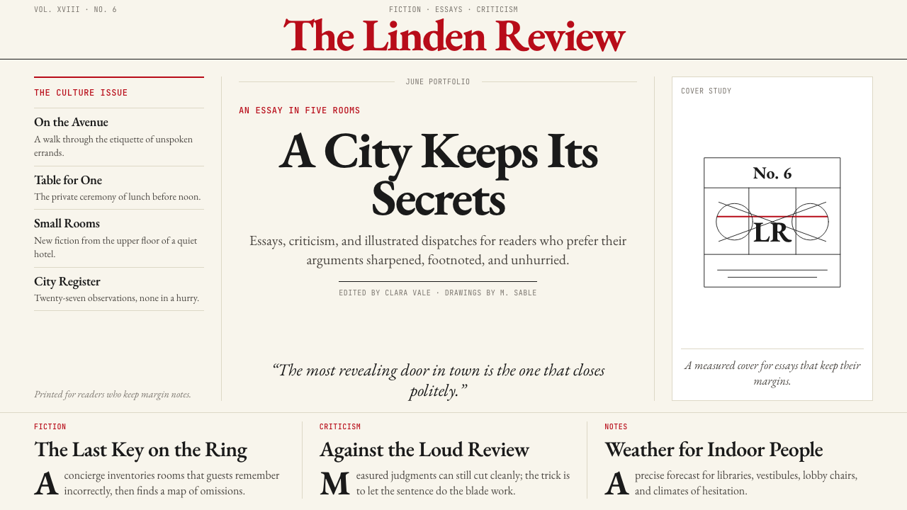
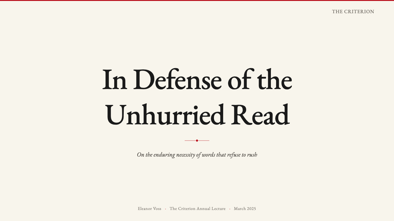
For presentation slides, the style works with particular strength on both cover and long-form content pages. A cover in this mode benefits from asymmetric typographic composition — a substantial headline in classical serif type, set flush left against the cream ground, with the organization name or date in a smaller scale below, and perhaps a single pen-and-ink style illustration or a simple ruled border. Content slides should prioritize column-like text flow over fragmented bullet points. Data slides take on an editorial quality: charts and tables styled with clean rules rather than colored backgrounds, axis labels set in the same serif family as the body text, and one warm accent color used sparingly to indicate the most important data point.在演示文稿中,这种风格在封面页与长篇内容页上都表现出特别的力量。这种模式下的封面适合非对称的排印构图——古典衬线体写成的分量感十足的标题,左对齐置于奶油色底面上,组织名称或日期以更小尺度排列于下方,或许配以一幅钢笔风格的插图或简单的边框线。内容页应优先采用栏目式文字流,而非碎片化的项目符号列表。数据页呈现出编辑式品质:图表与表格以清晰线条而非彩色背景造型,坐标轴标签与正文同用衬线家族,一种暖调强调色仅用于标示最重要的数据点。
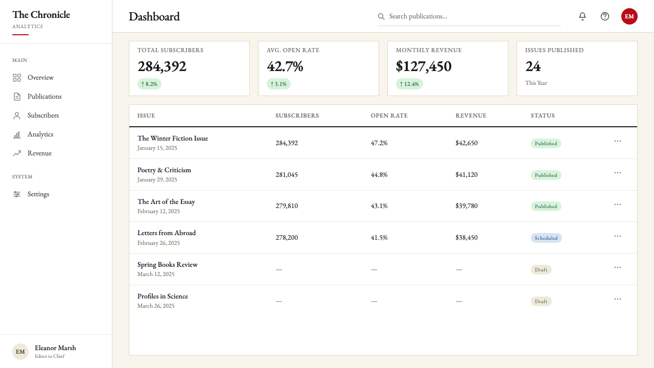
For web interfaces and dashboards, the style suits information-dense environments where trust, legibility, and hierarchy are the design priorities. A dashboard in this mode uses a near-cream or warm white background, sets all body text and labels in a classical serif, and applies the accent color only to interactive states or critical alerts. Navigation is typographic rather than icon-driven. Pricing pages benefit from the style's inherent sense of quality — column-based layouts, hairline rule separators, and tier names set in elegant serif with supporting descriptive prose rather than bullet features lists.对于网页界面与仪表板,这种风格适合信任感、易读性与信息层级是设计优先项的信息密集型环境。这种模式下的仪表板使用接近奶油色或温暖白色的背景,所有正文与标签采用古典衬线字体,强调色仅应用于交互状态或关键警示。导航以文字驱动而非图标驱动。定价页面受益于这种风格内在的品质感——基于栏目的布局、发丝线分隔符,以及以优雅衬线字体配辅助性说明散文(而非项目功能列表)排印的等级名称。
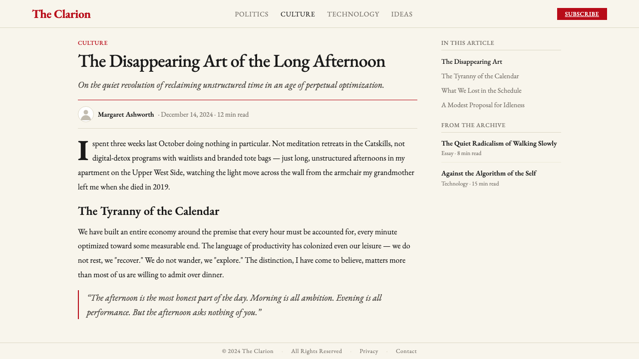
For editorial and marketing materials — article layouts, newsletters, event programs, brand reports — the New Yorker Classic provides a reliable framework for content-first presentation. An article layout in this mode uses a multi-column grid with generous margins, reserves the outer margin for pull quotes or annotations set at a smaller scale, and marks section breaks with a single bold horizontal rule rather than decorative imagery. Marketing pages benefit from the style's quiet assertiveness: alternating full-width content blocks in cream-on-black and black-on-cream, with the accent color reserved for the single most important call to action per page.对于编辑与营销材料——文章版面、新闻简报、活动手册、品牌报告——《纽约客》经典风格为内容优先的呈现提供了可靠的框架。这种模式下的文章版面使用多栏网格配充裕留白,将外侧留白保留给以更小尺度排印的引文或注释,以单条粗水平线而非装饰性图像标示章节分隔。营销页面受益于这种风格安静而自信的气质:奶油底黑字与黑底奶油字的全宽内容区块交替出现,强调色保留给每页唯一最重要的行动号召。
A common mistake when applying this style is importing the aesthetic without the underlying editorial logic. Decorating a dense, visually noisy layout with cream backgrounds and serif fonts produces something that looks confused rather than authoritative. The style works because every element earns its place. If you find yourself adding elements to fill visual space, the problem is the element — not the space. The space is doing work. Similarly, introducing a second accent color, or substituting a display serif with high visual personality for the quieter classical proportions the system requires, will break the register immediately. The system depends on restraint being total, not partial.应用这种风格时最常见的错误,是引入了美学外表而遗漏了底层的编辑逻辑。在密集、视觉嘈杂的版面上叠加奶油背景与衬线字体,产生的结果是困惑而非权威。这套风格之所以有效,是因为每个元素都赢得了自己的位置。如果你发现自己在添加元素以填充视觉空间,问题在于那个元素——而非空间。空间本身正在工作。同样,引入第二种强调色,或以具有强烈视觉个性的展示衬线字体替代这套体系所需的更为沉静的古典比例,都会立即打破这种语调。这套体系依赖于彻底而非局部的克制。
See the The New Yorker Classic design system查看 The New Yorker Classic 完整设计系统
The New Yorker Classic — FAQThe New Yorker Classic · 常见问题
How is The New Yorker Classic different from generic editorial serif design?《纽约客》经典风格与普通的编辑衬线设计有何区别?
Generic editorial serif design often uses classical typography as one element among many — combined with photographic imagery, varied accent colors, or structural grids that change between departments. The New Yorker Classic is distinguished by the totality of its system: the palette never exceeds three values, the illustrative tradition is pen-and-ink rather than photographic, and the structural vocabulary — hairline rules, drop caps, generous margins — is applied consistently across every element without exception. The system's authority comes from its coherence, not from any single element being especially distinctive.普通的编辑衬线设计通常将古典排印作为众多元素之一——与摄影图像、多种强调色或在不同栏目间变化的结构网格组合使用。《纽约客》经典风格以其体系的完整性而区别于此:色板从不超过三个值,插图传统是钢笔墨线而非摄影,结构词汇——发丝细线、首字下沉、宽绰留白——无例外地贯穿每个元素一致应用。这套体系的权威来自其连贯性,而非任何单一元素的特别出众。
Can this style work for brands outside editorial publishing?这种风格能应用于编辑出版之外的品牌吗?
Yes, but the fit depends on what values the brand wants to communicate. The style is well suited to any context where intellectual credibility, considered taste, and a certain cultural seriousness are genuine brand values — financial services positioning around expertise, consultancies communicating analytical depth, cultural institutions projecting curatorial authority, or premium consumer products where heritage and craft matter. It struggles in contexts requiring warmth, playfulness, or aspirational energy — lifestyle brands, youth-oriented products, or any context where the design needs to feel approachable and energetic rather than assured and unhurried.可以,但契合度取决于品牌希望传递什么价值观。这种风格非常适合任何将知识可信度、审慎品味与某种文化严肃性作为真实品牌价值的场景——以专业能力为核心定位的金融服务、传递分析深度的咨询机构、彰显策展权威的文化机构,或以传承与工艺为重的高端消费品。在需要温暖感、趣味性或向往感能量的场景中,它则力不从心——生活方式品牌、面向年轻人的产品,或任何设计需要显得平易近人与充满活力而非自信从容的场景。
Is it possible to use this style without classical serif typefaces?这种风格能在不使用古典衬线字体的情况下应用吗?
The classical serif is so central to the style that removing it requires exceptional care. The serif carries the tonal register — the sense of accumulated tradition and considered taste — that the cream palette and hairline rules reinforce. A sans-serif substitution tends to shift the register toward the clinical or the corporate rather than the literary. If a sans-serif must be used for technical reasons, the best approach is to select one with humanist proportions and generous spacing that echoes the rhythm of the serif system, and to compensate by increasing the weight given to other system elements: richer cream tone, more prominent ruling structure, and illustration that maintains the pen-and-ink vocabulary.古典衬线字体对这种风格如此核心,以至于去除它需要格外谨慎。衬线字体承载着基调——积累传统与审慎品味的感觉——奶油色板与发丝细线正是在强化这种感觉。无衬线字体的替代往往会将基调向临床感或企业感而非文学感偏移。如果因技术原因必须使用无衬线字体,最佳做法是选择一种具有人文主义比例与宽绰间距、能回响衬线体系节奏的字体,并通过加重其他体系元素来弥补:更浓郁的奶油色调、更突出的分割线结构,以及维持钢笔墨线词汇的插图。
How should the single accent color be deployed to avoid overuse?应如何部署唯一的强调色以避免滥用?
The discipline is simple: the accent appears once per visual unit — once per slide, once per page section, once per card — and only on the element that carries the most important piece of information or the primary identity signal. On a cover, it belongs to the masthead or the issue descriptor. On a content page, it marks a single critical metric or the section header. On a navigation bar, it indicates only the active state. The moment it appears on two competing elements of equal importance, it loses its function as a signal and becomes decoration. If you find yourself uncertain where the accent should go, that uncertainty usually means the design has too many elements competing for primary attention.纪律很简单:强调色在每个视觉单元中只出现一次——每张幻灯片一次、每个页面章节一次、每张卡片一次——且仅用于承载最重要信息或主要身份信号的元素。在封面上,它属于刊头或期号说明。在内容页上,它标示单一关键指标或章节标题。在导航栏上,它仅指示激活状态。一旦它同时出现在两个同等重要的竞争元素上,就失去了作为信号的功能,沦为装饰。如果你发现自己对强调色应该放在何处感到不确定,这种不确定通常意味着设计中有过多元素在争夺首要注意力。
Does this style work in digital dark mode?这种风格在数字暗色模式下有效吗?
Dark mode presents real challenges for a system whose identity is built on warm cream and deep ink. A simple color inversion — black ground, cream text — is technically possible and can retain some of the typographic character, but it loses the sense of printed-page warmth that gives the light version its particular atmosphere. The accent red, on a dark ground, can shift in perceived intensity and may need to be slightly cooled or deepened to avoid reading as aggressive. A more considered dark adaptation treats the dark ground not as a direct inversion but as a translation: deep cool-toned near-black that echoes the depth of aged ink, cream-toned type rather than pure white, and the accent used even more sparingly than in the light version.暗色模式对一个身份建立于温暖奶油与深黑墨印之上的体系构成真实挑战。简单的颜色反转——黑色底面、奶油色文字——在技术上可行,也能保留部分排印特质,但会失去浅色版本特有氛围所依赖的印刷纸页温度感。强调红色在深色底面上的感知强度可能发生偏移,或许需要略微冷却或加深以避免显得激进。更审慎的暗色适配将深色底面不视为直接反转,而视为一种转译:深冷调近黑色,回响陈年墨印的深度;奶油调文字而非纯白;强调色比浅色版本使用得更为节制。
Related design styles相关设计风格
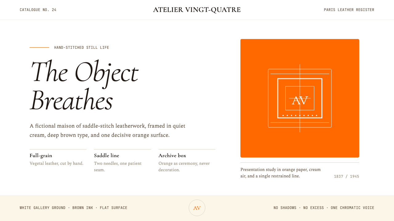 HermèsTwo centuries of restraint in orange. Brown serif on cream, gallery-quiet, ne…近两个世纪的巴黎皮革工艺:标志性的爱马仕橙、深棕衬线落于乳白纸底——产品如美术…
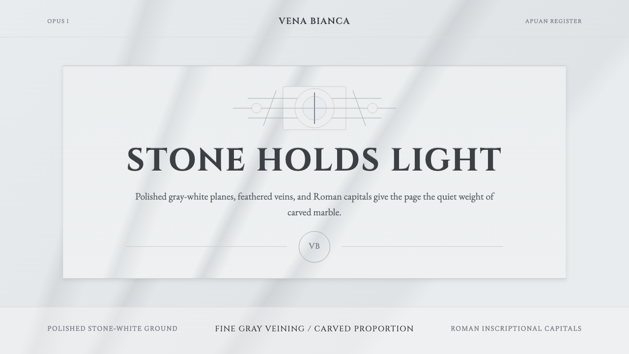 Carrara MarbleLuxury in restraint. Cool stone-white fields, feathery gray veins, and Cinzel…克制即奢华:冷石白、羽状灰纹与 Cinzel 罗马大写。
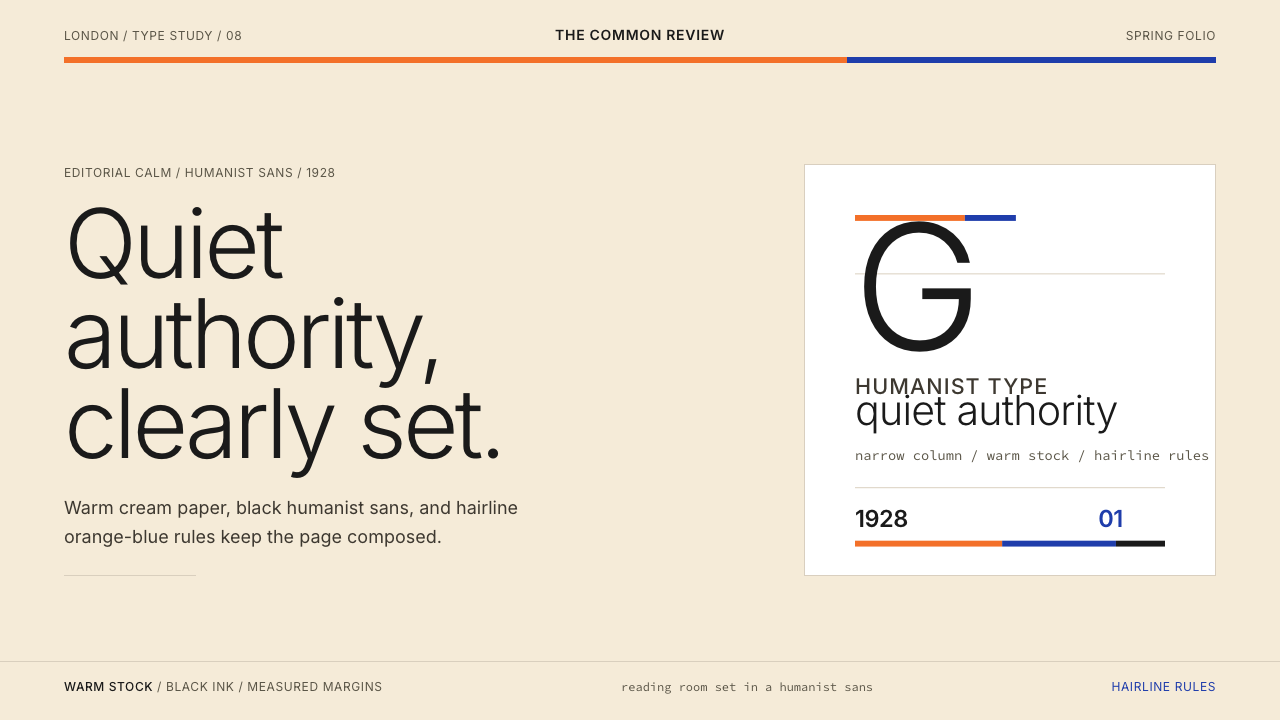 Gill Sans (BBC, 1928)Quiet authority, clearly set. Warm cream, black humanist sans, and hairline o…安静而权威。奶油底、黑色人文无衬线与橙蓝细线。
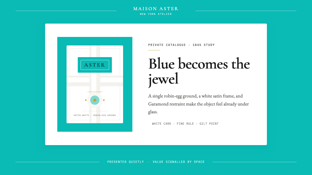 Tiffany Robin-Egg BlueBlue is the luxury signal. Robin-egg ground, white satin rules, Garamond rest…蓝色即奢华信号:知更鸟蛋蓝铺底,白缎细线与Garamond克制成章。
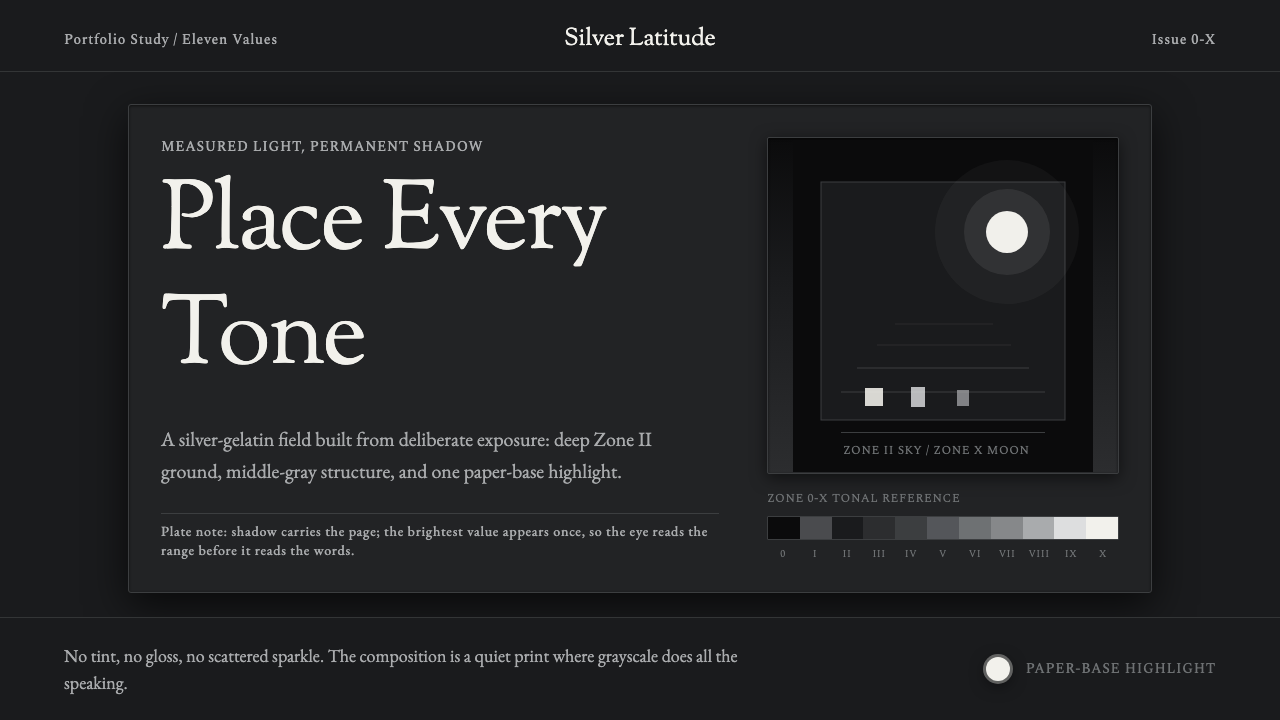 Ansel Adams Zone SystemOnly light remains. Deep shadow, serif captions, and one white moon mark the…只剩光:深暗底、衬线标注与一枚白月排出灰阶。
 Bahraini Pearl Diving GreyQuiet authority at dusk. Nacre grey type and hairline grids hold one brass-wa…黄昏中的安静权威。珠母灰字体与发丝网格托住一盏铜暖灯。