What is Ansel Adams Zone System?
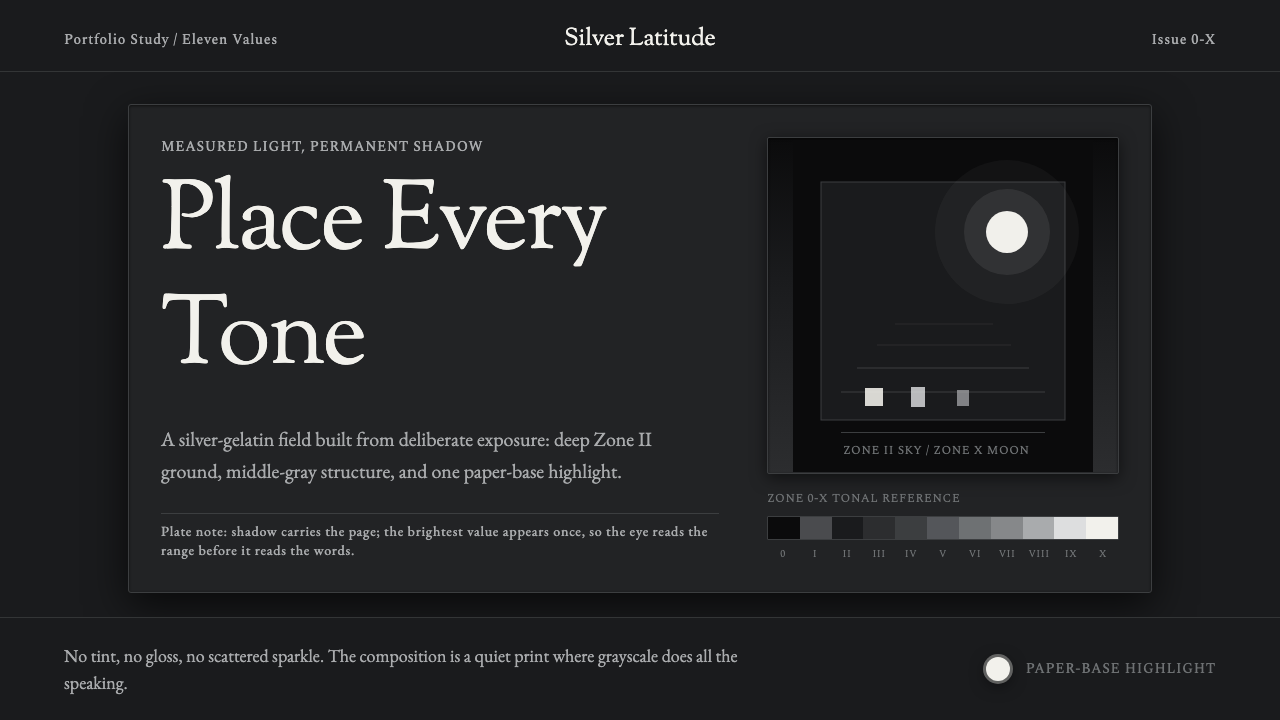
Ansel Adams turned exposure into a precise language of gray — this style keeps only that ladder of tone, deep shadow to a single luminous highlight, and removes color entirely.
Ansel Adams Zone System in brief
The Ansel Adams Zone System is a design system built from the technical and aesthetic discipline of silver-gelatin photography, specifically the measured tonal control that Adams and Fred Archer codified as the Zone System — a method for translating a scene's actual light into a precise, deliberate grayscale before the shutter is even released. This design system takes that photographic discipline and applies it to interface tone.
The ground sits deliberately in deep shadow — a dark tone corresponding to the lower zones of the tonal ladder, never a cream or paper-white base. Against that darkness, a single luminous highlight anchors each composition, functioning the way the moon anchors Adams's most famous photograph: a small, intensely bright point of interest surrounded by an otherwise carefully controlled field of darker values.
There is no color anywhere in the system — only light, rendered as a continuous, carefully graduated range of grays. Every element's visual weight is determined purely by where it sits on that tonal ladder, and typography is restrained and serif, echoing the caption conventions of fine-art photography prints rather than the sans-serif conventions of modern digital interfaces.

Where does Ansel Adams Zone System come from?
Ansel Adams, working alongside photographer and educator Fred Archer, formalized the Zone System around 1939 to 1940 as a systematic method for controlling photographic tonal range from the moment of exposure through development and printing. Prior to this system, photographers largely relied on intuition and experience to judge how a scene's light would translate onto film and paper. Adams and Archer instead divided the tonal range into eleven numbered zones, from Zone 0 (maximum black, no detail) through Zone X (pure paper-base white), with each zone representing a specific, calculable relationship between a metered light reading and the final printed density.
The system emerged from Adams's dual background as both a photographer and a trained musician, and he frequently described exposure and development as analogous to a musical score and its performance — the negative was the score, the print was the performance, and the Zone System was the disciplined technique that let a photographer translate one into the other with precision rather than luck. This was a radical formalization at the time, turning what had been treated as artistic intuition into something closer to a measurable, teachable craft.
Adams was also a founding member of Group f/64, a informal association of California photographers in the early 1930s who rejected the soft-focus, painterly Pictorialist style then fashionable and instead championed 'straight photography' — sharp focus, full tonal range, and a commitment to the medium's own inherent qualities rather than imitating painting. The Zone System was, in effect, the technical infrastructure that made this aesthetic commitment achievable and repeatable at a professional level.
The Zone System reached its most iconic public demonstration in Moonrise, Hernandez, New Mexico, captured by Adams in 1941. The photograph shows a small adobe village and cemetery beneath a vast sky, with a bright moon and a band of illuminated clouds set against a deep, near-black sky rendered through masterful zone control during both exposure and printing. The image's stark contrast between a luminous, isolated highlight and enveloping tonal darkness became one of the most reproduced photographs in American art history, and it remains the clearest visual reference for exactly the tonal relationship this design system distills.
What defines the Ansel Adams Zone System look?
Deep Zone Shadow Ground
The base of every composition sits in deep shadow, corresponding to the lower end of the tonal ladder — never a cream or white base. This deliberately mimics the deep, near-black sky in Moonrise, Hernandez, establishing darkness as the default field rather than an occasional dark-mode variant.
Single Luminous Highlight
Every composition is anchored by exactly one bright, luminous point of focus, echoing the way the moon dominates Adams's most iconic frame. This highlight should be small relative to the overall composition and surrounded by carefully graduated darker tones, never competing with a second highlight of similar intensity.
Precise Tonal Ladder
Grays are treated as a discrete, calculable scale rather than an arbitrary gradient — every element's brightness value should read as a deliberate step on the ladder, mirroring the Zone System's own numbered zones. This precision is what separates the style from a generic 'moody dark theme.'
Total Absence of Color
No hue appears anywhere in the system — only value, the lightness or darkness of gray. This is a stricter constraint than a typical 'monochrome' theme, which often still permits a single tinted accent; here, light itself, not pigment, is the only expressive material.
Serif Caption Typography
Type draws on the restrained serif conventions used in fine-art photography captions and gallery labels — small, precise, and typographically quiet, never competing visually with the tonal composition it accompanies. Type functions as documentation of the image, not as a bold graphic element in its own right.
Full-Range Contrast
The system commits to a genuinely full tonal range, from the deepest available shadow to the brightest available highlight, rather than staying in a narrow mid-gray comfort zone. This full range is what gives the style its dramatic, almost sculptural sense of depth despite using no color at all.
Restraint and Stillness
Compositions favor a still, contemplative quality over dynamism or urgency — echoing the patient, deliberate craft of large-format landscape photography, where a single exposure could take considerable time to plan and execute. Motion, when it appears at all, should be slow and measured rather than quick or energetic.

Who shaped Ansel Adams Zone System?
Adams co-developed the Zone System and became the era's most influential landscape photographer, best known for images like Moonrise, Hernandez, New Mexico. His insistence on treating exposure and printing as a precise, teachable craft rather than pure intuition underlies this entire design system's tonal discipline.
Archer co-developed the Zone System alongside Adams, contributing the systematic, numbered-zone framework that turned tonal control into a repeatable technical method rather than an individual photographer's personal habit.
How do you use Ansel Adams Zone System today?
This style is best applied wherever a product wants to feel contemplative, authoritative, and visually disciplined through light and shadow alone — it is a demanding style that rewards restraint and punishes any impulse to add color for warmth or variety.
For presentation slides, the deep-shadow ground and single highlight work powerfully on a cover slide: one bright element — a title word, a single key figure — set against an otherwise dark, carefully graduated field. Content slides should maintain the same discipline, using tonal contrast rather than color to establish hierarchy between a headline and supporting text, and never introducing a second highlight of equal brightness that would compete with the first.
For web interfaces, the system suits portfolio sites, fine-art or photography platforms, premium subscription products, and any dashboard wanting to communicate calm authority rather than energetic activity. A single accent element — a call-to-action button, a key metric — should occupy the role of the luminous highlight, while everything else recedes into carefully graduated dark values.
For editorial and marketing content, the style suits long-form photo essays, museum or gallery marketing, and premium brand storytelling built around craft and precision. Pull quotes or key statistics can serve as the single highlight within an otherwise dark-toned article layout.
The most common mistake is introducing any hint of color — a tinted accent, a colored icon — which immediately breaks the style's core premise that only light, never color, is doing the expressive work. Another mistake is using too many highlights at once; the entire tonal drama depends on scarcity, one luminous point commanding attention against a controlled field of darkness.

Ansel Adams Zone System — FAQ
Is this simply grayscale or black-and-white design?
It is more disciplined than a casual grayscale filter. The Zone System's core idea is that every tonal value is a deliberate, calculable step rather than an arbitrary shade of gray, and the composition is built around a specific dramatic relationship — deep shadow surrounding one luminous highlight — rather than an even distribution of gray values across the frame.
How many highlights can a single composition have?
Ideally one. The style's dramatic power comes specifically from scarcity — a single luminous point commanding attention against controlled darkness, the way the moon does in Moonrise, Hernandez. Multiple equally bright highlights dilute this effect and flatten the tonal hierarchy the entire system depends on.
Can this style incorporate any color at all, even a single muted accent?
No — the style's defining constraint is the total absence of hue. Introducing even a single muted color tint changes the system into a conventional dark theme with a color accent, which is a different and much more common design language. What makes this style distinct is that light and shadow alone carry all the expressive weight.
Does this style suit a fast-moving, energetic product?
Not well. The style is built around stillness, patience, and contemplation — qualities drawn from large-format landscape photography's slow, deliberate process. Products wanting to feel fast, energetic, or playful will find the style's restraint works against that goal; it rewards products that want to communicate calm authority instead.
Related design styles
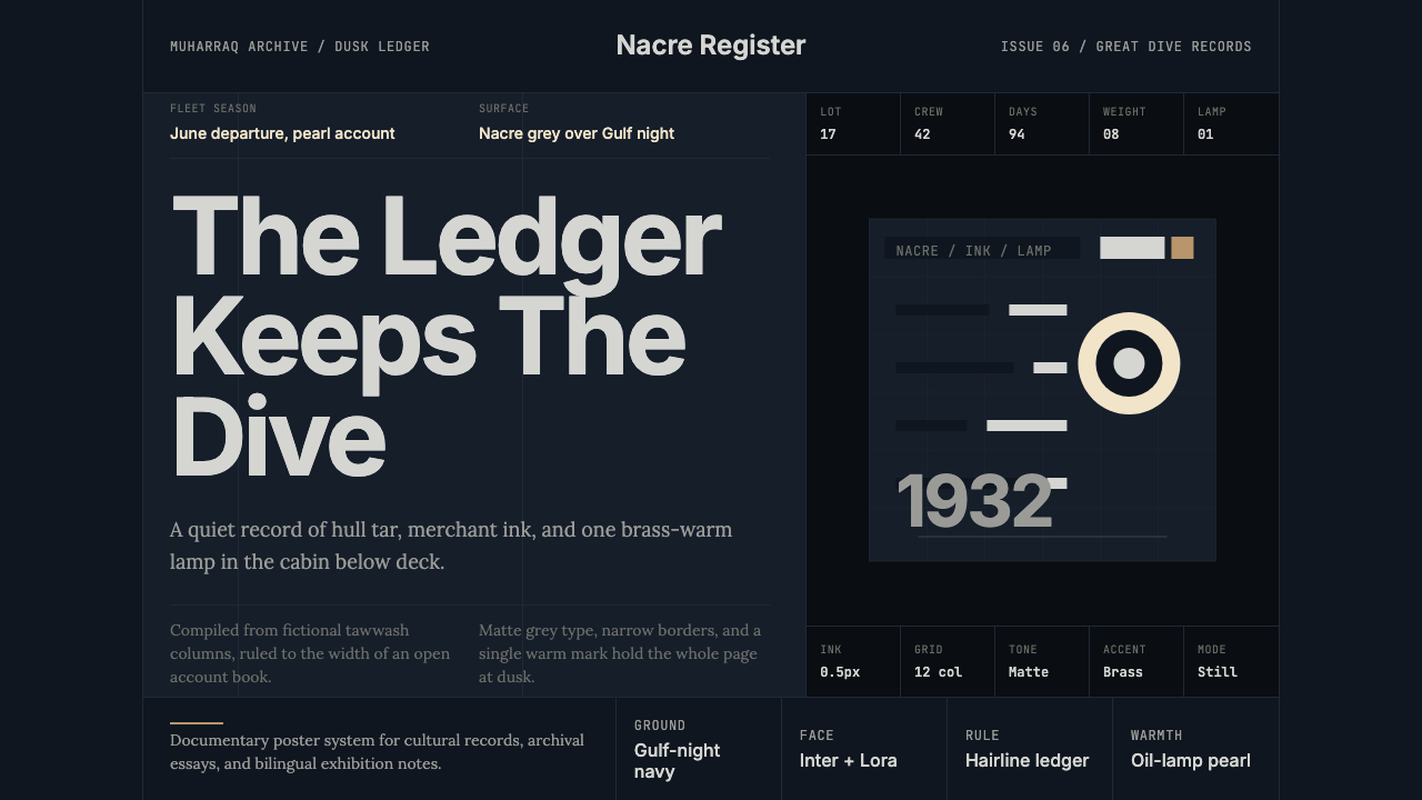 Bahraini Pearl Diving GreyQuiet authority at dusk. Nacre grey type and hairline grids hold one brass-wa…
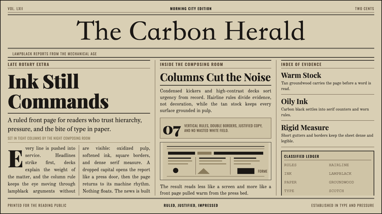 Broadsheet LetterpressAuthority in ink. Lampblack serif decks lock into tan paper with strict ruled…
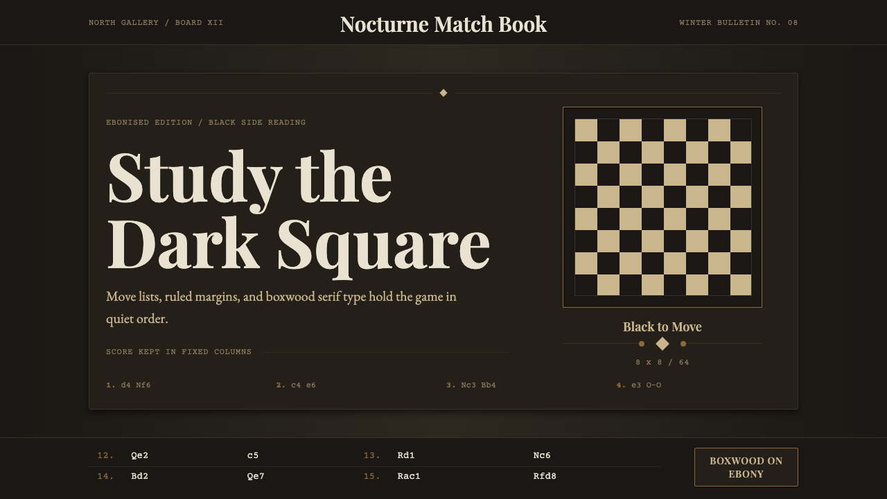 Chess TournamentQuiet intellect. Cream Playfair type, walnut rules, and notation glow on ebon…
 Grant Wood American Gothic (1930)Plainness stands firm. Dusty denim and ochre align on a strict central axis.
 National GeographicAuthority frames wonder. Yellow border, Bitter slab type, and warm paper make…
 Silver Gelatin DarkroomTonality is the craft. Safelight red, contact grids, and ten-zone grays hold…