What is Grant Wood American Gothic (1930)?
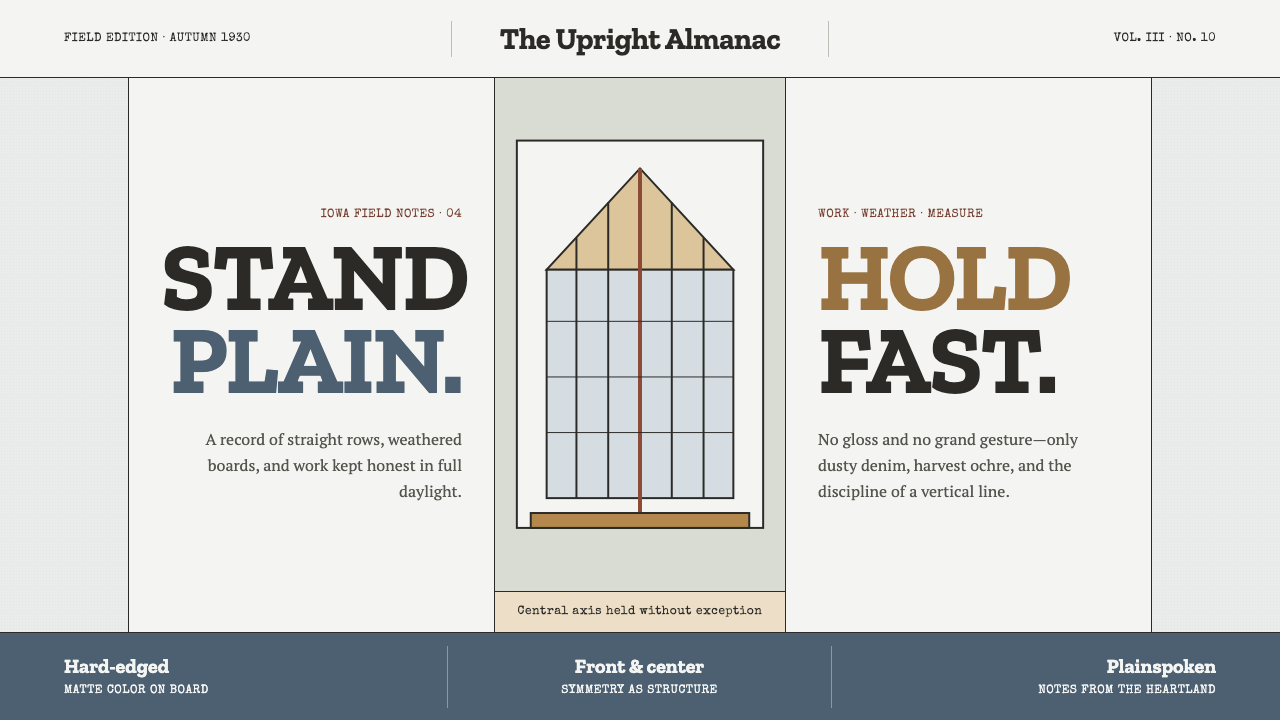
American Gothic turned a plain Iowa farmhouse and two unsmiling figures into the most recognized image in American painting — and this system builds an entire visual language out of that plainness held perfectly straight.
Grant Wood American Gothic (1930) in brief
This is a system built on restraint held rigid. The palette is drab and sun-faded on purpose — denim blue-gray for work clothes, dull ochre for ripened wheat, chalky cream for clapboard siding — as if every color had spent a decade outdoors. Nothing is saturated, nothing glows; the effect is of paint that has been scrubbed rather than mixed for effect.
Composition runs on a single unbending vertical axis. The gothic window's peak, the part in a man's combed hair, the handle of a pitchfork, the seam running down a pair of overalls — all of it lines up on one spine, and everything else in the frame is built to either mirror that line or answer it in quiet symmetry. There is no diagonal energy here, no dynamic sweep. The composition holds itself at attention.
Surfaces are matte and hard-edged, painted with a precision closer to a signboard than a sketch — flat planes of color meeting at knife-clean seams, with plain slab lettering doing the same job a sign painter's hand would do on a small-town shopfront. The whole system reads as sober, upright, and entirely unwilling to decorate itself.
Where does Grant Wood American Gothic (1930) come from?
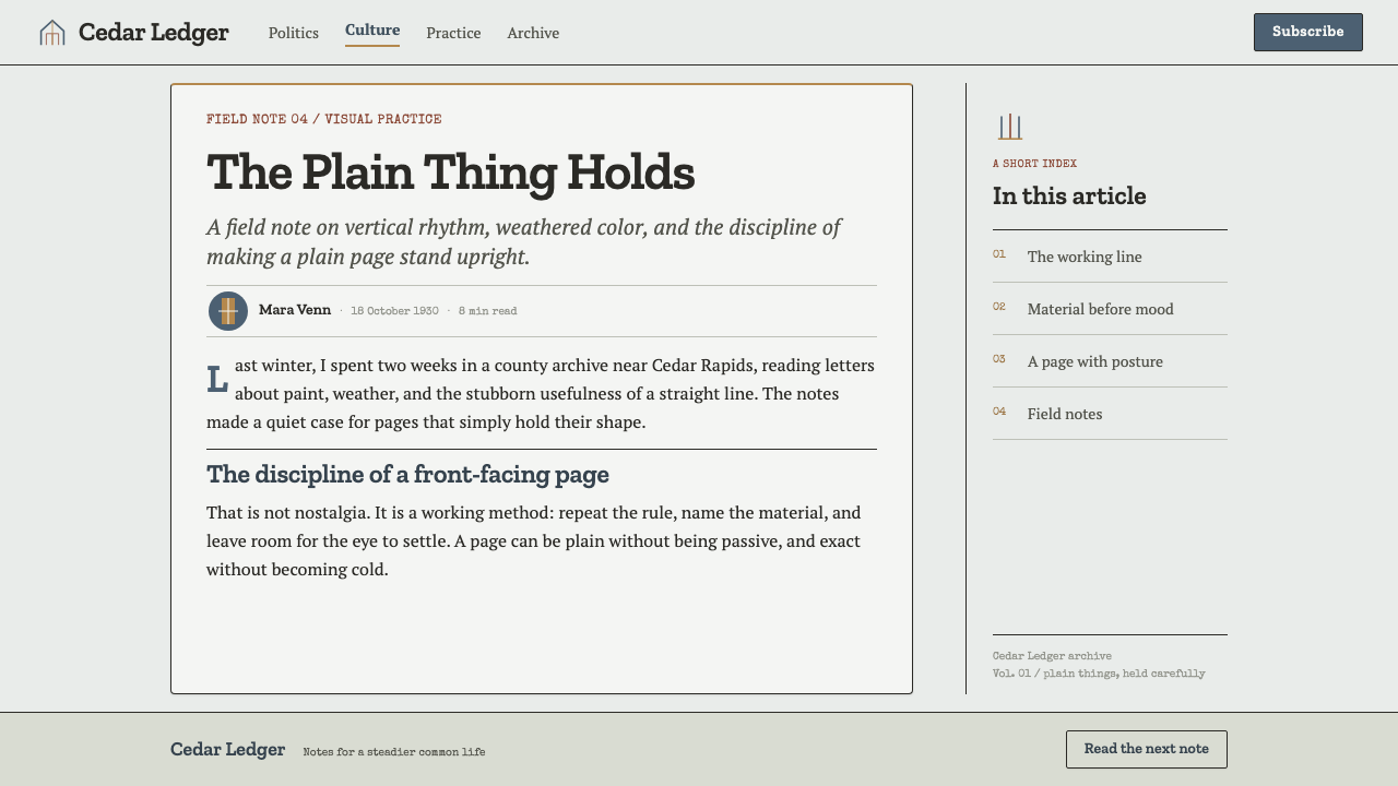
Grant Wood painted American Gothic in 1930 after spotting a small white farmhouse in the town of Eldon, Iowa. The house was built in the American Carpenter Gothic style — a cheap, wood-framed translation of European ecclesiastical Gothic Revival, complete with a pointed arched window borrowed straight from cathedral architecture but cut here from ordinary lumber for an ordinary rural home. Wood was struck by the incongruity of a grand architectural gesture reduced to a modest domestic scale, and he sketched the house on the spot, deciding afterward what kind of people he imagined would live behind that window.
For his models, Wood turned to people he already knew rather than professional sitters: his sister Nan Wood Graham, and his own dentist, Byron McKeeby, whose long, gaunt, deeply lined face matched the severity Wood wanted for the male figure. He dressed McKeeby in plain overalls with a pitchfork and Graham in a colonial-print apron with a cameo brooch at the collar — a small heirloom detail meant to signal respectable, old-fashioned propriety amid the plainness. Wood intended the two as father and daughter, though the ambiguity of their relationship has been debated by viewers ever since.
The painting was submitted to the Art Institute of Chicago's annual exhibition in 1930, where it won a bronze medal and a modest cash prize; the Art Institute purchased it soon after; it remains in that collection today. Reception in Iowa itself was famously uneasy — many Midwesterners felt Wood had caricatured them as grim, puritanical, and humorless, and Wood spent years insisting the painting was intended as a sincere, admiring portrait of the resilience and self-discipline of rural Midwestern character rather than a mockery of it.
The painting became a defining work of American Regionalism, a movement that also included Thomas Hart Benton and John Steuart Curry — the three were often grouped together as the leading figures of American Scene painting during the Depression years. Regionalism was explicitly anti-Modernist: where European painters were pursuing Cubism and abstraction, Wood, Benton, and Curry insisted that American art should depict American subjects — farms, small towns, harvests, and the specific, unglamorous texture of Midwestern life — in a clear, legible, representational style.
What defines the Grant Wood American Gothic (1930) look?
Color
The palette is drab by design: denim blue-gray, dull ochre, chalky cream, and skin tones flattened toward a pale, weathered gray. Nothing is vivid or saturated. Every hue behaves as though it has been bleached by years of sun and washed by years of use — the visual equivalent of thrift.
The Vertical Axis
One unbroken vertical line organizes everything: the gothic window's peak, the center part of combed hair, the pitchfork handle, the seam of a pair of overalls. Every element on the page either sits on that axis or mirrors across it in quiet, deliberate symmetry — a formality closer to religious icon painting than to a candid portrait.
Surface and Paint Handling
Paint is applied flat, matte, and hard-edged, with almost no visible brushwork — a precision Wood absorbed from Northern Renaissance panel painters he studied in Munich, transplanted onto homespun American subjects. Edges between color fields meet cleanly, like a signboard rather than a loose sketch.
Pattern and Repetition
Shapes rhyme across the frame rather than standing alone: the tines of the pitchfork echo the stitching of the overalls, which echo the lapped boards of the house siding, which echo the tracery of the gothic window. This is a system built from a small set of repeated forms rather than a wide decorative vocabulary.
Typography
Lettering is plain slab or block form — the kind cut by hand on a small-town shopfront or grange-hall sign, with no flourish, no italics, no ornamental serif. It asserts information rather than persuading with elegance, matching the picture's flat, direct honesty.
Frontal Restraint
Figures and forms face the viewer squarely, arms held close, postures unbending, expressions unsmiling. This is a visual vocabulary built around self-containment — nothing leans, nothing gestures outward, nothing performs for the camera. Restraint itself becomes the subject.

Who shaped Grant Wood American Gothic (1930)?
Wood was an Iowa-born painter who had studied briefly in Munich, absorbing the flat, precise technique of Northern Renaissance panel painters before turning that technique toward distinctly American, Midwestern subjects. American Gothic, painted in 1930, made him famous almost overnight and established him as the central figure of American Regionalism, a movement built on depicting ordinary rural American life with clarity and dignity rather than caricature or European-style abstraction.
Benton was, alongside Wood and Curry, one of the three artists most closely identified with American Regionalism. His own work favored sinuous, muscular figures and sweeping mural compositions depicting American labor and rural life, a more dynamic counterpart to Wood's rigid stillness. Together the three artists gave the Depression-era United States a distinctly national, anti-Modernist visual identity.
Curry, a Kansas-born painter, completed the trio of leading Regionalists alongside Wood and Benton. His paintings depicted the drama and hardship of Midwestern rural and religious life — storms, revival meetings, farm labor — with the same commitment to legible, representational storytelling that defined the wider Regionalist movement.
Graham, Grant Wood's younger sister, posed as the daughter figure in American Gothic, dressed in a colonial-print apron with a cameo brooch. She spent much of her later life defending the painting's reputation, objecting publicly to commercial uses and parodies that she felt trivialized her brother's intent, and insisting the two figures were meant as father and daughter rather than husband and wife.
McKeeby was Grant Wood's own dentist, recruited as a model because his long, gaunt, deeply lined face matched the severe character Wood wanted for the male figure. He posed in plain overalls holding a pitchfork, and — much like Nan Wood Graham — lived to see the image he helped create become one of the most reproduced and parodied paintings in American art.
How do you use Grant Wood American Gothic (1930) today?
This system rewards work that wants to look serious, disciplined, and unhurried rather than playful. Applying it correctly means understanding the logic underneath — a rigid central axis, a drab sun-faded palette, and paint handled as flat honest planes — rather than simply desaturating a layout and calling it done.
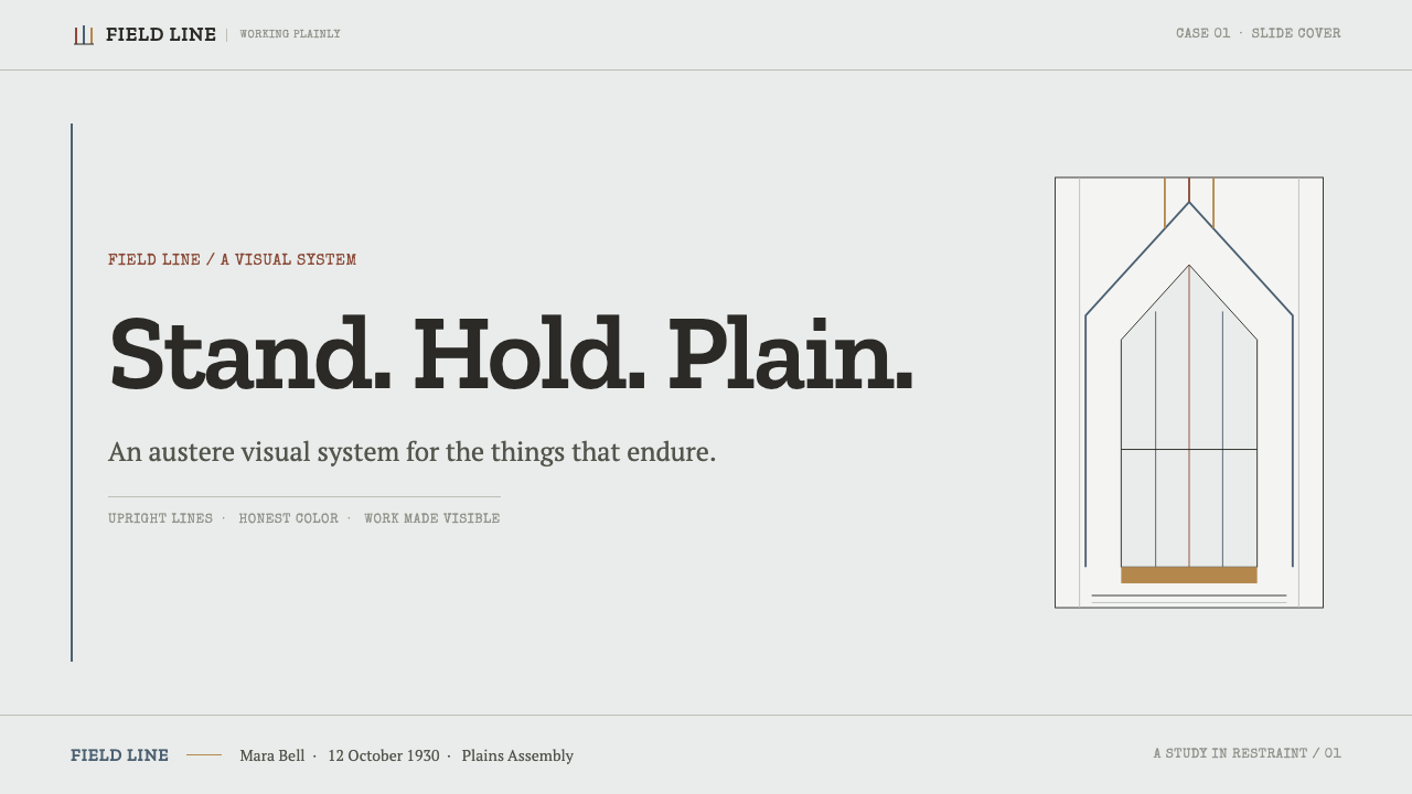
For presentation slides, the style is strongest on cover pages built around one strict vertical line: a tall, narrow image or shape anchoring the center, with title text in plain slab caps set above or below it in careful symmetry. Content slides should stay quiet — a single ochre or denim accent against cream, generous plain space, headers that state rather than announce. Data slides work best as simple stacked or paired comparisons, since the style has no appetite for busy charts.
For web interfaces, the palette and restraint suit products that want to read as trustworthy, heritage-minded, or deliberately unflashy — agricultural and craft brands, cooperative or civic platforms, long-form archives. A muted cream-and-denim base with a single ochre accent for calls to action reads as sober rather than boring, provided the layout keeps a clear vertical spine rather than scattering elements loosely across the page.
For editorial and marketing work, the style suits narrative long-form pieces about Americana, rural history, or craft heritage. Treat headlines like sign-painted lettering — bold, plain, centered — and let photography or illustration carry the same flat, hard-edged quality as the source painting rather than softening it with gradients or blur.
The most common mistake is mistaking this system for generic 'rustic farmhouse' decor — adding wood-grain textures, curved country-kitchen typefaces, or warm golden-hour lighting. Authentic American Gothic restraint is severe, not cozy: the palette stays dusty rather than warm, the composition stays rigidly symmetrical rather than relaxed, and nothing is added purely for charm.
Grant Wood American Gothic (1930) — FAQ
Is American Gothic meant as satire or as a sincere tribute?
The painting has been read both ways since 1930, and Wood himself spent years pushing back against the satirical reading. Many Iowans initially felt caricatured as grim and puritanical, but Wood maintained the picture was an admiring portrait of Midwestern resilience, thrift, and self-discipline. The design system follows Wood's own account: the restraint is meant to read as dignity, not as a joke at anyone's expense.
Are the two figures meant to be father and daughter, or husband and wife?
Wood intended them as father and daughter — his sister Nan Wood Graham and his dentist Byron McKeeby posed for the roles. The ambiguity comes from the composition itself, which places the two figures at a formal, unromantic distance with no gesture clarifying the relationship, which is precisely the kind of visual reticence this system is built to reproduce.
Why is the vertical axis so important to this style?
The axis is what turns a plain rural scene into something with the gravity of a religious icon. Every repeated vertical element — the gothic window, the hair part, the pitchfork, the overalls seam — reinforces a single, unbending line running through the composition. Break that axis and the system loses the formal stillness that makes it distinctive; it starts to read as an ordinary snapshot instead.
How is this different from generic rustic or farmhouse design?
Generic rustic design reaches for warmth — wood grain, soft golden lighting, curved cozy typefaces. American Gothic reaches for severity instead: a dusty, sun-bleached palette, hard-edged flat paint, rigid symmetry, and plain sign-painter lettering with no ornament. The two moods can look superficially similar on a mood board, but one is comforting and the other is upright and unsmiling — mixing them undoes the system's core discipline.
Does this style work in a dark interface, or is it strictly a light, cream-toned system?
The historical palette is light-ground — cream clapboard and pale sky are essential to the sun-bleached, weathered mood. A dark inversion is possible but risky: the denim and ochre accents need to stay dusty rather than glowing, or the system starts to resemble a different, more theatrical style entirely. If a dark variant is needed, keep contrast low and matte rather than high and dramatic.
Related design styles
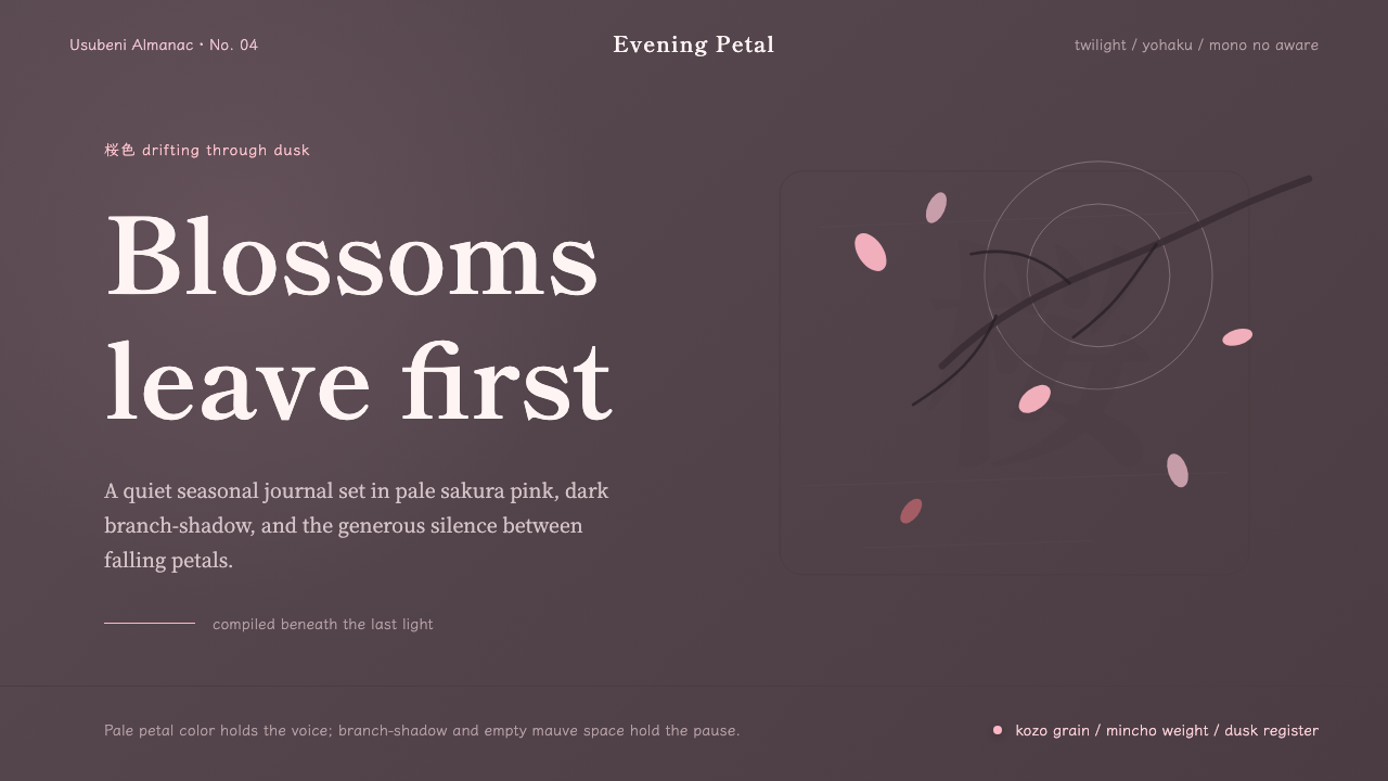 Cherry Blossom HanamiTenderness arrives in dusk. Sakura pink, branch-shadow, and Mincho type leave…
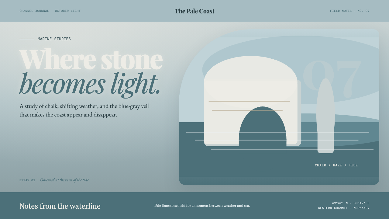 Étretat Chalk CliffsStone becomes light. Chalk-white forms dissolve through blue-gray mist and li…
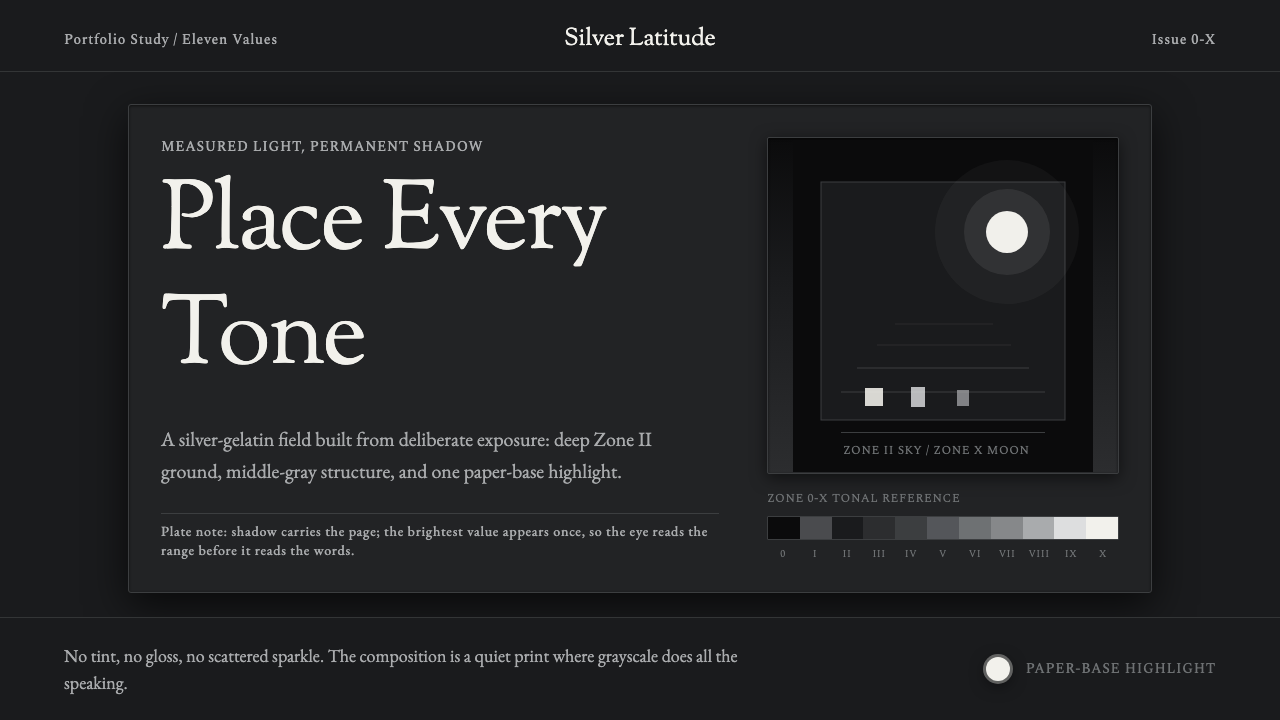 Ansel Adams Zone SystemOnly light remains. Deep shadow, serif captions, and one white moon mark the…
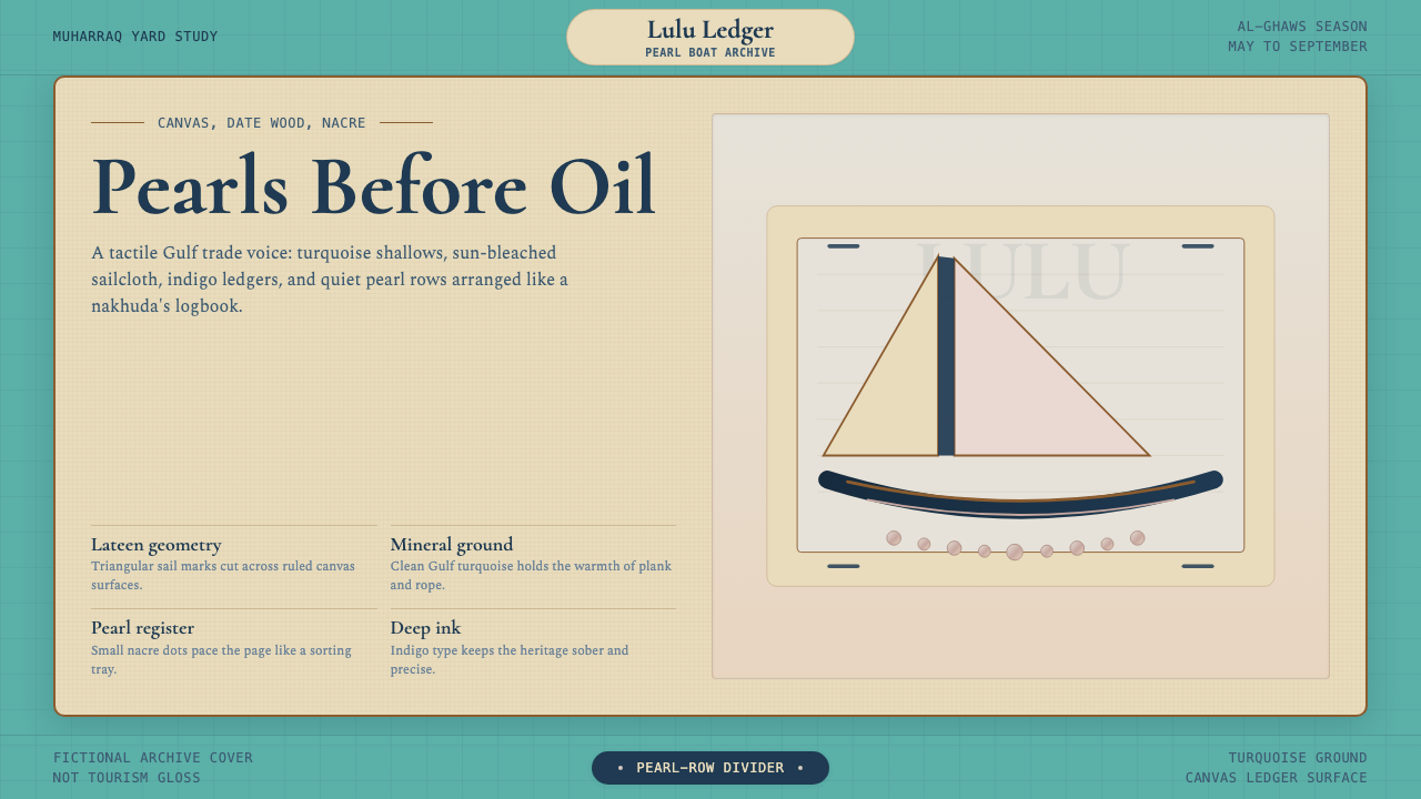 Bahraini Dhow Pearl-Diving BoatMineral and sun-bleached. Gulf turquoise, canvas cream, and pearl rows frame…
 Bahraini Pearl Diving GreyQuiet authority at dusk. Nacre grey type and hairline grids hold one brass-wa…
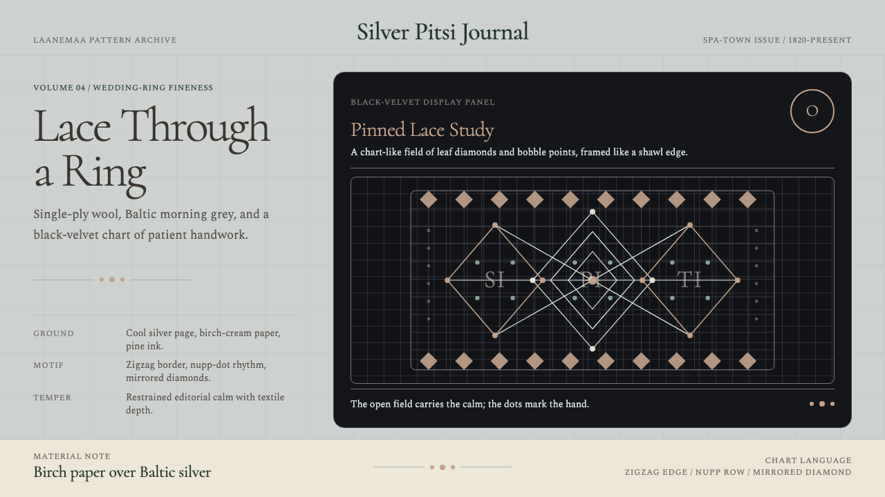 Estonian Haapsalu Lace ShawlQuiet craft, held in silver light. Cormorant type meets nupp dots and velvet…