What is Greenlandic Tupilak?
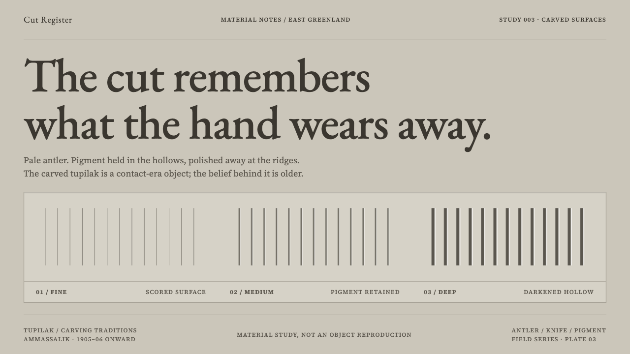
A tupilak was a weapon before it was an object: this style cuts a pale material with a knife, rubs dark pigment into the grooves, and captions the result in a single quiet line.
Greenlandic Tupilak in brief
The Greenlandic tupilak style takes its visual language from small carved objects made in East Greenland: grimacing, coiled figures, half animal and half human, cut from antler, sperm-whale tooth, walrus ivory, soapstone or driftwood. The surfaces are pale. The lines are incised with a knife. Dark pigment is rubbed into the cuts, where it stays in the grooves and wears away on the raised places that hands have touched. The design system is built the same way: antler-grey fields, incised linework and quiet serif captions.
What separates the style from a generic 'folk art' look is its refusal of cuteness. The tupilak began as something else. In the shamanic belief of the Ammassalik region it was assembled from animal and human parts, animated by ritual and sent after an enemy, and it could turn on its maker if the enemy proved stronger. The carved figures people can hold today are a later thing, but they keep their ancestry in the gaping mouth, the tight body and the limbs fused between animal and person. A design that borrows them should keep the weight.
In practice that means treating a screen like a museum case rather than a gift shop: small objects, plenty of ground around them, and a single line of text that says what the thing is made of, who collected it and when. The pigment lives in the cut. The ground stays pale.

Where does Greenlandic Tupilak come from?
The tupilak belongs to the Inuit shamanic practice of East Greenland, and the source for this style is the Ammassalik district, the area around present-day Tasiilaq. In the shamanic belief of the period before 1900, as the source material describes it, the tupilak was not an object to be shown. It was assembled from animal and human parts, animated by ritual and sent against an enemy. Its danger ran both ways: if the intended victim proved the stronger, the creature could turn and destroy its maker. Something so dangerous and so intimate was never meant to sit on a shelf.
The carved object is younger. In 1905–06 the ethnographer William Thalbitzer was working at Ammassalik and asked for a tupilak. The real thing could not be handed over, so the shaman Mitsivarniannga carved him three. That exchange explains the paradox at the heart of the style: the objects now called tupilaks are representations, made for an outsider's collecting, of something that had never been meant to be seen. The era line that frames this style reflects it exactly: shamanic belief before 1900, and the carved object from the European contact of 1905–06 onward.
Three strands run together here. The first is Inuit shamanic practice, the belief system in which the tupilak had its meaning. The second is Arctic ethnographic collecting, which created a demand for portable examples and a habit of describing them in catalogue terms — material, collector, year. The third is the souvenir-carving trade, in which carvers went on producing small figures for visitors. Together they explain the style's odd mixture of ferocity and quietness: a fierce subject, presented in the flat, descriptive voice of an accession register.
This history is why the materials matter so much. Antler, sperm-whale tooth, walrus ivory, soapstone and driftwood are what Arctic coasts offer: pale, dense, workable with a knife. Cutting a mouth open in antler and rubbing dark pigment into the cut is a sequence of hand actions, and the surface keeps a record of each one. The design system follows that logic. The cut holds the pigment, and every dark mark is a place where a blade has been.
What defines the Greenlandic Tupilak look?
Antler-grey fields
The ground is a pale, slightly warm grey, the colour of antler and bone rather than white paper. It is a field, not a void: quiet enough to let fine marks register and with enough tone to feel like a material. There are no saturated colours. The whole palette is the pale of the carved material and the dark of the pigment that sits in its cuts.
Incised line
Linework looks cut, not drawn. Strokes begin and end where a knife entered and left the material, widths vary slightly with the pressure of the hand, and there is none of the smooth confidence of a vector curve. Lines describe the grimace, the coil of a body and the joints where limbs fuse, and they stay thin and exact rather than expressive.
Pigment in the groove
Dark pigment is confined to the cuts. It stays in the grooves and wears off on the raised places where a hand has held the object. In an interface this becomes a rule about where darkness goes: into rules, outlines and strokes, while raised surfaces stay pale. Wear is expressed as lightness at high points, never as an added grunge texture.
Quiet serif captions
Text is a single descriptive line in a serif face, in the voice of an accession record: material, collector, year. It is small, restrained and set beside or beneath the object, never over it. The caption does not sell or explain. It states what the thing is made of and who gathered it, and trusts the object to carry the rest.
A fierce, compressed figure
The figures grimace with open mouths, coil their bodies and fuse their limbs between animal and person. Forms are compressed into small, tight silhouettes with no clear division between creature and human. The impression is of density and tension, not of charm. Imagery in this style should look as if it could still turn on someone.
Small scale, wide ground
These are small objects, small enough to close a hand around. The layout respects that: the object is shown at modest size with a generous surround of pale ground, never inflated to fill the frame. The space around it works like a museum case, giving the object room to be looked at closely.

Who shaped Greenlandic Tupilak?
Mitsivarniannga was the shaman who, when William Thalbitzer asked for a tupilak at Ammassalik in 1905–06, carved him three, because the real thing could not be handed over. His name marks the moment the tupilak became a carved object: a made representation of something never meant to be seen.
William Thalbitzer was the ethnographer at Ammassalik in 1905–06 whose request led to the first carved tupilaks. He represents the collecting side of the story, and the catalogue habit of describing an object in a line of material, collector and year, which gives this style its quiet captions.
The carvers of Ammassalik, who went on producing small figures in the souvenir-carving trade that followed contact, are the collective hand behind the style's surfaces: knife-cut lines, pigment held in the grooves, polish worn by use. Their work is why the style is about carving rather than myth.
How do you use Greenlandic Tupilak today?
The Greenlandic Tupilak style suits subjects that deserve seriousness and attention to materials: museum and archive projects, ethnographic and natural-history work, craft and provenance, small objects looked at closely. It rewards restraint. The more quietly it is used, the closer it stays to the object it comes from.
For presentation slides, a cover can be a single object photographed or drawn on a pale antler-grey field, with the title set in a restrained serif and a one-line caption beneath it. Content slides should be spacious, with one image or idea per slide and a caption line giving material, source and date. Data slides work well as register-like tables, with rows reading like accession entries, thin dark rules doing the work of the grooves and no decorative fills.
For web interfaces, the style suits collection viewers, archive and inventory tools, craft and collectible product pages and cultural-institution sites. Dashboards should stay light and ledger-like rather than dense and analytical. A pricing page can be a plain table with caption-style descriptions of each plan. Depth should come from line weight and spacing, never from drop shadows or glossy surfaces, because everything here is carved rather than lit.
For editorial and marketing work, the style fits catalogue entries, exhibition pages, long-form writing about culture and craft, and premium goods that really are hand-made. Use it with care when the origin is a specific people's ritual object. Credit the source in the caption, treat the figure with gravity and avoid making it a mascot or a decorative monster. The strongest use is one that lets the object be looked at the way a collector or curator would look at it.
The common mistake is to make it cute. Rounded friendly shapes, bright accent colours, cartoon monsters and generic 'Arctic' decoration such as snowflakes or aurora all contradict the source, which was a weapon before it was an object. Other errors include leaving out the caption, so the image has no provenance, and filling shapes with solid black instead of keeping dark pigment in the cuts. A third is to use the style for anything casual or jokey, where its gravity will read as misplaced.

Greenlandic Tupilak — FAQ
What is a tupilak?
In the shamanic belief of East Greenland, a tupilak was a creature assembled from animal and human parts, animated by ritual and sent after an enemy. It could turn on its maker if the enemy proved stronger. The small carved figures that bear the name today are later representations, made from 1905–06 onward for collectors, and they keep the grimace, coil and fused limbs of the original idea.
Is a tupilak a souvenir or a sacred object?
It is both, and the tension is the point. The original tupilak was never meant to be seen, and the real one could not be handed over. The carved objects are younger: made for an ethnographer in 1905–06, then continued in the souvenir-carving trade. Good use of the style respects that history by treating the figure with gravity rather than as a cute collectible.
Why is the text limited to one quiet caption line?
Because the style borrows the voice of an accession record: material, collector, year. That plain, descriptive register lets a fierce subject sit calmly on the page and keeps words from competing with the object. A caption is also a form of respect, since it names what the thing is made of and who gathered it instead of telling the viewer how to feel.
Which materials does the style refer to?
Antler, sperm-whale tooth, walrus ivory, soapstone and driftwood: pale, dense materials that take a knife-cut line. The visual system turns that into an antler-grey ground, thin incised linework and dark pigment kept in the grooves, with wear showing as lighter high points where a hand has held the object.
Is it appropriate to use the style for a commercial brand?
It can be, with care. The style comes from a specific people's ritual tradition and a documented history of collecting, so it works best in contexts that give it weight: museums, archives, craft, provenance, thoughtful editorial. Credit the source, keep the tone serious, and avoid turning the figure into a mascot, a joke or generic 'Arctic' decoration.
Related design styles
 Estonian Haapsalu Lace ShawlQuiet craft, held in silver light. Cormorant type meets nupp dots and velvet…
 Shaker Furniture 1850Utility becomes beauty. Bone plaster, iron black, smoke pine, and one smoke-t…
 Samaritan TorahContinuity made visible. Iron-gall columns, prick marks, and gilt colophon cr…
 Sumi Grayscale GradientOne ink, every value. A single carbon black diluted into graded grays, marked…
 Buncheong Gray Slip WareBetween celadon and porcelain. Greenish-gray clay, chalky slip brushwork, dar…
 Grant Wood American Gothic (1930)Plainness stands firm. Dusty denim and ochre align on a strict central axis.