What is Buncheong Gray Slip Ware?
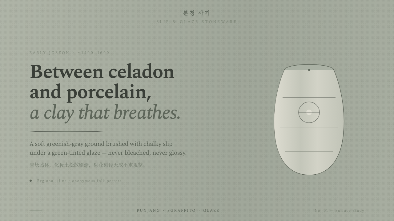
Buncheong turns rough greenish-gray clay, chalky slip, and dark incised marks into a quiet surface language shaped by touch rather than polish.
Buncheong Gray Slip Ware in brief
Buncheong Gray Slip Ware is the coarse greenish-gray stoneware associated with early Joseon Korea, made distinctive by a clay body brushed with chalky white slip and covered with a green-tinted, semi-translucent glaze. It occupies a perceptual middle ground between celadon and porcelain: less polished than porcelain, less jewel-like than celadon, yet capable of a restrained and highly legible beauty.
Its visual character comes from the meeting of material and gesture. The gray-green ground remains present beneath the surface; slip appears as soft white brushwork rather than an immaculate field; dark sgraffito lines cut into the pale layer with direct, almost conversational force. The result is quiet and nearly monochrome, but never sterile. It has the warmth of a hand-thrown object without relying on warm color.
This design system distills Buncheong into a calm visual language for contemporary work. Backgrounds should feel softly mineral and greenish-gray, marks should resemble chalky slip, and lines should read as incisions rather than polished outlines. The governing quality is controlled irregularity: edges may waver, strokes may vary, and forms may retain evidence of making. The surface is composed, but it should never look mechanically perfect.
Where does Buncheong Gray Slip Ware come from?
Buncheong belongs to the early Joseon dynasty and is situated in Korea, in East Asia. The approved period for the style is the fifteenth and sixteenth centuries, broadly corresponding to the early Joseon era. Its identity is therefore historical as well as visual: the surface language is inseparable from the period, region, clay, and craft vocabulary that define it.
The material sequence establishes the style's central tension. A coarse greenish-gray stoneware body provides the ground; chalky white slip is brushed across it; a green-tinted, semi-translucent glaze settles over the surface. Because the glaze does not erase the underlying body or the evidence of the slip, the finished object holds several visual conditions at once: gray-green depth, pale marks, and a subdued glazed veil.
Buncheong is also identified through slip-decorated stoneware and sgraffito folk pottery. These descriptions point to two complementary modes of making. Slip decoration introduces a visible, gestural layer, while sgraffito incisions bring the darker body or line beneath that layer back into view. Neither process depends on perfect regularity. Their expressive force comes from the fact that a hand has moved across the surface.
The tradition is connected to Joseon folk potters, with Ko Yusop named among its key figures. In this account, authorship is not reduced to a single signature or a fixed formal recipe. Buncheong is better understood as a material and folk vocabulary: a family of surfaces shaped by greenish-gray clay, white slip, dark incised drawing, and the quiet interval between celadon and porcelain.
What defines the Buncheong Gray Slip Ware look?
Greenish-Gray Ground
The ground should feel mineral, muted, and slightly green rather than white, beige, or warm gray. It carries the visual weight of coarse stoneware and gives every pale mark something to emerge from. The surface is quiet but not empty; subtle variation in tone can suggest clay, glaze, and the uneven presence of the hand.
Chalky Slip
White is not a pristine page in Buncheong; it is a deposited material. Slip marks should look chalky, opaque, and lightly brushed, with softened boundaries or changes in coverage where the gesture accelerates or relaxes. The pale layer is an active mark-making tool, not merely a neutral background.
Dark Incision
Sgraffito lines provide contrast without introducing a separate visual world. They are dark, direct, and slightly raw, as if drawn by cutting through the slip to reveal what lies beneath. Use them to define contours, divide space, or suggest a simple emblem, but preserve the sense that the line belongs to the vessel surface rather than floating above it.
Green-Tinted Veil
The glaze is semi-translucent and green-tinted, so it should unify the surface without making it glossy or jewel-like. Think of a thin veil that allows the ground and marks to remain legible. Depth comes from layering and material relationship, not from dramatic shine, glassy highlights, or polished effects.
Folk Gesture
Buncheong favors loose folk brushwork over controlled calligraphic display. Strokes may vary in pressure, direction, and density, creating a rhythm that feels made rather than plotted. This irregularity should be deliberate in the design system: repeated marks can share a family resemblance without becoming identical or mechanically tiled.
Quiet Monochrome
The palette remains close to one restrained family: greenish gray, chalky white, and dark linework. Contrast is present, but it is never loud or decorative. Hierarchy should come from density, scale, placement, and the relationship between marked and unmarked ground, allowing the surface to feel composed through silence as much as through emphasis.
Hand-Thrown Imperfection
The system should retain a soft, hand-thrown character. Slightly uneven edges, interrupted marks, and variations in opacity keep the work from becoming a clean white interface with a decorative texture placed on top. Imperfection is not noise; it is the visible record of touch that makes the style feel tactile and grounded.
Who shaped Buncheong Gray Slip Ware?
Joseon folk potters are the central collective presence in this visual language. Their work is represented through coarse greenish-gray stoneware, loose slip brushwork, sgraffito lines, and a surface that accepts variation instead of suppressing it. The style is therefore communal and material before it is individual or signature-driven.
Ko Yusop is named among the key figures associated with Buncheong Gray Slip Ware in the approved material. His inclusion places the style within a field of named cultural reference while leaving room for the broader folk practice that gives Buncheong its unmistakable hand-made character.
Buncheong ware itself functions as the principal visual figure of the system: a named tradition positioned between celadon and porcelain. Its identity is carried by the relationship among body, slip, glaze, and incision, making the material surface as important as any motif placed upon it.
How do you use Buncheong Gray Slip Ware today?
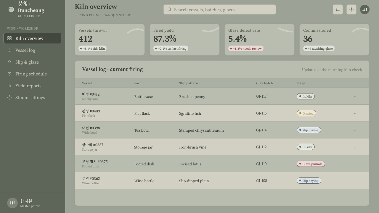
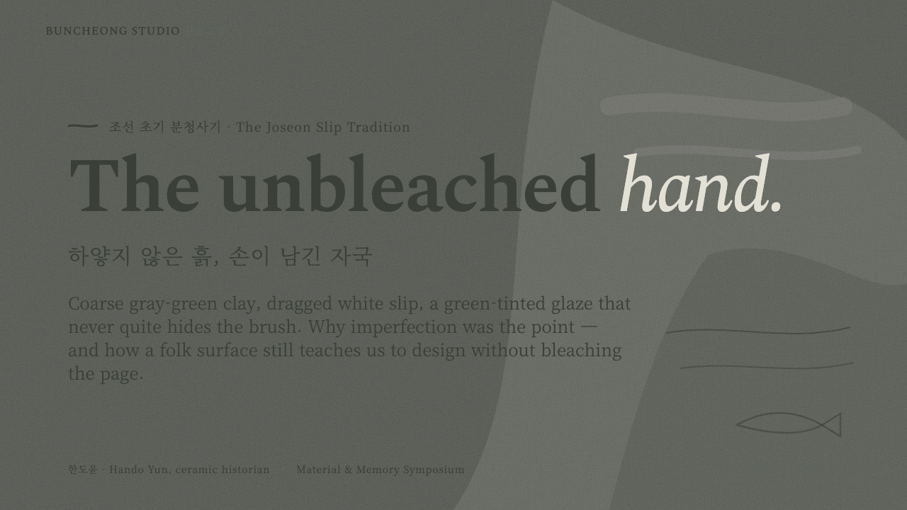
For presentation slides, Buncheong works best when the cover introduces the material atmosphere before the content begins. Use a broad greenish-gray field, a restrained chalky mark, and a dark incised title treatment with generous breathing room. Content slides should maintain the same quiet ground while allowing pale brushwork or dark lines to organize sections. Data slides can treat bars, dividers, and callouts as painted or incised marks, keeping the information legible without turning the surface into decoration.
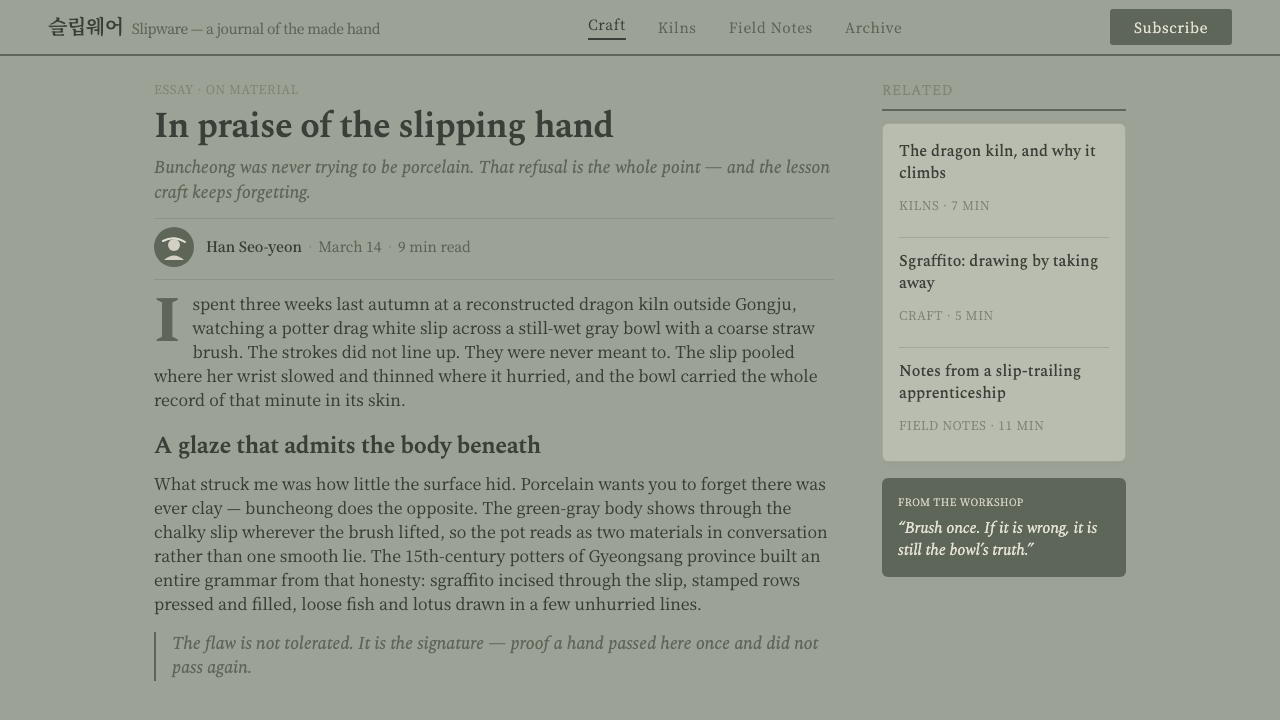
For web interfaces, the style suits dashboards and pricing pages that want to feel calm, tactile, and considered. Keep the main field softly greenish-gray, use chalky white for active surfaces or emphasis, and reserve dark linework for text, borders, and essential separation. Cards should feel like planes of material rather than floating glass, while controls can use irregular painted indicators or restrained incised states. The interface should remain highly scannable; the pottery reference belongs in the surface behavior, not in ornamental clutter.
For editorial and marketing work, Buncheong supports a slow, tactile reading experience. Articles can use a narrow text measure, generous unmarked margins, and section transitions suggested by a dark line or a pale brush band. Images should be framed as quiet objects within the field rather than surrounded by elaborate effects. Marketing pages can alternate dense marked areas with open clay-like space, using the contrast between gesture and silence to give campaigns a distinctive rhythm.
The style is especially effective when the subject values craft, restraint, material intelligence, or a relationship between tradition and contemporary use. A product story can let the greenish-gray ground establish calm authority, then use chalky marks to identify features and dark incisions to signal navigation. Because the palette is nearly monochrome, hierarchy must be carefully staged through placement, density, and contrast rather than through a parade of accent colors.
The common mistake is to treat Buncheong as a generic beige pottery texture or as a clean white interface with a few rough lines added afterward. That approach loses the essential relationship among greenish-gray body, chalky slip, translucent green veil, and dark incision. Another mistake is making every irregularity random. Authentic application needs variation with a shared material logic: marks should feel spontaneous, but the overall surface must still be quiet, coherent, and intentional.
Buncheong Gray Slip Ware — FAQ
Is Buncheong the same as celadon or porcelain?
No. Buncheong is positioned between celadon and porcelain. Its coarse greenish-gray stoneware body, chalky slip brushwork, dark sgraffito lines, and green-tinted semi-translucent glaze give it a distinct identity. The comparison is useful because it explains its visual balance: it shares a glazed ceramic context with celadon and porcelain, but its surface remains more direct, earthy, and visibly made.
Why should the background not be pure white?
Pure white removes the sense of clay and makes the slip marks read as ordinary graphic decoration. Buncheong depends on a soft greenish-gray ground that feels like a material body beneath the surface. A restrained gray-green field gives pale marks somewhere to settle and lets dark incisions feel embedded rather than printed on top.
How imperfect should the brushwork and incisions be?
They should feel loose and hand-made, but not careless or noisy. Vary pressure, direction, opacity, and edge quality while keeping the marks within the same material family. If every mark is identical, the system becomes mechanical; if every mark is unrelated, the surface loses coherence. The goal is controlled irregularity that preserves the record of touch.
Can this style use strong color accents?
It can, but strong accents should be treated as an exception rather than the organizing principle. Buncheong is fundamentally a quiet monochrome system built from greenish gray, chalky white, and dark linework. Adding many vivid colors would shift attention away from the relationships among body, slip, glaze, and incision, which are the style's essential structure.
What makes a digital application feel genuinely Buncheong-derived?
A genuine application carries the logic of the ceramic surface into hierarchy, spacing, marks, and contrast. It uses the soft greenish-gray ground as a material condition, chalky white as an active deposited mark, and dark lines as embedded structure. It also allows measured variation and open space. Simply adding a pottery photograph, beige texture, or rough border to an otherwise polished interface borrows the subject matter without adopting the visual language.
Related design styles
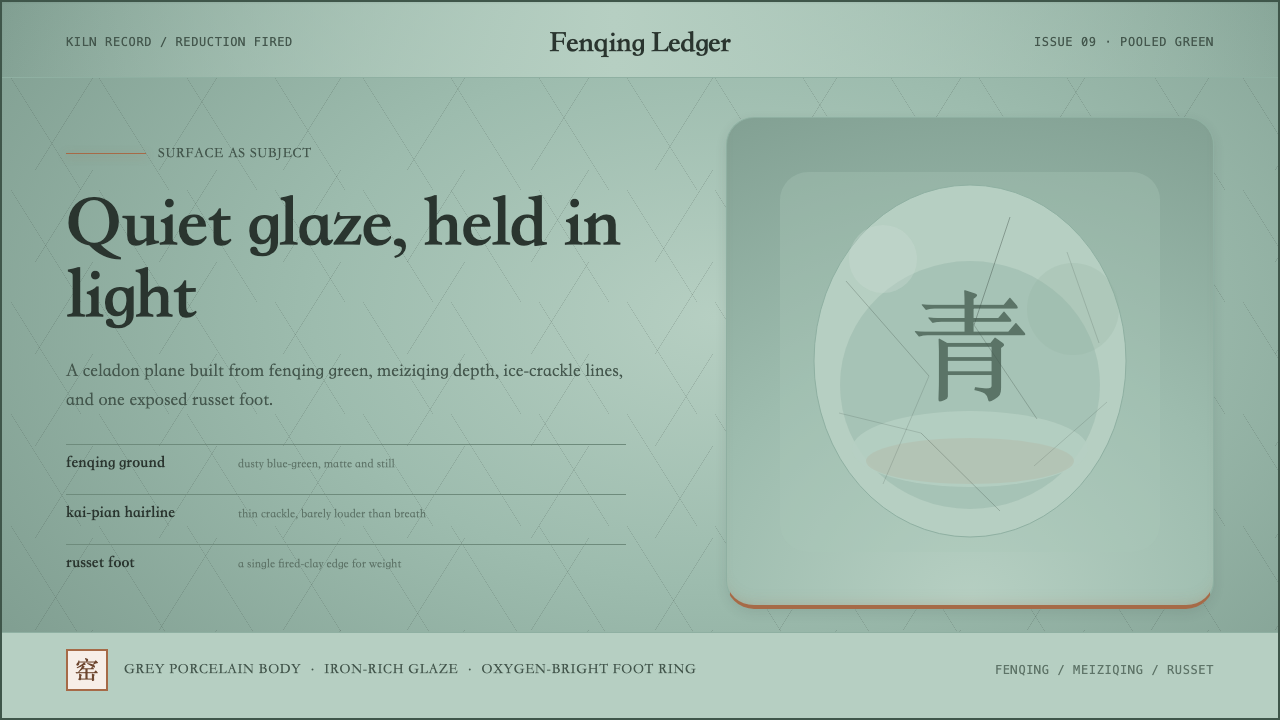 Longquan CeladonQuiet glaze carries the page. Fenqing green, crackle hairlines, and one russe…
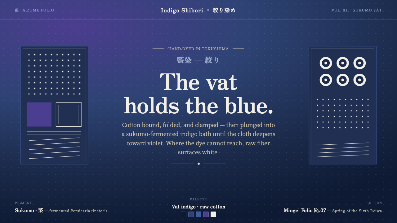 Indigo ShiboriCloth before image. Bound cotton plunged into sukumo vats — raw-white resist…
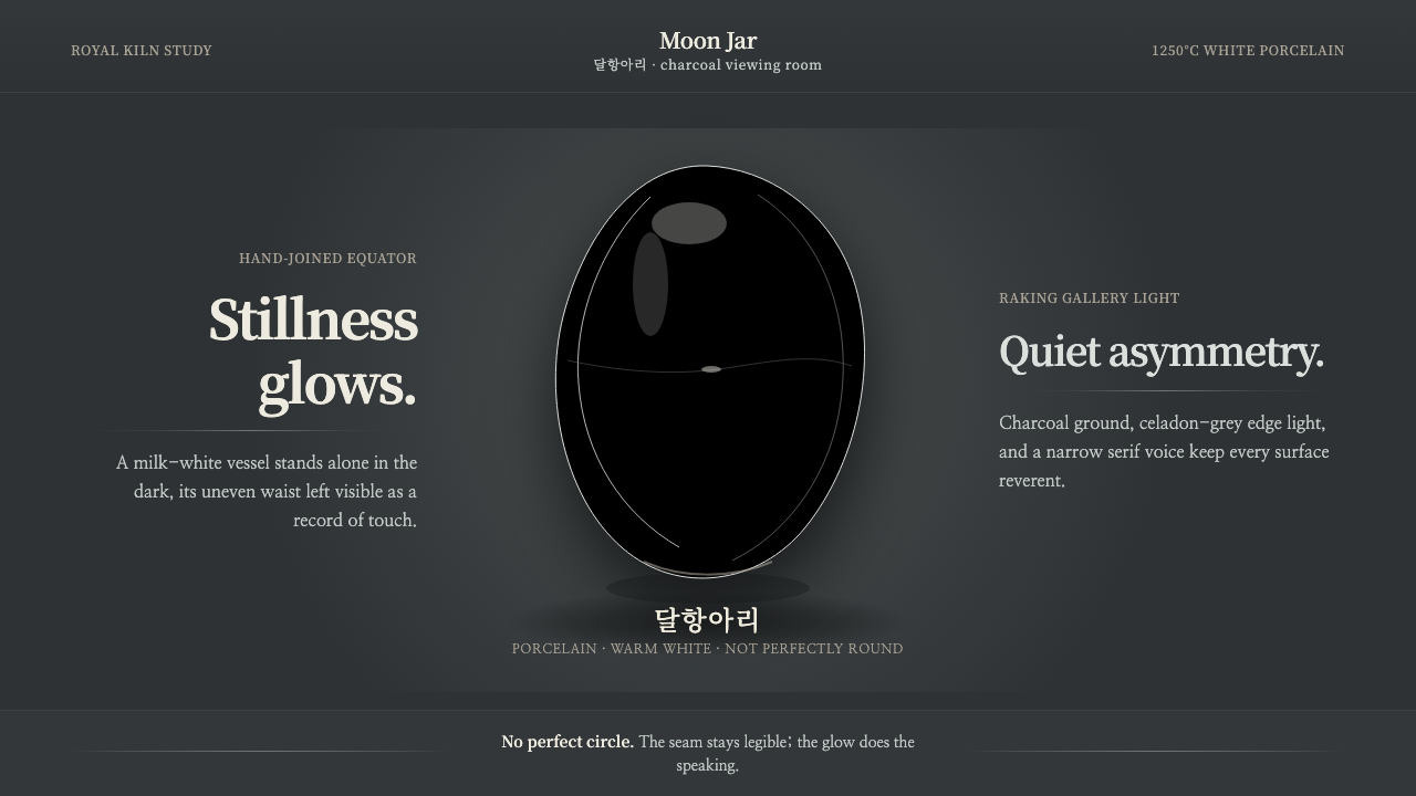 Joseon Moon JarQuiet imperfection glows. Milk-white porcelain floats on charcoal with a visi…
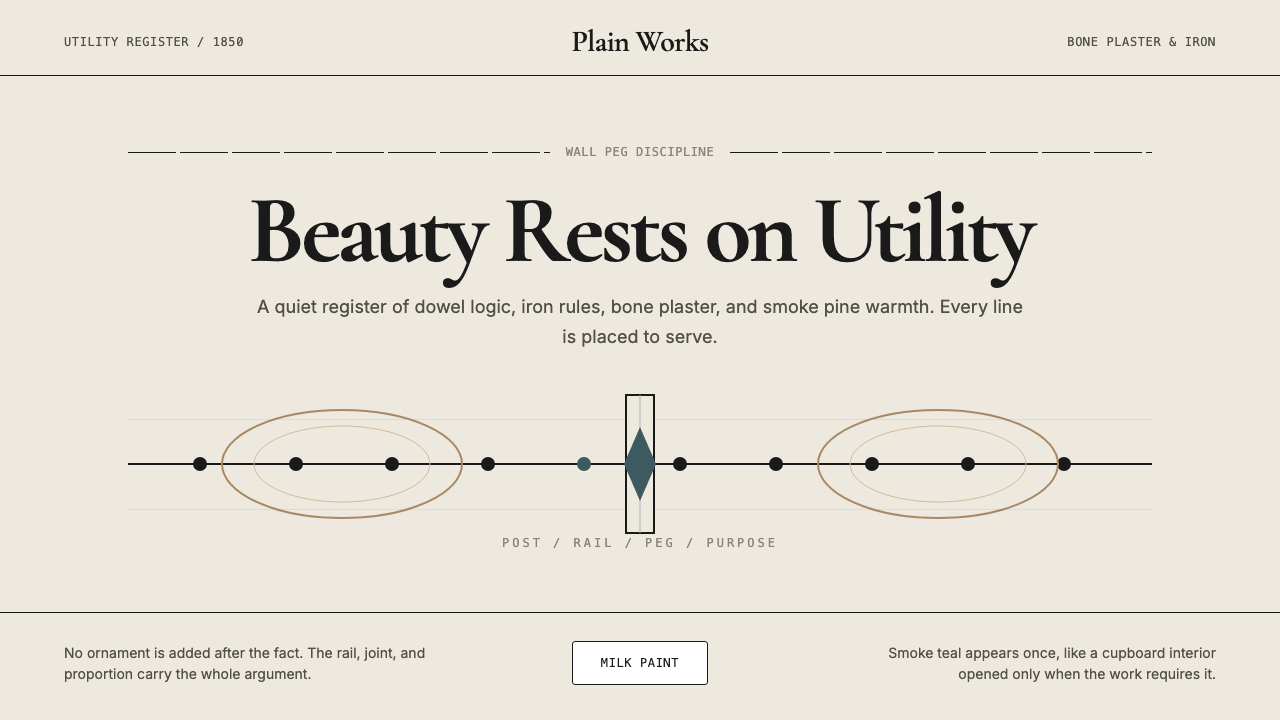 Shaker Furniture 1850Utility becomes beauty. Bone plaster, iron black, smoke pine, and one smoke-t…
 Estonian Haapsalu Lace ShawlQuiet craft, held in silver light. Cormorant type meets nupp dots and velvet…
 Goryeo Celadon 高麗青瓷Stillness carries ornament. Bisaek jade ground holds white and black hairline…