What is Samaritan Torah?
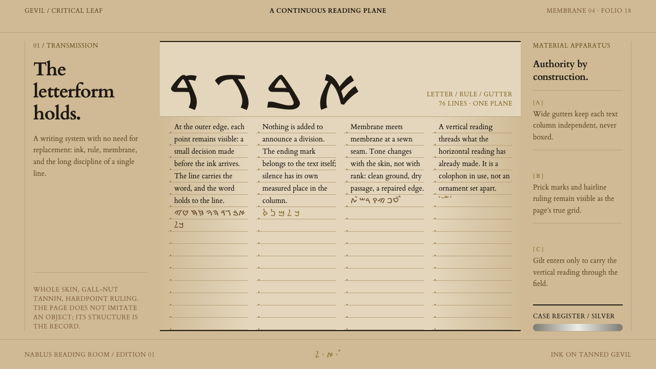
While other scribes moved to the square script, the Samaritans kept writing the Torah in the old paleo-Hebrew letterform — and this design language turns that unbroken continuity into ruled columns, prick marks and tanned ground.
Samaritan Torah in brief
The Samaritan Torah design style takes its structure from a single type of object: the Torah scroll of the Samaritan community, written in a majuscule that descends directly from paleo-Hebrew and set on gevil, ram skin tanned whole with gall-nut tannins. The style is light-ground, warm and uneven: a tanned parchment surface, strict ruled columns, prick marks at the outer margin, generous gutters between columns, and a vertical colophon that crosses the text block against the direction of reading.
What distinguishes it from the many parchment-flavored styles in circulation is that nothing here imitates age for its own sake. Every feature has a job in the scroll's construction. The columns are the skeleton, each holding between seventy-five and eighty-nine lines. The prick marks exist because they are how the ruling was set out. The uneven ground exists because skin is tanned and stained membrane by membrane, and the membranes are sewn into one continuous roll. Divisions between passages are made by the script's own end-of-section marker rather than by rules, frames or ornaments. The aesthetic is best described as structural honesty rather than antique decoration.
Visually, the style is quiet and legible, but it rewards attention. The text hangs from the ruled lines, spacing between columns is wide, and color is limited to the browned tone of iron-gall ink, the warm range of the tanned skin and a small touch of gilt in the colophon. Seams, repairs and places where the pen ran dry are not hidden. They stay on the page as evidence that the document has been copied, kept and mended over centuries by a very small community.
Where does Samaritan Torah come from?
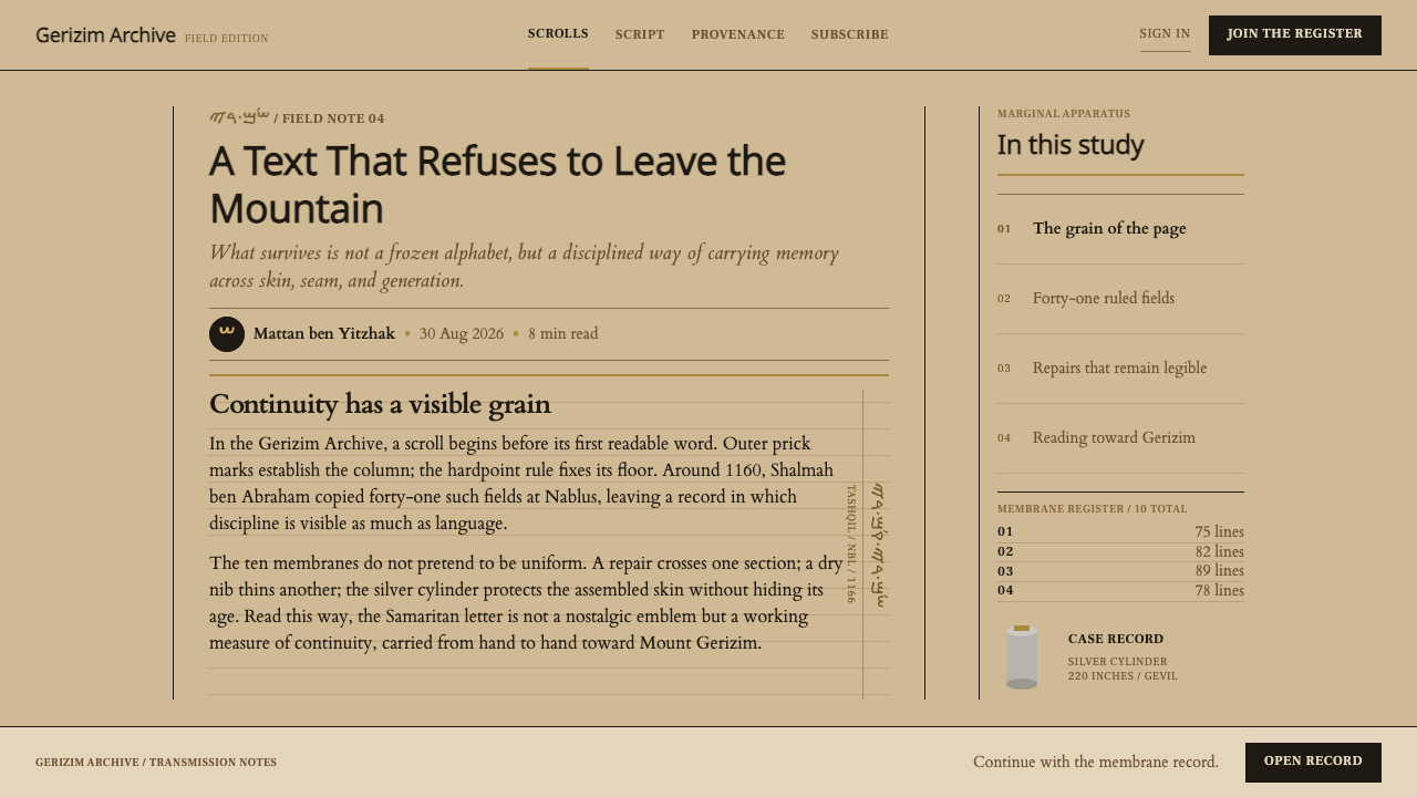
The Samaritans are a small community whose religious life centers on Mount Gerizim, near Nablus, and the tradition behind this style is that of the Samaritan Pentateuch. Today the community worldwide numbers only a few hundred people, living around Nablus and Mount Gerizim and in Holon, Israel, and everything in its worship is oriented toward the mountain. The source material names three overlapping strands that define the style: the transmission of the Samaritan Pentateuch, the continuity of paleo-Hebrew scribal practice, and the tashqil, a vertical colophon that runs through the text block.
The decisive fact is the choice of letterform. When other Jewish scribes moved to the square Aramaic script, the Samaritans did not. They went on writing the Torah in a majuscule descended straight from paleo-Hebrew. This decision, repeated generation after generation, is the reason the style exists: it is a design language about refusing to change a form because the form carries identity. The era of the tradition is simply given as before 1900, since the lineage runs far back, but the reference object for this system is more specific.
That reference is a scroll copied at Nablus around 1160 to 1166, which later received repairs in the seventeenth and eighteenth centuries. The source lists two names alongside it, Shalmah ben Abraham and Abisha ben Pinhas, best read as anchors for a scribal line rather than as the authors of any one surviving page. The layered dating matters to designers. A twelfth-century copying, seventeenth- and eighteenth-century repairs and a living community that still reads the text mean that the page is a record of repeated care, which is exactly what the visible seams and uneven membranes express.
To translate this into design, the system adopts the scroll's logic rather than its imagery. The columns are strict because the ruling was strict. The gutters are generous because they belong to the column architecture. The tanned ground is uneven because tanning is uneven. The vertical colophon, written across the grain of the text, becomes a recurring structural device: a single line that reads at right angles to everything else and ties the block together. And because division in the original comes only from the end-of-section marker, the style gives up horizontal rules, boxes and ornamental frames entirely. What remains is a system where layout is almost entirely a matter of ruling, spacing and one repeated marker.
What defines the Samaritan Torah look?
Ruled Columns
The skeleton of the style is a strict set of ruled columns, each holding a fixed run of seventy-five to eighty-nine lines. Text hangs from the ruling and never floats free. In design terms this means a rigid underlying grid with baselines that every element respects, and no decorative container is needed because the structure itself does the organizing.
Prick Marks
At the outer margin of the page sit prick marks, the small points through which the ruling was set out. They are a trace of process, deliberately kept visible. A design that borrows them uses small, quiet registration points in the margin rather than icons or decoration, and treats the margin as the place where the page admits how it was made.
Generous Gutters
The space between columns is wide and consistent. Gutters carry as much of the layout as the text does, giving the eye room to rest and making each column a distinct unit. Avoid cramming extra elements into the gutters; the blank strip is part of the construction, and the one thing allowed to pass through it is the vertical colophon.
Tanned Ground
The background is not a flat tint but a tanned skin: warm, sandy and uneven, with some membranes darker and stained and others cleaner. The variation follows the joins between sheets, so tonal shifts are tied to structure rather than scattered as noise. Light-ground, warm and slightly dull, it should feel handled, never pristine.
Iron-Gall Ink
Text is written in iron-gall ink, which ages to a warm brown and is darkest where the pen was freshly loaded. Where the pen ran dry the ink thins and browns, and the style keeps that variation. Type color therefore sits in a brown-black range rather than pure black, and a slight unevenness of density across a column is intended, not a rendering flaw.
Vertical Colophon
A vertical colophon, the tashqil, runs through the text block at right angles to the lines, and in this system it carries a touch of gilt. It reads against the grain of the page, binding the columns into one object. Use it sparingly and consistently: one vertical element per page or spread, placed as structure and never as a decorative border.
Section Markers and Visible Repair
Passages are divided by the script's end-of-section marker, not by rules, boxes or ornament. Seams, patches and repairs stay on the page, because the scroll is a document of continued care. Together these two rules give the style its distinct feel: separation by a single repeated glyph, and honesty about wear.
Who shaped Samaritan Torah?
In the reference record for this system, Shalmah ben Abraham's name sits beside the dating of the scroll copied at Nablus around 1160 to 1166. He stands for the scribal hand behind a particular, datable copying, a reminder that a Torah scroll is a made object, written line by line, and that every column of the style traces back to an individual act of ruling and writing.
Abisha ben Pinhas is the second name attached to this tradition. Within the Samaritan account of its own scrolls, the name works as an emblem of the oldest scribal authority, and in this style it signifies the claim to continuity: that the form being copied today is the form that has always been copied. For designers it is the justification for strictness. If a form is meant to stay unchanged, the system that carries it has to hold its structure rigidly.
The Samaritan community, centered on Nablus and Mount Gerizim with a presence in Holon, Israel, is the true author of the tradition. Numbering only a few hundred people worldwide, it has kept the paleo-Hebrew letterform in use while neighboring scribal cultures moved to the square script. Everything in its worship faces Mount Gerizim, and the discipline of the style, with a single orientation, a single form and no ornament, reflects that.
How do you use Samaritan Torah today?
The Samaritan Torah style is a document style. It works best where the content is text, structure and provenance, and where the design wants to project continuity and seriousness without resorting to ornament. It is a poor fit for playful or high-energy products, but an excellent fit wherever trust, record-keeping or scholarly weight is the point.
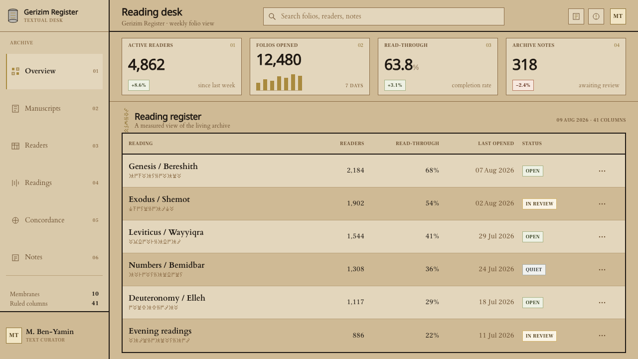
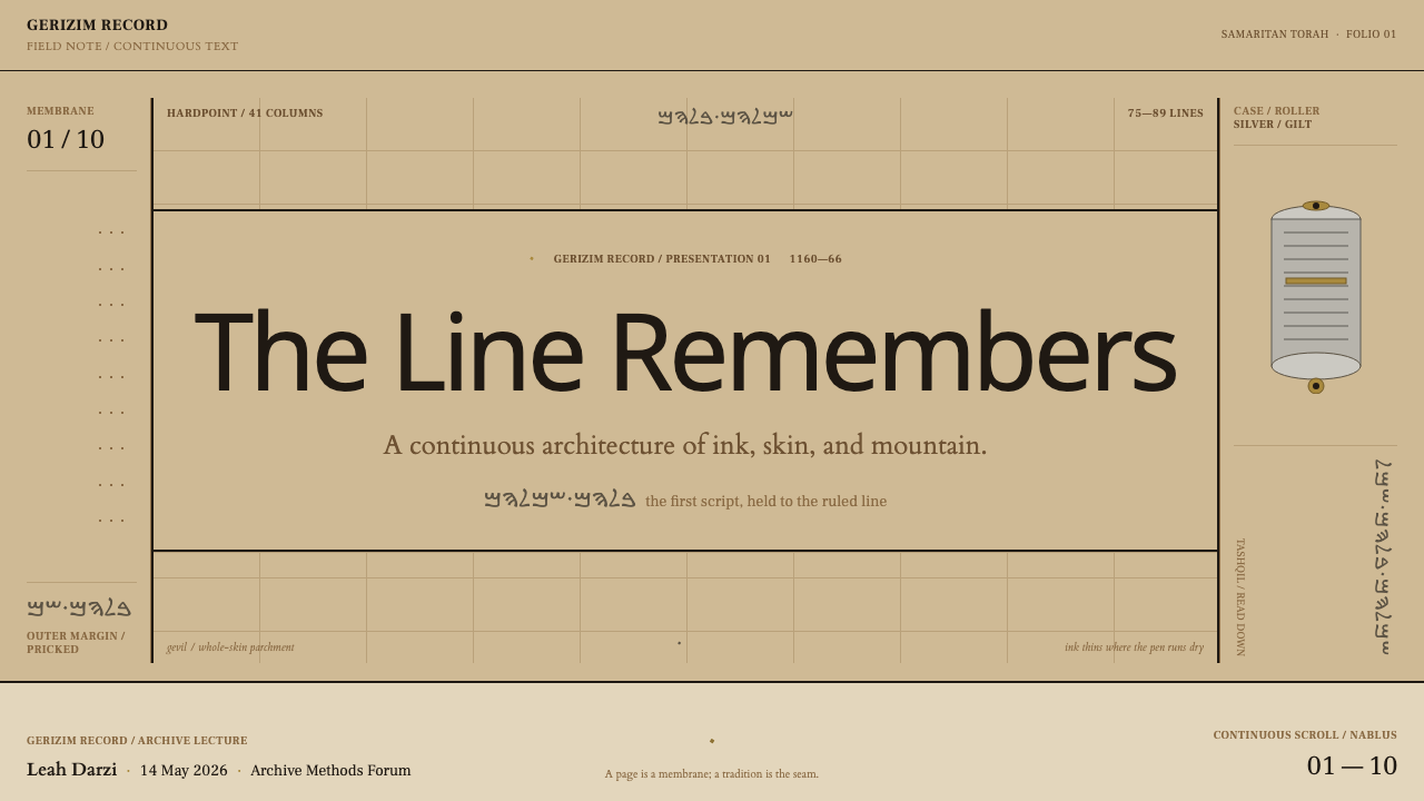
For presentation slides, the cover can be a single tanned-ground field with the title set at the head of the first column and one thin vertical gilt line crossing the text block. Content slides are best built as one to three ruled columns with text hanging from implied baselines; use the end-of-section glyph, not a divider, between topics. Data slides suit tables and ledgers: rows aligned to the ruling, figures in the ink-brown range, and annotations in the margin where the prick marks would sit.
For web interfaces, the style fits archives, reading tools, documentation, legal and records products, and knowledge bases. Keep the layout to a strict column structure with generous gutters, set the ground to a warm uneven tan with only subtle tonal shifts at section boundaries, and let the single vertical gilt element act as the signature of the page. Buttons and inputs should be restrained and flat; prefer text links and small markers to filled controls. Navigation can take the form of a narrow vertical strip that echoes the colophon.
For editorial and marketing work, the style gives long-form pieces an air of authority. Multi-column article layouts, margin notes, pull quotes set as vertical annotations and section breaks marked by a recurring glyph all feel native. Marketing pages for heritage, archival, publishing or institutional brands can lean on the provenance story: dated, handled, patient. Photography should be toned toward the warm ground and kept uncluttered, with no drop shadows and no frames.
The most common mistake is treating it as generic parchment. Adding torn edges, burnt corners, flourishes or decorative drop caps reverses the logic, since the original has no ornament at all. The second mistake is making the ground uniform, or the opposite, scattering random stains: the unevenness has to follow structure, with changes at the joins. The third is dividing sections with horizontal rules or boxed cards, which the original never does. If you feel the urge to add a border, add space instead; if you need to separate topics, use the end-of-section marker.
Samaritan Torah — FAQ
What is gevil?
Gevil is the writing surface used for this scroll: a ram skin tanned whole with gall-nut tannins, rather than split into layers as other parchments are. The sheets are sewn into a continuous scroll and kept in a silver cylinder. In the design system, its uneven, warm, slightly stained tone is the model for the page ground, and the joins between sheets explain where the tonal changes happen.
Why do the Samaritans use a different script from other Jewish communities?
When other Jewish scribes moved to the square Aramaic script, the Samaritans kept writing the Torah in a majuscule descended directly from paleo-Hebrew. The result is a letterform that preserves an older stage of the alphabet. For the design style, that choice is the central idea: continuity is treated as a visual value, and the structure of the page is built to protect a form that was deliberately never changed.
What is the tashqil?
The tashqil is a vertical colophon that runs through the text block at right angles to the lines of writing. It reads against the grain of the page and cuts across the columns. In this style it is the signature structural element, usually touched with gilt, and a design should use it once per page or spread as a unifying line rather than as a border or a decorative divider.
Is this the same as a generic parchment or medieval manuscript style?
No. Generic parchment styles lean on ornament: decorative initials, flourishes, borders and aged edges. The Samaritan Torah has none of these. Its look comes entirely from construction: ruling, prick marks, column count, seams and a single repeated section marker. A design that borrows only the brown tint without the rigid columns and the absence of ornament will read as costume rather than as this tradition.
Can the style work on screens or in dark mode?
It is a light-ground style, and its warm tanned surface is part of its identity, so it translates most naturally to reading-oriented screens. A dark version is possible only by treating the ground as a dark, uneven skin and keeping ink in a warm pale range, but the sense of handled, tanned material is easily lost. If you need a dark theme, keep the column structure and the single vertical gilt element, and test that the unevenness still follows the joins.
Related design styles
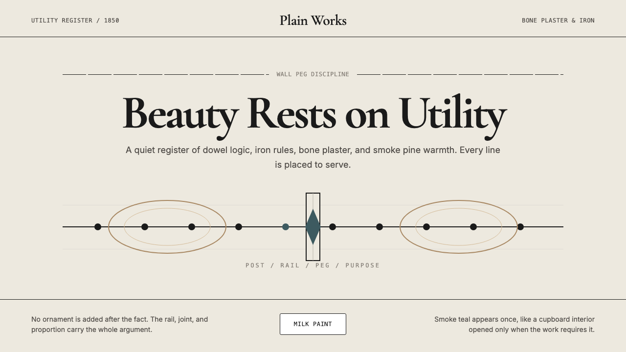 Shaker Furniture 1850Utility becomes beauty. Bone plaster, iron black, smoke pine, and one smoke-t…
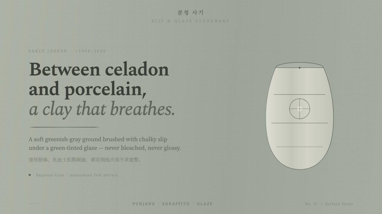 Buncheong Gray Slip WareBetween celadon and porcelain. Greenish-gray clay, chalky slip brushwork, dar…
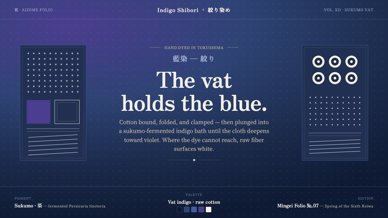 Indigo ShiboriCloth before image. Bound cotton plunged into sukumo vats — raw-white resist…
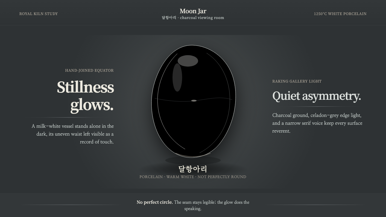 Joseon Moon JarQuiet imperfection glows. Milk-white porcelain floats on charcoal with a visi…
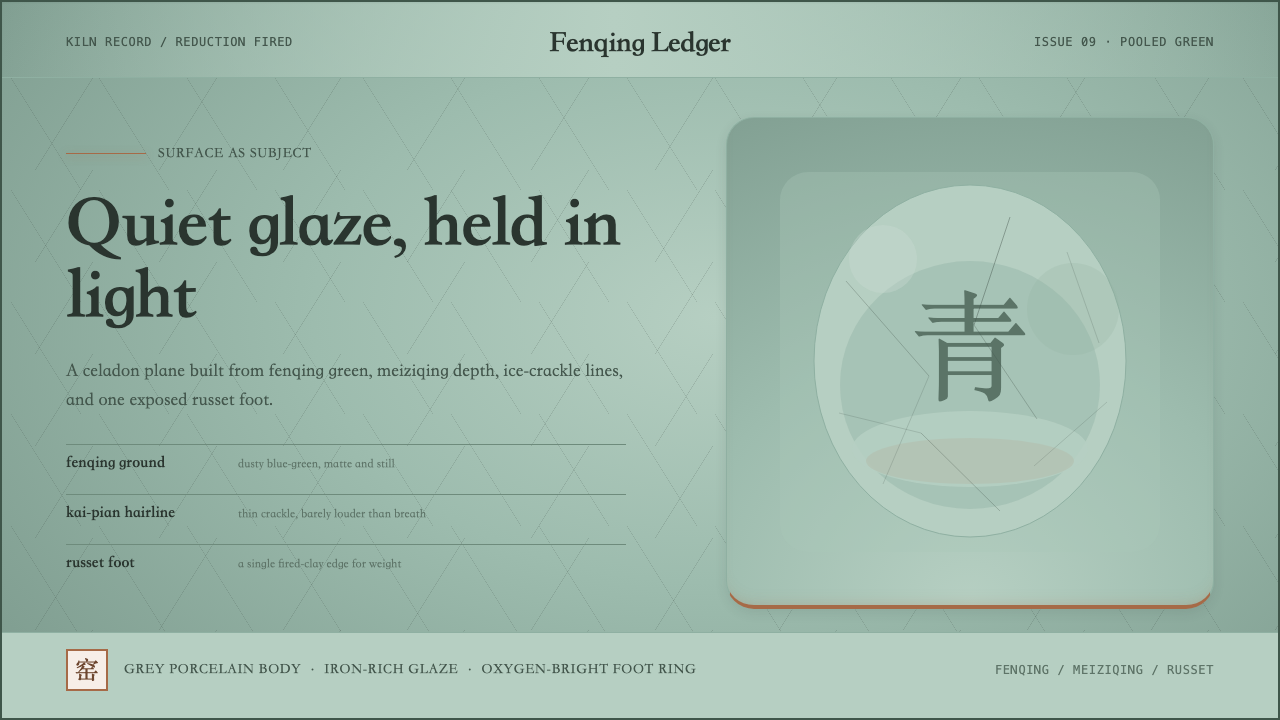 Longquan CeladonQuiet glaze carries the page. Fenqing green, crackle hairlines, and one russe…
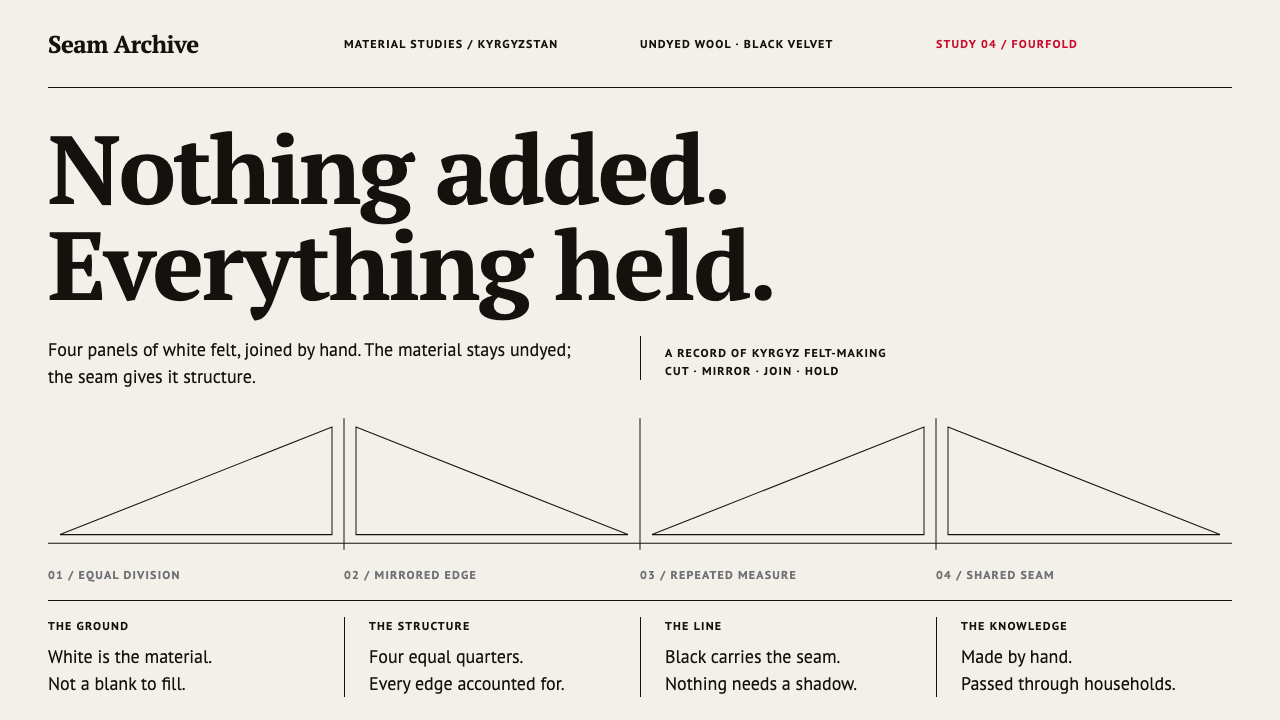 Ak-Kalpak Felt HatWhite does the work. Undyed felt tones, black hairline seams and four mirrore…