What is Indigo Shibori?
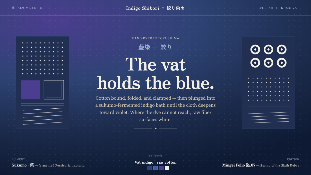
Indigo Shibori begins with cloth, not an image — bound cotton, deep violet indigo, and raw-white resist marks carrying the memory of immersion.
Indigo Shibori in brief
Indigo Shibori is the visual language of Japanese aizome, in which cotton is repeatedly plunged into a fermented sukumo-indigo vat until the cloth holds a deep blue pushed toward violet. Binding, folding, and clamping keep dye from reaching selected fibers, allowing crisp raw-cotton whites to surface against a ground whose depth and pooling remain visibly uneven.
As a design system, it is built on immersion and resist rather than on flat illustration. The field is dark indigo cloth, never a cream-colored substitute; the light areas are off-white, like undyed cotton rather than paper. Kanoko dot grids, itajime clamp geometry, and arashi diagonal striping provide distinct pattern families, but all remain subordinate to the sense that the surface has been folded, bound, submerged, and opened again.
Its character comes from the tension between control and accident. The resist creates deliberate gaps, repeats, and silhouettes, while the dye produces variation in density, edge, and pooling. Indigo Shibori therefore feels ordered without becoming mechanical: every mark has a method behind it, yet no field is perfectly uniform.
Where does Indigo Shibori come from?
Indigo Shibori belongs to the Japanese aizome tradition and is rooted in Edo-period folk textile practice, with the tradition continuing through today. Its cultural identity is therefore not a retrospective graphic style assembled from historical references. It is a living craft language whose visual rules remain connected to the handling of cotton, resist, dye, and the opened cloth.
The defining process is repeated immersion in a sukumo-fermented indigo vat. Before dyeing, artisans bind, fold, or clamp portions of the cotton so the dye cannot reach them. Once the cloth is released, the protected fibers read as raw-white shapes against the dark indigo field. The resulting image is inseparable from the making: the pattern is evidence of what was held away from the dye.
Within the broader landscape of Japanese folk-textile craft, Indigo Shibori brings together aizome dyeing with shibori resist methods such as kanoko, itajime, and arashi. Anonymous aizome dye-masters, shibori artisans, and sukumo-fermented indigo dye houses are the key figures of this tradition. Their collective practice explains why the style feels material, process-led, and continuously renewed rather than fixed to a single author.
What defines the Indigo Shibori look?
Indigo Ground
The dominant field is a dark indigo driven toward violet, with visible variation in depth rather than a perfectly even fill. It should feel like dyed cotton: dense, absorbed, and slightly alive across the surface. Cream is the wrong direction; the ground is authentically cloth and authentically indigo.
Raw-Cotton Light
Light areas are undyed resist, not paper white and not decorative cream. Their warmth should remain quiet, allowing the indigo to carry the visual weight. White shapes work best when they look protected from dye, with edges that suggest binding, folding, or clamping.
Resist Geometry
Itajime introduces folded, clamped geometry: repeated blocks, angular openings, and mirrored interruptions. The forms may be clear, but they should never feel like sterile vector decoration. Their authority comes from the physical act of compressing cloth before immersion.
Pattern Families
Kanoko suggests compact dot grids, while arashi suggests diagonal striping that cuts across the field with directional energy. These families should remain legible as distinct resist behaviors. Combining them is possible, but each pattern needs enough surrounding cloth to retain its own rhythm.
Controlled Irregularity
The resist establishes intention, while the vat produces variation. Slight shifts in density, imperfect repeats, and pooled edges are signs of authenticity rather than defects. Repetition should be recognizable, but never so exact that the textile loses the trace of handling.
Material-Led Composition
Composition should behave like a cloth surface rather than a poster pasted onto cloth. Large uninterrupted indigo areas give the pattern room to breathe; resist marks act as islands, grids, or directional bands. The system gains strength when every graphic decision appears to follow the behavior of folded and dyed cotton.
Who shaped Indigo Shibori?
The anonymous dye-masters represent the collective knowledge of Japanese aizome: preparing cotton for immersion, judging the depth of the indigo field, and sustaining a process in which variation is part of the result. Their importance is not individual authorship but continuity. Indigo Shibori should retain that sense of accumulated practice rather than presenting itself as a signature style.
Shibori artisans give form to the resist itself. Through binding, folding, and clamping, they decide where dye can travel and where the cotton must remain exposed. Kanoko, itajime, and arashi are not merely visual motifs; they are records of distinct handling methods. Their work makes the pattern feel enacted rather than drawn.
Sukumo-fermented indigo dye houses stand for the depth of the vat as a material source. The final blue is not an arbitrary surface color but the consequence of cotton meeting fermented indigo repeatedly. In design terms, the dye house is what keeps the ground from becoming generic navy: the field must suggest absorption, depth, and accumulated immersion.
How do you use Indigo Shibori today?
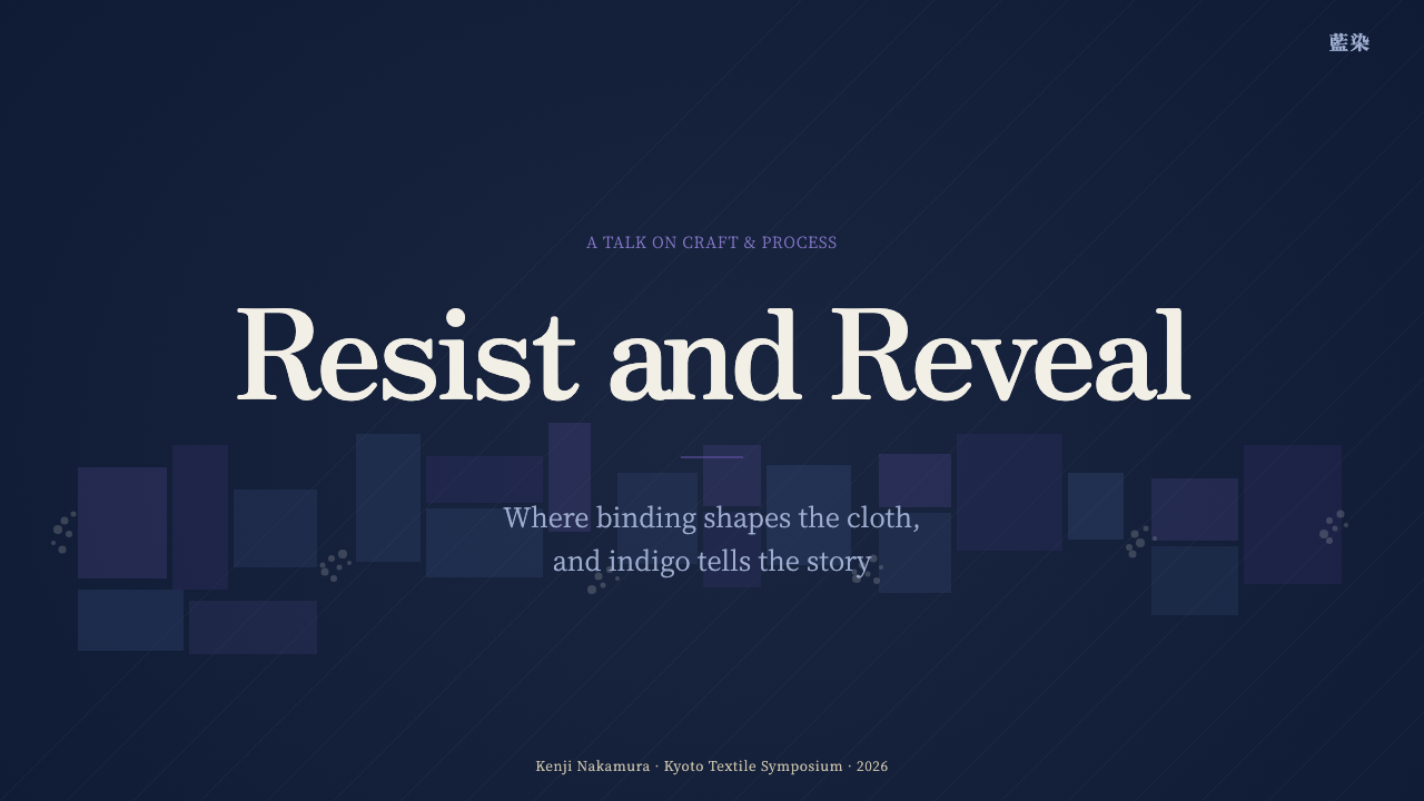
For presentation slides, let the cover behave like a single unfolded textile: a dark indigo field, one restrained resist pattern, and a title set in raw-cotton light. Content slides should use broad indigo areas to separate sections, with kanoko dots for quiet indexing or itajime geometry for structural emphasis. Data slides can treat charts as resist marks: bars, bands, or plotted forms should appear to have been held away from the dye, while the surrounding field remains visually dominant.
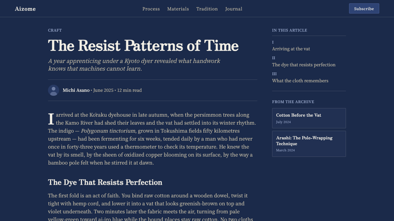
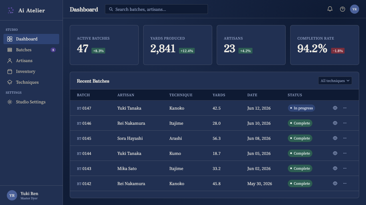
For web interfaces, Indigo Shibori suits dashboards, analytical tools, and pricing pages that need a strong dark ground with a tactile identity. Use indigo to establish the main field, off-white for readable content, and patterned resist marks only for selected states, categories, or focal panels. A dashboard should remain calm and legible: the textile character belongs in the surface rhythm and selective patterning, not in making every control compete for attention.
For editorial and marketing work, the style supports a narrative built around process, craft, and material transformation. Give articles generous uninterrupted indigo space, then place quotations, metadata, or section signals in raw-cotton light. Marketing layouts can alternate dense patterned areas with quiet cloth-like fields, using kanoko as a subtle texture and arashi as a directional device for campaigns, product stories, or transitions between ideas.
The common mistake is to treat Indigo Shibori as a generic blue-and-white pattern. A flat navy background, perfectly repeated geometry, and bright paper white may borrow the silhouette while losing the tradition. Avoid overloading the surface with every pattern family at once, and do not smooth away the uneven pooling that gives the system its identity. The goal is not to imitate decoration; it is to preserve the relationship between cloth, resist, immersion, and revealed fiber.
Indigo Shibori — FAQ
Is Indigo Shibori simply a blue-and-white pattern?
No. Its identity depends on the relationship between dyed cloth and protected fiber. The dark field must suggest repeated immersion in a sukumo-indigo vat, while the light areas must read as raw cotton left untouched by the dye. Pattern alone is insufficient; the surface needs material depth, controlled irregularity, and evidence of binding, folding, or clamping.
Must the background be dark indigo?
The dark indigo ground is fundamental to this system. It may vary in depth and lean toward violet, but replacing it with cream, pale blue, or a generic dark neutral changes the character substantially. The light contrast works because the raw-cotton resist is revealed from within a dyed field, not placed on top of a light background.
How much irregularity should the design include?
Enough to show that resist and immersion have shaped the result, but not so much that the pattern loses its family resemblance. Repetition can remain clear, while density, edge quality, and pooling shift across the field. The desired balance is deliberate structure with visible variation, rather than either random texture or flawless mechanical duplication.
Can Indigo Shibori work in a modern interface?
Yes, especially when the interface benefits from a strong dark ground, clear contrast, and a distinctive material metaphor. It works well for dashboards, analytical tools, and pricing pages when patterns are used selectively to establish hierarchy or focus. It becomes less convincing when every control is textured or when the surface is reduced to decorative blue geometry detached from cloth and resist.
Related design styles
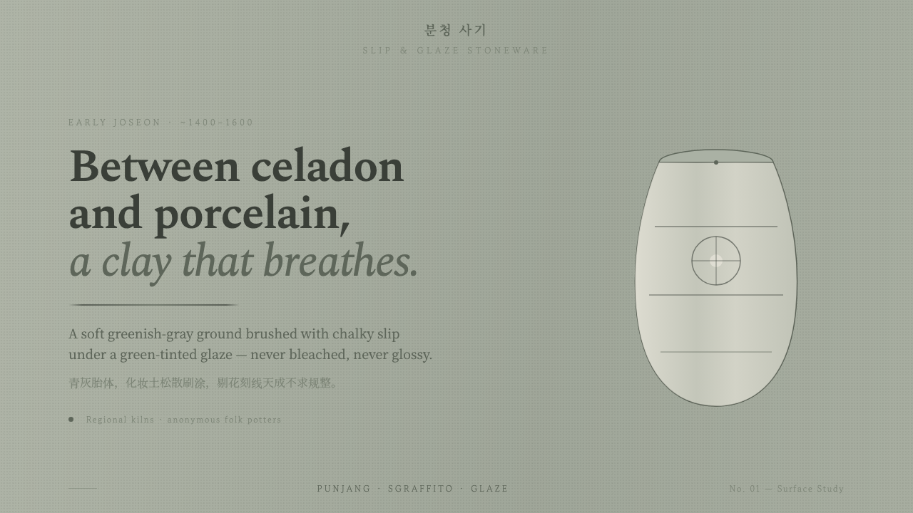 Buncheong Gray Slip WareBetween celadon and porcelain. Greenish-gray clay, chalky slip brushwork, dar…
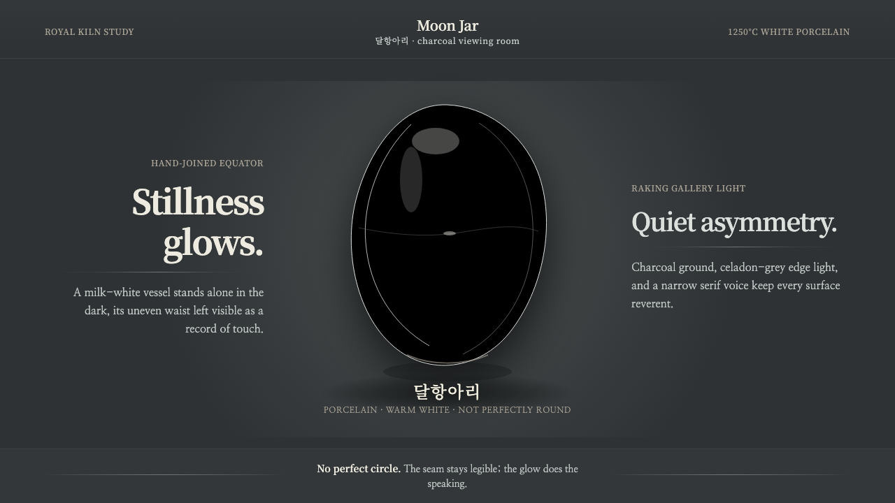 Joseon Moon JarQuiet imperfection glows. Milk-white porcelain floats on charcoal with a visi…
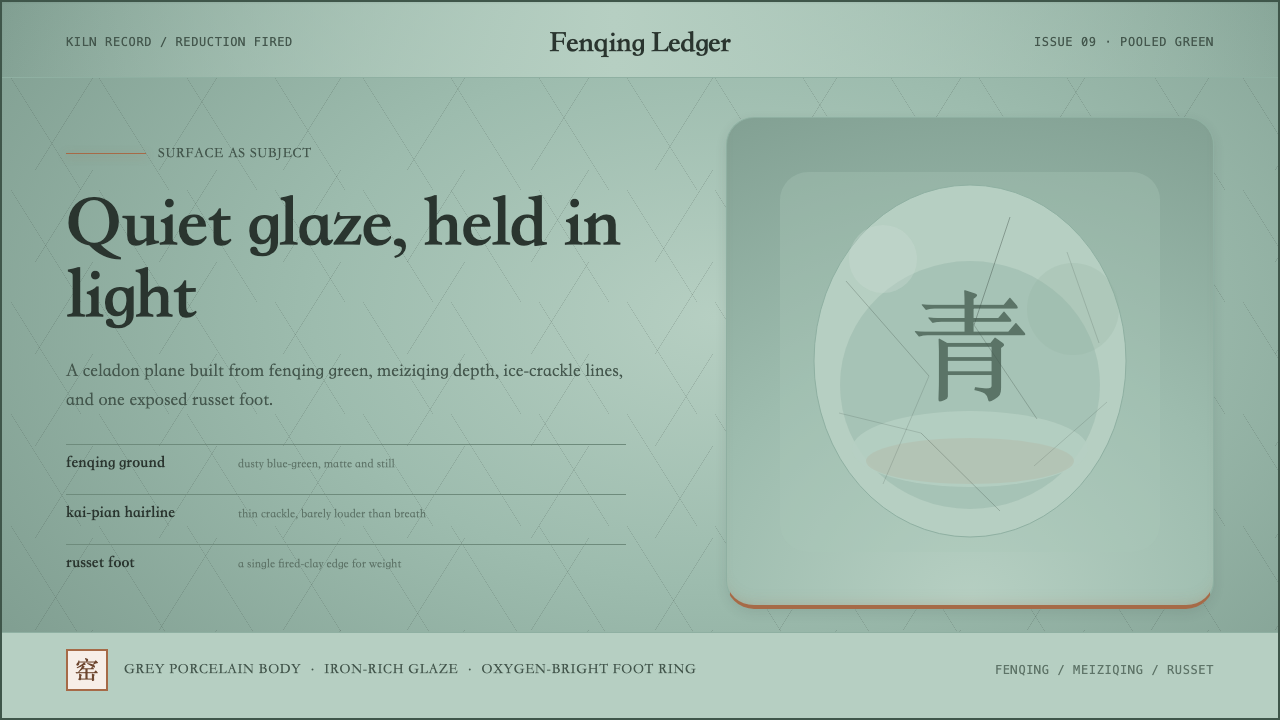 Longquan CeladonQuiet glaze carries the page. Fenqing green, crackle hairlines, and one russe…
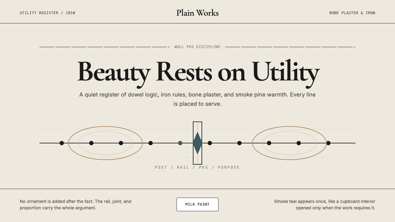 Shaker Furniture 1850Utility becomes beauty. Bone plaster, iron black, smoke pine, and one smoke-t…
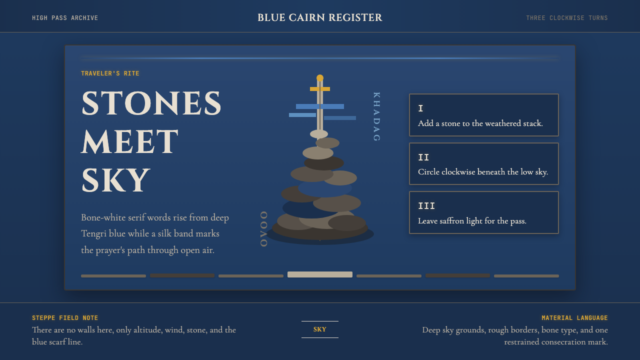 Mongolian Ovoo (Cairn Prayer Site)Sacred austerity. Steppe-blue ground, bone serif type, and one silk-blue pray…
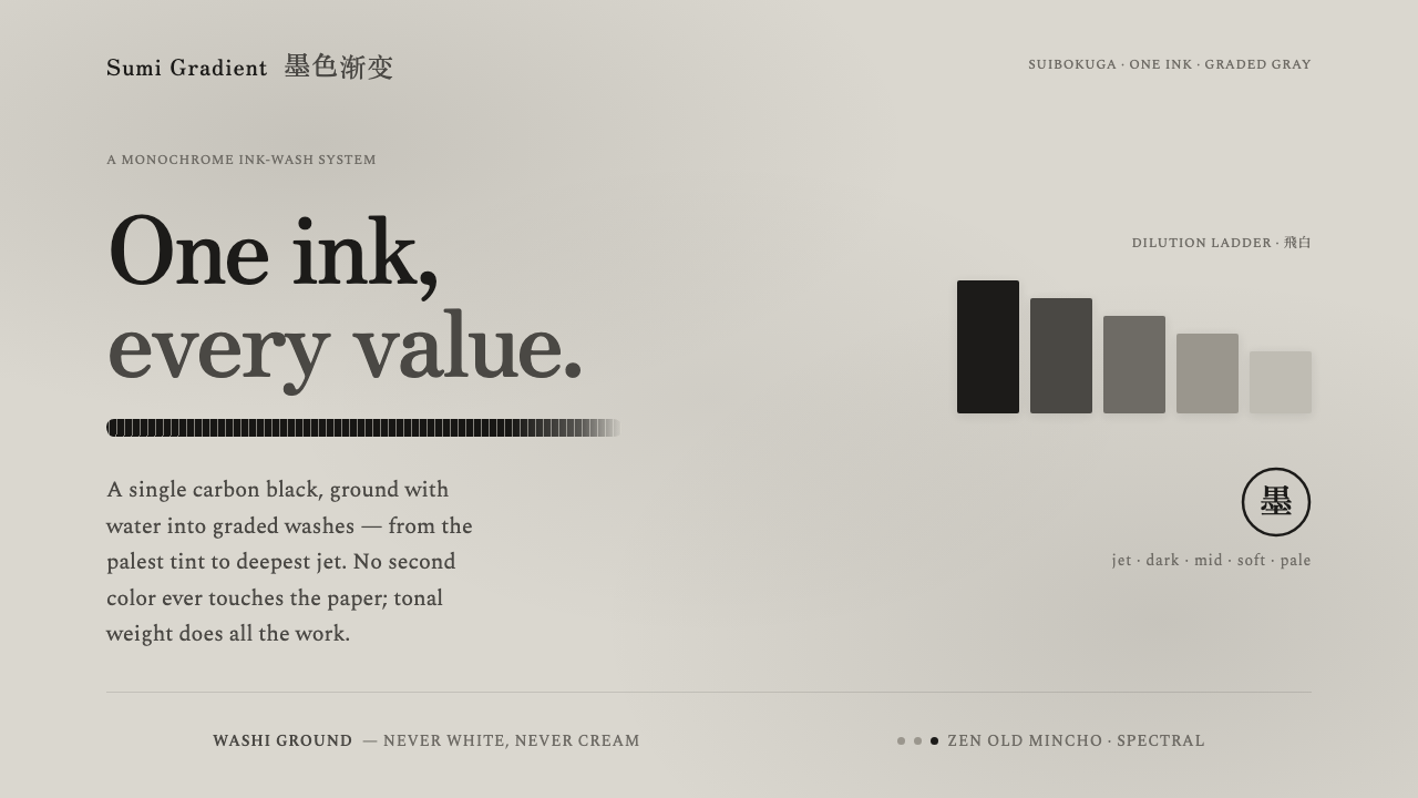 Sumi Grayscale GradientOne ink, every value. A single carbon black diluted into graded grays, marked…