What is Joseon Moon Jar?
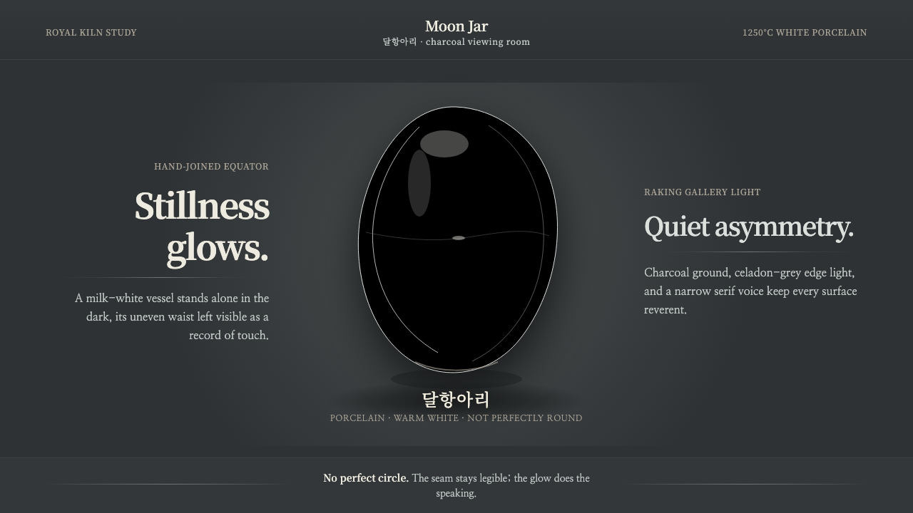
The Joseon moon jar makes imperfection luminous — milk-white porcelain held in charcoal darkness, its hand-joined seam left visible as evidence of making.
Joseon Moon Jar in brief
The Joseon moon jar, or dalhangari, is a white-porcelain vessel from Korea’s Joseon dynasty, especially associated with the 17th and 18th centuries. Its body is made from two hemispheres thrown separately on the wheel and joined by hand around the equator. The result is not a mathematically perfect sphere but a quietly irregular volume whose slight asymmetry records the potter’s touch.
Its visual language is built from restraint: milk-white porcelain, a warm glaze, a charcoal ground, and a single vessel given enough darkness around it to appear almost self-luminous. Where light moves across the uneven curve, the white can shift toward a pale celadon blue-grey. The effect is less decorative than atmospheric, with the object carrying its own presence through surface, silhouette, and interval.
The design system derived from the moon jar treats imperfection as structure rather than error. The seam is not concealed, the curve is not corrected into mechanical symmetry, and the dark background is not filled with supporting ornament. Everything is arranged to preserve the feeling of a handmade object standing alone in quiet space.

Where does Joseon Moon Jar come from?
The moon jar belongs to the Joseon white-porcelain tradition, known as baekja, and its historical setting is Korea during the Joseon dynasty. The surviving form is inseparable from the period’s Confucian austerity aesthetics: visual authority comes from clarity, proportion, material presence, and disciplined omission rather than surface richness or theatrical display.
The making process defines the object’s character. A potter throws the upper and lower portions separately, then joins them by hand at the waist. This construction allows the final body to remain subtly uneven. The visible seam is therefore not an accidental flaw left behind by production; it is the line where separate acts of making become one vessel.
The material reinforces the moon jar’s quiet radiance. Iron-free kaolin produces a clean white porcelain body, while very high firing allows the glaze to settle into a warm milk-white. The surface is not visually flat in the lifeless sense. Its irregular curve changes the way light travels across it, producing gentle shifts toward pale celadon blue-grey wherever the illumination grazes rather than strikes directly.
Modern museum presentation has become part of the design vocabulary associated with the form. Museums commonly isolate moon jars against deep charcoal grounds, allowing the pale vessel to emerge from darkness without visual competition. This presentation is carried into the design system as a near-black stage, a luminous central object, and a surrounding field of silence. The historical vessel and its contemporary display therefore meet through atmosphere rather than imitation.
What defines the Joseon Moon Jar look?
Milk-White Color
The dominant color is a warm, softened white rather than a sharp institutional white. It should feel mineral and tactile, carrying the quiet density of porcelain. Under raking light, the surface may drift toward a pale celadon blue-grey, creating variation without breaking the overall calm. Color is atmospheric, not decorative.
Charcoal Ground
The background is near-black charcoal, deep enough to make the porcelain appear illuminated from within. It is not a theatrical black designed for drama; it is a quiet field that removes distraction. The ground should absorb attention around the vessel while preserving a soft sense of depth.
Hand-Joined Form
The silhouette should read as a rounded vessel assembled by hand, not as a flawless digital sphere. The upper and lower halves can meet with a subtle change of tension at the waist. Curves should feel continuous but never mechanically identical from side to side. The form gains dignity from its controlled irregularity.
Visible Seam
The equatorial seam is a primary visual event. It may be quiet, but it must remain legible enough to explain how the vessel came into being. In interface or editorial applications, a comparable line can divide sections, reveal construction, or mark a transition without becoming a decorative rule.
Raking Light
Light should travel across the curve instead of flattening it with uniform illumination. A restrained highlight can reveal the glaze’s warmth, while a cooler edge suggests the pale celadon shift produced by the changing angle. Depth comes from gradual tonal movement and the relationship between light and darkness, not from glossy spectacle.
Quiet Imperfection
Irregularity is valuable only when it remains quiet. The design should not exaggerate wobble, texture, or asymmetry into a visible effect. A slight deviation in a curve, a seam that does not disappear, or a field that is not perfectly uniform is enough. The principle is presence without performance.

Who shaped Joseon Moon Jar?
The anonymous potters of the Bunwon royal kilns are the central human presence behind the moon jar tradition named in the source material. Their importance lies not in individual celebrity but in the disciplined process preserved by the vessel: forming separate hemispheres, joining them by hand, accepting irregularity, and allowing the final glaze to speak through its material character.
This figure represents the act of building the vessel in separate parts rather than forcing a single mechanically perfect body. The thrower establishes the moon jar’s quiet volume, giving each hemisphere enough independence for the finished form to retain a trace of human adjustment. In the design language, this becomes respect for components that are related but not identical.
The hand joiner is the maker who turns two formed parts into one vessel at the equator. The joining does not erase the history of assembly; it makes that history visible. As a conceptual figure, the joiner stands for transitions that are honest about their construction, where a boundary explains connection instead of pretending that no boundary exists.
The museum display is not a maker, but it is an important figure in the contemporary visual life of the moon jar. By placing the vessel against deep charcoal and giving it visual isolation, the display allows the glaze, seam, and silhouette to become legible. It demonstrates that context can be quiet and still profoundly shape perception.
How do you use Joseon Moon Jar today?
For presentation covers, use the moon jar as a solitary luminous form against a charcoal field. Keep the title quiet and give the vessel enough surrounding darkness to establish reverence without turning the page ceremonial. On content slides, let the visible seam become a structural cue: it can separate a heading from its explanation or mark the point where two ideas meet. Data slides should favor calm, spacious diagrams with tonal shifts that echo porcelain and shadow rather than bright categorical color.
For web dashboards and pricing pages, the system works best when information feels considered rather than urgent. Use the charcoal ground to establish focus, pale porcelain tones for primary surfaces, and a restrained blue-grey variation for secondary states or transitions. Cards should feel like objects placed on a dark stage, with clear edges and quiet depth. Pricing tiers can be distinguished through changes in warmth, illumination, or surface emphasis instead of loud color coding.
For editorial layouts, the moon jar supports essays about craft, material, culture, and deliberate restraint. A large opening image or abstract vessel shape can occupy the dark field, while body text remains calm and closely related to the luminous object. Section breaks can borrow the seam as a thin conceptual boundary. Metadata, captions, and pull quotes should remain subordinate, giving the main text the same spacious isolation as the vessel.
For marketing work, the style is effective when the product promise involves care, tactility, quiet confidence, or a visible human process. Product photography should avoid busy environments and let the object emerge through controlled contrast. Campaign language can focus on making, touch, surface, and the value of what remains imperfect. Calls to action should feel like invitations into the dark field, not interruptions placed on top of it.
The common mistake is treating the moon jar as generic minimalism or as a decorative black-and-white palette. Removing elements is not enough. If the seam disappears, the form becomes an anonymous sphere; if the dark ground becomes glossy or theatrical, the quietness is lost; if irregularity is exaggerated, it becomes a gimmick. The system depends on a specific balance: one handmade form, one deep ground, one legible trace of construction, and enough restraint for light to do the work.

Joseon Moon Jar — FAQ
Is the Joseon moon jar simply a minimalist style?
No. Minimalism describes reduction, but the moon jar system is more specific. It depends on the relationship between handmade irregularity, a visible seam, milk-white porcelain, and a charcoal ground. Remove the material logic and the evidence of construction, and only an empty neutral style remains. The essential quality is not having less; it is allowing the remaining form to carry more meaning.
Should the seam always be shown?
The seam is central because it explains the vessel’s making and protects the design from becoming generic perfection. It does not need to be loud, thick, or visually dominant. It should be legible enough to reward attention, especially when the viewer looks closely. In a digital layout, that may mean a quiet boundary, a shift in surface, or an intentional change in alignment rather than a literal drawn line.
Can this style work on a light background?
It can, but the emotional balance changes. The deep charcoal ground is important because it isolates the pale vessel and makes the glaze seem luminous. A light background can preserve the porcelain palette, but it must introduce another way to create separation, such as generous surrounding space, subtle tonal contrast, or a carefully controlled shadow. Without that separation, the vessel loses its quiet emergence from darkness.
How should irregularity be handled in a digital design?
Irregularity should be restrained and structural. A gently uneven silhouette, a seam that does not align with mechanical precision, or a slight tonal shift across a surface can suggest the handmade origin. The goal is not to add random distortion. Every deviation should feel like a consequence of forming, joining, firing, or light moving across porcelain.
What kinds of products suit the Joseon moon jar system?
It suits products and experiences that value calm, craft, material honesty, cultural depth, and quiet confidence. It can support editorial platforms, cultural institutions, considered product brands, portfolios, and interfaces where focus matters more than constant stimulation. It is less suitable when the product depends on loud urgency, playful abundance, or rapid visual switching. The system works when the surrounding experience is willing to slow down and let one form remain present.
Related design styles
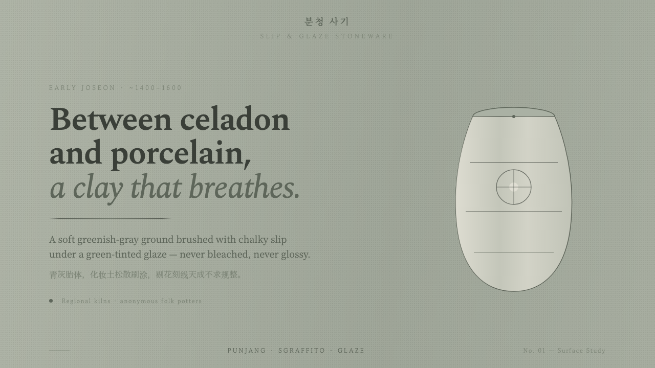 Buncheong Gray Slip WareBetween celadon and porcelain. Greenish-gray clay, chalky slip brushwork, dar…
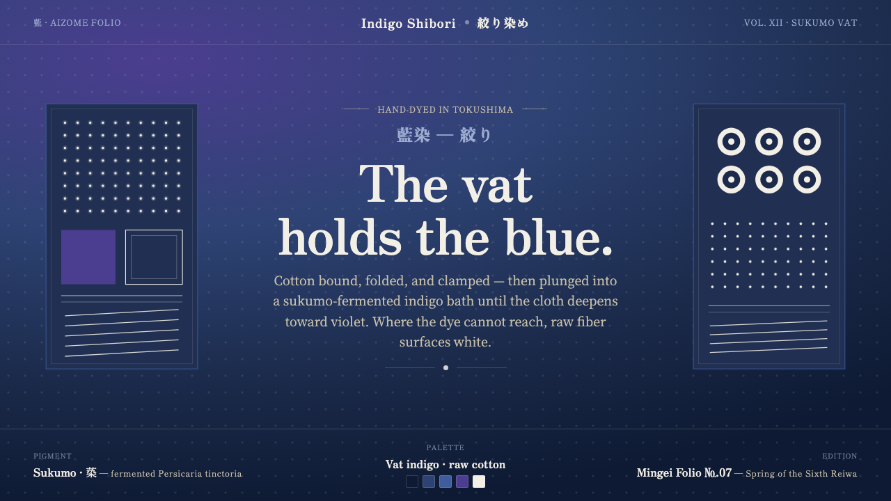 Indigo ShiboriCloth before image. Bound cotton plunged into sukumo vats — raw-white resist…
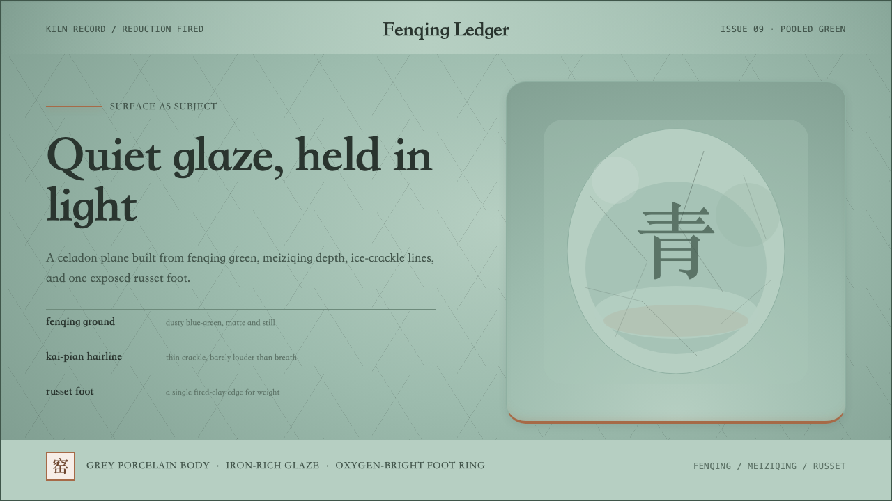 Longquan CeladonQuiet glaze carries the page. Fenqing green, crackle hairlines, and one russe…
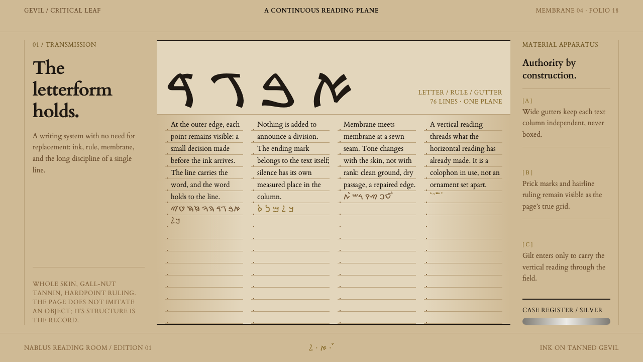 Samaritan TorahContinuity made visible. Iron-gall columns, prick marks, and gilt colophon cr…
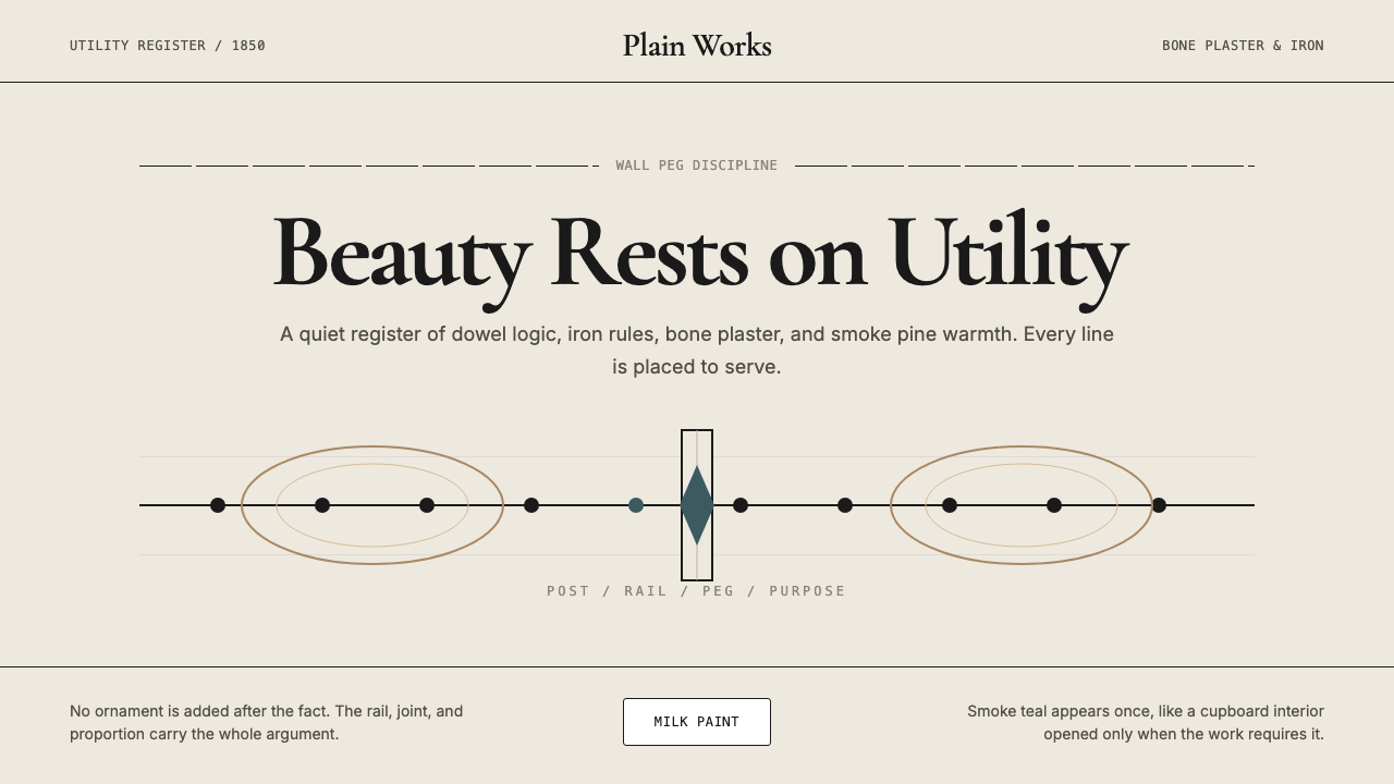 Shaker Furniture 1850Utility becomes beauty. Bone plaster, iron black, smoke pine, and one smoke-t…
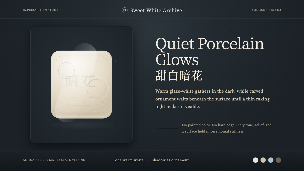 Jingdezhen BlancQuiet porcelain glows. Warm glaze-white on slate reveals hidden anhua incisio…