What is Jingdezhen Blanc?
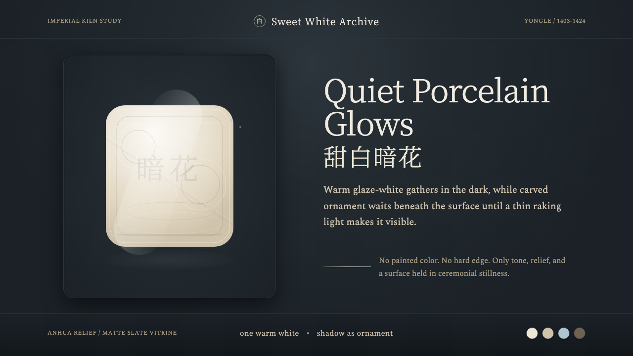
Jingdezhen Blanc is the hush of an imperial kiln — a warm, glowing white porcelain whose only decoration hides inside the glaze itself, waiting for the right light to appear.
Jingdezhen Blanc in brief
Jingdezhen Blanc takes its surface from Yongle-era tianbai ('sweet-white') porcelain, the glaze the Ming imperial kilns perfected at the start of the fifteenth century. The white is never cold or clinical: it is warm and mellow, faintly translucent, closer to the color of rendered fat or new rice than paper or snow. Set against a dark museum-vitrine ground, that warmth reads as a quiet inner glow — the glaze seems to be lit from within rather than lit from outside.
The only ornament is anhua, 'hidden decoration' — floral scrollwork and stylized motifs incised directly into the unfired body before the glaze goes on. Once fired, the carving all but disappears under the thick sweet-white glaze; it surfaces only when light rakes across the surface at a low angle, catching the shallow ridges and throwing them into faint relief. There is no pigment doing this work. Color, in the conventional sense, is nearly absent — what stands in for it is a close-valued, soft-edged gradient of shadow, the same warm white shading by degrees into itself.
Everything about the style argues for restraint. There is no applied pattern, no painted border, no second material competing for attention — one glaze, one carving technique, one dark ground to set it against. The decoration is there to be discovered, not displayed; the whole effect depends on quiet surfaces occasionally, and only occasionally, giving something up.
Where does Jingdezhen Blanc come from?
Jingdezhen Blanc has no post-1900 reference point: its source material predates the modern era entirely, reaching its peak during the Yongle reign (1403 to 1424) of the Ming dynasty. Yongle was the third Ming emperor, the ruler who moved the capital to Beijing and built the Forbidden City, and his reign is also when the imperial kiln system at Jingdezhen, in Jiangxi province, was placed under direct court supervision. Porcelain made for the emperor's own household and for state ritual use was produced nowhere else; Jingdezhen's kilns had access to the finest local kaolin and petuntse clay, and imperial oversight meant potters could refuse anything short of perfect.
Sweet-white glaze sits inside a much longer Chinese tradition of prizing white ware above color. Earlier dynasties had already produced celebrated white ceramics — the ivory-toned Ding ware of the Song dynasty, the pale Shufu ware of the Yuan — but Yongle tianbai pushed the color further toward purity and the body further toward thinness, so that light itself began to pass through the rim and walls of a bowl. Under imperial patronage, with unlimited firing attempts and no commercial pressure to hurry a batch to market, potters could chase a glaze recipe until it consistently produced this particular warm, jade-like white, prized above all decorated wares of its own moment.
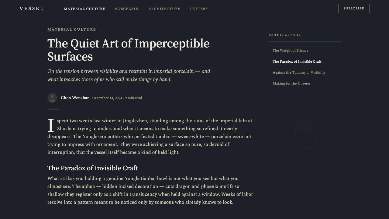
The anhua carving technique that decorates tianbai ware reflects a specific taste: the literati preference for restraint over display. Where later Ming and Qing porcelain would explode into the famous polychrome overglaze enamels and cobalt-blue painting the West came to associate with 'china,' Yongle sweet-white deliberately withheld color altogether. Hiding the decoration inside the glaze, visible only under the right light and to a patient viewer, was itself a kind of connoisseurship — the finest work was not the loudest work, and true refinement declared itself quietly or not at all.
Surviving Yongle tianbai pieces are now scattered among the world's major collections — the Palace Museum in Beijing, the National Palace Museum in Taipei, the British Museum — and museums typically display them under raking, directional light precisely so that the anhua carving becomes visible to visitors who would otherwise see only a plain white bowl. That curatorial choice is arguably where this design style's core visual idea comes from: the object rewards a particular kind of looking, and everything else about its presentation exists to make that reward available.
What defines the Jingdezhen Blanc look?
Glaze color / Sweet-white tone
The defining surface is a warm, mellow white with a faint translucency — never the cold, high-key white of a clinical interior, and never a flat, opaque cream either. Think of the glaze as slightly underlit rather than fully bright: its warmth comes from within the material, not from a light source hitting it.
Anhua hidden relief
Ornament exists only as carving, never as applied pattern or added color. Floral and scrollwork motifs are incised so shallowly that they vanish under flat lighting and reappear only at a raking angle. Any interface or layout drawing on this style should treat decoration the same way: present by default, but requiring the right conditions — a hover state, a scroll position, an angle of attention — to become visible.
Ground / dark vitrine contrast
The sweet-white glaze is always shown against a dark, near-black ground, the way a museum vitrine isolates an object in shadow. This contrast is what makes the white read as luminous rather than merely pale; without a dark field behind it, the glaze loses its glow and becomes ordinary.
Tonal gradation / soft-edged shadow
Where other styles use color to build hierarchy, this one uses gradations of the same warm white shading into soft-edged shadow. Transitions are gradual and diffuse, never hard-edged or abrupt — the opposite of a graphic, poster-like shadow. Depth is suggested the way relief carving suggests depth: gently, and only close up.
Surface translucency / inner glow
Because Yongle glaze was famously thin and pure enough to let light pass through the porcelain body, the surface should always feel like it has depth beneath it — like light is trapped a few layers down rather than sitting on top of an opaque material. Flat, matte-white surfaces without this sense of interior light miss the point of the style entirely.
Restraint / minimal ornament
One glaze, one carving technique, one dark ground — no second decorative system is layered in. This restraint is not minimalism in the reductive, contemporary sense; it is closer to connoisseurship, a taste that treats visible effort and applied decoration as evidence of a lesser hand.
Form
The vessels this glaze historically decorated — stem cups, bowls, small dishes for ritual and imperial table use — favor simple, rounded, unbroken silhouettes. There are no sharp edges or faceted surfaces competing with the glaze; the form exists mainly to hold and present a continuous, unbroken skin of white.
Who shaped Jingdezhen Blanc?
The Jingdezhen imperial kilns of the early Ming operated under direct court supervision, producing wares exclusively for the emperor's household and state ritual use. The potters who perfected the sweet-white glaze recipe worked largely anonymously, refining a formula through repeated firings until it consistently produced the desired warm, faintly translucent white — a level of iterative craft made possible only by the absence of commercial deadlines.
Tianbai, or 'sweet-white,' porcelain reached its definitive form during the Yongle reign (1403 to 1424), the period against which all later Chinese white ware is still measured. It set the template this style draws on directly: a warm, jade-toned glaze decorated only with anhua carving hidden beneath its surface.
Jingdezhen's status as China's ceramic capital rests on a rare combination of natural resources — fine local kaolin and petuntse clay — and a concentration of specialized labor that no other kiln site could match. Its centrality to Chinese and, later, global porcelain production made it the natural site for the Ming court to locate its imperial kilns.
The broader administrative system that oversaw imperial kiln production graded and destroyed any piece falling short of the standard required for court use, a quality-control regime with no commercial parallel. That system is indirectly responsible for the uniformity and refinement associated with Yongle sweet-white ware today.
How do you use Jingdezhen Blanc today?
Because its visual logic depends on material quality rather than pattern or color, Jingdezhen Blanc transfers unusually well into premium, luxury, and quiet-brand contexts — anywhere a product wants to communicate confidence without shouting. It reads as expensive by implication: the assumption a viewer makes about a warm, glowing white with barely-visible carving is that a great deal of care went into producing something this understated.
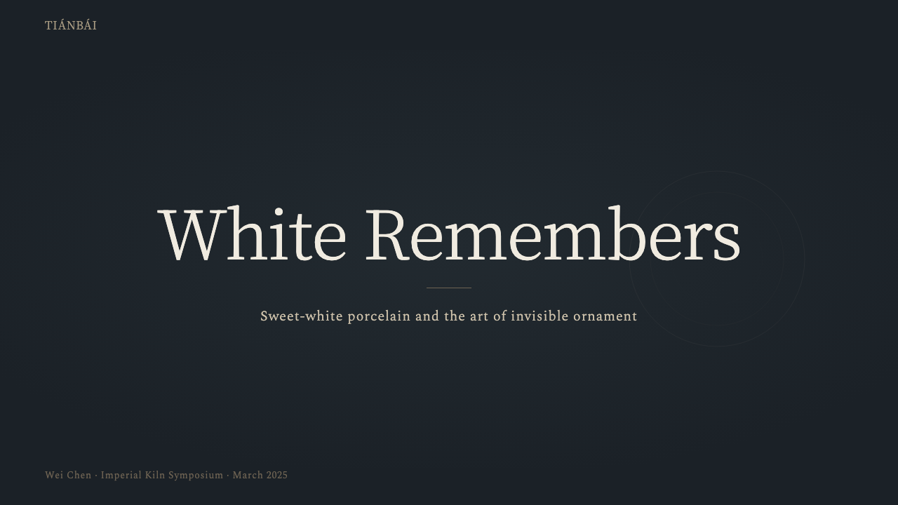
On presentation slides, the style suits a cover treatment built around a single warm-white panel or shape set against a near-black field, with a title in restrained, quiet type rather than bold display lettering. Content slides should keep the same discipline: one warm off-white background, one dark accent, and any supporting imagery treated as if lit from a low angle so it picks up gentle, gradient-based shadow rather than hard graphic shapes. Data should be presented plainly, letting whitespace and tonal contrast — not color-coding — carry the hierarchy.
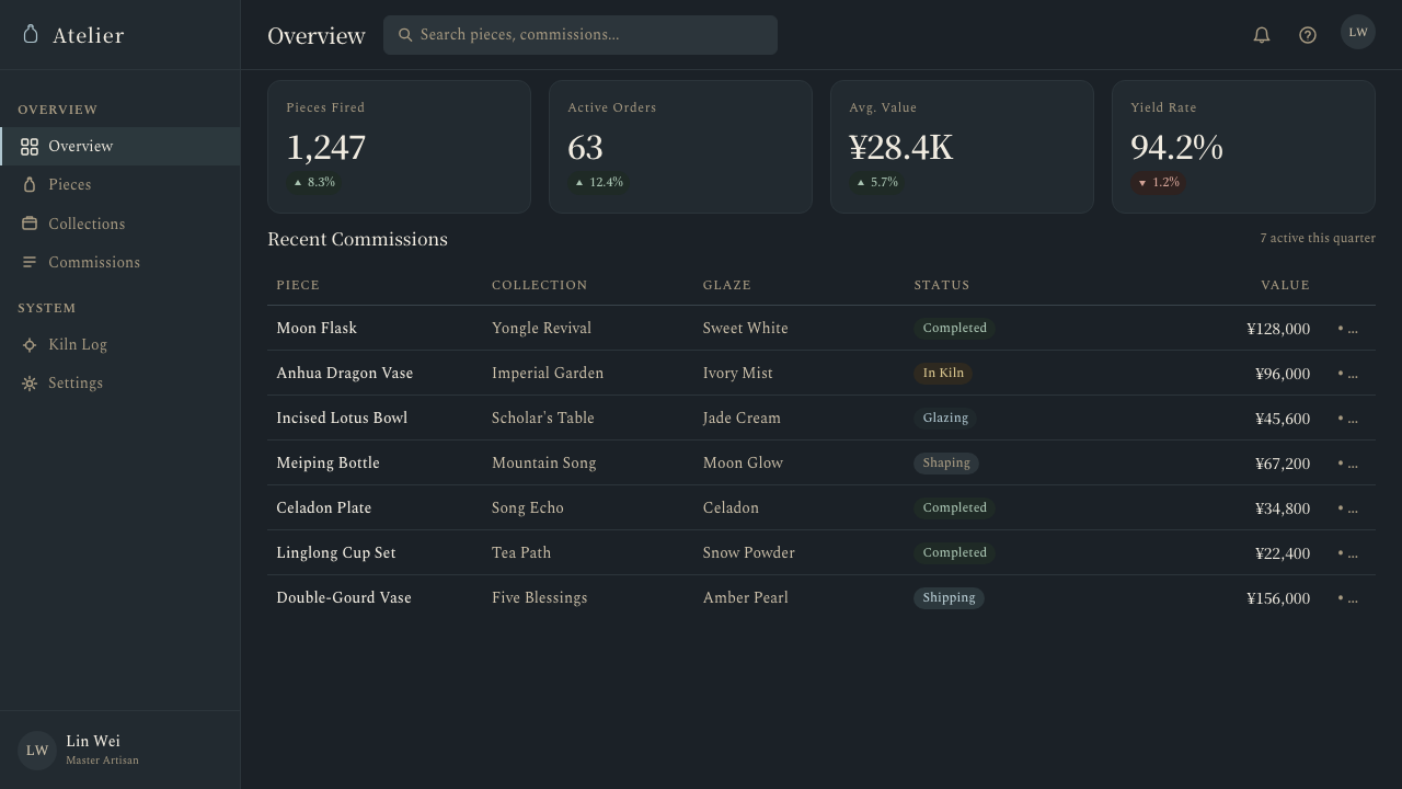
In web interfaces, the style favors dashboards and pricing pages that want to read as premium rather than merely clean. A near-black or deep charcoal ground, warm off-white content panels, and soft, wide, low-opacity shadows in place of hard-edged card shadows all reinforce the glaze-and-vitrine relationship at the heart of the style. Any decorative flourish — an icon, a divider, a background pattern — should behave like anhua carving: present in the markup, but nearly invisible until the user's attention (via hover, focus, or scroll) catches it at the right angle.
For editorial and marketing work, the style rewards slow reveals over immediate spectacle. A product photograph, hero image, or pull-quote can sit on a warm white field with a dark surrounding frame, echoing the vitrine; type should stay quiet and let the material — the imagery, the whitespace, the gradient — do the persuading. This is not a style built for urgency or a hard call to action; it is built for a viewer willing to look twice.
The most common mistake is making the white too stark or too cold — reaching for a bright, high-key, paper-white surface instead of the warm, mellow tone the style depends on, which instantly reads as clinical or cheap rather than refined. The second most common mistake runs the opposite direction: over-decorating, adding visible patterns, icons, or colored accents where the entire point of anhua is that the decoration should be barely there, discoverable rather than displayed. Both mistakes replace a quiet, considered surface with something that announces itself, which defeats the style's actual argument.
Jingdezhen Blanc — FAQ
How do I keep the white warm instead of cold or clinical?
Bias the white toward a faint warmth — closer to the color of cream, bone, or new rice than pure paper-white — and always place it against a dark ground rather than isolating it on its own. Warmth and contrast are what make the glaze read as glowing rather than sterile; a stark white with no dark field around it will read as a hospital interior rather than an imperial glaze.
How much hidden decoration should I actually add?
Very little, and it should never compete with the surface for attention. Real anhua carving is invisible under normal, flat viewing conditions and only appears under raking light or close inspection — the digital equivalent is a subtle texture, a barely-there pattern revealed on hover, or a gradient that shifts slightly with scroll position. If the decoration is visible at first glance, it has already broken the rule the whole style is built on.
Does this style work on a light background, or does it require a dark ground?
The dark ground is close to essential. The entire visual argument depends on the contrast between a glowing warm-white surface and a near-black field around it, the way a museum vitrine isolates an object in shadow. On a fully light background, the glaze loses the contrast that makes it read as luminous, and the style collapses into a generic off-white minimalism with none of its original character.
Is this just a version of minimalist or Muji-style design?
It shares minimalism's restraint but for a different reason. Contemporary minimalism strips ornament for efficiency and function; Jingdezhen Blanc hides its ornament instead of removing it, because the historical taste it draws on treated visible decoration as a lesser achievement than decoration a viewer had to work to find. The result looks similarly quiet, but the underlying logic is closer to connoisseurship than to efficiency.
Can this style work for products outside the luxury category?
Yes, though it takes more discipline to pull off. The style's core ideas — warmth over sterility, restraint over decoration, quality communicated through material rather than color — can suit any product that wants to feel considered rather than loud, from professional tools to editorial platforms. What doesn't transfer well is anything that needs to communicate urgency, playfulness, or immediate visual excitement, since the style's entire mechanism is a slow, quiet reveal.
Related design styles
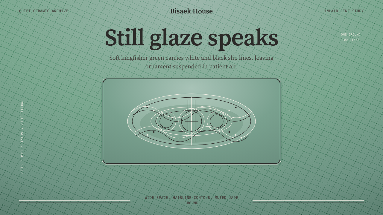 Goryeo Celadon 高麗青瓷Stillness carries ornament. Bisaek jade ground holds white and black hairline…
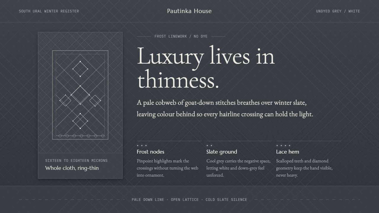 Orenburg Goat-Down Gossamer ShawlLuxury in thinness. Pale Cormorant type and down-lace lines breathe on Ural s…
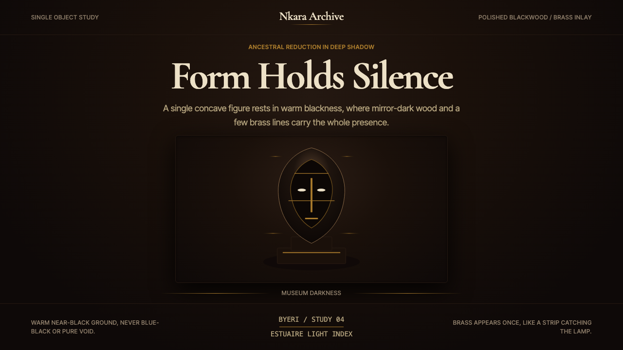 Gabonese Fang Mask & ByeriStillness has weight. Mirror-black forms, brass hairlines, and museum shadow…
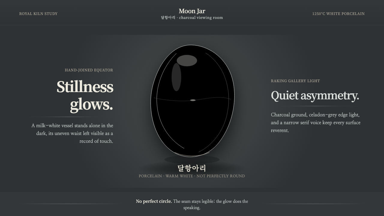 Joseon Moon JarQuiet imperfection glows. Milk-white porcelain floats on charcoal with a visi…
 Tibetan Mani StonePrayer made permanent in stone. Sunk-relief glyphs incised into cool slate, p…
 Venetian Plaster WhiteQuiet luxury in cool shadow. Bodoni type rests on clouded gray plaster planes.