What is Sumi Grayscale Gradient?
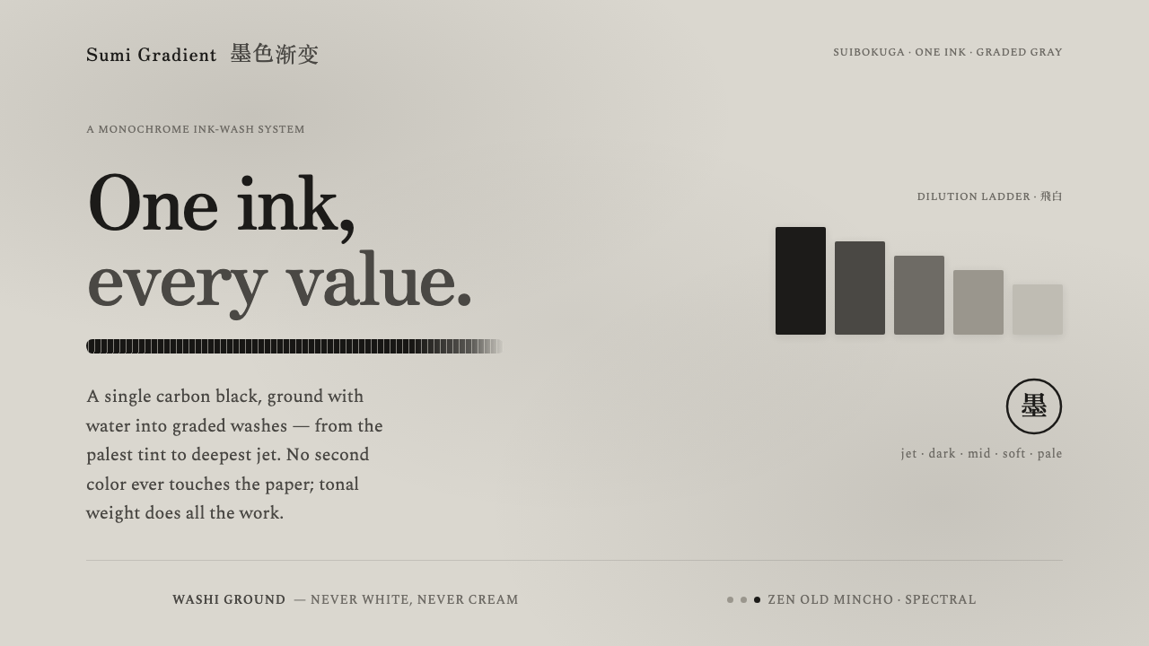
One black ink becomes an entire atmosphere: warm gray washes, breathing paper, and a single dry-brush gesture held against silence.
Sumi Grayscale Gradient in brief
Sumi Grayscale Gradient builds its visual language from carbon black diluted across a continuous range of gray. The palest wash and the deepest jet belong to the same family, so hierarchy comes from value, opacity, and density rather than hue. The result is monochrome without being stark: quieter than black and white, warmer than a purely neutral interface, and close in feeling to ink settling into rag paper.
Its ground is a warm-neutral pale gray that recalls washi carrying a faint overall wash. It is neither bright white nor cream, and that distinction matters. The surface feels already touched by material before any content appears. Against it, reserved negative space becomes active rather than empty, allowing a decisive black stroke, a heading, or a dark block to register as an intentional mark.
The style is defined as much by behavior as by palette. Edges may bleed softly where wash meets paper, while a dry brush leaves broken striations and visible resistance. Typography uses a restrained serif with brush-like edges. Every surface remains matte and layered, as though built from overlapping ink rather than illuminated effects.
Where does Sumi Grayscale Gradient come from?
Sumi Grayscale Gradient is positioned as a contemporary practice from 1990–2010, rooted in the classical ink traditions of Japan. Its historical character therefore comes from translation rather than reconstruction: the source is the discipline of suibokuga and sumi-e, while the destination is modern monochrome graphic work. The style carries the atmosphere of ink painting into a visual system that can organize type, surfaces, and interface states.
Suibokuga and sumi-e provide the central premise: black ink is not a single flat color but a field of possible values. Dilution creates pale washes, accumulated ink creates depth, and the mark records the pressure and movement of the brush. Sumi Grayscale Gradient abstracts that premise into a consistent language, preserving the relationship between material, gesture, and absence while reducing the palette to its most essential source.
The style also belongs to the wider movement of modern monochrome ink graphic work and minimalist East Asian calligraphy. These references explain why the visual system feels both composed and bodily. It seeks order, but it does not erase the hand. It simplifies the palette, but it keeps evidence of contact: striation, bleeding, uneven deposit, and the difference between a wet wash and a dry mark.
Its identity is completed by the tension between contemporary restraint and paper-based tactility. A page or screen should feel quiet enough for a single gesture to matter, yet structured enough that gray value can carry information. The result is not an imitation of a historical painting. It is a contemporary monochrome language that borrows ink logic, calligraphic economy, and the expressive authority of deliberate emptiness.
What defines the Sumi Grayscale Gradient look?
Grayscale Value
Every visual distinction comes from diluted or concentrated black ink. Pale washes establish background hierarchy, middle grays support secondary information, and deep black reserves emphasis for decisive marks and primary type. The palette is broad in value but narrow in hue, producing a calm system in which contrast feels weighted rather than colorful.
Warm Paper Ground
The background is a warm-neutral pale gray, evoking washi under a faint wash. It avoids the clinical brightness of white and the decorative warmth of cream. This ground gives the entire composition a pre-existing material presence, so dark marks appear deposited onto a surface rather than placed inside an empty digital field.
Dry-Brush Gesture
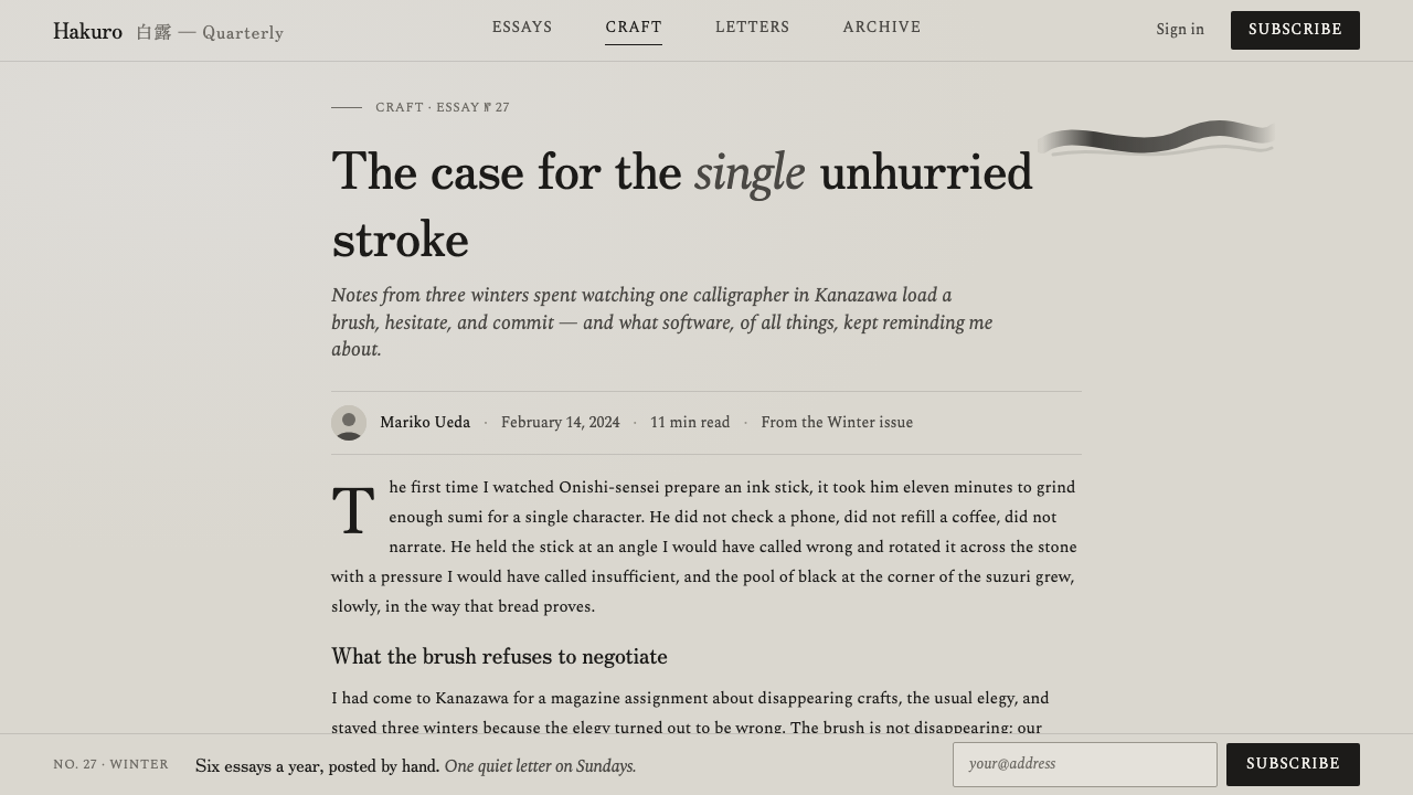
A decisive dry-brush stroke acts as the signature gesture. Its broken deposit, visible drag, and uneven edge create a point of force within otherwise reserved space. The stroke should feel intentional and singular, not like a repeated texture pasted across every component. Its authority comes from restraint.
Brush-Edge Serif
Typography uses a restrained serif whose edges suggest brush contact without becoming theatrical calligraphy. Letterforms remain readable and composed, while slight irregularity keeps them connected to the material world of ink and paper. Type should support the atmosphere through quiet authority, not compete with the gesture.
Bleed and Striation
Texture comes from the contrast between soft wash edges and dry-brush striation. Bleeding suggests moisture absorbed into paper; striation exposes the brush's resistance and the unevenness of contact. Together they make the monochrome surface feel layered, matte, and breathable rather than mechanically shaded.
Reserved Negative Space
Empty space is treated as part of the mark-making system. It gives the dry stroke room to resonate, separates values without relying on borders, and allows a pale wash to remain perceptible. Crowding the composition weakens the style because the visual argument depends on the relationship between what is placed and what is deliberately withheld.
Who shaped Sumi Grayscale Gradient?
Contemporary sumi-e practitioners represent the living bridge between inherited ink discipline and present-day visual practice. Their relevance here is not a specific signature or biography, but an approach: allowing diluted black to carry atmosphere, preserving the evidence of the brush, and treating restraint as an expressive choice.
Suibokuga ink-painters supply the foundational vocabulary of wash, value, brush pressure, and breathing space. Their contribution to this style is the understanding that monochrome does not mean uniform. A limited material can produce a wide emotional and spatial field when its density and movement remain visible.
Modern monochrome ink graphic designers translate painting logic into organized communication. They show how a dry mark, a gray field, and a controlled serif can structure information without abandoning tactile presence. In this lineage, atmosphere is not an illustration added after the layout; it is part of the layout's operating logic.
How do you use Sumi Grayscale Gradient today?
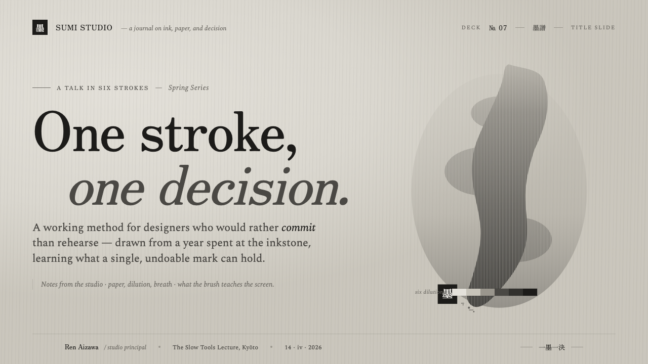
For presentation slides, use the warm-gray ground as a continuous field across the deck. A cover can hold the title in restrained serif type with one decisive dry-brush stroke placed against generous negative space. Content slides should let gray value establish hierarchy: darker type for the main statement, quieter washes for context, and a single strong mark to identify a transition. Data slides benefit from ink-like fields and restrained tonal steps rather than colorful chart palettes.
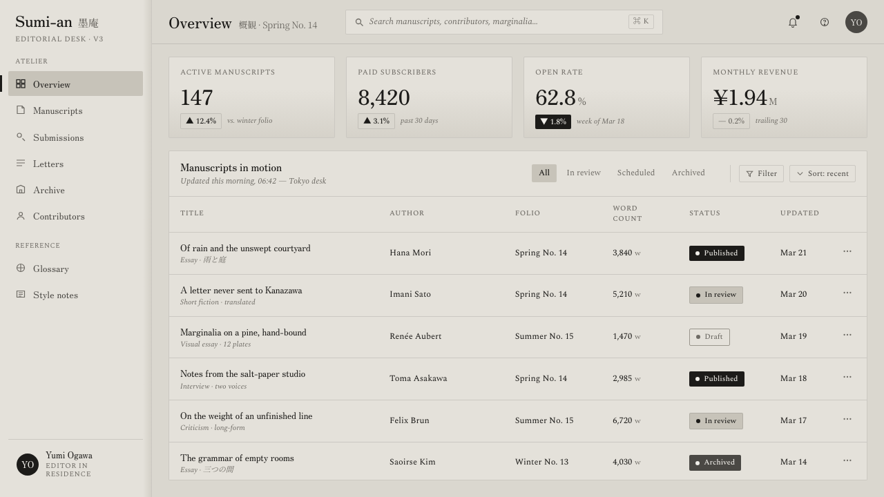
For web interfaces, the style suits dashboards and pricing pages that need calm authority and clear scanning. Keep the ground warm and pale, use deep black for primary text, and let graded grays separate panels, states, or levels of importance. Borders should feel like measured ink rules, not glossy chrome. Cards can use tonal layering instead of artificial depth, while interactive emphasis should arrive through a darker value or a controlled brush gesture rather than a bright accent hue.
For editorial and marketing work, build a page around the relationship between a quiet field and one expressive intervention. Articles can pair a narrow, composed text measure with generous margins and occasional ink-wash blocks for notes or quotations. Marketing pages can use the dry-brush stroke as a recurring signature, but each appearance should feel placed rather than repeated. Product imagery should remain matte and tactile, with tonal treatment that preserves the sensation of paper and ink.
For identity systems, the style is strongest when the mark, type, and surface share the same material logic. A wordmark can use the brush-edge serif while supporting information remains restrained and highly legible. Packaging, posters, and campaign cards can shift from pale wash to deep black to create rhythm without introducing unrelated color. The system feels coherent when every contrast appears to come from the same ink source.
The common mistake is treating grayscale as permission to flatten everything into identical gray boxes. Sumi Grayscale Gradient depends on difference: pale wash against paper, concentrated black against open space, soft bleed against broken dry brush. Another mistake is scattering brush texture everywhere. The signature stroke should remain rare and decisive; if every element behaves like a gesture, no gesture retains authority.
Sumi Grayscale Gradient — FAQ
Is Sumi Grayscale Gradient simply a black-and-white style?
No. Black and white usually imply a sharper binary contrast, while this style depends on a continuous field of diluted gray values. Its ground is warm-neutral and pale rather than bright white, and its surfaces carry wash, bleed, and dry-brush evidence. The defining experience is not the absence of color alone, but the sense that every value comes from one material source.
Why must the background avoid both bright white and cream?
The warm-neutral pale gray creates the specific material atmosphere of washi carrying a faint ink wash. Bright white would make the system feel clinical and digital; cream would introduce a stronger decorative warmth. The pale gray sits between those readings, giving the page a quiet, already-touched surface on which ink can accumulate.
How should the dry-brush stroke be used?
Use it as a deliberate focal gesture, usually against reserved negative space. Its broken texture and uneven edge should establish emphasis or rhythm, not become a generic background pattern. The stroke works because it is rare enough to carry attention. Repeating it across every section turns a signature into wallpaper and removes its expressive force.
Can another accent color be added?
Adding another hue would change the central premise of the style. Its identity depends on a single black source moving through gray values, with the warm-neutral ground providing atmosphere rather than color contrast. If an application requires stronger emphasis, use value, density, scale, placement, or the dry-brush gesture before introducing a new hue.
Where does this style work best, and where can it struggle?
It works best where calm focus, material sensitivity, and disciplined hierarchy are desirable: editorial layouts, thoughtful marketing, presentation systems, dashboards, and pricing pages. It can struggle when a product depends on bright chromatic coding, glossy energy, or a highly playful surface. The key question is whether the product benefits from quiet tonal structure and a deliberate sense of touch.
Related design styles
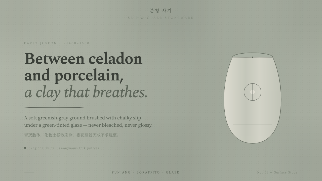 Buncheong Gray Slip WareBetween celadon and porcelain. Greenish-gray clay, chalky slip brushwork, dar…
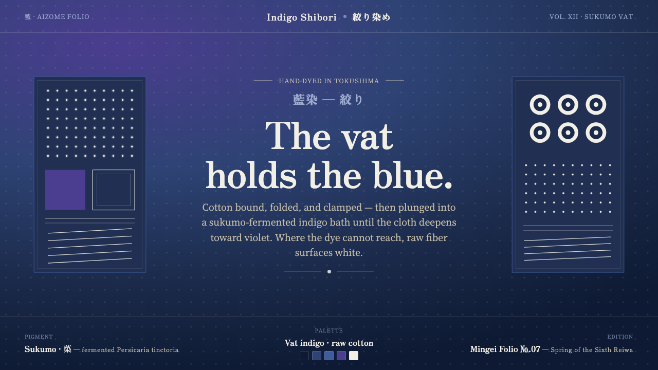 Indigo ShiboriCloth before image. Bound cotton plunged into sukumo vats — raw-white resist…
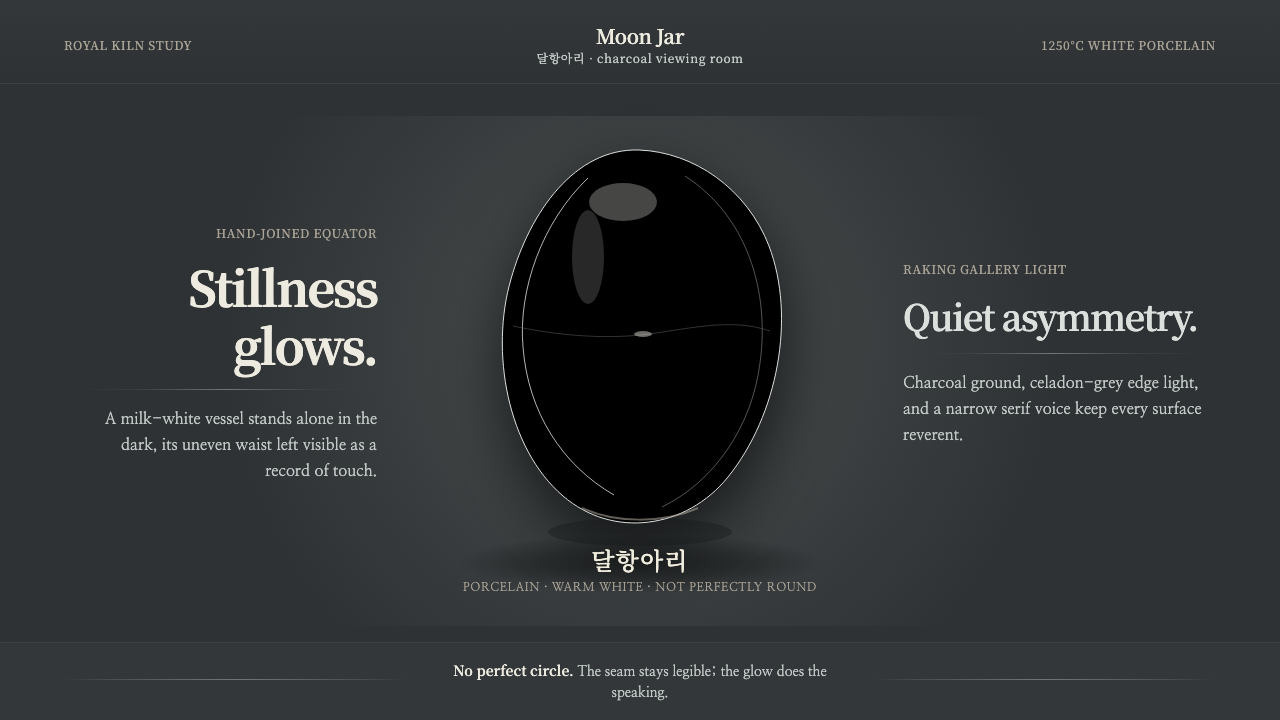 Joseon Moon JarQuiet imperfection glows. Milk-white porcelain floats on charcoal with a visi…
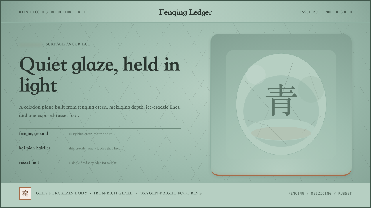 Longquan CeladonQuiet glaze carries the page. Fenqing green, crackle hairlines, and one russe…
 Shaker Furniture 1850Utility becomes beauty. Bone plaster, iron black, smoke pine, and one smoke-t…
 Estonian Haapsalu Lace ShawlQuiet craft, held in silver light. Cormorant type meets nupp dots and velvet…