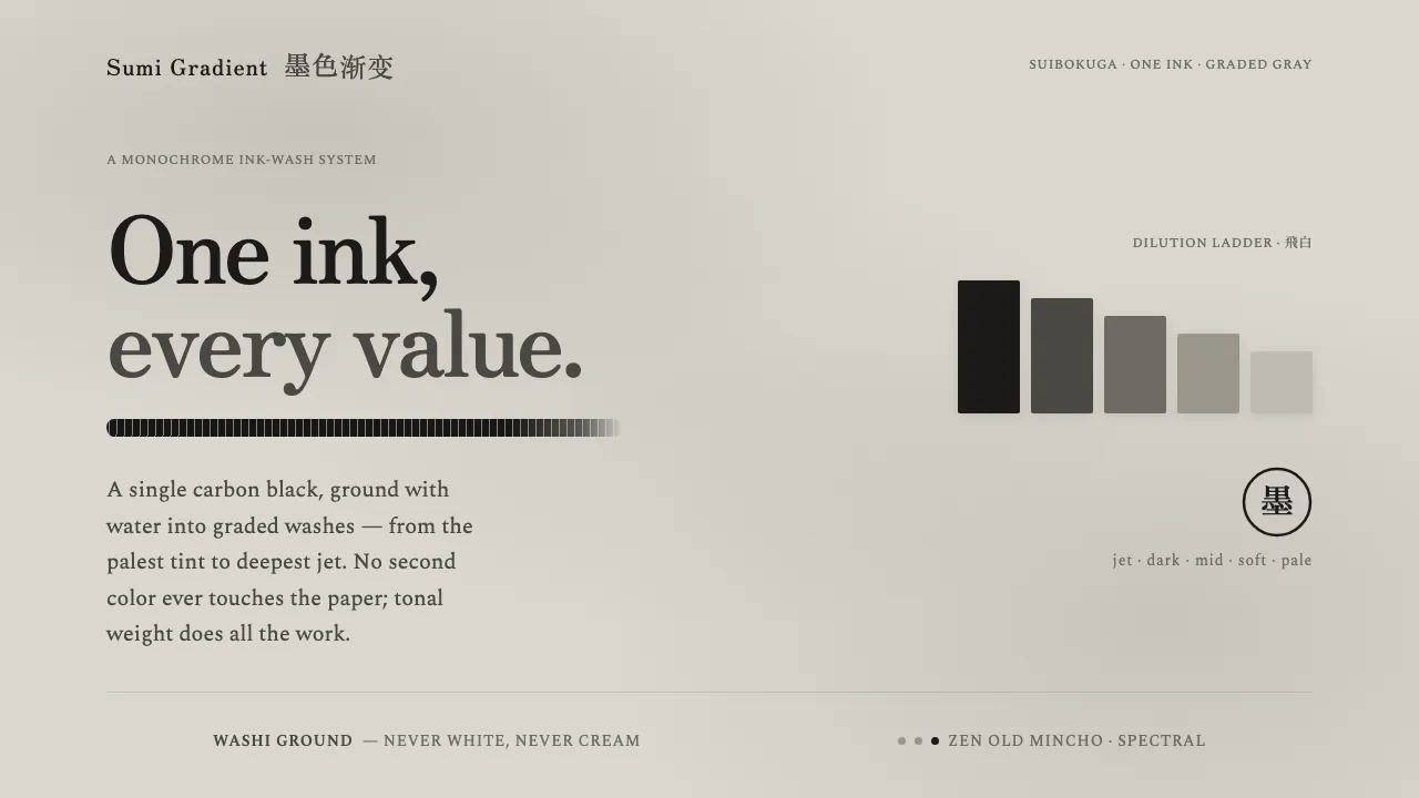
About Sumi Grayscale Gradient
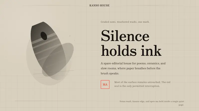
Sumi Grayscale Gradient builds an entire visual language from a single black ink, diluted into graded gray washes from the palest tint to the deepest jet. Rooted in the suibokuga and sumi-e ink-painting tradition of Japan, it reads as a sheet of washi carrying a faint overall ink wash — a warm-neutral pale gray ground, never bright white, never cream.
The signature gesture is one decisive dry-brush black stroke against reserved negative space. Type is a restrained brush-edge serif. Texture lives in dry-brush striation and soft bleeding wash edges, and every surface behaves like layered ink on rag paper — matte, breathing, and unmistakably monochrome.
- Origin
- East Asia — Japan (suibokuga / sumi-e tradition)
- Era
- 1990–2010 (contemporary practice rooted in classical suibokuga / sumi-e)
- Key figures
- Contemporary sumi-e practitioners · Suibokuga ink-painters · Modern monochrome ink graphic designers
- Movements
- Suibokuga / sumi-e ink-wash painting · Modern monochrome ink graphic work · Minimalist East Asian calligraphy
Sumi Grayscale Gradient design spec
Colors
Typography
The other 11 sections — buttons, cards, spacing, motion, techniques and more — open once you unlock. Download the DESIGN.md or send it to your AI in one click. Unlock once, yours forever.
Sign up nowStyles similar to Sumi Grayscale Gradient
Also inspired by art & artists, with a close feel.
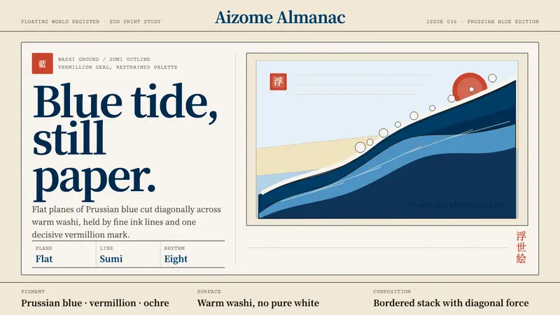 Edo Ukiyo-e (Hokusai)Flat power on paper. Prussian blue diagonals and vermillion seals cut across warm washi.
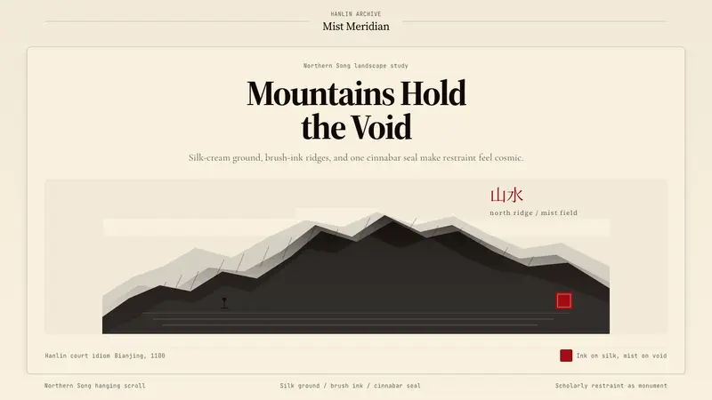 Song Landscape Painting (1100)Monumental calm. Silk-cream ground, ink ridges, and a cinnabar seal.
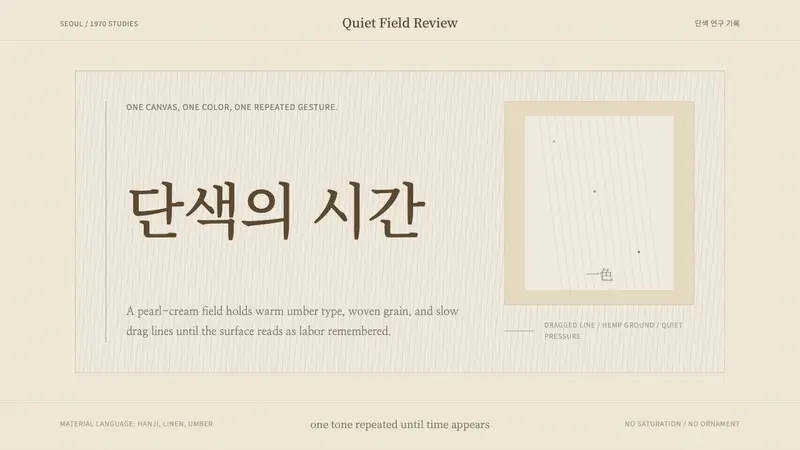 Korean Dansaekhwa MonochromeLabor becomes stillness. Umber serif type and drag lines on pearl cream.
 Sumi-e Ink WashRestraint carries weight. Washed black ink floats on oatmeal washi, anchored by one red seal.