What is Gotland Picture Stone?
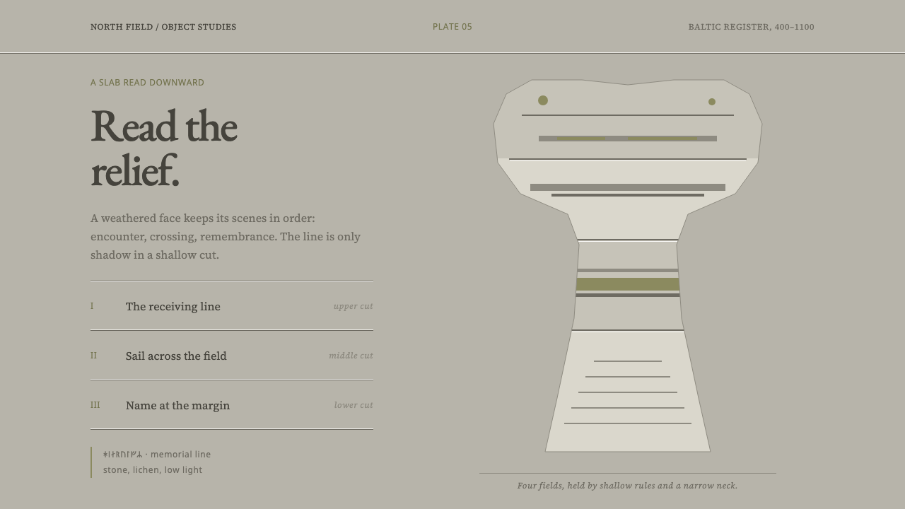
Gotland's picture stones tell their stories in shallow carving on weathered limestone, and this style borrows their patience — pale grey surfaces, low contrast on purpose, and meaning that emerges slowly from stacked horizontal registers.
Gotland Picture Stone in brief
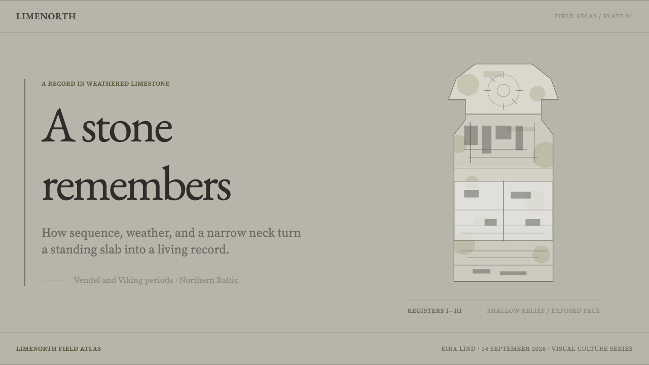
Gotland's picture stones are limestone slabs raised across the Baltic island during the Vendel and Viking periods, cut to a mushroom silhouette with a narrow neck. Their faces are divided into stacked horizontal registers of shallow relief, each carrying a scene: an eight-legged horse met by a figure with a drinking horn, a longship whose sail is nearly as wide as the hull is long. Runic inscriptions run along the edges. As a design reference, they are an object lesson in storytelling that does not shout.
The central idea is that meaning should emerge, not be announced. The images on the stones are carved shallowly and were meant to be read as the light moved across them, so they take some effort to see. The design system keeps that quality on purpose. It uses low contrast, a restrained palette taken from the stone as it survives today, and hierarchy created by dividing space into bands, not by adding weight or colour intensity.
Visually, the style is quiet and patient. A pale, lichen-mottled grey ground carries lines that are only slightly darker than the surface. Sections are stacked as horizontal bands, like the registers of a stone. Colour is almost absent, with a little yellow-green lichen and, as a clearly marked modern device, small amounts of red and black. The effect is of an object that has been outdoors for a very long time and is still telling its story.
Where does Gotland Picture Stone come from?
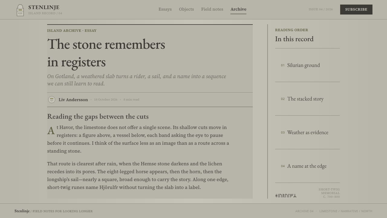
The picture stones belong to Gotland, the Baltic Sea island in Sweden, and to the Vendel and Viking Age, roughly 400 to 1100 CE. They were raised across the island over those centuries, and the source describes them as limestone slabs cut to a mushroom silhouette: broad at the top, narrowing to a neck. The shape matters to the design system as much as the imagery does, because it is a form that organises the surface before a single figure is carved on it.
Their faces are organised as horizontal registers, each a band of shallow relief. In the examples the source mentions, one band holds an eight-legged horse met with a drinking horn, and another holds a longship with a sail nearly as wide as the hull is long. The source lists Norse ship-of-the-dead iconography among the traditions the style draws on, and the longship belongs in that company. The registers establish a reading order: the eye moves from band to band, taking each as a unit. This is the discipline the design system borrows when it divides a page into stacked sections.
Along the edges run short-twig runic inscriptions, one of them an alphabet, another a name. The source lists Hjôrulfr among its key figures, and a name cut in stone is a signature in the most literal sense. Short-twig runic epigraphy is one of the movements the style belongs to, and the edge inscriptions suggest a principle for interface text as well: small, compact, set at the margins, and quietly readable once you look for it.
What we see today is the stone as it survives, not as it first looked. The picture stones were classed into a type series established in 1941 and 1942, and the source names Sune Lindqvist among the key figures. The red and black visible on stones in museums are twentieth-century reading colours, added to make the carving easier to see. The design system does not try to reconstruct a lost original. It takes its palette from the weathered surface and uses the reading colours only sparingly, as an openly modern device.
What defines the Gotland Picture Stone look?
Weathered Limestone Grey
The ground is a pale grey taken from limestone that has stood in the open for centuries. It is not perfectly even: lichen mottles it and frost wears it. In a layout this means a light, slightly textured neutral that fills the whole page, and sections are distinguished by tiny shifts in the grey rather than by boxes or fills. Everything else is built from it.
Low Contrast on Purpose
Ornament and illustration are only slightly darker than the ground, so they must be looked at to be seen. The restraint is deliberate: the imagery emerges with the light, and the design does not pretend otherwise. This applies to decoration and structure, not to reading. Body text should stay comfortably legible, and the quietness belongs to the ornamental layer.
Horizontal Registers
The page is divided into stacked bands, each holding one scene, one idea or one data block. Bands are separated by shallow lines or small changes in tone, and each is read as a unit before the eye moves to the next. This structure replaces emphasis by weight. Importance comes from where a band sits and how much room it is given, not from making something bold or bright.
Mushroom Silhouette
The stones are broad at the top and narrow toward a neck, a shape that suggests a crown and a stem. In the design system this appears as a preference for containers, headers and framing devices that are wider at the top and narrower below, giving the page a gentle taper. It is a subtle outline rather than a literal icon, and it ties the layout to the form of the original objects.
Shallow Relief Lines
Lines read as carved rather than drawn: they are even, slightly darker than the surface and without sharp highlights. Shadows, where they are suggested at all, are minimal and soft, like the faint edge of a shallow cut. The impression is of imagery pressed into the surface, not placed over it. Figures are simple and flat, with outlines doing most of the work.
Lichen and Marked Reading Colours
A muted yellow-green, the colour of lichen on stone, appears in small patches as the only natural accent. Red and black, the reading colours added to stones in the twentieth century, are used sparingly and treated as a visibly modern device: for example to highlight a single key item, never as a base palette. Marking them as modern is honest about what they are.
Edge Inscriptions
Short-twig runes run along the stone's edges, one line an alphabet and one a name. They are compact, set at the margin and clearly secondary to the picture field. In a layout, the equivalent is metadata set in the margins: labels, dates, captions and attributions, small and tidy, set apart from the main bands, with the quiet authority of a signature on the side of an object.
Who shaped Gotland Picture Stone?
Sune Lindqvist is named in the source among the key figures, and the source records that the picture-stone type series was established in 1941 and 1942. His place in the list is a reminder that part of what we know about the stones is a product of twentieth-century classification, which sorted a large body of carvings into types and made them legible as a group.
Hjôrulfr is a personal name that the source lists among its key figures, and it stands for the way that individual people appear on these stones: as names cut in short-twig runes along the edges. The source gives no further biography, and this article adds none. What the name shows is that the carved surface carried both a story and, at its margin, someone's mark.
The carvers who cut the stones during the Vendel and Viking periods are not named in the source, but their decisions define the style: a mushroom silhouette, stacked registers, shallow relief and edge inscriptions. They worked in limestone, a material that weathers visibly, and the design system takes its palette from what centuries of weather have made of their work.
The edges of the stones carry short-twig runic inscriptions, including one alphabet and one name. The source treats short-twig runic epigraphy as a movement of its own, and in the design system it becomes the model for compact marginal text: neat, small, set apart from the picture field, and part of the object rather than an added label.
How do you use Gotland Picture Stone today?
The Gotland Picture Stone style is a good fit for work that tells a story slowly and wants to feel serious, timeless and unhurried. Museums, archives, heritage and cultural projects, long-form journalism, history and educational products, and any brand that prefers to be discovered rather than announced will find in it a ready vocabulary. It is weaker where urgency, high energy or strong calls to action are the priority.
For presentation slides, the cover can be a pale grey field with a title set clearly and a thin band of lichen colour along one edge. Content slides use stacked registers, one idea per band, with captions placed along the margin. Data slides suit timelines, comparisons and small multiples laid out in horizontal bands, with fine, low-contrast gridlines and one marked highlight in the reading colour, red, to show the single value that matters.
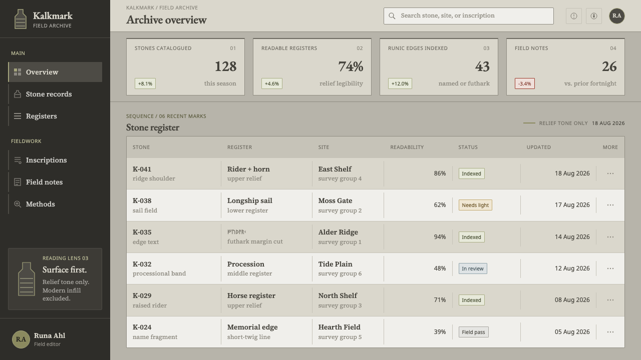
For web interfaces, treat the page as a stone. Long pages work as a sequence of full-width bands, each separated by a shallow line and given its own breathing room. Dashboards can organise panels into horizontal rows rather than a card grid. Pricing pages can stack tiers as registers. Navigation and metadata belong at the edges. Keep text contrast at a comfortable reading level, and spend the low-contrast treatment on borders, illustrations and decoration.
For editorial and marketing work, the style supports slow reveal. Sections can appear gently as the reader scrolls, as if light were moving across the stone, and illustrations can be line drawings in a tone just darker than the page. Long articles can use bands to mark chapters, with a short marginal inscription for dates or credits. Marketing pages should let the story build band by band instead of opening with a hero shout.
The most common mistake is to boost contrast, because the quiet look can seem unfinished; it is not, and heavy weights or saturated colours destroy the effect. Another is to use red and black as the main palette, forgetting that they are marked modern reading colours. A third is to equate the stones with a generic Viking look: fantasy runic typefaces, axes, dragons and parchment textures have no place here. This style is about weathered limestone and patient reading.
Gotland Picture Stone — FAQ
What is a picture stone?
A picture stone is a limestone slab raised on Gotland during the Vendel and Viking periods, cut to a mushroom silhouette with a narrow neck. Its face is divided into stacked horizontal registers of shallow relief showing scenes such as an eight-legged horse met with a drinking horn or a longship. Short-twig runic inscriptions run along the edges. The design system borrows its layout, its surface and its patient pace.
Isn't such low contrast bad for accessibility?
It can be if applied to text. The low-contrast treatment belongs to ornament, borders, illustrations and secondary structure, which are meant to be discovered rather than read. Body text, labels and controls should keep a comfortable reading contrast, and the main hierarchy should be carried by the stacked bands, position and size. A page can feel quiet and still be fully usable if the quietness is spent on decoration.
Why are red and black used so sparingly?
Because they are not part of the stones' surviving surface. The red and black seen on picture stones in museums are twentieth-century reading colours, added to make the carvings easier to see. The design system treats them as an openly modern device: a small highlight, a single marked item, never a base palette. Using them lightly keeps the look honest to the weathered grey stone.
Does this style look like a Viking theme?
No, and it should not be pushed that way. The source describes picture-stone carving as a specific craft of Gotland, with its own forms: mushroom silhouettes, registers, shallow relief and short-twig runic edges. The design system reads as weathered stone and quiet storytelling. A generic Viking look, with fantasy lettering, weapons or aged parchment, would replace that specificity with a costume.
How do I show hierarchy without bold type or strong colour?
Use the registers. Place the most important content in its own band, give it more space, and put it higher in the sequence. Distinguish levels by position, scale and separation, with shallow lines or slight tonal shifts between bands. Secondary information goes to the margins as small inscriptions. One marked highlight, in lichen colour or the modern reading red, can then mark the single item that must be noticed.
Related design styles
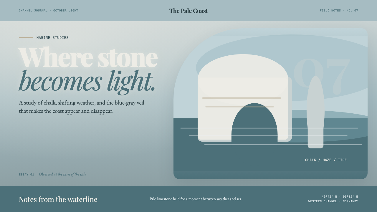 Étretat Chalk CliffsStone becomes light. Chalk-white forms dissolve through blue-gray mist and li…
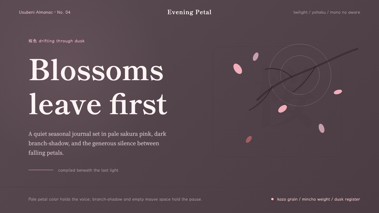 Cherry Blossom HanamiTenderness arrives in dusk. Sakura pink, branch-shadow, and Mincho type leave…
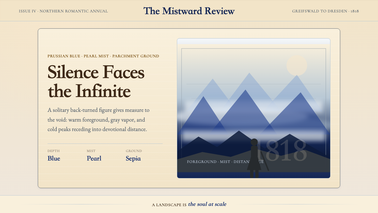 Caspar David FriedrichSilence becomes vast. Prussian blue depth, pearl mist, and parchment framing…
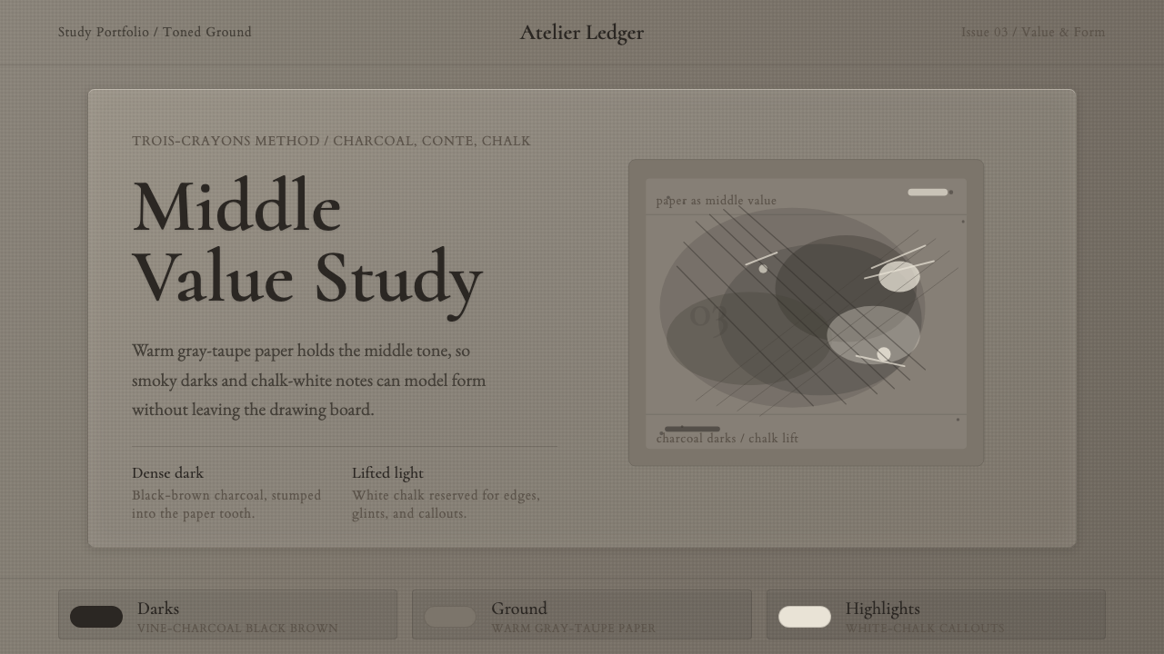 Charcoal & Conté DrawingAtelier calm, in middle value. Gray-taupe tooth, smoky charcoal, and chalk-wh…
 Claude Monet ImpressionistLight becomes the subject. Buttercream, pastel dapples, and Cormorant serif s…
 Degas Ballet PastelsBackstage glamour is labor. Jade walls, rose footlights, cropped serifs on cr…