What is Étretat Chalk Cliffs?
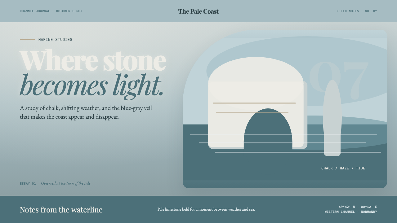
At Étretat, stone becomes light: chalk-white cliffs dissolve into blue-gray sea mist while literary serifs give the atmosphere an editorial voice.
Étretat Chalk Cliffs in brief
Étretat Chalk Cliffs is an atmospheric coastal style drawn from the pale limestone walls of Normandy’s shore, especially the Porte d’Aval arch and the L’Aiguille needle. Dark flint bands thread through the chalk like restrained marks, while the cliffs rise above the Channel in a light that feels cool, veiled, and almost weightless.
The visual system takes its ground from marine mist rather than sand, cream, or bright paper. A cyan-gray field carries the page, and chalk white is reserved for forms that should appear to glow through it. The contrast remains deliberately gentle: nothing is harshly outlined, and no element should feel detached from the surrounding air.
Its editorial character comes from French nineteenth-century literary serifs placed inside an Impressionist atmosphere. The result is neither a literal seascape nor a decorative beach theme. It is a quiet study in luminosity, where stone, text, and empty space seem to share the same cool light.

Where does Étretat Chalk Cliffs come from?
The physical subject is Étretat, a coastal place in Normandy on the English Channel. Its cliffs are far older than the visual movement that later made them an artistic subject: pale limestone rises into monumental forms, dark flint interrupts the surface, and the arch and needle create silhouettes that can be read as both geological and sculptural.
The approved historical frame is pre-1900 French Impressionist marine painting, joined to a high-key atmospheric seascape tradition. The source names Claude Monet, Gustave Courbet, and Eugène Boudin as key figures in this constellation. Their presence establishes the style as a French coastal art reference rather than a generic ocean palette.
Claude Monet is the clearest visual anchor. He painted the Étretat cliffs across some fifty canvases, treating them almost purely through colour and luminosity. The stone is not presented as a fixed object with a single correct appearance; it is repeatedly altered by Channel light, haze, and the changing relationship between pale rock and blue-gray air.
This design system distills that approach into a contemporary visual language. It preserves the marine mist as the ground, turns chalk white into a selective highlight, and uses literary serif type to retain the sense of a printed French art publication. The translation is atmospheric rather than illustrative: the page should feel as though the cliffs are emerging from light, not pasted onto it.
What defines the Étretat Chalk Cliffs look?
Marine Mist
The ground is cyan-gray, cool and atmospheric rather than creamy or sandy. It should feel like air carrying moisture, with enough softness for pale forms to recede into it. The background is not empty decoration; it is the climate in which every other element is read.
Chalk White
White is treated as illuminated stone, not as a default paper colour. It belongs to the cliff forms, selected headings, and moments that need to glow through the mist. Against the cyan-gray ground, chalk white should appear luminous and mineral, never clinical or stark.
Literary Serifs
Typography carries the voice of a French nineteenth-century publication. Serifs should feel literary, composed, and tactile, with enough refinement to suggest printed criticism or a coastal art monograph. Type is not a neutral container here; it is part of the historical atmosphere.
Low Contrast
The style depends on relationships that remain readable without becoming severe. Pale stone, mist, and text should sit close enough in value to feel related, while darker flint-like marks provide quiet orientation. The aim is clarity softened by atmosphere, not maximum separation.
Geological Silhouette
The Porte d’Aval arch and L’Aiguille needle provide the essential shapes: monumental, pale, and slightly remote. They work best as simplified silhouettes or broad masses rather than busy illustrations. Their power comes from the tension between solid rock and the open field of mist around it.
Atmospheric Light
Light is expressed through luminosity rather than glare. Forms may fade gently into the field, and highlights should feel dispersed by Channel air. The visual rhythm is slow and suspended, like an impression that remains after the exact outline of an object has softened.
Stone and Flint
The material contrast is restrained but essential: chalk-white mass against dark, narrow mineral interruption. Flint-like accents can guide attention, divide a field, or give a quiet edge to a composition. They should remain subordinate to the pale cliff and mist, never becoming a hard graphic system of their own.

Who shaped Étretat Chalk Cliffs?
Monet is the central figure named by this theme. He painted the Étretat cliffs across some fifty canvases, approaching them through colour and luminosity rather than a single fixed description. His repeated attention establishes the system’s core idea: the cliff is not only stone, but stone continuously transformed by Channel light and mist.
Courbet is named as one of the key figures in the style’s French marine-painting constellation. In this system, his presence helps keep the reference anchored in nineteenth-century French art rather than allowing the palette to drift into a generic contemporary coastal mood. His name belongs to the historical frame, while the interface remains focused on mist, stone, and light.
Boudin is also identified as a key figure in the approved historical frame. His inclusion places Étretat within a broader French coastal and atmospheric context, alongside the source’s emphasis on high-key marine light. The design does not imitate a particular canvas; it carries forward the shared idea that weathered air can become the subject of an image.
How do you use Étretat Chalk Cliffs today?
For presentation slides, use the cyan-gray field as a continuous atmosphere across cover, content, and data slides. A cover can let one chalk-white cliff form emerge beside a literary serif title, with the silhouette partly dissolving into the ground. Content slides should preserve generous breathing room and a restrained hierarchy. Data slides work best when charts feel like pale geological forms inside mist, with darker flint-like accents used only to guide reading.
For web interfaces, the style suits dashboards, pricing pages, and tools that want to feel considered rather than aggressively technical. Keep the interface pale, cool, and low-contrast, then reserve chalk white for active emphasis and darker mineral tones for essential structure. Cards should feel like quiet surfaces within one atmospheric field, not separate floating objects. Serif headings can carry the editorial voice while supporting text remains calm and highly legible.
For editorial and marketing work, Étretat Chalk Cliffs supports essays, cultural programs, travel writing, art publications, and products that need a sense of place without becoming picturesque. A long-form page can pair narrow reading measures with broad mist-filled margins, using pale cliff shapes as occasional interruptions. Marketing compositions benefit from one strong geological silhouette, a literary headline, and a restrained call to action that feels discovered rather than shouted.
Imagery should be treated as atmosphere rather than inventory. Use cropped cliff masses, pale rock, blue-gray haze, and the contrast between chalk and flint. Avoid filling every section with literal coastal photography; the style is strongest when the image and the surrounding field share the same light. A fragment of arch or needle can be more persuasive than a complete scenic view because it preserves ambiguity and lets the mist remain active.
The common mistake is turning the theme into a bright beach palette or a decorative collection of ocean references. Cream backgrounds, saturated nautical blues, hard outlines, and busy scenic imagery break the intended mood. Another mistake is using white everywhere as ordinary paper. Here, white is a mineral highlight with visual importance; it should appear to emerge from the cyan-gray field, while the rest of the system stays soft, spacious, and quietly atmospheric.

Étretat Chalk Cliffs — FAQ
Is Étretat Chalk Cliffs simply a coastal photography style?
No. Its source is the relationship between pale limestone, dark flint, blue-gray marine mist, and the changing luminosity of Channel light. Photography can support the language, but the system is equally comfortable with simplified silhouettes, empty atmospheric fields, and literary typography. What matters is not showing a beach, but making stone feel suspended inside light.
Can the style use a dark background?
It can, but the result moves away from the approved light-ground character. The defining atmosphere depends on cyan-gray air and chalk white glowing within it. A dark treatment may preserve the flint reference, but it risks turning the cliffs into hard graphic symbols and losing the softness of the marine mist. Light, cool, and low-contrast grounds are the more faithful choice.
Why are literary serifs so important here?
The serifs connect the visual system to its French nineteenth-century reference and give the atmosphere an editorial voice. Without them, the cyan-gray field and chalk-white forms could become a generic modern interface. The type should suggest a printed art publication: reflective, composed, and culturally situated, while remaining clear enough for practical reading.
Why should the contrast stay so soft?
Because the subject is not only the cliff but the air surrounding it. Strong separation would make the forms feel cut out and would replace atmospheric light with graphic force. Soft contrast allows chalk, mist, and text to occupy related visual space, while darker flint-like accents preserve orientation. The style is meant to remain legible without becoming severe.
Does the style work for dashboards and pricing pages?
Yes, when the product benefits from calm authority, editorial clarity, and a strong sense of place. Dashboards can use the mist field to unify many panels, while chalk-white emphasis and mineral-dark structure help users distinguish important information. It is less suitable when the product depends on loud urgency, dense visual competition, or highly saturated interaction signals.
Related design styles
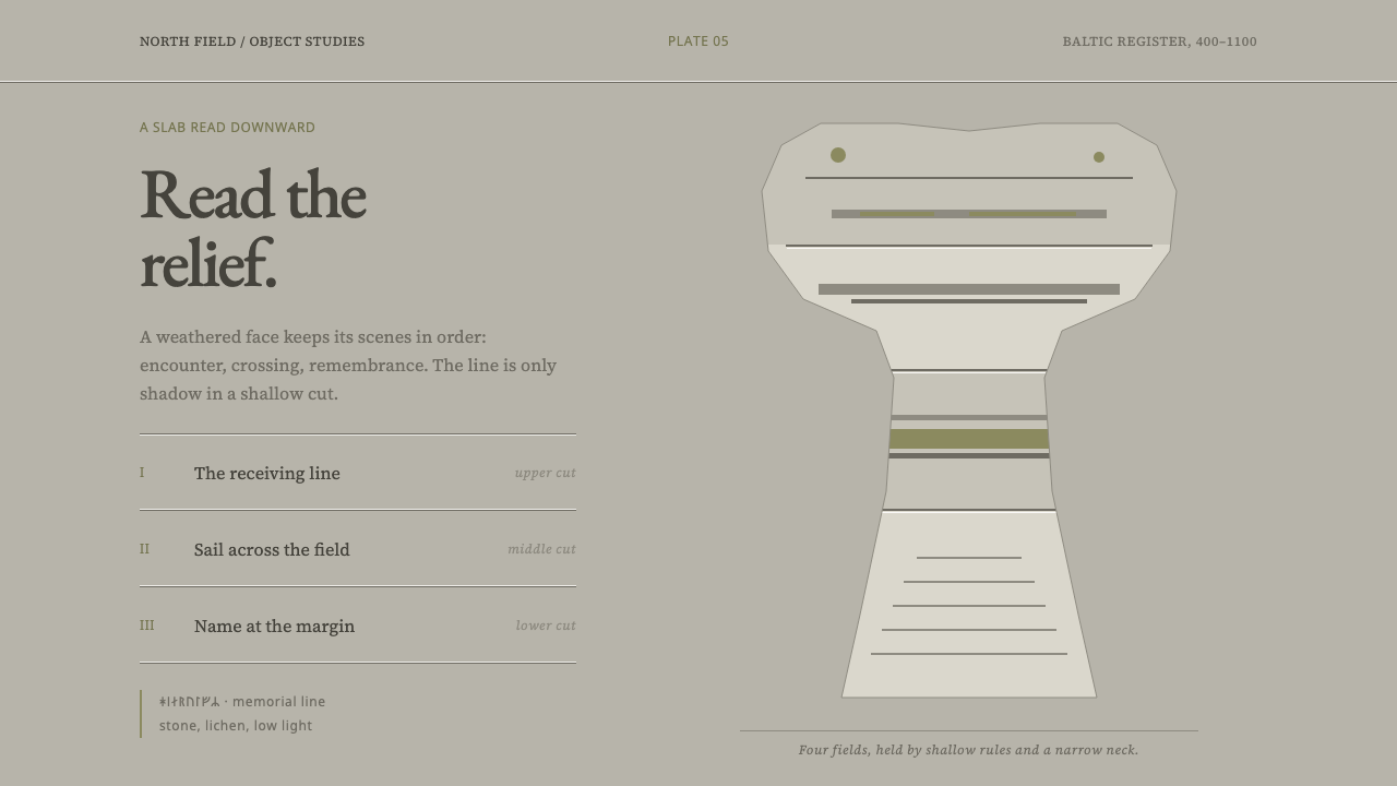 Gotland Picture StoneMeaning emerges slowly. Weathered limestone greys divide a story into shallow…
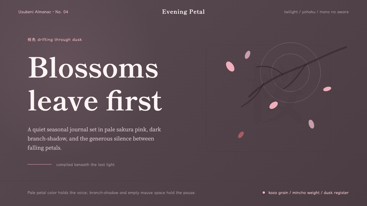 Cherry Blossom HanamiTenderness arrives in dusk. Sakura pink, branch-shadow, and Mincho type leave…
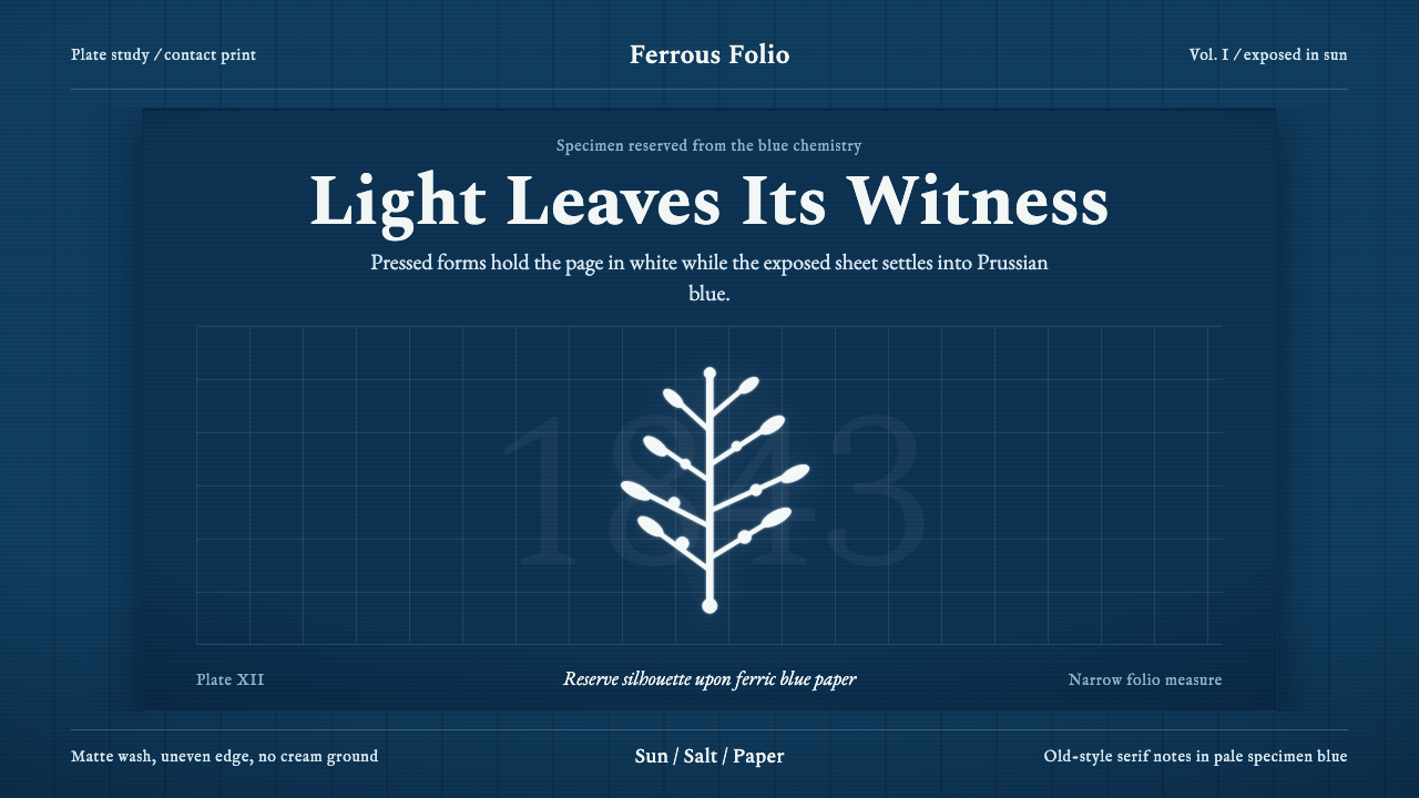 Anna Atkins CyanotypeScience turns spectral. Prussian blue ground, white reserves, Victorian serif…
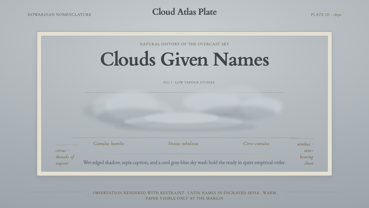 Cloud Atlas PlateObservation becomes atmosphere. Gray-blue wash, soft clouds, and sepia Latin…
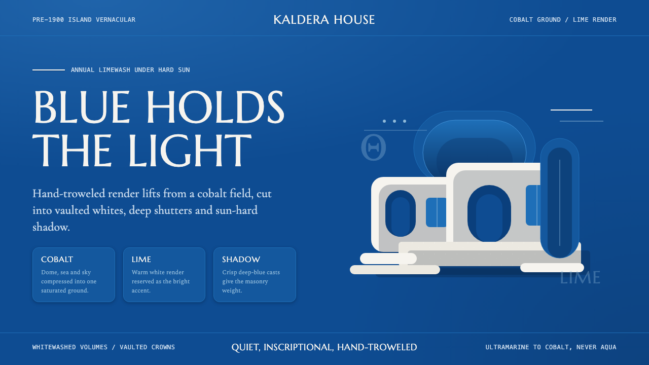 Cycladic SantoriniQuiet island gravity. Cobalt field, Marcellus capitals and white vaults hold…
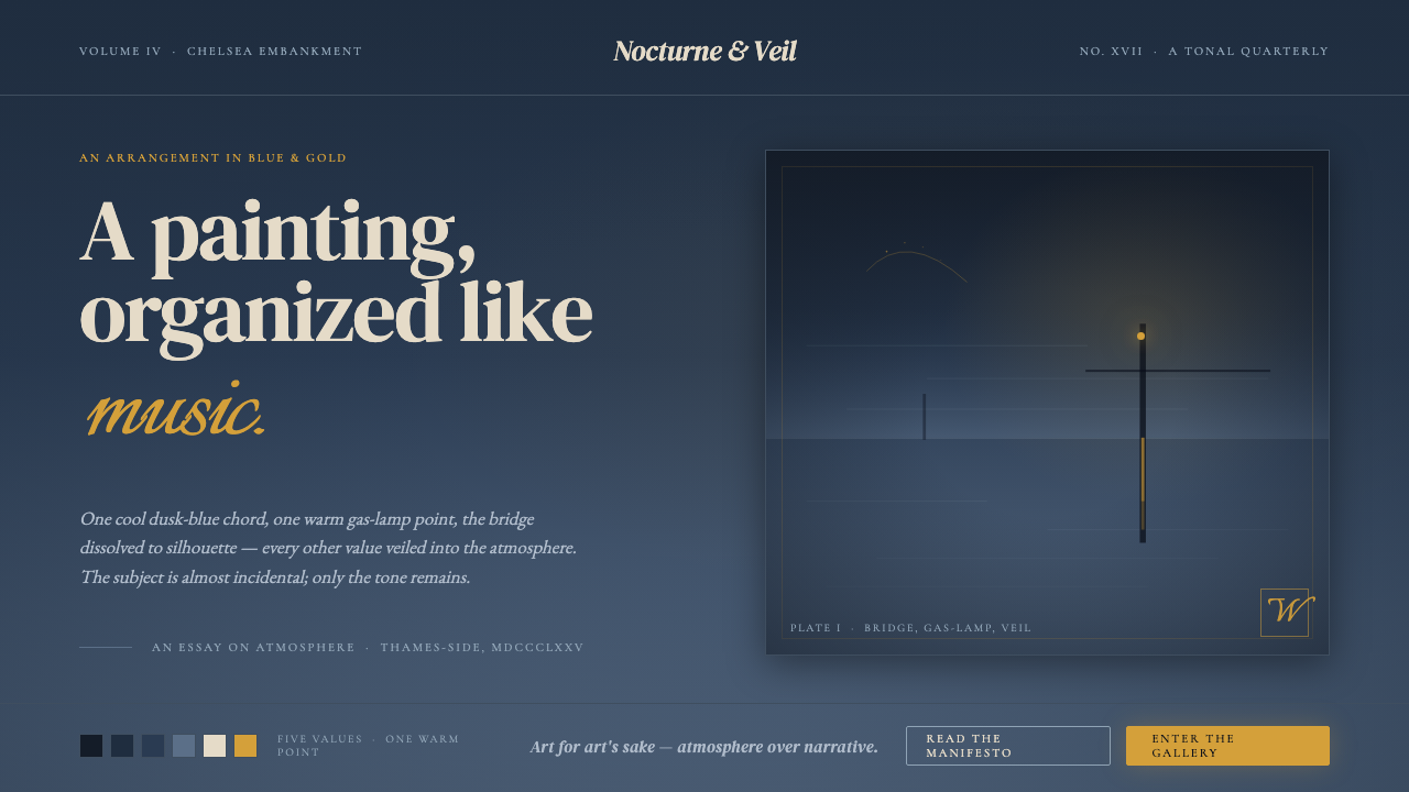 Whistler Nocturne TonalismA painting organized like music. One dusk-blue chord, one warm gas-lamp point…