What is Pamukkale Travertines?
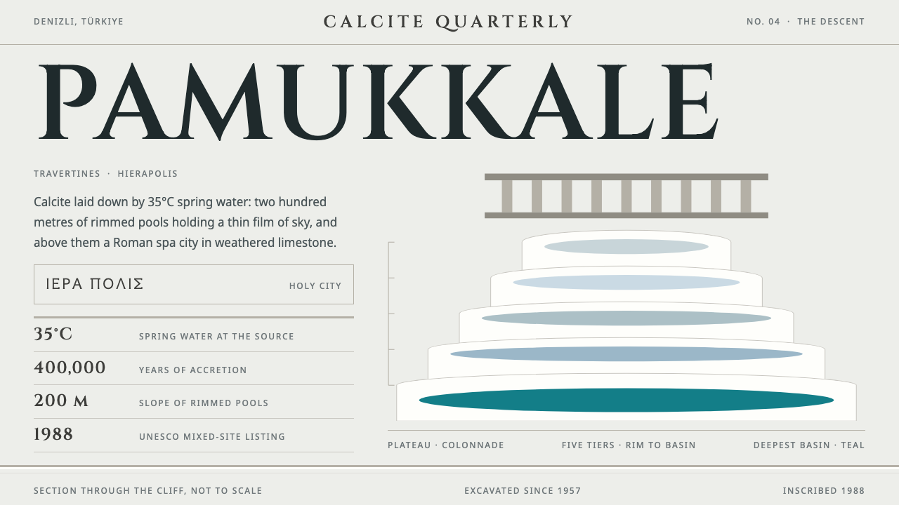
Pamukkale turns a white cliff of calcite pools into a design language: stepped terrace tiers, Roman inscription capitals, and teal saved for the deepest basin.
Pamukkale Travertines in brief
The Pamukkale Travertines style draws on a real landscape in south-western Türkiye: a white hillside of calcite terraces laid down by spring water, with a Roman spa city standing on the plateau above. Its name in Turkish means cotton castle, yet the material is stone. The visual result is a bright, hard-lit, nearly shadowless look in which pages are stone white and cards step down like rimmed pools.
Two halves of the place are combined. The natural half supplies lobed terrace tiers, rippled strata and thin, transparent water that mostly reflects the sky. The built half, Hierapolis, supplies straight colonnades, inscription-style capital letters and a weathered limestone dignity. The system pairs them so that organic curves and ancient geometry sit together on one page.
Colour is deliberately scarce. Most of the cliff is bare white crust, and pools take on the colour of the sky in the shallows. Real teal appears only where a basin runs deep, and the style honours that by reserving its one saturated accent for a single deep pool of emphasis. Greek text is set in a real Greek typeface rather than faked, a small sign of respect for the site's languages.

Where does Pamukkale Travertines come from?
The terraces of Pamukkale lie in Denizli Province in south-western Türkiye. They were formed when spring water, warm from deep underground and carrying dissolved calcium bicarbonate, ran down the slope and released carbon dioxide. White calcite was left behind. Over roughly 400,000 years that slow deposition built a cliff of rimmed pools stepping down about 200 metres, mostly bare crust, with water so thin that it often reflects only sky.
On the plateau above stands Hierapolis, a thermal city founded in the Hellenistic period, around 190 BC, and expanded under Roman rule. Its limestone colonnades and semicircular theatre still stand, weathered to a pale tone that echoes the terraces below. The city's life was tied to the springs: people came to bathe, to be healed and to worship at sacred water, a culture of spa and sacred-spring tradition that gave the site its long identity.
Two historical figures anchor the human story. Epictetus, the Stoic philosopher, is associated with Hierapolis, and Philip the Apostle is remembered as a figure of the city's early Christian history. Their names survive in the cultural record of the site and remind designers that the place is not only scenery but a living archive of ideas and belief. The city continued through the Roman era and beyond until about the seventh century AD.
In modern times the site has been studied and conserved by archaeologists and architects, among them Paolo Verzone and Francesco D'Andria, whose work on Hierapolis shaped what visitors see. In 1988 the area was inscribed on the UNESCO World Heritage list as a mixed site, recognising both its natural and cultural value. The source material also frames it as natural geoheritage, Hellenistic and Roman thermal-city urbanism, and spa and sacred-spring culture, which are the three threads this design style weaves together.
What defines the Pamukkale Travertines look?
Color
The base is travertine white, a warm and slightly chalky off-white that reads as stone rather than paper. Supporting tones are pale limestone greys and sky-washed blues, as if the pools were reflecting a clear day. A single saturated teal is saved for the deepest basin: one call to action or one key figure per view. Using teal everywhere would break the logic of the landscape that the style borrows.
Typography
Headlines use Cinzel, a typeface modelled on Roman inscription capitals, set in capitals with generous letterspacing so they feel carved into a lintel. Body text uses a clean, readable face that does not compete with the carved headings. Greek text is set in a genuine Greek typeface, never faked from Latin shapes. The contrast between monumental titles and quiet reading text echoes the contrast between the ancient city and the soft pools.
Terrace Tiers
Cards and panels are arranged as stepped tiers, each one a little lower or offset from the last, with lobed or scalloped rims like the edge of a calcite basin. Containers feel like shallow trays rather than raised boxes. The staggering gives pages a sense of descent and flow, as if content were water moving down the slope from one pool to the next.
Strata and Ripples
Dividers and backgrounds borrow the rippled lines of mineral deposition: soft horizontal bands, curved contour lines and fine banding in near-white tones. These textures are subtle enough to be felt more than seen. They replace conventional rules and shadows, giving structure to the page the way layers give structure to the cliff.
Colonnades and Straight Lines
Against the soft curves of the terraces, Hierapolis supplies verticals and strict rhythm: evenly spaced columns, straight rules, regular grids in lists and navigation. This is where the system gets its civic, dignified side. The balance between curved and straight keeps the style from drifting into a vague spa-brochure look.
Light and Shadow
The light is high, hard and bright, as at midday on a white slope. That means almost no cast shadows; separation comes from thin tonal steps, hairline edges and the occasional glint of blue. Depth is described by layering rather than blur. Pages feel airy and dry, and the near absence of shadow keeps the white from turning muddy.

Who shaped Pamukkale Travertines?
Stoic philosopher associated with Hierapolis. His presence in the city's cultural record links the site to a tradition of discipline, plain speech and restraint, qualities mirrored in the style's calm layouts.
Remembered in connection with Hierapolis and its early Christian history. His association with the city shows that the site stayed a place of pilgrimage and belief after its Hellenistic and Roman heyday.
An architect connected with the modern study of Hierapolis. His documentation and excavation work helped recover the plan of the ancient city that designers now draw on for colonnade rhythm.
An archaeologist whose work at Hierapolis helped shape contemporary understanding and conservation of the site, including the city's relationship to its sacred springs.
How do you use Pamukkale Travertines today?
The Pamukkale style suits subjects that need calm, spaciousness and a sense of heritage: travel, wellness, hospitality, museums, cultural institutions and anything connected to water or stone. It is a poor fit for dense, high-energy interfaces, where the airy white and single teal accent would feel underpowered.
For presentation slides, a cover can be a field of travertine white with the title in carved-looking capitals and one band of terraced shapes across the bottom. Content slides work well as stepped cards, each placed slightly lower than the one before, with one deep-teal element per slide marking the key point. Data pages should keep charts in pale tones and give the chart's most important series the single teal accent.
For web interfaces, use it for booking sites, wellness and spa products, museum guides and reading apps. Cards with scalloped rims, thin strata dividers and capital-letter section headings give the page an unmistakable character. Pricing pages can present plans as descending tiers, with the recommended plan taking the teal, which turns the colour scarcity into a usable emphasis system.
For editorial and marketing work, the style supports long-form travel writing, heritage stories and brand pages for water, minerals or hospitality. Photograph white terraces against bright sky, keep captions in the quiet text face, and let carved headings carry the drama. Greek or other non-Latin quotations should be set in proper fonts to stay in tune with the style's respect for the site's languages.
A common mistake is to scatter teal across buttons, links, badges and icons, which turns a subtle system into a swimming-pool brochure. The landscape keeps real teal for one deep pool, and the design should do the same. Another mistake is to add heavy shadows or glossy gradients; the style's light is hard and dry, and its depth comes from stepped layers instead.

Pamukkale Travertines — FAQ
What does Pamukkale mean and why is it a design reference?
Pamukkale means cotton castle in Turkish, though the white is calcite, not cotton. It became a design reference because its stepped pools, stone-white palette and the Roman city of Hierapolis above them form a coherent visual system of curves and straight lines.
How were the terraces formed?
Warm spring water carrying dissolved calcium bicarbonate ran down the slope and released carbon dioxide, leaving calcite behind. Over about 400,000 years this built rimmed pools stepping down roughly 200 metres.
Which typeface does the style use?
Headlines use Cinzel, a typeface based on Roman inscription capitals, paired with a quiet readable face for body text. Greek text is set in a real Greek typeface rather than imitated.
Why is teal used so sparingly?
On the real cliff, most pools are shallow and mirror the sky, and real teal appears only where a basin is deep. The design copies that scarcity: a single saturated teal marks the most important element on a page.
When should I avoid this style?
Avoid it for dense, fast-moving interfaces and for brands that need loud, saturated colour. Its strength is calm, heritage and spaciousness, and it loses that when overloaded.
Related design styles
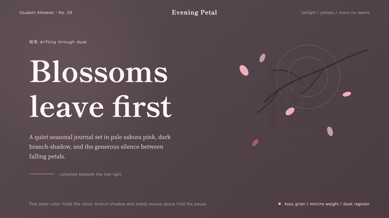 Cherry Blossom HanamiTenderness arrives in dusk. Sakura pink, branch-shadow, and Mincho type leave…
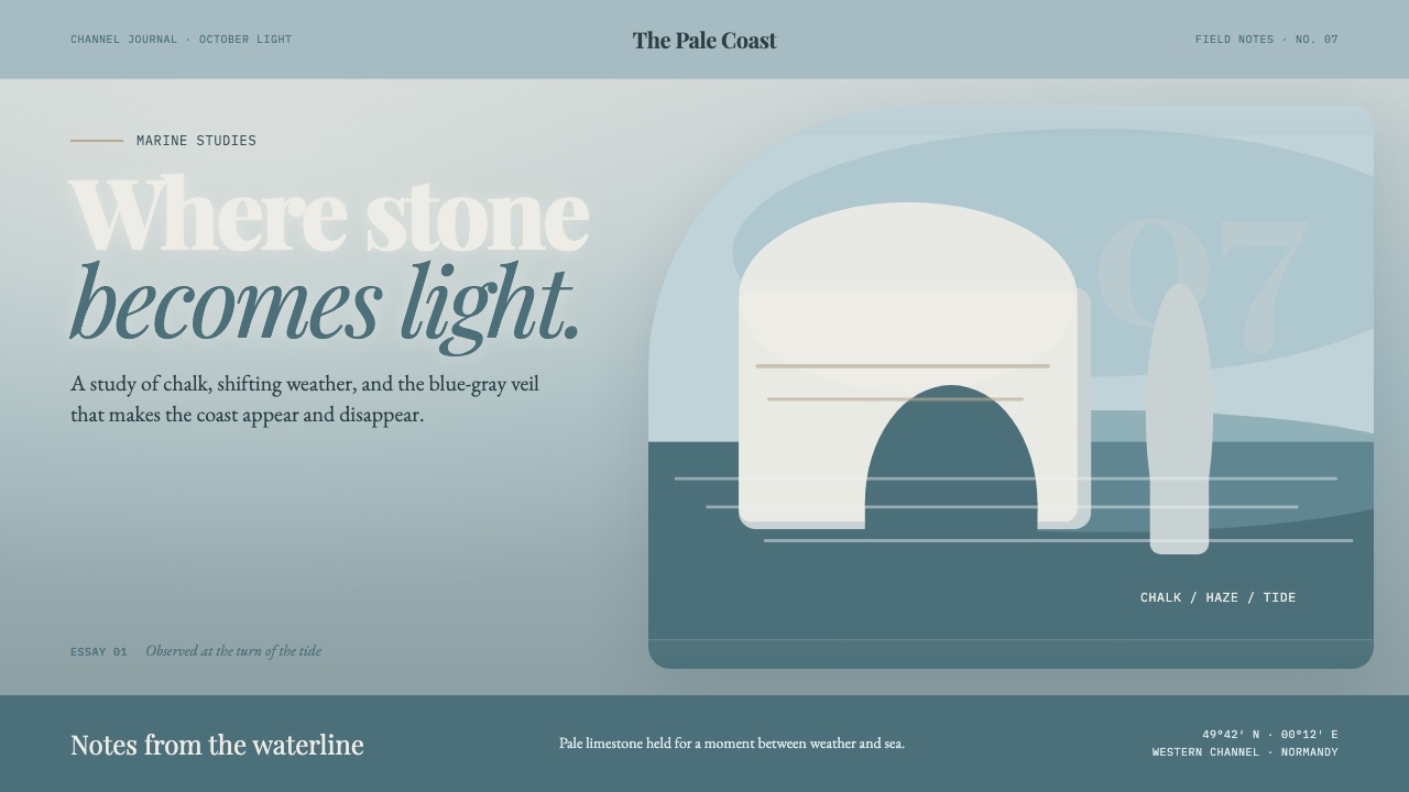 Étretat Chalk CliffsStone becomes light. Chalk-white forms dissolve through blue-gray mist and li…
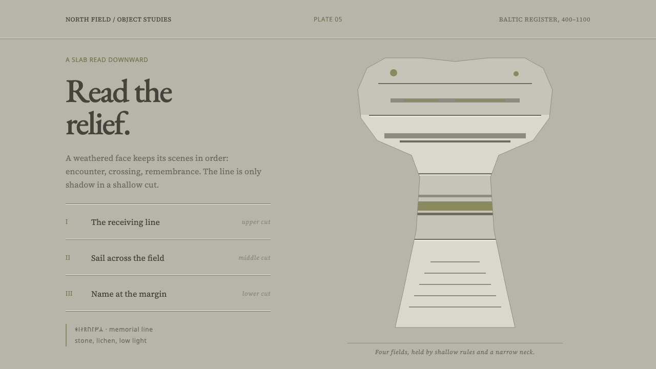 Gotland Picture StoneMeaning emerges slowly. Weathered limestone greys divide a story into shallow…
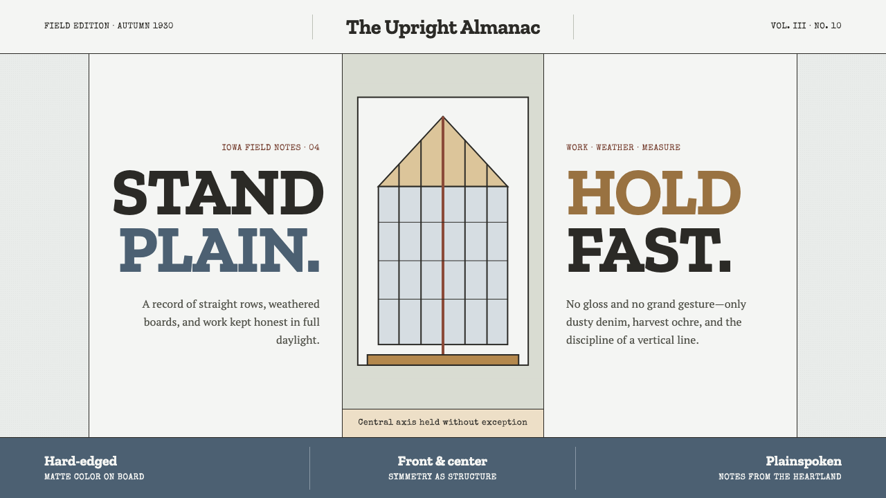 Grant Wood American Gothic (1930)Plainness stands firm. Dusty denim and ochre align on a strict central axis.
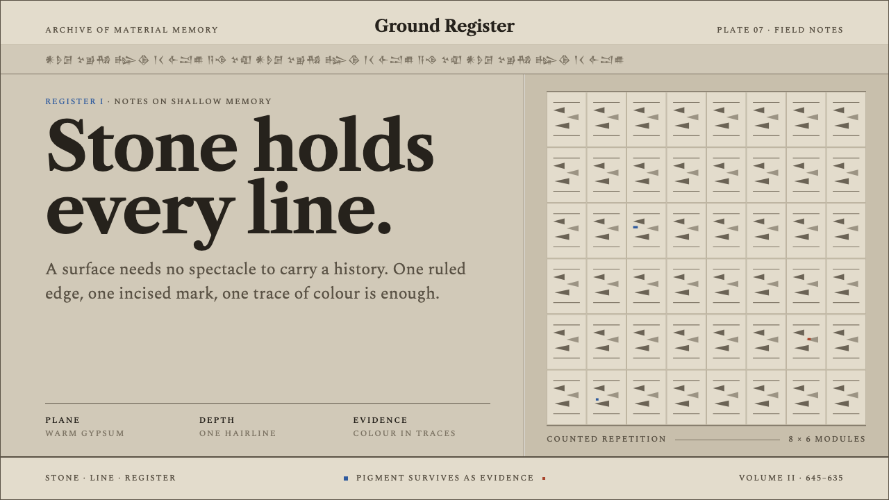 Assyrian Palace ReliefHistory cut to a hairline. Warm gypsum registers hold serif type and rare pig…
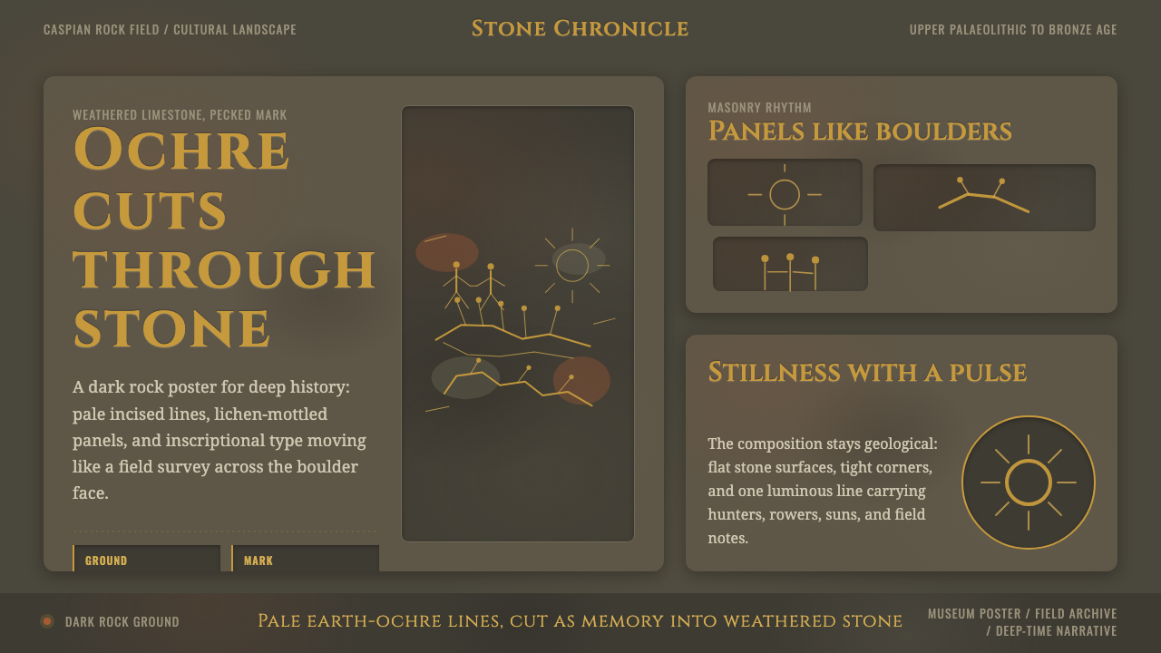 Azerbaijani Gobustan PetroglyphAncient rock speaks. Ochre incisions glow across dark lichen-mottled stone.